Hi Ismael,
thanks for the fast response.
What is the difference between “background: blue;” and “background: rgba(255,90,8,0.8);”?
What in detail are they doing?
Is it enough to use:
#top .avia-post-nav {
background: #c3512f;
}
When I use the obove code the color isnt transparent any more. I can i make it transparent again?
Hi,
I just want to hide the producte categories shown on the single product page. I do NOT want to hide the product tags. I tried to hide via CSS:
.template-shop .product_meta {
clear: both;
font-size: 11px;
position: relative;
top: 8px;
display:none;
}
this worked but it also hided the product tags
Thanks
Glenn
Hi guys – I’ve just posted a thread but it was closed
https://kriesi.at/support/topic/possible-bug-image-rollover-isnt-covering-whole-image/
I’ve noticed that when I put my images in the 3 or 4 column layout – the opacity rollover doesn’t reach the end of the image.
This only seems to happen in the middle images of either of this layout.
So for the 3 column layout – the second image rollover doesn’t cover the image properly and for the 4 column layout, the second and third rollover doesn’t cover the image properly. I can’t take a screenshot so have included login details below for you to see. All of the images are the same dimensions so it can’t be this. I had a peek at the CSS but can’t work out what’s causing it.
Here is an example page with the bug – please roll your mouse over the second and third image to see what I’m talking about. I’m using the latest Chrome on Mac but my client picked this up while viewing in IE.
http://www.acmena.com.au/services/
Any clues as to how to fix this?
I was advised to update to V2.4 – which I did but this didn’t fix the issue. Can someone look into this please/
Cheers
I’ve supplied login details and they’re listed in the thread linked above.
Hey!
Please remove the code then install this plugin: http://wordpress.org/plugins/wp-mobile-detect/
Edit header.php, find this code on line 2:
global $avia_config;
On top of it, add this code:
if( wpmd_is_phone() ){
        $redirect_url = 'http://jonnyfreesh.com/music';
        header('Location: ' . $redirect_url ); // Redirect the user
}
Remove browser cache then reload the page.
Regards,
Ismael
Hi crevlon!
You can change the text color using this:
#top .avia-post-nav {
color: red;
}
Change container background when hovered using this:
#top .avia-post-nav:hover {
background: #222;
background: rgba(255,50,8,0.5);
}
This is for the initial background of the navigation:
#top .avia-post-nav {
background: blue;
background: rgba(255,90,8,0.8);
}
Best regards,
Ismael
Hi!
Please post the login details here as a private reply. We would like to inspect it.
Best regards,
Ismael
I posted about this a little earlier and Josue sent me this link to check out.
http://stackoverflow.com/questions/16165211/how-to-set-a-different-static-homepage-for-mobile-version-wordpress
I’m trying the 3rd post. When i put the code at the top of my headers.php file it didn’t perform a redirect and the code showed up on my site. So i added a line above it, right at the top of my headers.php file, “<?php” and now the site just shows up as a blank white page.
Any suggestions as to what I might be doing wrong? This is how the top of my headers.php file looks now :
<?php
if( is_front_page() ){
include_once(‘mobile-detect/Mobile_Detect.php’);
$detect = new Mobile_Detect();
if ( $detect->isMobile() || $detect->isTablet() ) {
$redirect_url = ‘http://jonnyfreesh.com/music’;
header(‘Location: ‘ . $redirect_url ); // Redirect the user
}
}
<?php
global $avia_config;
$style = $avia_config[‘box_class’];
$responsive = avia_get_option(‘responsive_layout’,’responsive’);
$blank = isset($avia_config[‘template’]) ? $avia_config[‘template’] : “”;
$headerS = !$blank ? avia_header_setting() : “”;
$headerMenu = $responsive ? avia_get_option(‘header_menu’,’mobile_drop_down’) : “”;
?>
Thanks
Jonny
Hi!
I’m not sure why it doesn’t work for you. Have you tried Peter’s solution here https://kriesi.at/support/topic/iconfont-manager-upload-problem/?
Best regards,
Ismael
Hi!
Yes, it is not full compatible with the theme and you might need a freelance developer to fix a few layout issues.
Please add this on your custom.css or Quick CSS:
#main {
margin-top: -1px;
}
Best regards,
Ismael
Thanks Ismael,
So then what you’re saying is that from the get go it’s not fully compatible with the theme and that to use it I would need to hire a developer?
Also, I’ve just realized that I have the same issue with the thin white line at the top of the page as well. I tried putting in this css into the quickcss but it didn’t work.
#top.avia-blank {
height: 101% !important;
}
Many Thanks for the awesome support guys.
Jonny
Hey mgerenser!
1) Your child theme has only the mega menu using that blue color. If you use this instead it will effect both the mega menu current menu and the regular menu current menu:
#top .header_color .main_menu .menu ul .current_page_item > a, #top .header_color .main_menu .menu ul .current-menu-item > a {
color: #1d66ab;
}
2) I’m seeing the border on each column so I’m not sure if it has already resolved itself.
Regards,
Devin
Hey!
Please add following codes to Quick CSS in Enfold theme options under Styling tab
1-
#header_main .social_bookmarks {
top: -32%; margin-top: 0; }
.bottom_nav_header #header_meta {
z-index: 2; }
2-
.avia-menu-fx { display: none; }
3- It does appear on my end. Please see screenshot here http://i.imgur.com/pQ123kD.jpg
4- Can you post a screenshot and show how you would like it to look?
5- You should add Fullwidth Easy Slider to your page and insert "Slideshow Background Image" in slider options
Regards,
Yigit
Hey asherbarrett!
Please try following code
#menu-item-2343 a {
background: blue !important;
padding: 10px;
color: red !important;
}
You should change the menu item ID to match your menu items ID
Cheers!
Yigit
Hello,
i have the problem that it is not showing the last posters username at the topic list.
It looks like that:
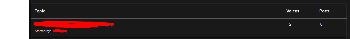
How can i change that? I checked the bbPress settings but can’t find a option for that so i guess it has something todo with the template.
Thank you very much
Hi!
First re-download the theme files from your downloads on Themeforest and then install the updated theme files. For a quick guide on updating your theme take a look at this video on updating the Enfold theme via FTP: https://vimeo.com/channels/aviathemes/67209750
In addition, try deactivating all active plugins and see if that helps layerslider work correctly in IE since it has had a lot more testing and usage for cross browser compatibility than even the theme.
@viscribe – if you can create a new topic with a link to your site and the same information we’ll take a look at it there. IE issues can be varied and I don’t want the two of you to get confused on which is working for whom.
Best regards,
Devin
Hey Minz!
1) While possible, we don’t have a code example or a how to. You would need to write new custom css to replace the bullets with the icons of your choice.
2) I don’t know why they aren’t lined up on that page. You may want to try adding a blank column on the side of each of the 2/3 columns to make sure everything is getting cleared out correctly.
And possibly try re-making the tables to see if it was just an error in their initial setup.
3) Try adding the following CSS to your Quick CSS (located under the Styling Tab in the theme options) or the custom.css file in the css folder of your theme files:
@media only screen and (max-width: 989px) {
 .responsive .boxed#top {
  width: 100%;
 }
}
adjust the max-width as needed to get the effect you are looking for. You *might* need to add !important to the width value if it doesn’t overwrite the themes media query correctly at first.
4) You can use this to remove it:
.footer_color .widget_nav_menu ul:first-child>.current-menu-item, .footer_color .widget_nav_menu ul:first-child>.current_page_item {
    background: transparent;
}
or alter it to fit your design.
Regards,
Devin
I’m trying to make a panorama picture (1140px wide) full-width responsive but it’s stopping at 1140 px. I have all the settings right, I believe, but it’s leaving white space on both sides.
The sample slider’s background image is 1600. Do all fullwidth sliders need the same dimensions?
I would like to add buttons like these in the top secondary menu http://j2k.info/american/ and i added the following css to my theme but nothing happen. can you help me out?
the css i added
#menu-item-2508 a {
background: blue !important;
padding: 10px;
color: red !important;
}
#header_meta {
box-shadow: none;
}
.header-buttons { border-bottom: 2px solid blue; }
my site i’m building.
http://mindseye-studios.com/clients/johnmoore/
Hi guys,
I’m trying to change the width of the blog. The target is the blog, where sidebar has default size, but post has the width for 1000px images. I edited grid.css – added new rule for screens with min-width 1500px – just copied from “@media only screen and (min-width: 1340px)”, not replaced. I changed “responsive_large .container” value to 1365px and “responsive_large .container .nine.units” to 1050px. Nothing else. It looks nice now. But do I need to edit something else with #top selectors? I don’t understand what is it for. When I look into html code using Firebug I see, that the theme uses nine units, but grid.css has units from one two twelve. Why? Could you explain what container units mean?
Thank you
Hello, I like some css modifications.
HEADER
I am using the header botton with social icons.
1. to have the social icons on the top of all, at the same y-position of header meta content.
2. no border in menu section (actually is a green line)
3. with my modifications of header the “back to top” button not appears in bottom position. how to fix it?
CONTENT
i like too much to have some page with two columns. in one to have got an image and overlaps in the other column. how to make this?
the same question but with two sections.
the overlaps effect is beautiful!!
SLIDER
how is the element “easy slider transparent”. It appears in demo themeforest enfold theme but not in dummie demo data.
thanks so much!!
xavier.
Hey!
Please add following code to Quick CSS as well
#top .social_bookmarks li, .sub_menu li { border-right-style: none; }
Best regards,
Yigit
Hey CloudChoice!
Please use following code instead
#header_meta { box-shadow: none; }
#header_main { border-top: none; }
Cheers!
Yigit
That worked! Just had to figure out one other bit of code to fix the fact that the dropdown part was one pixel to the right of the rest. I fixed it with this:
#top .sub_menu li li a {
margin-left: -1px!important; }
In case anyone else is reading this because they are looking for help with a similar problem, here is the full code we used:
#lang_sel_click {
position: absolute!important;
top: -12px!important;
left: -150px!important; }

#lang_sel_click a, #lang_sel_click a:visited {
line-height: 10px!important; }

#lang_sel_click li { width: 150px!important; }

#lang_sel_click .sub_menu li ul {
top: 26px!important;
left: 0%!important;
border-top: none!important; }

#top .sub_menu li ul { left: 0%!important;
top: 31px!important; }

#top .sub_menu li li a { line-height: 22px!important; padding: 3px 10px!important; font-size: 11px!important; border-top: none!important; margin-left: -1px!important; }

#top .sub_menu li li:first-child > a {
border-bottom: solid 1px #cdcdcd!important;
border-left: solid 1px #cdcdcd!important;
border-right: solid 1px #cdcdcd!important; }

.header_color .sub_menu ul { background-color: #f8f8f8!important; }

#top .sub_menu li ul { width: 151px!important; }
#lang_sel_click li { padding-left: 0!important; }
Thanks again for all the brilliant coding help! :)
P.S. I also can’t work out how to loop it. It currently finishes and then stops. Please can you point me in the right direction.
Hi!
Please add following code to Quick CSS as well
#top .sub_menu li ul { width: 151px; }
#lang_sel_click li { padding-left: 0; }
That should solve both issues. If not, please create a temporary admin login and post it here privately so we can take a look
Best regards,
Yigit
Just updated the current version and the following messages appeared:
Warning: require_once(class-envato-protected-api.php) [function.require-once]: failed to open stream: No such file or directory in /home/content/48/11359548/html/wp-content/themes/enfold-new/framework/php/auto-updates/class-pixelentity-theme-update.php on line 32
Fatal error: require_once() [function.require]: Failed opening required ‘class-envato-protected-api.php’ (include_path=’.:/usr/local/php5_3/lib/php’) in /home/content/48/11359548/html/wp-content/themes/enfold-new/framework/php/auto-updates/class-pixelentity-theme-update.php on line 32
Hi!
Please add following code to Quick CSS as well
1-
#top .sub_menu li li:first-child > a {
border: solid 1px #cdcdcd!important;
}
2-
.header_color .sub_menu ul { background-color: #f8f8f8!important; }
3- You are going to need to hire a freelance developer for that kind of customization as it is beyond the scope of support we can provide. You can also request quote here.
Cheers!
Yigit
Hi again,
I tried replacing the enfold-new with the updated enfold version, but when I did, the slider remained not visible. Any other ideas besides rebuilding from scratch?
Thanks again. Replacing all of the semicolons with !important; in the code that you and Ismael gave me has helped some. I have also tweaked the code to adjust padding, line-height, etc.
This code appears to be almost correct. However, I am still having a few problems:
- When you click the dropdown button, the first item that pops up below the current is missing its left, right and bottom borders. (Top border is set to none in the code because it would overlap with the current item’s bottom border.) There is also a weird line that is tangential to the menu (to the top right of the first dropdown item).
- The weird blank space to the left of the current item in the menu is still there. Upon closer look, I do not think it is a matter of color, so I removed the “background-color: inherit;” from the code. It appears that this one item is about 10px narrower than the rest of the items. I have tried to adjust the width, but this did not work. Trying to insert negative margin just moved the entire item, including this blank space.
Here is the code as I have revised it:
#lang_sel_click {
position: absolute!important;
top: -12px!important;
left: -150px!important; }

#lang_sel_click a, #lang_sel_click a:visited {
line-height: 10px!important; }

#lang_sel_click li { width: 150px!important; }

#lang_sel_click .sub_menu li ul {
top: 26px!important;
left: 0%!important;
border-top: none!important; }

#top .sub_menu li ul { left: 0%!important;
top: 31px!important; }

#top .sub_menu li li a { line-height: 22px!important; padding: 3px 10px!important; font-size: 11px!important; border-top: none!important; }
Thanks again. Take care.
-
This reply was modified 12 years, 3 months ago by
 MHM.
MHM.