-
AuthorSearch Results
-
June 18, 2025 at 8:16 pm #1485651
In reply to: One background image not showing on mobile
Hello again,
I still have the problem: I’ve now moved the site to the original domain, and the issue is not related to the browser, but to the column settings. I’m using the image as a column background, and when I set it to “scale to fit”, it doesn’t show on mobile. When I change it to “stretch to fit”, it does appear — but then the resolution looks strange and unattractive on desktop. What’s the solution?Best regards
June 18, 2025 at 8:26 am #1485624In reply to: color of hamburger menu on mobile
Don´t know if I got this right…only put this in?
Like this?
@media only screen and (max-width: 767px) {/* Add your Mobile Styles here */
#top .header_color .av-hamburger-inner,
#top .header_color .av-hamburger-inner::before,
#top .header_color .av-hamburger-inner::after {
background-color: #000000;
}
}June 18, 2025 at 8:19 am #1485623In reply to: color of hamburger menu on mobile
Hey!
Thank you for the inquiry.
Did you add this css code?
@media only screen and (max-width: 767px) {
    #top .header_color .av-hamburger-inner,#top .header_color .av-hamburger-inner::before,#top .header_color .av-hamburger-inner::after {
        background-color: var(--enfold-header_burger_color);
    }
}
This sets the color of the hamburger menu icon to white. You can replace it with:
@media only screen and (max-width: 767px) {

  /* Add your Mobile Styles here */
  #top .header_color .av-hamburger-inner,
  #top .header_color .av-hamburger-inner::before,
  #top .header_color .av-hamburger-inner::after {
    background-color: var(--enfold-main-color-color);
  }
}
Regards,
IsmaelJune 18, 2025 at 7:37 am #1485615In reply to: Accessibility Issue with Search Icon
Hi,
However, I believe there may have been a misunderstanding regarding the issue. The problem is not with the icon itself or its aria-hidden attribute, but with the structure and function of the link that wraps the icon.
If we’re not mistaken, the issue occurs because the SVG icon includes the aria-hidden attribute, which makes it unreadable to accessibility tools. As a result, the parent link is marked as “suspicious” since the icon is hidden and the link lacks any accessible text or description. The span avia_hidden_link_text, which contains the word “Search” also has its display property set to none, making it inaccessible to screen readers as well.
Removing the aria-hidden attribute from the SVG icon or adjusting the visibility of the avia_hidden_link_text should help.
#top .avia_hidden_link_text {
    position: absolute;
    width: 1px;
    height: 1px;
    padding: 0;
    margin: -1px;
    overflow: hidden;
    clip: rect(0 0 0 0);
    white-space: nowrap;
    border: 0;
}
You can also try editing the enfold/includes/config-enfold/functions-enfold.php, around line 125, change the text “Search” to “Click here to search”.
$items .= '<span class="avia_hidden_link_text">' . __( 'Click Here to Search', 'avia_framework' ) . '</span>';According to https://wave.webaim.org/, screen readers tend to better interpret buttons or links when it contains more descriptive text.
If this doesn’t help, you can always try the suggestions above.
Let us know the result.
Best regards,
IsmaelJune 18, 2025 at 6:35 am #1485607In reply to: Navigation thumbnails not appearing on layer slider
Hey tonyiatridis,
Thank you for the inquiry.
We enabled the Project Settings > Navigation > Show Navigation Buttons > Slide Navigation Buttons, then added this css code to make the thumbnail navigation fullwidth.
.ls-noskin .ls-thumbnail { top: 0px; width: 100% !important; }Best regards,
IsmaelJune 17, 2025 at 11:05 pm #1485600Topic: Theme Demos & Widgets
in forum Enfoldaron8778
ParticipantHi Guys,
Just wondering if there will be any new demo releases and widgets coming through in any of the updates? I love Enfold and really used to it but would be good if there were different hamburger menu designs and header styles for mob etc also different header styles for desktop for phone numbers and emails with icons ready to go?
Just asking if there is anything new bubbling to get excited about
Cheers
AronJune 17, 2025 at 8:33 pm #1485587In reply to: My cart icon is white/invisible
Hey Enfoldfanatic,
It looks like you have this css that is making it white:#top #wrap_all .header_color .cart_dropdown_first .cart_dropdown_link.avia-svg-icon svg:first-child { fill: #ffffff; }see if you can remove this, or you can try adding this:
#top #wrap_all .header_color #menu-item-shop .cart_dropdown_first .cart_dropdown_link.avia-svg-icon svg:first-child {
    fill: #000;
}
Best regards,
MikeJune 17, 2025 at 8:19 pm #1485586In reply to: menu boarded items
#menu-item-2351 {
  margin-left: 5px;
}
#av-burger-menu-ul .menu-item-2351 {
  margin-top: 10px !important;
}
if you like to have more distance in hamburger menue too.
June 17, 2025 at 4:41 pm #1485584In reply to: Glassy and transparent header or transparent header
you mean when hamburger is visible.
put that rule of ismael inside a media-query:
@media only screen and (min-width: 989px) {
  #top .av_header_transparency .header_bg {
    opacity:1;
    background:linear-gradient(to bottom,#132444,rgba(17,18,53,0))
  }
}
June 17, 2025 at 3:25 pm #1485581I have uploaded an example on ImgBB: https://ibb.co/8LpmsTLR
Those headings should be placed on top of every section of my onepager. The background form (or image) should have those diagonal edges. Any idea?
June 17, 2025 at 2:16 pm #1485577In reply to: Make arrows more visible in slideshow
try this:
#top .avia-slideshow .avia-slideshow-arrows a::before {
  background: rgba(0,0,0,0.7) !important;
}

#top .avia-slideshow .avia-slideshow-arrows svg {
  height: 2em;
  margin-top: 0 !important;
  line-height: 0 !important;
  position: absolute;
  top: 50%;
  transform: translate(-50%, -50%);
  left: 50%;
}

#top .avia-slideshow .avia-slideshow-arrows a:hover svg {
  fill: yellow;
  transition: all 0.7s ease;
}

#top .avia-slideshow .avia-slideshow-arrows a:hover svg path {
  stroke-width: 1;
  stroke: yellow;
  stroke-linecap: round;
}
because now i guess these icons are svg files allready. so to make them thicker use stroke-width on the path.
June 17, 2025 at 11:56 am #1485573Topic: Gallery resposive column
in forum EnfoldLuisgasser
ParticipantHi,
i have a gallery with 4 columns – looks nice on desktop.
But in the mobile version ist a bit to small – so is there a way to make 2 columns on mobile with CSS like this “@media only screen and (max-width: 767px){”Thank you for helping!
June 17, 2025 at 10:40 am #1485567In reply to: Glassy and transparent header or transparent header
Hey limedrop,
Thank you for the inquiry.
You can try this css code to apply a linear gradient background color to the header:
#top .av_header_transparency .header_bg {
    opacity: 1;
    background: linear-gradient(to bottom, #0f114c, rgba(15, 17, 76, 0));
}
You may need to adjust the color of the main menu items as well.
Best regards,
IsmaelJune 17, 2025 at 9:55 am #1485562Topic: Glassy and transparent header or transparent header
in forum Enfoldlimedrop
ParticipantCan I please have a css the will give me the opportunities to have a gradient color in top header? Now I have it in the image, but it would be easier to have it in the code.
June 17, 2025 at 9:05 am #1485561In reply to: svg logo’s in header and transparant header.
see a similar Problem with an inline svg in the content. https://kriesi.at/support/topic/svg-transparent/#post-1469552
both svg logos are present in the DOM only opacity rules the visibility. The transparency logo is after the normal logo:
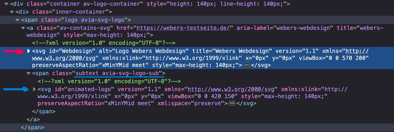
if there are same classes defined inside the inline svg files the last one (transparency logo inside the subtext) will win the css race ;)
Look with a good text editor to your svg files to see the culprit.
If you can make the link to your page public – i can give you better advice.
June 17, 2025 at 7:40 am #1485552In reply to: Reduce loading time with the AJAX portfolio
Hey klick-design-rbh,
Duplicate thread: https://kriesi.at/support/topic/reduce-loading-time-with-the-ajax-portfolio-2/
Best regards,
IsmaelJune 16, 2025 at 9:03 pm #1485528In reply to: Hiding Image on Mobile not working
maybe you get rid of that top border by:
#after_full_slider_1.container_wrap {
  border-top-width: 0;
}
June 16, 2025 at 9:07 am #1485493In reply to: hide the icon mouse-over label
Hey laptophobo,
Thank you for the inquiry.
Try to add this filter in the functions.php file to remove the default attributes of the SVG icons:
add_filter('avf_ignore_svg_aria_attributes', '__return_true');Let us know the result.
Best regards,
IsmaelJune 16, 2025 at 8:36 am #1485491In reply to: Product filter from demo
Hey Mike,
That makes so much sence, i should have tried that out.
I have no further questions on the topic.Thank you, you are the man Mike!
Kind regards,
June 15, 2025 at 6:35 am #1485464In reply to: Hiding Image on Mobile not working
First : i’m talking about a custom class : hide-on-smallscreens – not an ID
and maybe put your two columns inside a color-section.with my solution you can then remove all other trials to hide the column.
PS: you are still on Enfold 6.0.2 my testpage is on 7.1.1 – i only mention that because i can not reproduce a negative margin-top value on the img tag itself.
-
This reply was modified 9 months, 1 week ago by
Guenni007.
June 14, 2025 at 8:25 pm #1485459In reply to: Accessibility Issue with Search Icon
Hi,
I have researched this and while there is a long technical explanation for why the WAVE test tool is flagging this, I found a solution in my research. Try adding this code to the end of your child theme functions.php file in Appearance ▸ Editor:function remove_link_from_search_icon_and_add_it_back_on_click() { ?> <script> document.addEventListener('DOMContentLoaded', function() { const searchLink = document.querySelector('#menu-item-search a'); if (searchLink) { // Store the original href const originalHref = searchLink.getAttribute('href'); // Remove the href on page load searchLink.removeAttribute('href'); // Add click event to restore href searchLink.addEventListener('click', function() { if (!searchLink.getAttribute('href')) { searchLink.setAttribute('href', originalHref); } }); } }); </script> <?php } add_action( 'wp_footer', 'remove_link_from_search_icon_and_add_it_back_on_click', 99 );If you are not using a child theme you could use the WP Code plugin then add a new snippet, in the top right corner use the PHP snippet as the code type:

and ensure that it is activated, then add the above code and save.
I tested this on the WAVE Web Accessibility Evaluation Tool and it removed the error.Best regards,
MikeJune 14, 2025 at 9:04 am #1485455In reply to: Hiding Image on Mobile not working
Why do you have that text as double content?
Lets try if a css only solution will do the job:
Do not create that extra text section. This means: your 1/3 column on the left – the 2/3 column with your text on the right. As probably before, move the line column upwards (-200px) using the setting via Advanced – Position relative in the Row Settings – Row Screen Options setting and let the columns wrap at 989px. Give the column with the image its own meaningful class, e.g.: hide-on-smallscreens.
Now insert it into the Quick CSS:
@media only screen and (max-width: 989px) {
 #top .flex_column.hide-on-smallscreens {
    display: none !important;
  }
  #top .flex_column.hide-on-smallscreens + .flex_column {
    width: 100%;
  }
}
maybe it is better to shift the image via position relative.
June 13, 2025 at 6:57 pm #1485447In reply to: Change the Contact Form Captcha message
Hi,
Thanks for the update. Please let us know if you should need any further help on the topic, or if we can close it.
Best regards,
RikardJune 13, 2025 at 4:50 pm #1485438In reply to: Hiding Image on Mobile not working
I do want to hide the overlapping – clear background golfer on mobile. It is great on desktop, love the look, but on mobile, it is too small to cover at all. I have built and customize many sites on Enfold, the show/hide works almost all the time. Does this help you understand what I am trying to do?
June 13, 2025 at 4:47 pm #1485437In reply to: Hiding Image on Mobile not working
I did make a reproduction page top and made it exactly like the homepage – from scratch, not making templates out of the elements, using same settings and set up. It was the same result. I also made other changes experimenting with the image, z index and hiding… same result. Switched the columns where the image was, same result.
https://img.savvyify.com/image/IMG-4759.y8rhx
I am at a loss to what to try next.
Please help.
Did I give credentials? I will add them just in case below.June 13, 2025 at 4:19 pm #1485434Topic: Padding in textboxes
in forum EnfoldSchmidtgrafisk
ParticipantHey Enfold
I’v got 4 columns with 0% space between them.
In top of the columns I got images with no space and that looks great, under the images I got text boxes, I’d like to add left and right padding to the textboxes to make space between the different text’sPlease have a look at the colorsection at the bottom of the frontpage.
Thanks ;)
AlanJune 13, 2025 at 12:12 pm #1485420In reply to: Rotating Banner of Logos
PS: i changed the script! That even a normal Enfold Content Slider could be present too.
PPS: I didn’t want to install endless scrolling. I think it would be necessary to have the entry-slide in a separate entry-slide-wrap. That’s where the trick lies, that I collect all entry-slides and move them into the first entry-slide-wrap. Then delete the empty wrappers. I therefore decided to change the direction of the slider. My content slider solution stops at mouseenter – and starts again at mouseleaveJune 13, 2025 at 10:08 am #1485414In reply to: Pages not loading on mobile in Safari
After couple of hours of investigation i found it … i wanted to hide the top header on mobile and user the css for this
@media only screen and (max-width: 767px){
#header_meta {display:none;}
}..but how to hide the top header instead?
This works now:
#top .av_header_transparency #header_meta { display:none;}…we can close here … thx
June 12, 2025 at 10:45 pm #1485383In reply to: blog slider extraction – title above the image
Hey SurigliaStudio,
Try adding this code to the end of your child theme functions.php file in Appearance ▸ Editor:function blog_title_above_image() { ?> <script> window.addEventListener('DOMContentLoaded', function() { (function($){ $('.slide-entry').each(function() { $(this).find('.entry-content-header').insertBefore( $(this).find('a.slide-image')); $(this).find('.av-vertical-delimiter').css('display','none'); }); })(jQuery); }); </script> <?php } add_action( 'wp_footer', 'blog_title_above_image', 99 );If you are not using a child theme you could use the WP Code plugin then add a new snippet, in the top right corner use the PHP snippet as the code type:
and ensure that it is activated, then add the above code and save.
Please ensure to copy the code from the forum and not an email notification so the symbols are not converted.
Please see the screenshot in the Private Content area of the expected results.Best regards,
MikeJune 12, 2025 at 6:33 pm #1485375In reply to: Horizontal gallery on mobile
Hi-
I’m having a hard time figuring out how to send you a link that doesn’t require a password. Instead I added a horizontal gallery to my own website using the same settings on my client’s website. You can see the vertical photos are cut off when displayed on a mobile view, yet when viewed on a desktop there is no cropping.For now, I’ve disabled the view of the horizontal gallery on my clients’ website when viewed on a mobile device. However she is asking if there’s anyway to display the horizontal gallery without any photos being cut off when viewed on a mobile phone.
Thanks!
-
This reply was modified 9 months, 1 week ago by
-
AuthorSearch Results
-
Search Results
-
Topic: Theme Demos & Widgets
Hi Guys,
Just wondering if there will be any new demo releases and widgets coming through in any of the updates? I love Enfold and really used to it but would be good if there were different hamburger menu designs and header styles for mob etc also different header styles for desktop for phone numbers and emails with icons ready to go?
Just asking if there is anything new bubbling to get excited about
Cheers
AronTopic: Gallery resposive column
Hi,
i have a gallery with 4 columns – looks nice on desktop.
But in the mobile version ist a bit to small – so is there a way to make 2 columns on mobile with CSS like this “@media only screen and (max-width: 767px){”Thank you for helping!
Can I please have a css the will give me the opportunities to have a gradient color in top header? Now I have it in the image, but it would be easier to have it in the code.
Topic: Padding in textboxes
Hey Enfold
I’v got 4 columns with 0% space between them.
In top of the columns I got images with no space and that looks great, under the images I got text boxes, I’d like to add left and right padding to the textboxes to make space between the different text’sPlease have a look at the colorsection at the bottom of the frontpage.
Thanks ;)
Alan