 Steve
SteveGuest
Hi.
I purchased ENFOLD using Template ENFOLD-DJ and found a bug:
– In Desktop View: Flex Cell «Greatest Hits Vol2» appears
– In Mobile View: Flex Cell «Greatest Hits Vol2» disappears, not shown any more.
How can I achieve to show this flex cell on Mobile view? Need some #ID CSS?
Thank you
I seem to have encountered the same problem as in this post.
I did the same changes as suggested in this post, but the files remains. These files are over 40GB on what is a relativly small and static site.
Right now the site has 5GB allocated for the entire website and is over 964% over that, 48GB as of right now. The site in question is lindked below.
I have contacted my hosting company and they tell me they can delete these files manually for me. Is there any problems in doing this?
Sicher, dass es nicht nur ein Caching ist? Du hast WP-Rocket am Start. Cleare mal den Cache dort. Und deaktiviere dann WP-Rocket temporär.
Dann – falls aktiv, mach noch einen Refresh der css und js files in Enfold ( Enfold-Child / Performance ) ganz unten “Delete Old CSS And JS Files?”
Aus irgendeinem Grund ( und auch nur auf realen iPhones ) wird dieser full-width button den du am Desktop zeigst trotzdem mit berücksichtigt. Es wird nur der Anchor ausgeblendet – die Wrapper bleiben sichtbar. Daher:
Versuche mal folgendes : setze den Full-Width button in eine eigene Color-Section und blende diese dann für kleine Screens aus.
PS: das ganze ist übrigens auf allen seiten dann auch der Fall – wo du unterhalb der Slider auch immer einen Full-Screen Button setzt.
dies wird auch auf realen iPhones gezeigt:

Hey cherrmann,
Thank you for the info.
We took a look at the page and found that there is an invisible Separator / Whitespace element just above the footer that has a height of 300px. This is what is causing the large gap on mobile view.
You can locate this element in the layout builder and either remove it or you can try this css to adjust its height on mobile view:
@media only screen and (max-width: 767px) {
  #top .hr.hr-invisible.av-mljdspyf-71312ddfce3302f17c1d53863ec1237a {
    height: 50px;
  }
}
Let us know if the issue persists.
Best regards,
Ismael
i guess you have a page with fixed header – even on mobile too?
The problem is that Safari shrinks the tab bar when scrolling, which changes the visible area. If your header is fixed with top: 0, but the calculation of the spacing is messed up by the changing browser UI, this ‘gap’ is created, through which the content flashes.
This is especially noticeable when you display the tabs at the top in iOS Safari. As these shrink when scrolling, the viewport height changes.
For me it would be nice to see the page. Then i can try to give you better advice.
Hi,
I have a website which is fine on all devices, but not on the iPhone (tested with iPhone 13). I tried so many things/hacks, but I cannot get it done. Can you check and help me please?
it shows an large white space on top and cuts content above the footer.
Let me know if you need more information or login data.
Thank you.
Hi Mike,
Awesome support, thanks a lot! It works fine :-)
You can close this topic.
Regards,
Bernd
Hey nioperik2,
Thank you for the inquiry.
The wpo-minify folder is created and managed by the WP-Optimize plugin, so this is not something directly related to the Enfold theme itself.
We found a support thread that addresses your exact question, but we’re not sure if this is still accurate.
— https://wordpress.org/support/topic/can-i-delete-minify-folder/
For more details, please refer to the WP-Optimize documentation.
— https://teamupdraft.com/documentation/wp-optimize/getting-started/
For any further questions specifically about WP-Optimize, we recommend reaching out to the WP-Optimize support team directly.
Best regards,
Ismael
Hey oestersund,
Thank you for the update.
You’re right, the issue is that the previous css uses display: none !important; without scoping it to a specific page, so it ends up hiding #layer_slider_2 on all pages, not just the homepage.
The fix is to wrap those rules in a page-specific selector. The easiest way to do this is to use the unique body class that WordPress adds for each page. For example, if your homepage has the slug “home”, the body class would be something like page-id-123 or home. You can check the exact class by inspecting the body tag in your browser’s dev tools.
Once you have the body class for your homepage, update the css like this:
/*Homepage Slider Laptop Mobile*/
@media only screen and (min-width: 768px) {
    .page-id-123 #layer_slider_1 { display: block !important; }
    .page-id-123 #layer_slider_2 { display: none !important; }
}
@media only screen and (max-width: 767px) {
    .page-id-123 #layer_slider_2 { display: block !important; }
    .page-id-123 #layer_slider_1 { display: none !important; }
}
Replace .page-id-123 with the actual page ID class from your homepage body tag. This way the hide/show rules only apply on the homepage and all other pages with layer sliders will display normally on mobile again. This documentation should help.
— https://kriesi.at/documentation/enfold/add-custom-css/#how-to-inspect-an-element-on-the-page
Please make sure to purge the cache before testing. Let us know if the issue persists.
Best regards,
Ismael
Dear team / Dear Mike,
with the a.m. post number, I raised an issue regarding layer slider visibility on mobile on my page below named first.
A solution was provided regarding my request on one single page (homepage), and the result was fine
but now the presented CSS code has an unwished side effect on all other pages: All layer sliders are not visible now an all page on mobile. examplample pages see below
By accident, I have recognized that now on ALL OTHER pages the layer sliders (different ones), doe not appear on mobile view any longer. Except on the homepage, All sliders shall be visible on all devices. “Hide on mobile” is not activated.
-> How to fix this as soon as possible? My guess is: it has to do with the numbers of the sliders maybe.
Thanks a lot and best regards, Tilman!
css entered by MIke was:
/*Homepage Slider Laptop Mobil*/
@media only screen and (min-width: 768px) {
#layer_slider_1 { display: block !important; }
#layer_slider_2 { display: none !important; }
}
@media only screen and (max-width: 767px) {
#layer_slider_2 { display: block !important; }
#layer_slider_1 { display: none !important; }
}
Hey Erwin,
Thank you for the inquiry.
You can disable the hover/focus effect on the masonry gallery images by adding the following css to Enfold > General Styling > Quick CSS:
#top .av-masonry-item .av-masonry-image-container:before,
#top .av-masonry-item .av-masonry-image-container:after {
    display: none !important;
}

#top .av-masonry-item:hover .av-masonry-image-container img {
    opacity: 1 !important;
    filter: none !important;
    transform: none !important;
}
If you only want to target a specific masonry gallery on the page and leave the others unaffected, you can wrap it in a section or cell with a Custom CSS Class and then use that class as the parent selector in the code above.
— https://kriesi.at/documentation/enfold/add-custom-css/#enable-custom-css-class-name-support
Let us know if the issue persists.
Best regards,
Ismael
Hey Daniel,
Please see this thread: https://kriesi.at/support/topic/cve-2022-48285-on-jszip-3-6-0/#post-1470007
If you wish, you can request the Dev Team to consider this again on our Feature Request: https://github.com/KriesiMedia/Enfold-Feature-Requests/issues
Note that at the time the updated version was buggy and did not work as it should, perhaps there is a newer update at this time? The Dev Team would need to review though the Feature Request link above.
See https://kriesi.at/support/topic/cve-2022-48285-on-jszip-3-6-0/#post-1469608
Best regards,
Mike
Hi team,
i have rebuilt this function (https://kriesi.at/support/topic/portfolio-grid-questions-2/) on a new website.
Now, i have blue 2 blocks inbetween which should only show text with link for contact without mouse over scroll function .. can i exclude those both blocks from the global setting with scrolling? and how?


Hi team,
i have rebuilt this function (https://kriesi.at/support/topic/portfolio-grid-questions-2/) on a new website.
Mouseover works … clickable too.
Now, i have 2 blocks here that should only show text with link for contact without mouse over scroll function .. can i exclude those both blocks from the global setting with scrolling? and how?
https://ibb.co/B52b9zW8
-
This topic was modified 3 weeks, 3 days ago by
 xeovision.
PS: I know its a different topic , but do have you a solution for this one? another board member tried to help out, but so far no solution and no answer from the Kriesi team.
thx again for your great support Mike
Hi,
The issue is that newer versions of jQuery (1.9+) no longer support the old CSS selector syntax using bare # characters. We need to escape them properly. This is the updated code that I added to your site, I also changed the offset to match your header height.
function slow_scroll_to_anchor() { ?>
  <script>
(function($) {
  $('a[href*="#"]:not([href="#"])').click(function() {
    var width = $(window).width()
    if (location.pathname.replace(/^\//,'') == this.pathname.replace(/^\//,'')
&& location.hostname == this.hostname) {

      var target = $(this.hash);
      target = target.length ? target : $('[name=' + this.hash.slice(1) +']');
      if (target.length) {
        if ($(window).width() < 768) {
          $('html,body').animate({
            scrollTop: target.offset().top - 150
          }, 1000);
          return false;
        } else {
          $('html,body').animate({
            scrollTop: target.offset().top - 250
          }, 1000);
          return false;
        }
      }
    }
  });

  // Executed on page load with URL containing an anchor tag.
  var hash = location.href.split("#")[1];
  if (hash) {
    var target = $('#' + hash);
    if (target.length) {
      if ($(window).width() < 768) {
        $('html,body').animate({
          scrollTop: target.offset().top - 150
        }, 1000);
      } else {
        $('html,body').animate({
          scrollTop: target.offset().top - 250
        }, 1000);
      }
    }
  }
}(jQuery));
</script>
  <?php
}
add_action( 'wp_footer', 'slow_scroll_to_anchor', 99 );
Please clear your cache and check.
Best regards,
Mike
Hey ivancazzol,
Please note that the Grid element gets it’s height from the elements inside of it, so on mobile, when the top grid row is stacked the right side cell that only has a background image, that shows below the first cell, will have no height. In our demo it has has another image element in it the “Parallax” text
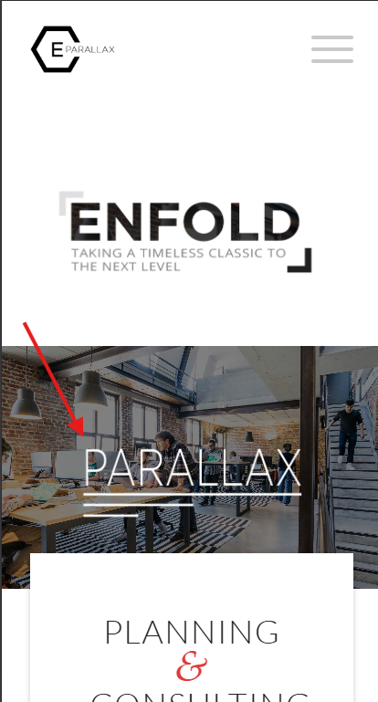
To correct yours, add a Whitespace (hr) element with a min-height that you want it to be, perhaps 200px or so.
Best regards,
Mike
Hello,
I am experiencing an issue with my website http://www.aliko.it. The issue is that when accessing the site from a mobile device, the website seems to load a different page as the homepage rather than displaying the same homepage with responsive adjustments. The desktop version shows the correct layout, while the mobile version appears to load another layout.
The website is built with the Enfold theme, and I am using the Advanced Layout Builder. I would like the layout to remain consistent across devices, with only the standard responsive adjustments. Could you please help me understand what might be causing this issue and how to fix it?
If needed, I can provide screenshots or access to the backend.
Thank you in advance for your support.
Best regards,
Ivan Cazzol
Hey Sebastian,
A mobile transparent header is not an option in the theme, it can be achieved with custom css. There is not one solution for all sites, so you may need to adjust the top margin some:
@media only screen and (max-width: 766px) {
.responsive #top #main {margin-top: -80px!important;}
#top #wrap_all .av_header_transparency {background-color: transparent!important;}
div#header_main > .container {display: block !important;}
}
Best regards,
Mike
Hallo,
i used the transparent header on desktop where the logo is placed on the bg image. But on mobile i receive always the white background bar with logo above the image. How can i have the same like desktop?
Ismael, thank you very much. Unfortunately, both sliders are shown with this code, as well on laptop as on mobile.
Hey Elena,
Thank you for the inquiry.
Edit the page then try to set the Layout > Header visibility and transparency settings to No Transparency or Transparent & Glassy Header. To center the logo, please try this css code:
#header_main .inner-container {
    display: flex;
    align-items: center;
    width: 100%;
}

#header_main .main_menu,
#header_main .av-main-nav-wrap,
#header_main .av-main-nav {
    display: contents;
}

#header_main .logo {
    order: 35;
    flex-shrink: 0;
    margin: 0 40px;
    transform: translate(10px, 10px);
}

#header_main .menu-item-top-level-1 { order: 10; margin-left: auto; }
#header_main .menu-item-top-level-2 { order: 20; }
#header_main .menu-item-top-level-3 { order: 30; }
#header_main .menu-item-top-level-4 { order: 40; }
#header_main .menu-item-top-level-5 { order: 50; }
#header_main .menu-item-top-level-6 { order: 60; margin-right: auto; }

#header_main .av-burger-menu-main {
    display: none;
}
You may need to shorten the title of the “Cosa posso fare per te” menu item.
Best regards,
Ismael
Hey tchamp77,
Thank you for the inquiry,
This is to be expected, since the default behavior when clicking an inactive Horizontal Gallery item is to navigate or slide it to the center. This behavior overrides the anchoring to the Accordion items. Once the image is centered, the anchor should work without issue.
To override this behavior, you can try this script in the functions.php file:
<?php
add_action( 'wp_footer', 'ava_wp_footer_script_mod', 99 );

function ava_wp_footer_script_mod() {
    ?>
    <script>
    // override default horizontal gallery clicks behavior to open accordion and scroll to title
    (function($) {
        $(document).on('click', '.av-horizontal-gallery-slider a[href^="#toggle-id-"]', function(e) {
            e.preventDefault();
            e.stopImmediatePropagation();

            var targetId = $(this).attr('href').slice(1);

            setTimeout(function() {
                var $title = $('#toggle-toggle-' + targetId);
                var $wrap  = $('#' + targetId);

                if (!$title.length) return;

                if (!$wrap.hasClass('active_tc')) $title.trigger('click');

                setTimeout(function() {
                    $('html, body').animate({ scrollTop: $title.offset().top - 80 }, 500);
                }, 50);
            }, 50);
        });
    })(jQuery);
    </script>
    <?php
}
Best regards,
Ismael
Hi,
I need a specific header layout that I cannot configure in Enfold.
Required layout desktop and mobile:
– Burger menu left
– Logo perfectly centered in the header
– Transparent header
– Header height 120px desktop / 80px mobile
Both elements should sit on the same vertical center line.
Is there a recommended way to achieve this with Enfold?
Thanks
T
Dear Team,
I want to display one out of 2 two layers slider depending on the device. I tried the following code, but still both sliders are appearing on both devices. How to correct the code?
Thanks a lot and best regards,
Tilman
/* 1. Laptop/Desktop: Slider 1 zeigen, Slider 2 ausblenden */
@media only screen and (min-width: 768px) {
#layerslider_1 { display: block !important; }
#layerslider_25 { display: none !important; }
}
/* 2. Mobile (Handys/Tablets): Slider 2 zeigen, Slider 1 ausblenden */
@media only screen and (max-width: 767px) {
#layerslider_25 { display: none !important; }
#layerslider_1 { display: block !important; }
}
Hi,
We’re using a fixed header on mobile. Also with more height because of an integrated widget. The problem is, if you jump to an anchor on mobile, the anchor and the following headline are hidden behind the fixed header.
Is there a way to adapt the anchor links on mobile?
I tried the solution from the thread https://kriesi.at/support/topic/anchor-links-do-not-work-properly-only-on-mobile/ with a js in functions.php. But this results in a JS error:
Uncaught Error: Syntax error, unrecognized expression: a[href*=#]:not([href=#])
Regards,
Bernd
Morning.
Is there a way of making the background of an element variably transparent for a selected background colour?
Not sure if I have asked the question correctly so please have a look at the top header on the site https://citizenscience.org.za
In order to get the effect of the black transparent background holding the title text in white, I am using a 1/1 Column with a background image inserted to repeat across the element. This background image is a black square with 50% transparency.
I am trying to find out if there are settings for the background of the Column (or other element) which would (1) set the background colour and then (2) allow you to set the transparency of that background colour.
Thank you.
MdF
-
This topic was modified 4 weeks ago by
 MdF.
MdF.
Hi,
Thanks for the update. Please let us know if you should need any further help on the topic, or if we can close it.
Best regards,
Rikard
@Ismael – that restores the symbol, thanks. But why did the theme change something to stop it working?
Hey zimbo,
Thank you for the inquiry.
What happens when you add the following css code?
#top #header .av-main-nav>li>a>svg:first-child, #top #wrap_all .header_color .cart_dropdown_first .cart_dropdown_link.avia-svg-icon svg:first-child {
    fill: #000;
    stroke: #000;
}

Best regards,
Ismael