-
AuthorSearch Results
-
February 26, 2016 at 2:13 pm #589796
In reply to: Ajax Search Dropdown Menu
You’re right! Thank you Yigit! close topic..
Jas
February 26, 2016 at 2:04 pm #589784In reply to: Header with funtions
Hey!
you can achieve that with this code:
@media only screen and (max-width: 767px) {
.responsive #top #main {
margin-top: -115px;
}}
Regards,
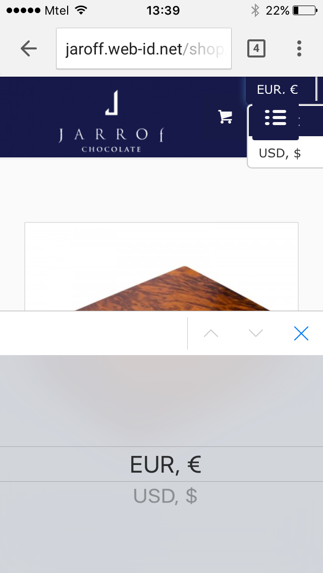
AndyFebruary 26, 2016 at 2:01 pm #589778In reply to: Currency switcher in the main menu
Hi again,
1.) I am not talking about language switcher, I mean currency switcher. I wrote which is the plugin in my first post, may be you didn’t see it:
“There is more info about the plugin:
Currency Switcher (https://wordpress.org/plugins/woocommerce-currency-switcher/)
Documentation at http://currency-switcher.com/documentation/#!/section_3 ”I also wrote that I have found almost the same topic in your forum and try most of the things there, but couldn’t figure it out. I have added header widget area, like it is wrote in the other topic, put some CSS code which I also took from there.
The link to the topic is: https://kriesi.at/support/topic/woocommerce-currency-switcher/
The guy who solved the problem there was Yigit – https://kriesi.at/support/profile/yigit/, I don’t know what exactly he had done, but need the same solution.Here is some screen shots of the problem:
http://c2n.me/3uQ8KGj.png and http://c2n.me/3uQ8ElH.png
There you can see how the currency switcher is going behind the main menu in mobile version.2.) About my second question. It is not Woocommerce plugin. I wrote to the plugin developer also and he answered me this before a couple of hours:
“Deal is in wp theme: http://clip2net.com/s/3uMjPEp – its redraws by script for mini cart, but its wrong behavior. You can write question to the theme support about …”
I am sending and links to the project in private content.
Hope you can help me in this two cases.
Thank you in advance for your assistance.Regards
Ivan-
This reply was modified 10 years, 1 month ago by
webcrewbg.
February 26, 2016 at 2:00 pm #589777Topic: Add a border for each masonry entry
in forum EnfoldWebVision
ParticipantHello
When we show a masonry element in a color section that has a darker background, the entries look just fine – there’s a nice contrast between the entry and the background color. Please see link #1.
But if we add another color section and it has a white background color, the entries just mix together with the white background. And it’s not good.
We want be able to add a simple 1px solid #f4f5f5 border for each masonry entry.Please assist.
PS: Weøve tried solution from this thread – https://kriesi.at/support/topic/border-margin-for-masonry-blog-module/ – but the border at the bottom ends too soon, please see link #2.
All the best.
-
This topic was modified 10 years, 1 month ago by
WebVision.
February 26, 2016 at 1:56 pm #589773In reply to: Mobile Menu Social Icons
Done! Thank you!
Close topic..
Jas
February 26, 2016 at 1:45 pm #589759In reply to: Search on mobile devices
Hi basdemos!
Please add following code to functions.php file in Appearance > Editor
add_shortcode('avia_search', 'get_search_form');

function add_custom_tooltip(){
?>
<script>
jQuery(window).load(function(){
jQuery('.only-mobile-menu-search a').removeAttr('href');
});
</script>
<?php
}
add_action('wp_footer', 'add_custom_tooltip');
and then go to Appearance > Menus and add a new link and add following into navigation label
[avia_search]and then click “Screen options” on the top right side of the screen and check “CSS Classes”. Then edit your search menu item and give it custom CSS class “only-mobile-menu-search” and save. Then add following code to Quick CSS in Enfold theme options under General Styling tab
@media only screen and (min-width: 990px) {
.only-mobile-menu-search { display: none !important; }}
Regards,
YigitFebruary 26, 2016 at 1:36 pm #589749In reply to: Ajax Search Dropdown Menu
Hi!
Please add following code to Quick CSS as well
#top .header_color .ajax_search_entry:hover .ajax_search_title {
    color: black;
}
Cheers!
YigitFebruary 26, 2016 at 1:29 pm #589735In reply to: text covering images on mobile
Hey Laureninthailand!
Replied you here – https://kriesi.at/support/topic/text-covering-images-on-mobile/
Best regards,
YigitFebruary 26, 2016 at 1:28 pm #589731In reply to: Mobile issues
Hey mcraig77!
Please open different tickets for different question.
1.) refer to this solution: https://kriesi.at/support/topic/sticky-header-for-mobile/#post-276637
2.) use this code in Quick CSS field:@media only screen and (max-width: 767px) { .responsive #top .header_bg { background-color: red; }}3.) This code:
@media only screen and (max-width: 767px) {
.responsive #top .logo {
margin-left: 90px;
}}
Cheers!
AndyFebruary 26, 2016 at 1:00 pm #589715In reply to: Fullscreen slider caption text positioning
Hey!
move it by using this code in Quick CSS field:
.avia-caption-content.av_inherit_color {
position: relative;
top: 200px;
}
and adjust top value as needed.
Cheers!
AndyFebruary 26, 2016 at 12:56 pm #589714Hi!
Sure. Please edit your blog page and two blog posts element and then turn on custom CSS field for ALB elements – http://kriesi.at/documentation/enfold/turn-on-custom-css-field-for-all-alb-elements/. Edit one of your element and choose to display 10 posts and give it a custom CSS class “only-mo” and then edit other element and choose to display all posts and give it a class “only-dt” then add following code to Quick CSS in Enfold theme options under General Styling tab
@media only screen and (max-width: 990px) {
.only-desktop { display: none !important; }}
@media only screen and (min-width: 990px) {
.only-mobile { display: none !important; }}
Regards,
YigitFebruary 26, 2016 at 12:48 pm #589708In reply to: time to first byte is too long
a cache plugin is installed [zencache] [although updated of PHP is underway
Cloud fare will not solve the problem because not rendering is the issue. it is the first time to byte
According to Google [using search console] the DNS lookup is not an inssue. And if you look at the report you sent, it is not the problem. It is waiting for something [yellow colored box] DNS ilookup and response s a fraction of a second
Ajax issue I saw. I added in the quick CSS :
add_action( ‘init’, ‘my_deregister_heartbeat’, 1 );
function my_deregister_heartbeat() {
global $pagenow;if ( ‘post.php’ != $pagenow && ‘post-new.php’ != $pagenow )
wp_deregister_script(‘heartbeat’);
}
this should stop the heartbeat. but apparently not always. Is there a better way to stop the ajax heartbeat ?
If you look at the recommendations, combining CSS and JS are a main factor, and the main ones are Theme related.February 26, 2016 at 12:46 pm #589707Topic: Problem in der responsive Ansicht mit Feldern
in forum EnfoldFrankmen
ParticipantHallo,
habe nun noch ein Problem in der responsive Ansicht:
Ich habe mit:
#top input[type=”text”] {width: 400px;}
#top input[type=”email”] {width: 400px;}die Felder vom CF7 auf die passende Länge gesetzt da sich die Felder direkt im CF7 mit:
[text* your-name size:30 maxlength:60]
irgendwie nicht verändern (scheint wohl ein Problem zwischen CF7 und Enfold zu sein)Die Einstellungen betrifft die Formulare und auch die Kommentare
Nun sind die Felder halt nicht mehr responsive, lösche ich den Quick CSS-Code wieder gehen die Felder im Formular immer über die komplette Zeile sind dafür aber wieder responsive ;-(
Gibt es dafür evtl. auch eine Lösung ??
February 26, 2016 at 12:41 pm #589704In reply to: Adding partial transparency to Enfold main menu
Hallo Guenni007
Vorab erstmals vielen lieben Dank fuer Deine tatkraeftige Unterstuetzung. Sogar mit entsprechender Testseite zur besseren Veranschaulichung … Find ich wirklich super …
#header_main, #header_meta {
background: rgba(255, 255, 255, 0.6) !important;
border-bottom-width: 0 !important;
border-top-width: 0 !important
}#header_main.container_wrap {
border-top-width: 0 !important;
}.header_bg {
background: transparent !important;
}Dein Code Snippet funktioniert toll. Nur dass ich beim scrolling/down lieber wieder einen soliden weissen Hintergrund haben wuerde da das sonst irgendwie mit dem restlichen Hinterhalt optisch schwer in Einklang zu bringen ist. Ansonsten ist es aber perfect.
Nochmals vielen lieben Dank.
February 26, 2016 at 12:16 pm #589693In reply to: Header with funtions
Hi!
I changed header pixel height in your Enfold’s header height. Then I added this code at the bottom of your Quick CSS field:
/* kriesi custom code */
#top .title_container .container {
padding-top: 100px;
}
#text-6 {
padding-top: 0px;
top: 78px;
}
and now it seems to be fine for me. Can you confirm please?
Cheers!
Andy-
This reply was modified 10 years, 1 month ago by
Andy.
February 26, 2016 at 11:55 am #589683In reply to: Mobile Menu Social Icons
Hi!
That is expected. You should add your “click to call” button as described here – https://kriesi.at/support/topic/phone-number-click-to-call/#post-452509
Cheers!
YigitFebruary 26, 2016 at 11:52 am #589680In reply to: Video Poster Self hosted Video
Hey fkf44!
no, currently there is no such function. You would need to try a workaround. But maybe this solution is helpful: https://kriesi.at/support/topic/video-poster-how-to/#post-495389
Regards,
AndyFebruary 26, 2016 at 11:44 am #589675In reply to: Responsive Ansicht Zwischenräume entfernen
Hi Andy,
super passt perfekt !!
Habe nun allerdings noch ein anderes Problem in der responsive Ansicht:Ich habe mit:
#top input[type=”text”] {width: 400px;}
#top input[type=”email”] {width: 400px;}Die Einstellungen betrifft die Formulare und auch die Kommentare
Die Felder vom CF7 auf die passende Länge gesetzt da sich die Felder direkt im CF7 mit:
[text* your-name size:30 maxlength:60]
irgendwie nicht verändern (scheint wohl ein Problem zwischen CF7 und Enfold zu sein)Nun sind die Felder halt nicht mehr responsive, lösche ich den Quick CSS-Code wieder gehen die Felder im Formular immer über die komplette Zeile sind dafür aber wieder responsive ;-(
Gibt es dafür evtl. auch eine Lösung ??
February 26, 2016 at 11:39 am #589670In reply to: Change link to featured image
Hey!
in the example you provided the featured image is not linked to a lightbox.
As I already told you here you need to link the image to your post manually.
Regards,
AndyFebruary 26, 2016 at 11:24 am #589657In reply to: portfolio grid category
Top banana :)
Works a treat.
If I ever meet you I owe you a drink.Thanks
TJ
February 26, 2016 at 11:23 am #589655In reply to: Responsive Ansicht Zwischenräume entfernen
Hi!
versuche es mit diesem Code im Quick CSS Feld:
@media only screen and (max-width: 767px) {
.responsive #top .container .av-content-small, .responsive #top #wrap_all .flex_column, .responsive #top #wrap_all .av-flex-cells .no_margin {
margin-bottom: 0px;
}}
Gruß!
AndyFebruary 26, 2016 at 11:18 am #589654In reply to: Custom woocommerce category page
Hey!
you can use page-id to hide/display certain elements in different position, like in this example: https://kriesi.at/support/topic/changing-a-specific-page-with-quick-css/#post-223394
Yes you are right, that’s why I told you to contact WooCommerce support about it.
Best regards,
AndyFebruary 26, 2016 at 11:01 am #589646Hi,
thanks for information, all fine, lets close the topic.
regards,
paulFebruary 26, 2016 at 10:40 am #589640I might :) It is very close now so, if I start a new topic, I will tag you in the post. If there is a certain way I should tag you please let me know. You can put those directions in private content if you like.
You can close this topic.
Thank you!
February 26, 2016 at 10:33 am #589638In reply to: Mobile Menu Social Icons
Thanks Yigit!
Yes that fixed it but I lost the click-ability of the phone number. Can we get that back so people can click to dial?
I’m sure when we removed the link to dial that solved the issue because it made all text the same.Here is the mobile device CSS that is currently active on the site.
It is near the top of Quick CSS@media only screen and (max-width: 768px) { #top .av_header_transparency .phone-info, #top .av_header_transparency .phone-info span { color: #555555!important; }} /*phone info*/Also I found this CSS for the desktop site. Could it be conflicting?
Desktop site looks perfect.
This is just below the code above..header-scrolled .phone-info span { color: #8f8c8f; }Thank you
February 26, 2016 at 10:18 am #589633In reply to: Content Element: Icon – On Mobile Site
HI Yigit!
Almost! First, THANK YOU for helping me. I appreciate your time. My goal is to make this work for all my sites. I”m sure when I solve it for this site it will work for all other sites. I am going to try to not be too picky :) but here is what has happened.
I. On iPhone 6s Plus the icons were not centered so I adjusted the code to center the icons within the circles.
see screenshot 1
This part I changed from -10px to -2px#photo-center a.av-icon-char:before { left: -2px; position: relative; }II. Result > caused center icons to be off-center on Android and iPhone 4s screens. I”m guessing it is probably off center for your iPhone 5s. Hmm.
see screenshot 2.III. Objectives:
A. I am trying to achieve the same dimensions for header slider and this icon section. On the iPhone 6s Plus, and I think on the iPhone 6 they are the same size.
B. I am trying to achieve centering of all icons on all mobile devices.IV. I moved ALL code we’ve added throughout this thread to the bottom of quick CSS. Perhaps something is conflicting?
/*mobile - icon - color section content*/

@media only screen and (max-width: 767px) {
#top #wrap_all #photo-center .flex_column.av_one_third {
    width: 31%;
    height: 485px!important;
    float: left;
    clear: none;
    margin-left: 1%;
}} /*content element: icon*/

@media only screen and (min-device-width: 414px) and (max-device-width: 736px) and (orientation: portrait) {
a.av-icon-char {
font-size: 20px !important;
width: 20px !important;
height: 20px !important;
line-height: 20px !important;
}} /*icon content element size*/

@media only screen and (max-width: 767px) {
#photo-center .av-parallax .av-parallax-inner {
    background-position: 50% 50% !important;
    height: 165px !important;
}} /*move background image*/

@media only screen and (max-width: 767px) {
.avia-section {
height: 165px;
}} /*adjust color section size*/

@media only screen and (max-width: 767px) {
span.av_font_icon.avia_animate_when_visible.av-icon-style-border.av-no-color.avia-icon-pos-center.avia_start_animation.avia_start_delayed_animation {
position: relative;
top: -40px;
}}

@media only screen and (max-width: 480px) {
#photo-center a.av-icon-char {
    width: 15px!important;
    height: 15px!important;
    line-height: 15px!important;
}
#photo-center a.av-icon-char:before {
    left: -2px;
    position: relative;
}
#photo-center .av_icon_caption {
    font-size: 13px;
}}
February 26, 2016 at 10:14 am #589631Topic: Polylang Language Switcher on Blank Page Template
in forum EnfoldInfinity
ParticipantHello,
I would like to add the polylang language switcher bar on top of my “coming soon” page which is based on the blank – Template. Therefore I need to add the follwoing code at the very top, but only if the “blank”-template is used, because otherwise the bar is placed on the menu.
Can you advice which files I do have to modify supposed that I am using an enfold child theme?
February 26, 2016 at 10:00 am #589621In reply to: Play video within masonry gallery
perhaps this is something for you: https://kriesi.at/support/topic/how-do-you-create-a-featured-video-image-on-a-video-post/
February 26, 2016 at 8:38 am #589590In reply to: Aligning elements
Hi SpecThra!
1. To position the logo and the social icons as you described goto
Enfold > Header > Header Behavior > Let logo and menu position adapt to browser window2. An inline style=”min-width: 180px; width: 340px;” is applied to FB widget change the width=”340px” to 100%.
3. check if the padding is applied to color section in the edit options.
4. Check out the plugin list here https://kriesi.at/support/topic/recommended-plugins/
Please share a mockup of what you need to align so we can understand you better and help you better.Cheers!
Vinay KashyapFebruary 26, 2016 at 8:03 am #589583In reply to: Change how testimonials display
Hi!
Please add this css code in order to create padding around the testimonial container:
@media only screen and (max-width: 767px) {
.responsive #top .container .av-content-small, .responsive #top #wrap_all .flex_column, .responsive #top #wrap_all .av-flex-cells .no_margin {
    padding: 20px;
    margin-bottom: 0;
}
}
If you want to have a little space between the items, remove the margin-bottom property.
Cheers!
Ismael -
This reply was modified 10 years, 1 month ago by
-
AuthorSearch Results
-
Search Results
-
Hello
When we show a masonry element in a color section that has a darker background, the entries look just fine – there’s a nice contrast between the entry and the background color. Please see link #1.
But if we add another color section and it has a white background color, the entries just mix together with the white background. And it’s not good.
We want be able to add a simple 1px solid #f4f5f5 border for each masonry entry.Please assist.
PS: Weøve tried solution from this thread – https://kriesi.at/support/topic/border-margin-for-masonry-blog-module/ – but the border at the bottom ends too soon, please see link #2.
All the best.
Hallo,
habe nun noch ein Problem in der responsive Ansicht:
Ich habe mit:
#top input[type=”text”] {width: 400px;}
#top input[type=”email”] {width: 400px;}die Felder vom CF7 auf die passende Länge gesetzt da sich die Felder direkt im CF7 mit:
[text* your-name size:30 maxlength:60]
irgendwie nicht verändern (scheint wohl ein Problem zwischen CF7 und Enfold zu sein)Die Einstellungen betrifft die Formulare und auch die Kommentare
Nun sind die Felder halt nicht mehr responsive, lösche ich den Quick CSS-Code wieder gehen die Felder im Formular immer über die komplette Zeile sind dafür aber wieder responsive ;-(
Gibt es dafür evtl. auch eine Lösung ??
Hello,
I would like to add the polylang language switcher bar on top of my “coming soon” page which is based on the blank – Template. Therefore I need to add the follwoing code at the very top, but only if the “blank”-template is used, because otherwise the bar is placed on the menu.
Can you advice which files I do have to modify supposed that I am using an enfold child theme?