Hey koomo,
Thank you for the inquiry.
Please add this css code to adjust the position of the overlay inside the carousel.
.swiper-slide span.image-overlay.overlay-type-image {
    left: 0 !important;
    top: 0 !important;
}
Best regards,
Ismael
Hi,
Thanks for your patience, the reason this is occuring is becuse you have a script adding the read more links:
(function($){
  $(window).on('av-height-change', function() {
    $('.av-masonry:not([class*="-gallery"]) .av-masonry-entry').each(function() {
      var more = $(this).find('.av-masonry-read-more');
      var cont = $(this).find('.av-masonry-entry-content');

      if( more.length == 1 ) return;
      cont.append('<div class="av-masonry-read-more">Lees meer ></div>');
    });
  });
})(jQuery);
they are added after the page load and the masonry has set the abosulte item heights, which is used in the grid placement, thus the 36px height of the read more offsets the 30px margin bottom, so you have no space. This is also occuring on the desktop version, there you have set a 70px bottom margin, but after the read more is added the space looks about 30px, you probly didn’t notice.
So the solution is to change your custom css for mobile from margin-bottom: 30px !important; to margin-bottom: 70px !important;
Best regards,
Mike
Hi,
Typically updating from v4.x to v7.x should cause no major issues as the theme is backward compatible, but if your child theme has any customized elements, or a header.php or footer.php, these will cause issues, and should be removed first.
Updating via FTP by overwriting the theme files will also cause issues as older files will be left behind, updating by uploading the theme as “new” in the WP backend is safer as WordPress removes the old directory and then adds the new directory.
I have not seen an issue where an update lead to the shortcodes showing (e.g. [av_textblock]), do you see the shortcodes on the frontend or in the backend in the Block Editor? Pages & Posts created with the ALB (Advanced Layout Builder) should not be opened, edited, or saved with the Block Editor, always edit ALB pages with the ALB editor. Also don’t use any other builders like elementor, beaver builder, visual composer, etc.
Incremental updates is not needed as I have seen v3.x updated without issues. I recommend exporting your child theme settings for backup, and exporting the layerslider sildes. Then create a staging site to test the update on, this way your live site is unchanged while your issue can be examined. Ensure that your stagging site is not using a cache plugin or object-oriented cache from your server, or a CDN, as these may not show the updated site correctly.
The only issues that I find for Ninja Forms are old:
2015: https://kriesi.at/support/topic/customize-ninja-form-styling/
2016: https://kriesi.at/support/topic/enfold-ninja-forms-conditional-logic-problems/
2019: https://kriesi.at/support/topic/ninja-forms-not-working-after-latest-wordpress-update/
2021: https://kriesi.at/support/topic/ninja-forms-breaking-with-enfold/
Note that the layerslider has had many changes and you may need to edit your slides and resave the transforms and minor settings, there is nothing we can do about that, the layerslider doesn’t seem to be fully backward compatible.
Best regards,
Mike
Hi,
Thanks for the update. Please let us know if you should need any further help on the topic, or if we can close it.
Best regards,
Rikard
Hello.
We’re creating a Masonry gallery to display blog posts, with 12 categories.
When viewing the page, we see that the Masonry gallery only displays 8 filter categories, not the 12 I have selected.
I’ve created this test page, where you can see an article gallery at the top with the Magazine option, where you can see the 12 filter categories, and another one below with the Masonry gallery option, where only 8 categories are displayed, even though I have 12 selected.
See test pages: https://saitra.com/aaa-pruebas/
How can we fix this?
Thank you.
Hi,
For the follow-up inquiries, please continue here: https://kriesi.at/support/topic/color-setting-logo-area-heading/
Best regards,
Ismael
Hey schub1981,
Thank you for the inquiry.
We may need to inspect the elements on your site in order to provide an appropriate solution. Please provide the site URL in the private field. Have you tried adjusting the color options in the Enfold > General Styling > Logo Area tab?
In the meantime, to adjust the color of the burger menu icon on mobile view, try to use the following css code:
@media only screen and (max-width: 767px) {

  /* Add your Mobile Styles here */
  .header_color .av-hamburger-inner,
  .header_color .av-hamburger-inner::before,
  .header_color .av-hamburger-inner::after {
    background-color: #da2727;
  }

  .html_av-overlay-side-classic #top .av-burger-overlay li li .avia-bullet,
  .html_av-overlay-side.av-burger-overlay-active #top .av-hamburger-inner,
  .html_av-overlay-side.av-burger-overlay-active #top .av-hamburger-inner::before,
  .html_av-overlay-side.av-burger-overlay-active #top .av-hamburger-inner::after {
    background-color: #da2727;
  }
}
Best regards,
Ismael
Hey ckrizman,
Thank you for the inquiry.
There is no built-in option for this by default, but you can adjust the svg divider position using css. For example, you can use the following code to move the top divider 50px upward and the bottom divider 100px downward:
.avia_transform .av-extra-border-element.border-extra-diagonal {
    height: 250px;
    margin-top: -100px;
}

.avia-divider-svg.avia-divider-svg-tilt.avia-divider-svg-top.avia-flipped-svg.avia-to-front.avia-svg-original {
    margin-top: -50px;
}
Best regards,
Ismael
Dear people of the support forum,
I am having an issue on this page (and also on other pages with a masonry grid layout):
On mobile, the bottom margins only load after a delay. I’m not sure how long it takes. They seem to load after scrolling un and down a couple of times. The frames containing the post previews are pushed against eachother, before the bottom margins kick in. Obviosly, I would like the margins to load upon loading the page instantly.
I have set the margin with this code:
@media only screen and (max-width: 767px) {
 #top .av-masonry .av-masonry-entry {
    width: 96% !important;
    margin-right: 0% !important;
	margin-bottom: 30px !important;
}
}
How can this be fixed?
Thanks so much in advance!
The logo background (logo area background color) is set to white (#ffffff). This works for both the full and narrow desktop views.
But the background is dark gray on mobile devices. It can only be changed with very bright special colors, which do not fit into the color scheme.
Due to the dark background, the burger menu is no longer visible.
Another question: How and where can I change the colors of the search icon and the social icons in the header? When I hover over them with my mouse, a bright color appears that is not set anywhere in the styling.
So, two open points/questions:
1. Why do the header colors differ between desktop and mobile? How can I synchronize this?
2. How and where are the colors of the icons and the burger menu in the header adjusted?
Hi,
Thank you for the inquiry.
Most of the color styling options are located under Enfold > General Styling. You can check the preview to see which element a specific field controls. If you can’t find the correct setting there, you can also edit the element in the Advanced Layout Builder and adjust the color options in the Styling tab.
To adjust the color of the phone number, please add this code in the Quick CSS field:
#top .header_color .phone-info a {
    color: #ffffff;
}
You may need to toggle or temporarily disable the Enfold > Performance > File Compression settings to make sure that the changes take effect.
Let us know the result.
Best regards,
Ismael
Hey samholl,
The update to 7.1.2 has to be done manually from the version you are running, please refer to my replies in this thread: https://kriesi.at/support/topic/enfold-4-5-theme-update-update-failed-download-failed-a-valid-url-was-not-pro/#post-1021541
You can either update manually via FTP: https://kriesi.at/documentation/enfold/how-to-install-enfold-theme/#theme-update, or upload the theme as if it was new under Appearance->Themes->Add New Theme.
If that doesn’t work then please try to delete the whole theme folder, then replace it with the new version. Make sure that you have backups of the site before starting updating.
Also please read this after you have updated: https://kriesi.at/documentation/enfold/theme-registration/
Best regards,
Rikard
 DavidMacullum
Guest
Hi,
I hope you’re doing well.
I’m reaching out to see if you’re currently accepting guest posts for your website. I’d love to share a few topic ideas that would fit nicely with your existing content and add value for your readers.
If you’re interested, I can write a well-researched, original article at no cost — all I’d ask in return is to include one relevant backlink within the content.
Please let me know if this sounds good to you, and I’ll be happy to send over some topic suggestions.
Looking forward to hearing from you
Best regards,
David Macullum
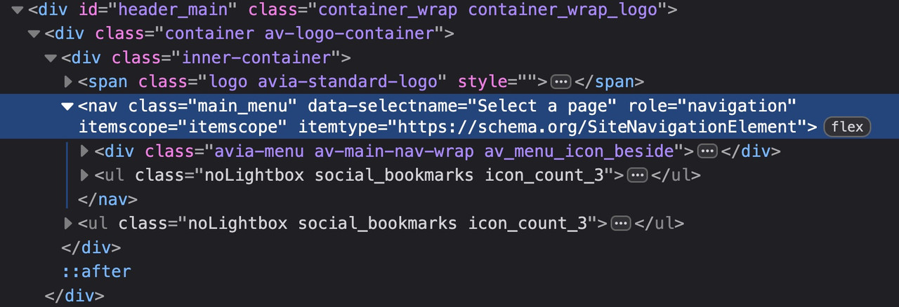
At the very least, it would be good to know your header settings (logo left, menu below, etc.). For example, when I work on the new version with (logo left, menu right), the social bookmarks are located within main_menu. When I look at the board at the top here, they are located next to main_menu. – That depends on where I place the flex container.
so it all depends on your setting . so it will be the best to see the concerning site.
f.e. if you got a setting that the burger is visible from the beginning – like in freelancer demo
then you had to remove the media-query setting for screens above 768px.
Thanks for your quick answer, Guenni.
I found the right setting (main menu on the left) :-)
But I have another problem with the color settings: The logo background (logo area background color) is set to white (#ffffff). This works for both the full and narrow desktop views.
However, the background is gray on mobile devices. It can only be changed with very bright colors, which do not fit into the color scheme.
Due to the dark background, the burger menu is no longer visible.
Another question: How and where can I change the colors of the search icon and the social icons in the header? When I hover over them with my mouse, a bright color appears that is not set anywhere in the styling.
So, two open questions:
1. Why do the header colors differ between desktop and mobile?
2. How and where are the colors of the icons and the burger menu in the header adjusted?
-
This reply was modified 7 months, 1 week ago by
 schub1981.
btw. your code sometimes leads to show the social icons twice. Because the example of medical demo has the navigation below the logo container.
Then we have those social icons twice in the DOM
Therefore (menu below the logo) , it is better to define your code as follows:
( for those settings where the social bookmarks are not visible below 767 you had to adjust that code)
@media only screen and (max-width: 479px) {
  .responsive #top #wrap_all #header .main_menu > .social_bookmarks {
    display: block;
  }
}
try
@media only screen and (max-width: 989px) {
  .responsive #top #wrap_all .main_menu {
    display: flex !important;
    flex-direction: row-reverse;
    align-items: flex-start;
    height: 100% !important;
  }
  #top #wrap_all .social_bookmarks {
    padding-right: 20px;
    border-right: 1px solid var(--enfold-header-color-meta);
  }
}

@media only screen and (min-width: 768px) and (max-width: 989px) {
  .responsive.html_mobile_menu_tablet #top .avia-menu.av_menu_icon_beside {
    border: none;
    padding-right: 0px;
  }
}

@media only screen and (max-width: 767px) {
  .responsive #top #wrap_all #header .main_menu > .social_bookmarks {
    display: block !important;
    top: 40px
  }
  .responsive #top #wrap_all .av_mobile_menu_tablet .main_menu {
    align-items: flex-start;
  }
  .responsive #top .av_seperator_big_border .avia-menu.av_menu_icon_beside {
    padding-right: 0;
    margin-right: 0;
    border: none;
  }
}
and check please the style on screens less than 767px if that fits for you. on medical demo it works well.
I sorted this one out so you can close it. For anyone else looking for a solution add this to Quick CSS:
@media only screen and (max-width:767px) {
.responsive #top #wrap_all #header {
position: fixed !important;
}
.responsive #top #main {
padding-top: 100px !important;
}
#header_meta {
display: none;
}
}
So you uploaded your own symbols to Fontello? You didn’t enter a name for the font at the top of the Fontello page. That’s the one way to get the font name fontello.
Can you insert the icon as symbol if you place an element ( icon ) to a page?
Have you choosen that icon on Enfold Options – Social Profiles : at the end of that dropdown list your new entry?
next – i do not know it you can choose every string on that – because these settings will end in a class e.g. (social_bookmarks_tripadvisor and av-social-link-tripadvisor) if you got a space inside $icons[‘tripadvisor’] it might be broken. ( you can have Tripadvisor)
( the display_name is the Name that is shown on hovering that icon )
try:
function avia_add_custom_icon($icons) {
  $icons['tripadvisor']  = array( 'font' =>'fontello', 'icon' => 'uf262', 'display_name' => 'Trip Advisor');
  return $icons;
}
add_filter('avf_default_icons','avia_add_custom_icon', 10, 1);

// Add new icon as an option for social icons
function avia_add_custom_social_icon($icons) {
  $icons['tripadvisor'] = 'tripadvisor';
  return $icons;
}
add_filter('avf_social_icons_options','avia_add_custom_social_icon', 10, 1);
We have a one-page website https://wagesafe.ai/ and I need to make the header (or at least the menu) sticky on mobile devices. Currently you select a menu item and it scrolls you down the page to the anchor point but the menu then disappears. There is also no back to top arrow on mobile so you don’t really have an easy way to navigate to another section of the page. Does anyone know a way to fix this please?
Oh, I had changed the mobile menu but not the desktop version! It’s working now. Thank you. Now to open a new thread for my next problem….hopefully you’ll have the answers for that as well! :)
 Artur Lee
Guest
I hope this message finds you well. My name is Arthur, and I am reaching out on behalf of Devox Software, a reputable software development company.
We strictly avoid involvement with black-hat or gray-area industries such as casinos, dating platforms, or any similar topics.
Yes, we’re currently working on expanding our link-building strategy and are looking for reliable partners for collaboration. We’re mostly interested in link insertions and guest post opportunities on niche-relevant, high-quality sites with dofollow links. We are keenly interested in the possibility of securing a backlink on your website. Could you kindly provide details regarding the terms, pricing, and any specific requirements for such placements?
Thank you in advance for considering our inquiry. I look forward to your response and hope we can explore a mutually beneficial collaboration.
Hi,
Thanks for the update. Please let us know if you should need any further help on the topic, or if we can close it.
Best regards,
Rikard
Hello everyone.
At https://kriesi.at/documentation/enfold/social-share-buttons/#toggle-id-1, I found this code to display social media icons on mobile devices:
/* Do not hide social bookmarks */
@media only screen and (max-width: 479px) {
.responsive #top #wrap_all #header .social_bookmarks {
display: block;
}}
It works perfectly, but the icons are to the right of the menu.
Would it be possible to have them between the logo and the menu instead?

Alternatively, is it possible to insert them within the mobile menu?
Regards.
You are so right. Thanks for pointing that out. I’ve moved it to the top of the Quick CSS where it belongs!
Thanks, Ismael!
On mobile viewport, header color switches to white. Color should stay the same as in desktop viewport. See example in PC.
I have published it live now so you can see the issue. The URL is https://wagesafe.ai/
If you click on News it will take you to the blog section. Click on a article and it takes you away from the main page to the post page which then breaks the menu at the top. I’ve changed the How It Works menu item to be https://wagesafe.ai/#how-it-works thinking that might fix it but when you click on a blog the main menu item changes to eg. https://wagesafe.ai/wagesafes-real-time-independent-wage-compliance-vs-annual-boot-tests/#how-it-works.
Really hoping there is a way to fix this. I thought perhaps the blog might be able to open in a lightbox or something so you aren’t diverted away from the one-page layout but can’t work out how to do this. It’s kind of possible for a portfolio item but not a blog post.
Thanks.
 Jacob
JacobGuest
I am unable to get rid of this error that I am seeing at the top of my website. It is coming from Enfold theme, specifically the LayerSlider. I tried many things with the help of ChatGPT and am not getting any success… What can I do to get rid of this issue? The website is https://hawk-hub.com/
Hi Ismael.
Thanks for your support.
The previews in the lists actually seem correct, both on desktop and smartphone.
However, the problem when opening the post on desktop seems unchanged.

On smartphone, however, there is now a huge space between the photo and the post title, both in portrait and landscape view.

Regards.
here are some rulesets that belong to your question.
#top #header_main_alternate,
#top #header .av-main-nav > li > a {
  background-color: #aaa;
}

#top #header .av-main-nav > li > a,
top #wrap_all #header #menu-item-search > a{
  border-color: #fff  !important;
}

#top #header .av-main-nav > li > a .avia-menu-text {
  color: #333
}

#top #menu-item-search a.avia-svg-icon svg {
  z-index: 1;
  fill: #333 !important;
}
_____________
btw. dear mods : why is the search icon set to z-index: -1 on header_main_alternate on default ?