Yes. You can close this topic.
Hi,
We added the plugin to add the image to search but it seems to default to having the image HUGE at the top of the post. Is there anyway to make it so those are not defaulting to that? That they default to not showing in the post? We have thousands of posts that would be an absolute nightmare to go through them all. Thank you for your help.
Hi Andy,
If you go to Appearance -> Widgets -> You will see two headers named header1 and header2. One contains a clock and another contains a tiny stock ticker (shortcode) :)
Andin the functions.php file I have the following code:
// Below code is to only show header clock on front page

add_action( 'ava_after_main_menu', 'enfold_customization_header_widget_area' );
function enfold_customization_header_widget_area() {
if(is_front_page()){
	dynamic_sidebar( 'header1' );
	dynamic_sidebar( 'header2' );
}
}
And I have the following Custom CSS styles:
/* Header Widget header1: clock CSS */
#header .widget {
left: 91%;
padding-top: 0px;
position: absolute;
top: -100%;
padding-bottom: 0px;
z-index: 1;
}

/* Header Widget header2 Stock Ticker */
#header2 .widget {
left: 50%;
padding-top: 0px;
position: absolute;
top: -20%;
padding-bottom: 0px;
z-index: 1;
}
Hey mynoxin,
I’ve tagged the topic for our german speaking moderator, please wait for his reply.
Best regards,
Rikard
Hi,
Can you please try using following code instead
.page-id-56 .gform_body {
    margin-top: -20px;
}
Best regards,
Yigit
Hi Andy,
Great, glad we could help. Please let us know if you should need any more help on the topic.
Thanks,
Rikard
Hi,
Please try adding this code to the Quick CSS section under Enfold > General Styling or to your child themes style.css file:
#top #header_main > .container, #top #header_main > .container .main_menu ul:first-child > li > a, #top #header_main #menu-item-shop .cart_dropdown_link {
    line-height: 200px;
}
Please make sure that > sign is not converted to – http://i.imgur.com/IDXRZQ3.png in Quick CSS field.
Best regards,
Yigit
Hi,
Please try adding this code to the Quick CSS section under Enfold > General Styling or to your child themes style.css file:
.av_header_transparency .av-main-nav ul {
    top: 75%;
}
Best regards,
Yigit
Hi,
Please try adding this code to the Quick CSS section under Enfold > General Styling or to your child themes style.css file:
.home .avia-button {
    margin-top: -5px;
}
If that does not help, please post a screenshot and show the changes you would like to make. You can upload your screenshots on imgur.com or Dropbox public folder and post the links here.
Best regards,
Yigit
Hi Andy,
I was not asking for support for a 3rd party plugin in my previous post.
I just wanted you to read the reply of one of this plugin author who was stating that this function ” is something that a “theme” would control” …
Anyway, I understand that from your point of view, this is beyond Enfold’s support scope.
Thank you for the link to the recommended plugin and have a great week.
This topic can now be closed,
Steph.
Hi,
we don’t provide support for 3rd party plugins, as written in our support policy. If you have questions about any plugins then ask plugin’s author or just use Google for example. I have no experience with such a function you need. Check out this as well: https://kriesi.at/support/topic/recommended-plugins/
Let us know if you have questions about the theme and we are happy to assist you with any issues/questions about it.
Best regards,
Andy
Sorry this is probably something stupid I am missing, but I have a simple white border and it’s coming across grey on the screen.
This is my CSS:
.border {
border-left:5px solid white;
border-right:5px solid white;
border-top:5px solid white;
border-bottom:15px solid white;
}
How can I make it white?
Hi,
I checked on desktop, but there is no logo in footer neither:
View post on imgur.com
You can just use basic HTML code to insert any image (or logo) inside a text widget.
Best regards,
Andy
Hey cblajos,
Please try adding this code to the Quick CSS section under Enfold > General Styling or to your child themes style.css file:
Adjust the padding top and bottom values to suite your design.
.page-id-1097 .content:first-child {
    padding-top: 10px;
    padding-bottom: 10px;
}
Best regards,
Vinay
Hi,
I’m not able to use the layout builder anymore when editting or creating pages. (posts and products are working fine).
I see the following errors when loading a page in the backend:
– Uncaught Error: cannot call methods on sortable prior to initialization; attempted to call method ‘toArray’
– Google Maps API warning: NoApiKeys https://developers.google.com/maps/documentation/javascript/error-messages#no-api-keys
– Uncaught TypeError: Cannot read property ‘hasClass’ of undefined
I’ve tried the following solutions without any result:
1. Deactivated all plugins
2. Installed latest Enfold version with FTP
3. Installed latest WP version
4. Included the code in functions.php from thread: https://kriesi.at/support/topic/having-problems-after-updating-to-wordpress-4-5-please-read-this-first/
When using a default WP theme there are no issues.
Please help.
Cheers,
Jaap
Hi there,
I’ve used the code found here: https://kriesi.at/support/topic/display-product-category-under-title/#post-182523
to display woocommerce product category under title. Is there a way to display it over the title = between the product image and product title?
Best regards
Carsten
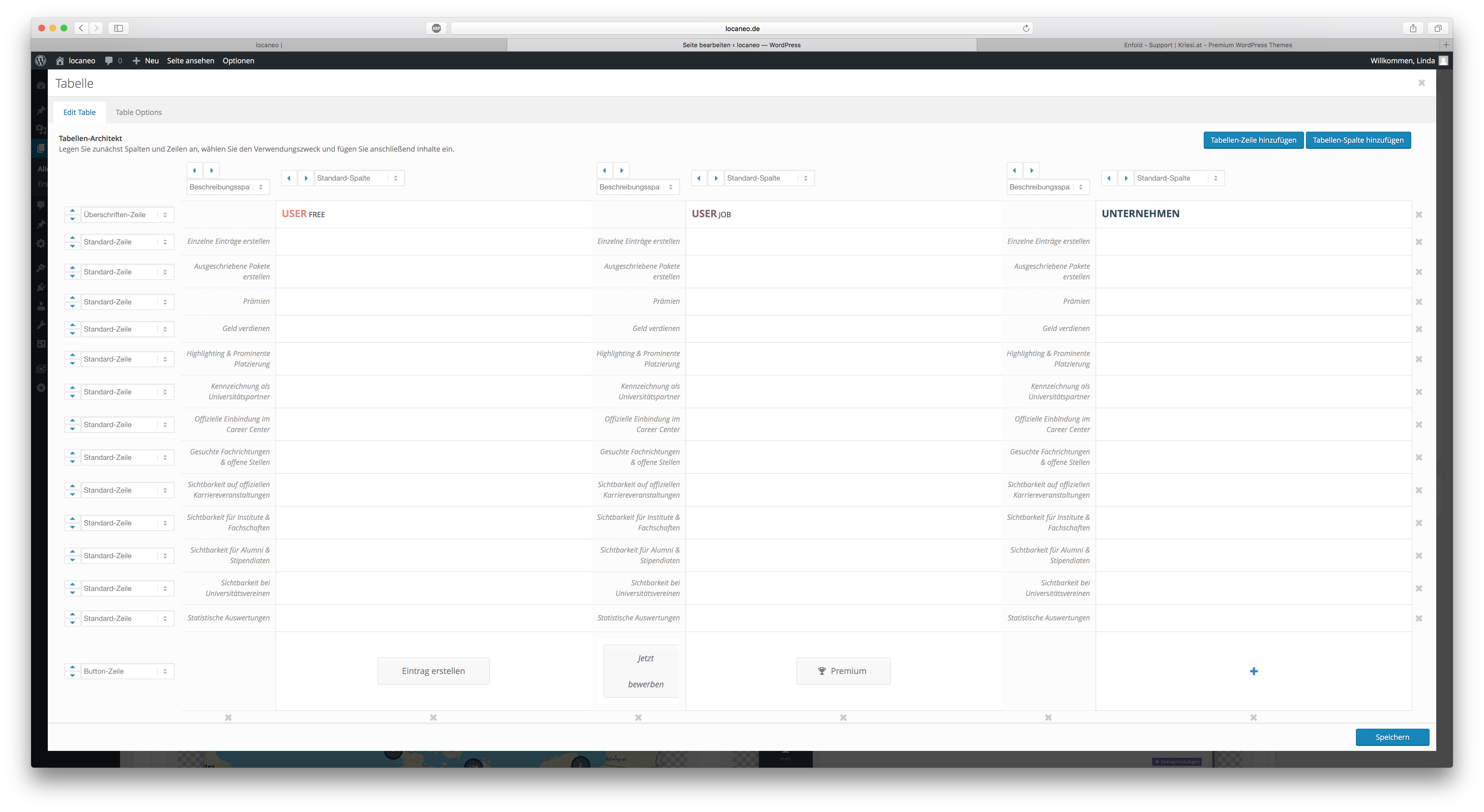
Hi guys,
I have added two table elements to my site. One is for desktop the other one for mobile because I need the description col next to every other column on mobile.
So, my mobile table element looks like this in backend:
http://fs5.directupload.net/images/160711/bulwuk2v.png
Normally it should look like this:
http://fs5.directupload.net/images/160711/6vtwan7q.png
As you can see, the buttons on the bottom of the table are switching positions. Don’t know why. Everytime I try to fix it and save it, they just switch their positions. Can you tell me if I am doing something wrong or if you can fix this for me? That’s driving me crazy..
Greetings,
Linda
Hi,
Try this:
#top #header .av-main-nav > li.av-menu-button-bordered > a .avia-menu-text, #top #header .av-main-nav > li.av-menu-button-bordered > a .avia-menu-subtext:hover {
    color: red !important;
}
Regards,
Rikard
Avia Layout Builder works without problems.
So is it solved for you finally?
Did you insert the code from here into your functions.php?
Best regards,
Andy
Hi Jerome,
Everything is simple if you know it already :-)
Let us know if you should need any further help on the topic.
Regards,
Rikard
Hi,
Great, glad you found the problem. Please let us know if you should need any more help on the topic.
Best regards,
Rikard
Hi, thanks for quick reply.
Here’s the css for the responsive logo I have now:
@media only screen and (max-width: 767px) {
.responsive .logo a, .responsive .logo img {
display: inline-block;
vertical-align: middle;
margin: 0 auto;
max-width: 100%;
height: 80px !important;
max-height: 80px !important;
width: auto;
top: -7px;
}
.responsive .logo {
position: relative;
display: block;
width: 100%;
}
.logo img {
left: 40% !important;
transform: translateX(-40%) !important;
}
}
It looks the way I want, but on scroll I want only the logo to be relative and scroll away, but that the header is fixed still.
The logo is centered now, but not when I move my mobile to horizontal view it’s not.
This is how it look now which I like: https://www.dropbox.com/s/c74ez1zg67okev5/Bilde%2011.07.2016%2C%2010.59.56.png?dl=0
This is horizontal view that I don’t like: https://www.dropbox.com/s/azh3ovq1jwlnz45/Bilde%2011.07.2016%2C%2011.00.10.png?dl=0
with too much space in header and not centered logo
This is view on scroll where I like the hamburger and white fixed header, but not that the logo is fixed and showing on scroll.
https://www.dropbox.com/s/c8boi9gyhfodzxg/Bilde%2011.07.2016%2C%2011.01.03.png?dl=0
Kindly regards, Mathilde
Hi
I use the zen menu logic plugin and I guess, have the same problem than Koballo:
I don’t speak Spanish and didn’t understand why I repost my problem here:
After installation of zen menu logic (wich works properly as it should), the search button in the menu disappeared (magnifying glass). I tried several configs but nothing could help me out.
Is there any possibility to get the search back into menu? (without too much manipulation in config.php)
thank you!
-
This topic was modified 9 years, 9 months ago by
 Schmiddy.
Hi,
As mentioned the logo is already relative. Are you trying to show the logo within the header area? the height of the logo is more than the header so it is bound to extrude. Reduce the logo height to around 55px. If this is not what you want please post us a screenshot/mockup of what you would like to achieve? You can upload the screenshot to imgur.com or dropbox and share the link here :)
@media only screen and (max-width: 767px) {
.responsive .logo a, .responsive .logo img {
    height: 50px !important;
    max-height: 50px !important;
    top: -20px!important;
}}
Best regards,
Vinay
Hey kirillko,
Please try adding this code to the Quick CSS section under Enfold > General Styling or to your child themes style.css file:
.socket_color table, .socket_color tr:nth-child(odd){
	background: transparent;
}

tr:first-child th, tr:first-child td {
    border-style: none!important;
    border-top-width: 0!important;
}

.page-id-126 input[type='text'],.page-id-126 select, .page-id-126 input[type='email'] {
	background:#FFF!important;
}
Best regards,
Vinay
Hey webdevsd,
Please try adding the page ID that is available when you right click and inspect the page body tag to the Quick CSS section under Enfold > General Styling or to your child themes style.css file:
/* About page */
.page-id-9 {
font-size: 50px!important;
color: #d13d32!important;
padding-top: 10px!important;
}
Best regards,
Vinay
-
This reply was modified 9 years, 9 months ago by
 Vinay.
Hi Vinay,
Thanks, now it’s all relative, but it’s only the logo that I wish to be relative, not the header, and the hamburger (which is fixed). And also that the logo still overlaps the content like on desktop view. Is it possible to have the fixed white header still? And also get the content more up? And how to get logo centered fully both in mobile and tablet also while moving the screen horizontal?
Thanks a lot,
Kindly regards, Mathilde