Hi,
Great, glad you got it working :-)
Let us know if you should need any further help on the topic.
Best regards,
Rikard
Hi,
Please try adding this code to the Quick CSS section under Enfold > General Styling or to your child themes style.css file:
#advanced_menu_hide {
    top: 100px;
}
ul#mobile-advanced {
    border: 1px solid #363636;
    border-top: none;
}
then remove following custom CSS code
#advanced_menu_hide {
    display: none !important;
}
Best regards,
Yigit
Hi,
You’re most welcome :)
Feel free to start a new topic if you require assistance with anything else.
Best regards,
Jordan
Hi Elliot,
I tried adding this at the end of the link or url “?iframe=true ” but i dont get any luck. Do you have any sample on this topic? i need to make a login inside a lightbox when users click the text login. Thank you so much i hope you can help me with this sir!
Hi,
I added following code to Quick CSS
strong.custom-bc {
    position: relative;
    top: 10px;
}
and wrapped your text into a strong tag with a custom class :)
Best regards,
Yigit
Hey Richard,
Thanks for getting in touch with us!
Sorry for the issue you are having. Kriesi has been notified of this issue and it is being looked into. A fix will be included in the next patch.
Until then please try this suggested quick fix and let me know how it goes – https://kriesi.at/support/topic/woocommerce-2-6-problem-urgent/#post-650161
Best regards,
Jordan
Dear Kriesi,
One submenu is very long which is why I’ve applied the solution as suggested here: https://kriesi.at/support/topic/untermenu-scrollen/ At first it looked great, but now I realize that the scroll function applies to all submenus, which makes it look super bad see print screen: http://prntscr.com/bvr6hv
Can the code be applied in a way, so that it only effects the menu item “Kantone” and not the others?
Thank you and best,
R
Hi :)
How can I remove “Envie de parcourir plutôt nos actualités ?” and the 3 topics bottom this title ? *
Thank you
Hey!
Can you please change the ID to “icon-with-text” and code to
#icon-with-text .av_font_icon strong {
    padding-top: 15px;
}
If that does not help, please create a temporary admin login and post it here privately
Cheers!
Yigit
Hey!
You can add one Image with hotspots elements ( with “only_desktop” class ) and then on image element (without hotspots and with “only_mobile” class) to your page and add custom CSS code into Quick CSS :)
Cheers!
Yigit
Hey!
Please add following code to Quick CSS in Enfold theme options under General Styling tab
#top #wrap_all .av-social-link-icon_name:hover a {
    background-color: red;
    color: white;
}
Regards,
Yigit
Hi Yigit
This only_mobile in the image with hotspot element? and the code only_desktop should be for each hotspot? and i guess the css will go to custom CSS in general styling?
Also i couldnt find any custom CSS in hotspot properties :)
Thank you very much
-
This reply was modified 9 years, 8 months ago by
 hdpcr.
Hi,
I want the same hover effect on buttons in top layer slider as on x-large buttons downside of same page, how can I do this?
Hi
Please take a look on the page on desktop then in mobile so you can have an idea if this CSS will work. There are a lot of hotspots, 107
Thank you
Hey!
Please refer to this post – https://kriesi.at/support/topic/woocommerce-2-6-problem-urgent/#post-650161
Best regards,
Yigit
Hi
To make a social icon appear on mobile I used the code below. This works fine except that it moves the menu icon down a bit, out of line with the logo, thus:

How can I raise it up a bit?
many thanks
Peter
@media only screen and (max-width: 989px) {
.responsive .av_mobile_menu_tablet .main_menu {
display: block !important;
}
.avia-menu { display: none !important; }}
@media only screen and (max-width: 767px) {
.responsive #header .main_menu ul {
display: block !important;
}}
@media only screen and (max-width: 767px) {
.responsive.html_header_top #header_main .social_bookmarks {
right: -30%;
width: auto;
margin-top: 5%;
}}
@media only screen and (max-width: 767px) {
.responsive.html_header_top #header_main .social_bookmarks {
right: -90%; }}
Hello,
Is it possible to change te url only on the homepage on the logo element?
I’ve seen this post:
https://kriesi.at/support/topic/changing-the-header-logo-link/#post-661402
But that’s for all the pages. Maybe put the functions in a code block on the homepage?
The reason I’m asking is because I want to but a button on the same place as the logo in stead of the logo.
Maybe there is an other possibility, for example placing a custom block on the same place as the logo?
Greets Jeen
Hi,
Sorry for the late reply. Are you sure that is a category page? It looks like normal page when I look at the code. You can try this to target that specific page:
.html_header_transparency .page-id-703 #main {
    padding-top: 44px !important;
}
Thanks,
Rikard
I have an Enfold logo/menu setup with logo left and menu right and a fixed header size of 180px. I added the following code to add some space between de menu items.
.av-main-nav > li > a { padding: 0 40px; }
Now i want to rise the menu items closer to the top of the screen. What css code do i have to use?
I tried a lot but no luck.
THX Freek
Hi Fleur,
Please try the following in Quick CSS under Enfold–>General Styling:
@media only screen and (max-width: 767px) {
#advanced_menu_toggle, #advanced_menu_hide {
    margin-top: 10px !important;
}
}
Regards,
Rikard
Hi Raphael,
Great, let us know if you should need any further help on the topic.
Thanks,
Rikard
Hi,
I a have an easy slider within a colour section with a custom height of 400px and no padding. I am trying to get the easyslider to fill the colour section but it wont, either the easyslider has a margin I cannot get rid of or the colour sections padding will not go away. I have already adding the following to quick css with no luck :
.avia-slideshow { margin: 0 !important; }
.content {
padding-top: 0px !important;
padding: bottom: 0px !important;
}
.avia-slideshow li img { padding: 0 !important; }
.avia-slideshow { margin: 0 !important; }
Hi,
use my code and add some media queries to it, so it will work on smaller screens only, like:
@media only screen and (max-width: 989px) and {
.responsive #top #wrap_all .slide-entry {
width: 100%;
}}
Adjust as needed.
Best regards,
Andy
Hi,
use this code:
#top .avia-layerslider .ls-nav-prev, #top .avia-layerslider .ls-nav-next {
display: none;
}
Best regards,
Andy
Hi,
ja, du musst nur einmal bezahlen.
Ich glaube ich verstehe es immer noch nicht, denn ich denke immer noch, dass du das doch machen kannst mit einem Galerie Element innerhalb eines 2/3 Layout Elements.
Der Shortcode dafür hier:
[av_two_third first  min_height='' vertical_alignment='' space='' custom_margin='' margin='0px' padding='0px' border='' border_color='' radius='0px' background_color='' src='' background_position='top left' background_repeat='no-repeat' animation='' mobile_display='']

[av_gallery ids='2994,2985,2982,2973,2964' style='big_thumb' preview_size='portfolio' crop_big_preview_thumbnail='avia-gallery-big-no-crop-thumb' thumb_size='portfolio' columns='5' imagelink='lightbox' lazyload='avia_lazyload' custom_class='']

[/av_two_third][av_one_third  min_height='' vertical_alignment='' space='' custom_margin='' margin='0px' padding='0px' border='' border_color='' radius='0px' background_color='' src='' background_position='top left' background_repeat='no-repeat' animation='' mobile_display='']

[av_textblock size='' font_color='' color='']
Click here to add your own text
[/av_textblock]

[/av_one_third]
Gruß,
Andy
In the screenshot you sent you can clearly see the margin on the left (if you inspect the box, you’ll see there’s a 4 % margin added to the left for some reason by Enfold).
Also, by looking at the site at desktop size now you can see there is no longer a grid, because the solution you gave me sets the width of each box to 100% always.
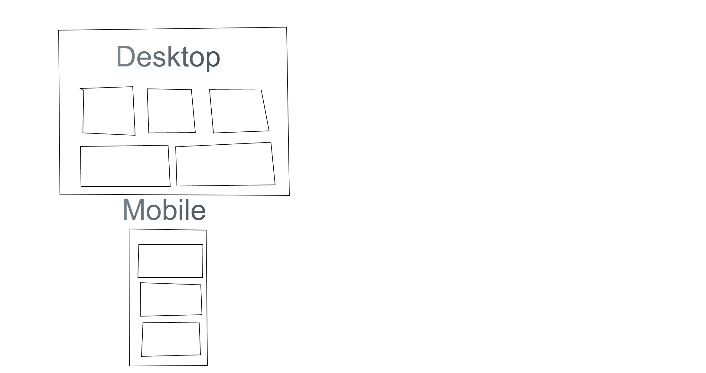
What I want to achieve is what Enfold is supposed to achieve as default: a grid that is any number of boxes wide (done in layout builder), which wraps to fewer columns when the screen size decreases. I drew up a “mockup” of a grid and how it should work. https://sketch.io/render/sk-19f72734af26215b055f6d8c65001ee8.jpeg
Hi,
use this code inside Quick CSS field:
.avia_desktop .av_slideshow.avia-slideshow .avia-slideshow-controls
a {
opacity: 1;
}
Best regards,
Andy