-
Search Results
-
Hello, I want to change the top bar menu colour, here are my conditions:
1. I used the transparent header to my homepage and just a homepage (to show the image of the slider)
2. And of course the top bar menu also get to transparent
3. I want to change the colour of my top bar menu into another colour and not transparent, But still maintain the transparency to my main menu on the hompage.I already try the advance styling in enfold menu, but the result is not what i want. so, i need a help to solve my problems.
Thank youHello,
I am using the latest version of Enfold theme and have added advanced layer slider on the home page and project page. On my Laptop it is working fine but when I open the homepage on Ipad and Iphone or any other mobile device the slider images are not coming out according to the screen size. Also the text on the slides are not resizing them according to the screen size.Please let me know the solution. I have given you my site account details So you can get in and checkout the settings and values for the various variables that I have used. And let me know the changes or do them that are required to make it look correct on all the devices.
Will look forward to your response. Kindly revert ASAP.
Many Thanks!
AmanHi,
i use 4 columns av_on_fourth in one row. On desktop and mobile it looks good. But on tablets the columns get very small and are positioned on the left (see Screenshot)
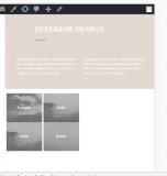
Is it possible to get a better responsive Design for that?best regards
Chris
Hey, can you please give me the code to make the mega menu background back-transparent on the desktop version of the site. I am currently using transparent headers.
The website it http://www.molexmediagroup.com/project-newa/
Feel free to login and make changes to the menu.
Hello,
I have chosen to use the front page scroll down feature. Works great. http://www.robertLcarey.com.
Unfortunately, when I create pages that are not part of the Front Page, the navigation at the top of the new page will not take me back to the front page (home).
How do I fix?
Potential solutions that I do not know how to implement.
a. Get the navigation to work whenever I create a new page.
b. On those pages, hide those buttons that don’t work and provide a home page button and a back button. (In the future, when I add book content there’s a need to a way to get back.) Which means I will need to change the Front Page name to Home.

See yellow circlesc. The bread crumbs could work, but it is not as elegant of a solution.
Thoughts?
Thank you,
Bob
Hello,
I also wanted to use the Progress Bars element on top of the top image, but couldn’t get it to drop onto the slider over the right side of the image. I tried to drop the content element on the Fullscreen Slider and it would not drop onto it.
Do I need to create a new color section and place the image there and then drop rows instead of using the Fullscreen Slider. It would be nice to add images later on etc. to get the cool effect, but the other item is more important.
How do I accomplish this?
Hello,
Loving Enfold and the ability to use the demos to build a site.
I’ve spent hours online searching for solutions and have not found the answers I seek.
I’m hoping you can help me solve some issues I’m having.On the front page (top) I’ve replaced the images inherited from the demo I used.

I wanted to change the transparent slider with the about us and reservations buttons, but did not find the content in the LayerSlider WP.
I have looked for the captions option as suggested in a post, but could not find it. I wonder if the version of the LayerSlider might be the issue?
The following images are what is inside the LayerSlider WP on my site.


My goal is to simply (once I find the text boxes) change out the text and hide the buttons until I need them later.
I appreciate the help!
Thank you,
Bob
Viewing 30 results - 92,551 through 92,580 (of 142,886 total)

