Hi,
Please try the following instead:
#top .avia-slider-testimonials.avia-testimonial-wrapper {
    min-height: 250px;
    max-height: 250px;
    overflow: hidden;
}
Best regards,
Rikard
Hey ronmann,
Thank you for using Enfold.
Please replace the “avf_builder_boxes” filter with the following.
add_filter('avf_builder_boxes', 'avf_builder_boxes_mod');

function avf_builder_boxes_mod($metabox)
{
	foreach($metabox as &$meta)
	{
		if($meta['id'] == 'avia_builder' || $meta['id'] == 'layout')
		{
			$meta['page'][] = 'sfwd-lessons'; /*instead add the name of the custom post type here*/
                        $meta['page'][] = 'sfwd-courses';
                        $meta['page'][] = 'sfwd-quiz';
                        $meta['page'][] = 'sfwd-topic';
		}
	}

	return $metabox;
}
Best regards,
Ismael
Hi,
I found out that this is a wpengine issue. Please check this thread.
// https://wordpress.org/support/topic/my-cpt-all-migrated-but-theyre-in-a-different-order-on-the-front-end/?replies=3
Normally we disable ORDER BY RAND() orderings in MySQL queries because this is a big no-no for large databases which we’ve seen cause massive slow-downs for dozens of our customers. However, you can enable it if you know what you’re doing, for example if you cache the results for 5-15 minutes so that you’re not pummeling the database with these slow queries.
I enabled the Allow ORDER BY RAND() option in the WP Engine’s dashboard and it’s working now.
Best regards,
Ismael
Hey MaaikeVVV,
Thank you for using Enfold.
1.) You can set the font in a lot of ways. If you want to set a general font for the body or heading texts, go to the Enfold > General Styling > Fonts panel. In the Advanced Styling panel, you can set the style of a specific element. You can also use the Quick CSS field if you want to apply a custom modification to a certain element. If you’re going for a custom font, use the @fontface rule.
// http://www.w3schools.com/cssref/css3_pr_font-face_rule.asp
2.) Use this for the posts title in the blog overview page.
#top .fullsize .template-blog .post-title {
    font-size: 35px !important;
}
3.) Please try the following plugins.
// https://wordpress.org/plugins/convert-post-types/
// https://wordpress.org/plugins/post-type-converter/
Best regards,
Ismael
Hi,
1.) You create a folder called “includes” in the child theme folder and then create a copy of the loop-index.php file.
2.) You have to edit the template directly.
below is missing date and comments:
http://imgur.com/7HQmKCj
They are missing because you disabled it in the Theme Options > Blog Layout > Blog meta elements panel. You can add this in the Quick CSS field.
#top .av-blog-meta-date-disabled .minor-meta.date-container, #top .av-blog-meta-date-disabled .text-sep-date {
    display: inline-block;
}

#top .av-blog-meta-comments-disabled .minor-meta.comment-container, #top .av-blog-meta-comments-disabled .text-sep-comment {
    display: inline-block;
}
Best regards,
Ismael
Hi,
Do you need the shrinking header behavior? Please post the login details here so that we can check the settings. Or try this in the Quick CSS field.
#top #header_main > .container, #top #header_main > .container .main_menu ul:first-child > li > a, #top #header_main #menu-item-shop .cart_dropdown_linkav-logo-container {
    min-height: 129px !important;
}
Regards,
Ismael
Hello!
I added this to Quick CSS so that the active item would be shaded on the mobile menu:
#mobile-advanced li.current-menu-item {
background-color: #f8f8f8;
}
Problem is that is is shading the main menu item and all submenu items under that main menu, instead of just the one page they are on. How to fix that?
Thanks in advance for any help you can give.
-
This topic was modified 9 years, 4 months ago by
 Julie. Reason: Removed original question that I no longer need an answer to
Hi,
Thank you for the info. Please try this code in the Quick CSS field.
.blockUI.blockOverlay:before {
	height: 1em;
	width: 1em;
	display: block;
	position: absolute;
	top: 50%;
	left: 50%;
	margin-left: -.5em;
	margin-top: -.5em;
	display: block;
	content: "";
	background: url(../images/icons/loader.svg) center center;
	background-size: cover;
	line-height: 1;
	text-align: center;
	font-size: 2em;
	color: rgba(#000,0.75);
    -webkit-animation: spin 1s ease-in-out infinite;
    -moz-animation:    spin 1s ease-in-out infinite;
    -o-animation:      spin 1s ease-in-out infinite;
    animation:         spin 1s ease-in-out infinite;
}
Best regards,
Ismael
Specifically, on the “Color Sections,” the theme positions the background images “center bottom” instead of “center top” on all mobile devices, and ignores CSS commands to position the background differently.
@Guenni007 – Thanks so much for attempting to help.
Here is what we are trying to resolve. If you look at the Enfold-Wedding Demo: http://kriesi.at/themes/enfold-wedding/ on a mobile device (not on a simulated mobile device on a desktop, but on an actual mobile device), you will see that the photo of the girl cuts off the head:
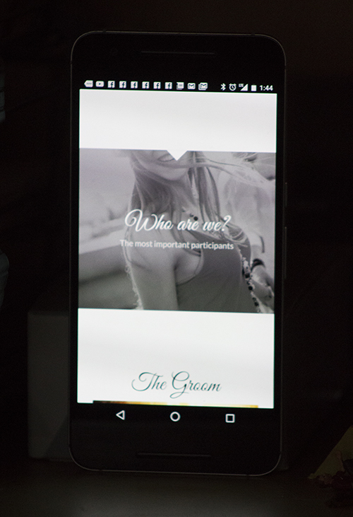
This is exactly what is happening with all of our photos contained in “Color Sections” – they crop off the top. I have written to the theme people, above, and they have offered various media queries. My own programmer, who is very good and very resourceful, has also implemented various media queries. They work fine on a simulated mobile device on a desktop, but do not work on an actual mobile device. We have tested many different media queries, both from the Enfold authors and from my own programmer and they do not work on actual mobile devices.
We believe there is something in the Enfold theme which is blocking these media queries from working on mobile devices. We have no idea what. The theme authors have been no help. If you can offer any suggestion that would be greatly appreciated.
Done! I created a new topic titled “[avia_codeblock_placeholder uid=”0″]” and granted you there administrator access.
Hallo
Mobile werden das Blog und Singleblog in Blocksatz dargestellt. Desktop ist alles ok.
well if you look here http://webers-testseite.de/ikom/circles/
on top there is a responsive background-image in a color section. !
The thing is how to set up that color-section.
Choose “no minimum height and on tab 2 choose “scale to fit”. (this is not so important because image-background size will be calculated later – but you will have to know the class for the color section)
Than you have to know the aspect-ratio of your background image !
f.e. your background image has a 4:1 ratio. (1200px : 300px)
on quick css i than set up the height from the color-section by:
.page-id-2981 .avia-full-contain {
    background-size: 100vw auto;
    height: calc(25vw);
}
that is the trick ! the css width is set to 100vw and height to auto
the height of the container is in dependency to image aspect ratio. !
but never the less you will than have to think about the content in it ( f.e. h2 headings on my example)
and than we are again on media querries to adapt it to shrinking color sections
Hey team_ubermedia,
try this code:
@media only screen and (max-width: 767px) {
.responsive.html_header_top #header_main .social_bookmarks, .responsive.html_top_nav_header #top .social_bookmarks {
right: -100px;
}}
and adjust as needed.
Best regards,
Andy
the page order means if you are on dashboard page list the order of the pages there. Pages on top and down.
The Page ID and order here is determined by creating time. – But i believe you can set a page order by quickedit option on that list.
But my advice is to install that little plugin “intuitive custom postorder”
Installed and activated you can go to options dialog of that plugin and set the influence of that plugin to pages, posts, portfolios, categories etc.
after that you can drag&drop (nearby the mark field there will be than a up and down sign on hovering that place) in that pages list pages up and down creating your own order
look here: https://wordpress.org/plugins/intuitive-custom-post-order/screenshots/
I see where this has come up before. I have tried suggestion but not working for me.
I have a video element and have put the vimeo embed link: https://player.vimeo.com/video/XXXXXXXXX
When I preview, I just see a link instead of the player. The link works when I remove privacy but of course it is going out to vimeo.
I have tried RAP (https://kriesi.at/support/topic/video-player-not-showing-only-showing-link/) suggestion and I have tried editing the avia.js but neither solution worked.
Youtube videos seem to work ok.
I am using Enfold 3.5.3
Any suggestions would be helpful
Hi,
this is not happening for me, no gap on desktop as you can see here: http://i.imgur.com/A7vgg8F.jpg
Best regards,
Andy
Hi!
Can you please create a new topic, so we can review?
Backend access could also needed.
Thanks a lot
Cheers!
Basilis
Hi Andy,
Thanks for the advice and I’ll keep the questioning simple in the future!
I’ve added your code, although the 2nd piece of code didn’t seem to work.
I changed the class to “.avia-testimonial-subtitle” instead where it became responsive, only I can’t align the text with “text-align: center;”(with either class). I tried using “!important;” but it remains aligned to the left.
This is the code I have for the subtitle:
.avia-testimonial-subtitle {
font-family: lustria!important;
font-size: 20px!important;
text-align: right!important;
color: white!important;
padding-top: 50px!important;
}
The padding won’t respond either so I added 50px below the name field which works fine so no issue there, just added information that might help the cause.
Thanks for the help, top notch support.
James
Hi
I changed the header height because of the logo size.
http://nmftv.de/der-alte/
Now i want to set the menu to the top of the header (right now its vertical centered of the header) and also set the submenu just under the mainmenu (not below the header)
any suggestions how to fix this?
cheers
velli
Sorry, forgot the code.
<style type=’text/css’ media=’screen’>
#top #header_main > .container, #top #header_main > .container .main_menu ul:first-child > li > a, #top #header_main #menu-item-shop .cart_dropdown_link{ height:150px; line-height: 150px; }
.html_top_nav_header .av-logo-container{ height:150px; }
.html_header_top.html_header_sticky #top #wrap_all #main{ padding-top:148px; }
</style>
It begins at line 60.
.html_header_top.html_header_sticky #top #wrap_all #main{ padding-top:148px; }
How do I remove it?
Hi there,
my enfold based website has some automatic generated inline css-code and that makes the main content have a padding-top value which I don’t want it to have. Where does this value come from and how can I remove it?
In the private content box I have posted the url to the website at it’s temporarily host.
Thanks and BR, Niemitz
It is still not showing the subbuttons correct (pakketilbud1, pakketilbud2 and pakketilbud3)
My full quick css code is:
.custom-tag { padding: 5px; background-color: rgba(0,0,0,0.5); }
@media only screen and (max-width: 767px) { .progressbar-title {
font-size: 11px;
}}
@media only screen and (max-width: 767px) { .av-catalogue-content p:last-child {
font-size: 11px;
}
.avia_message_box_content {
margin-left: -8px;
margin-right: -8px;
}}
.sidebar_left .inner_sidebar {
margin-right: 0;
}
.sidebar_left .menu li a {
border: 1px solid #e1e1e1;
border-right: 0;
border-left: 0;
margin: 0 0 -1px;
padding: 12px 16px !important;
text-align: left;
}
.sidebar_left .menu li:first-child a {
border-top: 0;
}
Hi, I just had my previous ticket closed, but then began reviewing again. Following your direction on this page makes this issue happen. Can you please advise if it is something in your code?
https://kriesi.at/support/topic/replace-standard-search-with-woocommerce-product-search/
thanks!
Ok, the first 2 worked. For #3 I put everything into the element 1/1 but then it didn’t look even, the header was to one side and the sidebar was all the way to the top near the menu and the full width section at the bottom doesn’t go all the way across full width, which is what I want.
Dear Enfold Team,
Thanks always for your help.
I am trying to style the menu widget with CSS. Some things work and others not.
Is it possible to give the basic CSS coding for it so I can adjust what is necessary?
basically I want to:
remove the dots
create a menu color, hover and visited (colors)
possibly put in lines as in the default side-bar submenu.
Here is the code I have tried but it is not doing quite what I want:
/*BLOG WIDGET MENU*/
#top .widget_nav_menu li {
background: none;
outline: none;
}
.widget_nav_menu ul:first-child>.current-menu-item>a{
color: #7aa84a;
}
.sidebar .widget_nav_menu ul:first-child>.current-menu-item {
box-shadow: none;
}
#top .widget_nav_menu ul ul li:before {
content: none;
}
#top .widget_nav_menu ul ul li a {
padding: 6px 0px 7px 0px;
color: #ebca75;
}
#top .widget_nav_menu ul ul li a:hover {
color: #8fa874;
}
#top .widget_nav_menu ul ul li a:visited {
color: #7aa84a;
}
website is tcm-team.at
Hey!
Glad we could help. Just let us know if you need anything related to the topic :)
Regards,
Nikko
Hi,
try this code:
.textwidget {
position: relative;
right: -160px;
top: -38px;
}
and adjust as needed.
Best regards,
Andy
Hi,
please open different tickets for different questions, otherwise our forum gets too confusing.
1.) Instead of changing position, I recommend to change styling. So you can use your quote as name and your actual name as subtitle. Use this code inside Quick CSS field:
#top .av-large-testimonial-slider .avia-testimonial-name {
font-size: 35px;
color: white !important;
font-family: Arial;
opacity: 0.7;
}
For actual subtitle (your name) use this code:
span.avia-testimonial-subtitle.av_opacity_variation {
opacity: 1 !important;
color: red;
font-size: 10px;
font-family: Georgia;
}
Adjust everything as needed.
Best regards,
Andy
Hey Triceratops,
tag pages are not controlled by the theme, but by WordPress itself. You would need to work with Wordpess’ Template function: https://codex.wordpress.org/Tag_Templates
Maybe a plugin like this could help you: https://wordpress.org/plugins/tag-pages/
Best regards,
Andy