Hi,
a while back I received some excellent css advice which enabled me to target the nth-child background colour of .products li in a Woocommerce category loop. This enabled me to have every odd product background showing a background colour. This worked well and the client was very happy.
Fast forward a year and we are now re-doing their site in a full width layout. The problem I now have is that the li loop is sitting at the far left of the window.
View post on imgur.com
We would like the product loop to line up with the two 1/2 columns above so that the products line up neatly.
I can do this in a large browser windows using:
.av-product-class- {width:100%!important; padding-left:18%; padding-right: 10%;}
View post on imgur.com
This works nicely in large browsers but as soon as I start to reduce the window down, the % values I’ve used don’t work any more and the product loop is off centre. Normally I would try and use a media query to sort this and I can do this when it gets down to ipad and iPhone sizes but is there a way to centre this in the browser so that it matches the content width?
The site is at: http://ridelines.digitalessence.net/group-mtb-courses/
And the product loop is a code block within a coloured section. I’ve tried placing it within a full 1/1 column but this didn’t help.
I’m now turning to you for some of your amazing css magic, hoping that this can be achieved.
Thanks as always.
Hi Vinay,
Having tested the code you posted about the enfold mobile menu theme here: https://kriesi.at/support/topic/mobile-menu-animation-2/#post-708965
This works fine scrolling the menu up and down but if i change the orientation on the iphone whilst the menu is open I get strange results and the same occurs if you adjust the desktop browsers height by resizing your browser. This appears to move the open menu up or down depending on how you resize your browser. Do you know anything which could fix this issue please?
Hi Yigit,
I must probably continue to search for a solution.
This can only be a temporary solution.
Our customer must be able to change the content.
Thank you for your support
Christoph
Hi!
I replied to your other thread here – https://kriesi.at/support/topic/translate-mailchimp/. Let us continue there.
You are welcome! :)
For your information, you can take a look at Enfold documentation here – http://kriesi.at/documentation/enfold/
And if there are features that you wish Enfold had, you can request them and vote the requested ones here – https://kriesi.at/support/enfold-feature-requests/
For any other questions or issues, feel free to post them here on the forum and we will gladly try to help you :)
Cheers!
Yigit
 Michelle Perron
Yeah!!!! Thank you. Are you able to help with the Avia Layout Builder? The top post, “Tail Coverage Malpractice Insurance: Everything a Physician Needs to Know” shows the Yoast SEO with a yellow light for keywords not being in the H2 header and having the keywords in the first paragraph is showing red (first item on SEO list.).
Hi Ismael,
many thanks for your support. I think the adjustment does not work properly (cache has been cleared). That is, the slideshow does not stop after clicking a given slide. It should stop for 10sec and resume automatically after that period.
Can you please post the code you inserted/specify the adjustments you made? Many thanks for your efforts.
Hi! My problem is that in the english version /en the home slider does not work proprerly. I am using WMPL plugin for traslation. In spanish (lang default) is working ok (sticky head) http://flame.neosystemssl.com/
but in engish the slider does not skick to the top… http://flame.neosystemssl.com/en/ Do scroll and you will see…
Hi Yigit,
Almost done.
I use the plugin “Page In Widget”
Now I miss 3 closing </ div>
Regards
Christoph
Hi,
Glad you figured it out!
Could you please post the translation files in this thread – https://kriesi.at/support/topic/please-contribute-and-translate-enfold/ so our devs can include it in upcoming update? :)
Best regards,
Yigit
Hello Nikko,
Thanks for the solution for the captions. It worked. !
I’am using mostly with Chrome on a desktop.
And when I am using a tablet with Chrome the first and last masonry are not working properly (2 pictures in 1 row and the third picture beneath).
https://i.imgsafe.org/0bebb5aa7a.jpg
Thanks for the explanation Ismael. I think this should be deleted in the theme files because a fix width and ‘flexible’ is a contradiction, isn’t it?
I couldn’t find a way to delete the line in a child theme so I deleted it in the parent theme. Now I got 6 grid items in a row which made the grid items too small. I fixed it by adding a min-width to the child theme
#top .container .av-masonry-col-flexible .av-masonry-entry{
min-width: 300px;
}
Could this be an option? Deleting the line in enfold and adding a min-width instead?
-
This reply was modified 9 years, 2 months ago by
 bluecafe.
Hey!
Please change the code to following one
add_action('ava_before_footer','avia_footer_top_column');
function avia_footer_top_column(){
          dynamic_sidebar( 'footertop' );
}
Regards,
Yigit
Hi Yigit,
Thanks, but I need the widget just above <div class=”container_wrap footer_color” id=”footer”>.
Between footer and content
best regards
Christoph
Hey screege,
Please try adding this code to the Quick CSS section under Enfold > General Styling or to your child themes style.css file:
#top .av-main-nav ul ul {
    height: 300px;
    overflow-x: scroll;
}
However we would recommend you to reconfigure your menu. Maybe you could only add “Apple” link for example and display subcategories there. Would be better user experience in my opinion :)
Best regards,
Yigit
hi. is there a simple way to let the partner logos flow over the full width of the website? here is use 8 logos, can i show 10 and let them flow over the whole website width? http://imgur.com/a/Mv8F9
and i use a video slider here. how can i set a maximum high of the slide of 400px? the video should be displayed over the full width and there should be a crop at the top and the bottom. http://imgur.com/a/0X0VT
Hi Vinay,
thank you again. This code leads to the following results:
– banner is on top of the menu bar
– banner doesn´t have vivid colors, has like a white/grey opaque effect on it
– on tablets the banner doesn´t go away when scrolling
– in landscape mode the banner looks like on desktop (but doesn´t go away)
– in portrait mode the banner ist completely white
Any solutions?
Hey. i have added some code to solve problems with look of the customer reviews.
/*Kundenkommentar Rund 180px*/
#top .av-large-testimonial-slider .avia-testimonial-meta .avia-testimonial-image {

  width: 180px;

  height: 180px;
  text-align: center;

}
.avia-testimonial-meta-mini {
  text-align: center!important;
}
@media only screen and (min-width: 990px) {
#top .av-large-testimonial-slider .avia-testimonial-meta .avia-testimonial-image {
margin-left: 20%;
}}
it looks this at the moment: http://imgur.com/a/Df844 and i want to get nearly this code. not exactly but some changes to get in this direction :) :) :) http://imgur.com/a/BF0eZ
Greetings, Lukas
Thanks for your awesome help and the best theme ever!!
Hi imc-html!
Please go to Appearance > Widgets and create a new widget area and name it “footertop” and then add following code to Functions.php file in Appearance > Editor
add_action('avia_before_footer_columns','avia_footer_top_column');
function avia_footer_top_column(){
          dynamic_sidebar( 'footertop' );
}
Cheers!
Yigit
Hi,
I need a widget area above the footer.
Please Help
Christoph
Hey kopperdrake,
Thank you for using Enfold.
Please add this css code in the Quick CSS field to create indentations.
#top .widget ul {
    list-style-type: disc;
}

#top .widget .children {
    padding-left: 10px;
}

#top .widget .children .children {
    padding-left: 20px;
}
Best regards,
Ismael
Hi,
This is possible but you have to remove the following css code in the css > shortcodes.css file.
#top .container .av-masonry-col-flexible .av-masonry-entry{
     width: 49.80%;
}
The width inside a column layout or a color section is limited so the masonry element are force to only have two columns.
Best regards,
Ismael
Hey Nikko,
Absolutely awesome, exactly what I was after!
You even fixed my testimonials which were pencil thin without all this code!
 /* resizing testimonial (tablet)
-------------------------------- */
@media only screen and (max-width: 768px) {
#top .avia-slider-testimonials.avia-testimonial-wrapper .avia-testimonial-row {
     width: 125%;
     left: -75px;
}}
 /* resizing testimonial (iPhone 5 portrait)
-------------------------------- */
@media only screen and (max-width: 500px) {
#top .avia-slider-testimonials.avia-testimonial-wrapper .avia-testimonial-row {
     width: 130%;
     left: -42px;
}}
Great stuff dude!
Thanks,
James
Hi
Please can we re-open this thread:
https://kriesi.at/support/topic/enfold-portfolio-images-bunching-on-load/#post-735616
I have checked on another machine in Google chrome with a hard refresh and the issue is still persisting.
Many thanks
Jon
Hi I wondered if you could help me I’m having a very strange problem. I have some pages that use simple grid rows with content. I now want to change the top section to be a color section with a full width background image. When I add the color section, then move some content in or edit the layout even slightly the whole page layout seems to break and have weird margins all over?
The strange this is, if I start a fresh new page and build the same layout I want with the color sections I have no problem at all. But it now means I’m having to re-create these pages, name them as the same, re-name the old pages, then set a 401 content deleted which is quite frustrating, when all I want to do is simply edit the original pages layout. There doesn’t seem to be a replace page option in wordpress.
I’ve attached an example of the footer going wrong, please note its not just the footer but this is an example of one element that gets messed up like others. 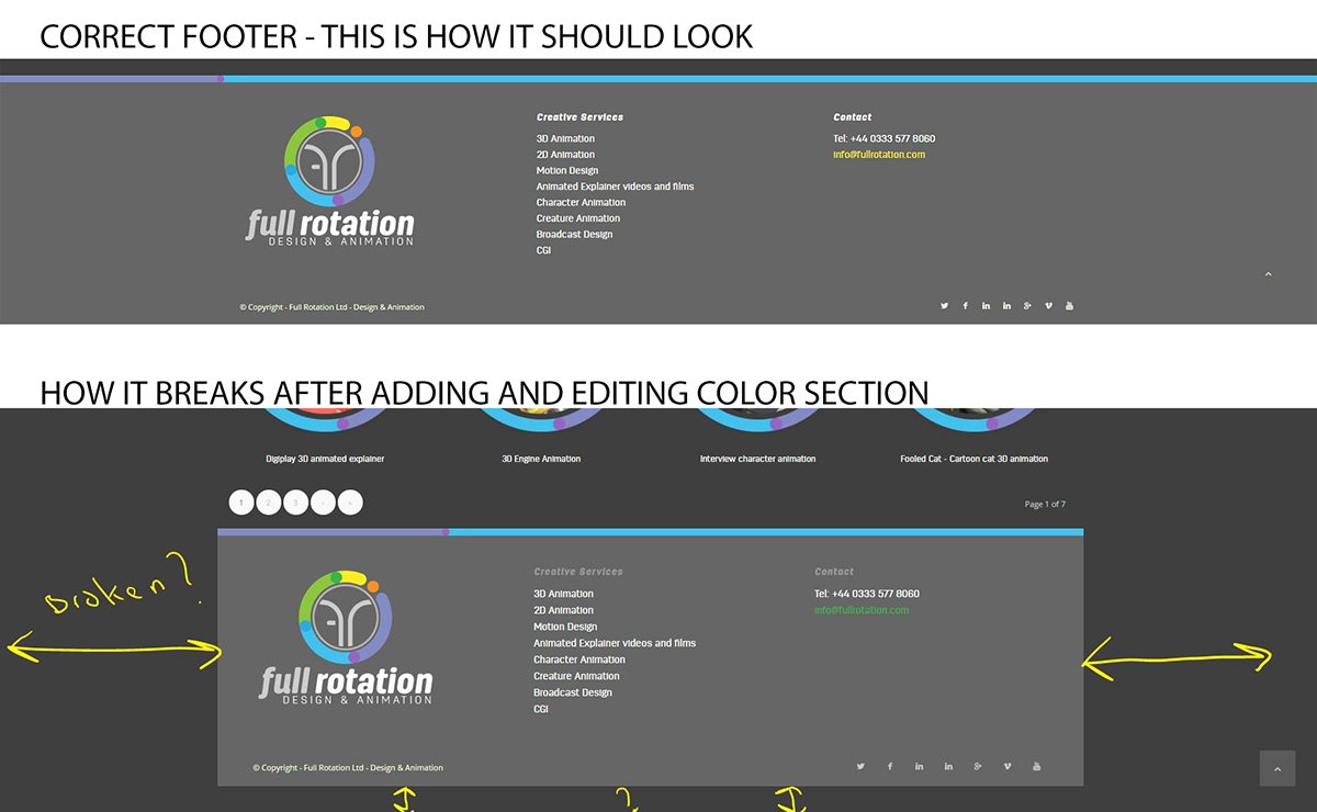
Im using the latest wordpress and enfold 3.8
Many thanks
Maybe you can help me with adaption on this code: https://kriesi.at/support/topic/edit-full-screen-image-slide/
Greetings, Lukas
Maybe you can help me with this meanwhile :)
Hi,
Try adding this css code in Quick CSS just below Rikard’s code:
.html_header_top.html_header_topbar_active.html_header_sticky #top .av_header_transparency + #main {
    padding-top: 0 !important;
}
Let us know if this helps :)
Best regards,
Nikko
Hey Jambo,
Try adding this css code in Quick CSS (located in Enfold > General Styling):
@media only screen and (max-width:767px) {
  .responsive #top #wrap_all .flex_column {
    padding: 0 !important;
  }
}
Hope this helps :)
Best regards,
Nikko
Hey Folks,
my page is displaying an error message on the top of the whole page. Down anyone know how to solve it?
I couldn’t find any solution for it. Thanks to all!
Cheers, Christian
error message: ‘, ‘auto’); ga(‘send’, ‘pageview’);