Hi,
UPDATE: Please install the following plugin.
// https://wordpress.org/plugins/heartbeat-control/
Set the Control heartbeat locations to “Disable Everywhere” or set the frequency to 50 seconds.
Or add this code in the functions.php file:
add_action( 'init', 'stop_heartbeat', 1 );
function stop_heartbeat() {
     wp_deregister_script('heartbeat');
}
By doing this, you’ll have far more fewer request from the admin-ajax.php file and maybe your host won’t block it.
Best regards,
Ismael
Hi,
Looks right on your device but not mine both on laptop and iPad.
What is the actual model of you iPad and laptop? I’m asking because there’s a chance that you have a device with retina display. This is the correct css media query for iPad devices.
// http://stephen.io/mediaqueries/
To target devices with retina display, refer to this link.
// https://css-tricks.com/snippets/css/retina-display-media-query/
Best regards,
Ismael.
Hi,
Great, glad you got it working and thanks for the feedback. Please let us know if you should need any further help on the topic or if we can close it.
Best regards,
Rikard
Hey Russ!
Do you have access to your mod security log file? I read a little more about the topic and on stackoverflow they suggested to check the log file since mod_security logs whenever it issues a block/redirect. But I would guess it could be the same reason as with Guido site. It works fine as long as no html whatsoever is used. once a strong tag or a tag or something similar is used the request is blocked…
Best regards,
Kriesi
Hi,
Great, glad you got it working and thanks for the feedback. Please let us know if you should need any further help on the topic or if we can close it.
Best regards,
Rikard
Hi,
Glad we could help. Please let us know if you should need any further help on the topic or if we can close it.
Best regards,
Rikard
Hey aenarios,
Please enable debug mode in order to see builder shortcodes: http://kriesi.at/documentation/enfold/enable-advanced-layout-builder-debug/
You can then create a new page and paste the following shortcode into it:
[av_section min_height='' min_height_px='500px' padding='default' shadow='no-shadow' bottom_border='no-border-styling' id='' color='main_color' custom_bg='' src='' attachment='' attachment_size='' attach='scroll' position='top left' repeat='no-repeat' video='' video_ratio='16:9' overlay_opacity='0.5' overlay_color='' overlay_pattern='' overlay_custom_pattern='']
[av_one_full first min_height='' vertical_alignment='av-align-top' space='' custom_margin='aviaTBcustom_margin' margin='-40px,0px' padding='0px' padding_sync='true' border='' border_color='' radius='0px' radius_sync='true' background_color='' src='' attachment='' attachment_size='' background_position='top left' background_repeat='no-repeat']

[av_feature_image_slider link='category,14,15' items='3' offset='enforce_duplicates' contents='title_read_more' slider_size='2:1' preview_mode='custom' image_size='extra_large' control_layout='av-control-minimal' animation='fade' autoplay='no' interval='5' overlay_enable='aviaTBoverlay_enable' overlay_opacity='0.3' overlay_color='#000000' overlay_pattern='' overlay_custom_pattern='']

[/av_one_full]
[/av_section]

[av_blog blog_type='posts' link='category' blog_style='single-big' columns='3' contents='excerpt' content_length='content' preview_mode='auto' image_size='portfolio' items='1' offset='no_duplicates' paginate='no' conditional='is_subpage']

[av_blog blog_type='posts' link='category' blog_style='blog-grid' columns='2' contents='excerpt' content_length='content' preview_mode='auto' image_size='portfolio' items='6' offset='no_duplicates' paginate='yes']
Best regards,
Rikard
Hi,
Great, glad it started working. Please let us know if you should need any further help on the topic or if we can close it.
Best regards,
Rikard
Hey!
They are not attachment /media pages, they are not real pages, they are something else that seems to be a lightbox photo.
They are actually attachment pages as you can see in the body class attribute.
<body id="top" class="attachment attachment-template-default single single-attachment postid-8109 attachmentid-8109 attachment-jpeg stretched open_sans " itemscope="itemscope" itemtype="https://schema.org/WebPage" style="position: relative; min-height: 100%; top: 0px;">
However, when opening the image on a new a tab, in the url there is a “resize” parameter.
https://i1.wp.com/www.thomashenthorne.com/wp-content/uploads/2015/07/27-022.jpg?resize=300%2C200
Could you please provide the login details so that we can inspect the site?
I remember there was an issue with the Masonry gallery not displaying that the developers patched recently. Is it possible that the patch somehow did this? Just “grasping at straws” here.
That was a javascript issue. :)
Regards,
Ismael
Hi,
Please try the following in Quick CSS under Enfold->General Styling:
@media only screen and (max-width: 767px) {
.home #av_section_2 .no_margin.av_one_fifth {
    width: 20% !important;
    float: none !important;
    display: table-cell !important;
    margin-left: 0 !important;
    margin-top: 0 !important;
}
}
Best regards,
Rikard
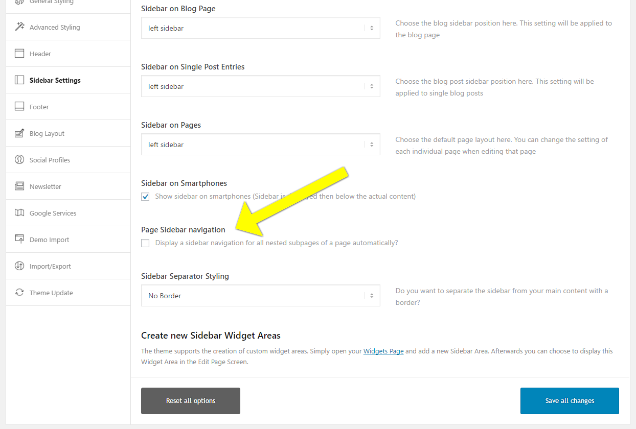
I would like to use the “Page Sidebar navigation” tool
Screenshot of tool in Enfold Theme settings
https://s3.amazonaws.com/screenshots.screencast-o-matic.com/screenshot/u/mNG/1492737815212-13384.png
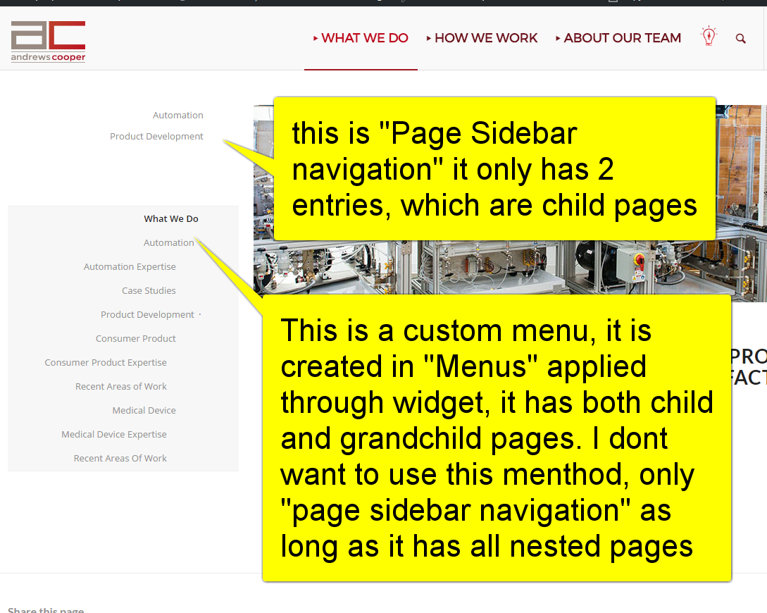
when I enable the tool only the top level “child” pages will show and not the “grandchild”.
The sidebar on the left top nav of “What we do” is currently showing you both the “Page Sidebar Navigation” which has 2 entries and the custom menu, which shows all the entries. As stated I do not want to use a custom menu for this anymore, I want to use “Page Sidebar Navigation” as long as it can show the full nest of pages including grandchild. I’m sure this is as simple as changing the “depth” varial somewhere in enfolds-functions.php ?
Here is a screenshot to further illustrate.
http://screencast-o-matic.com/screenshots/u/mNG/1492738069264-56491.png
Ok, I got the site looking pretty good on a computer. When I view it on an iPhone or iPad though, the homepage comes out fine, but the other 3 pages (Shop, About, Contact) have the top header picture missing, the one that the menu overlays when you view it on a computer. On the iPhone those images don’t show up at all, and on an iPad they look like they are positioned way up top off the screen and you can only barely see the bottom of the image on the screen.
FYI I have the header images on all 3 pages as a background image inside a color section (I got this from Kriesi’s tutorial video on YouTube). For the Section Layout settings I have Custom Height in Pixel set to 600px, default padding and display a simple 1px top border and no border styling. For the Section Background settings I have Section Colors set to Main Content, with the 1400×600 background image inserted. I have it set to Parallax, Top Center, and Scale to Fit.
Any ideas? I really need to get this site up and running so any help is greatly appreciated.
Sorry I fixed this. Topic closed. Thanks.
Hi Nikko,
I mean the years at the top.
Sorry for being so unclear!
 L
LParticipant
Hi guys,
You see that into the feature request the changes for mobile appearance is a #1 request for a long time and the votes are keep counting.
I dont want to push this but most of us are really waiting for these changes for some time and I hope the new mobile appearance will satisfy our needs. With all the respect of Kriesi and the work done, I decided to create this topic just in case you are interested to learn what the community considers as needed for the revamping of mobile navigation. I think a topic like this would help you to consider what needs to be implemented or done differently in order to maintain Enfold as a great theme.
So here is my list of what should be changed:
-Parent menu items that contains child menu items must be expandable by a tap of a finger it must include +/- to show visitors that it can be expandable;
-Top menu (secondary menu) must be included into the mobile menu container;
-Social icons and search field must be inside the mobile menu container;
-A WPML language switcher element must be included on the top of mobile menu container – seperate placement from WP menus
I hope this helps to consider what to change.
Regards
Hi @victoria_d,
Thanks for the interest, but as per my last message, I could manage to get it all working just by changing the sorting order of Product Grid/Slider elements. It really seems to be some sort of coding bug or incompatibility.
Reading my first post, I just realized that some of the things I’ve written have been cut from the message, such as
I have the latest version of Enfold, WPML and \Woocommerce\. \I \use \Avia \page \builder \which \have \been \working \well\, \but \after \installing \WPML \and \configuring \translations, Product Grid and Product Slider stopped working.
But whatever, I guess it doesn’t matter now. I didn’t find where to close the topic, so if any moderators can do it for me I’d appreciate!
Thanks all!
-
This reply was modified 8 years, 11 months ago by
 rmf339.
Hi Erin,
I just published a quick and easy fix for this error. It’s not Enfold, it’s related to your PHP memory.
Hope it helps :-)
Cheers,
Russell
Hello,
We are using woocommerce’s one page check out and it works great on a desktop but on a mobile device it will show the product table but no “Add to Order” buttons.
Thanks
Hello,
I have a website with the menu on the top. There are two Links on the menu and both of them are mega menu with submenu displaying below since when the mouse hover them.
I have a display problem with one of the mega menu, the submenu is displaying on the right side instead of being underneath. How can I fix this ?
Thank you so much for your help
-
This topic was modified 8 years, 11 months ago by
 805ITS.
Hi.
As you can see in the top of my page I have used icons as a sort of submenu. Is there an easy way of not making them “fade in” the way they do? I dont want any animation on them.
-
This topic was modified 8 years, 11 months ago by
 adferger1. Reason: Typos
Hey doricameron,
Please be sure to check your mark-up and that all tags are properly formed. See this similiar issue for reference:
https://kriesi.at/support/topic/content-disappears-2/
Best regards,
Jordan Shannon
Hi,
Okay, please replace this code I gave:
#top #header_meta .avia-button-wrap.avia-button-left {
    margin-left: 10px;
    float: left;
    position: relative;
    top: -10px;
}
to this css code:
#header_meta nav.sub_menu {
    position: static;
}

#header_meta #avia2-menu {
    padding: 10px 0;
}

#top #header_meta .avia-button-wrap.avia-button-left {
    position: absolute;
    top: 0;
    left: 0;
}
Hope this helps :)
Best regards,
Nikko
Hi,
Try adding this css code:
@media only screen and (max-width:767px) {
  #top .av-image-caption-overlay-center p {
    font-size: 14px;
  }
}
Hope this helps. Just adjust the font size as you see fit :)
Best regards,
Nikko
Hi,
Try adding this css code in Quick CSS (located in Enfold > General Styling):
#top #header_meta .avia-button-wrap.avia-button-left {
    margin-left: 10px;
    float: left;
    position: relative;
    top: -10px;
}

#top #header_meta .avia-button.avia-size-small {
    padding: 4px;
}
Let us know if this helps :)
Best regards,
Nikko
Hi,
Try adding this css code in Quick CSS:
@media only screen and (max-width:767px) {
  .responsive #top .avia-post-nav {
    display: block !important;
  }
}
Let us know if this helps :)
Best regards,
Nikko
Hi,
I’m referring to the solution given by Ismael, the link I gave should point exactly to it. Try to edit the js > shortcodes.js file, look for this code around line 1272:
filters['itemSelector'] = "a.isotope-item";
replace it with this code:
filters['itemSelector'] = ".isotope-item";
Let us know if this helps.
Best regards,
Nikko
Hey feoleb,
Try adding the following to quick css to the media query you posted above:
article.slide-entry.flex_column.post-entry{
padding-top:32px!important
}
Let me know if this works for you
Best regards,
Jordan Shannon
Hey Alexander,
Try adding this css code in Quick CSS (located in Enfold > General Styling):
#top #footer .widget_nav_menu li {
    font-size: 15px;
    font-weight: bold;
}
Just adjust the font size value as you see fit. Hope this helps :)
Best regards,
Nikko
Ok that didn’t work but i’ve managed to make some progress. Seems I was on to something yesterday but I forgot to add the period before the styles after my own style.
Here’s what I got to work, at least to get a color change over the entire container on hover, with the ease-in transition working (but not ease out):
#top .rtr-column-link .av-layout-grid-container {
  display: block;
  width: 100%;
  height: 100%;
}
#top .rtr-column-link:hover  {
  background-color: #000;
  transition: all 0.3s ease-in-out;
  opacity: 0.5;
}
The problem is no matter what I do I can’t get the hover color to change. It stays the white with opacity only. Also the link doesn’t span the entire block. and then theres that pesky ease-out transition that won’t work no matter what I try.
Also i’d like to have a separate option to make the hover affect the background only (as well as cover everything as it is now.)
The container i’m targeting is the Talent Acquisition box on the left under the hero.
Let me know if you find it.
Thanks!