Hey Kriesi,
I used to have arrows and dots for the slideshow on mobile devices,
though after the last update they dissapeared. I’ve managed to find this line on shortcodes.css (line 3695) –
@media only screen and (max-width: 767px) {
.responsive #top .avia-slideshow-controls a{display:none;}
…
How do I bring them back?
Thanks,
Uri
Hi,
You could try creating two different menus in Appearance > Menus one for mobile and one for desktop and then adding following code to Functions.php file in Appearance > Editor
function av_different_mobile_menu( $args = '' ) {

if(wp_is_mobile()) {
	$args['menu'] = 'main-menu-mobile';
} else {
	$args['menu'] = 'main-menu';
}
	return $args;
}
add_filter( 'wp_nav_menu_args', 'av_different_mobile_menu' );
Best regards,
Yigit
Hi,
Please try adding this code to the Quick CSS section under Enfold > General Styling or to your child themes style.css file:
@media only screen and (max-width: 480px) {
.responsive #top #wrap_all .container.av-logo-container {
    margin: 0 30px;
}}
Best regards,
Yigit
my advice is – erase the page in english. open the page in original language and duplicate the page by using WPML window on top right position
click the image to enlarge:

then go and translate your content for each alb element.
If you don’t like the grid-row element for the english translation – erase it via advanced layout builder (not via debug window)
I had blury images which I fixed with the help of:
However, the product gallery is still broken in WC3. Where I used to have thumbnails I now have larger images each the size of the main product image, all stacked vertically. Here’s an example:
How can I fix this?
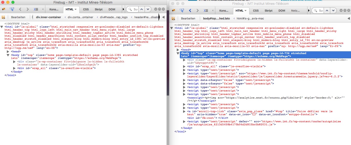
click to enlarge the firebug window of your source code:

you see on the right side the code you inserted. All strikethrough rules are overwritten by some other rules with more rights (more specific or other reasons. If you like to have it than set the rule to !important like:
.txtsh .av-special-heading-tag {
    font-family: "PT Sans","HelveticaNeue","Helvetica Neue",Helvetica,Arial,sans-serif;
    font-size: 17px !important;
    font-style: italic;
    font-weight: bold;
    line-height: 1.5em;
    margin-bottom: 8px;
    margin-top: 43px !important;
    padding-right: 6px !important;
    text-align: left !important;
}
-
This reply was modified 8 years, 11 months ago by
 Guenni007.
Hi
I have used your theme to bulde this shop:
We tried to us ‘ WooCommerce Advance Image Zoom’ plugin and we had to disable the LightBox of the product images. So we did as instructed by Yigit from your support team and managed to disable the LightBox, you can see his instructions in this topic:
https://kriesi.at/support/topic/disabeling-the-lightbox-of-the-product-image/
Since the plugin we wised to us is not good, we wish to restore the LightBox of the product images; so I have deleted all Yigit’s instructions, but it didn’t change and the LightBox is still disabled. I did all the changes in the child theme and I have update the theme and still there is no LightBox for the product images.
Can you help with this issue?
Thanks
Tamar
Many thanks for the feedback. I used the way you commented. But nothing worked.
.txtsh .av-special-heading-tag {
Margin-top: 43px;
Font-weight: bold!
Font-size: 17px;
Line-height: 1.5em;
Margin-bottom: 8px;
Text-align: left;
Font-family: ‘PT Sans’, ‘HelveticaNeue’, ‘Helvetica Neue’, Helvetica, Arial, sans-serif;
Font-style: italic;
Padding-right: 6px;
}
Hi Mike,
Please refer to this thread for a possible solution, but it will require some coding.
If you need further assistance please let us know.
Best regards,
Victoria
Hi dngood,
This is the rule that makes the whole page red:
html, #scroll-top-link {
    background-color: #cc283b;
}
You could add the rule and of course flush the cache:
html {
    background-color: transparent;
}
If you need further assistance please let us know.
Best regards,
Victoria
Hello, I use the CSS CLASS to control the SPECIAL HEADING. But the code below does not work. What can I be doing wrong?
CODE
/ * SPECIAL HEADING CUSTOM * /
.txtsh {
Margin-top: 46px;
Font-weight: bold!
Font-size: 17px;
Line-height: 1.5em;
Margin-bottom: 8px;
Text-align: left;
Font-family: ‘PT Sans’, ‘HelveticaNeue’, ‘Helvetica Neue’, Helvetica, Arial, sans-serif;
Font-style: italic;
Padding-right: 6px;
}
VIEW IMAGE
View post on imgur.com
PAGE WEB SITE
[http://www.liliansouza.com/assets/2016/atividades/]
Hi guys,
still a small question regarding the menu making the site jump to top on mobile phones:
– all plugins are off
– I took out all css
After I took out all css I put it back piece by piece and found this piece of code is the error:
@media only screen and (max-width: 767px) {

.responsive #top #wrap_all #header {
    position: fixed;
    background: transparent;
    }
}
Second issue is the overlay option breaks the contactform
How are we able to fix this?
-
This reply was modified 8 years, 11 months ago by
 insanityNL.
Hi team,
on a customer page i have the problem that the (internal mapped) links into the testimonial section didn´t work on mobile devices. No problem on desktop. What´s the solutution? Should i do an upgrade from enfold 3.8.5 to a higher version?
Best regards,
Alexander
Hi,
Here is the code you can put in Enfold > General Styling > Quick Css, if it does not work, put into themes/enfold/css/custom.css or in your child theme style.css
#top #wrap_all .av-main-nav ul > li:hover > a {
    color: orange;
}
If you need further assistance please let us know.
Best regards,
Victoria
Hey nuncer,
Have you tried the solutions in this thread: https://kriesi.at/support/topic/social-share-buttons-product-page/
Can you try that and let us know what happens?
Best regards,
Sarah
Hey Chris,
Please disable the plugins you tried, then try the solutions Ismael presented here: https://kriesi.at/support/topic/events-in-ascending-order/
Please let us know how it goes. :)
Best regards,
Sarah
Hi cvan,
The next and previous links are actually fixed in the browser window so that it’s there even when you scroll down. If you want, you can add your own previous and next buttons in your post and remove the buttons we have in the theme by following the instructions in this thread: https://kriesi.at/support/topic/how-to-customize-previous-and-next-button-in-post/
For customizing the nagivation, we recommend using Quick CSS if you can. For your example, you can use this code: .avia-post-nav .entry-image {display:none!important;}
Best regards,
Sarah
Mein Problem scheint ähnlich jenes dieses Posts zu sein:
Leider half mir der Post nicht.
Ich editiere die Homepages aus der Demo, wann immer ich diese in den Theme Options als Frontpage auswähle – ist der Content weg (Videoslider + 1 Farbsektion bleibt, alles danach weg). Habe dies nun schon mehrmals probiert und neu erstellt, es tritt leider immer wieder das gleiche Problem auf. Es funktioniert nicht mehr, seit ich die Footer und Sidebar Einstellungen geändert habe, vielleicht hängt es damit zusammen? (diese Einstellung wieder ändern, hat aber auch nichts mehr geholfen).
Hey Mike,
I think what you’re talking about is the tooltip for the title of the image. It’s best to include a title that describes the image. However, if you really want to remove it, you can either keep the title field blank for your images, OR remove the attribute entirely by following the instructions here: https://kriesi.at/support/topic/how-to-remove-tooltips/#post-224464
Best regards,
Sarah
Hi,
Did you really have all your settings synchronized?
=> Yes! (BTW, Yigit must have checked it with the admin. credentials)
And now i see you are using a caching tool (autoptimize codes are seen in css etc) are you shure to empty both cache?
=> Yes! Both autoptimize and WP super cache.
And next difference is that your french site got a grid row element above the footer the english version not. Is that footer width different if you have on english Version too a grid-row element above the footer?
=> With a grid row on the english, the footer is OK (full width), but it did not answer the question why it’s not OK without the grid row element…
-
This reply was modified 8 years, 11 months ago by
 Oli.
Oli.
@alexbanaga if you want to work with woocommerce 3 you have to use my solution. Otherwise stay with woocommerce 2.6.14 until enfold gets an update.
1) And now i see you are using a caching tool (autoptimize codes are seen in css etc) are you shure to empty both cache?
2) And next difference is that your french site got a grid row element above the footer the english version not. Is that footer width different if you have on english Version too a grid-row element above the footer?
3) all your footer scripts are missing on english version now? !
-
This reply was modified 8 years, 11 months ago by Guenni007.
well first of all – the whole Enfold Options Dialog has got his own settings for each flag on top.
Did you really have all your settings synchronized? f.e. you can have your own quick css for each language.
By the way if i had to install a multilingual Site i allways do all the Settings for the main language after i’m happy with that – i export the theme settings file – switch the language on top of Enfold Options Dialog by choosing the other flags – and import the main language Theme-Settings file.
Hi,
Where do you want to place the AASW logo? Use the following css code to adjust the position of the image on mobile view.
@media only screen and (max-width: 767px) {
    .responsive.html_header_sidebar #header .avia-custom-sidebar-widget-area {
        display: block;
        position: absolute;
        top: 0;
        left: 30%;
    }
}
Best regards,
Ismael
Hi,
Those pages does not exist and the scan is probably returning a false positive report which is not uncommon. The background parallax effect is working properly on the “Business” and “Residential > Pricing” pages. The effect is quite subtle but it’s there.
<div class="av-parallax-inner alternate_color avia-full-stretch" style="background-color: #ffffff; background-repeat: no-repeat; background-image: url(https://guardiantechsolutions.com/wp-content/uploads/2013/04/home-office-2.jpg); background-attachment: scroll; background-position: top center; "></div>
Best regards,
Ismael
Hey onastvar,
Thanks for using our theme :)
I`ve checked your bottom-footer text and I added the p tag with the custom_footer_link class and you need to apply this custom CSS code:
.custom_footer_link {
  display: inline-block;
  position: absolute;
  top: 5px;
  right: 292px;
}
Now, about the link question, may you explain it better? Ive seen that youre using a custom widget plugin (used in the card images)
Best regards,
John Torvik
Hallo Frau Fütterer, haben Sie meinen Beitrag gelesen?
@murdochduncan please update to the latest version of enfold (4.0.5), of woocommerce (3.0.4) and follow this instructions.
Hi,
Thank you for the update. Try to apply a margin to the color section.
#av_section_titles {
    margin-top: 50px;
    margin-bottom: 50px;
}
Best regards,
Ismael