I tried a few minutes ago the menu on right as icon. If I click on desktop on it, it opens correct. But clicking on any menu does not drive me to the page – only submenus do open them. Am I wrong in using it?
Hello,
Thank you, the social button appeared again.
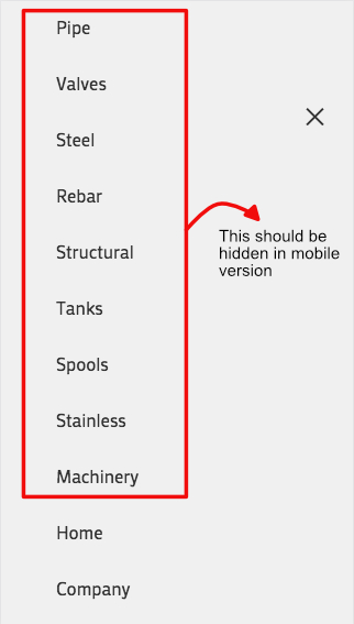
About the menu, before (the update) I had set a main menu and a secondary menu. The secondary menu has too many elements, and in a mobile device does not looks good. So my client wanted to have a different menu for the mobile version, in order to do this I decided to use some CSS, using this code:
@media only screen and (max-width: 767px) {
.hide-on-mobile { display: none !important; }}
@media only screen and (min-width: 768px) {
.hide-on-desktop { display: none !important; }}
In this way I could hide elements in both menus for showing elements only for mobile and others only for desktop, using the CSS Classes field in Menus. http://i.imgur.com/l1fVK0v.png
After the update, this CSS does not work in the mobile main menu, but it still does work in the secondary menu and in all menus in desktop version.
Here I can show you the main and secondary menu in the desktop website http://i.imgur.com/r9L5MvG.jpg
But in the mobile site, all elements are displayed in the main menu. http://i.imgur.com/734Gdjg.jpg
Thank you!
Before the 4.1.1 update, due to the width of the main menu elements, I used CSS to switch to the mobile menu at 1150px via this code:
@media only screen and (max-width: 1150px) {
nav.main_menu {display:none !important;}
#advanced_menu_toggle, #advanced_menu_hide {display:block !important;}
}
This used to work fine but 4.1.1 has broken this because the whole structure of the menu has now altered and some of the old mobile menu classes have been changed.
I cannot however work out how to get this working again in 4.1.1 – I have tried all sorts of variations of classes but nothing works. Please advise some new CSS to switch to the mobile menu at 1150px.
This suggestion does not solve the problem because between 1150px and 990px the burger icon appears in the space where the normal menu was displayed as seen in this screenshot – plus the mobile search icon is missing.
So, how to add the search icon with the burger at 1150px, and have the two of them in the ‘correct’ place from 1150px downwards, as seen here?
-
This topic was modified 8 years, 9 months ago by
 zimbo.
When I hover over a photo, it fades out and opens a fullscreen option.
Like so: /Users/heatherfrancis/Desktop/Screen Shot 2017-07-13 at 11.59.07 AM.png
I would like to turn that option off, but can not find how to do that on my own.
Thanks!
Issue: Invalid character “” on several lines in shortcodes.js can cause issues with minifying plugins.
Post: https://kriesi.at/support/topic/invalid-character-a-on-several-lines-in-shortcodes-js/
I just thought it would be good to mentioned it also here.
Milan
I have found the cause of the problem in the custom css file…its the first nav-wrap rule, I tried to add the same to mobile styles but with #2f3393 and !important…no change…removed to copy and paste code here.
I cant find any burger related rules in quick css or additional css…below is the css found in the “custom css” file
/* Have fun adding your style here :) - PS: At all times this file should contain a comment or a rule, otherwise opera might act buggy :( */

/* General Custom CSS */

.av-main-nav-wrap ul * {
   color: #fff;
}
#header_main_alternate {
     background-color: #2f3393;
}
#top #wrap_all .header_color .av-menu-button-colored > a .avia-menu-text {
 background-color: #00aeed;
}
.header_color .avia-menu-fx {
   border-bottom-color:  #00aeed;
   background-color:  #00aeed;
}

.av-main-nav-wrap ul.sub-menu * {
   color: #2f3393;
}

#header_main{
border-bottom-width: 0px !important;
border-bottom-style: solid;
z-index: 1;
}

/*
Desktop Styles
================================================== */
/* Note: Add new css to the media query below that you want to only effect the desktop view of your site */

@media only screen and (min-width: 768px) {
  /* Add your Desktop Styles here */

}

/*
Mobile Styles
================================================== */
/* Note: Add new css to the media query below that you want to only effect the Mobile and Tablet Portrait view */

@media only screen and (max-width: 767px) {
  /* Add your Mobile Styles here */

}
This is the only issue preventing the site to go live now…please help! :D Thanks
Hey geertroggeman,
Please try adding the following to return the social icons on mobile:
@media only screen and (max-width: 767px){
.responsive #top #header .social_bookmarks {
    display: block!important;
}
}
As for the other issue, I would like a further explanation as I’m having trouble understanding exactly what it is you need.
Best regards,
Jordan Shannon
Hey there,
Couldn’t find an answer on how to get rid of the burger icon on desktop after today’s update. Now I’ve got double menu on the header.
Any suggestions pls?
Regards,
hacart
Hey Keith,
Add the following to quick css:
@media only screen and (max-width: 767px){
.responsive #top #header .social_bookmarks {
    display: block!important;
}
}
Best regards,
Jordan Shannon
Hi,
Add the following to quick css:
@media only screen and (max-width: 767px)  {

.av-hamburger .av-hamburger-box .av-hamburger-inner, .av-hamburger .av-hamburger-box .av-hamburger-inner::before, .av-hamburger .av-hamburger-box .av-hamburger-inner::after {
background-color:red!important;
}

.html_av-overlay-side #top .av-burger-overlay-scroll{
background:red!important;
}
}
Best regards,
Jordan Shannon
Hi,
On this website : (see private content)
The main menu was aligned to the right till version 4.1
The code I used was given by Josue in a previous support demand :
#top .av-subnav-menu {
text-align: right;
padding-right: 15px;
}
But it seems not to work anymore.
Could you help me fix it please ?
— Jerome.
Hello,
I have a text element inside a tab element “Our Why”
The text on the page seems far from the tabs on the top
View post on imgur.com
Can I get support please moving the text closer to the tabs on top?
Hi,
Okay, this looks correct. Please add the following to quick css:
.template-page.content.av-content-full.alpha.units{
padding-bottom:0px!important;
}

#text-2.widget.clearfix.widget_text{
margin-top:0px!important;
margin-bottom:0px!important;
}

#text-2.widget.clearfix.widget_text .textwidget p{
margin-top:0px!important;
margin-bottom:0px!important;
}
Best regards,
Jordan Shannon
Hi,
I see. Add the the following to quick css:
@media only screen and (min-width: 767px)  {
strong.logo img {
margin-top:40px!important;
}
}
Best regards,
Jordan Shannon
The mobile logo looks good now but now without that extra padding the desktop logo isnt centered vertically as you can see here:
https://ibb.co/nhFfLF
Hey elvirais,
Unfortunately we do not have the updated version for 2017. This appears to be the latest:
Best regards,
Jordan Shannon
I found your other post to use this:
.html_header_top.html_logo_center #top .main_menu ul:first-child {
display: inline-block;
width: auto;
}
But why did this change and will it be fixed so you don’t need the coding?
I got it to work but have one more question
– how do I add padding around the text section below each image?
eg to the left, right, top and bottom of
our super fun Boomerang GIF Booth takes a series of quick shots and strings them together in an awesome clip that plays forwards and backwards. it’s crazy fun
our premium photo booth boasts gorgeous professional studio lighting, 32″ interactive touchscreen, high quality props, fast on-the-spot prints, custom templates, instant social media sharing+++
our one-of-a-kind 3D Selfie Booth uses a new technology called Boomarray to create cool 3D motion effects bringing your selfies to a whole-notha-level
Please note the padding should ONLY be applied to the text and button below the images and NOT around the images
-
This reply was modified 8 years, 9 months ago by
 navindesigns.
Hey Nathan,
Add the following to quick css:
#top .avia-slideshow-button {
  font-size:20px!important;
}
Just adjust the size number to what you need.
Best regards,
Jordan Shannon
hm i thought that the settings here will overwrite even the quick css settings. than without the real link i could not help you.
this is color definition of that part – try to find a similar rule in your quick css to get rid of it:
#top #wrap_all .av-burger-overlay .av-burger-overlay-scroll #av-burger-menu-ul li a {
    color: #2f3393
}
-
This reply was modified 8 years, 9 months ago by
 Guenni007.
Hey Nathan,
Add the following to quick css:
.page-thumb{
display:none;
}

.product-sorting{
display:none;
}

.content{
padding-top:0px!important;
}
Best regards,
Jordan Shannon
The main menu issue I experience, too. Always left-aligned since 4.1 update. How to fix?
edit: https://kriesi.at/support/topic/enfold-version-4-1-update-troubles/#post-819277 fixed it for me
-
This reply was modified 8 years, 9 months ago by
 aschlemmer.
Merhabalar,
Sorunuzu burada yanitladim – https://kriesi.at/support/topic/menus-limit/. Bu konuyu simdilik kapatiyorum, acik olandan devam edelim :)
Best regards,
Yigit
Hi,
Please try adding this code to the Quick CSS section under Enfold > General Styling or to your child theme’s style.css file:
#top #header_meta a {
    color: orange;
}
If that does not help, please post a screenshot and show the changes you would like to make. You can upload your screenshots on imgur.com or Dropbox public folder and post the links here.
Best regards,
Yigit
Hey giorgiosilvia,
Login credentials are not working for me.
Please make sure to check this post – https://kriesi.at/support/topic/enfold-version-4-1-update-troubles/#post-819186 and if that still does not help, please check the login credentials once again.
Best regards,
Yigit
Hi John!
Got it fixed with a code from the this thread.
Thanx
Yigit has already had a look at this issue on this thread https://kriesi.at/support/topic/v4-1-mobile-menu-dissappeared/
He advised that the mobile menu should be visible again now, but it really isn’t.
I have multi-cleared caches reloaded the page numerous times and tried different browsers but I am still seeing no mobile menu at all.
Is anyone able to kindly double check this, please?