-
AuthorSearch Results
-
October 9, 2023 at 7:48 am #1421868
In reply to: Vimeo Video in Headersection is not running
Hi,
You may have to disable the “autoplay” option for the second video below the color section. Let us know if this helps.
Thank you for your patience.
Best regards,
IsmaelOctober 9, 2023 at 5:49 am #1421864In reply to: Cookie Banner reopen
Hey Sebastian,
Thank you for the inquiry.
Are you referring to the av_privacy_modal_popup_button shortcode?
[av_privacy_modal_popup_button wrapper_class="" id="" class=""]your button text[/av_privacy_modal_popup_button]You can add the shortcode in a text widget, then remove the button style with this css code.
#top .avia-button.avia-cookie-consent-button.av-extra-cookie-btn.avia-cookie-info-btn {
    background: transparent;
    color: #ffffff;
}
Best regards,
IsmaelOctober 9, 2023 at 3:04 am #1421853In reply to: Font looks different on Mac/Windows
Hi Svenja,
To make sure it’s consistent on both systems, you can try to upload custom fonts instead:
1. Go to https://transfonter.org/
2. Add the Palatino font (get it from your Mac)
3. Check TTF, EOT, WOFF, WOFF2, SVG and click Convert
4. Click the Download link
5. Go to Enfold > Import/Export > Custom Font Manager, upload the zip file generated from the previous step.For further information check our documentation: https://kriesi.at/documentation/enfold/typography/#how-to-upload-custom-fonts
Or you may want to check this thread for further information: https://kriesi.at/support/topic/loading-google-fonts-locally-for-gdpr-compliance/
Hope it helps.Best regards,
NikkoOctober 9, 2023 at 2:49 am #1421849In reply to: Icons titles unbalanced on smartphone view
Hi HulaSlim,
Can you try to add this CSS code and see if it helps:
#top #av_section_1 .av_one_half .avia-icon-list-container .entry-content-header {
    display: none;
}

#top #av_section_1 .av_one_half .avia-icon-list-container .iconlist_icon {
    font-size: 20px;
    max-width: 30px;
    max-height: 30px;
    line-height: 30px;
}

#top #av_section_1 .av_one_half:has(.avia-icon-list-container) {
    display: flex;
}
Best regards,
NikkoOctober 8, 2023 at 11:06 pm #1421847Hi,
Thanks for the feedback and the link to your example site, it helped me by seeing what they have done. When I check the site I see the break point for the mobile menu is 992px, and the set the menu item width to 14.25% and the font is a little smaller.
So to show the burger menu until 991px we will use this css:@media only screen and (min-width: 767px) and (max-width: 991px) { #top #header .av-main-nav > li.menu-item { display: none!important; } #top #header .av-burger-menu-main.menu-item-avia-special { cursor: pointer; display: block!important; } #top #header .av-main-nav > li > a { background-color: transparent !important; } .html_header_top #top .av_menu_left .main_menu { right: 20% !important; left: auto !important; } .html_header_top .av_bottom_nav_header .av-logo-container .main_menu { display: block !important; } #top #header_main_alternate { display: none; } }the expected results:

Then to set the main menu similar to the other site we will use this css:@media only screen and (min-width: 992px) { .main_menu { display: flex; align-items: center; } .avia-menu>ul.av-main-nav { margin: 0; display: flex; justify-content: space-around; position: relative; } .avia-menu>ul.av-main-nav>li.menu-item { width: 14.25%; padding: 0; } .avia-menu>ul.av-main-nav>li.menu-item>a, .avia-menu>ul.av-main-nav>li.menu-item>a span { display: flex; align-items: center; justify-content: center; width: 100%; padding: 0; font-size: 18px; } .avia-menu>ul.av-main-nav>li.menu-item .avia-menu-text, .avia-menu>ul.av-main-nav>li.menu-item-search-dropdown { display: flex; justify-content: center; } #top #header_main_alternate .container { margin: 0 auto; padding: 0px 50px; } } @media only screen and (min-width: 1200px) { .avia-menu>ul.av-main-nav>li.menu-item { margin: 0 13px; } }the expected results 992px:

and at larger screens 1440px:

Please give this a try.
Please ensure to copy the code from the forum and not an email notification so the symbols are not converted.Best regards,
MikeOctober 8, 2023 at 5:54 pm #1421830In reply to: Blog pic width
Hey Bettina,
Thanks for the link to your site, try this CSS in your Enfold Theme Options ▸ General Styling ▸ Quick CSS field:#top.single-post .avia-image-container.avia-align-left { margin-right: 0; } #top.single-post p > i { font-size: 12px; }Please ensure to copy the code from the forum and not an email notification so the symbols are not converted.
After applying the css, please clear your browser cache and check.Best regards,
MikeOctober 8, 2023 at 5:43 pm #1421828Hi,
I can get the menu items to be in one row starting at 768px with this css:@media only screen and (min-width: 768px) { #header_main_alternate > .container { margin: auto; padding: 0; } #top #header .av-main-nav > li { padding: 0; } }Please ensure to copy the code from the forum and not an email notification so the symbols are not converted.
but not spaced equally across the whole width of the navigation.
After applying the css, please clear your browser cache and check.
the expected results:

Best regards,
MikeOctober 8, 2023 at 5:16 pm #1421826In reply to: Add area image to shop pages
Hi,
Please see the explanation here.
I believe that your “Gallery page” is actually the woocommerce shop page so to add the image and shortcode breadcrumb there you will need to edit the new function that I added above.
You would add is_shop() I did this for you, please check.Best regards,
MikeOctober 8, 2023 at 3:44 pm #1421818This reply has been marked as private.October 8, 2023 at 3:15 pm #1421813In reply to: No current color in main menu when open blog post
Hi,
I believe Nikko made the chage at Enfold Theme Options ▸ Theme Options ▸ Where Do You Want To Display The Blog
I believe the image is added by your custom function in your child theme functions.php:function add_custom_header_image() { if ( is_single() || is_archive() ) { ?> <div class="single-header-image"><br><br></div> <div class="breadcrumbrow" style="background-color: #f8f8f8;"><div class="container" style="padding-top:3px;"> <?php echo do_shortcode('[av_breadcrumbs]'); ?></div></div> <?php } } add_action( 'ava_after_main_title', 'add_custom_header_image', 10 );To show the image and breadcrumb in the above function on the blog page you would add !is_front_page() && is_home()
like this:function add_custom_header_image() { if ( is_single() || is_archive() || !is_front_page() && is_home() ) { ?> <div class="single-header-image"><br><br></div> <div class="breadcrumbrow" style="background-color: #f8f8f8;"><div class="container" style="padding-top:3px;"> <?php echo do_shortcode('[av_breadcrumbs]'); ?></div></div> <?php } } add_action( 'ava_after_main_title', 'add_custom_header_image', 10 );I did this for you, please clear your browser cache and check the blog page
Best regards,
MikeOctober 8, 2023 at 2:29 pm #1421809In reply to: Add area image to shop pages
Hi,
Thank you for the link to your site, I added this function in your child theme functions.php:function add_custom_header_image_to_products() { if ( is_product() ) { ?> <div class="single-header-image"><br><br></div> <div class="breadcrumbrow" style="background-color: #f8f8f8;"><div class="container" style="padding-top:3px;"> <?php echo do_shortcode('[av_breadcrumbs]'); ?></div></div> <?php } } add_action( 'woocommerce_before_main_content', 'add_custom_header_image_to_products', 10 );Please check the product page linked below.
Best regards,
MikeOctober 8, 2023 at 12:38 pm #1421800In reply to: Different widths for different elements on pages?
Hi,
Thanks for the screenshots, it looks like the page you want to be 960px is the blog page, and I assume other pages, so I recommend settings the site content width to 960px at Enfold Theme Options ▸ General Layout ▸ Dimensions ▸ Content | Sidebar Ratio.
Then it looks like a single post is the page you want to be 720px, I would achieve this will css like trying this CSS in your Enfold Theme Options ▸ General Styling ▸ Quick CSS field:#top.single-post .fullsize .template-blog .post .entry-content-wrapper { max-width: 720px; } #top.single-post .av-content-full > .related_posts { max-width: 720px; } #top.single-post .av-content-full > .comment-entry { max-width: 720px; }Please ensure to copy the code from the forum and not an email notification so the symbols are not converted.
After applying the css, please clear your browser cache and check.
This css assumes that the single post is created with the default editor, and your settings are similar to my demo site, unfortunately there are so many settings that to give to an exact solution I will need to see your page. You could include a admin login in the Private Content area below, or we could wait until your site is live.Best regards,
MikeOctober 8, 2023 at 7:15 am #1421796In reply to: Mouse Hower effect
But – please, this only replaces the behaviour on mobile devices. This happens when the descriptions are permanently displayed because the hover effect cannot be effective. So that these overlays do not cover a main part of the image, they are moved here below the images.
If you also want to use it on the desktop with small screen widths, we have to remove the class avia_mobile from the code and put the whole thing in a media query, e.g. only up to 767px.
October 7, 2023 at 9:58 pm #1421788Hi,
Glad Guenni007 could help, thank you Guenni007, I checked your blog page with Safari Responsive Design Mode emulating a iPhone in portrait mode, but I was able to scroll fine, I also checked on my Android phone with no issues, unfortunately I don’t have a iPhone to test with, if you are still experiencing this issue please tell us which model of iPhone you are using and we will see if we can reproduce this error. Perhaps the version you are using is not using the latest Safari? On my Mac I have v16.6, but the Desktop Safari and mobile version don’t always behave the same.Best regards,
MikeOctober 7, 2023 at 8:10 pm #1421778In reply to: Headlines on mobile phones
Thank you so mutch! Now it works:-)! Do you happen to know how to solve my problem here well – I just can’t manage it….
October 7, 2023 at 7:44 pm #1421772In reply to: Add area image to shop pages
Hey Sebastian,
Try this solution.Best regards,
MikeOctober 7, 2023 at 7:42 pm #1421771In reply to: Headlines on mobile phones
Hi,
On the page that you linked to, “Schulmaterialien” is an H1 tag and your CSS is targeting H2 tags, Try this CSS in your Enfold Theme Options ▸ General Styling ▸ Quick CSS field instead:@media only screen and (max-width: 767px) { #top #wrap_all #main .header_color h1, #top #wrap_all #main .main_color h1, #top #wrap_all #main .alternate_color h1 { font-size: 24px; } }Please ensure to copy the code from the forum and not an email notification so the symbols are not converted.
After applying the css, please clear your browser cache and check.Best regards,
MikeOctober 7, 2023 at 7:15 pm #1421767In reply to: Alternative main menu
Hi,
Try this thread, if you have trouble setting it up please include an admin login in the Private Content area and explain which page you want which menu to show on so we can examine.Best regards,
MikeOctober 7, 2023 at 6:48 pm #1421764Hey Tina,
Thanks for your question, by the sound of “Video outside the viewport” I was thinking that at mobile the video was partly off the page, I checked your videos at the mobile size but they all showed in the pages correctly. Then I found this thread from just a couple of month ago that shed some light on it.If you want a video to be counted, it basically needs to be in the initial viewport, the video is embedded way down the page in the example you have given.
So it wouldn’t really have the video indexed as apart of the page.I see that you videos are also near the bottom of the page, or “outside the initial viewport”, so to correct you will need to place the videos at the top of your page.
Right now you have a image that looks like a video that links to a lower part of the page, try swaping this out for a real video. But since you have many videos on your page, only one will get indexed, do you may also need to make a new page for each video, so it can be at the top.
I hope this helps.Best regards,
MikeOctober 7, 2023 at 3:22 pm #1421748In reply to: Mouse Hower effect
Ich habe jetzt deinen Code eingegeben bei CSS
#top .av-masonry.description-below .av-inner-masonry-content,
#top .av-masonry.description-below .av-inner-masonry-content .avia-arrow {
  background-color: #cde5a5;
}

.responsive.avia_mobile #top .av-masonry.description-below .av-inner-masonry-content {
  position: relative !important;
  top: 100%;
}

.responsive.avia_mobile #top .av-masonry.description-below .av-inner-masonry {
  overflow: visible;
}

.responsive.avia_mobile #top .av-masonry.description-below a.av-masonry-entry {
  margin-bottom: 60px !important;
}

.responsive.avia_mobile #top .av-masonry.description-below .av-inner-masonry-content {
  padding: 5px 10px;
  text-align: center;
  min-height: 65px
}

.responsive.avia_mobile #top .av-masonry.description-below .av-inner-masonry-content .av-masonry-entry-title {
  position: absolute;
  top: 50%;
  left: 50%;
  transform: translate(-50% , -50%);
  padding: 0 !important;
  margin: 0 !important;
  width: 100%;
  font-size: 18px !important;
}
Dann habe ich folgendes gemacht:
https://www.dropbox.com/scl/fi/a2k6d2dbx0z9cfvgdlgx5/Screenshot-2023-10-07-151719.png?rlkey=gkw34l59cf4v0614vo6pqh5qk&dl=0
https://www.dropbox.com/scl/fi/4mgyhs5xfkaevtczi5bl7/Screenshot-2023-10-07-151653.png?rlkey=7ok6d7qht8ubssvgvun6cc7i2&dl=0
https://www.dropbox.com/scl/fi/emieeysdcjx97ffd56g1u/Screenshot-2023-10-07-151622.png?rlkey=swmquijj3xsozk5fpfjek2b8l&dl=0
Das war wahrscheinlich auch falsch von mir, denn es hat nicht funktioniert. Heul!October 7, 2023 at 2:06 pm #1421743In reply to: Top menu bar problems
Hi,
Thank you for the link to your site, I enabled the WP Rocket to see what could be the cause for the topbar menu error, and it seems to be the WP Rocket setting “Optimize CSS delivery” I disabled this and tested your homepage with Windows in Chrome, Firefox, & Edge in a separate logged out window and this seems to have solved the issue. Please clear your browser cache and check. I would not worry about this option because you are using the theme option Enfold Theme Options ▸ Performance ▸ JS & CSS file merging and compression which should be the same thing, sometimes using two options to do the same thing can cause errors.
To disable the topbar on mobile I added this CSS in your Enfold Theme Options ▸ General Styling ▸ Quick CSS field:@media only screen and (max-width: 980px) { #header_meta { display: none; } }I choose 980px because that is when your topbar started doubling up, if you want to change it to when the burger menu is not shown, try changing it to 990px.
Best regards,
MikeOctober 7, 2023 at 1:27 pm #1421742In reply to: Which Hotel booking plugin?
Hi,
Yes I understand, our demo was created with the WooCommerce Bookings plugin in mind and the Motopress Hotel Booking Plugin can’t use the same settings and options.
Unfortunately I don’t have a solution for you, if you would like to request this feature of a new demo being created, the Dev Team has opened a new Github Feature Request for users to place requests and follow them as the Dev Team reviews them.Best regards,
MikeOctober 7, 2023 at 11:47 am #1421737In reply to: Mouse Hower effect
For those masonries – on ipad and bigger tablets it might be nice to position the caption ( that is on mobile always visible ) beneath the image – and not as overlay style.
Maybe it is best to give a custom class to that masonry – to always use that setting on demand.
f.e. description-below
and: because it is only wanted on mobile devices ( with no hover )#top .av-masonry.description-below .av-inner-masonry-content, #top .av-masonry.description-below .av-inner-masonry-content .avia-arrow { background-color: #cde5a5; } .responsive.avia_mobile #top .av-masonry.description-below .av-inner-masonry-content { position: relative !important; top: 100%; } .responsive.avia_mobile #top .av-masonry.description-below .av-inner-masonry { overflow: visible; } .responsive.avia_mobile #top .av-masonry.description-below a.av-masonry-entry { margin-bottom: 60px !important; } .responsive.avia_mobile #top .av-masonry.description-below .av-inner-masonry-content { padding: 5px 10px; text-align: center; min-height: 65px } .responsive.avia_mobile #top .av-masonry.description-below .av-inner-masonry-content .av-masonry-entry-title { position: absolute; top: 50%; left: 50%; transform: translate(-50% , -50%); padding: 0 !important; margin: 0 !important; width: 100%; font-size: 18px !important; }October 7, 2023 at 8:01 am #1421718does that stick behavior persist if you deactivate your WP Optimizer? – after that refresh all cachings and merging files on enfold and test it.
Try deactivating all plugins – and reactivating one by one. And inspect when the behavior turns back.
(https://kriesi.at/support/topic/experiencing-hick-up-hiccup-when-scrolling/)
________where does that html layout come from inside text-block element?
a lot of classes inside (flex flex-grow flex-col gap-3 or min-h-[20px]) but i could not find any rules on those classes.
( is that tailwind css ? where are the rules for it? )
see the DOM : https://gatehealing.com/helpful-resources/on that page i do not understand the ol (ordered list ) settings – why not one ol – and let the numbers grow on return key
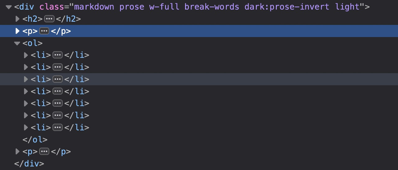
next: i see some errors on jQuery is not defined – this often happens when you are loading jQuery in your Footer but try to load other scripts in the head or before that jQuery load that needs the jQuery Sources.
October 6, 2023 at 10:24 pm #1421713And now that I’m on my laptop, it sticks on laptop as well. (Chrome, firefox….Im using firefox on phone, but tried both on laptop)
October 6, 2023 at 9:51 pm #1421711In reply to: Headlines on mobile phones
Did you purge the cache before testing the page? You may have to toggle or temporarily disable the Enfold > Performance > File Compression settings as well. Please make sure to perform a hard refresh before testing the page.
Yes, I have done that:( If I enter the following code (=>css-field), …
@media only screen and (max-width: 767px) {
  #top #wrap_all .header_color h2,
  #top #wrap_all .main_color h2,
  #top #wrap_all .alternate_color h2 {
    font-size: 24px;
  }
}
it still does not work.
-
This reply was modified 2 years, 6 months ago by
Tim.
October 6, 2023 at 9:20 pm #1421707In reply to: Top menu bar problems
Thanks!
I am using WP Rocket as a cache plugin. When I turn it off, the problem on the desktop with logged in vs. logged out goes away. So, that was the problem. Now I just need to figure out how to keep the plugin on, but not mess up the headers.
As for mobile, I would like to just not show it. I can create a mobile specific menu that shows both menus for that.October 6, 2023 at 8:32 pm #1421688In reply to: Mouse Hower effect
ich wünschte ich wüsste wie man eine mouse hover an mobilen Endgeräten haben könnte.
Den gibt es nämlich nicht. touch screens habe sowas nicht. Problem der touch event wird als hover gewertet und aktiviert den Status.Standardmäßig sollte es aber bei Enfold so sein, das in dem Fall die Captions dauerhaft angezeigt werden. Willst Du das unterbinden?
Dann könntest du ( sorry als Participant / Boardteilnehmer ist wohl duzen angesagt ) diese Elemente die durch das hovern hineinfahren einfach ausblenden mit display none..responsive.avia_mobile #top .av-masonry:not(.av-caption-style-overlay) .av-masonry-entry.av-masonry-item-with-image .av-inner-masonry-content { display: none }diese klasse: avia_mobile wird bei allen mobilen Endgeräten an html gesetzt.
October 6, 2023 at 7:24 pm #1421684In reply to: Top menu bar problems
Hey prerules,
Thank you for the link to your site, it looks like right now you have the top bar disabled so I’m not seeing it at all. But from your screenshots it looks like you are showing a secondary menu in the top bar. If you want to hide it on mobile we can offer some css to do so, with eight menu items it will show as multiple lines.
We could also help you show only two or three menu items on mobile so your most important items will show.
As for the difference between your logged in and out views, I think that this maybe related to a caching plugin, are you using one? Try disabling it and check again, if not please include an admin login in the Private Content area so we can check and be of more assistance.Best regards,
MikeOctober 6, 2023 at 4:09 pm #1421666In reply to: Scroll up button on mobile (responsive)
Hi,
Please try this CSS to display the social icons on small mobile screens as well:
@media only screen and (max-width: 479px) {
.responsive #top #wrap_all #header .social_bookmarks {
    display: none;
}
}
Please note that there is not much space in the header on screen sizes like that, so you would likely have to apply additional CSS in order to make it look good.
Best regards,
Rikard -
This reply was modified 2 years, 6 months ago by
-
AuthorSearch Results