Hi,
Try changing the screen size number down to your device size, I had max-width: 1440px but perhaps that is also your “desktop” size.
Otherwise try checking your screen resolution and letting us know what sizes you want this for.
Best regards,
Mike
Hi,
Ok, all links, Try this CSS in your Enfold Theme Options ▸ General Styling ▸ Quick CSS field:
#top a {
  text-decoration: underline;
  color: #a8ca6d;
}
After applying the css, please clear your browser cache and check.
Best regards,
Mike
Hi,
Thank you for the link to your site, but I get the error:
FEHLER: Zu viele fehlgeschlagene Anmeldeversuche. Bitte versuche es in 24 Stunden noch einmal.
so I can not login, nonetheless from your screenshot and your info above, please note that touch devices do not have a “hover” attribute, so to remove the “white” overlay on touch devices, Try this CSS in your Enfold Theme Options ▸ General Styling ▸ Quick CSS field:
@media only screen and (max-width: 1440px) {
.touch-device #top .av-hover-overlay-active .av-masonry-image-container {
    opacity: 1;
}
}
as for the click issue, I believe you have a function or plugin conflict, Try disabling your plugins. If that resolves the issue, reactivate each one individually until you find the cause. Otherwise try disabling all of your customization scripts and see if that helps.
If not Please include a working admin login in the Private Content area.
Best regards,
Mike
Hey AlexCryo,
Thank you for your patience, the width of 1410px is set by your layout at Enfold Theme Options ▸ General Layout ▸ Dimensions ▸ Maximum Container width
you can set this to 100% or if you only want this for your shop pages you can try this css:
.responsive #top.archive.woocommerce .container {
    max-width: 100%;
    padding: 0;
}
After applying the css, please clear your browser cache and check.
Best regards,
Mike
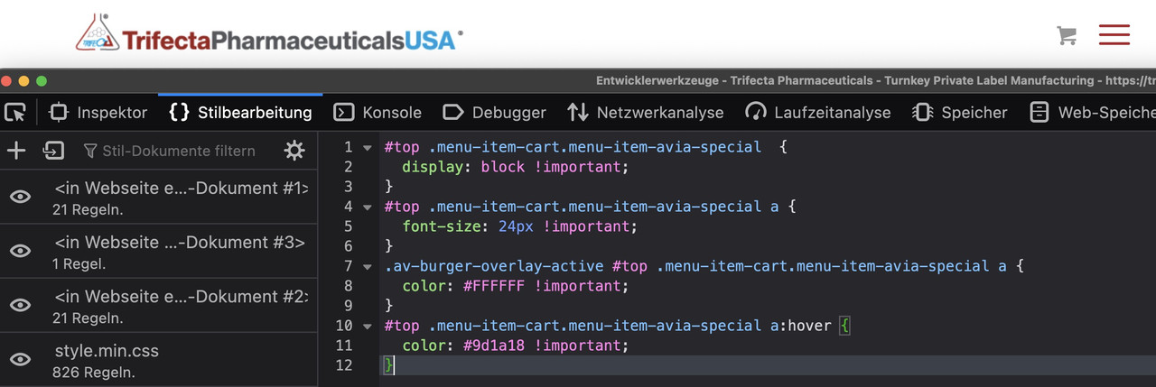
The thing is, you didn’t mention that you were using the hamburger from the start.
I can see the item but it is set to display none by css code.
to see a first result bring this to quick css and look:
( a little bit more css to see selectors if influnce )
#top .menu-item-cart.menu-item-avia-special  {
  display: block !important;
}
#top .menu-item-cart.menu-item-avia-special a {
  font-size: 24px !important;
}
.av-burger-overlay-active #top .menu-item-cart.menu-item-avia-special a {
	color: #FFFFFF !important;
}
#top .menu-item-cart.menu-item-avia-special a:hover {
	color: #9d1a18 !important;
}
(click to enlarge:)
_____________________
and don’t forget to replace the “#” by the link of that cart icon
get rid of the class: menu-item in that snippet:
function add_cart_icon_to_main_menu( $items, $args ){
if ($args->theme_location == 'avia'){
$cartLink = '<li class="menu-item-cart menu-item-avia-special" role="menuitem"><a aria-label="Cart" href="#" rel="nofollow" aria-hidden="false" data-av_icon="" data-av_iconfont="entypo-fontello" alt="Cart" ><span class="avia_hidden_link_text avia-menu-text">Cart</span></a></li>';
$items = $items . $cartLink;
}
return $items;
}
add_filter( 'wp_nav_menu_items', 'add_cart_icon_to_main_menu', 9999, 2 );
i downloaded enfold on my laptop and trying to upload
Please remove the other solution trials – do not use a combined solution – and only use that: https://kriesi.at/support/topic/icon-next-to-burger-all-previous-topics-wont-work/#post-1424623
And copy paste the code from there to your child-theme functions.php.
After doing that we can discuss when or when not the icon is visible.
Hi,
Thank you for your patience, I just found this thread, nonetheless try this CSS in your Enfold Theme Options ▸ General Styling ▸ Quick CSS field:
@media only screen and (min-width: 772px) in (max-width: 1023px)  {
	.html_header_top.html_header_sticky #top #wrap_all #main {
    padding-top: 150px;
}
}
After applying the css, please clear your browser cache and check.
Best regards,
Mike
removed this junk code but didn’t help
[av_textblock fold_type='' fold_height='' fold_more='Read more' fold_less='Read less' fold_text_style='' fold_btn_align='' textblock_styling_align='' textblock_styling='' textblock_styling_gap='' textblock_styling_mobile='' size='' av-desktop-font-size='' av-medium-font-size='' av-small-font-size='' av-mini-font-size='' font_color='' color='' fold_overlay_color='' fold_text_color='' fold_btn_color='theme-color' fold_btn_bg_color='' fold_btn_font_color='' size-btn-text='' av-desktop-font-size-btn-text='' av-medium-font-size-btn-text='' av-small-font-size-btn-text='' av-mini-font-size-btn-text='' fold_timer='' z_index_fold='' id='' custom_class='' template_class='' element_template='' one_element_template='' av_uid='av-lok43reo' sc_version='1.0' admin_preview_bg='']
Thanks @Guenni007 and Mike for your solutions. Your combined solution creates the same problem as the solution by @Guenni007 in the other thread. You can see it if you click on the website and then resize the browser window. The display of the shopping cart icon happens exactly opposite of what I need. On Desktop -> It only shows if you resize the browser window in the width to iPad size and smaller. It should behave the exact opposite. Not visible on mobile or iPad…only visible on desktop. Also I would prefer to have a link inside of the burger menu with a shopping card icon and “Visit Shop” that only shows on mobile resolutions.
Your help and support are highly appreciated.
Regards
Stefan
Hi adapt,
Great, I’m glad that Ismael could help you out. Please let us know if you should need any further help on the topic, or if we can close it.
Best regards,
Rikard
In fact, you could do it with a hook as well. – but i would use a wordpress hook on that.
The main navigation menu theme_location is avia.
( you see that you can use that hook also to other menu locations :
avia(main-menu), avia2( top-menu), avia3(footer-menu) )
function add_cart_icon_to_main_menu( $items, $args ){
if ($args->theme_location == 'avia'){
$cartLink = '<li class="menu-item menu-item-cart menu-item-avia-special" role="menuitem"><a aria-label="Cart" href="#" rel="nofollow" aria-hidden="false" data-av_icon="" data-av_iconfont="entypo-fontello" alt="Cart" ><span class="avia_hidden_link_text avia-menu-text">Cart</span></a></li>';
$items = $items . $cartLink;
}
return $items;
}
add_filter( 'wp_nav_menu_items', 'add_cart_icon_to_main_menu', 9999, 2 );
replace that “#” in the snippet with your prefered link
this will insert a new menu-item to the main nav. But: it will be the very last menu-item even behind the search icon and even behind the hamburger icon itself.
Same here moving it to the right position is easy with that extra class from snippet ( menu-item-cart)
function move_cart_icon_before_burger() {
?>
<script>
(function($){
  $('li.menu-item-cart').insertBefore($('li.av-burger-menu-main'));
})(jQuery);
</script>
<?php
}
add_action('wp_footer', 'move_cart_icon_before_burger');
to see that solution used : https://webers-testseite.de/
first : if you have a shop – and that is the cart icon for. i guess there are options to show that cart icon in main menu.
_______
One method to do it:
i prefer the hook on next answer !
do you know how to give a custom class to a menu item?
place inside the menu an custom link ( preferably as the last link in your main menu. ), replace the label of that menu-item with your icon. give the custom-class : menu-item-avia-special to it. thats it
Menu-items with that class will be visible – if the burger is active
1) custom link – the later “navigation label” is what you insert to “Link Text”
– in your case it is enough to insert: <span class='av-icon-char' aria-hidden='true' data-av_icon='' data-av_iconfont='entypo-fontello'></span>
2) give to that menu-item the custom class: menu-item-avia-special
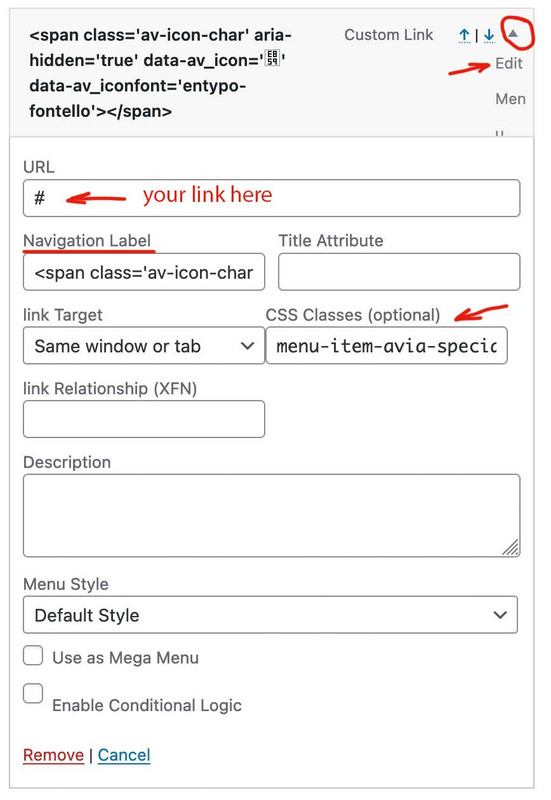
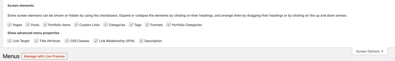
if you do not see on editing the menu-items a custom class input field. :
on top right Window of your Menus Option Dialog there is a slide out dialog : “Screen Options” – open it and mark all you needed for that:
to change position with f.e. the search icon that is easy … just ask
( in that case it might be useful to have another custom class on that menu-item f.e. in your case menu-item-cart)
Hi Rikard,
Thank you for this. Unfortunately the top portion of the header is not visible (the area with the phone number). Would you have any suggestions to maintain the phone number and contact info at the top?
Thanks in advance, Mike
I have a sticky header and anchor links on a one page site to scroll to sections. The header is transparent background and i want the scrolling to go all the way to start of section on anchor link click. It leaves 56px at the top. How can i adjust?
i have checked out this link https://kriesi.at/support/topic/adding-offset-value-to-smooth-scrolling-anchor-links/ but doesn’t work for me
Hi,
Thanks for the update. Please let us know if you should need any further help on the topic, or if we can close it.
Best regards,
Rikard
How would I remove the down arrow at the top of my color sections?I have looked everywhere on the backend and page builder and do not see an option to remove this.
Hi chitz,
The error you are getting does not mean that your support expired but maybe PHP ZipArchive Extension is not enabled on your server/webhost, or some settings are not set properly or insufficient. Here are some posts that are related to it:
– https://kriesi.at/support/topic/cannot-instal-enfold/
– https://kriesi.at/support/topic/i-cant-install-the-enfold-theme/
– https://kriesi.at/support/topic/how-to-register-a-theme-on-enfold-3-3-2-do-i-first-download-latest-version/#post-1404769
Try to enable PHP ZipArchive Extension and if it’s already enabled try to adjust some of the settings mentioned in the posts given.
Best regards,
Nikko
Hi limedrop,
Unfortunately, we don’t have styling options for the Mobile Menu, however, we can assist you with the CSS code necessary to have that style, you can try to add this CSS code in Enfold > General Styling > Quick CSS, to set the background color, color, font-size, etc.
#top #wrap_all #av-burger-menu-ul li a {
    background-color: blue;
}

#top #wrap_all #av-burger-menu-ul li a .avia-menu-text {
    color: white;
    font-size: 18px;
}
Hope it helps.
Best regards,
Nikko
Hi Kati,
Please try to add this CSS code as well:
@media only screen and (max-width:1280px) {
  .responsive #top .av_mobile_menu_tablet .av-main-nav .menu-item {
    display: none;
  }

  .responsive #top .av_mobile_menu_tablet .av-main-nav .menu-item-avia-special {
    display: block;
  }
}
Best regards,
Nikko
Hi diogovareta,
Edit the content area column, and make sure Equal Height Columns is set to Equal Height.
Then, edit the sidebar column, and go to Advanced > Developer Settings > Custom CSS Class, and add my-sidebar to the field and save it.
Then, go to Enfold > General Styling > Quick CSS and add this CSS Code:
#top .my-sidebar {
    border-left: 1px solid #e1e1e1;
    padding-left: 50px;
}
Best regards,
Nikko
Hi ausgesonnen,
I’m closing this thread since it’s a duplicate of your other post: https://kriesi.at/support/topic/menu-to-be-not-in-bold/
Best regards,
Nikko
Hi,
Yes this is true, due to your customization.
Best regards,
Mike
Hi,
i would like to know if it is possible to put a picture on the right side on a big slideshow. It should stay there all the time.
How could i do that?
Many greetings rixi
Hey ti2media,
Thank you for the inquiry.
Please add this css code to adjust the size of the icon and move it beside the burger menu.
#top .av-custom-menu-button .av_font_icon {
    font-size: 30px;
    color: red;
}

#top .av-custom-menu-button {
    position: absolute;
    right: 100px;
    top: 14px;
    z-index: 100;
    height: 62px;
    width: 50px;
    border-right: 2px solid;
    line-height: 62px;
}
After that, you have to remove this css code to get rid of the box beside the cart icon.
.av-custom-menu-button a {
    padding: 10px 10px;
    background: red;
    position: relative !important;
    left: 0 !important;
}
Best regards,
Ismael
Hey kaneljeff,
Thank you for the inquiry.
There is no option for this by default but you can manually insert items from custom post types in the Appearance > Menus panel. If you can’t find the portfolio items in the selection, look for the Screen Options at the very top, and make sure that the Portfolio Items are checked.
Best regards,
Ismael
Hi all.
I encountered the following problem:
I’m creating a custom page for the wooCommerce archive and using full-width blocks. However, when I assign this page as the main page of the store in the WooCommerce settings, all the full width blocks become the width of the container: 1430px
How to fix it? in the same way on the pages of categories – the top banners with category pictures are aligned with the width of the container. I ask the guru for help. Thank you.
-
This topic was modified 2 years, 5 months ago by
 AlexCryo.
Hi,
@mheckm: Mike provided a script that should completely remove the slider from the document on smaller screens. You might be able to adjust it to suit your needs.
// https://kriesi.at/support/topic/hidden-full-screen-slider-image-is-downloaded-on-phone/#post-1375934
If you have more questions, please feel free to open another thread.
Best regards,
Ismael
@Ismael – thanks for the reply – that’s not something I had considered. Much appreciated!
@SHR Design – you might want to create your own thread for your issue, as it’s completely unrelated to this topic.