-
AuthorSearch Results
-
December 31, 2023 at 3:57 pm #1429059
Hey DermaBBSaar,
Thanks for your question, but the site that you have linked to doesn’t seem to be built with Enfold and doesn’t use the LayerSlider.
For Enfold & the LayerSlider on mobile, typically Enfold doesn’t have a transparent header for mobile, so on mobile the LayerSlider will be below the header, while on desktop with a transparent header the LayerSlider shows to the top behind the header.
Also in the LayerSlider, typically the desktop slider is in a landscape format, but mobile devices use a portrait format, so a desktop slider will scale down to show the whole slider.
Typically people will create two sliders one of desktop and the other in a portrait layout to show on mobile, if they want more that a scaled down slider.
If you have some experience with the LayerSlider, it is possible to use one slider and have the desktop and mobile elements and layout set for all devices, but this can be tricky, here is a basic example of the LayerSlider device options used to show different elements and different sizes. You could also watch some YouTube tutorials. But it is a lot easier to use two sliders and display one or the other.
So if this describes your situation please give this a try.Best regards,
MikeDecember 31, 2023 at 3:16 pm #1429056In reply to: How to style hr tag + why are H tags all caps?
Hey bbarasa,
To change the text-transform of H tags you can go to Enfold Theme Options ▸ Advanced Styling ▸ All Headings (H1-H6) and change the text-transform to none:

or you can try this CSS in your Enfold Theme Options ▸ General Styling ▸ Quick CSS field:#top .template-page .entry-content-wrapper h1,#top .template-page .entry-content-wrapper h2 { text-transform: none; }To change the HR element, choose the custom option and then adjust to suit:

I didn’t see a HR element on the page that you linked to.Best regards,
MikeDecember 31, 2023 at 3:03 pm #1429055In reply to: Column with background will be cut off
Hi,
Try this CSS in your Enfold Theme Options ▸ General Styling ▸ Quick CSS field:@media only screen and (min-width: 768px) and (max-width: 1023px) { #top.home .entry-content-wrapper .no_margin.av_one_third { width: 50%; } #top.home .entry-content-wrapper .no_margin.av_one_third.first { clear: right; } }Please ensure to copy the code from the forum and not an email notification so the symbols are not converted.
After applying the css, please clear your browser cache and check.Best regards,
MikeDecember 31, 2023 at 8:41 am #1429043Topic: layer slider mobile view Fullsize with transparent menu
in forum EnfoldDermaBBSaar
ParticipantHello and happy new year.
Thanks for the great WordPress theme. I have a question about the layer slider in mobile view.
This is displayed below the burger menu and below the white bar.
I think it would be good if the layer slider in the mobile view had the same properties as in the desktop version. In the Layerslider Project Settings I have set the responsive layout. At the moment the complete slider is reduced in size and displayed as an image under the white menu bar.
The burger menu should be displayed transparent and the layer should be displayed as full size. (like in the desktop view) Is this possible?
Thanks for your guidance and help.Greetings
MichaelDecember 31, 2023 at 8:20 am #1429042In reply to: sticky header menu scroll issue
can you try this:
#top #header .avia_mega_div {
  max-height: calc(100vh - 20px);
  overflow-y: auto !important;
}
December 30, 2023 at 4:20 pm #1429033Hi,
The code Ismael posted above worked for me changing the backend “portfolio” labels to “sites” after I adjusted it some:add_action('after_setup_theme', function() { remove_action('init', 'portfolio_register'); }); add_action('init', 'portfolio_register_mod'); function portfolio_register_mod() { global $avia_config; $labels = array( 'name' => _x('sites', 'post type general name','avia_framework'), 'singular_name' => _x('sites', 'post type singular name','avia_framework'), 'add_new' => _x('Add New', 'sites','avia_framework'), 'add_new_item' => __('Add New Sites Entry','avia_framework'), 'edit_item' => __('Edit Sites Entry','avia_framework'), 'new_item' => __('New Sites Entry','avia_framework'), 'view_item' => __('View Sites Entry','avia_framework'), 'search_items' => __('Search Sites Entries','avia_framework'), 'not_found' => __('No Sites Entries found','avia_framework'), 'not_found_in_trash' => __('No Sites Entries found in Trash','avia_framework'), 'parent_item_colon' => '' ); $permalinks = get_option('avia_permalink_settings'); if(!$permalinks) $permalinks = array(); $permalinks['portfolio_permalink_base'] = empty($permalinks['portfolio_permalink_base']) ? __('sites', 'avia_framework') : $permalinks['portfolio_permalink_base']; $permalinks['portfolio_entries_taxonomy_base'] = empty($permalinks['portfolio_entries_taxonomy_base']) ? __('sites_entries', 'avia_framework') : $permalinks['portfolio_entries_taxonomy_base']; $args = array( 'labels' => $labels, 'public' => true, 'show_ui' => true, 'capability_type' => 'post', 'hierarchical' => false, 'rewrite' => array('slug'=>_x($permalinks['portfolio_permalink_base'],'URL slug','avia_framework'), 'with_front'=>true), 'query_var' => true, 'show_in_nav_menus'=> true, 'taxonomies' => array('post_tag'), 'supports' => array('title','thumbnail','excerpt','editor','comments') ); $args = apply_filters('avf_portfolio_cpt_args', $args); $avia_config['custom_post']['portfolio']['args'] = $args; register_post_type( 'portfolio' , $args ); $tax_args = array( "hierarchical" => true, "label" => "Sites Categories", "singular_label" => "Sites Category", "rewrite" => array('slug'=>_x($permalinks['portfolio_entries_taxonomy_base'],'URL slug','avia_framework'), 'with_front'=>true), "query_var" => true ); $avia_config['custom_taxonomy']['portfolio']['portfolio_entries']['args'] = $tax_args; register_taxonomy("portfolio_entries", array("portfolio"), $tax_args); //deactivate the avia_flush_rewrites() function - not required because we rely on the default wordpress permalink settings remove_action('wp_loaded', 'avia_flush_rewrites'); }but to change the permalinks from ‘portfolio-items’ to ‘sites’ you will need to adjust the permalink field and then resave the permalinks:

then the database will be updated:

You will need to do this because you can not overwrite the register-portfolio.php file in the child theme and the original file still add the portfolio function, otherwise you will have your new CPT and the portfolio CPT both showing in the permalinks options.
Or you can try laptophobo’s plugin option.Best regards,
MikeDecember 30, 2023 at 2:15 pm #1429021In reply to: Navigation Arrows to the side – Post Slider
Hi,
Thanks for sharing Guenni007, since you also want a simple black arrow with no outline also add this css to Guenni007’s:#top .avia-slideshow-arrows a { color: #000; }Please ensure to copy the code from the forum and not an email notification so the symbols are not converted.
After applying the css, please clear your browser cache and check.Best regards,
MikeDecember 30, 2023 at 12:45 pm #1429015In reply to: tab section width
Hi,
Try adding padding to suit, this is an example:@media only screen and (min-width: 767px) { .js_active .av-tab-section-tab-title-container { display: flex!important; justify-content: space-around; align-items: flex-end; padding: 0 50px; } } #top .av-inner-tab-title { text-transform: none; }note the added code: padding: 0 50px;
Best regards,
MikeDecember 29, 2023 at 5:39 pm #1429004In reply to: Background image does not appear on both sides
Hey schweg33,
Try this CSS in your Enfold Theme Options ▸ General Styling ▸ Quick CSS field:#top:not(.home) #wrap_all .container_wrap_first { min-height: 75vh; background-image: url(/wp-content/themes/enfold/images/background-images/floral-dark-compressed.png) !important; background-repeat: repeat; }Please ensure to copy the code from the forum and not an email notification so the symbols are not converted.
After applying the css, please clear your browser cache and check.Best regards,
MikeDecember 29, 2023 at 5:30 pm #1429003In reply to: tab section width
Hey Tilman,
Try this CSS in your Enfold Theme Options ▸ General Styling ▸ Quick CSS field:@media only screen and (min-width: 767px) { .js_active .av-tab-section-tab-title-container { display: flex!important; justify-content: space-around; align-items: flex-end; } } #top .av-inner-tab-title { text-transform: none; }Please ensure to copy the code from the forum and not an email notification so the symbols are not converted.
After applying the css, please clear your browser cache and check.Best regards,
MikeDecember 29, 2023 at 12:15 pm #1428994In reply to: Code snippet no longer working
Hi,
To have a second blockquote color like green, you will need to add a custom class the blockquote, it looks like you are using Text Elements like this:

so switch to the Text tab and add the class: green

then add the css:#top #wrap_all .all_colors blockquote.green { border-color: green; }this is the expected results:

Best regards,
MikeDecember 29, 2023 at 11:05 am #1428991In reply to: Navigation Arrows to the side – Post Slider
you can try that in quick css:
But maybe that is only nice for wide screens – if there is not enough space it will be not advisable@media only screen and (min-width:1300px) { #top .avia-content-slider { overflow: visible !important; } #top .avia-content-slider .avia-slideshow-arrows a.prev-slide { left: -70px; } #top .avia-content-slider .avia-slideshow-arrows a.next-slide { right: -70px; } #top .avia-content-slider .avia-slideshow-arrows a.prev-slide:before{ text-indent: 15px; } #top .avia-content-slider .avia-slideshow-arrows a.next-slide:before { text-indent: -15px; } }Select an alternative value for 1300px for your installation
December 29, 2023 at 2:15 am #1428985In reply to: Been working since Christmas eve to fix menu
Hi daves1997,
The sub menu arrows are caused by this code:
.menu li > a:after,
#top .av-subnav-menu .menu-item-has-children > a:after { content: ' ▾'; }
}
To fix it, I have removed that code from Appearance > Customize, and then replaced it from Quick CSS:
#top .main_menu .menu-item-has-children > a:after {
    content: ' ▾';
    font-size: 18px;
}
The code should work however caching seems to prevent it from working because the older code is being fetched.
Would it be okay to temporarily disable WP Rocket?Best regards,
NikkoDecember 28, 2023 at 7:40 pm #1428975Hey UPON,
Thank you for the link to your site, try this CSS in your Enfold Theme Options ▸ General Styling ▸ Quick CSS field:#top .formcraft-datepicker .ui-datepicker-title select { color: inherit; -webkit-appearance: none; -moz-appearance: none; text-indent: 0.01px; text-overflow: ''; box-shadow: none; padding: 0 0.5em!important; height: 2.9em; vertical-align: top; margin: 0; border: 0; background: 0 0; cursor: pointer; width: auto; display: inline-block; font-size: inherit; border-radius: 0; }Please ensure to copy the code from the forum and not an email notification so the symbols are not converted.
After applying the css, please clear your browser cache and check.
This in the expected results:

Best regards,
MikeDecember 28, 2023 at 6:07 pm #1428970In reply to: Been working since Christmas eve to fix menu
need all menu items on top. spacing needs change
December 28, 2023 at 5:56 pm #1428968In reply to: Been working since Christmas eve to fix menu
Hey Dave,
You can find this custom code you added in the Appearance > Customize > Additional CSS at line 7 ( https://i.imgur.com/k0kQJeY.png ):
li.dropdown_ul_available:not(#menu-item-5472)::after {
    content: "▼";
    color: #210e23;
    position: absolute;
    top: 31px;
    left: -3px;
	 font-weight: bold;
}
After removing it, make sure to clear any server-side, plugin-based, and browser caches.
Regards,
YigitDecember 28, 2023 at 5:51 pm #1428967In reply to: PNG Shows white
Hey,
Please try using the following code instead:
#top .avia-logo-element-container .slide-image
{
  background: transparent;
}
Cheers!
YigitDecember 28, 2023 at 1:04 pm #1428951In reply to: Vetrical Tabs
Hi,
Thanks for the update. The Tabs and Tab Section are different elements, so they don’t have the same options unfortunately. You have the option to put the tabs on the top or bottom with the Tab section, but not on the side. We’ll look at the possibility to implement such a feature in the future though.
Best regards,
RikardDecember 28, 2023 at 12:04 pm #1428949In reply to: Code snippet no longer working
Hey John,
Try this CSS in your Enfold Theme Options ▸ General Styling ▸ Quick CSS field:#top #wrap_all .all_colors blockquote { border-color: red; }and change the color to suit, and then clear your browser cache and any cache plugin, and check.
Best regards,
MikeDecember 28, 2023 at 8:02 am #1428938on each Enfold Advanced Layout Builder (ALB) Element – you have the chance to save that element as template:
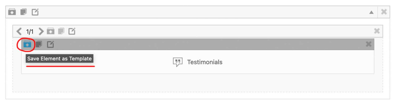
you now can insert this ( completely styled and filled with content ) ALB Element to different pages/posts – on top right of the layout builder window there is a drop-down:
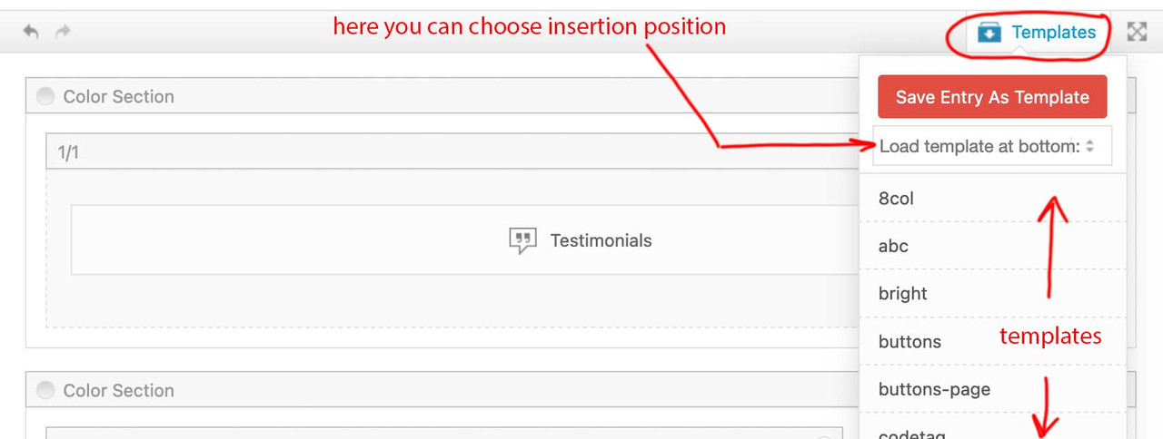
after Insertion ( top or bottom ) you now can drag that element to the wanted position.
___________
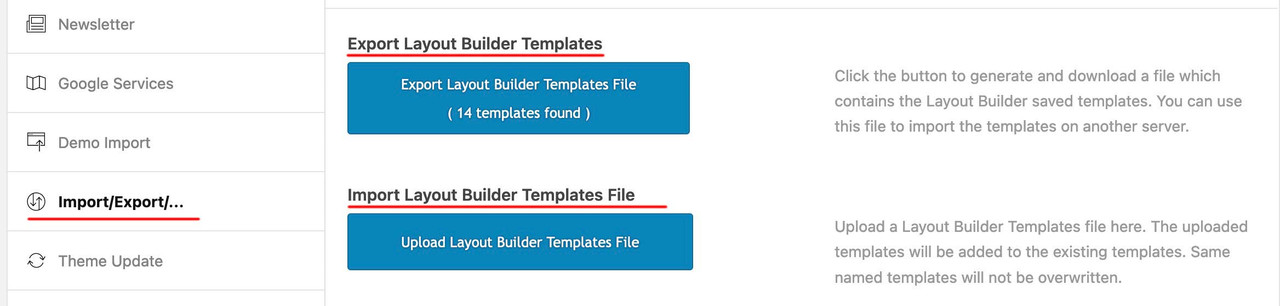
by the way: these templates could even be transformed to different installations ( but you had to think of transfering the content used inside these elements by yourself ) :
 December 28, 2023 at 7:13 am #1428937
In reply to: Alternative minimum height for mobile
give a custom class to your color-section – f.e. : fifty
then put your rules inside a media-query: ( if you like to have it on a different screen-width than 767px – change that f.e. to 989px )
@media only screen and (max-width:767px) {
  .responsive #top .avia-section.fifty {
    height: 50vh;
  }
}
PS: if you really like to have that only for mobile devices – and not for small screen sizes ? you can change that selector ( and use the enfold default class for mobile devices: avia_mobile ):.responsive.avia_mobile #top .avia-section.fifty { height: 50vh; }December 28, 2023 at 4:43 am #1428936Topic: Alternative minimum height for mobile
in forum EnfoldEnfoldfanatic
ParticipantHi guys,
I’m using the color section on a homepage with a minimum height set at 90%, however this applies on both desktop and mobile. For mobile I would like to set a min-height of 50%. I couldn’t find some css snippet for such setting on the documentation page https://kriesi.at/documentation/enfold/color-section/#toggle-id-1.
What would be the proper CSS snippet to set an alternative min height on mobile viewports?
Thanks and regards,
SDecember 27, 2023 at 9:54 pm #1428928Topic: Any one there?
in forum Enfolddaves1997
Participantmy previous topic went unanswered. The more I try to fix the worse it gets
December 27, 2023 at 5:50 pm #1428915In reply to: Blog titel
Hey Anouk,
For your blog page, try this CSS in your Enfold Theme Options ▸ General Styling ▸ Quick CSS field:.html_elegant-blog #top .post-entry .post-title, .html_elegant-blog .avia-content-slider .slide-entry-title { text-transform: none; color: red; }Feel free to change the color to suit.
Please ensure to copy the code from the forum and not an email notification so the symbols are not converted.
After applying the css, please clear your browser cache and check.Best regards,
MikeDecember 27, 2023 at 5:07 pm #1428911In reply to: Social Icon Hover
Hey northorie,
Try this CSS in your Enfold Theme Options ▸ General Styling ▸ Quick CSS field:#top #wrap_all .av-social-link-instagram:hover a, #top #wrap_all .av-social-link-instagram a:focus { color: #fff; background-color: purple; }Please ensure to copy the code from the forum and not an email notification so the symbols are not converted.
After applying the css, please clear your browser cache and check.Best regards,
MikeDecember 27, 2023 at 12:28 pm #1428906In reply to: Images side by side
Hey sophiasbiti,
To align your two icons side-by-side and center them in the page, try this CSS in your Enfold Theme Options ▸ General Styling ▸ Quick CSS field:#top.page-id-3264 .avia-builder-el-20 { text-align: center; } #top.page-id-3264 .avia-builder-el-20 .avia-image-container { display: inline; }the expected results:

To have the icons closer you will need to choose images with less empty space around them, here you can see the empty space:

Best regards,
MikeDecember 26, 2023 at 7:03 pm #1428892Hey Hector Moya,
Thanks for your question, but we don’t have any experience with the Kadence blocks, and I’m not sure how you would be able to use a block plugin within the Enfold Advanced Layout Builder since it doesn’t support “blocks”. Typically we don’t recommend using any other builders as they tend to conflict with the ALB, and the ALB can not be removed from Enfold.
I don’t see a practical way to create your pages with the Gutenberg editor and use the functionality of the Enfold elements.
I took a look at your page, specifically the header, but it seems to be fullwidth. Perhaps if your create a test page where you can demonstrate the issue, we can recommend so css, but I’m not sure if you will experience more conflicts as you create your site using the Kadence blocks, I would recommend using the Enfold elements to create your site.
That said if I had to use the Kadence blocks for a full-width hero header, I would try to use the Kadence blocks shortcode and inject the hero header using the ava_after_main_container hook, here is an example
If Kadence blocks doesn’t have a shortcode you could create one, or try some css like this to make the child element fullwidth when the parent is not:.hero_container { width: 100vw !important; position: relative !important; left: calc(-50vw + 50%) !important; }Please note that using the contact form which is not appropriate for support questions, please log in to the support forum and open a new thread if you need further assistance.
If you are unable to login to the support forum because you don’t have a activate support contract, please try going to your Theme Forest account and renew your support and then log in to the support forum and open a new thread.Best regards,
MikeDecember 25, 2023 at 7:59 am #1428858Topic: Vetrical Tabs
in forum EnfoldStephenStamp
ParticipantI am trying to create a section with vertical tabs. your demo has a similar section with horizontal tabs across the top under the heading “Deep integration for market-leading plugins.”
I have gone to the documentation and find that there is nothing addressing this or anything to assist with vertical tabs. further to this the link to your you tube video I cannot view as it reports an error that it is a private video. I have logged into YouTube and still receive the same error message.I would like to create the section with the vertical tabs on the left, as I have a requirement for 14 tabs I would also like to break this section into two lots of 7 tabs showing a more or next page on the first column where the vertical tabs are,
in the right side I would like to show the content for each tab..i cannot attach an image which may demonstrate this better
December 25, 2023 at 7:08 am #1428857In reply to: cache not working
Yigit thnk you for answering
enabling the “Delete Old CSS And JS Files?” option in the Enfold theme option has absolutely no effect on the problem. Please note that the dynamic caching on siteground works together with a speed optimizer plugin made by them. As I said this was working fine for years and suddenly stopped having as a result the site to b slow and consuming huge resourcesregards
JohnDecember 23, 2023 at 7:31 pm #1428830In reply to: Header: Language selector
-
AuthorSearch Results
-
Search Results
-
Hello and happy new year.
Thanks for the great WordPress theme. I have a question about the layer slider in mobile view.
This is displayed below the burger menu and below the white bar.
I think it would be good if the layer slider in the mobile view had the same properties as in the desktop version. In the Layerslider Project Settings I have set the responsive layout. At the moment the complete slider is reduced in size and displayed as an image under the white menu bar.
The burger menu should be displayed transparent and the layer should be displayed as full size. (like in the desktop view) Is this possible?
Thanks for your guidance and help.Greetings
MichaelHi guys,
I’m using the color section on a homepage with a minimum height set at 90%, however this applies on both desktop and mobile. For mobile I would like to set a min-height of 50%. I couldn’t find some css snippet for such setting on the documentation page https://kriesi.at/documentation/enfold/color-section/#toggle-id-1.
What would be the proper CSS snippet to set an alternative min height on mobile viewports?
Thanks and regards,
STopic: Any one there?
Topic: Vetrical Tabs
I am trying to create a section with vertical tabs. your demo has a similar section with horizontal tabs across the top under the heading “Deep integration for market-leading plugins.”
I have gone to the documentation and find that there is nothing addressing this or anything to assist with vertical tabs. further to this the link to your you tube video I cannot view as it reports an error that it is a private video. I have logged into YouTube and still receive the same error message.I would like to create the section with the vertical tabs on the left, as I have a requirement for 14 tabs I would also like to break this section into two lots of 7 tabs showing a more or next page on the first column where the vertical tabs are,
in the right side I would like to show the content for each tab..i cannot attach an image which may demonstrate this better