Hi,
I see three errors in the browser console:

the last two are:
Google Maps JavaScript API error: InvalidKeyMapError
Google Maps JavaScript API warning: NoApiKeys
I believe both of these are because your map API key is not added to the page, the map API key is typically added via javascript and you should be able to find it in the page source code by searching with Ctrl+F (windows), I didn’t see it, but I don’t know your exact API key, so try search the source code for it.
Anyways, the point that I’m getting at is the first javascript error in the browser console, a jQuery is not defined for a meta property with this link:
/event/blazers-vs-clippers-fundraiser/?instance_id=1309

it seems that jQuery is treating /?instance_id=1309 as jQuery code, when it is not, and sometimes when there is a break in jQuery it stops the rest of the scripts to also break. So perhaps the javascript to add the map api is not running because of this error.
Try removing this error first and see if that helps.
I believe the link is your event url, so try removing ?instance_id=1309 from the link as a test and see if this solves the first error, and the map error too.
Best regards,
Mike
Hi,
I have not researched any plugins with this feature, but you could use this CSS in your Enfold Theme Options ▸ General Styling ▸ Quick CSS field to hide the top cart section that is not needed:
#top.woocommerce-cart .woocommerce.wp-block-group[data-block-name="woocommerce/classic-shortcode"] {
	display: none;
}
Perhaps this is the default behavior of the plugin.
Best regards,
Mike
Hey laptophobo,
I’m seeing this error in the browser console: https://developers.google.com/maps/documentation/javascript/error-messages#invalid-key-map-error. Could you try following the instructions there to see if that helps?
Best regards,
Rikard
Hi,
Great, I’m glad that Ismael could help you out. Please let us know if you should need any further help on the topic, or if we can close it.
Best regards,
Rikard
Hi,
Great, I’m glad that you got it working, and thank to @guenni007 for helping out :-)
Please let us know if you should need any further help on the topic, or if we can close it.
Best regards,
Rikard
Hi,
Great, I’m glad that Ismael could help you out. Please let us know if you should need any further help on the topic, or if we can close it.
Best regards,
Rikard
This reply has been marked as private.
Hi,
Thank you for the link to your site, portfolio post IDs are different than page IDs, this is an example:
#top.postid-364 #av_section_1 > .container {
	padding: 0;
}
I adjusted all three and they are now showing correctly.
Please clear your browser cache and check.
Best regards,
Mike
I wonder why the fonts are popping up here as load stopper and how to solve that
Hi,
Try adding this CSS in your Enfold Theme Options ▸ General Styling ▸ Quick CSS field:
#top strong > a {
    text-decoration: underline!important;
}
Please ensure to copy the code from the forum and not an email notification so the symbols are not converted.
After applying the css, please clear your browser cache and check.
Best regards,
Mike
Hi,
In line with my earlier request and your solution, I want to do the same now for portfolio items/pages.
However, the css does not work for these.
What should I change in this text ,except for the number?
#top.page-id-2129 #av_section_1 > .container {
padding: 0;
}
Hi,
Thanks for the feedback, I see that your image has 50% black area on the left, and a person on the right on your desktop size screen.
If you also want this for mobile and you don’t require the slider to be full height, then try the “Fullwidth Easy Slider” instead of the “Fullscreen” slider that you are using, the Fullwidth slider will scale down for mobile.
Or you can use the Fullscreen slider you have now for desktop, and the Fullwidth for mobile, to do this go to the advanced tab and the Responsive settings for each slider and choose the devices to hide the slider on:

If I don’t understand correctly perhaps a mock up would help us understand better.
Best regards,
Mike
Hi Mike,
Very nice that you responded quickly. I couldn’t find where to open a new topic so I put it in my penultimate one. I would like to know how I can do this better.
What you just explained to me is very new to me. So I don’t really understand what to do. I can move the photos, but I would of course prefer it if the photo were shown in full. Should I perhaps choose a different slide view for this?
And what I also wonder is whether there is an easy plugin with which I can easily adjust everything at mobile phone level?
I would like to hear a response and hopefully you can help me on my way. Because the website is online now and does not look very neat to the customer.
Greetings,
Fa
Hi,
This looks like a new topic, please note that we ask that each thread stays on a specific topic, this helps other users find solutions based on the opening subject line quicker.
When I check you site on mobile your slider is fullscreen, so I assume that you are asking if it can be fullscreen and so the background image similar to the desktop version.
Your slider is using a landscape image, but mobile is typically a portrait layout, so your best solution would be to create a second slider for mobile devices and choose a image in a portrait layout.
Or you could try moving the image to the left so the person is shown in the middle on mobile devices with this css:
@media only screen and (max-width: 767px) {
#top.home .avia-fullscreen-slider .avia-slideshow-inner .avia-slideshow-slide {
	background-position: right center !important;
}
}
Please ensure to copy the code from the forum and not an email notification so the symbols are not converted.
After applying the css, please clear your browser cache and check.
Please note that testing with iPads & iPhones can be hard to clear the cache, often you need to also clear the history to fully purge the cache, following these steps for Safari and note Step 4 where you will Clear the History.
If this helps you with this topic please let us know so we can close this thread.
Thank you for your patience and understanding and for using Enfold.
For further questions please open a new thread
Best regards,
Mike
I added to my custom css file a rule that all links should be underlined as follows:
#top >a {
    text-decoration: underline!important;
}
#top >a strong {
    text-decoration: underline!important;
}
This works fine in pages. However in text fields present in posts or portfolio the rule is not applied. Inspecting at the rules applied I see that a rule on base.css overwrites my custom rules:
#top a:where(:not(.wp-element-button)) {
	text-decoration: none;				/*	WP 6.1 fix   */
}
I added then in my custom rule a new one:
 #top a:where(:not(.wp-element-button)) {
	text-decoration: underline!important;
}
But this new rule doesn’t affect the whole post page. I tried to clear cache, both from my browser and from the server, but the base.css rule still overwrites my custom rule.
How can I fix it? Thanks
-
This topic was modified 2 years, 3 months ago by
 elenapoliti.
Hey Enfoldfanatic,
Thank you for the inquiry.
Edit the Accordion element and make sure that the Content > Behavior > Behavior is set to Multiple toggles open allowed. You can then add this script in the functions.php file to programmatically open all toggles only on desktop view.
function av_custom_inline_script()
{
    wp_add_inline_script( 'jquery',
    "
    (function($) {
        var windowsize = $(window).width();

        if (windowsize > 1024) {
            $(window).on('load', function() {
                $('.toggler').trigger('click');
                $('.toggler').addClass('activeTitle');
                $('.toggle_wrap').addClass('active_tc');
            });
        }
    })(jQuery);
    "
    );
}
add_action( 'wp_enqueue_scripts', 'av_custom_inline_script' );
Best regards,
Ismael
Hey fabienneRedUmb,
Thank you for the inquiry.
You can leave the Heading Font Sizes and Subheading Font Sizes of the Special Heading elements set to Default, and define the font size for headings (h1, h2, h3, etc.) in the Enfold > Advanced Styling panel. Afterward, you can add the following css code to adjust the default size of the subheading element relative to the configurations or style adjustments made in the Advanced Styling panel.
#top .av-subheading {
    font-size: 1.2em !important;
}
Best regards,
Ismael
Hey Diana,
Try this CSS in your Enfold Theme Options ▸ General Styling ▸ Quick CSS field:
#top #header.av_header_transparency .avia-menu-fx {
    bottom: -1px;
}
After applying the css, please clear your browser cache and check.
Best regards,
Mike
Hi there,
Would it be possible to add some CSS which defines that for a certain toggle accordeon element all toggles are opened on desktop viewports while the toggles keep nicely collapsed on mobile viewports.
Currently the toggles are standard closes, wish to open them all standard from a viewpoint of 768 or higher.
Thanks in advance!
Hi,
On your blue site the border has been removed with this custom css:
.container_wrap {
    border-top: none !important;
}
You can remove it to show the border.
Best regards,
Mike
The red line is at the top in Chrome and Firefox and the blue line is not. If your browser is in dark mode it is difficult to see.
Thanks
Hey Maxime,
The version of the theme you are running is very old and not compatible with newer versions of PHP. Please try to update to the latest version (5.6.9) to see if that helps. The update to 5.6.9 has to be done manually from the version you are running, please refer to my replies in this thread: https://kriesi.at/support/topic/enfold-4-5-theme-update-update-failed-download-failed-a-valid-url-was-not-pro/#post-1021541
You can either update manually via FTP: https://kriesi.at/documentation/enfold/how-to-install-enfold-theme/#theme-update, or upload it as if it was a new theme under Appearance in the WordPress menu.
If that doesn’t work then please try to delete the whole theme folder, then replace it with the new version. Make sure that you have backups of the site before starting updating.
Also please read this after you have updated: https://kriesi.at/documentation/enfold/theme-registration/
If you don’t have access to the Themeforest account which was used to purchase the theme, then please try reaching out to the person who bought it.
Best regards,
Rikard
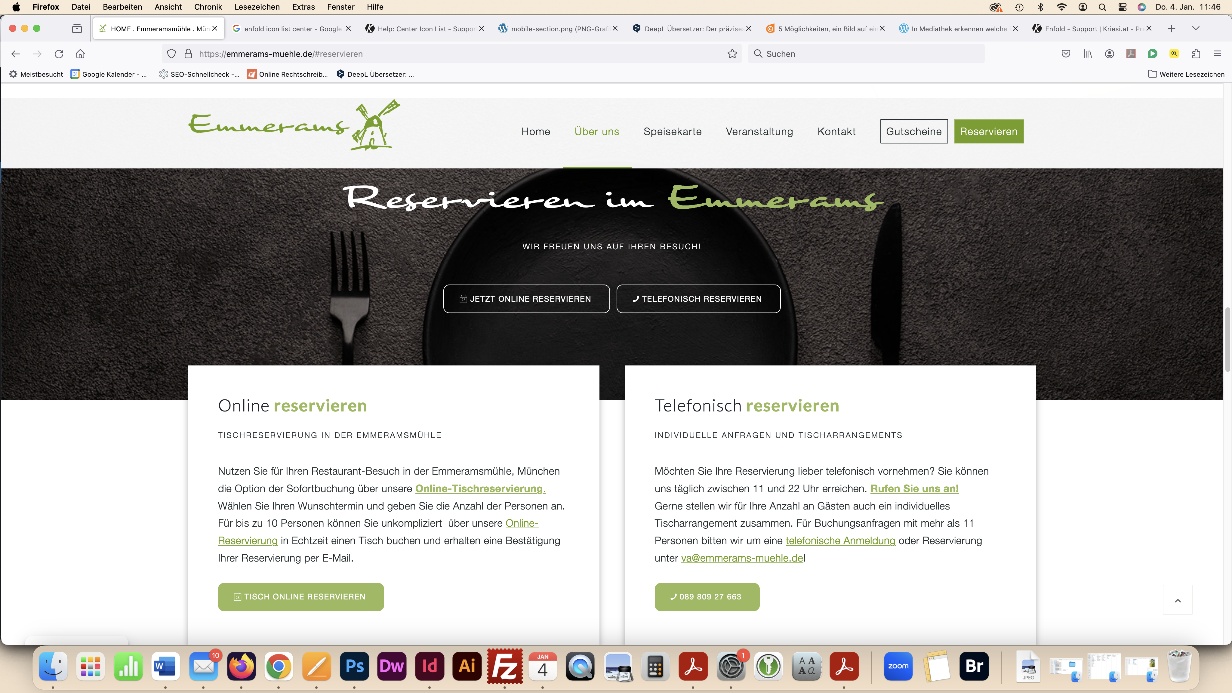
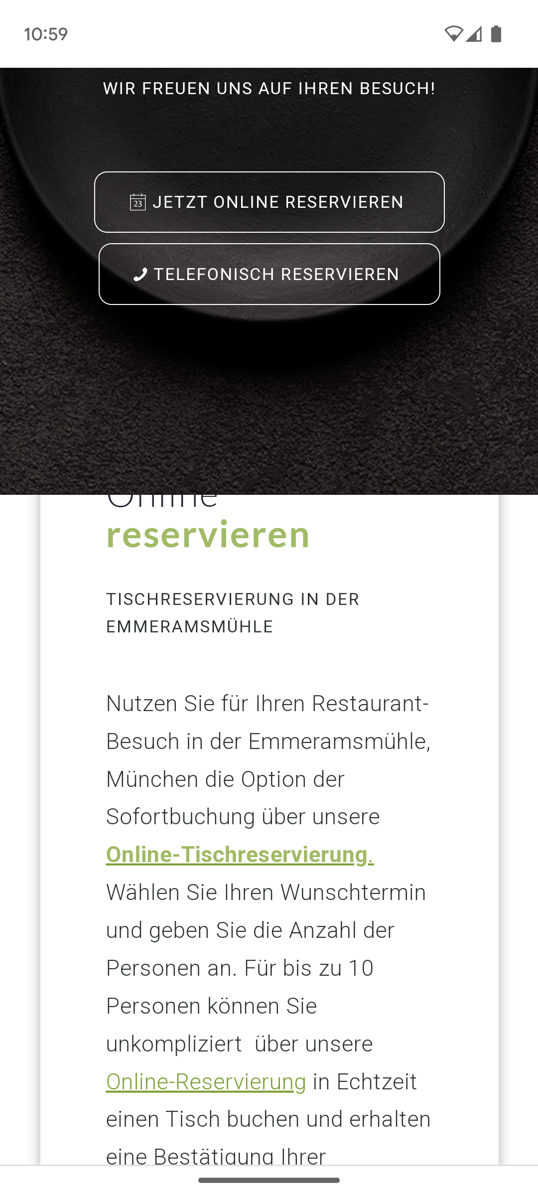
Dear Support Team,
On the website https://emmerams-muehle.de/#reservierung I have 2 columns (within a section = “Online Reservieren ” and “Telefonisch Reservieren”) which move over the previous color section (= dark background with “Reservieren im Emmerams”) when scrolling.
This works perfectly on the desktop PC and is displayed correctly: see screenshot: https://emmerams-muehle.de/support/desktop-section.png
Only on the cell phone the white column does not move over the element, but under it: see screenshot: https://emmerams-muehle.de/support/mobile-section.png
What can I do so that it is also displayed above it on the cell phone?
Many thanks for your support.
Best regards, Diana
Hi,
The quantity fields do not show on mobile by design, because there is not enough room.
There is no setting to show it, if you want to show it please try the css above or try one of these:
Best regards,
Mike
Hi I embarrassed to ask this but I can’t find how a line is showing at the top of a site. I duplicated the site so all code is the same but there is no line at the top of the duplicate:
Original:
Duplicate:
Please can you take a look and let me know how to create a blue line at the top of the duplicate and if poss let me know how you found it.
Thanks again
Rob
Sorry it was only renamed, making some changes with my client:
sorry im not a programer and i do not now how to use the validators. I know some basics but thats all.
i tryed to use the validators, but get results i do not understand and show 720 issues.
https://paste.pics/Q5Y24
I do not understand this. I have used only the back end to format the content. I do not use any sepcial code. Where is the problem?
I see no tags in text view on most of the contet and when there are tags they are properly closed:
https://paste.pics/Q5Y2M
https://paste.pics/Q5Y2P
All the headings have on backend properly closed tags:
https://paste.pics/Q5WAB
What else can i do??
I have 5 licenses of this theme, but when it is necessary i will buy another one to solve this problem.
This is a mission critical content from my top client and i cannot work with it.
And one another observation:
I saved the content of this page to template – not to loose it (becouse i redesigned it from scratch two times).
When i load it from tepmplate and save – it works.
But after this when i try to do some changes and save – all of the content from tabs is missing.
Thank you for your help.
if you got a link on your private Content field – i could not see this as participant.
So maybe a mod should adjust it for you.
btw: if you got the hamburger icon from the beginning the media query aren’t needed!
you can put inside the same media query to have then complete:
@media only screen and (max-width:989px) {
  .responsive #top .av-burger-menu-main  {
    top: -5px
  }
  #top .av-burger-menu-main .av-hamburger-box strong {
    display: block !important;
    position: absolute;
    top: -10px;
    left: 50%;
    transform: translateX(-50%);
    color: var(--enfold-header_burger_color);
  }
  #top #header.av_header_transparency .av-burger-menu-main .av-hamburger-box strong {
    color: var(--enfold-header_replacement_menu_color);
  }
}
colors if burger menu is active – f.e.:
#top .header_color .av-hamburger--spin.is-active .av-hamburger-inner,
#top .header_color .av-hamburger--spin.is-active .av-hamburger-inner::before,
#top .header_color .av-hamburger--spin.is-active .av-hamburger-inner::after{
  background-color: #FFF;
}

#top .av-burger-menu-main .av-hamburger--spin.is-active .av-hamburger-box strong {
  color: #FFF ;
}


