-
AuthorSearch Results
-
January 28, 2024 at 12:29 am #1432247
In reply to: Sticky menu on mobile
Hey northorie,
Typically a sticky header would be achieved with this CSS in your Enfold Theme Options ▸ General Styling ▸ Quick CSS field:@media only screen and (max-width: 767px) { .responsive #top #wrap_all #header { position: fixed; } }but if you only want a sticky burger icon you could try this:
@media only screen and (max-width: 767px) {
  .responsive #top #wrap_all #header .av-burger-menu-main {
    position: fixed;
  }
}
If this doesn’t help please include the url to the page in question so we can take a closer look.
Best regards,
MikeJanuary 28, 2024 at 12:09 am #1432246In reply to: Display Entries From A Custom Taxonomy
Hey dmooredesign,
To display your CPT, try adding this to your child theme functions.php:add_theme_support('add_avia_builder_post_type_option'); add_theme_support('avia_template_builder_custom_post_type_grid');Please ensure to copy the code from the forum and not an email notification so the symbols are not converted.
See this thread.Best regards,
MikeJanuary 27, 2024 at 11:49 pm #1432245Hi,
Try this CSS in your Enfold Theme Options ▸ General Styling ▸ Quick CSS field:@media only screen and (max-width: 989px){ .html_mobile_menu_tablet #top #wrap_all .av_header_transparency { background-color: transparent; } .responsive #top #main { margin-top: 0; } }After applying the css, please clear your browser cache and check.
Best regards,
MikeJanuary 27, 2024 at 11:34 pm #1432244In reply to: tables column widths
Hi,
Try this CSS in your Enfold Theme Options ▸ General Styling ▸ Quick CSS field:#top.page-id-472 #main .main_color .avia-data-table * { border: none; background-color: #fff; font-size: 18px; text-align: left; } #top.page-id-472 .main_color .avia-data-table.avia_pricing_minimal th { color: #009bdd; width: 10%; }Best regards,
MikeJanuary 27, 2024 at 10:55 pm #1432241web4698
ParticipantHi there,
In WooCommerce the mobile menu, profile icon, and cart icon overlap the logo.
I used this coding which works but it creates another issue with the sticky the menu in desktop mode lossing it’s white background. I’ve attached a screenshot./*—— Burger Menu Mobile —-*/
.responsive #top #wrap_all .av_mobile_menu_tablet .main_menu {
position: absolute !important;
right: 0px !important;
}
.responsive.html_bottom_nav_header #top #menu-item-shop.cart_dropdown {
position: absolute !important;
right: -45px !important;
}
/*—— END Burger Menu Mobile —-*/January 27, 2024 at 9:18 pm #1432237I was asking if the to logo area can have the image behind it, instead of black, like the desktop has. Is that possible or does it have to have black bar? see screenshot top area: https://drive.google.com/file/d/1mur2XboO1ramxj6X8GRGIvIKUyLpeKj7/view?usp=sharing
January 27, 2024 at 9:17 pm #1432235Topic: Mobile menu main font smaller
in forum Enfoldausgesonnen
Participanthi there,
on mobile – how can I make the top level font smaller compared to the sublevel fonts?I found the option: Menü-Links in Seitenüberlagerung/-verschiebung, but when I change the font size there, it makes both smaller, the top and the sublevel. I only want to make the top level smaller.
Please send css.
Thanks
Peter-
This topic was modified 2 years, 2 months ago by
ausgesonnen.
January 27, 2024 at 4:55 pm #1432223In reply to: Backend not loading on a Mac
You can close the topic Rikard.
Thank you for your help.
Best reragds, Rogier
January 27, 2024 at 3:13 pm #1432217In reply to: Font does not work in Safari
Hi Monika,
Great, I’m glad to hear that it’s working as it should. @guenni007 did not login to your site, since he doesn’t have access to details posted in private. Thanks for helping out @guenni007 :-)
Please let us know if you should need any further help on the topic, or if we can close it.
Best regards,
RikardJanuary 27, 2024 at 1:32 pm #1432213In reply to: Video Media Element not showing video
Hi,
Thanks for that. Please try copying this shortcode:
[av_section min_height='' min_height_px='500px' padding='huge' shadow='no-border-styling' bottom_border='border-extra-arrow-down' bottom_border_diagonal_color='#ffffff' bottom_border_diagonal_direction='' bottom_border_style='' id='Demos' color='main_color' custom_bg='' src='https://test.kriesi.at/enfold-2017/wp-content/uploads/sites/24/2015/07/isometric-1.jpg' attachment='447' attachment_size='full' attach='scroll' position='center left' repeat='contain' video='' video_ratio='16:9' overlay_opacity='0.5' overlay_color='' overlay_pattern='' overlay_custom_pattern='' av_element_hidden_in_editor='0' av_uid='av-laduq6']
[av_one_half first min_height='' vertical_alignment='av-align-top' space='no_margin' custom_margin='aviaTBcustom_margin' margin='50px' margin_sync='true' padding='0px' padding_sync='true' border='' border_color='' radius='0px' radius_sync='true' background_color='' src='' attachment='' attachment_size='' background_position='top left' background_repeat='no-repeat' animation='left-to-right' mobile_display='' av_uid='av-l5utwe']

[/av_one_half][av_one_half min_height='' vertical_alignment='av-align-top' space='no_margin' custom_margin='aviaTBcustom_margin' margin='0px' margin_sync='true' padding='50px' padding_sync='true' border='' border_color='' radius='0px' radius_sync='true' background_color='rgba(255,255,255,0.85)' src='' attachment='' attachment_size='' background_position='top left' background_repeat='no-repeat' animation='left-to-right' mobile_display='' av_uid='av-kzc3a6']

[av_heading tag='h1' padding='20' heading='A growing library of more than 2 dozen demos' color='custom-color-heading' style='blockquote modern-quote' custom_font='#000000' size='40' subheading_active='' subheading_size='15' custom_class='' av_uid='av-kpdzb2'][/av_heading]

[av_hr class='custom' height='50' shadow='no-shadow' position='left' custom_border='av-border-fat' custom_width='50px' custom_border_color='#000000' custom_margin_top='30px' custom_margin_bottom='30px' icon_select='no' custom_icon_color='' icon='ue808' font='entypo-fontello' av_uid='av-klz60e']

[av_textblock size='' font_color='' color='' admin_preview_bg='rgb(255, 255, 255)' av_uid='av-keqweu']
Our demos are one of a kind: we only offer<strong> full concept demos</strong> with multiple pages that show whole projects, unlike others who only include a single page and call that a demo ;)

You can import them with <strong>a single click</strong>, they are easily adaptable to your needs and you can chose from a variety of layouts and niche designs. In addition to that you can also use the <strong>demo images used in our demo for your own project</strong>!
[/av_textblock]

[/av_one_half]
[/av_section]
Best regards,
RikardJanuary 27, 2024 at 1:20 pm #1432211In reply to: text around an image
Hi,
Thanks for the update. Please let us know if you should need any further help on the topic, or if we can close it.
Best regards,
RikardJanuary 27, 2024 at 1:18 pm #1432209In reply to: Backend not loading on a Mac
Hi,
Great, I’m glad that you found the problem, and thanks for sharing. Please let us know if you should need any further help on the topic, or if we can close it.
Best regards,
RikardJanuary 27, 2024 at 12:30 pm #1432204Meantime in the galaxy of the vast universe of the eternal bitmaps… Jeremy from RankMath send me this answer:
When it comes to editors, Enfold and Rank Math, the only possible conflict we can think of will be related to the Content Analysis where Rank Math may not be able to read the content.
Even for the content analysis tests, we have added API access to the content analysis in Rank Math to make content from the custom page builder readable.
You may share this guide to the developers of that page builder: https://rankmath.com/kb/content-analysis-api/
Please note that this should not affect your overall SEO performance as this issue is only happening on the backend.
But still – there are questions: (From me at Earth):
Part of: … My Reply to Jeremy!
If my content can’t be analysed by RM due to the fact that Enfold theme is not compatible – How can I then benefit from the SEO tool? – It can’t provide insight or suggestions/corrections if it cant read my content (In Danish)?? Nor show me when the contents score is good enuf to rank/outrank.
So I conclude that using Enfold on the content I already have on my site / pages can’t be analyzed by RM.
How about the AI content?
Can I copy paste my content into the AI and have it do it’s magic? – Then copy it back?I am using the Classic Editor and the AVIA pagebuilder – So could I copy/paste my content into the AI and have it analysed and work and expand the topics on a given page/topic? – Or can I only create new content with the AI and save that direct into my pages / or is that also a copy/ paste job?
Would you say that I am better off buying a new theme? That is 100% compatible? – Like X or Avada and maybe even start using the Gutenberg?
January 27, 2024 at 10:53 am #1432196In reply to: woocommerce color product
Hi,
Please try this CSS as well:
#top .main_color .price, .product_meta span {
  color: #fc6c12;
}

button.single_add_to_cart_button, .main_color .woocommerce-tabs .tabs .active, .main_color .woocommerce-tabs .tabs {
  background-color: #fc6c12;
}
Best regards,
RikardJanuary 27, 2024 at 9:51 am #1432193In reply to: Font does not work in Safari
the package you can download from google on fonts that have “variable fonts” contains a subfolder with those static fonts.
Enfold could handle variable fonts – but you had to know how to work with those variable fonts.if you only like to upload those static fonts – pull this folder form that zip file to your desktop – rename it to “Montserrat” and (important) zip it for PC ( not including the invisible OSX files generates with their compression options.). Betterzip f.e. has a drop-window where you can choose for what system you zip it.
Why this is important. if you upload that zipped file you will have an additional font in there:
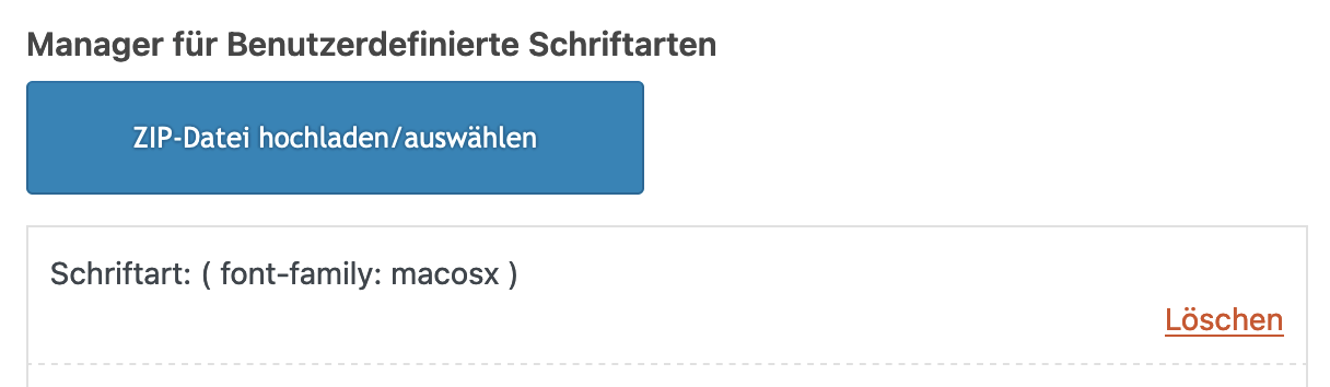
__________________
Next : Google does only offer ttf files for you. but it might be better to upload woff2 files ( brotli compression ) as font-files.
( less loading times on woff2 ). So it might be good to have both woff2 ( for modern Browsers ) and ttf (for older browser support)
see: https://kriesi.at/support/topic/host-web-font-yourself-some-info/#post-1364066
use transfonter to generate woff2 and ttf files – put them in one folder – rename the folder to your needs ( Montserrat ) – and upload that.
As mentioned there – think if you realy need an italic font to upload – because browser rendering might do a good job to of normal font.January 27, 2024 at 9:33 am #1432190In reply to: Social Media Icons won’t show on Mobile Menu
can you test in your quick css:
@media only screen and (min-width: 480px) {
  .responsive #top #header .main_menu .social_bookmarks {
    z-index: 5;
    line-height: 90px;
    margin-left: -40px
  }
}

@media only screen and (max-width: 479px) {
  .responsive.av-burger-overlay-active #top #wrap_all #header .social_bookmarks,
  .responsive.av-burger-overlay-active #top #wrap_all #main .av-logo-container .social_bookmarks {
    display:  block;
  }
  .responsive #top #header .main_menu .social_bookmarks {
    z-index: 5;
    line-height: 90px;
    margin-left: 20px;
  }
}
but i guess you had to think about a different position for those social bookmarks – maybe the header_meta is a good place for it. Because on screens smaller than 1400px your main menu overlaps your logo and the social bookmarks nav floats into a second line.
-
This reply was modified 2 years, 2 months ago by
Guenni007.
January 26, 2024 at 6:59 pm #1432173Nothing changed. Any other options?
Also, Is there a way to have the image behind the logo and Burger icon, like it is on desktop? That would solve the problem right them and move everything up. Just didn’t know if that was option for mobile.
thanks
January 26, 2024 at 4:26 pm #1432161In reply to: customer reviews – align the text at the top
Yes, you can close the topic, thank you!
Best regards,
KarinJanuary 26, 2024 at 4:08 pm #1432151In reply to: ENFOLD Theme – Demo File Import
Rikard
Yes I know how to add a new menu…
Please… follow me on this specific topic.
I don’t know HOW to add this specific item “Column Title”!!!
Since iit is not on the list on left side.
See the screenshot attached in the previous messages please.
January 26, 2024 at 4:01 pm #1432149In reply to: customer reviews – align the text at the top
Hi,
Great, I’m glad that you got it working. Please let us know if you should need any further help on the topic, or if we can close it.
Best regards,
RikardJanuary 26, 2024 at 2:39 pm #1432139In reply to: Align Menu on the bottom of header instead of center
Hi Guenni007
Thanks a lot. This works :-)
This topic can be closed.
Regards
BerndJanuary 26, 2024 at 1:22 pm #1432130In reply to: Align Menu on the bottom of header instead of center
can your try in quick css:
@media screen and (min-width:1226px) {
  #top #header .av-main-nav > li > a {
    line-height: unset !important;
    height: unset !important;
  }
  #top div.avia-menu {
    height: 100%;
  }
  #top #avia-menu {
    position: relative;
    top: calc(100% - 35px)
  }
}
January 26, 2024 at 11:30 am #1432122In reply to: Problem on show social icons in mobile header
January 26, 2024 at 11:14 am #1432117In reply to: Mobile view- Email field Border
Hi,
Great, I’m glad that Mike could help you out. Please let us know if you should need any further help on the topic, or if we can close it.
Best regards,
RikardJanuary 26, 2024 at 10:51 am #1432112In reply to: Small bar above Main Menu – font and icon size
Hi,
Thank you for the inquiry.
The css rule for the phone number should have the selector “phone-info” and “social_bookmarks” for the social icons. To hide the duplicate social icons in the main header container, please edit the last css code that we provided above and replace it with the following.
@media only screen and (max-width: 767px) {

  /* Add your Mobile Styles here */
  .responsive #top #wrap_all #header_meta .social_bookmarks {
    display: block;
  }
}
Best regards,
IsmaelJanuary 26, 2024 at 10:30 am #1432108In reply to: Problem on show social icons in mobile header
Hi,
The latest code should be placed inside the css media query. Please remove all css code related to this thread, then replace it with the following code.
@media only screen and (max-width: 767px) {

  #header_meta .container {
    display: flex;
    justify-content: flex-start;
  }

  /* Add your Mobile Styles here */
  .responsive #top #wrap_all #header .social_bookmarks,
  .responsive #top #wrap_all #main .av-logo-container .social_bookmarks {
    display: block;
    text-align: left;
    width: auto;
  }

  .responsive #header .sub_menu,
  .responsive #header_meta .sub_menu>ul {
    float: none;
    width: auto;
    text-align: center;
    margin: 0 auto;
    position: static;
    margin: 0;
  }

  .responsive #top #wrap_all #header_main .social_bookmarks {
    display: none;
  }
}
This should remove the duplicate social bookmarks container and position the icons beside the language flags in the far-left corner of the header meta container.
Best regards,
IsmaelJanuary 26, 2024 at 6:25 am #1432094bemodesign
ParticipantColor Section height 100% get cut off on Mobile View but looks right on desktop. I’m guessing it is because of the sticky top menu bar, but how do I fix this so it looks good on mobile view, without cutting off the button? Is there a way to raise it up a bit for mobile view?
January 26, 2024 at 5:09 am #1432091Topic: How to remove the slug from the homepage
in forum EnfoldRyan
ParticipantI had the same issue as this: https://kriesi.at/support/topic/how-to-remove-home-from-the-permalink-of-the-front-page/ which was never really resolved.
For anyone else encountering the issue, I figured out the answer. It doesn’t have to do with the theme, rather a wordpress setting.
to remove the slug from the homepage, in the WP dashboard go to:
Settings > Reading , then under “your homepage displays” select “a static page”
 January 26, 2024 at 4:22 am #1432087
Hi travel2unlimited,
Please try to check the solutions posted on this thread: https://kriesi.at/support/topic/prevent-auto-multi-image-generation/
I hope it helps.Best regards,
NikkoJanuary 26, 2024 at 4:18 am #1432086In reply to: Failed to Decode Downloaded Font
Hi havi,
Have you updated the theme via ftp? you have similar issue in this post: https://css-tricks.com/forums/topic/custom-fonts-returns-failed-to-decode-downloaded-font/#post-238852 can you try the solution posted there?
Best regards,
Nikko -
This topic was modified 2 years, 2 months ago by
-
AuthorSearch Results
-
Search Results
-
Hi there,
In WooCommerce the mobile menu, profile icon, and cart icon overlap the logo.
I used this coding which works but it creates another issue with the sticky the menu in desktop mode lossing it’s white background. I’ve attached a screenshot./*—— Burger Menu Mobile —-*/
.responsive #top #wrap_all .av_mobile_menu_tablet .main_menu {
position: absolute !important;
right: 0px !important;
}
.responsive.html_bottom_nav_header #top #menu-item-shop.cart_dropdown {
position: absolute !important;
right: -45px !important;
}
/*—— END Burger Menu Mobile —-*/hi there,
on mobile – how can I make the top level font smaller compared to the sublevel fonts?I found the option: Menü-Links in Seitenüberlagerung/-verschiebung, but when I change the font size there, it makes both smaller, the top and the sublevel. I only want to make the top level smaller.
Please send css.
Thanks
PeterColor Section height 100% get cut off on Mobile View but looks right on desktop. I’m guessing it is because of the sticky top menu bar, but how do I fix this so it looks good on mobile view, without cutting off the button? Is there a way to raise it up a bit for mobile view?
I had the same issue as this: https://kriesi.at/support/topic/how-to-remove-home-from-the-permalink-of-the-front-page/ which was never really resolved.
For anyone else encountering the issue, I figured out the answer. It doesn’t have to do with the theme, rather a wordpress setting.
to remove the slug from the homepage, in the WP dashboard go to:
Settings > Reading , then under “your homepage displays” select “a static page”