Hi,
Try this CSS in your Enfold Theme Options ▸ General Styling ▸ Quick CSS field:
@media only screen and (max-width: 500px) {
.responsive #top #wrap_all #main {
        padding-top: 81px !important;
    }
}
Please ensure to copy the code from the forum and not an email notification so the symbols are not converted.
After applying the css, please clear your browser cache and check.
Best regards,
Mike
Hi,
The two question affect each other, so lets start with the second question.
Currently on mobile your table is like this:

To make it easier to read, how about this:

To achieve this try adding this CSS in your Enfold Theme Options ▸ General Styling ▸ Quick CSS field:
@media only screen and (max-width: 767px) {
.responsive #top.page-id-472 .avia_responsive_table .avia-data-table tr:first-child th {
	display: inline;
}
.responsive #top.page-id-472 div .avia_responsive_table .avia-data-table td, .responsive #top.page-id-472 div .avia_responsive_table .avia-data-table th {
	display: inline;
}
.responsive #top.page-id-472 .avia-data-table.avia_pricing_minimal tr {
    padding-bottom: 20px;
}
}
Ensure to keep the other css above. This also solves the first question.
Please ensure to copy the code from the forum and not an email notification so the symbols are not converted.
After applying the css, please clear your browser cache and check.
Best regards,
Mike
HI,
I’ve made the menu on mobile sticky on my second page as well with this code:
@media only screen and (max-width: 767px) {
  .responsive #top #wrap_all #header {
    position: fixed;
  }
}
But it overlays the top of my website, so that not the whole text is visible.
Can you help?
Website on private content.
Best regards!
HI,
I’ve made the menu on mobile sticky with this code:
@media only screen and (max-width: 767px) {
  .responsive #top #wrap_all #header {
    position: fixed;
  }
}
But it overlays the top of my website, so that not the whole text is visible.
Can you help?
Best regards!
Hi,
is there a way to get this done:
I would like to have a big cookie-banner-popup in the center with full color and a background with light transparency, so you can see the actual website through it. An overlay.
It shoud be responsive to work on mobile, tablet and desktop.
Best regards :)
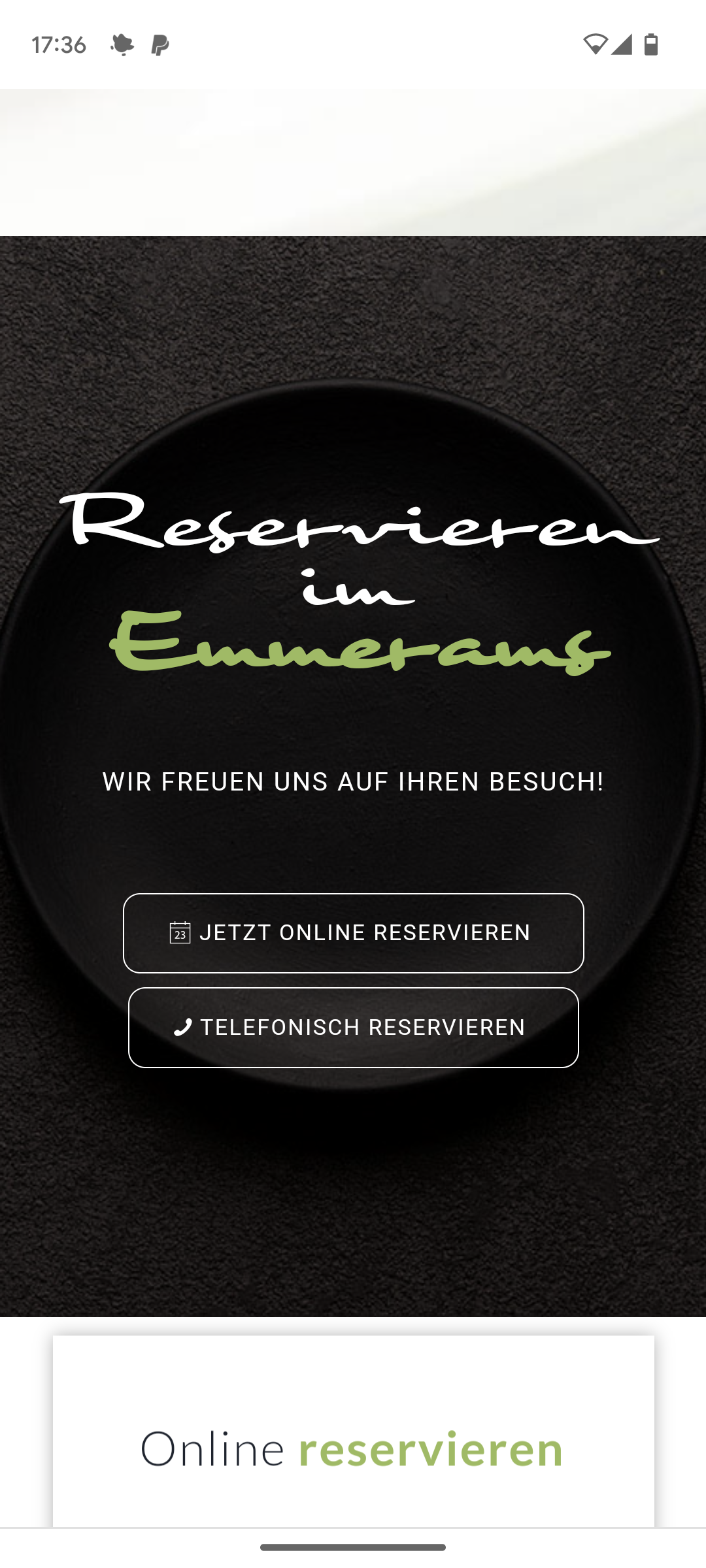
Dear Support Team,
The following 2 buttons “Jetzt online reservieren” and “Telefonisch reservieren” do not work on the cell phone: see section: https://emmerams-muehle.de/#reservierung
(> See also screenshot mobile view: https://emmerams-muehle.de/support/buttons-mobile.png)
I already had a support request regarding this section: at that time it was about the overlapping of the following boxes not working on the cell phone (see: https://kriesi.at/support/topic/overlap-cells/) > this worked wonderfully with your help, but now we have noticed that the two buttons mentioned above can no longer be clicked on the cell phone!
What can I do to make them work again on the cell phone?
Best regards Diana
Hi,
It’s added at the top of the Additional CSS box under Appearance->Customize.
Best regards,
Rikard
hello, is there a way to adjust font size and line height in the posts-element ( where you show alle posts out of one category )?
it uses quite a lot of space now and the font size is quite big
and the pencil in front of the line….can i change that? either get rid of it or get a dot instead of it?
best regards, jelle
——————
oke…ive found the font size and the title, though the line- height does not seem to do much…
( i want the titles to come closer to each other)
/* blog post element tekst managen */
#top .flex_column .template-blog .post-title {
  font-size: 12pt;
line-height: 12px;
}
-
This topic was modified 2 years, 1 month ago by
 jeel147.
-
This topic was modified 2 years, 1 month ago by jeel147.
Hi,
Great, I’m glad that Mike could help you out. Please let us know if you should need any further help on the topic, or if we can close it.
Best regards,
Rikard
Hi,
please send css for following problem: There are 3 cells in the flip box grid. When the window is wide it is ok. But when it is smaller then the cells overlap. This is because before it reaches breaking point and the images are aligned vertically, they briefly move on top of eachother. See here: https://ibb.co/7t748SZ
This looks particularly bad in the mobile version on some mobile phones with larger screens.
Please send CSS so I can adjust breaking point.
I have embedded an external page using the ‘div’ tag. On this page, there is a lightbox that can be opened. However, when opening this lightbox, the text from WordPress is displayed over the image. Unfortunately, I am not a programmer and would appreciate any help.
Embedding code::
<div data-embedded-src=”https://www.autoscout24.ch/de/hci/list?design=85&filter=676″ class=”embedded-content-area”></div><script src=”https://www.autoscout24.ch/MVC/Content/as24-hci-desktop/js/e.min.js”></script>
<script>
(function(loader){
loader
.onMessage(“open-gallery”, function openGallery(){
// code on opening the gallery
document.getElementById(“header”).style.display=”none”
document.getElementById(“footer”).style.display=”none”
document.getElementById(“socket”).style.display=”none”
})
.onMessage(“close-gallery”, function closeGallery(){
// code on closing the gallery
document.getElementById(“header”).style.display=””
document.getElementById(“footer”).style.display=””
document.getElementById(“socket”).style.display=””
});
}(window._embeddedContentLoader));
</script>
-
This topic was modified 2 years, 1 month ago by
 pmontani.
Hello I want to put the title of the images in the bottom, like in the image I send you, and in CSS (but in each image) I have to change to this:
.av-image-caption-overlay-center p:first-child {
margin-top: 170px;
}
But what exactly i have to put in that field to achieve this?
Hi,
Thanks for the update. Please let us know if you should need any further help on the topic, or if we can close it.
Best regards,
Rikard
Its says “no errors..” as well.
Mod_Security is activated, but we tested deactivating it and that didn’t change anything.
Yesterday I ended up rebuilding each page that was effected and tested along the way and it was the same weird issue for each page in that once I omitted the colon, the builder displayed properly in the admin. What’s even weirder is that there is one page that has colons, that is not effected at all. I can edit it without trouble. I can’t see any differences in the pages, so not sure how that happens. Its so odd and frustrating.
I am not even seeing that error that you mention in the error logs. I provided a copy of the logs below. They stop as of the 6th
We also activated the ini_set a couple days a go and that seemed to stop that error in the logs.
.
Hi,
I have replied to your new thread, please check.
Best regards,
Mike
Hey ausgesonnen,
Thank you for your patience, try this CSS in your Enfold Theme Options ▸ General Styling ▸ Quick CSS field:
@media only screen and (max-width: 767px) {
	.responsive #top.page-id-472 .avia_responsive_table.avia-data-table-wrap .avia-data-table td:before {
		display: none;
	}
	.responsive #top.page-id-472 .main_color .avia_responsive_table.avia-data-table-wrap .avia-data-table.avia_pricing_minimal th {
    width: 48%;
}
.responsive #top.page-id-472 .avia_responsive_table .avia-data-table {
    border-style: none;
}
}
Please ensure to copy the code from the forum and not an email notification so the symbols are not converted.
After applying the css, please clear your browser cache and check.
Please see the screenshot in the Private Content area of the expected results.
Best regards,
Mike
Hi,
Please try this instead:
#top #wrap_all .header_color .av-menu-button-colored > a .avia-menu-text:hover {
  background: orange;
}
Best regards,
Rikard
Hi,
Great, I’m glad to hear that we could help you out. Please let us know if you should need any further help on the topic, or if we can close it.
Best regards,
Rikard
Hi,
Thanks for the update. Please let us know if you should need any further help on the topic, or if we can close it.
Best regards,
Rikard
Hi Rikard,
thank you for your quick reply.
Unfortunately this doesn’t work.
I used now the “combination” between Yigits lines and yours:
#top #wrap_all .header_color .av-menu-button-colored > a .avia-menu-text {
background: black;
border: none;
}
#menu-item-166 a:hover {
background-color: orange;
}
Best regards
Grobi
Hi,
To make the header have the same width as your page content, add this CSS in your Enfold Theme Options ▸ General Styling ▸ Quick CSS field:
.responsive #top #header #header_main {
    padding: 0 50px;
    margin: auto;
    max-width: 1310px;
}
but this will also effect your menu, since it is in the same element, so you may wish to remove the menu background color with this css:
.responsive #top #header #header_main #header_main_alternate.container_wrap {
    background: #fff;
    border-top-style: none;
}
Please ensure to copy the code from the forum and not an email notification so the symbols are not converted.
After applying the css, please clear your browser cache and check.
Best regards,
Mike
Hey Koen,
There are no problems like that with the current version of the theme, so it will likely be solved.
The update to 5.6.10 has to be done manually from the version you are running, please refer to my replies in this thread: https://kriesi.at/support/topic/enfold-4-5-theme-update-update-failed-download-failed-a-valid-url-was-not-pro/#post-1021541
You can either update manually via FTP: https://kriesi.at/documentation/enfold/how-to-install-enfold-theme/#theme-update, or use a plugin to upload the theme zip file: https://wordpress.org/plugins/update-theme-and-plugins-from-zip-file/
If that doesn’t work then please try to delete the whole theme folder, then replace it with the new version. Make sure that you have backups of the site before starting updating.
Also please read this after you have updated: https://kriesi.at/documentation/enfold/theme-registration/
Best regards,
Rikard
Hi,
Thanks for the update. Please let us know if you should need any further help on the topic, or if we can close it.
Best regards,
Rikard
Hi,
Please try this CSS as well:
@media only screen and (max-width: 767px) {
  .responsive #header_meta .social_bookmarks li {
    border-top: none;
    border-bottom: none;
  }
}
Best regards,
Rikard
Hi,
Great, I’m glad that we could help. Please let us know if you should need any further help on the topic, or if we can close it.
Best regards,
Rikard
Hey juncruz562,
Thank you for the inquiry.
You can add this css code to center align the text or the phone info.
.html_header_top #top .av_header_stretch .container {
    display: flex;
    justify-content: center;
}
Best regards,
Ismael
Hi,
Thank you for the update.
You have to move the css rule inside the css media query.
@media only screen and (max-width: 1024px) {
  /* move the css code here */
}
Please remove the previous the css modifications, then replace it with the following code:
@media only screen and (max-width: 1024px) {
   .responsive #top #wrap_all .flex_column.av-break-at-tablet, .responsive #top #wrap_all .av-break-at-tablet .flex_cell {
       margin: 0;
       margin-bottom: 20px;
       width: 100%;
       display: block;
       height: auto;
       overflow: hidden;
   }
}
Best regards,
Ismael
Hi!
Thank you for the inquiry.
Are you referring to the “Excellent, Caring, and Accessible Healthcare ” in the top header? You can add the following css code to set the color of the text to black.
#top #header_meta a, #top #header_meta li, #top #header_meta .phone-info {
    color: #000000;
}
Best regards,
Ismael