-
Search Results
-
HI.
I have a layout for the home page that looks perfect in Desktop mode but compressed in Tablet mode and looks terrible in mobile mode. The Margins or padding left and right for the rows that begin with: Working With Us is Easy and Hi. I’m Robert are the rows in question.
Note: The row beginning with: Do Your Outdoor Areas Need a Makeover? looks very nice in all modes. I worked with Chat GPT in Appearance…Customize…CSS to resolve the layout issues for this row. Chat GPT seems unable to resolve the other two rows,
Please review this screenshot video: https://www.awesomescreenshot.com/video/41493405?key=78aeb216a83b4cc7d4c8017d672fef92
It presents the problem at hand.
I would appreciate it if you could please advise me on how to fix the problems with the layout with these columns on the home page.
Hi
here is a severe issue: “Taxonomy tags of masonry element incomplete”1: Open gwup.org
2: Scroll down until “Vollständige Artikel”
3: Find this list of filterable tags (taxonomy) – it is NOT COMPLETE
4: Click on the button” “Mehr laden”
5: NOW you see the complete list.See video here:
[video src="https://www.gwup.org/temporaer/taxonomy-issue.mp4" /]This is a severe issue.
Please tell us how to fix it!Here is the code:
[av_masonry_entries link='category,2780,2781,2779,2782,2793,2797,2783,2784,2798,2799,2800,2801,2785,2786,2787,2788,2802,2792,2789,2803,2804,2805,2790' term_rel='' wc_prod_visible='' wc_prod_hidden='hide' wc_prod_featured='' prod_order_by='' prod_order='' date_filter='' date_filter_start='' date_filter_end='' date_filter_format='yy/mm/dd' period_filter_unit_1='1' period_filter_unit_2='year' page_element_filter='skip_current' sort='yes-tax' query_orderby='date' query_order='DESC' caption_elements='title excerpt' caption_styling='' caption_display='on-hover' img_copyright='' size='fixed masonry' orientation='' image_size='masonry' gap='large' columns='4' av-desktop-columns='' av-medium-columns='' av-small-columns='' av-mini-columns='' items='12' paginate='load_more' color='custom' custom_bg='' img_copyright_font='' av-desktop-font-img_copyright_font='' av-medium-font-img_copyright_font='' av-small-font-img_copyright_font='' av-mini-font-img_copyright_font='' img_copyright_color='' img_copyright_bg='' animation='active' animation_duration='' animation_custom_bg_color='' animation_custom_bg_color_multi_list='' animation_z_index_curtain='100' overlay_fx='active' img_scrset='' lazy_loading='disabled' av-small-hide='aviaTBav-small-hide' av-mini-hide='aviaTBav-mini-hide' alb_description='' id='' custom_class='' template_class='' av_uid='av-m7i3btdw' sc_version='1.0']
[av_masonry_entries link='category,2780,2781,2779,2782,2793,2797,2783,2784,2798,2799,2800,2801,2785,2786,2787,2788,2802,2792,2789,2803,2804,2805,2790' term_rel='' wc_prod_visible='' wc_prod_hidden='hide' wc_prod_featured='' prod_order_by='' prod_order='' date_filter='' date_filter_start='' date_filter_end='' date_filter_format='yy/mm/dd' period_filter_unit_1='1' period_filter_unit_2='year' page_element_filter='skip_current' sort='yes-tax' query_orderby='date' query_order='DESC' caption_elements='title excerpt' caption_styling='' caption_display='on-hover' img_copyright='' size='fixed masonry' orientation='' image_size='masonry' gap='large' columns='4' av-desktop-columns='' av-medium-columns='' av-small-columns='' av-mini-columns='' items='3' paginate='load_more' color='custom' custom_bg='' img_copyright_font='' av-desktop-font-img_copyright_font='' av-medium-font-img_copyright_font='' av-small-font-img_copyright_font='' av-mini-font-img_copyright_font='' img_copyright_color='' img_copyright_bg='' animation='active' animation_duration='' animation_custom_bg_color='' animation_custom_bg_color_multi_list='' animation_z_index_curtain='100' overlay_fx='active' img_scrset='' lazy_loading='disabled' av-desktop-hide='aviaTBav-desktop-hide' av-medium-hide='aviaTBav-medium-hide' alb_description='' id='' custom_class='' template_class='' av_uid='av-m7rio00o' sc_version='1.0']
mfg
AndrèDear Enfold Team,
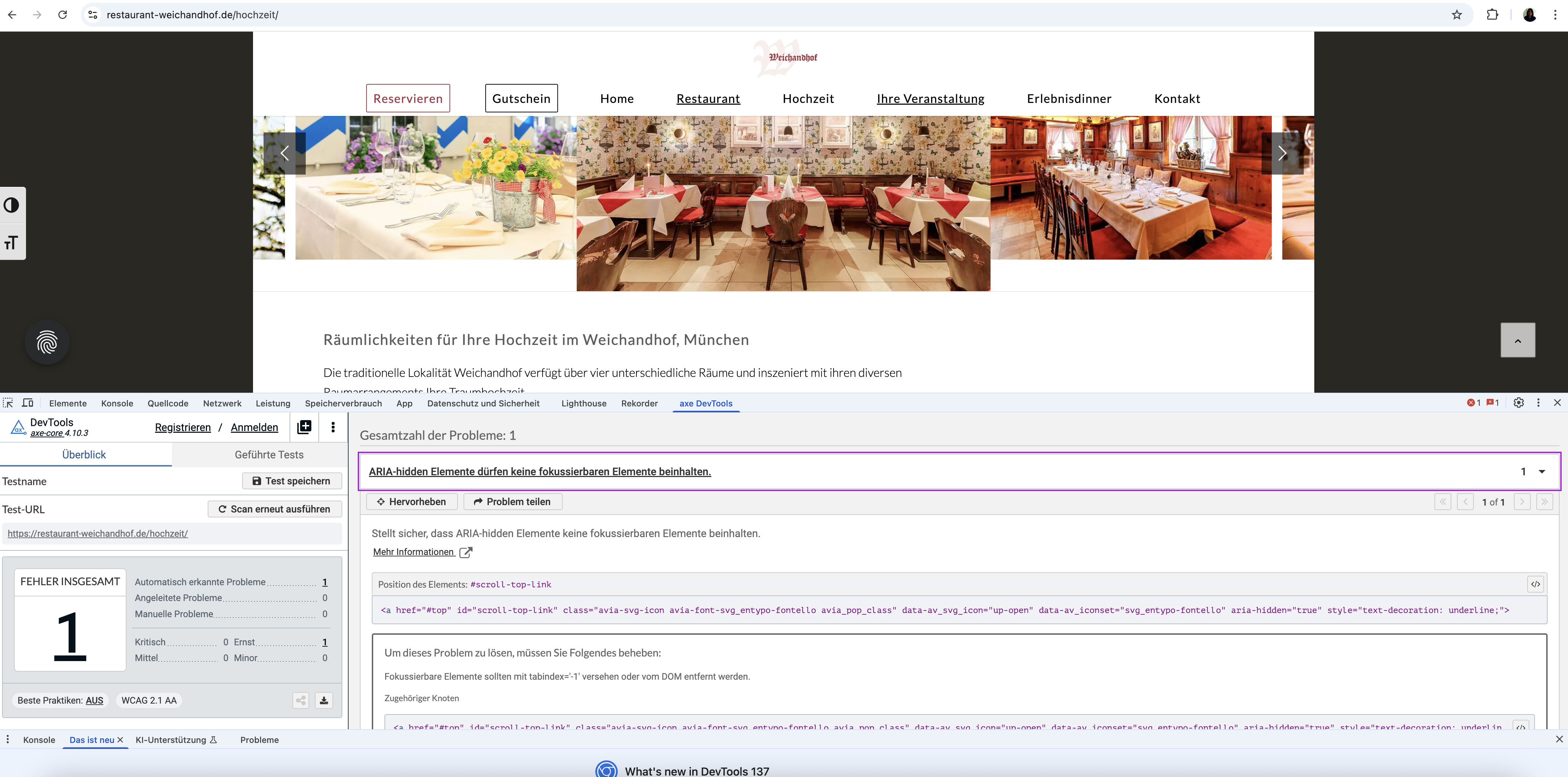
During accessibility testing of our website (https://restaurant-weichandhof.de) built with the Enfold theme, the AXE tool reported an issue concerning the built-in Scroll-to-Top button.
Specifically, the tool flags an error indicating that an element with aria-hidden=”true” is focusable. This error appears when the page is scrolled before starting the test (so the Scroll-to-Top button is visible). If the page is not scrolled prior to testing, the button is not visible and the error does not appear. This suggests the issue exists on every page but is only flagged depending on test conditions. This error really appears in EVERY SITE. Is there a way to fix it by not changing the ENDOLD-php-Code (> not consistent solutions for updates) ?
So I kindly ask you to review this ARIA issue and advise on how to ensure the Scroll-to-Top button meets WCAG 2.1 AA requirements.
Thank you in advance for your support.
Best regards, DianaTopic: Logo as SVG
Dear @Ismael,
you helped me out with a piece of code (see post #1484511) and it is working as expected:
function avf_no_inline_svg_mod($attachment_id, $url) {
    $logo_url = avia_get_option( 'logo' );
	$logo_url_transparency = avia_get_option( 'header_replacement_logo' );

    if ($url && $url == $logo_url || $url && $url == $logo_url_transparency) {
        return true;
    }

    return false;
}
add_filter('avf_no_inline_svg', 'avf_no_inline_svg_mod', 10, 2);
With this snippet added to functions.php the logo of my page is not rendered as path but instead loaded as an SVG image. Works for normal logos and the ones set in the transparency settings.
However, on pages with transparent header but smaller screen the normal logo is loaded. Not the transparent one. Any idea why? (Maybe helpful: I keep the transparent header for mobile menu due to a change in avia-sticky-header.js – code from the forum)
I appreciate your help.
Kind regards,
Daniel


