Hi,
Thank you for the screenshots.
You can add this CSS code to relocate the mobile menu to the right of the header.
@media only screen and (max-width: 989px) {

  /* Add your Mobile Styles here */
  .responsive #top #wrap_all .av_mobile_menu_tablet .main_menu {
    top: 0;
    left: auto;
    right: 0;
    display: block;
    transform: none;
  }

  .responsive #top #wrap_all .av_mobile_menu_tablet .main_menu .av-main-nav-wrap {
    transform: translateX(-50%);
    left: auto;
    right: 0;
    translate: none;
    float: right;
  }
}
Best regards,
Ismael
Hi,
Thank you for the update.
We adjusted the css code a bit. Please edit the css code, then try to toggle or temporarily disable the Enfold > Performance > File Compression settings afterwards.
#top .av-caption-style-overlay .av-masonry-item-with-image .av-inner-masonry-content *, #top .av-caption-style-overlay .av-masonry-item-with-image ins:before, #top #wrap_all .av-caption-style-overlay .av-masonry-item-with-image del {
    color: #004079;
}
Best regards,
Ismael
Hello I have try this: https://kriesi.at/support/topic/logo-mobile-blurry/ but is the same in my site, how can I do it?: this is the page: https://gonowjets.com/
Hi,
Thanks for the login, I found a few issues, first you had the “Classic Editor” plugin enabled, if you note back to the earlier post we noted that you should not use this plugin but instead use the built-in Classic Editor option in the theme at Enfold Theme Options ▸ Select Your Editor ▸ Use WP Classic Editor so I disabled this plugin and the kitchen sink showed on the test page created two years ago. I then viewed the frontend and back to the backend and checked again, this time it didn’t show, but after I clicked the update button to save the page the kitchen sink showed again, I tested many times and less that half of the time it worked.
The only error I see is from the WordPress core files: Deprecated TinyMCE API call: .onChange.add(..) I don’t see this on my demo site.
Perhaps this is because your site has not been updated, you are using Enfold v5.5 and we are now up to v5.6.10, so please try updating and checking again.
Best regards,
Mike
I have been having problems with the yoast highlight system not working. In addition, the system would constantly tell me I needed more transition words. I would add like 20 approved transition words, but the percentage on transition words on the page would not change. The third problem was that Yoast would constantly tell me I have three or more consecutive sentences on the page that began with the same word…when no such thing existed on the page.
As a result, I contact Yoast and they specifically told me that Yoast was only designed to work with the raw WordPress system…that it will NOT work with Enflold or other similar thrid-party content managers. This is something that Yoast does not advertise, nor does Enfold advertise that Yoast will not work properly.
Has Rank Math been verified to work properly with Enfold, or am I going to get the same kind of problems if I switch to Rank Math? Yoast’s response is pasted below…
__________________________________________
“Do you use a page builder like WPBackery or a theme like Divi or a theme like Enfold?
I’m asking because the eye marker feature is only available in the default Visual editor. If you are adding the content through the page builder, the eye icon will not work. Page builders add flexibility to the standard WordPress editor and build on top of it, making it impossible for Yoast to show the highlighted parts of the content.
In addition, the Yoast plugin analyzes the default WordPress content areas like the title, URL, and the main content box (WordPress editor). If you are adding your content through other plugins or theme content boxes (as most page builders do), Yoast may not be able to detect it by default.
Workaround.
For workaround: you may create a staging site first. Next, add the content through the default visual editor of WordPress and check the eye icon to highlight your text. Make the required adjustments. Once you are happy with the content, you can add the content back to your live site where you are using page builder. This way, you can bypass the limitation and can use the Yoast SEO plugin without any blockage.”
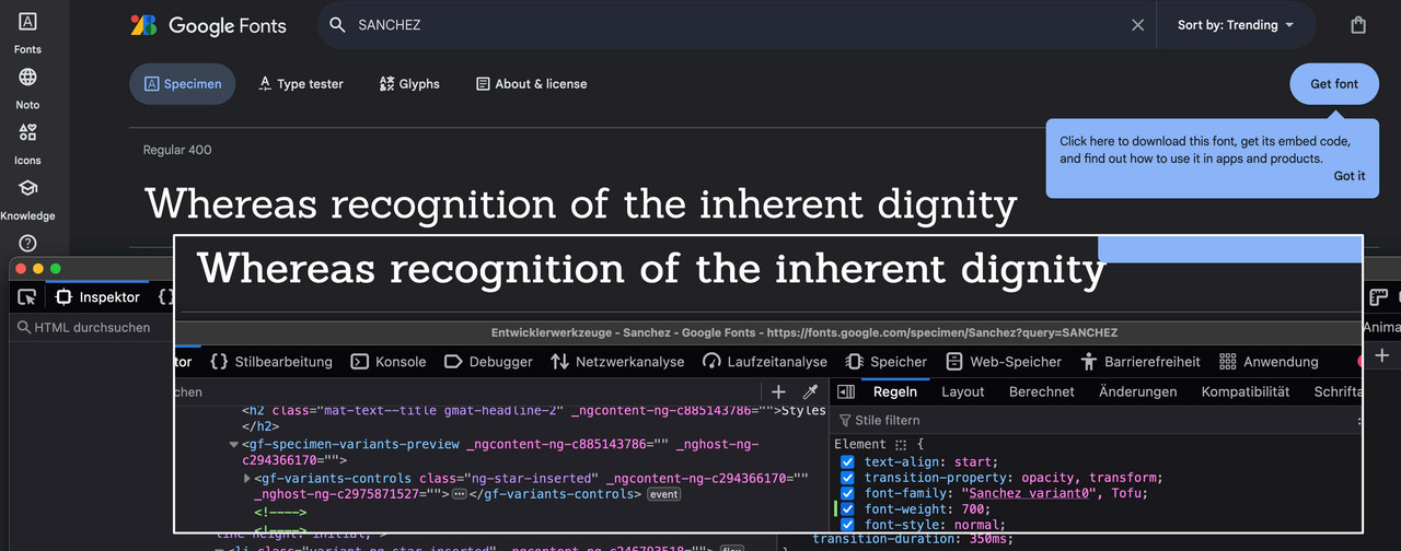
allthough there is no such font-style for sanchez – browser rendering could simulate a 700 Style.
just set it in your quick css to do so for headings.
see on google and developer tools change – on top 400 style – on bottom 700 via css
Hi,
Thanks for the update. Please let us know if you should need any further help on the topic, or if we can close it.
Best regards,
Rikard
Hi,
Great, I’m glad that Ismael could help you out. Please let us know if you should need any further help on the topic, or if we can close it.
Best regards,
Rikard
Hi,
Thanks for the update. Please let us know if you should need any further help on the topic, or if we can close it.
Best regards,
Rikard
 Kavin
KavinGuest
Hi Dear,
We are willing to collaboration a link on your page
I have multiple sites regarding education,gaming and business from these one link is for your web.
If your website gives 70+ (Plus) DR then i will offer upto $ 200 for link insert
If you have any query feel free to contact
Please let me know can i send you web details?
Waiting for your supportive response,
Regards,
With the extra CSS it hides the white empty space, thanks. I have also changed the media values to fit the mobile screens (479 & 480)
I am still dealing with the following issues:
1. On desktop and tablet screens it still shows both submenus instead of hiding the mobile version of the submenu
2. On desktop and tablet screens it is the mobile version that becomes sticky, so that won’t work properly
Hi,
Please see the link that Guenni007 posted above, and then reGenerate Thumbnails again, or try a plugin like TinyPNG
Best regards,
Mike
Hi,
I would like mobile menu start at 960px.
Find this and copy the CSS but the logo disappear. I would like in the left like in the mobile version.
Could you help me?
Thanks advance,
BR,
Antonio
I have this problems also, when you log in my account, could you also check it please? thank you very much. https://kriesi.at/support/topic/black-overlay-disappear-at-the-end-of-slide/
Hi,
@ThorstenFB: You can add the avf_allow_drag_drop in the functions.php file. Usage example can be found here: https://kriesi.at/support/topic/alb-does-not-work-with-user-role-editor/#post-1293830
Please create another thread if you need more assistance.
Best regards,
Ismael
omniradtech.com, hero image: its black overlay disappear at the end of slide. I set this overlay transition ” the layer will never animate out” at ADDTIONAL SETTING under this overlay.But the overlay still disppear. You see, if can not set this overlay, then the top bar menu “white color” is not obvious very much.
What can I do?
Hello Ismael,
My “solution” did not solve the issue completely. Now I have a problem with the Full Width Layer slider being invisible now and then. When I refresh the page in my browser, the FWLS is visible again, but at first visit it is not.
I think the option “Load javascript deferred” in wp-rocket is causing this issue, so I turned this option off now.
I just have to wait now for plugin updates before knowing if my issues are solved or not…. so pleae leave this topic open for now,
Best Wishes,
Alwin
Hi,
The website owner wants to change is home page slider with a single image with text over. This image have to replace the slider with the same styling.
I have not found so far how to replicate the same visual effect with a single image with text over. I am still have margin problem to get the image full width and full responsive. There is also a problem with the white margin at the top.
Could you please help?
Thank you
GJ
Hey schweg33,
Try this CSS in your Enfold Theme Options ▸ General Styling ▸ Quick CSS field:
#top a:hover .image-overlay .image-overlay-inside {
	display: none;
	animation: none;
}
.avia_transform #top a:hover .image-overlay {
	opacity: 0 !important;
}
but you can’t change the color of the mouse pointer, you would need to create your own and then use some css, see this thread.
Best regards,
Mike
Hi,
Thanks for your patience and the link to your example page, I’m not sure how close we could make a standard post page look like your examine, try using the Advanced Layout Builder to create your post page with a color section at the top with a background image and then place a column under it with a negative top margin and text so they overlap.
Best regards,
Mike
Hi,
Thanks for your patience, it looks like you have your color section set to a max height of 300px, so I checked your page with different screen sizes emulating different devices and the color section stays at 300px, your image inside changes due to the aspect. So if using center center is cuting too much of the top of the image try using top center:
so the top of the lady’s head will always show.
Or you can fine tune it with css like this:
#av_section_1.avia-section {
background-position: 50% 10%;
}
Or I guess you can create different images at different sizes to show for different screen sizes using the Element Visibility options, but I’m not sure this would be practical.
Best regards,
Mike
Hey rosarot,
Try this CSS in your Enfold Theme Options ▸ General Styling ▸ Quick CSS field:
#top.search-results .template-search article.blog-grid {
	width: 32%;
	float: left;
	clear: right;
}
Please ensure to copy the code from the forum and not an email notification so the symbols are not converted.
After applying the css, please clear your browser cache and check.
Best regards,
Mike
Hey beverlystone,
To restructure the table for mobile view from this:

to this:

I added this javascript to your WP Code plugin as a new snippet, and in the top right corner I used the javascript snippet as the code type:

and then saved.
document.addEventListener("DOMContentLoaded", function() {
  function restructureTableForMobile() {
    var screenWidth = window.innerWidth;
    var tables = document.querySelectorAll('tbody');

    if (screenWidth <= 767 && tables.length > 0) {
      tables.forEach(function(table) {
        var rows = table.querySelectorAll('tr');
        var newTableStructure = document.createDocumentFragment();
        var columns = rows[0].children.length;

        for (let colIndex = 0; colIndex < columns; colIndex++) {
          var newRow = document.createElement('tr');
          rows.forEach(function(row, rowIndex) {
            var cell = row.children[colIndex].cloneNode(true);
            newRow.appendChild(cell);
          });

          newTableStructure.appendChild(newRow);
        }
        table.innerHTML = '';
        table.appendChild(newTableStructure);
      });
    }
  }
  restructureTableForMobile();
  window.addEventListener('resize', restructureTableForMobile);
});
This will also work for multiple tables on the page, so I added another table to demonstrate, please check.
Best regards,
Mike
Hi,
Thank you for the link to your site, the reason your “Benvenuto” title is two different cases is because you are using two different elements, the mobile one is inside of the entry-content-wrapper container so the default css makes it uppercase, while the desktop version is outside of the container in another color section so the css doesn’t work there.
So to solve you can try this CSS in your Enfold Theme Options ▸ General Styling ▸ Quick CSS field:
.template-page .entry-content-wrapper h1, .template-page .entry-content-wrapper h2 {
    text-transform: lowercase;
}
After applying the css, please clear your browser cache and check.
Best regards,
Mike
Hi,
** Correction the hotspot animation settings are for the whole element not for the hotspot circles themselves.
So I added this css for you:
.avia_transform.js_active #top .avia_animated_image .av-display-hotspot {
	animation: avia-fadein 1.5s 1 ease-out;
    opacity: 1;
}
.avia_transform.js_active #top .avia_animated_image .av-image-hotspot .av-permanent-tooltip-single {
	animation: avia-fadein 1.5s 1 ease-out;
    opacity: 1;
    transition: none;
}
clear your browser cache and check.
Best regards,
Mike
On this page: on https://shethrivespsych.com/blog/
There is a grid row at the top and a Masonry content element below it. If that is all that exists on the page, the sidebar works. If I duplicate the grid row and put the second row below the Masonry element then the sidebar does not work. It is odd that it works at the top only and not the top and the bottom. How do i get it to the top and bottom and keep the sidebar.
Hi,
Thanks for the feedback, to do this we must change the max width of the page, in your theme settings you have the max width set to 1310px so the inside container follow this.
So if you want to change this for every page I recommend changing this setting, but I assume that you want this change for only this one page so try this CSS in your Enfold Theme Options ▸ General Styling ▸ Quick CSS field:
.responsive #top.page-id-4060 .container {
    max-width: 100%;
    width: 100%;
    padding: 0;
}
Please ensure to copy the code from the forum and not an email notification so the symbols are not converted.
After applying the css, please clear your browser cache and check.
If you find this too wide try removing the padding: 0; line in the css.
Best regards,
Mike
I put in a request yesterday and this this the second time I come in the next day and my question is not under my started topics section.
I’ve been using Enfold theme for about 10 years now. I’ve learned a lot, but I’m still a layperson and I’m really struggling with page speed. Is there any way somebody can come in and try to help me out? The speed on my. desktop is great. It’s the mobile that is very slow.
I’m not sure what the best settings are. And just requesting some personalized advice, if at all possible.
Thank you .
Hey LoPld,
For your first question, I believe what you want is to have the burger menu show until 1240px, if this is correct then your css is wrong. Try this CSS in your Enfold Theme Options ▸ General Styling ▸ Quick CSS field:
@media only screen and (min-width: 768px) and (max-width: 1240px){
.responsive #top .av-main-nav .menu-item-avia-special {
    display: block!important;
}
#top #header .av-main-nav > li.menu-item  {
  display: none!important;
}
.responsive #top .av-main-nav .menu-item-avia-special {
    display: block;
}
#top #header .av-main-nav > li#menu-item-search.menu-item  {
  display: block!important;
}
.av-main-nav-wrap {
    float: right;
}
}
@media only screen and (min-width: 990px) and (max-width: 1240px){
#top #header .av-main-nav > li#menu-item-search.menu-item  {
  display: block!important;
  line-height: 118px;
}
#top #header .av-main-nav > li#menu-item-search.menu-item a {
    line-height: 118px;
}
.responsive.html_mobile_menu_tablet #top #wrap_all .menu-item-search-dropdown > a {
    font-size: 24px;
    color: #e8c100;
}
}
Please ensure to copy the code from the forum and not an email notification so the symbols are not converted.
After applying the css, please clear your browser cache and check.
Best regards,
Mike
Hi,
To remove the text decoration from your icons, try this CSS in your Enfold Theme Options ▸ General Styling ▸ Quick CSS field:
#av_section_1.main_color .av_textblock_section a {
    text-decoration: none;
}
For your second question, try this CSS in your Enfold Theme Options ▸ General Styling ▸ Quick CSS field:
#top.page-id-1191  #av_section_2.main_color .av-masonry-outerimage-container {
    background-color: transparent;
}
Please ensure to copy the code from the forum and not an email notification so the symbols are not converted.
After applying the css, please clear your browser cache and check.
Best regards,
Mike