ismaels filter (ava_inside_main_menu) is a brilliant idea.
maybe it is easier to use if we insert a social bookmarks shortcode:
then we can use all those benefits of enfold options dialogs – and hover styling etc.
function social_bookmarks_shortcode_inside_main_menu() {
  $social_args = array('outside'=>'ul', 'inside'=>'li', 'append' => '');
  $social = avia_social_media_icons($social_args, false);
  return $social;
}
add_shortcode('social-bookmarks', 'social_bookmarks_shortcode_inside_main_menu');

add_action( 'ava_inside_main_menu', function() {
    echo do_shortcode('[social-bookmarks]');
});
Quick css for your setting (left burger – logo – socials )
#top div .logo {
  z-index: 101 !important;
}

#top .main_menu,
#top .avia-menu {
  width: 100%;
}

#avia-menu #menu-item-search {
  position: absolute;
  right: 0;
  left: auto;
}

#top #wrap_all .av-hamburger-inner {
  display:block;
  top: 0;
  margin-top: 4px;
}

.html_header_top #top #wrap_all .av_logo_right #header_main .logo {
  position: relative;
  left: 50%;
  right: auto;
  margin-left: unset;
  margin-right: unset;
  transform: translateX(-50%);
  width: auto;
}

.responsive #top #wrap_all  .main_menu {
  width: 100%;
  display: flex !important;
  flex-flow: row nowrap;
  justify-content: space-between;
  height: inherit;
}

#top #wrap_all .menu-item-avia-special {
  display: block ;
}

.responsive #top #wrap_all #header .main_menu ul.social_bookmarks {
    display: flex;
}

#top #wrap_all .main_menu ul.social_bookmarks li a {
  height: 30px;
}

#top .main_menu .social_bookmarks li {
  width:40px;
  margin-left:5px
}

#top .main_menu .social_bookmarks li.avia-svg-icon img[is-svg-img="true"],
#top .main_menu .social_bookmarks li.avia-svg-icon svg:first-child {
  height:1.1em;
  width: auto;
  margin-top: 4px !important;
}

@media only screen and (max-width: 767px) {
  .responsive #top #wrap_all .container {
    width: 95%;
    max-width: 95%;
  }
  .html_header_top #top #wrap_all .av_logo_right #header_main .logo {
    max-width: 200px;
    transform: translateX(-57%);  /* === an individual correction - depends on how many social icons are present=== */
  }
}
see : https://elementar.webers-webdesign.de/
PS: for more than 3 social bookmarks it gets complicated on small mobile screens. So maybe in this case we set them to display none – or switch in this case to header meta solution
PPS: i tried first that option to show social icons via Header – Extra Elements – Header Social Icons : “display in main header area”
but this was to complicated to find the right css positioning options – especially on shrinking headers.
Hi,
Thank you for the update.
Add the following code to your functions.php file to display an instagram icon next to the mobile menu:
add_action( 'ava_inside_main_menu', function() {
    $instagram_url = 'https://www.instagram.com/yourusername/';
    echo '<a class="av-custom-header-icon" href="' . esc_url( $instagram_url ) . '" target="_blank" rel="noopener noreferrer">';
    echo do_shortcode('[av_font_icon icon="instagram" font="svg_entypo-fontello" size="30px" av_uid="av-mhvfocn7"]');
    echo '</a>';
});
Then add this css code:
.av-custom-header-icon {
    position: absolute;
    left: 0;
    top: 20px;
    display: none;
}

@media (max-width: 768px) {
    .av-custom-header-icon {
        display: inline-block;
    }
}
Best regards,
Ismael
Hi,
Thank you for the update.
To make the buttons sticky on all screen sizes, place the Button Row element inside a Color Section, edit the section and apply a custom css class name “av-custom-sticky-menu-button-rows” in the Advanced > Developer Settings panel. Then add the following css code:
#main > .av-custom-sticky-menu-button-rows {
  position: fixed;
  top: 132px;
  z-index: 999;
  width: 100%;
}

#main > .av-custom-sticky-menu-button-rows + .clear + #av_section_1 {
  margin-top: 100px;
}
You can also apply a custom css class name to the section next to the Button Row element so you can replace the default selector #av_section_1.
Best regards,
Ismael
Hi,
Thank you for the info.
The leaflet image is not displaying, even on desktop view. There’s not much difference in file size or page loading impact between the 170×400px and 64×150px thumbnails, so I wouldn’t worry about that. Which thumbnails have you removed so far?
function avf_wp_calculate_image_srcset_mod( $sources ) {
    foreach ( $sources as $width => $image ) {
        if ( $width == 170 || $width == 400 ) {
            unset( $sources[$width] );
        }
    }
    return $sources;
}
add_filter( 'wp_calculate_image_srcset', 'avf_wp_calculate_image_srcset_mod' );
Also, why are you using gif as the image format? for non-animated images, it’s better to use jpg, png or webp.
Best regards,
Ismael
Hi,
Thank you for the update.
We’re not seeing any black background when reloading the page. If you’re referring to the background of the iframe itself, unfortunately, that’s something we can’t adjust — this is how it loads on our end.
Clip: https://streamable.com/glnnh3
Best regards,
Ismael
@Ismael:
On this page the images “Museum Leaflet” and “Domino by Pat Thomas” are inserted on the page as 64x150px and 90x150px size images. They display correctly as that size in desktop mode. Original image upload sizes were 339x800px and 299x500px.
In Dev Tools, switch to Responsive (or view on a smartphone) and the images no longer display because I have deleted the …x400px sizes.
Dev Tools Console reports:
greenville/:67 GET https://www.americanroadtrips.net/wp-content/uploads/2014/05/highway-61-blues-museum-leaflet-170×400.gif 404 (Not Found)
greenville/:67 GET https://www.americanroadtrips.net/wp-content/uploads/2014/05/domino-by-pat-thomas-239×400.gif 404 (Not Found)
Let’s focus on the Leaflet image.
The first question is why is the responsive page even trying to load the 170×400.gif image – this is surely way too big for a smartphone screen and to me the specified 64x150px size should still be loaded. That aside, how to remove the x400 image from srcset?
Second, these are the files in Media Library.
highway-61-blues-museum-leaflet-127×300.gif
highway-61-blues-museum-leaflet-222×525.gif
highway-61-blues-museum-leaflet-34×80.gif
highway-61-blues-museum-leaflet-64×150.gif
highway-61-blues-museum-leaflet-76×180.gif
highway-61-blues-museum-leaflet.gif
If you look at srcset for the leaflet, you will notice that highway-61-blues-museum-leaflet-76×180.gif is not listed within. Not that I’d want that size displayed either, but surely it should be included? Is this an error?
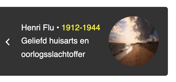
a p-tag inside a span-tag ? try another span with a custom class.
i tested 2 spans – that will lead to different troubles – because the span.entry-image will be placed inside and not besides entry-title
you can use :
Henri Flu • <i>1912-1944</i><span class="ondertitel">Geliefd huisarts en oorlogsslachtoffer</span>
or
Henri Flu <i><br>1912-1944</i><span class="ondertitel">Geliefd huisarts en oorlogsslachtoffer</span>
then you can colorise the i by:
#top .avia-post-nav .entry-title > i {
  color: #ff0;
}
#top .avia-post-nav .entry-image img {
  width: 100%;
  height: 100%;
}
because of “Lösungen” now in german
ich sehe deine Seite nicht (als Participant ) aber versuch mal stattdessen:
#top #wrap_all .avia_mega_div {
    background-color: rgba(255,255,255,0.2);
    backdrop-filter: blur(6px)
}

#top #wrap_all #header .avia_mega_div ul,
#top #wrap_all #header .avia_mega_div ul * {
    background: transparent ;
    color: #000; /**** das war nur um es an meiner Testumgebung umzusetzen ***/
}
die hover styles der menu-punkte bleiben bestehen – was für das navigieren eventuell hilfreich ist.
jedenfalls war es auf meiner Seite so.
see f.e. a test-page: https://webers-testseite.de/clippy-2/
( i set a custom ID to the sub-menu: submenu-with-icons )
#submenu-with-icons .menu-item a .avia-menu-text:before {
  font-family: entypo-fontello;
  display:   inline-block;
  position: relative;
  color: inherit;
  margin-right: 10px;
  line-height: inherit;
  font-size: 1.3rem;
  top: 2px;  /*** just a correction if font-size is bigger than text ***/
}

#submenu-with-icons .menu-item:nth-child(1) a .avia-menu-text:before { content: "\e82a"; }
#submenu-with-icons .menu-item:nth-child(2) a .avia-menu-text:before { content: "\e82b"; }
you can see that if there are more than 1 post inside a category – it works:
https://kunst-en-verhalen.rhijnhof.nl/pieta/
what makes me wonder is that on your posts with category: oorlogsslachtoffers (only 1) – there should be no post-navigation. ( Do you have in the page title that p-tag ?)
so maybe Ismael could help you with this inside your installation
PS : the setting on Enfold > Blog Layout > Single Post Navigation setting is not important if you use the filter from : above
With the help of this filter, you can even handle post-types differently.
if it is active again –
try:
.html_header_top #top #wrap_all .av_logo_right #header_main .logo {
  position: relative;
  left: 50%;
  right: auto;
  margin-left: unset;
  margin-right: unset;
  transform: translateX(-50%);
  width: auto;
}
you see i have centered the logo a little different – so if you find those margin-left and margin-right values in your code remove them.
i set it to unset to overwrite your settings.
Thanks sir,
1. I know i cna make my own custome HTML,but that is why I asked about the refund. Making that much custom HTML defeats the purpose of having a template.
2. I have many test pages. They all do the same thing. login info below.
3-4. I did this as I stated. I appended the customer copyright with your shortcode. It’s there now. Has no effect.
5. I am sorry but I need a higher level of support. I can’t post screnshots here so I am not going to waste my time usng workarounds for support tickets to get you screenshots. If you want to email me directly I will give you screenshots. You don’t need this to check the footer.php file. Youwill see at the end it has this code: “‘ id=’scroll-top-link’ class=’avia-svg-icon avia-font-svg_entypo-fontello’ <?php echo $icon_top[‘attr’]; ?> tabindex=’-1′ aria-hidden=’true’>
<?php echo $icon_top[‘svg’]; ?>
<span class=”avia_hidden_link_text”><?php echo $icon_title; ?></span>
<div id=”fb-root”></div>”
6. what change was this supposed to have? I don’t see any change from this.
7. You can recreate this. Make color section rox. Add bg image. Next add columns to fill row. Pick any column and add a bg-image to the column. It displays the column under the row and not on top of it. When you modify the higlight option it pushed the bg image off the bottom of the screen.
8. You can check my home page. I have two independent color sections both with text blocks that have only hedings. The same exact headings. Yet it shows two differnt things. How is that even possible? If it won’t display the same code twice on one page I am noit sure what I can do.
nearly every element I have to make custom inline because the global options to not seem to work. I really think I need to find a new theme. It’s not about getting used to it, right? It’s about this theme taking me more time to configure than it would be to just write the site from scratch, because the options are severely limited. I did not even know they made themes templates this limited.
Take a look. Tell me what you think after you see for yourself. Hopefully you can see what is wrong because I am wasting so much time with this theme I could have built three sites. Please sir. I made a mistake. I think it would be best to offer a refund as you do not have the resources to help me resolve this in a way that will work for it’s intended purpose. I can’t even modify image sizes or blog posts. It’s very frustrating. It’s my fault for buying the theme because I did not know it was missing the normal options you find in other themes. It’s great for your purpose, but I need a theme I can customize.
I can buy another theme and same myself over 70% of the labor costs your theme requires for basic styles. Let me know what you think. I am not trying to give you a hard time, I doubt you will fix any of this stuff and the answer will be the same -“make custome html”. I am just trying to be realistic. I feel like I lost a lot of money using this theme. Please help me cut my losses and move on.
Hi,
Thank you for the info.
Did you add this css code somewhere?
.js_active .woocommerce-tabs .panel {
    display: none;
}
Try to override it with this css code:
.js_active .woocommerce-tabs .panel {
    display: block;
}
Please make sure to temporarily disable the cache and compression plugin (Autoptimize) while testing the site.’
Clip: https://streamable.com/ih23g6
Best regards,
Ismael
Hey agenturwendt,
Thank you for the inquiry.
Looks like you have successfully adjusted the background of the slides using this css code:
#top .av-video-slide .avia-slide-wrap, #top .av-video-slide iframe {
    background: #fdf1e3 !important;
}
Let us know if you need any additional assistance.
Best regards,
Ismael
sadly – if there is the link – i can not see private content (as participant)
so you had to find the selector – and the declaration is then : text-transform: none;
f.e.:
#top .template-page .entry-content-wrapper h1,
#top .template-page .entry-content-wrapper h2 {
  text-transform: none;
}
or
#top .products .product h2,
#top .products .product h3,
#top .products .product h4,
#top .products .product h5,
#top .products .product h6,
#top h2.woocommerce-loop-product__title {
  text-transform: none;
}
Hey TasmaniaBV,
The update to 7.1.3 has to be done manually from the version you are running, please refer to my replies in this thread: https://kriesi.at/support/topic/enfold-4-5-theme-update-update-failed-download-failed-a-valid-url-was-not-pro/#post-1021541
You can either update manually via FTP: https://kriesi.at/documentation/enfold/how-to-install-enfold-theme/#theme-update, or upload the theme as if it was new under Appearance->Themes->Add New Theme.
If that doesn’t work then please try to delete the whole theme folder, then replace it with the new version. Make sure that you have backups of the site before starting updating.
Also please read this after you have updated: https://kriesi.at/documentation/enfold/theme-registration/
Best regards,
Rikard
I need some help please to tweak a function you supplied to me in this thread last year.
The function removes 495px wide images from srcset: these images were originally created on upload but then deleted as they were no longer used anywhere but unfortunately were still included in srcset definitions and didn’t display.
function avf_remove_specific_image_size_from_srcset( $sources, $size_array, $image_src, $image_meta, $attachment_id ) {
    if ( isset( $sources[495] ) ) {
        unset( $sources[495] );}
    return $sources;
}
add_filter( 'wp_calculate_image_srcset', 'avf_remove_specific_image_size_from_srcset', 10, 5 );
The image URL in srcset was …image-name-495×279.jpg, …image-name-495×335.jpg etc i.e. landscape images.
I have now discovered a problem that portrait images that were uploaded as 400px tall but then also deleted are referenced in srcset and not being displayed, e.g. …image-name-170×400.gif and …image-name-268×400.gif as two examples.
The above filter appears to work just on the first part of the image size URL specified in srcset, i.e. if I change 495 to 170 then the deleted 170×400.gif reference gets removed from srcset. I’ve tried $sources[x400] but that just crashes the site… :-)
Is there a function/filter, or modification to the above, that can remove all the 400px tall portrait references as well as 495px wide?
#top .avia-tooltip.avia-tt {
  display: none !important;
}
Hi,
We have a very old version (3.0.6) of the Enfold theme and we need to upgrade our PHP version from 5.6.40 to the neweset version PHP 8.4.
However when we tried we also needed to update the theme which we couldn’t find in our themeforest account so now we have bought the newest version.
I am trying to fix the issues with our IT partner and he tried updating it while running a localhost version on his laptop but he got a lot of errors.
Also as soon as we try to update through FTP we get a never ending stream of error messages for example:
Fatal error: Access level to av_email_spam::shortcode_insert_button() must be public (as in class aviaShortcodeTemplate) in ******\htdocs\*******\wp-content\themes\enfold\config-templatebuilder\avia-shortcodes\email_spam.php on line 16
To be smart i thought to just exclude it from the php file just to have it move on to the next 50 similar error messages.
Please let me know how to update the theme. As I found on your forums it was suggested you first needed to update to a version 4.5. or something and that would allow auto updates. However we now only have version 3.0.6. and the newest 7.1.3.
Kind regards
try:
@media only screen and (min-width:768px) {
  #top div .logo {
    z-index: 101 !important;
  }
  #top .main_menu,
  #top .avia-menu {
    width: 100%;
  }
  #avia-menu #menu-item-search {
    position: absolute;
    right: 0;
    left: auto;
  }
}
Dear people of the support forum,
On this page:
I would like to create the following header:
Hamburger menu icon on the left, logo centered, search icon (magnifying glass) on the right.
I am using a strechted layout with a container width of 1310px (standard fare).
For mobile, I would like to maintain this header layout.
I managed to center the logo on all screen sizes with this code:
.html_header_top #top .av_logo_right .logo {
    right: 50%;
    margin-right: -35.5px;
}

@media only screen and (max-width:767px) {
  .responsive #top #wrap_all #header_main .main_menu {
    left: 0;
    right: auto;
  }

  .html_header_top #top .av_logo_right #header_main .logo {
    position: relative;
    left: 50%;
    right: auto;
    margin-left: -41.5px;
    margin-right: 0;
  }
}
Your help will be much appreciated!
Greetings,
Can you please log in and check the installation for me? It looks like many theme options are missing. If these are all the options available, I understand, but it seems like part of the install might be incomplete.
I’m doing a lot of custom CSS because the theme doesn’t provide certain global options. It’s a nice design, but several features don’t appear to function as described. On top of the items I mentioned in the ticket I also have these issues, and many more. This was just the first list.
-The layout uses only 5 columns instead of the standard 12.
-On blog and masonry pages, image size settings are ignored.
-There’s no option to remove or modify the copyright label in the footer.
-The shortcode for removing your backlinks doesn’t work.
-The footer theme template file contains an unused “FB-content” div that isn’t documented/concerning to see rogue elements hidden like this that we can’t identify.
-full width doesn’t work- even with sidebar off.
-typography custom settings do not work
-columns do not overlay rows on center, they stack under them. Scaling or highlighting features of your theme cause the background to be pushed off the page.
-I have the same custom CSS heading style for all headings and also modified the typography settings of the template. Yet multiple headings on the exact same page display differently. How do we explain this? I have never before seen such behavior.
Here is one section where the accordian make is full width, then below it we have a color section that is full width, but the text block inside the color section only displays as block, no matter WHAT setting you change. See the blue bar under the “A” in APPRAISAL WORK below? The H2 text is center justified but no matter what we do the blue underline element stays as left aligned. I had to make a column just to get it to stay with the heading instead of drifting off the far left of the page. I have never seen any theme ever do this before. The custom changes that work on all the other wordpress sites do not work with this theme. You can see there is no sidebar, that is block format. You can see it in the theme file. You have anything listed as “content” restricted to under 900px or something like that. How do I fix that without rebuilding this template layout from scratch? Most themes just have a dropdown to change it but I can’t locate any similar options here.
The theme documentation discourages editing theme files, yet that seems to be the only way to achieve results. Other developers I consulted had the same experience and believe parts of the theme may not be working correctly.
I’ve used more than 20 ThemeForest themes and haven’t encountered this many issues before. I already checked the forums before posting. I’ll try to limit new posts to one or two issues at a time, but the number of non-functional options makes troubleshooting difficult.
If you believe these problems can be fixed, I’m happy to work with you. Otherwise, I’d respectfully request a refund so I can choose a different theme that better fits my needs.
Thank you for your time and understanding.
Hi,
Thank you for the inquiry.
1.) You can open threads using the form on this page: https://kriesi.at/support/forum/enfold/#new-post
2.) The default image style is set globally by the theme. If you need to adjust a specific image, you can do so using the Image element in the builder or by applying custom css in the Quick CSS field.
3.) It’s possible that the sidebar is enabled for that particular page. Make sure the page is set to full width by adjusting Layout > Sidebar Settings to “No Sidebar”.
If you have any other questions, please open a separate thread for each inquiry. Longer threads can get hard to follow, tend to go off topic and make it tricky for other users to find solutions. Keeping each thread focused on its original question helps us track what’s been resolved and makes it easier for everyone to find answers to similar issues.
To learn more about the theme, please check out the documentation: https://kriesi.at/documentation/enfold/
Thank you for your understanding.
Best regards,
Ismael
Hi,
Thank you for the update.
We cannot reproduce the issue with the search field or the details tab. The search field remains visible at all times, and the details tab is also visible on page load. If the tab is being deactivated on load, try adding this script in the functions.php file:
add_action('wp_footer', function() {
    ?>
    <script type="text/javascript">
    document.addEventListener('DOMContentLoaded', function() {
        var activeTab = document.querySelector('#top div div.product .woocommerce-tabs ul.tabs li.active a');

        if (activeTab) {
            activeTab.click();
        }
    });
    </script>
    <?php
}, 999);
Best regards,
Ismael
hallo @mofix – you can see here an updated snippet that will pull out the enfold options to determine the content width.
https://kriesi.at/support/topic/non-fullwidth-portfolio-or-grid-row-gets-colored-sides/#post-1491061
Hi,
Thanks for the update. Please let us know if you should need any further help on the topic, or if we can close it.
Best regards,
Rikard
You’re talking about the grid row element, right?
Edit: sadly you did not post a link to your page – but your screenshot is clear enough – i found your site now.
Because it looks exactly the same when you set a grid-row by css to to be not full-width, I thought you had used this element.
____________
So – why don’t you put the portfolio grid inside a 1/1 Container
The Color-Section can have the one background-color – and the 1/1 Container a different one.
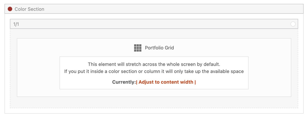
if you then do not want on top and bottom of the 1/1 Container the background-color of the Section just remove padding-top and padding-bottom of 50px.
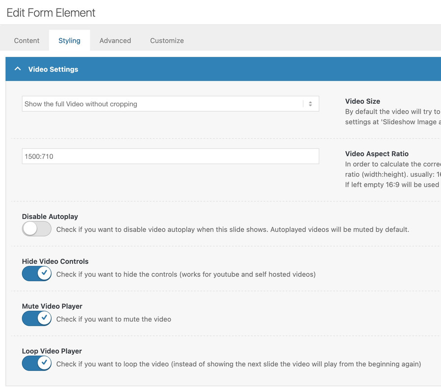
did you try out my suggestions? https://kriesi.at/support/topic/video-on-home-page-2/
and again see your video placed on one of my testpages: https://webers-testseite.de/lara-video/
the only thing you had to know is the aspect ratio of your video ( in your case 1500:710 ) and this is not 16/9
this belongs to paragraph margin setting. So maybe it is enogh to only get rid of default margin-top value on first p tag.
#top p:first-child {
  margin-top: 0 ;
}
Filesize is on original jpg small enough – so you can insert the full image. Maybe that is a bit sharper then.
And maybe you switch earlier to hamburger menu :
@media only screen and (max-width: 1200px) {
    #top #header .av-main-nav > li.menu-item  {
        display: none!important;
    }
    #top #header .av-burger-menu-main {
        cursor: pointer;
        display: block!important;
    }
}