-
AuthorSearch Results
-
April 30, 2024 at 9:33 am #1441405
In reply to: Change google maps styling
Hi Ismael,
It was here https://kriesi.at/support/topic/change-google-maps-styling/#post-1440344
Günter also said it would be a nice feature.
All the best,
PatrickApril 30, 2024 at 6:34 am #1441384Hi,
Thank you for the info.
You may need to check this thread: https://kriesi.at/support/topic/no-in-smart-quantity-woo-plugin/#post-1435087
The plugin might be conflicting with the theme’s custom quantity button. This can be fixed by editing the enfold/config-woocommerce/woocommerce-mod.js file and removing this code around line 131:
avia_apply_quant_btn();Best regards,
IsmaelApril 30, 2024 at 5:55 am #1441374In reply to: Problem with Autoptimize and Enfold
Hi,
Thank you for the update.
Have you tried following the suggestions in the PageSpeed Insight tool? The largest factor is the LCP (Largest Contentful Paint), almost 9 seconds, which can be improved by reducing the dimensions of the first image (sinnvollFUeHREN-Team-2024-de-1500×630.jpeg) and ensuring that it is compressed.
// https://pagespeed.web.dev/analysis/https-sinnvoll-fuehren-com/y0sdrq7rzb?form_factor=mobile
Additionally, there is a significant amount of content on the homepage causing excessive DOM size. You might want to consider removing some elements and transferring them to subpages.
In the Autoptimize plugin, you should try disabling the merging of resources (CSS/JS) and leaving compression enabled to eliminate render-blocking resources.
For more info about site optimization, please check the links below:
// https://kriesi.at/archives/scoring-100-100-in-google-pagespeed-insights-gtmetrix-pagespeed-and-yslow
// https://gtmetrix.com/wordpress-optimization-guide.htmlBest regards,
IsmaelApril 30, 2024 at 2:56 am #1441366In reply to: Setting shop page
This reply has been marked as private.April 29, 2024 at 8:19 pm #1441347In reply to: How to remove an element at the bottom of Blog Posts
you see here on your code that you have set these meta infos to display: none ( 1 and 2 ) but the separator ( text-sep ) is still there.
now – if you set the whole parent container to display : none that will do the job.
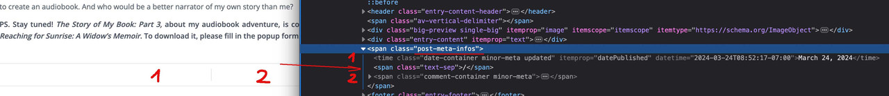
sorry it is only one css in your existing one that you can erase and insert instead mine from above
.html_elegant-blog #top .post-entry .minor-meta {
  display: none !important;
}
maybe you haven’t refreshed your merging on enfold or have some caching plugins that will preserve the old styles.
April 29, 2024 at 8:14 pm #1441346In reply to: Problem with Autoptimize and Enfold
Hey Ismael!
File Compression for CSS and JavaScript are disabled. We analysed it further. The problem occurs under the following conditions:
Autoptimize – Problem when activating Enforce JavaScript in <head> (JavaScript im <head> erzwingen)
WP-Optimize 3.3.2 – Problem when activating “Enable merging of JavaScript files” (Zusammenführung von JavaScript-Dateien aktivieren )Pagespeed is below 50 for mobile devices. That’s rather bad. And only 87 for desktop.
Do you have any other ideas to speed up the site?
Kind regards,
RalphApril 29, 2024 at 7:32 pm #1441341In reply to: How to add a new Enfold Child Custom Widget Area
Hi,
Thanks for the update. Please let us know if you should need any further help on the topic, or if we can close it.
Best regards,
RikardApril 29, 2024 at 7:31 pm #1441340In reply to: Tip: colored Gradients for iconfonts
yes – all data-av_icons are influenced from this.
but you can use that method aswell on headings:
#top #wrap_all .all_colors h1, #top #wrap_all .all_colors h2, #top #wrap_all .all_colors h3, #top #wrap_all .all_colors h4, #top #wrap_all .all_colors h5, #top #wrap_all .all_colors h6 { background-size: 100% 100% !important; background: var(--wp--preset--gradient--cool-to-warm-spectrum); -webkit-background-clip: text; -webkit-text-fill-color: transparent; display: inline-block; }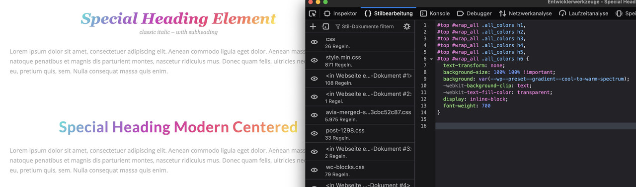 April 29, 2024 at 7:30 pm #1441339
In reply to: Footer background image blurry on iOS devices
You can clote the topic. Thank you guys for your help!
Best regards, Rogier
April 29, 2024 at 7:29 pm #1441338In reply to: Footer background image blurry on iOS devices
Hi,
Great, I’m glad that Ismael could help you out. Please let us know if you should need any further help on the topic, or if we can close it.
Best regards,
RikardApril 29, 2024 at 7:16 pm #1441333In reply to: Burger Menu – button menu space above
Hi,
Thanks for the screenshot, please try this in Quick CSS:
#av-burger-menu-ul li.menu-item-23 {
  padding-top: 15px;
}
Best regards,
RikardApril 29, 2024 at 6:07 pm #1441326In reply to: line below logo
Hey nadinedomnink,
Try this CSS in your Enfold Theme Options ▸ General Styling ▸ Quick CSS field:#top #header_main { border-bottom-width: 0; border-bottom-style: none; }to change the header background color use the settings at: Enfold Theme Options ▸ General Styling ▸ Logo Area Background Color
Best regards,
MikeApril 29, 2024 at 3:35 pm #1441311Topic: Custom post type in masonry
in forum EnfoldKonrad
ParticipantHi,
I’m currently in the process of migrating our old website onto a new website that’s developed with Enfold. On our old website, we had a few custom post types. I’ve created these post types on the new website using “Custom Post Type UI” and migrated all posts from the old site using the WP import/export tool.
I want to display these posts in masonry on my new site. I’ve followed this topic link to do so. However, even though I’ve put and customized the snippet in my functions.php file and created a custom taxonomy for the post type, when I select this taxonomy from “Display entries from: Category: Case studies,” it doesn’t display any posts in my masonry, even though the custom post type “Case studies” has a few posts already added.
What can be the problem? Am I missing something or did something change since the linked post?
Thanks in advance.
April 29, 2024 at 12:52 pm #1441299In reply to: Burger Menu – button menu space above
Hey Mike
I’ve taken a screenshot of the area I’m talking about. Hopefully you can see it. I just want the button to sit a bit lower from the rest of the menu on mobile as it’s too close to the bottom line of the other menu items. Needs a larger gap at the top of the button to the grey line. Does that make sense?Cheers
NatashaApril 29, 2024 at 12:22 pm #1441295Hi,
This is because the original solution was for archive pages, this is a single tribe event page, for this add this code to the end of your child theme functions.php file in Appearance ▸ Editor and keep the other code:function custom_single_tribe_events_script(){ ?> <script> (function($){ $(document).ready(function(){ $("#top.single-tribe_events h1.main-title.entry-title").text("Kalender mit Ereignissen"); }); })(jQuery); </script> <?php } add_action('wp_footer', 'custom_single_tribe_events_script');Best regards,
MikeApril 29, 2024 at 12:14 pm #1441294In reply to: Blog posts section heading style
Hi,
To change the h1 font size on single posts try this css:#top.single-post #wrap_all .all_colors .post-entry h1.post-title.entry-title { font-size: 20px; }I’m not sure what you mean by changing your image size, when you upload an image WordPress creates thumbnails of it to be used in different situations, often cropping your image, but for best results you should resize you image before you upload it, here is a free online resizer. If you need further help with this please open a new thread and explain in more detail including the sie you want the image to show and what size you are uploading.
Please note that we ask that you create a new thread for each issue, this helps other users find solutions based on the opening subject line quicker and helps keep the thread length manageable and on topic for multiple mods to assist. Thank you for your understanding.Best regards,
MikeApril 29, 2024 at 11:55 am #1441292Hi,
Another thing that might help with the LCP issue is to resize the image further. I know you already did this, but the current width of the original image is still 1200px, while the maximum size of the video container on desktop view is only 700px. This will be a lot smaller on mobile devices, so it will require a smaller image. Resizing the image to 700px or 600px (smaller is better) before uploading it should improve LCP.
This should also be done for the images in the columns (Couples Counseling, Individual Counseling, etc.) below the video. The rendered size of the image is only 355px, but the actual image is 845px in width. You should upload a smaller image or make sure to pick a smaller thumbnail size (portfolio, masonry, medium, etc.). The same thing should be done with the images below the “Schedule an appointment” button if you really want to optimize the loading speed of the page.
Best regards,
IsmaelApril 29, 2024 at 9:00 am #1441269Thank you – needed both lots of CSS to make it work for both desktop and mobile :-)
April 29, 2024 at 8:37 am #1441261Hi,
Thank you for the update.
We modified the css code a bit. Please try it again:
.tribe-events .tribe-events-l-container {
	padding-top: 0;
}
Best regards,
IsmaelApril 29, 2024 at 8:37 am #1441260In reply to: Change h2 to h3 or other in Blog
Hi,
Great, I’m glad that Mike could help you out. Please let us know if you should need any further help on the topic, or if we can close it.
Best regards,
RikardApril 29, 2024 at 7:27 am #1441248In reply to: How to remove an element at the bottom of Blog Posts
Hi,
Thank you for the update.
The css code provided by @Guenni007 above should have removed the parallel lines above the share icons.
.html_elegant-blog #top .post-entry .post-meta-infos {
    display: none !important;
}
Do you have any other css modifications in the Quick CSS field? Please ensure that there are no invalid css codes (such as missing curly braces, semicolons, etc.) and that all css rules have been closed correctly.
Best regards,
IsmaelApril 29, 2024 at 7:16 am #1441247In reply to: Increase Button Size for Cart
Hi,
You can also include this css code to decrease the space between the burger menu and the search icon:
.responsive #top #header_main > .container .main_menu .av-main-nav > li.av-burger-menu-main.menu-item-avia-special > a {
    padding: 0 0 0 15px;
    margin-right: 0;
}

.responsive #top #menu-item-shop.cart_dropdown {
    margin-left: 0;
}
There’s no other way to increase the clickable area of the cart icon without increasing its container size.
Best regards,
IsmaelApril 29, 2024 at 1:01 am #1441231Hey Mike
thank you that worked on desktop but not on mobile – is there a different code for mobile that I can use?
Cheers
NatashaApril 29, 2024 at 12:57 am #1441230In reply to: Change Events Calendar widget title font size
Hey Mike
Brilliant that worked thank you :-) And as its a widget is there anyway to get the heading to match the other widgets – eg lines top and bottom?
Cheers
NatashaApril 29, 2024 at 12:54 am #1441229In reply to: Burger Menu – button menu space above
Hi Mike
That only made the space that the menu itself takes up on desktop bigger – had no affect on the gap between the menu and the “Book online” button on the mobile/burger menu. I’m just wanting to move the button menu item further away from the menu line so that its easier to click on and doesnt look bunched up to the separator line on mobile.
Cheers
NatashaHi,
I’m not sure what you mean, I see your header on the search results page, see the screenshot in the Private Content area.
Perhaps you mean that there is a large space at the top, try this CSS in your Enfold Theme Options ▸ General Styling ▸ Quick CSS field:.html_header_top.html_header_topbar_active.html_header_sticky #top #main.swp-rp-main { padding-top: 0; margin-top: 0; }Best regards,
MikeApril 28, 2024 at 7:40 pm #1441215Sure, It’s on private content.
On desktop-version everything is fine and shall stay the way it is.
When you open the site on mobile you can see that th button is not at a good position (how could it be? It’s placed for desktop-Mode)Best regards
April 28, 2024 at 7:37 pm #1441214In reply to: How to remove an element at the bottom of Blog Posts
you have set the comments and time to display: none – but let the text-separator be visible.
why don’t you set the parent container to display: none – then you can erase the two rules and set:
( maybe it is best to do this only for single posts ).html_elegant-blog #top.single .post-entry .post-meta-infos { display: none !important; }April 28, 2024 at 3:40 pm #1441189In reply to: Change h2 to h3 or other in Blog
Hey Christian,
Try adding this code to the end of your child theme functions.php file in Appearance ▸ Editor:function custom_script() { ?> <script> (function($) { $(function() { function replaceElementTag(targetSelector, newTagString) { $(targetSelector).each(function(){ var newElem = $(newTagString, {html: $(this).html()}); $.each(this.attributes, function() { newElem.attr(this.name, this.value); }); $(this).replaceWith(newElem); }); } replaceElementTag('.post-entry h2.post-title.entry-title ', '<h4></h4>'); }); }(jQuery)); </script> <?php } add_action( 'wp_footer', 'custom_script', 99 );Please ensure to copy the code from the forum and not an email notification so the symbols are not converted.
In the code change:<h4></h4>to suit. Note that this may not change the font size, if you also want to change the font size try this CSS in your Enfold Theme Options ▸ General Styling ▸ Quick CSS field:.html_elegant-blog #top .post-entry .post-title, .html_elegant-blog .avia-content-slider .slide-entry-title { font-size: 20px; }and adjust to suit.
If this doesn’t help please include the url to the page in question so we can take a closer look.Best regards,
MikeApril 28, 2024 at 3:26 pm #1441188In reply to: Blog posts section heading style
-
AuthorSearch Results
-
Search Results
-
Topic: Custom post type in masonry
Hi,
I’m currently in the process of migrating our old website onto a new website that’s developed with Enfold. On our old website, we had a few custom post types. I’ve created these post types on the new website using “Custom Post Type UI” and migrated all posts from the old site using the WP import/export tool.
I want to display these posts in masonry on my new site. I’ve followed this topic link to do so. However, even though I’ve put and customized the snippet in my functions.php file and created a custom taxonomy for the post type, when I select this taxonomy from “Display entries from: Category: Case studies,” it doesn’t display any posts in my masonry, even though the custom post type “Case studies” has a few posts already added.
What can be the problem? Am I missing something or did something change since the linked post?
Thanks in advance.