-
Search Results
-
Hello,
I came from this:
– Updated the theme from 4.7.6.4 to 5.7 (just on staging site)
– Updated WordPress to 6.5.2 (on both sites)
– I also made a stage siteBut now a few problems have occurred.
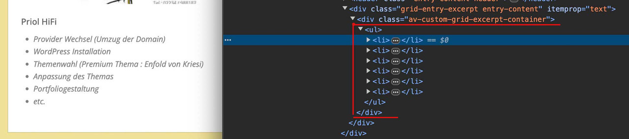
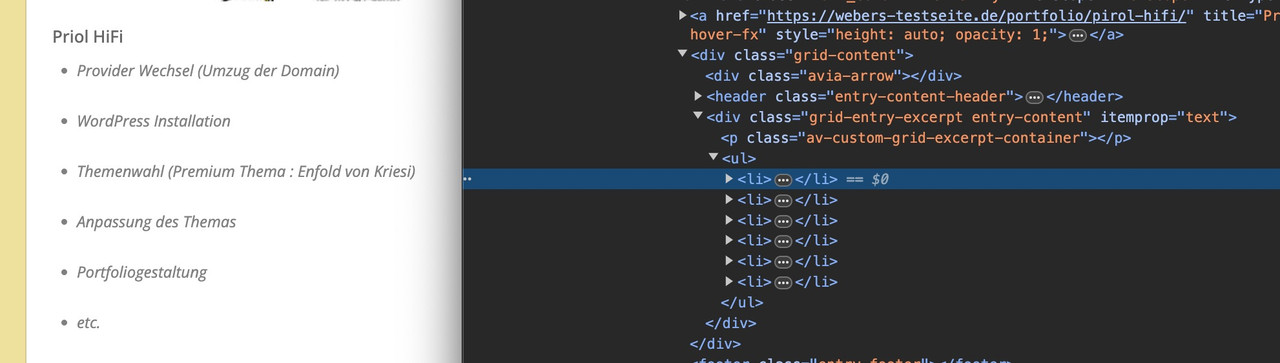
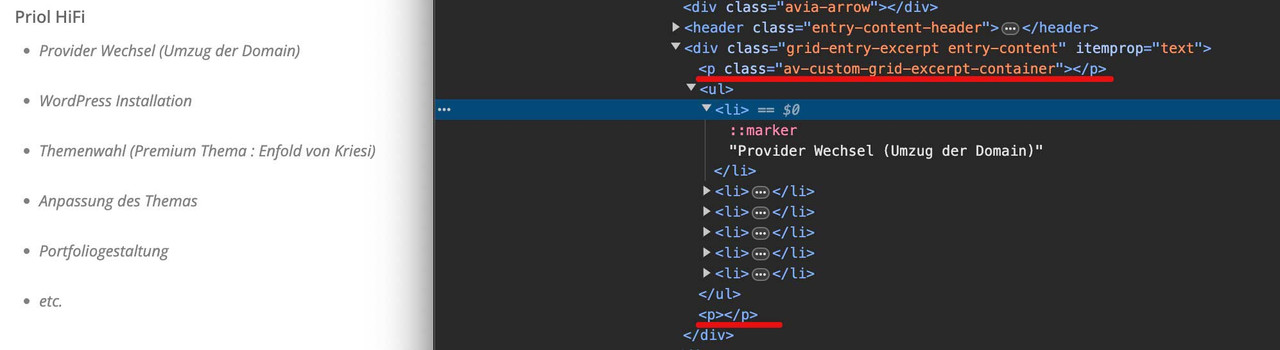
1. On almost every page (frontend) i have text displayed “array” -> see picture 1
2. I updated the theme just on stage site. Now my prefooter is gone -> see picture 2, picture 3 is the original state.
I do still have content in widgets footer columns.
3. My forms got deformed -> see picture 4
4. On some buttons and form links (i agree with terms and conditions links) i got additional line (so now they are two) -> see picture 5 (more in private).Also in private i have shared access to both live and stage site.
Can you please take a look at these problems?
Thank you,Hi ,
I use a background video in the header of a page (background content-section) on the desktop version. During the page load, there is a delay before the video starts, and initially, a white background is visible. Is there an option to load the video immediately, so that it is visible right when the page opens? The video is hosted on YouTube.
ThanksBest regards, Rogier
Hello,
In the Private Content section, we are providing two links, one which in the smartphone version shows body text without the fold/unfold feature turned on, and the other with that feature turned on. That second page version includes the word “defect” in the link. You will see that in the second version, the page does not set up correctly; the right side of the body text extends beyond the limits of the screen.. We have tried making text font size smaller but that does not solve the problem.
NOTE: The fold/unfold feature works fine on laptop/desktop screens.
Please let us know if this can be fixed without quick css; the goal here is to make sure that the “Read More” text works on smartphones with different screen sizes, not just one size.
Let us know if screenshots will help; not sure how to send them here.
Thanks,
Cliff
I had everything correctly and I went to test some different colors in the general styles.
Click and save, click and save, click and save.
Then I returned to the one I was using previously.
Now the nav menu text is black in the transparent headers, the text colors I chose only appear when scrolling and the nav collapses with the defined background color.
I tried and tried and nothing.
Now inspecting I see this:
#top #header.header_color.av_header_transparency .av-main-nav > li > a .avia-menu-text,{
color: var(--enfold-header_replacement_menu_color);
}
The only difference I see between browser is that safari uses bold and chrome not, but the black text is used when the header is transparent.
Thanks.
Topic: Pricing Table Not Aligning
I created a pricing table and the first column is not aligning unless I stretch the window to a very specific size. I created a completely different table for mobile, but the desktop table needs to align up correctly otherwise it doesn’t make sense at all.
Hello, is there a way to style mega menu section titles with color and box size look like some sort of heading?
Example in link.
Topic: Mobile view issues
Hello, could you please help me. I’m having a problem for mobile view that looks completely different than desktop nview. See attachment below and login
Viewing 30 results - 5,011 through 5,040 (of 142,863 total)