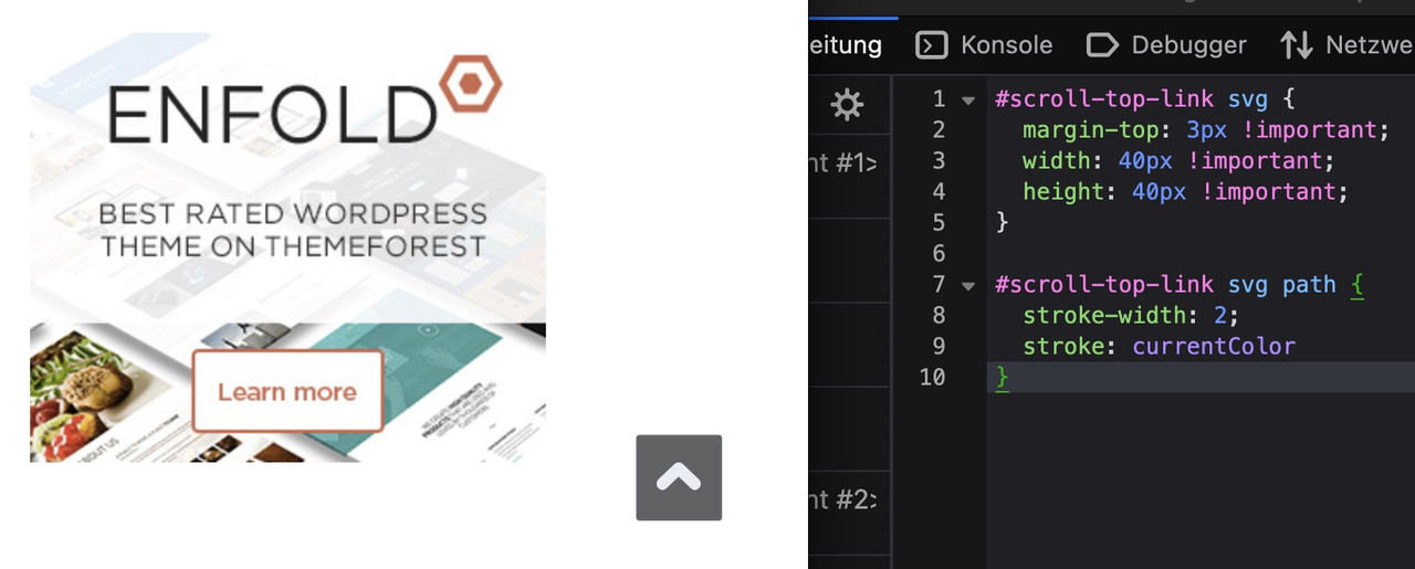
have a look if you have already the svg usage of those standard icons. – the up-open icon is already a bold one – but you can make it bigger:
#scroll-top-link svg {
  margin-top: 3px !important;
  width: 40px !important;
  height: 40px !important;
}

#scroll-top-link svg path {
  stroke-width: 2;
  stroke: currentColor
}
see :
btw: on mobile ( better on smaller screens it is set to display: none )
@media only screen and (max-width: 767px) {
  .responsive #scroll-top-link {
    display: block;
  }
}
The reason for this is that many people know that double-tapping the top of the screen scrolls the window upwards.
Dear Support.
Can you recommend a solution or PlugIn to create a feature similar to this website: https://immosell.ch/
Also once the box is closed there is an information Icon that can bring the box back. Also on my page I am using your scroll to the top icon which I would like to keep under the box if the box is showing and next to the Information icon once the box is closed.
Thanks for advise.
Regards
Stefan
Dear Support.
I duplicated a color section and used one version for laptop and one for mobile. It works really well. The only problem is that the ID for each section is the same. There is one ID used in two color sections, otherwise I would not know how to adress the section in the menue.
The result is that the link works on desktop but not on mobile. Is there a solution for this?
Regards
Stefan
Hi,
When I last used Enfold, there was a “Preview” button that would show you the page after you’d made changes in the editor. Now, I can only find an arrow at the top that will open the page, but unless I save the changes, they don’t appear there. I need a way to preview changes before making them permanent with a Save. Suggestions?
Also, next to the Copyright statement, I’d like to remove the text: powered by Enfold WordPress Theme. How can I do that?
Thanks.
Hi,
Thank you for the link.
Add this code in the functions.php file to load the Cairo font:
function av_load_google_fonts() {
    wp_enqueue_style(
        'google-fonts-cairo',
        'https://fonts.googleapis.com/css2?family=Cairo:wght@300;400;600;700&display=swap',
        array(),
        null
    );
}
add_action('wp_enqueue_scripts', 'av_load_google_fonts');
After that, add the following css to make the font the default body text:
#top, body, p, span, li, a, h1, h2, h3, h4, h5, h6, input, textarea, button {
    font-family: 'Cairo', sans-serif;
}
Let us know the result.
Best regards,
Ismael
Hey ti2media,
Thank you for the inquiry.
The color of the email field is different due to this css code:
#top .kontaktformular input[type='text'] {
    background-color: #ffffff !important;
    border: none !important;
    color: #0d3c63 !important;
}
To correct it, please replace it with the following css:
#top .kontaktformular input[type='text'], #top .kontaktformular input[type='email'] {
    background-color: #ffffff !important;
    border: none !important;
    color: #0d3c63 !important;
}
Then add this css code to adjust the width of the form fields:
#top fieldset {
    margin-bottom: 20px;
    overflow: hidden;
}
Best regards,
Ismael
Dear Sirs,
I have disabled the arrows on the navigation of the lightbox using the suggested css but I notice when I click on the image it still scrolls across. Is there any way we can stop this so we disable the scroll when someone clicks on the image please.
Many thanks
Peter
Hey ti2media,
Please try this CSS as well:
#scroll-top-link.avia-svg-icon svg:first-child {
  margin-top: 7px;
}
Best regards,
Rikard
Dear Support,
I tried to change the “Scroll to the Top” Element using some threads in this Forum. I wanted to achieve that the arrow inside the box is more bold and that the element itself is a little bigger. Doing that the arrow is not centered anymore. Also the element for some reason gets cut when scrolling on an iPhone. It’s only visible on mobile once you scroll up. It should always be visible. Please advise.
-
This topic was modified 3 months, 2 weeks ago by
 ti2media.
Hey jimmiemoreland,
Thank you for the inquiry.
You can add this css code to make the header sticky on mobile. Make sure to adjust the top padding based on the header’s height.
@media only screen and (max-width: 989px) {

  /* Add your Mobile Styles here */
  .responsive.html_mobile_menu_tablet #top #wrap_all #header {
    position: fixed;
  }

  .responsive.html_header_top #top #main {
    padding-top: 120px !important;
    margin: 0;
  }
}
Let us know the result.
Best regards,
Ismael
Hi,
Thank you for the update.
Try to add this css code to show the full image:
#top .fullsize .template-blog .big-preview img {
    min-width: 300px;
    background-size: contain;
}

Best regards,
Ismael
Hello, Id like the Sticky Header on MOBILE as I want my Phone number always displayed at the top when a user scrolls. I found the code below, but it doesnt do anything.
@media only screen and (max-width: 767px) {
.responsive #top #wrap_all .main_menu {
position: relative;
width: 100%;
}
}
I need the same to happen on disktop
try:
.responsive #top #section-container-width .container {
  width: 100% !important;
  max-width: 100% !important;
  padding: 0;
}

.responsive #top #section-container-width .avia-image-diff-container {
  margin: 0 !important;
}

.responsive #top #section-container-width .av-image-diff-wrapper,
.responsive #top #section-container-width .av-image-diff-wrapper img {
  width: 100%;
  max-width: 100% !important;
  margin: 0
}
your images are 1024px width – so you had to stretch them to the container width.
Rikard,
The menu on mobile view change automatically to be logo on the right and language switcher on the left. But on disk top logo on Arabic language stays on the lift and language switcher on the right. It should automatically to Logo on the right and language switcher on the left.
I didnt find any place in the theme settings to change this.
please support.
Thanks.
Hi Rikard,
Its working on mobile but not on disktop
Hey Eleina,
Thank you for the inquiry.
Please add this code in the Quick CSS field to adjust the layout of the top bar on mobile view:
@media only screen and (max-width: 768px) {

  /* Add your Mobile Styles here */
  #top #header_meta .phone-info>div>div {
    display: flex !important;
    align-items: center !important;
    justify-content: start !important;
    flex-direction: column;
    gap: 4px !important;
  }
}
Result:

Best regards,
Ismael
Hi,
Nailed it! We need to set overflow visible to both ul.avia-slideshow-inner and li.avia-slideshow-slide. Here is the complete CSS:
div.liste-recette div.avia-inner-caption h2.avia-caption-title {
	font: inherit;
	color: black;
	background: none;
	line-height: 1.2;
	padding-left: 0;
	padding-right: 0;
}
div.liste-recette div.avia-caption-content p {
	color: black;
	background: none;
	line-height: 1.2;
	padding-top: 0;
	padding-left: 0;
	padding-right: 0;
}
div.liste-recette ul.avia-slideshow-inner {
    margin-bottom: 100px;
    overflow: visible;
}
div.liste-recette li.avia-slideshow-slide {
    overflow: visible;
}
div.liste-recette div.av-slideshow-caption {
    bottom: -90px;
    width: 100%;
    padding: 0;
    left: 0;
}
Best regards,
Serge
Hi,
I want to display the title and cation of an Easy Slider below the images on this page, with title on the right at 25% width and caption on the left at 75% width. I tried code from other threads with the same topic to no avail.
I did set “liste-recette” as a custom CSS class for my Easy Slider element. I did successfully hide the slideshow controls with the following CSS:
div.liste-recette div.avia-slideshow-controls {
	display: none;
}
I tried code from other threads with the same topic but, after several hours hammering on that, I can’t figure out the correct CSS to make it work.
Best regards,
Serge
use the font-manager of enfold – it works great – even for variable fontfiles
first – if you compress your font-files on a mac (OSX) it will include even the typically non visible files on OSX folder. This is what you see – when you are talking about Font: MACOSX ( font-family: macosx ).
But your font-file of berthold should be there too.
I do not know if fontsquirrel can convert otf files of variable Fonts to ttf or woff2.
just one moment – i’m looking for an older post of mine. …
https://kriesi.at/support/topic/how-to-submit-and-use-custom-fonts/#post-1470894
you can download that script app – just place it on your desktop – and drag & drop files there to zip.
Or use keka to compress your font folder. And do not include invisible files
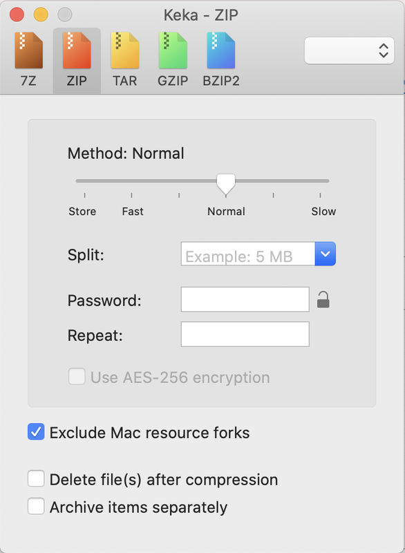
after compression it should show inside that font zip file only the fonts – and nothing else:

I have followed Ismael’s instructions to make my top bar larger, add isonc etc., and it looks great, thank you! The only problem is that it now doens’t look good on mobile. It should stack on mobile, Phone number at the top, then email underneath, and both centered. Is it possible to make it do that?
Thank you so much!
thefamilytreedition.com/bypass
Hi,
Thank you for the inquiry.
Adding this code in the Quick CSS field should correct the layout issue on mobile view:
@media only screen and (max-width: 768px) {

  /* Add your Mobile Styles here */
  #commentform label {
    position: relative;
    left: auto;
    top: 0;
  }

  #top .comment-form-cookies-consent label {
    top: -30px;
  }
}
Screenshot:

Best regards,
Ismael
Hi,
For mobile add this css:
#top #wrap_all .header_color .menu-item-30.av-menu-button-colored > a .avia-menu-text {
    background-color: #6c0f1b;
    border-color: #6c0f1b;
}
#top #wrap_all .header_color .av-menu-button-colored > a:hover .avia-menu-text {
    color: #000;
}
Please note that mobile devices don’t have a hover rule, but the color changes on click, like the desktop hover, adjust to suit.
Best regards,
Mike
Hey ceakins1908,
Try this css in your Quick CSS:
#top #wrap_all .header_color #menu-item-30.av-menu-button-colored > a .avia-menu-text {
    background-color: #6c0f1b;
    border-color: #6c0f1b;
}
#top #header.header_color.av_header_transparency .av-main-nav > li.av-menu-button-colored > a:hover .avia-menu-text {
    color: #000;
}
Adjust the black hover color to suit, then clear your cache and check.
Best regards,
Mike
if you would like to have it always visible just remove the hover pseudo-class:
here is the solution for sub-menu
#top .menu-item-has-children:hover:before {
  position: absolute;
  top: auto;
  bottom: -4px;
  left: 20px;
  display:   block;
  content: "\e886";
  font-size: 36px;
  line-height: 24px;
  font-family: 'entypo-fontello';
  color: inherit;
}
maybe you can bring that arrow to your sub-menu container. But then you can not center it below top-level menu text.
But if you are satisfied by a fixed distance from the left (f.e. 20px ) this is a not so complex solution.
or you set the avia-arrow-wrap and avia-arrow to show- and fill with background-color and border-color.
there is no extra class on top-level menu-item if a sub-menu is open. So this is probably only usable for modern browsers.
Maybe a solution to bring an extra class to top-level menu-item via script seems to be better.
try:
#top .menu-item-has-children > a {
  display: flex;
  justify-content: center;
}

#top .menu-item-has-children > a:hover:after,
#top .current_page_item.menu-item-has-children > a:after,
#top .menu-item-has-children:has(ul.sub-menu[style*="visible"]) > a:after {
  position: absolute;
  top: auto;
  bottom: -4px;
  display:   block;
  content: "\e886";
  font-size: 36px;
  line-height: 24px;
  font-family: 'entypo-fontello';
  color: var(--enfold-main-color-primary);
}
see here on “our clinic” menu-item: https://basis.webers-testseite.de/