-
AuthorSearch Results
-
July 28, 2024 at 3:49 pm #1463159
In reply to: Title and excerpt for Masonry Grid
Hi,
Try this CSS in your Enfold Theme Options ▸ General Styling ▸ Quick CSS field:#top .av-masonry-entry .av-inner-masonry-content { padding: 20px 0; }to remove the left and right padding of the excerpt, after applying the css, please clear your browser cache and check.
Best regards,
MikeJuly 28, 2024 at 3:21 pm #1463158Hey Jak73,
Add the page ID to the css like this:.html_header_top.html_header_sticky.html_large .page-id-1616 #main { padding-top: 66px; }After applying the css, please clear your browser cache and check.
Best regards,
MikeJuly 28, 2024 at 2:46 pm #1463154Jak73
ParticipantHi,
i would like to change:
.html_header_top.html_header_sticky.html_large #main {
padding-top: 116px;
}
to
.html_header_top.html_header_sticky.html_large #main {
padding-top: 66px;
}But only for selected pages.
How can i do that?
kind regards
JakJuly 28, 2024 at 2:20 pm #1463149Hi,
Thank you for your patience, as I review your request, I believe the only issue right now is switching to the built-in mobile menu before the custom menu becomes too large for the screen, so originally I have said to use the option <strong style=’color:#000′>Hide Header on this page but this also hides the mobile menu, so lets change this to <strong style=’color:#000′>Transparent Header

and hide the header with css:@media only screen and (min-width: 990px) { #header_main { display: none; } } @media only screen and (max-width: 989px) { .avia_codeblock > #header { display: none; } #menu-item-shop, .responsive.html_mobile_menu_tablet #top .av-logo-container .main_menu .social_bookmarks { display: none; } #av-burger-menu-ul .button.logo { display: none; } .logo a { display: flex; align-items: center; } #header_main { background-color: #000; } } @media only screen and (max-width: 989px) { .responsive #top #main {margin-top: -90px!important;} #top #wrap_all .av_header_transparency {background-color: transparent!important;} div#header_main > .container {display: block !important;} #top .av-burger-overlay li li .avia-bullet, #top .av-hamburger-inner,#top .av-hamburger-inner::before, #top .av-hamburger-inner::after { background-color: #fff !important; } .html_av-overlay-side-classic #top .av-burger-overlay li li .avia-bullet, .html_av-overlay-side.av-burger-overlay-active #top .av-hamburger-inner, .html_av-overlay-side.av-burger-overlay-active #top .av-hamburger-inner::before, .html_av-overlay-side.av-burger-overlay-active #top .av-hamburger-inner::after { background-color: #000 !important; } }and for my example menu it breaks around 914px so setting the mobile menu to show at 990px in the theme setting will solve this, and I set the <strong style=’color:#000′>Alternate Menu For Mobile to the same menu we used for the shortcode:

So now at 990px and above it looks like this:

and below 989px the mobile menu shows like this:

and when the menu is open:

I believe this is what you are trying to achieve, I linked to my example page below for you to check.Best regards,
MikeJuly 27, 2024 at 11:38 pm #1463132In reply to: change magazine enfold
Hi,
Thank you for your patience and the link to your site, I believe that I have found your magazine element on the page, please see the screenshot in the Private Content area, but I believe that the top item IN: Ongestructureerde data OUT: Gestructureerde info is the latest item, based on the date 27/07/2024 and the parent page /mdhai/ai-artikelen/
Perhaps I misunderstand, please let us know which item that you expect to show first and include a admin login in the Private Content area so we can examine the backend closer.Best regards,
MikeJuly 27, 2024 at 7:07 pm #1463123Hey stefv8,
Try this CSS in your Enfold Theme Options ▸ General Styling ▸ Quick CSS field:#top #wrap_all #main.all_colors h1, #top #wrap_all #main.all_colors h2, #top #wrap_all #main.all_colors h3, #top #wrap_all #main.all_colors h4, #top #wrap_all #main.all_colors h5, #top #wrap_all #main.all_colors h6 { text-transform: capitalize; }After applying the css, please clear your browser cache and check.
If this doesn’t help please link to your site so we can examine.Best regards,
MikeJuly 27, 2024 at 5:28 pm #1463117In reply to: Layout Tab Section
Hey Markus,
Thank you for the link to your site, for the tab content width, it looks like you have this custom css:.av-layout-tab-inner { margin-right: 20% !important; margin-left: 1% !important }please remove it, and add this css instead:
.responsive .av-layout-tab-inner > .container {
	padding: 0;
	max-width: 95%;
}
To have a line under the tabs instead of an arrow, add this CSS:
.avia_transform .av-tab-arrow-container span {
  left: 0;
  width: 100%;
  transform: none;
}
.av-active-tab-title .av-tab-arrow-container {
	top: -9px;
}
.av-inner-tab-title, .av-tab-arrow-container, .av-tab-section-icon, .av-tab-section-image {
   width: 100%;
}
this also increases your tab width so some of your tab titles are not over two lines.
After applying the css, please clear your browser cache and check.Best regards,
MikeJuly 27, 2024 at 2:47 pm #1463110In reply to: Advance Editor loss
Hi,
If you have any further question which is not on the original topic, then please open a new thread. Also please let us know what the error message says in english, and how to reproduce it.
Best regards,
RikardJuly 27, 2024 at 2:47 pm #1463109In reply to: Rounded corners on all images and Products
Hey bemodesign,
I checked your pages but I didn’t find an example of images with a border-radius, but when I review your past threads it looks like you wanted a border-radius of 30px, so for this on your shop images try this CSS in your Enfold Theme Options ▸ General Styling ▸ Quick CSS field:#top .av-product-class-minimal img { border-radius: 30px; }After applying the css, please clear your browser cache and check.
Best regards,
MikeJuly 26, 2024 at 7:37 pm #1463077In reply to: Editor issue with WPML translations
Hi, I translated the homepage as described above:
– Texts with the WPML editor
– I modified the layout only on the Italian page, with the Enfold editorIt is almost impossible to translate like this because the English page does not inherit all the changes made on the Italian page.
– From the WPML editor I see all these translated strings: https://drive.google.com/file/d/1h_X9dxV_nu-T1ZU4qpUvyv_l0HF24yU4/view?usp=sharing
– But from the front-end I don’t see them at all: https://drive.google.com/file/d/1SP_XlRbkoKD1Kur6eJDDuqBjljq7sJFk/view?usp=sharingSo I would ask you to allow me to edit the pages also from the Enfold editor, solving the problem for which I opened the ticket
More:
– When I go to the English page (https://ogliastrarimessaggio.com/en/), the language change flags are not seen: https://drive.google.com/file/d/1rQgTThO0NQa-T6reFXDUsRDhWRxNNbqi/view?usp =sharing
– When I try to reach the German version (https://ogliastrarimessaggio.com/de/), it gives me a 404. Regarding this problem, I followed all these directions https://wpml.org/forums/topic/404 -error-on-translated-pages/ but the problem still exists.At the moment all plugins are deactivated (only WPML ones are active).
I have already made a backup of the site, I will send you the credentials to access WP.Thanks,
LucaJuly 26, 2024 at 3:39 pm #1463060In reply to: Title and excerpt for Masonry Grid
Thanks Ismael,
See private link below. The top two items sit inside a standard portfolio grid with two columns. I would like to use the masonry grid instead as this gives me the option to have a gap between each column.
I’m using the following css to position the title and excerpt to the left below the featured image, but I cannot find a way to do the same for the title and excerpt text in the masonry grid.
.grid-entry .inner-entry { box-shadow: none; }
div.grid-content { text-align: left; }
.grid-content { padding-left: 0; }Best wishes,
RichardJuly 26, 2024 at 9:59 am #1463035In reply to: Mouse-over text-link is not working properly?
Hey Jak73,
Thank you for the inquiry.
The issue occurs because the page is set to have a transparent header. In this setup, the header normally covers the top part of the main container. You may need to add a Separator/Whitespace element above the Text Block containing the custom menu to push the element further away from the header.
Best regards,
IsmaelJuly 26, 2024 at 8:10 am #1463026In reply to: Title and excerpt for Masonry Grid
Hey Richard,
Thank you for the inquiry.
Please provide the site URL or a direct link to the page containing the Masonry element so that we can check them. A screenshot will also help.
If you need to adjust the background of the masonry content, please try this css code:
#top .av-inner-masonry-content {
    background: transparent;
}
Best regards,
IsmaelJuly 26, 2024 at 7:56 am #1463021In reply to: Variable product is not working
Hi,
Thank you for the update.
We’re seeing a few jQuery errors which might be related. Did you add this script?
        <script type="text/javascript">
            jQuery(function($) {
                jQuery('.dropdown_product_cat').on('change', function() {
                    if (jQuery(this).val() != '') {
                        var this_page = '';
                        var home_url = 'https://www.site.com.au/';
                        if (home_url.indexOf('?') > 0) {
                            this_page = home_url + '&product_cat=' + jQuery(this).val();
                        } else {
                            this_page = home_url + '?product_cat=' + jQuery(this).val();
                        }
                        location.href = this_page;
                    } else {
                        location.href = 'https://www.site.com.au/4x4-accessories-shop/';
                    }
                });
                if (jQuery().selectWoo) {
                    var wc_product_cat_select = function() {
                        jQuery('.dropdown_product_cat').selectWoo({
                            placeholder: 'Select a category',
                            minimumResultsForSearch: 5,
                            width: '100%',
                            allowClear: true,
                            language: {
                                noResults: function() {
                                    return 'No matches found';
                                }
                            }
                        });
                    };
                    wc_product_cat_select();
                }
            });
        </script>
I have installed YITH WooCommerce Product Add-ons & Extra Options
You might have set up the product page while this plugin was enabled, so when you disabled the plugin, the custom variation switches stopped working. Why did you disable the plugin?
Another issue with variable product is When I select any make and the second select box should show variations with respect to the selected Make,
How did you create the variations? Image switching should work when Enfold > Shop Options > Product Gallery is set to the second option (WooCommerce 3.0 gallery). Also, the product variations should be set up as described in the documentation below.
// https://woocommerce.com/document/variable-product/#adding-a-variable-product
Best regards,
IsmaelJuly 26, 2024 at 7:20 am #1463013In reply to: Social media icons
Hey Richard,
Thank you for the inquiry.
The social icons in the socket container were already white when we checked. To adjust the size, please add this css:
#top #socket .social_bookmarks li a {
  float: left;
  width: 50px;
  line-height: 50px;
  min-height: 50px;
  font-size: 30px;
}

#top #socket .social_bookmarks {
  height: 50px;
}
Best regards,
IsmaelHi,
I added this css to your Quick CSS:#top #header .avia_mega_div .sub-menu .avia_mega_text_block a { text-decoration: none; font-size: 12px; } #top #header .avia_mega_div .avia_mega_text_block .avia-bullet { margin-top: 10px; left: -8px; }please clear your browser cache and check.
Best regards,
MikeJuly 25, 2024 at 7:43 pm #1462998Hi,
Thanks for the update. Please let us know if you should need any further help on the topic, or if we can close it.
Best regards,
RikardJuly 25, 2024 at 7:04 pm #1462988Hi,
Try changing this media query to 990 as well:
@media only screen and (max-width: 767px) {
  .responsive #top #wrap_all .av-logo-container {
    height: 50px;
    line-height: 50px;
  }
}
Best regards,
RikardJuly 25, 2024 at 6:54 pm #1462986In reply to: Bug on version Version 6.0.2
Hi,
Thanks for the update. Please let us know if you should need any further help on the topic, or if we can close it.
Best regards,
RikardJuly 25, 2024 at 6:50 pm #1462985In reply to: Advanced Builder disappeared
Hi,
Thanks for the update. Please let us know if you should need any further help on the topic, or if we can close it.
Best regards,
RikardJuly 25, 2024 at 6:07 pm #1462978In reply to: Lightbox background
try:
#top .mfp-zoom-in.mfp-ready.mfp-bg,
#top .mfp-zoom-in.mfp-ready .mfp-preloader {
  opacity: 1;
  background-color: #013101;
}
July 25, 2024 at 4:19 pm #1462973In reply to: Enfold Theme Update.
On the Enfold Theme Update page I can see:
Your current Enfold Theme Version Number is 6.0.2
Your PHP version: 7.4.33I tried to update but this failed – shows following at the top of the page:
Last time we checked the token we were not able to connected to Envato:
Purchases could not be accessed
Username could not be accessed (needed for your information only)
E-Mail could not be accessed (needed for your information only)Following errors occurred:
Purchases: Errorcode 403 returned by Envato: Forbidden:
– reason: invalid-token
username Errorcode 403 returned by Envato: Forbidden:
– reason: invalid-token
email Errorcode 403 returned by Envato: Forbidden:
– reason: invalid-token
Purchases: A problem occurred accessing your purchases. Unable to check for updates.July 25, 2024 at 3:14 pm #1462972In reply to: Background image not correct size on screen
It’s working now, thank you!
I have another question.At the top of the homepage we have a photo slider with text and buttons, the multimedia element is called ‘Slideshow full-width’.
I can adjust the text per screen size, so that worked.
But on the mobile version the buttons are very large. How can I make this smaller on a mobile screen, but keep it large on a larger screen?July 25, 2024 at 11:01 am #1462956Hey Jak73,
You can simply change the values in your media queries, like this:
@media (min-width: 600px) and (max-width: 767px) {
  .avia-image-container.gallerie-image img {
    max-height: 450px;
    margin-top: 35px !important;
    margin-bottom: 18px;
  }
}
Could be made to apply to larger screens like this:
@media (min-width: 600px) and (max-width: 990px) {
  .avia-image-container.gallerie-image img {
    max-height: 450px;
    margin-top: 35px !important;
    margin-bottom: 18px;
  }
}
Best regards,
RikardJuly 25, 2024 at 10:56 am #1462955In reply to: How to add this border?
Hi,
Thanks for the update. Please let us know if you should need any further help on the topic, or if we can close it.
Best regards,
RikardJuly 25, 2024 at 10:10 am #1462947In reply to: Editor is useless
With the version 6.0.2 it looks like it will work with the editor.
@kriesi Team: Please close this topic.
Thanks!July 25, 2024 at 10:00 am #1462945In reply to: Scrolling inside Avia Builder does not work
btw: if i got big layouts i use often that little button :
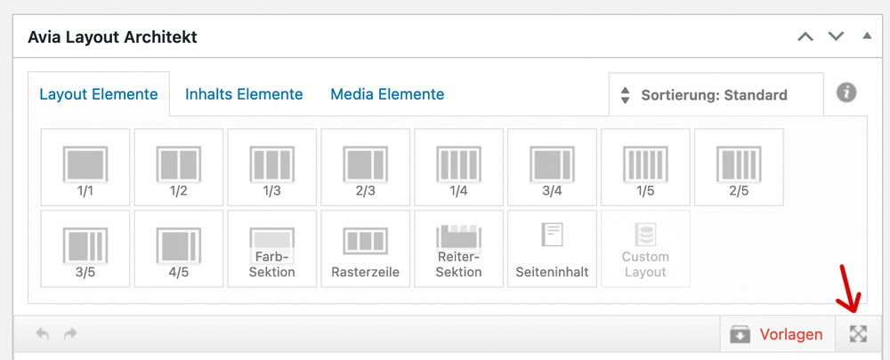
;). it fixes the ALB Control Bar to top – Layout Input Field scrolls away under the top fixed Control Bar. So no need to pull an ALB Element on holding down the button …
July 24, 2024 at 9:31 pm #1462898dameonjamie
ParticipantHello Kriesi,
This is a new problem that started with the latest update of Enfold.
On my website, I have a page with a size chart. Before the latest update, I could insert this size chart into the description of any product I add to my store in this way:
Steps
In the Product Description box of a new product…
1. Click the “Insert Theme Shortcode” icon in the editor (not the Advanced Layout Editor).
2. I believe it was “Page Content” and then I could select “Wild Sugar Size Chart“. This option is gone now.Here is a product I recently added to my online store after the latest major Enfold update:
https://www.wildsugar.fashion/shop/tops/lily-empress-top-in-amazon-fields/
To add the size chart now I have to copy a generated shortcode from the description of a product that was added before the latest Enfold update.I want to, once again, add the size chart to my products.
If there is a new or better way of doing it, please advise. |Thank you.
Best,
DameonJuly 24, 2024 at 8:16 pm #1462896In reply to: Scrolling inside Avia Builder does not work
Hi,
Thanks for the update. Please let us know if you should need any further help on the topic, or if we can close it.
Best regards,
RikardJuly 24, 2024 at 7:31 pm #1462885In reply to: Purchase Code
-
AuthorSearch Results
-
Search Results
-
Hi,
i would like to change:
.html_header_top.html_header_sticky.html_large #main {
padding-top: 116px;
}
to
.html_header_top.html_header_sticky.html_large #main {
padding-top: 66px;
}But only for selected pages.
How can i do that?
kind regards
JakHello Kriesi,
This is a new problem that started with the latest update of Enfold.
On my website, I have a page with a size chart. Before the latest update, I could insert this size chart into the description of any product I add to my store in this way:
Steps
In the Product Description box of a new product…
1. Click the “Insert Theme Shortcode” icon in the editor (not the Advanced Layout Editor).
2. I believe it was “Page Content” and then I could select “Wild Sugar Size Chart“. This option is gone now.Here is a product I recently added to my online store after the latest major Enfold update:
https://www.wildsugar.fashion/shop/tops/lily-empress-top-in-amazon-fields/
To add the size chart now I have to copy a generated shortcode from the description of a product that was added before the latest Enfold update.I want to, once again, add the size chart to my products.
If there is a new or better way of doing it, please advise. |Thank you.
Best,
Dameon