-
Search Results
-
Hi,
The spacing settings in the separator line don’t work in Enfold. Even with “Spacing” set to a negative value, nothing changes.
I use the spacer to separate two fullwidth sliders.
How can I reduce the top/bottom space.
Thanks!
SonnoTopic: theme and plugins
Hello Kriesi Support Team,
I am planning to build a hotel website using your enfold theme and I would like to confirm a few points regarding plugin compatibility and site structure:
1.II want to create a staff/private area where each employee has their own private page to download documents (PDFs like contracts, rules, etc.), and it should be possible to track/download logs to verify that each employee has accessed the files. Plugins I am considering for this are WP Customer Area or Client Portal. Are these compatible with Enfold?
2. I want to include a reviews/testimonials page similar to this example: https://www.villamarni.com/reviews/. Are there any known compatibility issues with plugins that import Airbnb reviews, or would you recommend a specific approach?
3. For now, bookings will link externally to Airbnb, not using an internal booking system, but in the future I may want to integrate a direct booking plugin. Is Enfold compatible with booking plugins such as MotoPress Hotel Booking or WooCommerce Bookings?
4. Can I use WPBakery Page Builder with Enfold by default for building pages, or do you recommend a different page builder?
5. Overall, would you say Enfold can support a website structure like the following?
~12 pages for rooms
~20 private pages for staff
Reviews/testimonials page
Homepage, services, contact, etc.
Thank you very much for your guidance. I want to make sure the theme fully supports this setup before purchasing.
Best regards,
Elisa PolidoriFonts on mobile are larger than fonts on other devices. Also, post fonts are larger than page fonts on mobile. Is this normal?
The General Styling > Typography tab has settings for font styling. Not sure why these only seem to work on desktop.
The biggest problem is post fonts H1, H2, and H3 on mobile. They are far too large and get cut off. Please advise on how to set those font sizes specifically.
Topic: Enfold Version 3.8
Hello,
My website uses the Enfold theme, version 3.8. I purchased it in 2017 and maintained it for about one year, but since then it has not been updated. The website still works, but I can’t make any changes in WordPress.
I tried to search for updates through the WordPress dashboard using my API key and username. However, after entering the data, WordPress says there are no updates available and that my theme is up to date.
The problem is that I cannot edit anything. No changes are saved or shown on the website.
I also can’t update PHP because the website stops working when I do. I would like to update my website and bring everything to the latest version so I can make changes again.
Can someone please help me? I would really appreciate quick support.
Kind regards,Topic: border and distance
Hello everyone,
I have added a submenu across the entire width of this page.
See link 1 below:Is it possible to reduce the space above and below the frame and create a thin frame at the top and bottom?
See sample link 2 below.
Thank you,
FranzMy website is using the Roboto font. I have selected it in Theme Options\General Styling\Fonts:

I want to use another font, “Josefin Sans” on the main special heading only of my homepage.
Please note: they are both Google Webkit fonts.This below is the CSS I used. I followed the instructions I found in the documentation.. You can find this CSS section at the end of my style.css file.
#top .titolo_homepage h1.av-special-heading-tag {
    font-family: 'Josefin Sans', sans-serif !important;
    letter-spacing: -2px;
}

#top .titolo_homepage .av-subheading p {
    font-family: 'Josefin Sans', sans-serif !important;
    letter-spacing: -2px;
    margin-top: -10px !important;
}
Please note: in “Performance,” I disabled CCS compression. I always clear the cache every time I test it, I am always using Incognito mode for my tests.
ON DESKTOP:
1) on desktop, when I open the page for the first time and haven’t yet accepted cookies, I see a normal sans serif font.

After accepting cookies, if I refresh the page, I will finally see the font I chose, Josefin Sans (it is especially recognizable by its very large N).

I should see it also before the cookies. In fact, if I select Josefin Sans in General Styling/Fonts/Headings, I see Josefin Sans also before cookies…
ON MOBILE:
1) Whatever browser I use (Chrome, Safari, Brave, Edge), I still see the default sans serif font, not Josefin sans. Both before and after cookies, both in normal mode and incognito mode.

2) please note: on PC, If I activate the Chrome developer’s mode and switch to “mobile,” I do see Josefin Sans!

So weird…
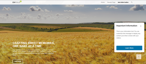
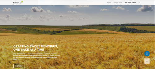
Topic: Fullscreen Slider Button
Hi
My client would like to change the verbiage on the green and white fullscreen slider button at the top of the home page.
Issue: It is not intuitive as to where it is configured. I have checked around all of the fullscreen slider options on the home page to no avail.
Please advise as to where it should be set.
Page: https://blgenvironmental.com/
Screenshot: https://tinyurl.com/26e4tema
Dear Team, the Enfold contact form isn’t displaying correctly on my phone. The fonts are displayed irregularly, the background color has disappeared, and the individual fields are too long. The problem is on both sites (please see the links in the private content)
I’ve cleared the cache several times on the desktop version and also on my phone, clearing the cache for both Safari and Google Chrome.
I’ve tried several CSS Codes I’ve found in the forum. No one worked.
Could you please help me?
Thank you so much!
Hi, I already learned that the excerpt has to be set manually if the layout editor is in use in a blog post.
Here: https://kriesi.at/support/topic/blog-excerpt-not-displayed/
To be honest, I think this is not a very smart solution and there should be a way to have an automated excerpt.
The current mode causes a plus on work and the risk that changes, made to the text, are not displayed because the excerpt is not updated.I really would appreciate if the TEAM offers a smarter solution to this issue.
Love & Beer & Rock’n’Roll !
Hi,
I’m experiencing an issue with the Enfold theme on mobile/small screens:
When the hamburger menu is active, the top header area briefly flashes white when I start scrolling down. After this quick flash, it fades back to the intended header background color.The issue occurs consistently on my own website, but to make sure it wasn’t caused by a local customization, I tested it on several official Enfold demos as well. The same white flash appears in the Enfold Knowledgebase Demo, so the bug seems to affect Enfold’s default configuration too.
It happens only on narrow/mobile viewports and only at the moment when the page first starts scrolling. The header appears to transition through a white state before applying its final background color.
Could you please take a look or let me know if there’s a known fix?
Thanks!
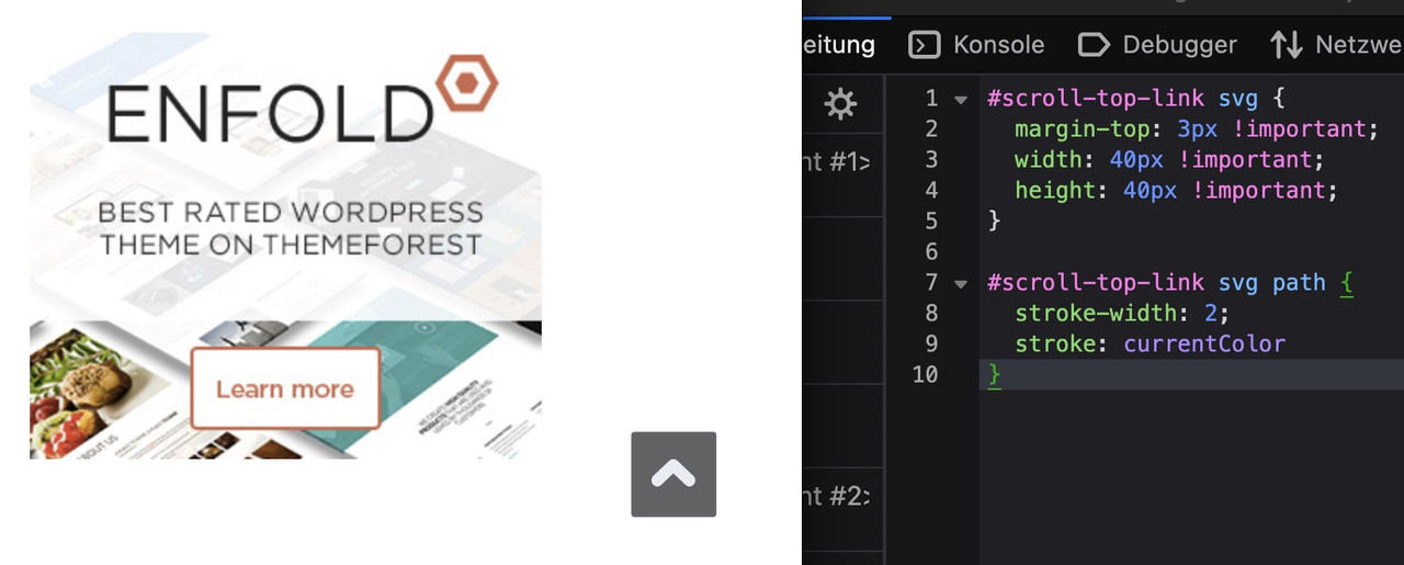
Topic: Icon Title on Hover
Hi, you helped me remove the image title on hover, but I also need to remove it from the icons. Can you help with that?
Sample: https://imgur.com/a/PyEH0Ph
Original ticket: https://kriesi.at/support/topic/image-title-on-hover/


