Developing a new site here:
http://globalgrowthnetworks.com (site will be secure soon by the way still is http for just the moment)
You can see the social icons are beneath the menu, do you have a css hack to move them atop the menu instead?
Thanks
Hi,
To show the search icon on the desktop menu try enabling Enfold Theme Options ▸ Main Menu ▸ General ▸ Append search icon to main menu
I can’t see your images as they require a login, to add a screenshot please try using an Screenshot service and pasting the image URL in your post.
Best regards,
Mike
Hi, The issue is The font is overlapping the areas on desktop. How do I resolve that first of all?
Hi Rikard,
please excuse my late reply. The problem has soon been resolved, the pages have gradually been displayed correctly again in the various browsers. Bitdefender may have interfered. You can close the topic.
Kind regards,
Karin
Hello,
On the top of the Parallax theme, I have put a quote and signature. What I don’t know how to do is to increase the space on each side of the copy, rather than having it go edge to edge, while keeping the colored box the same.
Can you please help with how to do that?
Hi,
I’m not sure what you mean by add some kind padding or margin around logotype to make it breath from the top and bottom limit in the header
perhaps you want more space around the logo with a larger header? You can make the header larger in the theme settings: Enfold Theme Options ▸ Header ▸ Header Layout ▸ Header Custom Height
please try this, or explain further.
Best regards,
Mike
Hello
I put my logo on the top menu, but on the desktop version it is smaller than I want and I want it centered top to bottom. I don’t know how to adjust that.
It looks perfect on cell phone, but not on tablet (same as desktop).
Hope you can help!
thanks for helping, realised some extra:
[extra bonus] i’d like to add some kind padding or margin around logotype to make it breath from the top and bottom limit in the header.
whats the best option?
is to add that as a rule in quick css?
or in the SVG inner rules?
or even there some setting for that in theme options..?
View post on imgur.com
as soon this and the line itens are defined the header is completed and this thread is ended well!
Hi Ismael,
Thank you for your response.
When I view the site from my laptop, everything looks fine. However, when I view the site on a desktop monitor, the font appears small, and there are large empty spaces on the sides of the page.
I have taken screenshots to show the issue. I provide a link to them in the “Private Content” section.
I appreciate your help in resolving this.
Hey TayHefty,
Thanks for the login details. I see that you are running an old version of the theme, could you try to update to the latest version (6.0.2) to see if that helps please? The update to 6.0.2 has to be done manually from the version you are running, please refer to my replies in this thread: https://kriesi.at/support/topic/enfold-4-5-theme-update-update-failed-download-failed-a-valid-url-was-not-pro/#post-1021541
You can either update manually via FTP: https://kriesi.at/documentation/enfold/how-to-install-enfold-theme/#theme-update, or upload the theme as if it was new under Appearance->Themes->Add New Theme.
If that doesn’t work then please try to delete the whole theme folder, then replace it with the new version. Make sure that you have backups of the site before starting updating.
Also please read this after you have updated: https://kriesi.at/documentation/enfold/theme-registration/
Best regards,
Rikard
Hi,
Great, I’m glad that Ismael could help you out. Please let us know if you should need any further help on the topic, or if we can close it.
Best regards,
Rikard
Hi,
Thanks for the update and for sharing your experience. Please let us know if you should need any further help on the topic, or if we can close it.
Best regards,
Rikard
I recently exported from one site my templates to another Enfold install (see: https://kriesi.at/support/topic/exporting-saved-page-templates-between-sites/#post-1464526). However, the Advanced Layerslider that is on one of the templates does not carry-over. So, is there a way to export (then upload) an Advanced Layerslider?
Thanks!
Hey spokerstradingco,
Thank you for the inquiry.
On smaller screens, the font size is set to 0.8em. Did you configure the font size for different screen sizes (Styling > Font Sizes > Heading Font Sizes)?
#top #wrap_all .av-special-heading.av-lxums4ni-4f37f7f215843741833d4240ad4206d4 .av-special-heading-tag {
    font-size: 0.8em;
}
Best regards,
Ismael
Hi,
Great, I’m glad that you got managed to fix things. Please let us know if you should need any further help on the topic, or if we can close it.
Best regards,
Rikard
Hi, I added the code form this thread but it didn’t seem to work. https://kriesi.at/support/topic/full-page-overlay-menu-font-size/
Hi
NB!
Even though a Media Library image is defined as Norwegian or English we need to have access to ALL images for ALL posts and pages. As the same images is used for both languages.
Today they are not.
————–
I have come across what seems like a bug.
In a pages and posts inserting an image only 32 images of the 230 images that are in the Media Library is seen. (I am not sure if this is also impacting WooCommerce product pages.) This is forcing the customer to reupload images to the Media Library to be able to use the correct images.
I have deactivated various plugins and noticed that Polylang language plugin and Enfold is causing this error.
I have also tried with the default WordPress theme of Twenty Twenty Four and all images were seen. So this seems limited to Enfold.
I made a search and came across this older issue from 2015 which is similar and it seems WPML is causing the error there.
Some exploration. Default language is Norwegian. Secondary language is English.
English page: https://industrihuset.no/en/heatingdrying-heatingcabinets-co2-incubators/
In the backend. Clicking to edit where the Memert image is seen. Then clicking to insert image. I noticed only 37 images from the Media Library.
Norwegian page: https://industrihuset.no/varmeskap-co2-inkubator/
Here 126 images are seen of the 230 images that are available.
We need to have all images available for all posts and pages independent of language used.
-
This topic was modified 1 year, 7 months ago by
 SHR Design. Reason: Adjusting
-
This topic was modified 1 year, 7 months ago by SHR Design.
HI, I have a 2 part question. On desktop The special heading product titles are overlapping the column boxes on my page. I have set the default font size to 5.5vw for all meaning the font should adapt but it is not. I have added a screenshot of the issue in private. This happen on Chrome and Safari. On mobile the special titles are too small – how do I make them larger on mobile? It adapts but is very small. I know I can add a default value to the mobile size but thought the auto text size would adjust to the width?
ok – now you have inserted the blue one :
put to your quick css:
html.html_header_transparency #header .logo #strokmatic-logo {
  fill: #FFF !important;
}
and please remove those 3 === from rule:
=== #top .av_header_transparency .header_bg {
  opacity:1;
  filter:alpha(opacity=100)
}
Perfectly solved… you can close the topic, thank you!
Hi,
Great, I’m glad to hear that you found the problem. Please let us know if you should need any further help on the topic, or if we can close it.
Best regards,
Rikard
Hi,
I tried to understand from other forum topics, but still not sure how to do the following:
I use trustindex.io to show up the google reviews on the website https://www.rietreiger.nl
I checkmarked the ‘rich snippet’ option in trustindex.io and therefore I have to insert a code in the <head> tag. See private content
Where can I do this? I use the child theme.
Many thanks in advance
and : do not combine my codes – these are alternatives.
Only use:
#top .av_header_transparency .header_bg {
  opacity: 1;
  filter: alpha(opacity=100);
}

html.html_header_transparency #top #header:not(.av_header_transparency) .header_bg {
  background-color: rgba(0,0,0,0.7) !important;
  -webkit-backdrop-filter: blur(8px);
  backdrop-filter: blur(8px);
}

html.html_header_transparency #top .av_header_transparency .header_bg {
  background-color: rgba(0,0,0,0.4) !important;
  -webkit-backdrop-filter: blur(5px);
  backdrop-filter: blur(5px);
}
do not use the gradient code from here: https://kriesi.at/support/topic/header-bg-in-a-transparent-header/#post-1464021
Hi laptophobo,
You can do that under Enfold->Import/Export->Export Layout Builder Templates.
Best regards,
Rikard
Hi,
Great, I’m glad that Ismael could help you out. Please let us know if you should need any further help on the topic, or if we can close it.
Best regards,
Rikard
It works perfectly, thank you so much!
Eventually, I used this code:
.header-scrolled .logo .subtext > img {
    opacity: 0;
    display: none;
}

#header .logo img,
#header.header-scrolled .logo img {
  transition : opacity 0s ease;
}
I think it looks perfect now, thanks again!!
Page:
This topic can be closed.
Dear Support Team
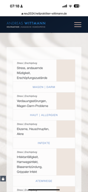
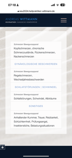
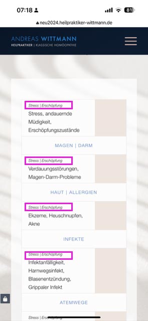
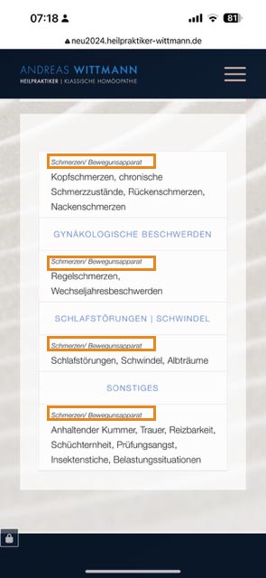
I have the following problem with the tables in the mobile view of the following section on this website: http://neu2024.heilpraktiker-wittmann.de/#indikationen
There are 2 columns in each of which a table is placed. Each table consists of 2 columns, each with a label column (left) and a text column. Everything is displayed correctly on the desktop PC, but unfortunately not on the mobile phone. There are several problems here:
1. and what surprises me the most: that these two tables are also displayed differently in the mobile view (although they are created exactly identically) :
– Mobile phone left table view: https://osmosis.de/support/tablle-left.png >> where do these light beige boxes come from???
– Mobile phone right table view: https://osmosis.de/support/tablle-right.png
2. then there are also content-related problems:
For each of the tables, the first label row is not displayed correctly and is repeated in each subsequent row: see:
– Mobile phone left table view: https://osmosis.de/support/tablle-left1.jpg >> where do these light beige boxes come from here???
– Mobile phone right table view: https://osmosis.de/support/tablle-right1.jpg
My wish would be the table as in the view of the right column (i.e. without these beige boxes) and of course with a correct display of the first labelling line.
Can you please help me?
Best regards and many thanks in advance. Diana
Hey Diana,
Thank you for the inquiry.
The content is cut off because the column has a -170px bottom margin.
#top .flex_column_table.av-equal-height-column-flextable.av-wu3tsa-2f8288ffd7b4a522ef607878953863b5 {
    margin-top: 0px;
    margin-bottom: -170px;
}
You can override this by adding this css code:
@media only screen and (max-width: 768px) {

  /* Add your Mobile Styles here */
  #top .flex_column_table.av-equal-height-column-flextable.av-wu3tsa-2f8288ffd7b4a522ef607878953863b5 {
    margin-top: 0px;
    margin-bottom: 0 !important;
  }
}
Best regards,
Ismael
Hi,
is that where I can add the ava_after_content code?
Yes, you can place the hook in the functions.php file. If you want to override the enfold/includes/loop-index.php, you can create a copy of it in the child theme folder. Please check the documentation below for more info:
// https://developer.wordpress.org/themes/advanced-topics/child-themes/#templates-parts-and-patterns
Best regards,
Ismael
Hi Mike,
Thank you so much. This helped a lot.
3 things, please
1. The burger background, how can I change the whole menu container (content 1) background and not just the burger background?
I’ve added padding on the left and right and didn’t use this code=line: line-height: 40px;
but the pudding does not fit into the container no matter what I tried it either too small on the right or it’s too big on the left (I added pic no. 1 for you to see)
and when the menu is open I would like it to be all white and the – X to close to be in #8c8c8c (the color of the background) and not like what it is with the padding (I added pic no. 2)
2. I’ve added a search option. It is to be shown on the menu, But it’s only on the mobile menu. I would like it to be displayed on the desktop too
3. I would like to enlarge the space between the menu and the logo (which means that the logo and the social links will be a little down)
Thank you again for all the help
Reut