-
Search Results
-
Topic: Block swipe for Easy Slider
On this page that I created with your very useful help, swiping on mobile devices changes the image, making it out-of-sync with the selected item in the ingredients list. How can I block user swiping? I cannot disable the Easy Slider navigation controls (set it to no user interaction) because the item selection code in the ingredient list needs them to display the corresponding image.
Best regards,
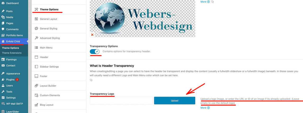
Serge FromentTopic: Enfold Not Showing Logo
Hello:
Demo import: Import: Small Business – Flat Demo
The Enfold Logo will not stop displaying. Have cleared all cache. Have deactivated all plugins. Upon inspection, it says my logo should be showing, but the enfold logo displays. Enfold logo image has been deleted.
I have changed nothing on the demo except for the logo and some color in the general styling. My logo displayed perfectly in another demo import. Have no clue, but would appreciate help. Thank you.
Tim
Hi all,
We have been using Enfold with Polylang for around a year. It has worked well to translate pages from English into German and then Spanish. However it has recently been causing issues whereby the frontend layout was broken. After some investigation, it seems that during the translation process, code is inserted ‘custom_class=’ or even ‘custom_class’ in the section and column elements. This therefore stops the execution of the page rendering and requires a manual cleanup of layout elements. I note that if an element has already been assigned an ID or class, this doesn’t happen.
I have tried the following to filter the outputs, but that hasn’t worked.
Any ideas of what else I can look into, or why this might be happening?
// Prevent Polylang from modifying Enfold shortcodes during duplication
add_filter(‘pll_copy_post_metas’, ‘preserve_enfold_alb_data’, 10, 3);
function preserve_enfold_alb_data($metas, $sync, $from) {
// Remove _aviaLayoutBuilder_active from auto-sync to force manual handling
$metas = array_diff($metas, array(‘_aviaLayoutBuilder_active’));
return $metas;
}// Clean up malformed custom_class parameters in shortcodes
add_filter(‘the_content’, ‘fix_polylang_enfold_shortcodes’, 1);
function fix_polylang_enfold_shortcodes($content) {
// Remove empty custom_class parameters from sections and columns
$content = preg_replace(‘/custom_class=[\'”]{2}/’, ”, $content);
$content = preg_replace(‘/custom_class=[\'”][\s]*[\'”]/’, ”, $content);
return $content;
}// Clean up malformed HTML output
add_filter(‘the_content’, ‘remove_custom_class_id_from_html’, 999);
function remove_custom_class_id_from_html($content) {
// Remove id=”custom_class=” (malformed with extra equals)
$content = preg_replace(‘/\s+id=[“\’]custom_class=[“\’]?/i’, ‘ ‘, $content);// Remove id=”custom_class” (literal value only)
$content = preg_replace(‘/\s+id=[“\’]custom_class[“\’]/i’, ‘ ‘, $content);return $content;
}`Hi – I am trying to center align the content in my footer widgets. I am able to get them to center on desktop, but I am unable to get them to center align on mobile. I am using this:
#footer .widget {
text-align: center;
}
Thank you for you help : )Topic: CPT Sticky Posts in Masonry
Hi folks,
I found a nice piece of code in the forum:
add_filter('avia_masonry_entries_query', 'avia_masonry_entries_query_mod', 10, 1);
function avia_masonry_entries_query_mod($query) {
	$query['post__in'] = get_option( 'sticky_posts' );
	$query['ignore_sticky_posts'] = 1;
	return $query;
}
Now my sticky posts from a CPT show up at the top –> BUT the rest of the posts is missing. Only the sticky posts are part of the query, the remaining posts are not part of the masonry. That is wrong. Any idea why?
Kind regards,
DanielOn mobile, the top image on webpages load the full width of the image, but not the full height. The photo is set to take up 50% of the view height, but that only kicks in after the user does something. The height loads after some action is taken on the screen, such as a scroll or click on the burger menu. The result is that the first impression of the webpage is bad with a cut off image that is too small/short in height.
Is it possible to have this corrected for the first image on pages on mobile?