Hi,
a: yes all would be lost
b: if all of the products followed the same format ie: dots in your slider, and the same number of slides as your variations in the same order, I expect that one javascript script would work for all. As the example thread did
But we won’t be sure until we test on your text product.
Best regards,
Mike
Subject: Issue resolved after replacing Child Theme – monitoring alerts
Hello Kriesi Support Team,
I wanted to update you on the latest status.
I completely deleted the Enfold Child theme that was previously created using the “Child Theme Configurator plugin” and deactivated the plugin as well. After that, I uploaded and activated the original Enfold Child theme folder provided by Kriesi.
Since making this change, everything is working correctly on both the staging site (https://gg.drisabelbalza.com) and the live website: https://www.drisbalebalza.com
There are no visible issues, and the site is behaving normally. At this point, I’m monitoring to confirm that the alert/error emails stop, which I expect now that the child theme structure is clean and original.
Thank you for your guidance. I hope this helped identify the real root cause.
Best regards,
Claudia
Hi,
Yes to the first two questions, as for the custom javascript it is a maybe, we would need to see a test page with the dots in your slider, and the same number of slides as your variations in the same order. Since there are no added classes to tell javascript the difference it needs to be setup so the first option is the first image in the slider & the last is the same as your last image. The dots in the slider link to the images, where the next/prev only link to the next image, not a specific image.
It may work similarly to this thread. But this thread is not your solution, we will need to examine and test on an example on your test page.
Best regards,
Mike
Hey Munford,
To hide the brand try this css:
.single-product .product_meta .tagged_as + .posted_in {
	display: none;
}
To change the woo sorting options to categories is not that easy, but I was able to create this function for your child theme functions.php
add_action( 'woocommerce_before_shop_loop', 'custom_product_category_dropdown', 20 );

function custom_product_category_dropdown() {
    $args = array(
        'show_option_none' => __( 'Filter by Category', 'woocommerce' ),
        'show_count'       => 1,
        'hierarchical'     => 1,
        'taxonomy'         => 'product_cat',
        'hide_empty'       => 1,
        'value_field'      => 'slug',
        'class'            => 'orderby',
        'name'             => 'product_cat_filter',
        'id'               => 'product_cat_filter',
    );

    echo '<div class=" sort-param sort-param-order custom-category-dropdown">';
    wp_dropdown_categories( $args );
    echo '</div>';

    ?>
    <script type="text/javascript">
        (function() {
            var dropdown = document.getElementById("product_cat_filter");
            if (dropdown) {
                dropdown.onchange = function() {
                    var val = this.value;
                    if (val !== '-1') {
                        // Redirect to the category archive page
                        window.location.href = "<?php echo esc_url( home_url( '/' ) ); ?>product-category/" + val;
                    }
                };
            }
        })();
    </script>
    <?php
}
Then add this css:
#top .product-sorting.avia-product-sorting {
   display: none;
}
.avia-webkit #top.woocommerce-page .custom-category-dropdown select {
    padding-right: 40px;
}
#top.woocommerce-page .custom-category-dropdown select {
	width: 100%;
}
The result:
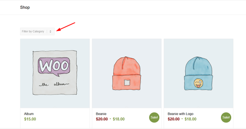
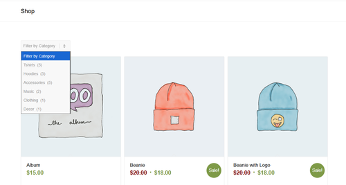
Note that clicking the category in the sort will redirect to the category page, I’m not sure if that will be an issue for you, but it’s the only solution I could come up with. Also the dropdowns style is a little different from the theme.
Best regards,
Mike
This reply has been marked as private.
Hi,
The update to 7.1.3 has to be done manually from the version you are running, please refer to my replies in this thread: https://kriesi.at/support/topic/enfold-4-5-theme-update-update-failed-download-failed-a-valid-url-was-not-pro/#post-1021541
You can either update manually via FTP: https://kriesi.at/documentation/enfold/how-to-install-enfold-theme/#theme-update, or upload the theme as if it was new under Appearance->Themes->Add New Theme.
If that doesn’t work then please try to delete the whole theme folder, then replace it with the new version. Make sure that you have backups of the site before starting updating.
Also please read this after you have updated: https://kriesi.at/documentation/enfold/theme-registration/
Best regards,
Rikard
Hey navindesigns,
This CSS is causing that:
#top #wrap_all .all_colors h2 {
  line-height: 20px !important;
}
Check in Quick CSS or under Enfold->Advanced Styling.
Best regards,
Rikard
well – for the size i see in your merged styles :
#top #wrap_all .av-inherit-size .av-special-heading-tag {
  font-size: 1em;
}
because it is the merged version i do not see – if it is a quick css made rule.
f.e. for the heading “NOTRE ENGAGEMENT” inside color-section : #engagement
these rulesets are made inline ( inside the element options ) ( they are listed in a post-….css file )
.avia-section.av-2ah6ew-59724389008986c8623645d2779db077 {
  background-color: #0984a9;
  background-image: unset;
}

#top #wrap_all .av-special-heading.av-ma6kesg8-158f508a9a89994cebab9c80a4c731f0 .av-special-heading-tag {
  font-size: 40px;
}
for the heading “ACTUALITÉ” inside color-section : #actualite this is not done.
so the standard property is used:
.main_color {
  background-color: var(--enfold-main-color-bg);
}
and this is for your page #fff
Hi,
Do you mean the gap between the first and second section on the front page? If so, then that is a section which automatically is being added after a slider. You can remove the padding and minimum height using this CSS:
.content {
  padding-top: 0;
  padding-bottom: 0;
  min-height: 0;
}
Note that it will apply to all elements with that class.
Best regards,
Rikard
Hi,
Please try this instead:
@media only screen and (max-width: 767px) {
#top fieldset {
  display: contents;
}
}
Best regards,
Rikard
Hi,
Glad that Ismael could help, you are correct that non-touch devices will not encounter touch events, so it should not be an issue. Unless there is anything else with this issue, shall we close this thread? Naturally you can always open a new thread for new issues, but we like to keep each thread on topic. :)
Best regards,
Mike
Yes, I am sending screenshot. All of these forms worked for years until the other day. When they all stopped working.
Hey Georg,
Thanks for reaching out to us. The update to 7.1.3 has to be done manually from the version you are running, please refer to my replies in this thread: https://kriesi.at/support/topic/enfold-4-5-theme-update-update-failed-download-failed-a-valid-url-was-not-pro/#post-1021541
You can either update manually via FTP: https://kriesi.at/documentation/enfold/how-to-install-enfold-theme/#theme-update, or upload the theme as if it was new under Appearance->Themes->Add New Theme.
If that doesn’t work then please try to delete the whole theme folder, then replace it with the new version. Make sure that you have backups of the site before starting updating.
Also please read this after you have updated: https://kriesi.at/documentation/enfold/theme-registration/
Best regards,
Rikard
Hey teresa,
The update to 7.1.3 has to be done manually from the version you are running, please refer to my replies in this thread: https://kriesi.at/support/topic/enfold-4-5-theme-update-update-failed-download-failed-a-valid-url-was-not-pro/#post-1021541
You can either update manually via FTP: https://kriesi.at/documentation/enfold/how-to-install-enfold-theme/#theme-update, or upload the theme as if it was new under Appearance->Themes->Add New Theme.
If that doesn’t work then please try to delete the whole theme folder, then replace it with the new version. Make sure that you have backups of the site before starting updating.
Also please read this after you have updated: https://kriesi.at/documentation/enfold/theme-registration/
Best regards,
Rikard
Hi Ismel,
I can’t seem to respond to the topic anymore, so I’m creating a new one with a link to the old one. I hope that’s OK!
I have activated the Theme Editor! I’m sorry again for the very late response.
Thanks Ismael for your precious help, it is ok now!
For any future use of anyone else, I’ve slightly adapted it. Now it sticks to the right of the logo, and there is a “left arrow” icon instead of the text.

Here the code to be added to the functions.php of the child theme. The button is visible <780px screens only.
add_action( 'ava_main_header', 'ava_main_header_mod' );

function ava_main_header_mod() {
    ?>
    <div class="ava-go-back-wrapper">
        #
            <svg width="24" height="24" viewBox="0 0 24 24" fill="none" xmlns="http://www.w3.org/2000/svg">
                <path d="M19 12H5" stroke="currentColor" stroke-width="2" stroke-linecap="round" stroke-linejoin="round"/>
                <path d="M12 19L5 12L12 5" stroke="currentColor" stroke-width="2" stroke-linecap="round" stroke-linejoin="round"/>
            </svg>
        </a>
    </div>

    <style>
        .ava-go-back-wrapper {
            display: none;
            margin-left: 10px;
            z-index: 1001;
            align-items: center;
        }

        .ava-go-back-button {
            display: flex;
            align-items: center;
            justify-content: center;
            width: 48px;
            height: 48px;
            padding: 0;
            background-color: transparent;
            border: none;
            color: #333333;
            text-decoration: none;
            -webkit-tap-highlight-color: transparent;
            transition: opacity 0.2s ease;
        }

        .ava-go-back-button:active {
            opacity: 0.5;
        }

        .ava-go-back-button svg {
            display: block;
        }

        @media only screen and (max-width: 780px) {
            .responsive #top .logo,
            .responsive .logo,
            .logo {
                display: flex !important;
                align-items: center !important;
                width: auto !important;
                float: left !important;
                overflow: visible !important;
            }

            .logo a {
                display: flex !important;
                align-items: center;
            }

            .ava-go-back-wrapper {
                display: flex !important;
            }
        }

        @media only screen and (max-width: 360px) {
            .ava-go-back-wrapper {
                 margin-left: 5px;
            }
            .ava-go-back-button {
                width: 40px;
                height: 40px;
            }
        }
    </style>

    <script>
        document.addEventListener('DOMContentLoaded', function() {
            var logo = document.querySelector('.logo');
            var backBtnWrapper = document.querySelector('.ava-go-back-wrapper');

            if (logo && backBtnWrapper) {
                logo.appendChild(backBtnWrapper);
            }

            function closeBurgerMenu() {
                const burgerBtn = document.querySelector('.av-burger-menu-main .av-hamburger.av-js-hamburger');
                const overlay = document.querySelector('.av-burger-overlay');
                if (burgerBtn && burgerBtn.classList.contains('is-active')) {
                    burgerBtn.classList.remove('is-active');
                }
                if (overlay) {
                    overlay.style.display = 'none';
                    overlay.style.opacity = '0';
                }
            }

            const goBackBtn = document.querySelector('.ava-go-back-button');
            if (goBackBtn) {
                goBackBtn.addEventListener('click', function(e) {
                    e.preventDefault();
                    e.stopPropagation();

                    closeBurgerMenu();

                    setTimeout(function() {
                        history.back();
                    }, 50);
                });
            }
        });
    </script>
    <?php
}
Bye!
A.-
Hi,
Thank you for the update.
You can apply a custom css class (e.g “av-tab-section-title-limit”) to the tab sections where you need the modifications, then adjust the selectors in the css rules accordingly. Please check this documentation for more information on how to apply custom css class names to the elements.
— https://kriesi.at/documentation/enfold/add-custom-css/
#top .av-tab-section-title-limit .av-tab-section-tab-title-container {
    display: flex;
    flex-wrap: wrap;
    justify-content: center;
    gap: 10px;
}

#top .av-tab-section-title-limit .av-tab-section-tab-title-container > * {
    flex: 0 0 calc((100% / 6) - (10px * 5 / 6));
    max-width: calc((1310px - (10px * 5)) / 6);
    box-sizing: border-box;
}
Best regards,
Ismael
Hey!
Thank you for the update.
Please add this to the style block or style element:
.ava-go-back-wrapper {
    position: absolute;
    z-index: 99;
    left: 55%;
    right: auto;
    top: 5px;
}

Best regards,
Ismael
Hi,
Thank you for the update.
We updated the script in the functions.php file — the page should now be scrollable.
function remove_slideshow_swipe_script() { ?>
<script>
document.addEventListener('DOMContentLoaded', function() {
    if (window.innerWidth <= 768) {
        var slideshow = document.querySelector('.avia-slideshow');
        if (!slideshow) return;

        slideshow.style.touchAction = 'pan-y';

        let startX = 0;
        let startY = 0;

        slideshow.addEventListener('touchstart', function(e) {
            startX = e.touches[0].clientX;
            startY = e.touches[0].clientY;
        }, {passive: true, capture: true});

        slideshow.addEventListener('touchmove', function(e) {
            const dx = Math.abs(e.touches[0].clientX - startX);
            const dy = Math.abs(e.touches[0].clientY - startY);

            if (dx > dy) {
                e.preventDefault();
                e.stopImmediatePropagation();
            }
        }, {passive: false, capture: true});
    }
});
</script>
<?php
}
add_action( 'wp_footer', 'remove_slideshow_swipe_script', 99 );
Best regards,
Ismael
Hello Enfold Support Team,
I am experiencing a recurring fatal error on a live website (https://www.drisabelbalza.com) that triggers WordPress “Your Site is Experiencing a Technical Issue” emails repeatedly.
Environment:
WordPress version: 6.8.3
Parent theme: Enfold 7.1.3
Active theme: Enfold Child (version 7.1.3)
Current plugin: (version )
PHP version: 7.4.33
Error Details:
An error of type E_ERROR was caused in line 223 of the file /home/drisabel/public_html/wp-content/themes/enfold/includes/classes/class-social-media-icons.php. Error message: Uncaught Error: Class ‘avia_font_manager’ not found in /home/drisabel/public_html/wp-content/themes/enfold/includes/classes/class-social-media-icons.php:223
Stack trace:
#0 /home/drisabel/public_html/wp-content/themes/enfold/includes/classes/class-social-media-icons.php(259): avia_social_media_icons->build_icon(Array)
#1 /home/drisabel/public_html/wp-content/themes/enfold/includes/classes/class-social-media-icons.php(288): avia_social_media_icons->html()
#2 /home/drisabel/public_html/wp-content/themes/enfold/includes/helper-main-menu.php(22): avia_social_media_icons(Array, false)
#3 /home/drisabel/public_html/wp-includes/template.php(812): require(‘/home/drisabel/…’)
#4 /home/drisabel/public_html/wp-includes/template.php(745): load_template(‘/home/drisabel/…’, false, Array)
#5 /home/drisabel/public_html/wp-includes/general-template.php(206): locate_template(Array, true, false, Array)
#6 /home/drisabel/public_html/wp-content/themes/enfold/header.php(275): get_template_part(‘includes/helper’, ‘main-menu’)
#
What I’ve already tried:
1- Purchased and installed a fresh, original Enfold 7.1.3 download
2- Verified that only one Enfold parent theme exists in /themes/enfold
3- Confirmed child theme only contains custom files (no class overrides). It exists in /themes/enfold-child
4- Switched PHP versions (8.1 → 7.4.33)
5- Cleared cache and re-uploaded theme via FTP
Despite this, the error has persisted since August 27, 2025, and continues to send automated WordPress admin emails. The live website https://www.drisabelbalza.com works fine and normally, but my client wants to stop receiving these alert emails from WordPress.
Questions:
It appears that avia_font_manager is not being loaded before class-social-media-icons.php is called. Could you please advise:
– Which file should load avia_font_manager in Enfold 7.1.3? May I need a code snippet somewhere?
– Whether this indicates a corrupted load order or a missing include
– If this is a known issue with WordPress 6.8.3
– I had a long stack trace list when I switched from PHP 7.4.33 to PHP 8.1, and it was worse in PHP 8.3, which is why I downgraded to PHP 7.4.33, where the list is shorter.
Thank you for your help.
Best regards,
Claudia.
Hi,
Thanks, I added this script to your child theme functions.php file:
function remove_slideshow_swipe_script() { ?>
  <script>
document.addEventListener('DOMContentLoaded', function() {
    if (window.innerWidth <= 768) {
        var slideshow = document.querySelector('.avia-slideshow');
        if (slideshow) {
            slideshow.style.touchAction = 'none';

            ['touchstart', 'touchmove', 'touchend'].forEach(function(event) {
                slideshow.addEventListener(event, function(e) {
                    e.preventDefault();
                    e.stopImmediatePropagation();
                }, {passive: false, capture: true});
            });
        }
    }
});
  </script>
  <?php
}
add_action( 'wp_footer', 'remove_slideshow_swipe_script', 99 );
and it is working for my Android device, with the other script still working, as before if you are using a iPhone you may need to clear the history to fully clear the cache.
Best regards,
Mike
Hey Angelo,
Thank you for the inquiry.
Try to add this code to the functions.php file to insert a go back button inside the header container.
add_action( 'ava_main_header', 'ava_main_header_mod' );
function ava_main_header_mod() {
    ?>
    <div class="ava-go-back-wrapper">
        <a href="javascript:history.back();" class="ava-go-back-button">Go Back</a>
    </div>

    <style>
        .ava-go-back-wrapper {
            display: none;
            justify-content: center;
            align-items: center;
            padding: 10px 0;
        }
        .ava-go-back-button {
            display: inline-block;
            padding: 8px 16px;
            background-color: #333;
            color: #fff;
            text-decoration: none;
            border-radius: 4px;
            font-size: 14px;
        }
        @media (max-width: 768px) {
            .ava-go-back-wrapper {
                display: flex;
            }
        }
    </style>

    <script>
        function closeBurgerMenu() {
            const burgerBtn = document.querySelector('.av-burger-menu-main .av-hamburger.av-js-hamburger');
            const overlay = document.querySelector('.av-burger-overlay');
            if (burgerBtn && burgerBtn.classList.contains('is-active')) {
                burgerBtn.classList.remove('is-active');
            }
            if (overlay) {
                overlay.style.display = 'none';
                overlay.style.opacity = '0';
            }
        }

        document.addEventListener('DOMContentLoaded', function() {
            closeBurgerMenu();

            const goBackBtn = document.querySelector('.ava-go-back-button');
            if (goBackBtn) {
                goBackBtn.addEventListener('click', function(e) {
                    e.stopPropagation();
                    closeBurgerMenu();
                    setTimeout(function() {
                        history.back();
                    }, 50);
                });
            }
        });

        window.addEventListener('pageshow', function(event) {
            if (event.persisted) {
                closeBurgerMenu();
            }
        });
    </script>
    <?php
}
Best regards,
Ismael
Support topic 2:
Is the number of tab section icons shown on mobile adjustable? I think 4-6 could be shown instead of 3, while still being readable.
The tab content can be swiped, but not the tab icons themselves – they have an arrow. Can you propose a mobile only element that hints the user that they can swipe? It’s not obvious it has that functionality.
In the middle of the top menu bar on the mobile view, I’d like to place a “<=” button (or a menu item with an icon).
This button/menu item should have a simple “javascript:history.back()” link so that the user can go back to the previous page.
This is useful when the website is installed as a webapp and there is no browser around it.
Could you please help me? I’ve seen some requests in the forum for a secondary menu in addition to the hamburger menu, but the PHP + CSS code mentioned seems quite complex for what I want to do.
Here what I’d like to achieve…

Thanks in advance!
Bye,
A.-
btw. with your semi-transparent flacon at the bottom – maybe it is nice to have the burger overlay semi-transparent.
.html_av-overlay-side #top .av-burger-overlay-scroll {
  background-color: rgba(255,255,255,0.7);
  backdrop-filter: blur(10px)
}

#av-burger-menu-ul .only_mobile img {
  filter: drop-shadow(1px 1px 2px #aaa)
}
there is still something wrong:
I’ll try again – please read it carefully
The menu you see above as a text menu and the menu you see in the hamburger menu have the same source but different selectors. So you don’t need to set up a media query to hide the logo in the top text menu. This is particularly advantageous in your case, as given the nature of your text menu, it would certainly be better to display the hamburger menu earlier (1085px) than would be possible at 768px. Your text menu overlaps the main logo long before it displays the hamburger icon.
for having an earlier hamburger icon you only need here a media query setting:
@media only screen and (max-width: 1085px) {
    #top #header .av-main-nav > li.menu-item  {
        display: none !important;
    }
    #top #header .av-burger-menu-main {
        cursor: pointer;
        display: block !important;
    }
}
Remove all media query settings for your only_mobile logo from your Quick CSS, with the exception of the existing global rule.
(This is why it already works for the footer area.)
.only_mobile {
  display: none;
}
you now only have to show it again for the hamburger menue:
#av-burger-menu-ul .only_mobile {
  display: block;
}
thats all.
btw: here are the selectors for your logos inside your menues:
top text menue: #avia-menu .only_mobile
hamburger menue: #av-burger-menu-ul .only_mobile
footer menue: #menu-main-menu .only_mobile
Hi,
Sorry for the delay. Since removing the br tags also removes the list items, we used this css in the style.css file to hide the line breaks and display the list as a standard bullet list.
.av-masonry-entry-content ul br {
    display: none;
}

.av-masonry-entry-content ul li {
    padding-left: 10px;
	position: relative;
}

.av-masonry-entry-content ul li:before {
    content: "•";
    position: absolute;
    left: 0;
    top: 5px;
    font-size: 1em;
    line-height: 1;
}
Please check the private field for the screenshot.

Best regards,
Ismael
Hey photographie-tous-azimuts,
Try adding this css:
/* Disable touch/swipe on mobile */
@media (max-width: 768px) {
    .slider-container,
    .slider-container * {
        touch-action: none !important;
        -webkit-user-drag: none !important;
        user-select: none !important;
    }
}
Then clear your cache and check. Unfortunately I can not test this on my end as desktop browser doesn’t show the swipe action, but this will likely work.
If you are using a iPhone you may need to clear the history to fully clear the cache.
Best regards,
Mike
On this page that I created with your very useful help, swiping on mobile devices changes the image, making it out-of-sync with the selected item in the ingredients list. How can I block user swiping? I cannot disable the Easy Slider navigation controls (set it to no user interaction) because the item selection code in the ingredient list needs them to display the corresponding image.
Best regards,
Serge Froment
but – you can have both by css– let the animation stay at slide (slide sidewards or slide up/down)
slides comes in by sliding – but buttons fade in: (maybe with delay)
.avia_transform #top .av_fullscreen .avia-slideshow-button,
.avia_transform #top .av_slideshow_full .avia-slideshow-button,
.avia_transform #top .av_fullscreen .avia-slideshow-button-2,
.avia_transform #top .av_slideshow_full .avia-slideshow-button-2 {
  opacity: 0;
  transform: translate(0,0);
}

.avia_transform #top .av_fullscreen .active-slide .avia-slideshow-button,
.avia_transform #top .av_slideshow_full .active-slide .avia-slideshow-button,
.avia_transform #top .av_fullscreen .active-slide .avia-slideshow-button-2,
.avia_transform #top .av_slideshow_full .active-slide .avia-slideshow-button-2 {
  visibility: visible;
  animation: caption-top 1s linear 2s 1 forwards;
}
the shortform of animation means:
animation:
	animation-name: caption-top;
	animation-duration: 1s;
	animation-timing-function: linear;
	animation-delay: 2s;
	animation-iteration-count: 1;
	animation-fill-mode: forwards;
if you do not like the delay – just remove or change that value to your delay ( f.e. 1s)
see: https://webers-testseite.de/slider-with-kenburns/
PS: you see – you can even address them differently the first button can fade in – the second one comes sliding in …