man sollte auf jedenfall für kleinere Screenweiten auch von dem riesen padding der grid-cells abweichen.
z.B.
@media only screen and (max-width:1090px) {
  .responsive #top #wrap_all #main .flex_cell {
    padding: 30px !important;
  }
}
und man kann wie oben schon gesagt die Cell-Sizes ändern z.B auf 2/5 – 3/5. – im Wechsel
siehe: https://webers-testseite.de/freelancer/
könnte Ihr mir mal die Seite als Link zukommen lassen? Wenn es denn absolute nicht geht, das es hier öffentlich gemacht werden kann.
Mein Nick führt Euch ja zu meiner Stammseite, einfach als e-mail dann absenden.
(Habe momentan zwar einen Autoresponder aktiviert, da ich ab morgen mal eine Woche nicht erreichbar sein werde.)
Das Problem mit iPad und Konsorten ist, das der mobile Safari momentan zu einem neuen IE6 wird. Die User werden ordentlich bevormundet, was die eigenen Anpassungen desselben betrifft. Ganze Features, die längst in anderen Browsern umgesetzt sind, fehlen hier. Ausserdem gibt es keine vernünftigen Methoden die Seite im Device mit Dev Tools zu inspizieren. Eine Emulation in Safari Desktop via XCode ist umständlich. Ich würde das mal versuchen, wenn ich nicht schon Sequoia installiert hätte.
PS: ich würde es wo es geht vermeiden, mit dem Trick des “doppelten Content in anderen Darstellungsmethoden” zu arbeiten. Dann lieber die vorhandene Gridrow an die neuen Bedürfnisse anpassen.
Diesen Breakpoint kann man natürlich verändern – via css Anweisung z.B.
@media only screen and (max-width: 1195px) {
  .responsive #top #wrap_all .av-break-at-tablet .flex_cell,
  .responsive #top #wrap_all .flex_column.av-break-at-tablet {
    margin: 0;
    margin-bottom: 0px;
    margin-bottom: 20px;
    width: 100%;
    display: block;
  }
}
Das Ein-/Ausblenden von Elementen kann man ganz entsprechend mit ähnlichen Media Queries abändern.
Aber – wie gesagt – um bessere Ratschläge zu geben müsst ich erstmal den Sachverhalt live sehen.
Hello,
I am using the Enfold theme, and I don’t know how to get rid of the huge empty space under the boxes that move just under the top photo. I’d attach a picture, but I don’t know how… but if you scroll down slighly from the top of the home space, after the boxes, and before the video, there is a huge space.
How can I control this?
I have been working on this a bit more and added a background image to display at the top of the header area on the pages in the website. You can see what I am referring to in the area in this screenshot that has the red outline around it:
https://hfxfarmersmarket.nicomitcms.com/wp-content/uploads/2024/10/Background-Example.jpg
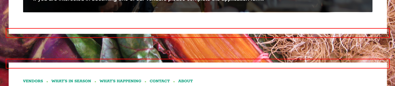
I am trying to add the same type of background to the bottom of the main content container and the top of the footer container, but not having much luck. See the red outlined areas in this screenshot:
https://hfxfarmersmarket.nicomitcms.com/wp-content/uploads/2024/10/Content-and-Footer-Example.jpg
If someone could let me know how I could do this, it would be great. The link to the website is included in the private data below. Thanks!
Hi Kriesi,
Can you help me with the mobile menu of this site? I’ve customized the header for the desktop version, but when I open the menu on any mobile device, it doesn’t seem to be attached to the header; there’s always some space (it’s noticeable). Can you take a look and let me know what I might have done wrong?
Thank you for your support, great work!
This is what it looks like:
@media only screen and (max-width: 767px) {
#top #wrap_all .avia-slideshow .av-slideshow-caption.av-m1g8o6g7-f7efce2774fcf0ca4bccdacd45c3be64__0 .avia-caption-title {
font-size: 22px !important;
}
}
#top .avia-slideshow .av-slideshow-caption.av-m1g8o6g7-f7efce2774fcf0ca4bccdacd45c3be64__0 .avia-caption-content p {
font-size: 18px;
}
@media only screen and (max-width: 767px) {
.home #full_slider_1 .slideshow_caption {
left: 20%;
width: 80%;
padding: 0;
}
}
Go to Enfold Options Page – Header – Tab: Extra Elements
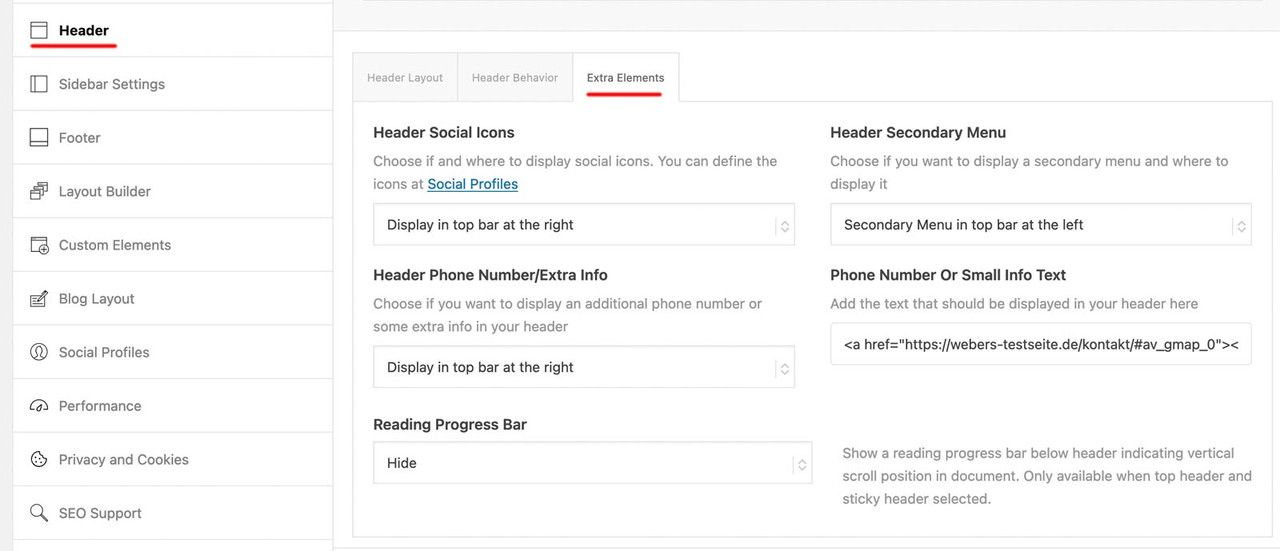
for the first two settings Header Social Icons and Header Secondary Menu these content had to be set – if they should be shown on that header_meta (top-bar).
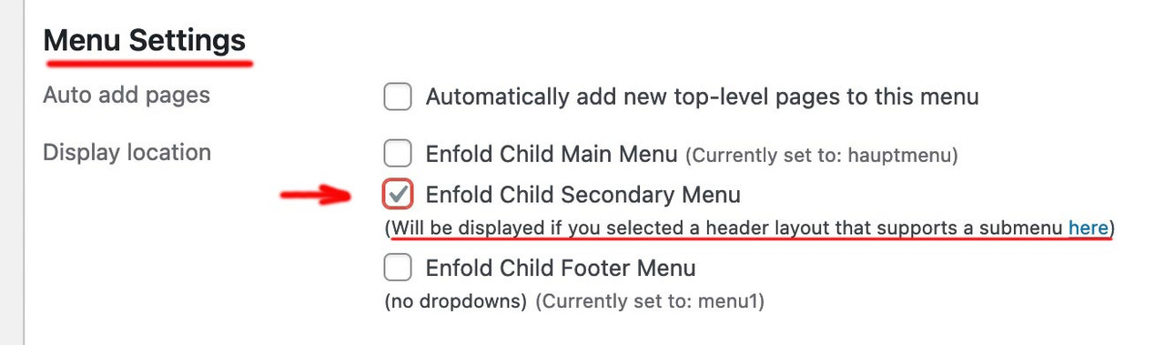
For secondary menue – you had to declare a menu as secondary menue on appearance – menus :
For Social icons – go to Enfold Option – Social Profiles.
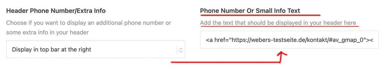
For Phone Number – you had on the right side an input field for that content ( tags are allowed here)
you might have something like:
<a href="domain/kontakt/#av_gmap_0"><span class="map">Location</span></a><a href="domain/kontakt/"><span class="contact">Contact</span></a><a href="tel:+492281234567"><span class="tel">Phone</span></a>
yes I do it in text mode, but the changes don’t save. I wrote to the event calendar support and they said it is a glitch in the plugin that they are looking at fixing. She also said the previous events links at the bottom should be there but are being blocked by some customizing I have there, but all I see is this which is hiding the search bar at the top:
/*-------hide top bars on events page--------*/
.tribe-events-header__events-bar.tribe-events-c-events-bar.tribe-events-c-events-bar--border {
    display: none
}
.tribe-events-header.tribe-events-header--has-event-search {
    display: none
}
can you see why that would effect the previous events links?
thanks for taking a look
Nancy
But with this system the image is positioned at the top I would like to place it in the center.
Would you know how?
Furthermore, is it possible to know the size of the column so as to create an already proportioned image?
Thank you,
Mariarita
Hello.
No matter how much I search, I can’t seem to find how to make the top bar appear (Like the grey-blue one at https://kriesi.at/themes/enfold-shop/ with the “Give us a call now” text), or how to edit it’s content. Can you please let me know?
Thank you
Hi,
Thank you for the update.
Have you tried adding this code in the functions.php file as @Guenni007 suggested in the previous thread?
function admin_head_mod() {
echo '<style type="text/css">
	#postbox-container-2 { clear: left; }
	.index-php #postbox-container-2 { clear: none; }
</style>';
}
add_action('admin_head', 'admin_head_mod');
Thread; https://kriesi.at/support/topic/enfold-back-end-not-working-in-safari-on-sequoia/#post-1468431
Best regards,
Ismael
 Michael Callahan
Guest
The carousel image captions are not showing up on my mobile Android phone view. When I preview mobile view on a laptop, I can however see the captions (which include HTML coding and links to other pages on the site). I have tried using “Title, Description, & Caption” and none of these options show. I have changed fonts, spacing, and nothing works. Before I start trying to input CSS code and potentially mess with the home page too much, can you please let me know what to do to fix this mobile phone viewing issue with the carousel image captions? This is the website: https://comfort1stinsulation.com/ .
Offtopic
by the way – the template_redirect could be used to have not the ugly : //domain/?s=xyz on search results page
but //domain/search/xyz
function re_rewrite_rules() {
  global $wp_rewrite;
  $wp_rewrite->search_base = 'search';
  $wp_rewrite->flush_rules();
}
add_action('init', 're_rewrite_rules');

function change_search_url() {
    if ( is_search() && ! empty( $_GET['s'] ) ) {
        wp_redirect( home_url( '/search/' ) . urlencode( get_query_var( 's' ) ) );
        exit();
    }
}
add_action( 'template_redirect', 'change_search_url' );
i can find this css in your setting:
homepage:
.avia-slideshow li {
  padding: 0;
  margin: 0;
  list-style-type: none;
  list-style-position: outside;
  position: absolute;
  visibility: hidden;
  z-index: 1;
  top: 0;
  left: 0;
  width: 100%;
  clear: both;
  opacity: 0;
  overflow: hidden;
}
visibility: hidden; opacity :0
.av-masonry-entry {
  position: relative;
  display: block;
  width: 24.9%;
  float: left;
  clear: none;
  text-decoration: none;
  visibility: hidden;
  opacity: 0;
}
visibility: hidden; opacity: 0; ?
i thought you like to have the first level only in that style.
ok – get rid of the bold setting for parent theme
( via : #top #header .av-main-nav > li.current-menu-item > a )
and use:
.header_color .main_menu ul  li.current_page_item > a > .avia-menu-text {
  font-weight:700;
  color: #000;
}
Hi,
Please see this thread to remove some of the filter options.
Best regards,
Mike
Hi,
Please try this CSS as well:
section.related .inner_product a.product_type_simple {
  width: 100%;
}

section.related .inner_product .yith-wcwl-add-button {
  margin-top: 55px;
}
Best regards,
Rikard
Hi,
we have website that uses a customized template in the loop-index.php file for posts. When switching to ALB this template is no longer being used. I can’t figure out which template the builder is using instead. Is it possible to make the ALB also use the index-loop.php. Is there maybe a setting in the backend for it. Right now I tried using this code, but it doesn’t seem to work.
function force_loop_index_template() {
    // Check if we're viewing a single post
    if ( is_single() ) {

        // Get the current post ID
        $post_id = get_the_ID();

        // Check if the Advanced Layout Builder is active for the current post
        $is_alb_active = get_post_meta( $post_id, '_aviaLayoutBuilder_active', true );

        // Check if the post belongs to the "Blog" or "News" category
        $has_required_category = has_category( array( 'Blog', 'News' ), $post_id );

        // If ALB is active and the post has the required categories
        if ( $is_alb_active == 'active' && $has_required_category ) {
            // Force load the loop-index.php template from the /includes/ folder in the child theme
            $custom_template = get_stylesheet_directory() . '/includes/loop-index.php';

            // Check if the template file exists
            if ( file_exists( $custom_template ) ) {
                // Load the custom template and exit to stop further execution
                include( $custom_template );
                exit;
            }
        }
    }
}
add_action( 'template_redirect', 'force_loop_index_template', 999 );
Unfortunately, due to a lack of developer tools, mobile browsers cannot be tested in the same way as desktop browsers. Unfortunately, the emulators aren’t accurate enough.
Since scrolling is triggered by a swipe (touch), I suspect that you could, for example, slightly touch a button which then gets the focus.
This is very speculative, but worth a try.
Try ( in this case only for that page-id of https://coralstarfish-com.stackstaging.com ) in your child-theme functions.php:
function blur_all_avia_buttons() {
if(is_page(22)){
?>
<script type="text/javascript">
window.addEventListener("DOMContentLoaded", function () {
(function($){
	$('.avia-button').addClass('btn-blur');
	$('.avia-button.btn-blur').on('mousedown touchstart', function(){
		$(this).blur();
	});
})(jQuery);
});
</script>
<?php
}
}
add_action('wp_footer', 'blur_all_avia_buttons');
Please delete the caches, especially in the mobile device itself.
Hi, goodmorning,
When I want to edit a page the layout of the avia editor is not in one line.
You should see (from top to bottom) Title, Layout editor, Yoast and on the right side image, publish, category, tags etc.
This is on multiple websites with Enfold.
So far I have:
Reinstalled WordPress;
Downgraded Enfold to 6.0 and updated to 6.0. 5;
Deactivated plugins and activated them one by one.
I have not found an answer for this problem anywhere.
I have made a small video and a screenshot and would like to share it with you so you know what I mean. But I can’t find an upload possibility.
Thank you for confirming Ismael.
It is ok, I can wait for the next update. It is a problem that macOS users are blocked with no options when having Private Relay on, hopefully you consider adding Turnstile sooner, which is way better for spam.
You can mark this as solved.
Hi,
We adjusted the css code again. Please make sure to temporarily disable the Enfold > Performance > File Compression settings and purge the cache before testing the page again. You can also try checking the site on incognito mode:
@media only screen and (max-width: 390px) and (max-height: 844px),
       only screen and (max-width: 375px) and (max-height: 812px) {
    .avia-section.av-4yjl9v-7b320115415e977d04047ac1e3f3980a .av-parallax .av-parallax-inner {
        top: 150px;
    }
}
Best regards,
Ismael
to influence the native list-point only – there is no way. Even a list-point color does not exist.
You can only influence the whole list item, it is not possible to influence only the list-style-type.
you do not need to set the color – then it will be inherited from text-block.
Are these red points dots? “disc” – so get rid of color property – and adjust the font-size to your needs.
if you just want to increase the font-size of the list-items select them by the li element and set the font-size property:
#top .avia_textblock > ul > li {
  font-size: 18px;
}
Your wording and topic title led me a little astray. If only you had written: Font-size of the list – that would be clearer
Hi,
Thanks for the update. Please let us know if you should need any further help on the topic, or if we can close it.
Best regards,
Rikard
Thanks again, Ismael. However, on a small phone screen I don’t see the difference, the bottom font is still bigger than the top.
Hi Ismael,
I have added the code, but unfortunately nothing changes.
The devices I used are an iPhone 15 pro and an iPhone Xs. Both show the same problem. In the simulator at my laptop the background shows how it supposed to be, but at a real phone it does not.
Kind Regards,
Lisa
When you get down to the footer on iPhone, the site automatically jumps up the page – what is causing this?
[video src="https://coralstarfish-com.stackstaging.com/wp-content/uploads/2024/10/Footer-jumping-bug.mp4" /]
-
This topic was modified 1 year, 5 months ago by
 whdsolutions.
-
This topic was modified 1 year, 5 months ago by whdsolutions.
Hi,
Thank you for the update.
It might be an issue with the embedded code in the Code Block element.
<div class="sked-portal-container" style="">
  <iframe id="sked-portal" sandbox="allow-top-navigation allow-scripts allow-forms allow-same-origin" style="border: none; height: 75vh; width: 100vw; " src="https://portal.sked.life/new-patient?key=sfdsfdsf">
  </iframe>

<script>
    (function(){
      try {
        const redirectUrl = "https://blossomfamilychiropractic.com/schedule-appointment/appointment-thank-you-orlando/";
        const messageHandler = function(event) {
          if(event && event.data) {
            const skedMessage = JSON.parse(event.data);
            if(skedMessage && skedMessage.actionType === 'confirm') {
              window.location.href = redirectUrl;
            }
          }
        };

        window.addEventListener('message', messageHandler);
      } catch(err){};
    })();
    </script></div>
Instead of embedding this code directly to the page, try creating a custom shortcode for it. Example:
function sked_portal_shortcode() {
    ob_start();
    ?>
<div class="sked-portal-container" style="">
        <iframe id="sked-portal" sandbox="allow-top-navigation allow-scripts allow-forms allow-same-origin" style="border: none; height: 75vh; width: 100vw;" src="https://portal.sked.life/new-patient?key=sfsfsdfsfssfds"></iframe>
        <script>
            (function(){
                try {
                    const redirectUrl = "https://blossomfamilychiropractic.com/schedule-appointment/appointment-thank-you-orlando/";
                    const messageHandler = function(event) {
                        if(event && event.data) {
                            const skedMessage = JSON.parse(event.data);
                            if(skedMessage && skedMessage.actionType === 'confirm') {
                                window.location.href = redirectUrl;
                            }
                        }
                    };

                    window.addEventListener('message', messageHandler);
                } catch(err) {};
            })();
        </script></div>
<?php
    return ob_get_clean();
}

add_shortcode('sked_portal', 'sked_portal_shortcode');
You can use this shortcode in Code Blocke element:
[sked_portal]
Please make sure to update the key value in this URL:
https://portal.sked.life/new-patient?key=sfsfsdfsfssfds
Best regards,
Ismael


