Hi,
Great, I’m glad that you found a solution, and thanks for the update. Please let us know if you should need any further help on the topic, or if we can close it.
Best regards,
Rikard
Hi there, I would like to make a seperate admin account for you to give you the login credentials but it requires an email adress, which one can I use?
By the way: there is no “Advanced Layout Builder” button at the top of the page. Normally when I login and I see the frontpage then it shows “Edit frontpage (advanced layout builder)” on top. But now it only says “edit frontpage” and when I do this the code screen appears and I can only see html code. As if the layout builder has disappeared.
if you only have a slideshow – without buttons and without links on the slides – you can have left side image: prev – and right side image : next
only by css:
(the navigation arrows must be selected as navigation controls – but we do not show them)
.avia-slideshow-arrows.avia-slideshow-controls {
  height: 100% !important;
  width: 100% !important;
  display: block;
  position: absolute;
  top: 0;
  left: 0;
}

#top .avia-slideshow-arrows a {
  width: 50% !important;
  height: 100%;
  top: 0;
  margin:0 !important;
  padding: 0 !important;
  opacity: 0 !important;
}

#top .avia-slideshow-arrows a.prev-slide {
  left: 0;
}

#top .avia-slideshow-arrows a.next-slide {
  right: 0;
}
if you like to have that arrows – we must have that css in addition:
(and remove the opacity : 0 above)
#top .avia-slideshow-arrows a.prev-slide:before {
  text-align: left;
}

#top .avia-slideshow-arrows a.next-slide:before {
  text-align:right;
}

#top .avia-slideshow-arrows a:before  {
  top: 50%;
  width: 30px;
  height: 60px;
}

#top .avia-slideshow-arrows a.prev-slide:before  {
  left: 20px;
  padding-left: 20px
}

#top .avia-slideshow-arrows a.next-slide:before  {
  right: 20px;
  left: auto;
  padding-right: 20px
}
see css solution in action : https://webers-testseite.de/easy-slider-navigation/
but if you have buttons inside those slides we have to do it via child-theme functions.php:
( without the css above – but without prev next option – but you can use buttons on sliders )
https://pastebin.com/sc2A3XqZ
-
This reply was modified 1 year, 2 months ago by
 Yigit.
-
This reply was modified 1 year, 2 months ago by Yigit.
You should be more specific about that. Does it no longer work in general or do you mean on mobile devices?
If you select this option in Enfold under Header- Header behavior, the header is generally set to position: fixed. Based on your nickname, I see on your page that the header is set to position: sticky. Did you set this yourself via quick css?
PS: Quick Css input field is just to place css rules – no script or php snippets. ( functions or add_filter rules etc.)
so remove those non css instructions and that css:
.html_header_top.html_header_sticky #header {
	position: sticky !important;
}
and place functions or filters to the child-theme functions.php. If you do not use child-theme then try one of those plugins to inject snippets.
Unfortunately, I have no experience with such plugins, so I can’t recommend one. Maybe a mod here knows a good one.
Next: how did you place the cart icon into the navigation?
Was building a page template fine over the week day last week while at work, and in the weekend at home I noticed that some styles were reset or something. I already had create a page template before hand, which I duplicated over the weekend.
The background gridlines you can apply to page blocks suddenly stopped showing up in the page block template library and on my actual pages. When I click on the page block, The gridlines show up, but soon as I click somewhere else; they disappear. So on a live page, those grid line patterns are no where to be seen.
Below is a link to a quick image of what I see when clicking on the page block.

What I see in wonderblocks.

I have a client site with tons of images in a masonry gallery, 300+.
After upgrading Enfold(v.6.0.6) & WP(v.6.7) recently, the vertical scroll bar inside the popup when adding images to the masonry gallery changed to a minimal style (just a thin gray line rather than the normal thicker line with a box inside it) and the “home” and “end” keyboard shortcut keys no longer work to instantly jump to the top and bottom of the gallery. The thicker normal scrollbar is normal everywhere else on the back and front ends. I need the shortcut keys to work, otherwise I have to “drag” an image all the end to one end of the gallery manually and it takes forever!
Is there any way to get the normal non-minimal scrollbar back for the gallery popup? Using Avia Layout Editor, running firefox on Windows, but I get the same issue in Edge and Brave. I can share a screenshot, just not sure how to do that in this post.
Please tell me there is a solution. Thanks.
Hey sander,
You should update the theme as soon as possible. The update to 6.0.6 has to be done manually from the version you are running, please refer to my replies in this thread: https://kriesi.at/support/topic/enfold-4-5-theme-update-update-failed-download-failed-a-valid-url-was-not-pro/#post-1021541
You can either update manually via FTP: https://kriesi.at/documentation/enfold/how-to-install-enfold-theme/#theme-update, or upload the theme as if it was new under Appearance->Themes->Add New Theme.
If that doesn’t work then please try to delete the whole theme folder, then replace it with the new version. Make sure that you have backups of the site before starting updating.
Also please read this after you have updated: https://kriesi.at/documentation/enfold/. You can run any recent PHP version once you have updated.
Best regards,
Rikard
und du hast absichtlich das mega-div so gestaltet, daß immer eine neue Zeile aufgemacht wird?
Denn eigentich ist so ein Menu prädestiniert für ein multi-column mega-div.
Trotzdem mal so: du weißt besser wie hoch dein Header inclusive Nav und Breadcrumb maximal ist, das sollte dann mindestens unten abgezogen werden:
#header .avia_mega_div {
  overflow: auto;
  height: calc(100vh - 200px);
  width: 400px !important;  /*** eventuell auch etwas verbreitern - das gibt dann weniger Umbrüche ***/
}
eventuell verkleinerst Du aber auch noch die Abstände:
#top #header .avia_mega_div > .sub-menu {
  padding: 10px 15px 10px;
}
Hi,
You would need to manually edit the footer.php file and add it to your child theme, but I don’t know if changing the div that holds the widgets to a <footer>, and removing the <footer> from the socket will break anything in the theme setting, but you can try. See this thread as a starting point and edit to suit.
If this doesn’t help try a posting a feature request here for the Dev Team to review.
Best regards,
Mike
Thank you Rikard, I procedeed with the opening of a new topic.
P.S. I’m encountering the same problem in all the websites with Enfold that I manage.
Best regards,
Alessandro
This reply has been marked as private.
Hi, in my https://www.ilredelweb.it/trackwizard/prodotto/trackwizard/ (and in all other future products)
I would like to hide the button add_to_cart and icon cart in top right, would it be possibile?
Thanks a lot, Gianluca
found the issue – videos do not play if the phone is in battery saving mode!
HI
I have a site I built a few years ago with background videos at the top of the pages, and they all seemed to work fine, also on mobile.
I have layersliders with the mobile videos on certain pages, and just a color section background video on the front page.
Now I am updating the site and moved some of the videos around (swapped pages) and if I look on mobile the front page comes up with a still image of the video with a play arrow that doesn’t work.
The other pages seem to load the video but it doesn’t play. I know some browsers don’t autoplay videos on mobile, but they were working before.
Can you take a look at this and tell me the best way to set this up?
thanks
Nancy
-
This topic was modified 1 year, 4 months ago by
 Munford.
-
This topic was modified 1 year, 4 months ago by Munford.
on pastebin – this is the already edited footer.php. You can download it there.
If you place it to your child-theme root directory ( just besides style.css, functions.php and screenshot.png) it will automatically work.
you can see the changings because they are commented in that file. i just shifted the closing div of #main to the top.
it seems to work as long as you do not need the curtanin effect footer – with footer-page it works too – see example pages
https://enfold.webers-webdesign.de/enfold-consulting/
or
https://enfold.webers-webdesign.de/enfold-photography-portfolio/
on those two pages i aditionally added:
.responsive #top #footer .container,
.responsive #top #socket .container,
.responsive #top #footer-page .container {
  max-width: 95vw;
}
Hi,
UPDATE: Looks like the Autoptimize plugin doesn’t have the “delay JavaScript execution” option, but you can try disabling the compression options of the cache plugin and use the Autoptimize settings instead. Let us know of the result.
Best regards,
Ismael
Hi,
Sorry for the delay. We are still not sure what is causing this issue. Have you tried using a different plugin for the “delay JavaScript execution” feature, such as Autoptimize? You can also compress the scripts and stylesheets with this plugin.
Best regards,
Ismael
Hey icarogioiosi,
Thank you for the inquiry.
The size of the logo will depend on the uploaded image, but we can adjust it with css. Unfortunately, there are no available options to adjust the width of the menu or the line spacing between the menu items, but again, we can adjust these with css.
Example:
.html_header_sidebar #top #header {
    width: 400px;
}

.html_header_left #main {
    margin-left: 400px;
}

.html_header_sidebar #header .av-main-nav > li > a {
    line-height: 2em;
    height: auto;
    padding: 30px 3px;
    margin: 0 auto;
}
Best regards,
Ismael
Hi,
Perhaps I don’t understand, I see this on mobile:

and this on desktop:

I don’t have a solution to move your secondary menu on the left side of the burger menu.
Best regards,
Mike
Hi,
It sounds like your page has been opened or saved as a “block editor” page, you should still see a blue “Advanced Layout Builder” button at the top of the page.
If not include a admin login in the Private Content area and a link to the page so we can examine.
Please note that the theme is now v6.0.6
Best regards,
Mike
Hi,
I’m unable to view your site, I get the error: 555 Security Incident Detected Your request was blocked.
please disable your security.
Or assuming that your button has the class topKnap changes the padding here:

Best regards,
Mike
Hi,
Try this CSS in your Enfold Theme Options ▸ General Styling ▸ Quick CSS field:
@media only screen and (max-width: 767px) {
    .responsive #top #wrap_all #header {
        height: 190px;
    }
}
After applying the css, please clear your browser cache and check.
Best regards,
Mike
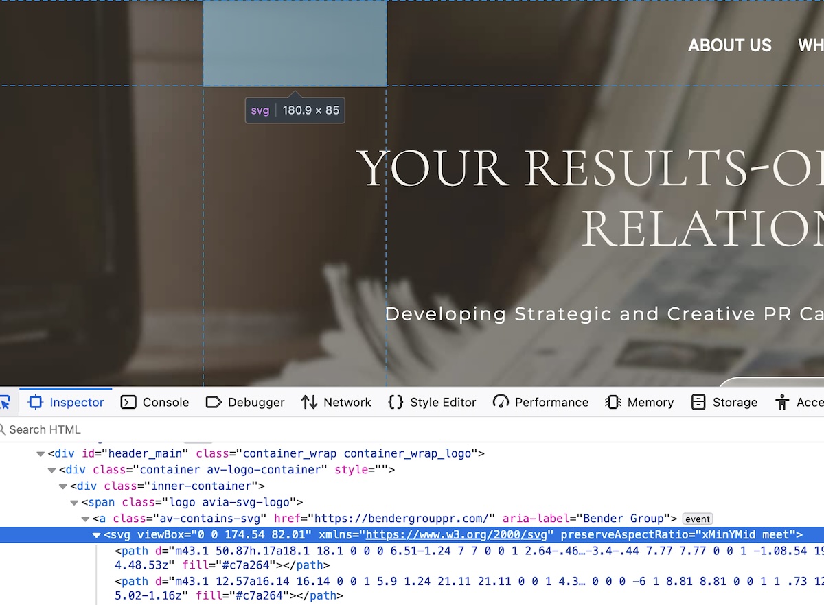
Thank you Rikard! This has solved most problems. The only part that’s still not working (a very important part) is the transparency of the SVG logo at the top of each page, before scrolling…
Any idea why?
Hi,
Thanks for the update. Please let us know if you should need any further help on the topic, or if we can close it.
Best regards,
Rikard
Hi,
Thanks for the update. Please let us know if you should need any further help on the topic, or if we can close it.
Best regards,
Rikard
I have a problem finding how and why to change the settings for the menu at the top of our website.
In the Appearance/Menus/Menu Structure/Menu Style drop down there are three options. Where do I change what these do?
At the moment it’s set to DEFAULT STYLE and that’s black text on a white background, same as the website.
If I set it to “BUTTON STYLE (Colored)” I get a menu item with an orange background and black text.
If I set it to “BUTTON STYLE (BORDERED)” I get a menu item with a dark blue background and black text.
Where do I change these?
Hello,
I’ve been searching the internet for ages for a good map software that isn’t from Google if possible. I used to have OSMapper, but they stopped using it. Now I use “Ultimate Maps by Supsystic”, but they only have two types of maps and they aren’t pretty.
Do you have a recommendation that isn’t too expensive, works well and looks good too?
Kind regards,
Martin
———————————————
Hallo,
ich suche schon ewig im Netz nach einer schönen Kartensoftware, die möglichst nicht von Google ist. Früher hatte ich mal OSMapper, doch die wurden eingestellt. Jetzt nutze ich “Ultimate Maps by Supsystic”, aber dort gehen nur noch zwei Kartenarten und die sind nicht schön.
Habt ihr eine Empfehlung, die nicht so teuer ist, die gut funktioniert und auch noch gut aussieht?
viele Grüße,
Martin
This reply has been marked as private.
please do not redefine the images_sizes!
Just wait a little i test my solution first …
see post : https://kriesi.at/support/topic/full-image-on-single-post/#post-1471388
Hey Tilman,
Thank you for the inquiry.
You can adjust the style of the titles in the second magazine element using this csscode:
#top .main_color .av-m3hnr7qq-27f7d867790b3f7b7d88721dc4cc0bcf .av-magazine-title a, #top .main_color .av-m3hnr7qq-27f7d867790b3f7b7d88721dc4cc0bcf .av-magazine-title {
    color: blue;
}
The class name “av-m3hnr7qq-27f7d867790b3f7b7d88721dc4cc0bcf” is a unique identifier automatically generated by the theme for this specific magazine element. You can also apply your own custom css class name in the Advanced > Developer Settings panel.
// https://kriesi.at/documentation/enfold/add-custom-css/#enable-custom-css-class-name-support
Best regards,
Ismael


