-
Search Results
-
Hi
I site I manage is showing the logo text under the logo, on mobile only. No text under logo image on laptop.
Strange thing is that it shows the actually text that appears in the logo image which is not really used elsewhere, meaning it is not the exact listed business name nor the logo filename but is the same as the text in the logo image.
I can’t find where it would be picking this up from.
I attach the link in the private content.Many thanks
TiaHi there!
I’ve just come across an issue when viewing our website on laptop+smaller screens, where the search icon has disappeared from the header menu. May someone please help me with this?
Laptop missing search icon – https://www.dropbox.com/scl/fi/gblncuezz0wd6ynws70cm/Signosaur_home_laptop-searchmissing.png?rlkey=b8rpd74c39nf4bml17ox42twm&dl=0
Search icon displaying on larger screen – https://www.dropbox.com/scl/fi/tabvk4c2hi3rv5dw6pkng/Signosaur_home_monitor-searchvisible.png?rlkey=t89wwlh0jdtabxpm95txd3e9w&dl=0
It was definitely there previously, so I’m not sure if it’s been in a recent update it’s disappeared and we just haven’t noticed. I’ve tried looking through all the theme settings to bring it back, but I can’t seem to find anything
Is there a menu setting I’m missing, or is there a code snippet I could use to bring it back please?
If you need any further info please let me know
Really appreciate your help on this one, thank you so much in advance! :)
Cheers
SarahHello Enfold Support,
I have noticed that some pages on my website are displaying broken layouts. On top of the pages, I see the following error message:
data-av_svg_icon=”search” data-av_iconset=”svg_entypo-fontello”
I have attached screenshots showing the issue for your reference.
Here are some of the links where I am seeing this problem:
https://www.banglabook.org/category/bangladeshi-writers/muhammed-zafar-iqbal/
https://www.banglabook.org/category/bangladeshi-writers/qazi-anowar-hossain/
https://www.banglabook.org/category/indian-writers/sunil-gangopadhay/
https://www.banglabook.org/category/indian-writers/shirshendu-mukhopadhyay-indian-writers/
I found this issue today, and there may be more pages affected. Could you please help me identify the cause and suggest a fix?
Thank you for your support!
Best regards,
BdfuelHi Gunter & team,
We have hit a reproducible issue that we can’t find the root cause of that we would like your help with as it seems directly related to one specific Enfold ALB element. I’ll try and explain as clearly as I can and we have a staging site setup for you to test it with.
If we choose to use a page as the Footer (and keep the socket) then we can see the issue. We have two pages on the staging site to be used as the footer:
1. “Footer” – this is using standard columns and works perfectly.
2. “Footer Grid Row” – this is using the Grid Row element and this is when the issue occurs. Switching the Enfold settings to use the “Footer” page instead of the one with the Grid Row resolves the issue. Switching it back and the issue occurs again.The issue ONLY occurs on mobile – you won’t see it on a desktop browser when in responsive design mode. You will need to test on a mobile. We have tested it on 3 different iPhones – all different models and all running different versions of Safari. Please test it on a mobile phone, logged out of the site, using Safari to see the issue.
The issue is that when you load a page and try to swipe to scroll, the page appears to be “sticky” and doesn’t actually scroll. Eventually after a few tries it might work, but it takes multiple swipes and sometimes never scrolls at all. All pages on the site are affected by it, and it occurs ONLY if the footer pages is designed using the Grid Row element. If you remove the Grid Row or switch the footer to be a different page not containing a grid row element, the issue goes away.
The odd thing is we have used grid rows in footers for other sites without issue. But with this site we are unable to due to this issue.
I hope that makes sense, it’s a little hard to describe. Please see private for staging site.
Thanks, look forward to seeing what you think.
Regards,
Tim
Hi guys
Have bought this theme 12 times and on one of my sites, Advanced Layout Builder has stopped working. Disabling Yoast SEO seems to help but our client uses that plugin and wants to keep it. Do you have any advice?
Thank you!
JonHELP!
I don’t want t0 rebuild what is missing..[av_section min_height='custom' min_height_pc='25' min_height_px='300px' padding='default' custom_margin='0px' custom_margin_sync='true' color='main_color' background='bg_color' custom_bg='#f2f2f2' src='https://cdnbeefperforms.ca/wp-content/uploads/2024/03/frying-pans-bg-scaled-1030x687.jpg' attachment='25287' attachment_size='large' attach='scroll' position='center right' repeat='stretch' overlay_enable='aviaTBoverlay_enable' overlay_opacity='0.5' overlay_color='#000000' shadow='no-border-styling' bottom_border='no-border-styling']
[av_heading heading='Foodservice Resources' tag='h2' style='blockquote modern-quote' subheading_active='subheading_below' color='custom-color-heading' custom_font='#ffffff' padding='10' custom_class='white']
New resources provided by Canada Beef and the Canadian Beef Centre of Excellence.
[/av_heading]
[/av_section][av_section min_height_pc='25' min_height_px='500px' padding='default' custom_margin='0px' custom_margin_sync='true' color='main_color' background='bg_color' shadow='no-border-styling' bottom_border='no-border-styling']
[av_one_fourth first min_height='av-equal-height-column' vertical_alignment='av-align-top' margin='40px' margin_sync='true' padding='40px' padding_sync='true' background='bg_color' background_color='#f2f2f2']
[av_textblock]
<h4 style=”text-align: center;”>Appetizers and Soups</h4>
[/av_textblock]
[av_image src='https://cdnbeefperforms.ca/wp-content/uploads/2024/05/CDNB_Culinary_Planner_Appetizers_and_Soups_Interactive_F-pdf-796x1030.jpg' attachment='25496' attachment_size='large' align='center' overlay_opacity='0.4' overlay_color='#000000' overlay_text_color='#ffffff' animation='fade-in']
[/av_image]
[av_button label='View Now' link='manually,https://cdnbeefperforms.ca/wp-content/uploads/2024/03/RS12961_Menu_Planner_Appetizers_and_Soups_Interactive_F_LowRes.pdf' link_target='_blank' size='large' position='center' color='black' custom_bg='#444444' custom_font='#ffffff']
[av_textblock]
Beef cuts, known for their rich and savory flavours, are the perfect addition to any soup or appetizer spread. From tenderloin to brisket, there are endless possibilities to create delicious bites that will leave your guests craving for more.
[/av_textblock]
[/av_one_fourth][av_one_fourth min_height='av-equal-height-column' vertical_alignment='av-align-top' margin='40px' margin_sync='true' padding='40px' padding_sync='true' background='bg_color' background_color='#f2f2f2']
[av_textblock]
<h4 style=”text-align: center;”>Beef Bowls</h4>
[/av_textblock]
[av_image src='https://cdnbeefperforms.ca/wp-content/uploads/2024/05/CDNB_Culinary_Planner_Beef_Bowls_Interactive_F-pdf-796x1030.jpg' attachment='25498' attachment_size='large' align='center' overlay_opacity='0.4' overlay_color='#000000' overlay_text_color='#ffffff' animation='fade-in']
[/av_image]
[av_button label='View Now' link='manually,https://cdnbeefperforms.ca/wp-content/uploads/2024/05/10053_CB_Beef_Bowl_Menu_Planner_Ph5F_Digital.pdf' link_target='_blank' size='large' position='center' color='black' custom_bg='#444444' custom_font='#ffffff']
[av_textblock]
Beef bowl entrées are a popular choice among meat lovers and food enthusiasts. These hearty and satisfying dishes showcase the versatility and succulence of various beef cuts. Each cut adds its unique flavour and texture to the dish
[/av_textblock]
[/av_one_fourth][av_one_fourth min_height='av-equal-height-column' vertical_alignment='av-align-top' margin='40px' margin_sync='true' padding='40px' padding_sync='true' background='bg_color' background_color='#f2f2f2']
[av_textblock]
<h4 style=”text-align: center;”>Burgers</h4>
[/av_textblock]
[av_image src='https://cdnbeefperforms.ca/wp-content/uploads/2024/05/CDNB_Culinary_Planner_Burgers_Interactive_F-pdf-796x1030.jpg' attachment='25500' attachment_size='large' align='center' overlay_opacity='0.4' overlay_color='#000000' overlay_text_color='#ffffff' animation='fade-in']
[/av_image]
[av_button label='View Now' link='manually,https://cdnbeefperforms.ca/wp-content/uploads/2024/05/RS12961_Menu_Planner_Burgers_Interactive_F_LowRes.pdf' link_target='_blank' size='large' position='center' color='black' custom_bg='#444444' custom_font='#ffffff']
[av_textblock]
Beef burgers are highly popular and versatile, ideal for quick service and diverse culinary styles. Easy to customize and profitable, they appeal to a broad customer base, fitting various dining settings from fast food to gourmet restaurants, ensuring consistent demand and customer satisfaction.
[/av_textblock]
[/av_one_fourth][av_one_fourth min_height='av-equal-height-column' vertical_alignment='av-align-top' margin='40px' margin_sync='true' padding='40px' padding_sync='true' background='bg_color' background_color='#f2f2f2']
[av_textblock]
<h4 style=”text-align: center;”>Sandwiches, Flatbreads and Wraps</h4>
[/av_textblock]
[av_image src='https://cdnbeefperforms.ca/wp-content/uploads/2024/05/CDNB_Culinary_Planner_Sandwiches_Flatbreads_and_Wraps_Interactive_F-pdf-796x1030.jpg' attachment='25502' attachment_size='large' align='center' overlay_opacity='0.4' overlay_color='#000000' overlay_text_color='#ffffff' animation='fade-in']
[/av_image]
[av_button label='View Now' link='manually,https://cdnbeefperforms.ca/wp-content/uploads/2024/05/RS12961_Menu_Planner_Sandwiches_Flatbreads_and_Wraps_Interactive_F_LowRes.pdf' link_target='_blank' size='large' position='center' color='black' custom_bg='#444444' custom_font='#ffffff']
[av_textblock]
Sandwiches, flatbreads, and wraps are versatile dishes that can be made using various ingredients, and beef cuts are an excellent choice to add a hearty and satisfying flavour to these dishes.
[/av_textblock]
[/av_one_fourth][av_one_fourth first min_height='av-equal-height-column' vertical_alignment='av-align-top' margin='40px' margin_sync='true' padding='40px' padding_sync='true' background='bg_color' background_color='#f2f2f2']
[av_textblock]
<h4 style=”text-align: center;”>Entrées Salads</h4>
[/av_textblock]
[av_image src='https://cdnbeefperforms.ca/wp-content/uploads/2024/05/CDNB_Culinary_Planner_Entree_Salads_Interactive_F-pdf-796x1030.jpg' attachment='25505' attachment_size='large' align='center' overlay_opacity='0.4' overlay_color='#000000' overlay_text_color='#ffffff' animation='fade-in']
[/av_image]
[av_button label='View Now' link='manually,https://cdnbeefperforms.ca/wp-content/uploads/2024/05/RS12961_Menu_Planner_Entree_Salads_Interactive_F_LowRes.pdf' link_target='_blank' size='large' position='center' color='black' custom_bg='#444444' custom_font='#ffffff']
[av_textblock]
Beef cuts in salads offer a hearty twist, bringing savoury slices of sirloin or flavourful strips of flank steak to vibrant greens and vegetables. Grilled to perfection, these cuts elevate salads, adding richness and a protein-packed punch to every bite.
[/av_textblock]
[/av_one_fourth][av_one_fourth min_height='av-equal-height-column' vertical_alignment='av-align-top' margin='40px' margin_sync='true' padding='40px' padding_sync='true' background='bg_color' background_color='#f2f2f2']
[av_textblock]
<h4 style=”text-align: center;”>Kids Menu</h4>
[/av_textblock]
[av_image src='https://cdnbeefperforms.ca/wp-content/uploads/2024/05/CDNB_Culinary_Planner_Kids_Menu_Interactive_F-pdf-796x1030.jpg' attachment='25507' attachment_size='large' align='center' overlay_opacity='0.4' overlay_color='#000000' overlay_text_color='#ffffff' animation='fade-in']
[/av_image]
[av_button label='View Now' link='manually,https://cdnbeefperforms.ca/wp-content/uploads/2024/05/RS12961_Menu_Planner_Kids_Menu_Interactive_F_LowRes.pdf' link_target='_blank' size='large' position='center' color='black' custom_bg='#444444' custom_font='#ffffff']
[av_textblock]
A kids menu featuring beef cuts offers tasty and nutritious options that cater to young tastes. These meals aim to please young palates while delivering essential protein and nutrients for their growth.
[/av_textblock]
[/av_one_fourth][av_one_fourth min_height='av-equal-height-column' vertical_alignment='av-align-top' margin='40px' margin_sync='true' padding='40px' padding_sync='true' background='bg_color' background_color='#f2f2f2']
[av_textblock]
<h4 style=”text-align: center;”>Entrées</h4>
[/av_textblock]
[av_image src='https://cdnbeefperforms.ca/wp-content/uploads/2024/05/CDNB_Culinary_Planner_Entree_Classics_Interactive_F-pdf-796x1030.jpg' attachment='25509' attachment_size='large' align='center' overlay_opacity='0.4' overlay_color='#000000' overlay_text_color='#ffffff' animation='fade-in']
[/av_image]
[av_button label='View Now' link='manually,https://cdnbeefperforms.ca/wp-content/uploads/2024/05/RS12961_Menu_Planner_Entree_Classics_Interactive_F_LowRes.pdf' link_target='_blank' size='large' position='center' color='black' custom_bg='#444444' custom_font='#ffffff']
[av_textblock]
Beef cuts can be utilized to create a variety of delicious entrée classics that are sure to satisfy any meat lover’s palate. The possibilities for creating delicious entrée classics are endless.
[/av_textblock]
[/av_one_fourth][av_one_fourth min_height='av-equal-height-column' vertical_alignment='av-align-top' margin='40px' margin_sync='true' padding='40px' padding_sync='true' background='bg_color' background_color='#f2f2f2']
[av_textblock]
<h4 style=”text-align: center;”>Senior Living</h4>
[/av_textblock]
[av_image src='https://cdnbeefperforms.ca/wp-content/uploads/2024/05/CDNB_Culinary_Planner_Senior_Living_Interactive_F-pdf-796x1030.jpg' attachment='25511' attachment_size='large' align='center' overlay_opacity='0.4' overlay_color='#000000' overlay_text_color='#ffffff' animation='fade-in']
[/av_image]
[av_button label='View Now' link='manually,https://cdnbeefperforms.ca/wp-content/uploads/2024/05/RS12961_Menu_Planner_Senior_Living_Interactive_F_LowRes.pdf' link_target='_blank' size='large' position='center' color='black' custom_bg='#444444' custom_font='#ffffff']
[av_textblock]
Entrées for seniors using beef cuts offer a wide range of options that are both nutritious and appetizing. These entrees can provide the necessary nutrients for seniors while catering to their specific dietary needs and preferences.
[/av_textblock]
[/av_one_fourth][/av_section]
[av_section min_height='custom' min_height_pc='25' min_height_px='300px' padding='default' custom_margin='0px' custom_margin_sync='true' color='main_color' background='bg_color' custom_bg='#f2f2f2' src='https://cdnbeefperforms.ca/wp-content/uploads/2023/12/RS12752_RS11619_Tuscan-inspired-Grilled-Steak-1500x430.jpg' attachment='25111' attachment_size='featured' attach='scroll' position='center right' repeat='stretch' overlay_enable='aviaTBoverlay_enable' overlay_opacity='0.5' overlay_color='#000000' shadow='no-border-styling' bottom_border='no-border-styling']
[av_one_half first vertical_alignment='av-align-middle' space='3']
[av_heading heading='VIDEO' tag='h1' style='blockquote modern-quote modern-centered' subheading_active='subheading_below' color='custom-color-heading' custom_font='#ffffff' padding='10']
<div style=”font-size:24px;”>CANADA PRIME GRADE BEEF</div><div style=”font-size:24px;padding-top:10px;”>MASTER CHEF</div>
[/av_heading]
[/av_one_half][av_one_half]
[av_textblock]
<div style=”border:solid 5px #f5f7f7; padding: 56.25% 0 0 0; position: relative;”>
<iframe style=”position: absolute; top: 0; left: 0; width: 100%; height: 100%;” title=”Canada Prime Grade Beef – Master Chef” src=”https://player.vimeo.com/video/1074398616?badge=0&autopause=0&player_id=0&app_id=58479″ frameborder=”0″></iframe>
</div>
[/av_textblock]
[/av_one_half][/av_section]
[av_section padding='default' custom_margin='0px' custom_margin_sync='true' color='main_color' background='bg_color' custom_bg='#f2f2f2' shadow='no-border-styling' bottom_border='no-border-styling']
[av_two_fifth first margin='0px' margin_sync='true' padding='40px' padding_sync='true' background='bg_color' background_color='#f2f2f2']
[av_image src='https://cdnbeefperforms.ca/wp-content/uploads/2024/03/RS12896_9582_2024_CB_Foodservice_Merch_Poster_F-1-pdf-scaled.jpg' attachment='25327' attachment_size='full' align='center' overlay_opacity='0.4' overlay_color='#000000' overlay_text_color='#ffffff' animation='fade-in']
[/av_image]
[av_button label='View PDF' link='manually,https://cdnbeefperforms.ca/wp-content/uploads/2024/03/RS12896_9582_2024_CB_Foodservice_Merch_Poster_F-1.pdf' link_target='_blank' size='large' position='center' color='black' custom_bg='#444444' custom_font='#ffffff']
[/av_two_fifth][av_three_fifth margin='0px' margin_sync='true' padding='40px' padding_sync='true' background='bg_color' background_color='#f2f2f2']
[av_textblock]
<h4 style=”text-align: center;”>Foodservice Beef Merchandising Guide Poster</h4>
[/av_textblock]
[av_textblock]
<p style=”text-align: center;”>Educate your front and back of house staff about the versatility of Canadian Beef with the new Foodservice Merchandising Poster, powered by the Canadian Beef Information Gateway. Users can scan QR codes to learn how to merchandise each foodservice-specific beef subprimal through videos, photographs, and more. Each subprimal also has product specifications to ensure informed purchasing, and commercial recipes to inspire your team to do more with Canadian Beef. Users can also access information about the Canadian Beef Advantage, including our gate-to-plate virtual tours, enabling further discussions about the unique qualities of Canadian Beef to customers.</p>
[/av_textblock]
[av_textblock]
[gravityform id=”39″ title=”true” description=”false” ajax=”true”]
[/av_textblock]
[/av_three_fifth][/av_section]
We are using a larger logo this year for the 250th Birthday of America and it looks great on a computer but on mobile, the header seems to be locked at a height that makes the new logo far too small. Is there CSS code I can add to allow the header to be larger and centered on mobile?
Ideally the logo would span the entire top of the screen on mobile and the hamburger menu would be centered below the logo. URL is in private content area. Thanks in advance for your help!Hi,
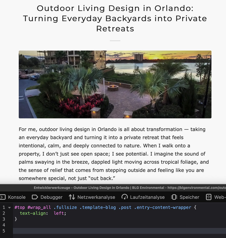
I’m facing an issue with Enfold / Avia Layout Builder where a section background image is set in the editor, but no
background-image: url(...)is generated on the frontend.What I see
- In the Avia editor, the section clearly has a background image selected
- The image attachment exists, has metadata, and
wp_get_attachment_url()returns a valid URL _aviaLayoutBuilderCleanDatacontains the image data, e.g.:
src='https://example.com/wp-content/uploads/2022/02/example.jpg'
attachment='3172'
attach='parallax'
What is generated
In both per-page CSS (dynamic_avia/avia_posts_css/post-XXXX.css) and merged CSS,
Enfold outputs:.avia-section.av-XXXX { background-image: unset; }The image URL does not appear anywhere in CSS or HTML.
Important detail
In the same builder data block, the section has:
background='bg_color'
even thoughsrc/attachmentare set.Question
Isbackground-image: unsetexpected behavior whenbackground='bg_color'is set, even if an image is assigned?If yes:
- what is the correct way to switch a section from
bg_colortoimagemode programmatically? - is there a supported way to make Enfold re-evaluate the background type based on existing
src/attachment, without manually re-editing each section?
Specific case, you can see on this page:
https://skotakconsulting.cz/fuze-spolecnosti/There is supposed to be a background image on the top section. Which is actually set in editor. You can see it here:
and here:
On that page, there is completely missing following section with parallax background image:
<div class="av-parallax enabled-parallax active-parallax" data-avia-parallax-ratio="0.3" style="top: auto; height: 827px; transform: matrix3d(1, 0, 0, 0, 0, 1, 0, 0, 0, 0, 1, 0, 0, 185, 0, 1);"><div class="av-parallax-inner main_color avia-full-stretch"></div></div>Thanks for any clarification.
Vaclav
Topic: Secondary Custom Menu
Hello – My client does not like the look of the Secondary Header Menu Option that is built in and would like a menu above the Main Menu like the attached screen shots both Desktop and Mobile. Can you please advise the best way to achieve this?
Appreciate your help!
AnnaHappy new year all,
I have noticed that videos that used to open in lightbox on some older blog articles (and on a new one I’m creating now) no longer open in lightbox, but instead open a new tab on desktop Chrome. I have checked Enfold theme settings and lightbox is still enabled.
Can you tell me what might be going wrong and how I can fix it?
Sample url of article from 2021 that used to launch lightbox for the videos: https://www.thomashenthorne.com/novato-home-prices-set-records/
Thanks,
RobHi,
I need the transparent header in mobile. I have add this code that I found in the documentation but can’t works.
@media only screen and (max-width: 990px) {
.responsive.html_mobile_menu_tablet #top #wrap_all #header {
position: absolute;
}
.html_mobile_menu_tablet #top #wrap_all .av_header_transparency {
background: transparent;
}
}Could you help me?
Many thanks,
BR,
Antonio
Topic: Unable to edit a page
Hi
After editing the contents of a page and clicking save and update the changes are not saved. No error is displayed. I’m just redirected to the edit page again with the changes which are gone. However on top of the page I got the message “Page updated” which is not corrected.
Anybody an idea why or how to debug this?
Thx!


