i almost did it.
but i have still on line to fix:
Notice: Functie WP_Scripts::add werd verkeerd aangeroepen. Het script met de handle “avia_analytics_js” is in de wachtrij gezet met afhankelijkheden die niet zijn geregistreerd: avia_builder_js. Lees Foutopsporing in WordPress voor meer informatie. (Dit bericht is toegevoegd in versie 6.9.1.) in /var/www/vhosts/denbreejenhoveniers.nl/httpdocs/wp-includes/functions.php on line 6131
it’s nice when you can help
Best regards,
Bert
Hi,
Thank you for the update.
This css code should help:
#top #header_meta .phone-info {
    position: absolute;
    right: 50px;
    top: 80px;
}
Result:

Best regards,
Ismael
Hi mjrielly,
Thank you for the inquiry.
The issue is that the form element are being affected by the css modification we applied to keep the form fields in a single row. To fix this, apply a custom css class name to the Contact Form element with the single row, then adjust the css rule accordingly.
— https://kriesi.at/support/topic/looking-for-some-styling-help-on-contact-form-with-recaptcha/#post-1496464
Let us know if that resolves it.
Best regards,
Ismael
Hi,
Thanks for the update. Please let us know if you should need any further help on the topic, or if we can close it.
Best regards,
Rikard
Hi,
I logged in today after a month or two and got this message above a page layout. What can I do to get rid of the message?
Notice: Functie WP_Styles::add werd verkeerd aangeroepen. De stijl met de handle “avia-module-audioplayer” is ingevoegd met afhankelijkheden die niet zijn geregistreerd: avia-layout. Lees Foutopsporing in WordPress voor meer informatie. (Dit bericht is toegevoegd in versie 6.9.1.) in /var/www/vhosts/denbreejenhoveniers.nl/httpdocs/wp-includes/functions.php on line 6131
HI
a couple video questions:
1. I have a new video in a fullscreen slider on the page below. I am seeing gray bands at top and bottom – I think it has a different aspect ratio that 16:9, but I can’t get it to display correctly (have tried all the settings on the video aspect ratio and video size). I see I can change the size of the slider but then the video gets cropped (I have it on original size).
Can you help me with this? The video on the front page looks fin (it’s a different aspect ratio).
2. That same video is in a layer slider with a background video that I am setting for mobile. The front page has the same setup, and that video loads on mobile (on safari at least) but the new festival-2026 mobile video is not loading. Can you see what the issue might be? they are set up the same, and the new video is smaller in size so should load faster.
-
This topic was modified 20 hours, 10 minutes ago by
 Munford.
Edit: something new to me – yes Mike is right – it is the “different” mobile menue – and you choose the same menue as the desktop menue.
______________
For me a mobile Menue is always the hamburger one on enfold –
But even then – there is no conflict because what is id in text-menu ist a class on hamburger menue.
My suggestion is that you use a footer-menue in this way:
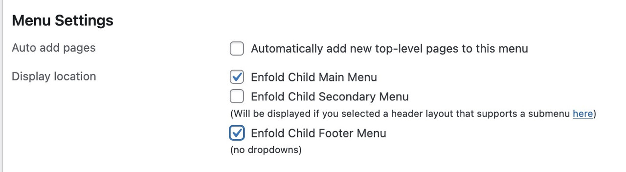
this will end in duplicate ID’s
Hi,
Thank you for the update.
You can use the following css to hide the badge message and force all the form elements including the submit button into the same row:
.avia_recaptcha_v3 .av-recaptcha-area,
.avia_recaptcha_v3 .av-google-badge-message {
    display: none;
}

.avia_recaptcha_v3 .form_element {
    display: inline-block;
    width: auto;
    vertical-align: top;
}
Add this to Enfold > General Styling > Quick CSS. Please make sure to purge the cache before testing.
Let us know the result.
Best regards,
Ismael
Hey Philipp Nepraunig,
Thank you for the inquiry.
We are aware of the issue, and a fix will be included in the next patch. In the meantime, you can add the code provided in the following thread to the functions.php file:
— https://kriesi.at/support/topic/not-registered-dependencies-for-enfold-css-and-js/#post-1495467
Let us know the result.
Best regards,
Ismael
Hey mattb1169,
Thank you for the inquiry.
We are not seeing the widget in the header, only the submenu on the top header. Did you remove the header widget? Please add it again so we can inspect the elements properly.
Best regards,
Ismael
Hello!
I was able to add the code provided in the documentation to child theme functions.php, and create a header widget. It’s defaulting to the upper left of the header area. I have a Center Logo, Menu Below, header, custom size (173px height). I want the widget to be placed on the right side of the open space in the header. When I implement the CSS to place the widget it breaks the styling and creates a hamburger menu. (a login graphic with link to another site), and offsets the primary logo. Is there a different solution? Back up would be a secondary menu in the small bar at the top, but I’d want that to be a button, not just text.
The site we have had working for a year or so has suddenly stopped working after a WordPress update. It now appears broken with the header images not appearing along with other css issues. No matter what i have tried to do to correct this it hasn’t fix it. Yet if i preview the home page for example this displays correctly, but the live site is displaying incorrectly? Could i ask one of the support team to take a look over the site and come back to me as soon as possible please with a fix?
Look forward to your reply.
When trying to get my website somewhat WCAG 2.2 compliant I get errors on duplicate id´s. It looks like it has to do with menu items on desktop vs mobile. If you look at the site via https://validator.w3.org/, you see what I mean.
Any ideas on how to get this of this problem?
Regards
Nina Sæther
Hey Munford,
Thank you for the inquiry.
The code you found is too general and will likely affect other elements on the page, not just the portfolio grid.
A cleaner approach is to add a custom css class to your portfolio element and target that instead. You can do this by opening the portfolio element in the layout builder, go to the “Advanced” tab and add a custom class name there (e.g., av-music-portfolio). Then add your spacing rule to Enfold > General Styling > Quick CSS:
#top .av-music-portfolio .isotope-item {
    margin-bottom: 20px;
}
This way the rule only applies to that specific portfolio and nothing else on the site.
For more details on adding custom css classes in Enfold, please refer to the documentation:
— https://kriesi.at/documentation/enfold/add-custom-css/
Let us know if the issue persists.
Best regards,
Ismael
hi
I am using the 1 column side by side portfolio grid to display a music program.
I would like to make a gap between the portfolio items.
I found the code:
@media only screen and (max-width: 767px) {
.responsive #top .container .av-content-small, .responsive #top #wrap_all .flex_column, .responsive #top #wrap_all .av-flex-cells .no_margin {
margin: 0;
margin-bottom: 0px;
margin-bottom: 20px;
width: 100%;
}
}
It seems to work – is that correct?
thanks
Nancy
-
This topic was modified 2 days, 20 hours ago by Munford.
-
This topic was modified 2 days, 19 hours ago by Munford.
-
This topic was modified 2 days, 19 hours ago by Munford.
Hey jb84,
There is a 500 internal server error on the file in private while saving the theme options. Why that is I can’t say unfortunately, you would have to share server error logs with us, or reach out to your hosting provider.
The missing styling was likely due to a missing curly bracket at the end of your Quick CSS code:
time.slide-meta-time {
    display: none!important;
}
.av-inner-tab-title {
    font-size: 15px;
    font-weight: bold;
}
#top .av_header_glassy.av_header_transparency #header_main {
    background-color: rgba(255,255,255,0.8);
Best regards,
Rikard
Hi guys,
I’d like to have the logo overlapping the header on mobile. I got it working fine on desktop but I couldn’t get it working on mobile. Any tips?
Best regards,
Steven
This is the CSS I used for desktop:
/*LOGO SIZE AND PLACEMENT*/
.logo svg {max-width: 350px; height: 390%; max-height: 390px !important;/*max width and amount of overlap*/}

@media only screen and (min-width: 990px) { /*Center logo desktop*/
    .responsive .logo {
        left: 50%;
        transform: translateX(-50%);
	}}

#top .logo,#top .logo a{overflow: visible;/*enable logo overlap*/}
For mobile I tried:
@media only screen and (max-width: 767px) {#top .logo, #top .logo a{overflow: visible;/*enable logo overlap on mobile*/}}

@media only screen and (max-width: 767px) {.logo svg {max-width: 200px!important;height: 490%; max-height: 490px !important;}}
But that didn’t work …
-
This topic was modified 3 days, 1 hour ago by
 steviger.
I have 5 masonry galleries on one page separated by tabs. I got around the scrolling to load issues by using this code I found here:
.av-masonry-entry {
opacity: 1;
visibility: visible;
}
However the issue I have is that every additional masonry gallery increases in height from the top of the page for some reason and I don’t know why. Any help is much appreciated!
Hey JannyPolak,
Thank you for the inquiry.
Looks like the Advanced Styling settings may be getting overridden by another css rule, or the styles may be cached. Before anything else, please try to disable the Enfold > Performance > File Compression settings, save, and purge your cache, then check again.
If the styling still doesn’t apply, you can force the font and text-transform for the main nav links with this custom css added on the Enfold > General Styling > Quick CSS field:
#top .av-main-nav > li > a > .avia-menu-text {
    font-family: 'Josefin Sans', sans-serif;
    font-size: 30px;
    font-weight: 400;
    text-transform: uppercase;
}
Make sure Josefin Sans is loaded on your site. If you’re using it via Enfold > Advanced Styling, it should already be enqueued. If not, you may need to select it under Enfold > General Styling > Fonts.
Please make sure to purge the cache before testing.
Let us know if the issue persists.
Best regards,
Ismael
How can I get the mobile view to had upper/lower case, instead of all uppercase?
I tried CSS and it still didn’t work. Worked for desktop, but not mobile view.
CSS added:
h1, h2, h3, h4, h5, h6 {
text-transform: none !important;
}
@media only screen and (max-width: 767px) {
h1, h2, h3, h4, h5, h6 {
text-transform: none !important;
}
}
Let’s try another page
The color isn’t the same at the top of the image and below the copyright notice.
Hey Elena,
It looks like you want the font size to be 14px, but you have a Advanced Styling set to 18px which overrides it:
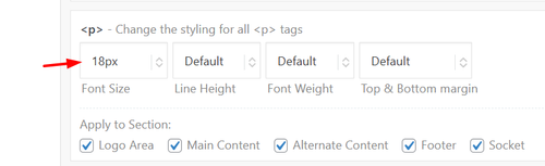
Since this size is for your whole site, try this css just for the testimonials:
#top .all_colors .avia-testimonial-content p em {
    font-size: 14px;
}
Best regards,
Mike
Hi,
Thanks for your patience, but I’m getting this Error: This password does not match the username please check.
When I check your page: dissolvurol.com/algicuivre-test
The according is orange on mouse over on firefox & edge & brave, as I understand this is the correct behavior.
On the same page the banner special heading text is Kaki (#fadaa3) the background is #016471, but I do not know which page has the top banner with “la gamme” which should have a kaki background.
Best regards,
Mike
Hi,
Thanks for the update. Please let us know if you should need any further help on the topic, or if we can close it.
Best regards,
Rikard
I’ve only used html for a couple of paragraphs on the homepage, custom ccs to change case and get rid of the top right enfold logo and the issues started well after. And I have issues with the contact page – the form disappears after I fill it out instead of it giving me “message sent. and I never see the form submissions in my inbox. I put no custom html or script tags inside any of the elements on pages. I’d appreciate if you can check it out. Thanks
Hey Rustum,
My research points that you must Duplicate Your Slider for Each Language by going to LayerSlider WP > All Sliders and click the “Duplicate” button for your original slider. Create a separate slider instance for each language you want to support. Then open each duplicated slider and modify the layer links to point to the appropriate pages in that specific language.
Links added in Layer Settings > Link may not translate automatically on the front end, which is why the duplication approach is necessary.
Please note that we are not the authors of the Layerslider and are limited in our knowledge of this topic, here is the official Layerslider support, perhaps they will have a better solution.
Best regards,
Mike
Hi,
On desktop I see that you have three grid rows with a HR in between each of them. On mobile you have the three grid rows and HRs hidden, but since the HRs are after the grid rows they create a after_grid_row container which is not hidden.
Try this css to hide the containers on mobile.
@media only screen and (max-width: 479px) {
   .page-id-31 #after_grid_row_1,.page-id-31 #after_grid_row_2,.page-id-31 #after_grid_row_3 {
        display: none !important;
    }
}
Best regards,
Mike
Hi
They are all set to only show on desktop and tablet and have been the entire time.
Removing them makes the grid row get stuck together and that is not what I want.
Regards
Nina
Hey Advantage09,
Thank you for the inquiry.
After reviewing the page, we can see that there are three Separator/White Space elements placed below the Grid Row element. These are causing the large gap on mobile.
You have two options to fix this:
1. Remove the three Separator/White Space elements entirely if they are not needed.
2. Keep them but set their visibility to desktop only. You can do this by editing each Separator element, going to Advanced > Responsive, and adjusting the Element Visibility setting so they only show on desktop.
Please make sure to purge the cache before testing. Let us know the result.
Best regards,
Ismael