-
AuthorSearch Results
-
March 11, 2026 at 8:47 pm #1495956
In reply to: Bildrechtsverstoß copytrack
Hey macuti,
I have added it below for you. Please see this post: https://kriesi.at/support/topic/copytrack-wants-me-to-show-a-license-for-an-image-included-in-the-demo/#post-1495685
If you read the whole thread you will see two links to the same image, the one for which we have a license for from 2014 by the user francesco83 and a newer one that copytrack is claiming for the user genious2000de or perhaps it is the same person, we don’t know. Either way our extended license is valid.
Please note that we can not offer legal advice.Best regards,
MikeMarch 11, 2026 at 8:21 pm #1495955In reply to: removing space between two colour sections
Hi,
Glad that we were able to help. As for your issue with the image I can not reproduce,. The image shows for me & it downloads fine. I’m not sure why this is occuring for you, but will take it under advisement.
If you have further questions please open a new thread and we will try to help. Thanks for using Enfold.Best regards,
MikeMarch 11, 2026 at 12:27 pm #1495946In reply to: removing space between two colour sections
Hi Ismael,
thank you.
It’s all clear to me.Just wanted to let you know that, when I click on the link I land on the Freeimage website but the image is not shown (the image space is black) and if I click on the download button, I get a page which says the website I am trying to reach contains child pornography content and therefore has been blocked by the Italian Public Security Dpt.
Best regards,
Elena-
This reply was modified 3 weeks, 1 day ago by
elenagrassi.
-
This reply was modified 3 weeks, 1 day ago by
March 11, 2026 at 6:29 am #1495939In reply to: removing space between two colour sections
Hey Elena,
Thank you for the update.
You can view the screenshot here:
— https://freeimage.host/i/column-height-1000.q5xszog
It shows the Column element that had the min-height of 1000px set. This setting can be found on the Layout > Height panel of the element.
Let us know if you have more questions.
Best regards,
IsmaelMarch 11, 2026 at 6:21 am #1495937In reply to: Display Issues on iPhone (13)
Hi,
Thank you for the update.
We are currently not able to reproduce the issue on our end. Could you please try the following before testing again:
1. Clear your browser cache.
2. Open the page in an incognito/private browsing window.
3. Purge the cache from your cache plugin (WP Rocket or any other active caching plugin).
4. Try testing on a different device or browser if possible.
Let us know the result after trying those steps.
Best regards,
IsmaelMarch 11, 2026 at 6:17 am #1495936Hey debbiepeverelli,
Thank you for the inquiry.
1. The overlapping image is likely due to the absolute positioning, which causes it to appear incorrectly scaled on smaller screens. The best approach is to either hide it on mobile or manually adjust its size using css media queries.
You may need to apply a custom css class name to the overlapping image element.
— https://kriesi.at/documentation/enfold/add-custom-css/#enable-custom-css-class-name-support
Once you have added a custom class, for example av-overlap-image, you can target it on smaller screens like this:
@media only screen and (max-width: 767px) {
    .av-overlap-image {
        display: none;
    }
}
Or if you prefer to keep it visible but resize it:
@media only screen and (max-width: 767px) {
    .av-overlap-image {
        width: 80px;
        height: auto;
        top: 20px;
        left: 10px;
    }
}
You can add these css rules to Enfold > General Styling > Quick CSS field and adjust the values as needed.
2. The light blue highlight on focused fields and the green success message are default styles applied to the contact form. You can override them by adding the following to Enfold > General Styling > Quick CSS field — adjust the color values to match your site:
#top .avia-form .avia-input:focus,
#top .avia-form .avia-textfield:focus {
    background-color: #yourcolor;
    border-color: #yourcolor;
}

#top .avia-form .avia-success {
    background-color: #yourcolor;
}

#top .avia-form .avia-success p {
    font-family: inherit;
    font-size: inherit;
    color: #yourcolor;
}
Replace #yourcolor with the hex values that match your site palette.
Let us know the result.
Best regards,
IsmaelMarch 10, 2026 at 11:13 pm #1495933In reply to: removing space between two colour sections
Hi Mike,
thank you! I had checked margins and paddings but had missed that!By the way, I cannot see any image at the link you provide.
Best regards,
ElenaMarch 10, 2026 at 8:14 pm #1495925In reply to: removing space between two colour sections
Hey Elena,
Thanks for the login, the column with the image had a min-height of 1000px, causing the color section to take this height. I removed it for you.

Best regards,
MikeMarch 9, 2026 at 11:38 am #1495875In reply to: page speed test
Hey Munford,
Thank you for the inquiry.
The “Make fewer HTTP requests” and “Add Expires headers” recommendations from speed testing tools are server-level optimizations and are not something we can control directly from the theme side. These are handled by your hosting server configuration.
For the Expires headers issue, this typically requires adding rules to your .htaccess file or asking your host to enable browser caching on the server. Here is an example of what you can add to your .htaccess file:
<IfModule mod_expires.c>
ExpiresActive On
ExpiresByType image/jpg "access plus 1 year"
ExpiresByType image/jpeg "access plus 1 year"
ExpiresByType image/gif "access plus 1 year"
ExpiresByType image/png "access plus 1 year"
ExpiresByType text/css "access plus 1 month"
ExpiresByType application/javascript "access plus 1 month"
</IfModule>
For reducing HTTP requests, the “Merge and compress files” option you already have enabled in Enfold > Performance is the main thing the theme can do on its end. Beyond that, reducing the number of active plugins and removing any unnecessary scripts loaded by third-party plugins will help.
We also recommend using a caching plugin like W3 Total Cache or WP Rocket, as these can handle both browser caching and HTTP request reduction more comprehensively. For more details, please refer to the W3 Total Cache documentation.
— https://wordpress.org/plugins/w3-total-cache/
Let us know if you have more questions.
Best regards,
IsmaelMarch 9, 2026 at 11:02 am #1495871In reply to: Disable focussing masonry gallery
Hey Erwin,
Thank you for the inquiry.
You can disable the hover/focus effect on the masonry gallery images by adding the following css to Enfold > General Styling > Quick CSS:
#top .av-masonry-item .av-masonry-image-container:before,
#top .av-masonry-item .av-masonry-image-container:after {
    display: none !important;
}

#top .av-masonry-item:hover .av-masonry-image-container img {
    opacity: 1 !important;
    filter: none !important;
    transform: none !important;
}
If you only want to target a specific masonry gallery on the page and leave the others unaffected, you can wrap it in a section or cell with a Custom CSS Class and then use that class as the parent selector in the code above.
— https://kriesi.at/documentation/enfold/add-custom-css/#enable-custom-css-class-name-support
Let us know if the issue persists.
Best regards,
IsmaelMarch 8, 2026 at 2:24 pm #1495859Topic: Disable focussing masonry gallery
in forum EnfoldErwin
ParticipantHi,
Is it possible to disable the filter that create a focus on images in a masonry gallery? I could do this using the show posts, but on another part of the site I’m using masonry and I would like it to see still and bright images.
Regards Erwin
March 8, 2026 at 1:10 pm #1495854Hey Sebastian,
Try adding this css:.referenzen .post-entry-4082 a.grid-image + .grid-content,.referenzen .post-entry-3960 a.grid-image + .grid-content { opacity: 1; transform: translate(-50%, -50%); }Best regards,
MikeMarch 8, 2026 at 11:44 am #1495846Hi,
Thanks for the login, I believe that this is the result that you wanted:

So I added this solution to your site, thanks to Guenni007.Best regards,
MikeMarch 7, 2026 at 5:08 pm #1495840In reply to: Manage WP Layer slider appearance laptop mobile
Hi,
I got the IDs from the page code using the Dev Tools
When I check today “Alex” is not italic:

Please clear your cache and check.Best regards,
MikeMarch 7, 2026 at 1:31 pm #1495831Hey ivancazzol,
Please note that the Grid element gets it’s height from the elements inside of it, so on mobile, when the top grid row is stacked the right side cell that only has a background image, that shows below the first cell, will have no height. In our demo it has has another image element in it the “Parallax” text
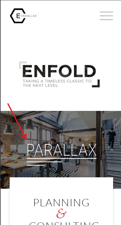
To correct yours, add a Whitespace (hr) element with a min-height that you want it to be, perhaps 200px or so.Best regards,
MikeMarch 6, 2026 at 1:42 pm #1495818I added the specified PHP code, but the behavior hasn’t changed. It’s still user-unfriendly and confusing.
In addition to still needing to double-click the image above, the second click doesn’t always take me to the corresponding Accordion item.
Please review it and let me know if you need FTP access.March 6, 2026 at 10:55 am #1495813Topic: Transparent header on desktop but not on Mobile
in forum Enfoldxeovision
ParticipantHallo,
i used the transparent header on desktop where the logo is placed on the bg image. But on mobile i receive always the white background bar with logo above the image. How can i have the same like desktop?March 6, 2026 at 6:12 am #1495802Hey tchamp77,
Thank you for the inquiry,
This is to be expected, since the default behavior when clicking an inactive Horizontal Gallery item is to navigate or slide it to the center. This behavior overrides the anchoring to the Accordion items. Once the image is centered, the anchor should work without issue.
To override this behavior, you can try this script in the functions.php file:
<?php
add_action( 'wp_footer', 'ava_wp_footer_script_mod', 99 );

function ava_wp_footer_script_mod() {
    ?>
    <script>
    // override default horizontal gallery clicks behavior to open accordion and scroll to title
    (function($) {
        $(document).on('click', '.av-horizontal-gallery-slider a[href^="#toggle-id-"]', function(e) {
            e.preventDefault();
            e.stopImmediatePropagation();

            var targetId = $(this).attr('href').slice(1);

            setTimeout(function() {
                var $title = $('#toggle-toggle-' + targetId);
                var $wrap  = $('#' + targetId);

                if (!$title.length) return;

                if (!$wrap.hasClass('active_tc')) $title.trigger('click');

                setTimeout(function() {
                    $('html, body').animate({ scrollTop: $title.offset().top - 80 }, 500);
                }, 50);
            }, 50);
        });
    })(jQuery);
    </script>
    <?php
}
Best regards,
IsmaelMarch 6, 2026 at 2:06 am #1495797In reply to: italic font – why
ich frage mich allerdings warum du es Dir so schwer machst die Layouts zu setzen.
Warum nicht in der 1/2 Column : heading ; image; text-blockEDIT to your next comment: I can’t entirely believe that, because it wasn’t old content that was presented, but rather there were several em tags as wrappers for existing content, as well as several empty em tags. There must have been at least one other reason.
March 5, 2026 at 1:35 pm #1495776tchamp77
ParticipantPlease see:
Among other pages that use this interface (see the bottom section of that page, green background), there’s a “Horizontal Gallery” that, when clicked (which is already strange because I have to click twice), should take me to the “Accordion” item. Not only does it sometimes work incorrectly, but it also takes me to the item description instead of displaying the item title (subsequent images don’t even take me to the item). I request that you review this issue, please.
March 5, 2026 at 11:15 am #1495771PS: Have you responded to their letter yet? If not, I would give a friendly but firm reply, asking to see their justification for sending such letters to the author.
_______________
BUT : definitly we need those copies of the licenses
It looks like the author has removed their image from https://photodune.net/, but it is available on other stock image sites. You can find it by searching the Licensor’s Author Username and Item Title.
It would be even better if each of the demo pages had photo credits for the images on their individual imprint pages (which do not yet exist).
Just because the author now offers the images to other stock photo agencies does not mean that licenses that have already been issued lose their validity.In general, you should consider—and devote yourself to the task—replacing all demo images with royalty-free images.
March 5, 2026 at 10:53 am #1495770It seems to be quite common with these services (iStock, Shutterstock, etc.) to register with a nickname rather than using your real name. Given the degree of overlap between the images from genious2000de and Francesco83, I would assume that they are the same person.
March 5, 2026 at 6:34 am #1495757Hey Marc,
Thank you for the inquiry.
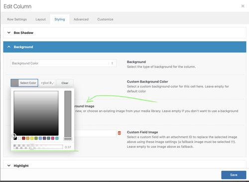
In the Column element’s Styling > Background > Custom Background Color, there should be a transparency (opacity) slider in the color picker, as shown in the screenshot below.
Let us know if you need more info.
Best regards,
IsmaelMarch 5, 2026 at 6:22 am #1495754In reply to: How to ReOrder Page Sidebar menu Items
Hi,
Thank you for the update.
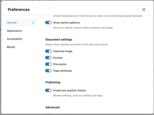
Are you using the default Block Editor? Please open the Preferences panel, and make sure that General > Document settings > Page attributes is enabled.
This documentation should help: https://wordpress.org/documentation/article/preferences-overview/
Best regards,
IsmaelMarch 5, 2026 at 6:02 am #1495751In reply to: Preview Changes, Edit Socket
Hi,
@ivloulinghong: In the Enfold > Footer > Copyright field, simply add the placeholder [nolink] to remove the default copyright text. Please check the screenshot below.
Best regards,
IsmaelMarch 4, 2026 at 10:27 pm #1495745March 4, 2026 at 12:02 pm #1495728Hi,
This image is available from the same author on Adobe Stock: https://stock.adobe.com/images/ricotta-cheese/38158374?prev_url=detail
A slightly different version is also available on Shutterstock since 2012: https://www.shutterstock.com/image-photo/ricotta-cheese-basil-leaves-cherry-tomatoes-93275449If the author was in fact the person written in the PDF file they sent you, I assume they would have taken down the images I shared above.
I’m sorry, but we cannot provide further advice on this case.
Best regards,
YigitMarch 4, 2026 at 9:41 am #1495722Topic: Variable transparent background colour for different elements
in forum EnfoldMdF
ParticipantMorning.
Is there a way of making the background of an element variably transparent for a selected background colour?
Not sure if I have asked the question correctly so please have a look at the top header on the site https://citizenscience.org.za
In order to get the effect of the black transparent background holding the title text in white, I am using a 1/1 Column with a background image inserted to repeat across the element. This background image is a black square with 50% transparency.
I am trying to find out if there are settings for the background of the Column (or other element) which would (1) set the background colour and then (2) allow you to set the transparency of that background colour.
Thank you.
MdF
-
This topic was modified 1 month ago by
MdF.
March 4, 2026 at 6:23 am #1495716In reply to: How to ReOrder Page Sidebar menu Items
Hi,
Thank you for the inquiry.
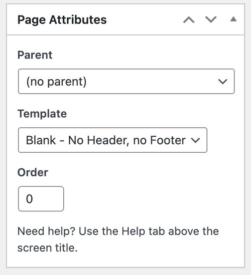
You can find the Order field in the page editor. Edit the page, then look for the Page Attributes box.
Let us know if you need more info.
Best regards,
IsmaelMarch 3, 2026 at 5:56 pm #1495701Thank you for the license information.
I got an email back from COPYTRACK, see private content, with a PDF file claiming that the image is from another author. Can I forward you the PDF for review? -
This reply was modified 3 weeks, 1 day ago by
-
AuthorSearch Results
-
Search Results
-
Hi,
Is it possible to disable the filter that create a focus on images in a masonry gallery? I could do this using the show posts, but on another part of the site I’m using masonry and I would like it to see still and bright images.
Regards Erwin
Hallo,
i used the transparent header on desktop where the logo is placed on the bg image. But on mobile i receive always the white background bar with logo above the image. How can i have the same like desktop?Please see:
Among other pages that use this interface (see the bottom section of that page, green background), there’s a “Horizontal Gallery” that, when clicked (which is already strange because I have to click twice), should take me to the “Accordion” item. Not only does it sometimes work incorrectly, but it also takes me to the item description instead of displaying the item title (subsequent images don’t even take me to the item). I request that you review this issue, please.
Morning.
Is there a way of making the background of an element variably transparent for a selected background colour?
Not sure if I have asked the question correctly so please have a look at the top header on the site https://citizenscience.org.za
In order to get the effect of the black transparent background holding the title text in white, I am using a 1/1 Column with a background image inserted to repeat across the element. This background image is a black square with 50% transparency.
I am trying to find out if there are settings for the background of the Column (or other element) which would (1) set the background colour and then (2) allow you to set the transparency of that background colour.
Thank you.
MdF