Viewing 30 results - 811 through 840 (of 106,442 total)
  • Author
    Search Results
  • #1489186
    Robert Berrier
    Guest

    Hi Team Enfold, Kriesi,

    I have been using Enfold for 10 years(?). I have no idea when it came out, but it feels like forever. Having used it on three websites, two of which are still online (links below). I wanted to give some serious user feedback to you and your team since I hope it will help you to make it even better! I totally understand if there is no room for such a thing in your team. So I’m simply sending it as a “here you go, some seriously golden nuggets, do with it what you want” type of email :)

    Websites:
    MeshMasters.com (up2date)
    RobertBerrier.com (old, and needs an update)

    Before I slap all the feedback points. Know that I am a (3D) artist, with limited web coding knowledge. So I don’t know what is possible or not.

    1) Often I want to have media like an image or video, but also text fields, to the left or right, or center of a section or part of the website, but in a smaller size than the container it’s in. For example, if I have a full width color section. Within that color section, I can use a 1/4 container with the media/text in it, another 3/4 container next to it to “force” it to be at a smaller size to the left or right of that color section. Or, I want to have a 1/3 sized media/text in the center of the website, so I put two 1/5 containers to the left and right. This “works”, but it’s finicky. I often rather want the media to be at a fixed (smaller) size, no matter what is next to it. Even better would be a percentage. Eg, this media should always be 20% size compared to the browser window, or 20% of the container it’s in. The container it is in would still be its max possible size. But it will try to get close to the smaller percentage or pixel size. This can somewhat be done with using a smaller resolution image. But this is also finicky because of all the different screen resolutions, especially in our age with HD vs 4k. So, a better way to “size” down images without having to container it. Perhaps a percentage setting in the media element itself.

    2) The ability to have (all) elements be in the center of of the page. Eg, media, containers, buttons. If they are smaller than the color section or container they are in. I often want them in the center of that color section or container. No matter what responsive size we are in. Currently I need to do this with “buffer” containers to try and align it to the setting.

    I have created some CSS code with a Class ID that I can add to a color section. Then everything in that color section will be centered. But I believe this should be a default setting within a color section and containers. Eg, “align all content within this container/color section to the Left/Center/Right.

    3) I use CSS code to not have the header be transparent. I would say this should be an option in the Enfold settings. Rather than needing to code.
    #header {
    background-color: #1d1d40; /* This is needed for the opacity change */
    opacity: 1 !important;
    }

    4) When text is in BOLD or STRONG. It gets an assigned color from the theme options. Not a bad idea, but it is a shared color with I believe “Primary Color – Font color for links, dropcaps and other elements” This means we users have less control over how text and it’s colors looks like. I suggest that BOLD and STRONG has a separate color option within the Theme color settings. In my opinion, links and BOLD should be seen as two different things to customize. I currently use CSS code to adjust this.

    5) For all my websites I have a max website width setting, as set in the Enfold settings. But sometimes, I want a color section to use its own unique size. For example, you will see on MeshMasters.com that the portfolio section is a full-width color section. While the contact section at the button is a bit smaller than the website’s width settings. Having this as a setting in color sections would give people more options to make cool layouts. Currently I have this CSS code for this:

    /* ========================================== */
    /* === Color sections width additions === */
    /* ========================================== */

    /* === Full width, no padding === */
    #fullwidth-container-nopadding .container {
    width: 100% !important;
    min-width: 100%;
    padding: 0;
    margin: 0;
    }

    /* === Full width, small padding === */
    #fullwidth-container-smallpadding .container {
    width: 100% !important;
    min-width: 100%;
    padding: 10px;
    margin: 10px;
    }

    /* === Full width, default padding === */
    #fullwidth-container .container {
    width: 100% !important;
    min-width: 100%;
    }

    5) Similar to the point above. I want my blog posts to be a smaller width. Since it makes reading large pieces of text easier. So having a separate width setting for blog posts could be interesting to add. For example, the main website is at say 85% width. But perhaps all blog posts are at 70%.

    6) Font sizes on the main page (or landing pages) are often large. To grab attention with cool copy writing that sells. These are often smaller pieces of text. But on blog posts you have large pieces of text. And so a smaller font size makes it more readable. Since there is only one BODY or P font size for the entire website. You are stuck in choosing one for all pages. I currently made CSS code so on blog posts all font sizes are 95% or 90% smaller than the rest of the website. Perhaps this could also be a setting in the Enfold theme settings. Eg “blog posts font sizes”.

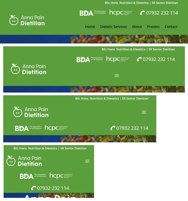
    7) There are currently three responsive break points in pixels. I believe it’s 990px and 768px and 480px. Perhaps this is the standard in web development. But the ability to change these website wide would be great. Eg, If I change the 990px to say 800px in the enfold settings. Then on all other instances where this is used, like in color sections, containers, etc. That value is also reflected there in the UI.

    8) When columns break down for responsiveness. They break down into a single column. Eg, a column of 3 containers, becomes a column of 1 with 3 containers below each other. Having options to control to how many columns it breaks would be great. Eg, 4 columns of containers next to each other (4×1). Could be 2 columns of 2 containers next to each other. Eg, 2×2. Instead of 1×4. More controls options for this would be AMAZING!

    9) fyi, I used CSS code to adjust the masonry gap size (to 4 px). It’s a small thing, but perhaps a quick win to add to the Masonry settings and so to make the theme better.

    10) another small thing. I use CSS code to remove the Gallery border.

    11) I use CSS code to remove the Blog button hover effect. Perhaps also a quick win to add to Enfold.
    /* === Hover icon disable === */
    .slide-entry-wrap .image-overlay-inside:before { display: none; }

    /* === Hover overlay color === */
    .image-overlay { background: #0f0f26; }

    12) Very similar where I remove the Featured Image effect:
    .big-preview.single-big a{
    pointer-events:none!important;
    }

    13) And also the blog page excerpts and dates:
    /* === Remove blog page excerpts === */
    .blog .slide-entry-excerpt { display: none; }

    /* === Remove blog page dates === */
    .slide-meta { display: none !important; }

    14) Tables are very difficult to adjust. There is no control over it’s color and borders. I use quite a lot of CSS code to adjust them. Perhaps this should be an entire section in the Enfold themes to control them?
    I currently use code to:
    – Adjust colors for: General cells, uneven cells, even cells, header cells, the borders
    – Thickness of borders and its colors
    – Give transparency to cells.
    – And then to apply these settings to each different theme area (Logo area, main area, alternative area, footer area, socket area)

    15) the button element is missing padding and margin settings (and maybe also alignment settings?)

    16) There are default padding settings for Color Sections. 0%, 20%, Default(?), 70% and 130%. It would be great if we can adjust these globally in the Enfold Settings. And ofcourse these changes are reflected in the Color Section padding settings. For example, Perhaps I want the default to be 60%, the large 100% and the extra large 150%

    Yes, I am aware you can put in custom values in the element itself. But it’s better to align values website wide.

    That’s it. I hope it helps and you can improve Enfold to an even better edition!

    Robert Berrier

    #1489182

    Hi, thanks for this answer, I just injected it into my function.php, but google insight still tells me the accessibility error:

    Links don’t have visible names
    Write visible and unique text for links (and for image placeholder text, if you use it in links) so that screen reader users can easily position the cursor over them and enjoy a better browsing experience. Learn how to make links accessible.

    https://pagespeed.web.dev/analysis/https-kerry-han-fr-test/2s8d8rqqkp?hl=fr&form_factor=mobile

    #1489177

    Hi,

    Thank you for the inquiry.

    The masonry element seems to be loading correctly on our end. Would you mind providing a screenshot of the issue? You can use platforms like Savvyify, ImgBB, PostImages, or Dropbox to upload and share the screenshot.

    www-maartenwebsites-nl-dev-regenboog-agenda-i-Pad-Air

    Best regards,
    Ismael

    #1489175

    In reply to: portfolio image sizing

    Hey dweddell,

    Thank you for the inquiry.

    The image displayed in the grid items is actually 495x400px, but the items must be resized based on the container’s maximum width, which also affects the rendered size of the images.

    For single portfolio pages, try to add the following code to the functions.php file to use the original (full-size) version of the portfolio featured image:

    add_action( 'init', 'ava_set_image_size_for_single_portfolio' );
    
    function ava_set_image_size_for_single_portfolio() {
        if ( is_singular( 'portfolio' ) ) {
            global $avia_config;
            $avia_config['size'] = 'full';
        }
    }

    Best regards,
    Ismael

    #1489166

    Topic: portfolio image sizing

    in forum Enfold
    dweddell
    Participant

    Hi

    I have set up a portfolio grid using image size of 495 x 400px. The image displayed in the actual portfolio page is 495 x 321px

    How do I configure this so that image displayed on actual portfolio page is also 495 x 400px?

    kind ergards

    Duncan

    #1489155

    Hi,

    Thank you for the update.

    Try to add this code to the functions.php file to include a < title > element inside the scroll-down svg image.

    add_action( 'wp_footer', 'ava_script_mod', 9999 );
    function ava_script_mod() {
        ?>
        <script type="text/javascript">
        jQuery(document).ready(function($) {
            $('.scroll-down-link svg').each(function () {
                $(this).find('title').remove();
    
                $(this).prepend('<title>Scroll down</title>');
            });
        });
        </script>
        <?php
    }

    Let us know the result.

    Best regards,
    Ismael

    #1489148

    Hi,

    Thank you for the update.

    We modified the avf_social_icons_options filter a bit and moved it around line 64 of the functions.php file. We also added the social icon in the Enfold > Social Profiles panel. Please make sure to purge the cache before checking the page.

    Screenshot-2025-09-11-at-10-31-50-AM
    image host
    Best regards,
    Ismael

    #1489132
    a_edemirci
    Participant

    Hello,

    When I first load my web site, main page goes black and only then it loads the entire page. Probably, it goes black while it is downloading instagram images. Is there any way to prevent the main page to go black during initial loading other than using preloader image?

    Thank you….

    #1489093
    icarogioiosi
    Participant

    Hello everyone.
    At https://kriesi.at/documentation/enfold/social-share-buttons/#toggle-id-1, I found this code to display social media icons on mobile devices:

    /* Do not hide social bookmarks */
    @media only screen and (max-width: 479px) {
    .responsive #top #wrap_all #header .social_bookmarks {
    display: block;
    }}

    It works perfectly, but the icons are to the right of the menu.
    Would it be possible to have them between the logo and the menu instead?

    02

    Alternatively, is it possible to insert them within the mobile menu?
    Regards.

    #1489070

    Hey Alejo Rotemberg,
    We expect no issues with updating, but recommend creating a full backup using your webhost backup tool, not a plugin unless you have specific knowledge with it and it has worked for you in the past. Often backup plugins fail when restoring.
    Also note that if you are not using a child theme and the core files such as functions.php were modified those customizations will be lost, so backup any customizations.
    Also note that if you are using a child theme and you have a copy of the header.php or footer.php in the child theme, please remove these as these files have changed and will cause an error.
    To update your version of Enfold you will need to download the latest installable WP version from your Theme Forest account and upload it to your WordPress ▸ Appearance ▸ Themes ▸ Add Themes ▸ Add New
    WordPress_Appearance_Themes_Add-Themes_Add-New.jpg
    after you choose the zip file and click install, you will see a This theme is already installed message because you are updating, you can continue
    Installing_theme_from_uploaded_file_This_theme_is_already_installed.jpg
    then you will see the Theme updated successfully message.
    Theme_updated_successfully.jpg

    Best regards,
    Mike

    #1489068

    Hi everyone.
    To save time, I did some testing on my own.

    The code Ismael suggested

    .big-preview img, .small-preview img {
    object-fit: cover;
    height: 82px;
    }

    I changed it to the following:

    .big-preview img, .small-preview img {
    width: 100%;
    height: 100%;
    object-fit: cover;
    object-position: center;
    display: block;
    }

    And this solved the issues with the fixed 82px height in posts.

    The following is the remaining code (changed from the one Ismael proposed on August 20th) that seems to fix the issues I reported today regarding what was displayed when opening posts on both devices.

    @media only screen and (max-width: 768px) { 
    
    .responsive .template-blog .blog-meta { 
    display: block; 
    float: none; 
    } 
    
    .responsive .template-blog .post .entry-content-wrapper { 
    overflow: hidden; 
    float: none; 
    width: 100%; 
    } 
    
    .responsive .template-blog .blog-meta, 
    .responsive .template-blog .blog-meta a { 
    width: 100%; 
    height: auto !important; /* follows natural pitch */ 
    min-height: unset !important; 
    display: block; 
    overflow: hidden; 
    } 
    
    .responsive .big-preview img, 
    .responsive .small-preview img { 
    width: 100%; 
    height: auto; /* maintain aspect ratio */
    object-fit: contain; /* do not crop, display entire image */
    display: block;
    }
    
    .big-preview img, .small-preview img {
    width: 100%;
    height: auto; /* maintain aspect ratio */
    object-fit: contain; /* do not crop, display entire image */
    display: block;
    }
    }

    Since I’m not an expert on CSS, I’m wondering if you see any obvious errors.
    If not, this solves my problem for now.

    #1489065

    Hi Ismael.
    Thanks for your support.
    The previews in the lists actually seem correct, both on desktop and smartphone.
    However, the problem when opening the post on desktop seems unchanged.
    41

    On smartphone, however, there is now a huge space between the photo and the post title, both in portrait and landscape view.
    51

    Regards.

    #1489055

    Hi,

    thanks for pointing out the two images. I re-outputted both images as SVG files and updated them in WordPress. The error seems to be fixed now. Thanks!

    Best regards,
    Caroline

    #1489050
    VachetAlexandre
    Participant

    I’d like to insert placeholder text so that Google Insight doesn’t report an accessibility error on my slider arrows. Do you have a CSS solution? I’ve found HTML solutions online, but I don’t know if we can modify the HTML to Enfold Child.

    Here’s the error reported by Google Insight:

    Links don’t have visible names
    Write visible and unique text for links (and for image placeholder text, if you use it in links) so that screen reader users can easily position the cursor over them and enjoy a better browsing experience. Learn how to make links accessible.
    Non-compliant elements
    Here’s the error reported by Google Insight :

    div#wrap_all > div#main > div.avia-fullscreen-slider > a.scroll-down-link

    #1489048

    I would probably do things differently, especially when it comes to responsive layouts.
    The grid box layout has several advantages, especially if you want the containers to be in different positions than in the DOM.
    In this case, I would define the individual elements as special grid areas. You can choose the names of the areas freely, but some names are obvious choices.

    The whole thing would then possibly respond as follows (however, this can also be customized to your requirements):

    (click to enlarge)

    The best thing would definitely be to remove the settings that are already set from your CSS, but for testing purposes, I think it will also work if you add this CSS to the end of your quick CSS.

    i would change the settings for your widget divs to:

    /* and change these values */
    .phone {
      background-image: url(https://peter-test1.co.uk/wp-content/uploads/2025/09/phone-icon.png);
      background-repeat: no-repeat;
      background-position: left 4px;
      padding-left: 30px;
      padding-top: 0;
      font-size: 24px;
      color: #fff;
      overflow: visible !important;
      line-height: 30px;
    }
    
    .headlogos {
      background-image: url(https://peter-test1.co.uk/wp-content/uploads/2025/09/bda-hcpc-logos.png);
      background-repeat: no-repeat;
      display: block;
      width: 269px;
      height: 54px;
      background-position: center left;
      Float: left;
    }

    and grid-layout settings:

    #top #header #header_main .container.av-logo-container .inner-container {
      display: grid !important;
      gap: 10px;
      grid-auto-flow: row;
      grid-template-columns: 210px 1fr;
      grid-template-areas: 
        "logo widget"
        "logo menu";
    }
    
    #top #header #header_main .container.av-logo-container .logo {
      grid-area: logo;
    }
    
    #top #header #header_main .container.av-logo-container .main_menu {
      grid-area: menu;
    }
    
    #top #header #header_main .container.av-logo-container .widget {
      grid-area: widget;
      justify-self: end;
    }
    
    .header_color .av-hamburger-inner, 
    .header_color .av-hamburger-inner::before, 
    .header_color .av-hamburger-inner::after {
      background-color: #FFF;
    }
    
    #top #header #header_main .container.av-logo-container .widget:before,
    #top #header #header_main .container.av-logo-container .widget:after {
      display: none;
    }
    
    @media only screen and (max-width: 1000px) {
      #top #header #header_main .container.av-logo-container .main_menu {
        justify-self: center
      }
    }
    
    @media only screen and (max-width: 889px) {
      .responsive #top #wrap_all .container {
        width: 95%;
        max-width: 95%;
      }
      #top #header #header_main .container.av-logo-container .inner-container {
        display: grid !important;
        gap: 10px;
        grid-auto-flow: row;
        grid-template-columns: 1fr 80px;
        justify-content: space-between;
        grid-template-areas: 
          "logo menu"
          "widget widget";
      }
      #top #header #header_main .container.av-logo-container .widget {
        justify-self: auto;
      }
    
      #top .topcontainer {
        display: flex;
        gap: 20px;
        flex-flow: row wrap;
        justify-content: space-between;
      }
    }
    
    @media only screen and (max-width: 605px) {
      #top .topcontainer {
        justify-content: center;
      }
    } 
    #1489043

    Hi,

    Looks like the .js css rule is being added by an SVG image named “Plattform_Service” or “Plattform_Microservice”. Try removing the image, then reload the page and let us know the result.

    Screenshot-2025-09-08-at-12-19-48-PM

    Screenshot-2025-09-08-at-12-20-29-PM

    Best regards,
    Ismael

    #1489033

    Hey condonp,
    Thanks for the mockup image:
    mockup
    it looks like you are close to achieving this, but I only see one widget in the header:
    Screen Shot 2025-09-07 at 7.19.10 AM
    to change the color of your widget and move the menu try adding this css:

    .responsive #top #header #header_main .inner-container .widget>div {
        background: rgb(77, 172, 56);
    }
    .topconatiner {
        align-items: center;
    }
    .responsive #top #header #header_main .inner-container .main_menu {
        justify-content: right;
    }
    .responsive #top #header #header_main .inner-container .main_menu {
    	margin-right: 6%;
    }

    for this:
    Screen Shot 2025-09-07 at 7.22.23 AM
    The snippet from the documentation that you are trying to follow looks nothing like your mockup.
    Screen Shot 2025-09-07 at 7.25.29 AM

    Best regards,
    Mike

    #1489032

    In reply to: PreSales Question

    Hey Steve Webgecko,
    Thank you for your patience, changing the colors on hover can be done with custom css, and a popup can be added via jQuery, but the popup will be in the center of the screen and not over the box that is clicked, like on your page. I recommend copying the bootstrap element HTML with the css & jQuery that makes this popup work and add it to a code block element on your Enfold page to duplicate this.
    Changing your blog images to B&W until hover can be done with a gray scale css filter, a icon could be added on hover but it would also require custom css.
    When you are ready to try this please ensure that you have an active support license and login to the forum and post your question with a admin login to your test page. The pre sales contact form is not appropriate for support.

    Best regards,
    Mike

    #1489029

    Hey oburlin,
    For the image caption, you will note in the element that it’s placement is in the overlay:
    Screen Shot 2025-09-06 at 7.14.36 AM
    To move to the lower part of the image, I see that you have added this custom css:

    .av-image-caption-overlay {
        background: none repeat scroll 0 0 rgba(0, 0, 0, 0) !important;
        bottom: 0px !important;
        color: black !important;
        height: auto !important;
        left: 50% !important;
        transform: translate(-50%) !important;
        width: auto !important;
    }

    Resulting in this:
    Screen Shot 2025-09-06 at 7.18.09 AM
    To make it one line try removing width: auto !important; from your css.
    Then you would see:
    Screen Shot 2025-09-06 at 7.20.28 AM
    If you want the caption below the image, try this css instead:

    #top .av-image-caption-overlay {
        height: auto;
        width: 100%;
        left: 0px;
        bottom: 0px;
        transform: translateY(100%);
    }
    #top .av-overlay-hover-deactivate .avia-image-overlay-wrap:hover .av-caption-image-overlay-bg {
        opacity: 0.4 !important;
    }
    #top .avia-image-container .av-caption-image-overlay-bg {
        opacity: 0.4;
        background-color: transparent;
    }
    #top .avia-image-container .av-image-caption-overlay-center {
        color: #000;
    }

    resulting in this:
    Screen Shot 2025-09-06 at 7.31.39 AM

    Best regards,
    Mike

    #1489025
    condonp
    Participant

    Dear Sirs

    I ahve added two widgets from your documentation https://kriesi.at/documentation/enfold/example-of-widget-left-logo-center-widget-right-menu-below/#toggle-id-2. What I am tring to achive is to Have the logo on Left and Widget one central and widget two to the right by widget 1. See examples I read the doc on flex and have added the CSS from documentation but am unsure how to achieve this can you help please,

    What I am tryng to achieve is here https://peter-test1.co.uk/wp-content/uploads/2025/09/Image1.jpg

    What I have currently is here https://peter-test1.co.uk/

    #1489024
    oburlin
    Participant

    I am a newbi on Enfold. When I added a caption to an image the text comes in the middle of the image.
    How to make so it comes in the lower part om the image?

    #1489023

    In reply to: Major Theme Update

    OK thanks. that seemed to work fine.

    So i have a caching question. I have a dev server with 30 sites on it.

    When I work with this theme the content updates are not reflected on the front end right away. In fact, they dont show up until hours later. I do not have a caching application installed and even when I clear the server cache the same problem shows. When I look at incognito browsing sometimes they show and sometimes they dont but they never update for example if i am making more than one content update.
    Simple things like adding a contact form, image, text, changing the main menu. None of it is showing on the front end after saving. The reason I am asking about your theme and caching is that I do not have this problem on any of the other sites I work on using the same server. All of those platforms update with revised content the instant I save and refresh the page – even in non private browsing windows.

    So is there a performance feature in this theme or a caching feature being used that could be causing this?

    Thanks so much for the help

    #1489020

    In reply to: Major Theme Update

    Hey mshane,
    Envato (Theme Forest) stopped using the API a few years ago, now they use a Token, but you can not use the Token with your version so you will need to manually update, then set up the Token and next time you can update in the theme panel. We expect no issues with updating, but recommend creating a full backup using your webhost backup tool, not a plugin unless you have specific knowledge with it and it has worked for you in the past. Often backup plugins fail when restoring.
    Also note that if you are not using a child theme and the core files such as functions.php were modified those customizations will be lost, so backup any customizations.
    Also note that if you are using a child theme and you have a copy of the header.php or footer.php in the child theme, please remove these as these files have changed and will cause an error.
    To update your version of Enfold you will need to download the latest installable WP version from your Theme Forest account and upload it to your WordPress ▸ Appearance ▸ Themes ▸ Add Themes ▸ Add New
    WordPress_Appearance_Themes_Add-Themes_Add-New.jpg
    after you choose the zip file and click install, you will see a This theme is already installed message because you are updating, you can continue
    Installing_theme_from_uploaded_file_This_theme_is_already_installed.jpg
    then you will see the Theme updated successfully message.
    Theme_updated_successfully.jpg

    Best regards,
    Mike

    #1489001

    Hi Ismael, thanks for your support.
    This latest code seems to have solved the problem on desktop, and the image display in the list is now correct.

    40

    Unfortunately, the list previews on smartphones are now incorrect.

    42

    And when you open the post on both desktop and smartphone, the image is reduced in height (probably to the 82px value indicated in the code).

    41

    Regarding the login details, I sent them on August 15th, but you’ll find them listed again in the private field because I think your direct access is essential.

    Regards.

    #1488996

    i guess both cells that are not displayed in responsive casse have only background-images and no content?

    #1488966

    In reply to: Rollover state

    Hey idcdesign,

    Thank you for the inquiry.

    Looks like the background color is applied to the column itself, which already contains a background image. Remove the current css modification and replace it with the following code:

    #rfbordertop:before {
        width: 100%;
        height: 100%;
        display: block;
        z-index: 2;
        position: absolute;
        top: 0;
        left: 0;
        visibility: visible;
    }
    
    #rfbordertop:hover::before {
        background: #0eb34b7d;
    }
    
    #rfbordertop .av_textblock_section, #rfbordertop .hr {
        z-index: 20;
        position: relative;
    }
    

    Let us know the result.

    Best regards,
    Ismael

    #1488958

    Hi,
    Thanks for your patience, the theme does not have a built-in setting to directly control the quality or compression of WebP images during the generation process, the avf_jpeg_quality filter is designed for JPEG images and does not apply to WebP. Typically is handled by WordPress and the PHP image extension on your server, ie: ImageMagick or GD, which is more common. If you can switch to ImageMagick on your server you can follow this documentation to adjust it.
    Otherwise, I recommend using a plugin to compress WebP files further such as Imagify or WebP Express. I have not tested these, there may be others.

    Best regards,
    Mike

    Indeed, I changed the shortcode and it broke everything at the bottom… I continued anyway, added some elements, and noticed another problem: an image was blocking the display at the bottom (the clue was that the footer wasn’t showing…). I deleted the image. I’ve been working on this page for 15 minutes now with several save sessions and it seems there is no longer a problem… I prefer not to claim victory too quickly… (Can you confirm that this can really break everything even just by updating the shortcode?).”

    #1488898
    95mc
    Participant

    Hi,

    I would like aligned center the content of the color section the id is #cont_planos
    Now is not align, see the attached images with differents widths.
    Could you help me?
    Many thanks,

    BR,

    Antonio

    #1488891

    Thanks for your help, that works fine :-)
    I managed to show .png Images but not .svg files. Is this not possible?

Viewing 30 results - 811 through 840 (of 106,442 total)