@Ismael:
On this page the images “Museum Leaflet” and “Domino by Pat Thomas” are inserted on the page as 64x150px and 90x150px size images. They display correctly as that size in desktop mode. Original image upload sizes were 339x800px and 299x500px.
In Dev Tools, switch to Responsive (or view on a smartphone) and the images no longer display because I have deleted the …x400px sizes.
Dev Tools Console reports:
greenville/:67 GET https://www.americanroadtrips.net/wp-content/uploads/2014/05/highway-61-blues-museum-leaflet-170×400.gif 404 (Not Found)
greenville/:67 GET https://www.americanroadtrips.net/wp-content/uploads/2014/05/domino-by-pat-thomas-239×400.gif 404 (Not Found)
Let’s focus on the Leaflet image.
The first question is why is the responsive page even trying to load the 170×400.gif image – this is surely way too big for a smartphone screen and to me the specified 64x150px size should still be loaded. That aside, how to remove the x400 image from srcset?
Second, these are the files in Media Library.
highway-61-blues-museum-leaflet-127×300.gif
highway-61-blues-museum-leaflet-222×525.gif
highway-61-blues-museum-leaflet-34×80.gif
highway-61-blues-museum-leaflet-64×150.gif
highway-61-blues-museum-leaflet-76×180.gif
highway-61-blues-museum-leaflet.gif
If you look at srcset for the leaflet, you will notice that highway-61-blues-museum-leaflet-76×180.gif is not listed within. Not that I’d want that size displayed either, but surely it should be included? Is this an error?
@Guenni007 – thanks but have a function to remove the image sizes I don’t use. I implemented it when I found out a few months after using Enfold for the first time (years ago…) about the huge number of image sizes it creates, most of which are never used. That is the ultimate cause of my problem here – I’d uploaded images and created pages then discovered I was almost out of disk space, so deleted all sizes I never use. But by then the deleted image sizes had been inserted into srcset, some don’t display as I’ve deleted them, and there is no (apparent) way to change the srcset HTML after it has first been created.
a p-tag inside a span-tag ? try another span with a custom class.
i tested 2 spans – that will lead to different troubles – because the span.entry-image will be placed inside and not besides entry-title
you can use :
Henri Flu • <i>1912-1944</i><span class="ondertitel">Geliefd huisarts en oorlogsslachtoffer</span>
or
Henri Flu <i><br>1912-1944</i><span class="ondertitel">Geliefd huisarts en oorlogsslachtoffer</span>
then you can colorise the i by:
#top .avia-post-nav .entry-title > i {
  color: #ff0;
}
#top .avia-post-nav .entry-image img {
  width: 100%;
  height: 100%;
}

Thanks sir,
1. I know i cna make my own custome HTML,but that is why I asked about the refund. Making that much custom HTML defeats the purpose of having a template.
2. I have many test pages. They all do the same thing. login info below.
3-4. I did this as I stated. I appended the customer copyright with your shortcode. It’s there now. Has no effect.
5. I am sorry but I need a higher level of support. I can’t post screnshots here so I am not going to waste my time usng workarounds for support tickets to get you screenshots. If you want to email me directly I will give you screenshots. You don’t need this to check the footer.php file. Youwill see at the end it has this code: “‘ id=’scroll-top-link’ class=’avia-svg-icon avia-font-svg_entypo-fontello’ <?php echo $icon_top[‘attr’]; ?> tabindex=’-1′ aria-hidden=’true’>
<?php echo $icon_top[‘svg’]; ?>
<span class=”avia_hidden_link_text”><?php echo $icon_title; ?></span>
<div id=”fb-root”></div>”
6. what change was this supposed to have? I don’t see any change from this.
7. You can recreate this. Make color section rox. Add bg image. Next add columns to fill row. Pick any column and add a bg-image to the column. It displays the column under the row and not on top of it. When you modify the higlight option it pushed the bg image off the bottom of the screen.
8. You can check my home page. I have two independent color sections both with text blocks that have only hedings. The same exact headings. Yet it shows two differnt things. How is that even possible? If it won’t display the same code twice on one page I am noit sure what I can do.
nearly every element I have to make custom inline because the global options to not seem to work. I really think I need to find a new theme. It’s not about getting used to it, right? It’s about this theme taking me more time to configure than it would be to just write the site from scratch, because the options are severely limited. I did not even know they made themes templates this limited.
Take a look. Tell me what you think after you see for yourself. Hopefully you can see what is wrong because I am wasting so much time with this theme I could have built three sites. Please sir. I made a mistake. I think it would be best to offer a refund as you do not have the resources to help me resolve this in a way that will work for it’s intended purpose. I can’t even modify image sizes or blog posts. It’s very frustrating. It’s my fault for buying the theme because I did not know it was missing the normal options you find in other themes. It’s great for your purpose, but I need a theme I can customize.
I can buy another theme and same myself over 70% of the labor costs your theme requires for basic styles. Let me know what you think. I am not trying to give you a hard time, I doubt you will fix any of this stuff and the answer will be the same -“make custome html”. I am just trying to be realistic. I feel like I lost a lot of money using this theme. Please help me cut my losses and move on.
Hi,
Thank you for the update
i dont mind to adding image in the description..
but thousands product need to edit 1 by 1..
And my question is.. why default wordpress theme work without problem ?
Thanks
Best Regards,
Christian
Hi,
Although Yoast reports a missing image, the featured product image should still be indexed correctly in the front end. If you really want to comply with the SEO checker for the product page, you need to add an image in the description or in the default editor, with the alt or title attribute containing the focus keyword.
Best regards,
Ismael
Hi,
The product image option was visible when we checked. Could you provide a screenshot of the issue? You can use platforms like Savvyify, ImgBB, PostImages or Dropbox to upload and share the screenshot.

Best regards,
Ismael
Hey,
Thank you for the update.
1. Yes, this is the maximum number of columns. If you need more, you can always use the code or text block element to manually create your own html.
2. Please create a test page, open a new thread, and provide the login details in the private field.
3-4. Simply add the [nolink] placeholder in the **Enfold > Footer > Copyright** field.
5. Please open a dedicated thread and provide a screenshot.
6. Make sure caching and compression are off, or temporarily disable the **Enfold > Performance > File Compression** settings.
7. Would you mind providing screenshot of the “stacking columns”? You can use image platforms like imgbb or imgur for the screenshot.
8. It’s possible that there is a heading configuration in the Enfold > Advanced Styling panel, or that they are Special Heading elements with their own configurations.
It usually takes a bit of time to get used to the theme, and you might have missed some options, so we recommend reviewing the documentation. For other inquiries, please open a dedicated thread.
If you would like to proceed with a refund, you may contact ThemeForest.
Thank you.
Best regards,
Ismael
Hello,
I added a background video to a color section. While the video is loading (especially with a slow internet connection), it shows a black background until the video starts. How can I change the black color? I already added a background color and a background image as well.
Thank you for any help.
a function like this to remove the image-sizes enfold likes to have:
function remove_enfold_image_sizes() {
// do NOT remove widget size, is used in backend portfolio items!
// remove_image_size('widget');
  remove_image_size('square');
  remove_image_size('featured');
  remove_image_size('featured_large');
  remove_image_size('portfolio');
  remove_image_size('portfolio_small');
  remove_image_size('gallery');
  remove_image_size('magazine');
  remove_image_size('masonry');
  remove_image_size('entry_without_sidebar');
  remove_image_size('entry_with_sidebar');
  remove_image_size('shop_thumbnail');
  remove_image_size('shop_catalog');
  remove_image_size('shop_single');
  remove_image_size('shop_gallery_thumbnail');
}
add_action('init', 'remove_enfold_image_sizes');
i guess does only influence the calculation of newly uploaded images.
The former uploads are not influenced on that. So these sizes are still in your uploads folder. (have a look by ftp inspection if this is the fact)
the use of Force Regenerate Thumbnails – removes those already calculated image-sizes that are not registered.
@Guenni007 – refresh and re-enable didn’t work.
If I regenerate the thumbnails will that force a code change to all the srcset definitions? That’s what I need, something to force the HTML on each page to “regenerate” and only pick up the image sizes that now remain in the Media Library, removing all the references to the deleted sizes. I don’t understand why Updating a page doesn’t force such a reset/regeneration.
Did you try to disable temporarly on performance the option : Responsive Images
then refresh all cachings and reenable the option again.
Maybe that will do the job.
Next: have you regenerated the thumbnails – best is Force Regenerate Thumbnails plugin for that
I need some help please to tweak a function you supplied to me in this thread last year.
The function removes 495px wide images from srcset: these images were originally created on upload but then deleted as they were no longer used anywhere but unfortunately were still included in srcset definitions and didn’t display.
function avf_remove_specific_image_size_from_srcset( $sources, $size_array, $image_src, $image_meta, $attachment_id ) {
    if ( isset( $sources[495] ) ) {
        unset( $sources[495] );}
    return $sources;
}
add_filter( 'wp_calculate_image_srcset', 'avf_remove_specific_image_size_from_srcset', 10, 5 );
The image URL in srcset was …image-name-495×279.jpg, …image-name-495×335.jpg etc i.e. landscape images.
I have now discovered a problem that portrait images that were uploaded as 400px tall but then also deleted are referenced in srcset and not being displayed, e.g. …image-name-170×400.gif and …image-name-268×400.gif as two examples.
The above filter appears to work just on the first part of the image size URL specified in srcset, i.e. if I change 495 to 170 then the deleted 170×400.gif reference gets removed from srcset. I’ve tried $sources[x400] but that just crashes the site… :-)
Is there a function/filter, or modification to the above, that can remove all the 400px tall portrait references as well as 495px wide?
Hi @guenni007 and @rikard, thanks for helping out. I’ve attached a screenshot below. I’m trying to disable the tooltip that hovers over the image in the gallery, especially on mobile, but would be ok just disabling it altogether.
This reply has been marked as private.
Thank you both,
I had to work around it with color section in th eend since I was heaving a meeting with my clients for a draft. But I still would like to use grid instead because it’s easyer to keep the columns in the right place also in rows.
See screenshot in private content how I wanted it to look, and for now fixed with colorsection. So I need boxed layout with full width background image (second section at the image).
I tried to add the new function script, but then it all is 100% width, look at link in private content for first section woth colored columns. How to get the concainer 1400px and the bg image full width behind it?
Hope this can be fixed. Thank you!
Kind regards, Mathilde
Greetings,
Can you please log in and check the installation for me? It looks like many theme options are missing. If these are all the options available, I understand, but it seems like part of the install might be incomplete.
I’m doing a lot of custom CSS because the theme doesn’t provide certain global options. It’s a nice design, but several features don’t appear to function as described. On top of the items I mentioned in the ticket I also have these issues, and many more. This was just the first list.
-The layout uses only 5 columns instead of the standard 12.
-On blog and masonry pages, image size settings are ignored.
-There’s no option to remove or modify the copyright label in the footer.
-The shortcode for removing your backlinks doesn’t work.
-The footer theme template file contains an unused “FB-content” div that isn’t documented/concerning to see rogue elements hidden like this that we can’t identify.
-full width doesn’t work- even with sidebar off.
-typography custom settings do not work
-columns do not overlay rows on center, they stack under them. Scaling or highlighting features of your theme cause the background to be pushed off the page.
-I have the same custom CSS heading style for all headings and also modified the typography settings of the template. Yet multiple headings on the exact same page display differently. How do we explain this? I have never before seen such behavior.
Here is one section where the accordian make is full width, then below it we have a color section that is full width, but the text block inside the color section only displays as block, no matter WHAT setting you change. See the blue bar under the “A” in APPRAISAL WORK below? The H2 text is center justified but no matter what we do the blue underline element stays as left aligned. I had to make a column just to get it to stay with the heading instead of drifting off the far left of the page. I have never seen any theme ever do this before. The custom changes that work on all the other wordpress sites do not work with this theme. You can see there is no sidebar, that is block format. You can see it in the theme file. You have anything listed as “content” restricted to under 900px or something like that. How do I fix that without rebuilding this template layout from scratch? Most themes just have a dropdown to change it but I can’t locate any similar options here.
The theme documentation discourages editing theme files, yet that seems to be the only way to achieve results. Other developers I consulted had the same experience and believe parts of the theme may not be working correctly.
I’ve used more than 20 ThemeForest themes and haven’t encountered this many issues before. I already checked the forums before posting. I’ll try to limit new posts to one or two issues at a time, but the number of non-functional options makes troubleshooting difficult.
If you believe these problems can be fixed, I’m happy to work with you. Otherwise, I’d respectfully request a refund so I can choose a different theme that better fits my needs.
Thank you for your time and understanding.
Hi Ismael,
Thank you for the test.
In the page idk why its not showing product image at right panel bar.. (im using this)
please try again in product, and add image at product image bar ( not in description )
Best Regards,
Christian
Hi,
Thank you for the inquiry.
1.) You can open threads using the form on this page: https://kriesi.at/support/forum/enfold/#new-post
2.) The default image style is set globally by the theme. If you need to adjust a specific image, you can do so using the Image element in the builder or by applying custom css in the Quick CSS field.
3.) It’s possible that the sidebar is enabled for that particular page. Make sure the page is set to full width by adjusting Layout > Sidebar Settings to “No Sidebar”.
If you have any other questions, please open a separate thread for each inquiry. Longer threads can get hard to follow, tend to go off topic and make it tricky for other users to find solutions. Keeping each thread focused on its original question helps us track what’s been resolved and makes it easier for everyone to find answers to similar issues.
To learn more about the theme, please check out the documentation: https://kriesi.at/documentation/enfold/
Thank you for your understanding.
Best regards,
Ismael
Hi,
Thank you for the info.
It seems to be working as expected. We created a test page, added a focus keyword “test”, and then added an image with both an alt and title attribute containing the word “test”. Make sure that the alt and title attributes of the images you add to the page contain one of the focus keywords (see private field).

Best regards,
Ismael
Hi,
Did you regenerate the thumbnails using the plugins suggested above? You could also try re-uploading the featured images.
Best regards,
Ismael
Hi,
Thank you for the inquiry.
You can try this script in the functions.php file to deactivate slides that are not visible on the current screen size.
— https://pastebin.com/RKdaXj6s
add_action('wp_footer', function() { ?>
<script>
document.addEventListener("DOMContentLoaded", function() {
const sliders = document.querySelectorAll(".avia-slideshow");
function activateVisibleSlider() {
sliders.forEach(slider => {
const isVisible = slider.offsetParent !== null;
const slides = slider.querySelectorAll("li[data-img-url]");
slides.forEach(slide => {
const bgUrl = slide.getAttribute("data-img-url");
if (isVisible) {
slide.style.backgroundImage = <code>url("${bgUrl}")</code>;
} else {
slide.style.backgroundImage = "none";
}
});
});
}
activateVisibleSlider();
let resizeTimer;
window.addEventListener("resize", () => {
clearTimeout(resizeTimer);
resizeTimer = setTimeout(activateVisibleSlider, 200);
});
});
</script>
<?php }, 999);
Best regards,
Ismael
Greetings,
It was not my intention to post a public ticket for the world but I can’t find any other support option.
1. Is there a way I can open a direct ticket to get support without posting in the public forum?
2. Where do you modify the global settings for images and styles? I can’t find theme options to modify the image styling. Everything seems inline. I don’t have any global border or radius or overlay or background. Do I create a custom element and save as a theme option or how are people doing this?
3. Is it possible to change to a 12 column grid with this theme? When I choose 3/5 it measures less than 1/3 of the horizontal monitor space I tested these on. I don’t understand these measurements. It says the color block is full width row, then it makes the column measurement “3/5” only 3/5 of a “block format” which equals 1/3 display space in real life. 3/5 is unfortunatly the largest centered column option for the theme I can find.
4. Can you style the same background options for columns like you do for rows? It will allow me to stick the bg image on the row so it doesn’t scroll, but when I put a bg image on the row and the column, it doesn’t center and column overlay on the row it’s nested in, rather it drops the column content down below the row bg. The style options for columns seem to be much more restricted than the row styles in the theme builder.
What all am I doing wrong here? I am obviously not a wordpress theme expert. Thanks anyone for your help.
ok – i think you should use not the nextgen gallery images for that – In that case, you would not have taken advantage of the lightbox, which displays an enlarged version of your images. Instead, use the original uploaded files.
Why not try the Masonry gallery? It offers even more configuration options. – The css code is on my testpage
Assign a custom class to this gallery – and reduce the value for the maximum width – as on blog pages. e.g: 800px
.avia-gallery.your-custom-class {
  max-width: 800px;
  margin: 0 auto;
}
you can decide to show on grid a smaller version of your images – and in light-box to show the full image. On masonry-gallery you can set to have different column-counts on responsive case.
See: https://webers-testseite.de/condonp/
We dont want to use gallery as images come up too big when only set to three columns width. https://peter-test1.co.uk/gallery/
-
This reply was modified 5 months, 2 weeks ago by
 condonp.
Are you talking about the tooltips displayed by the browser itself when hovering over the image?
They appear automatically if the image has a title attribute.
However, if you have a gallery that displays images in a lightbox, this title attribute is also displayed as text in the bottom bar of the lightbox. Completely removing the title tag would therefore be suboptimal. For galleries, you can switch to displaying the description or caption instead, but this is not possible for all Enfold elements.
So if it only affects the galleries on your site, you could do that, but you would then have to update the description of the images, for example.
There is a snippet that, when placed in the child theme’s functions.php, temporarily removes this title tag on hover but adds it back when clicked:
function temporary_removal_title_tags(){
?>
<script>
  window.onload = function() {
    var elementsWithTitle = document.querySelectorAll('a, img, *[title]');
    for (var i = 0; i < elementsWithTitle.length; i++) {
        var element = elementsWithTitle[i];

        element.setAttribute("data-original-title", element.title);

        element.addEventListener("mouseenter", function() {
            this.title = "";
        });

        element.addEventListener("mouseleave", function() {
            this.title = this.getAttribute("data-original-title");
        });

        element.addEventListener("mousedown", function() {
            this.title = this.getAttribute("data-original-title");
        });
    }
  };
</script>
<?php
}
add_action('wp_footer', 'temporary_removal_title_tags');
here you see that this script is working for all anchor elements or images – or all elements that have a title-tag
Dear Sirs,
I have a gallery set up with 3 columns with images closer together and centralised as in https://wayneandersonart.com/gallery/. I have set up 3 columns and trying to get them closer together. I have set the row layout to have no space between columns it says (not used when fullwidth breakpoint active) not sure I understand this. where is this set ?
if you see https://peter-test1.co.uk/gallery/ our development site this is the current set up
I am trying to achieve reduced column space of the three images that are central like https://wayneandersonart.com/gallery/ can you help.
I have set up access to the development site. Can you help please.
Many Thanks
Peter
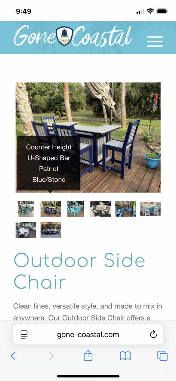
Filesize is on original jpg small enough – so you can insert the full image. Maybe that is a bit sharper then.
And maybe you switch earlier to hamburger menu :
@media only screen and (max-width: 1200px) {
    #top #header .av-main-nav > li.menu-item  {
        display: none!important;
    }
    #top #header .av-burger-menu-main {
        cursor: pointer;
        display: block!important;
    }
}

