We dont want to use gallery as images come up too big when only set to three columns width. https://peter-test1.co.uk/gallery/
-
This reply was modified 4 months, 3 weeks ago by
 condonp.
Are you talking about the tooltips displayed by the browser itself when hovering over the image?
They appear automatically if the image has a title attribute.
However, if you have a gallery that displays images in a lightbox, this title attribute is also displayed as text in the bottom bar of the lightbox. Completely removing the title tag would therefore be suboptimal. For galleries, you can switch to displaying the description or caption instead, but this is not possible for all Enfold elements.
So if it only affects the galleries on your site, you could do that, but you would then have to update the description of the images, for example.
There is a snippet that, when placed in the child theme’s functions.php, temporarily removes this title tag on hover but adds it back when clicked:
function temporary_removal_title_tags(){
?>
<script>
  window.onload = function() {
    var elementsWithTitle = document.querySelectorAll('a, img, *[title]');
    for (var i = 0; i < elementsWithTitle.length; i++) {
        var element = elementsWithTitle[i];

        element.setAttribute("data-original-title", element.title);

        element.addEventListener("mouseenter", function() {
            this.title = "";
        });

        element.addEventListener("mouseleave", function() {
            this.title = this.getAttribute("data-original-title");
        });

        element.addEventListener("mousedown", function() {
            this.title = this.getAttribute("data-original-title");
        });
    }
  };
</script>
<?php
}
add_action('wp_footer', 'temporary_removal_title_tags');
here you see that this script is working for all anchor elements or images – or all elements that have a title-tag
Dear Sirs,
I have a gallery set up with 3 columns with images closer together and centralised as in https://wayneandersonart.com/gallery/. I have set up 3 columns and trying to get them closer together. I have set the row layout to have no space between columns it says (not used when fullwidth breakpoint active) not sure I understand this. where is this set ?
if you see https://peter-test1.co.uk/gallery/ our development site this is the current set up
I am trying to achieve reduced column space of the three images that are central like https://wayneandersonart.com/gallery/ can you help.
I have set up access to the development site. Can you help please.
Many Thanks
Peter
Filesize is on original jpg small enough – so you can insert the full image. Maybe that is a bit sharper then.
And maybe you switch earlier to hamburger menu :
@media only screen and (max-width: 1200px) {
    #top #header .av-main-nav > li.menu-item  {
        display: none!important;
    }
    #top #header .av-burger-menu-main {
        cursor: pointer;
        display: block!important;
    }
}
Open that image link in your browser: https://dapoostkapelle.nl/wp-content/uploads/2025/06/First_business_card_5.png
you then can see the whitespace around it.
Only logo image on small screen size like tablet in vertical mode and mobile devices too
Would you like to hide only the logo image or both the logo image and navigation?
Would you like to hide it on small screen sizes or exclusively on mobile devices?
Hi @Guenni007,
Thank you for the suggestion. I looked through that thread, but it seems to help solve loading/hiding video within an avia framework element (e.g., color section), but not the loading of the avia element itself (e.g., fullscreen slider) and all of its image content.
Am I missing something?
Ideally, the display of the user would be determined early in the page loading process and, based on the result, would only load one of the fullscreen sliders I have on the home page, and would not load (or show) any of the others.
Hello,
I was able to fix the image problem with additional CSS.
There is still an issue with the search box in the top right corner of the nav bar. When you enter search terms, a drop-down appears with results; however, it closes really quickly, and you cannot click any of the results. How do I fix this?
Also, when you go to a product detail page, it use to show the details, but after an update, you now have to click details like it’s a button. How can I make it always visible again?
Example: https://dpfsource.com/product/ct350-da/
Thanks
Hi Guenni007 or someone else :-)
Can you help mw with this code again? I need one gridrow just as above with 1400px in boxed layout and fullwith background color, thats okay. But then I also need a gridrow with 1400px boxed layout with fullwidth background image bg. Now the background gets 1400px. Is it difficult to get another code for this? Thank you,
Kind regards, Mathilde
now – thanks for the admin permissions.
i did what i mentioned above: for the thumbs in grid i take the portfolio size (495×400)
using that snippet to have original images in the ajax preview image ( on imagify you have choosen to have no compression – so original image might be of less file-size than the recalculated large image-size )
and disabeling the enfold option to use lazyloading ( maybe the option of wp-rocket is better )
but with these changings – you can see a much better loading performance.
in additon – i decided to show on lightbox the full image ( because your large recalculated images are much bigger in file-size than the full one )
and to have no scroll on background – on opend lightbox.
ok – this seems to be enough inside child-theme functions.php:
add_filter("avf_ajax_preview_image_size", function($size) {
   $size = "full";
   return $size;
}, 10, 1);
PS : you should use for the thumbnails in the grid recalculated smaller images e.g.
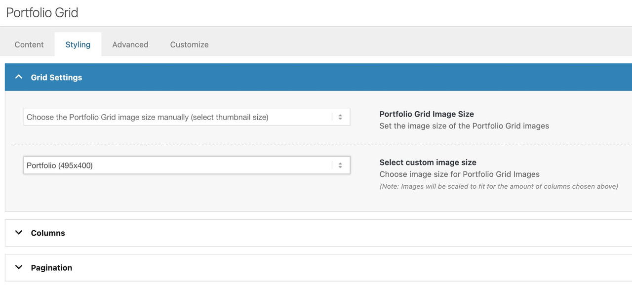
you are now using the full image (no-scaling).
Edited – because there is that existing filter to influence the shown image in preview …
can we influence the image shown in the ajax preview ( that img insided avia-gallery-big ) – it seems to use the recalculated “large” image.
But as you know this might be bigger in file size than the original uploaded image!
I can not find a filter to adjust it.
or could we influence it by
$params['preview_size'] = apply_filters( 'avf_ajax_preview_image_size', 'gallery' );
i can find this in portfolio.php
//	create array with responsive info for lightbox
	$img = Av_Responsive_Images()->responsive_image_src( $attachment->ID, 'large' );
bring it to full will often reduce file-size – as you know that Enfold standard compression leads to bigger file-sizes on large image.
ok – i found the place to change in gallery.php (line 757)
$prev = wp_get_attachment_image_src( $attachment->ID, $preview_size );
if we would use :
$prev = wp_get_attachment_image_src( $attachment->ID, 'full' );
looking to his page f.e.:
the krebs-treppen-systeme-gelaender-system30-3.jpg is 121kb
but krebs-treppen-systeme-gelaender-system30-3-1030×839.jpg is 268kb
the whole page got over 112MB images – and could be reduced to a half size.
Hello,
I have added the images using the code provided in the forum. However, when I try to enlarge them, they get grainy. How can I fix this?
Hey Munford,
When I check the price shows for each variation:
Best regards,
Mike
Hey tlscaliti,
That is not theme functionality, but if you remove the title attribute from the image, then it should not appear.
Best regards,
Rikard
you can try:
#top .avia-featureimage-slideshow .avia-caption-title a {
  display: inline-block;
  line-height: 1.4em;
  background-color: rgba(0,0,0,0.3);
  backdrop-filter: blur(4px);
  padding: 5px 8px;
  border: 2px solid #FFF;
  border-radius: 5px
}
Just leave out the border styling if you don’t like to have it. I’ve now adjusted it so that it fits the button.
Hi support, on my website http://www.avvocatoambienteesicurezza.it I would like to have the title of the “featured image slider” element with a gray overlay, can you please help me?
Hey mntsrvcs,
Thank you for the inquiry.
This is possible, but you will need to directly modify the includes > loop-search.php file. Please check the links below for more info.
— https://kriesi.at/support/topic/add-featured-image-to-search-results/#post-249161
— https://kriesi.at/support/topic/change-layout-search-results/#post-1359284
Best regards,
Ismael
Hello,
I purchased extended support for my current site. My site is running Woocommerce and I am trying to add product images to the search results page. I have tried using the Advanced Woo Search plugin, but it is not working, and I believe it is due to a conflict with the Enfold theme.
Also, I have a search box in the top right corner of the nav bar. When you enter search terms, a drop-down appears with results; however, it closes really quickly, and you cannot click any of the results. How do I fix this?
have you followed my link to the testpage? There is the video in the “background!” you can see the layout of that in the placed image below.
The rest is the css you need.
PS: Hope Mike could help you – because as a participant i can not see private content area.
Dear Support,
After updating the theme, any time I update a page, the page goes blank and all content is removed. I have tried adding all different types of content (text, images, buttons) and I have enabled the WP Classic Editor in Theme Options, but nothing has worked.
I have been able to restore previous versions of pages, but need to add new content. Any information on how this can be fixed will be greatly appreciated. Thanks.
Dear Ismael,
Thank you a lot. That works just great.
Just one thing: The post image should be shown completely:

Thank you!
-
This reply was modified 5 months ago by
 Jables.
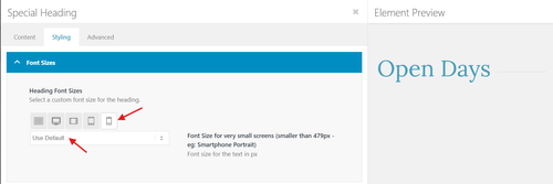
Hi,
Thanks, the H1 “Open Days” is in a Special Header element, so you can chacge the mobile size by clicking the Mobile icon and choosing the size:
Best regards,
Mike
Hey Nicolas Stephanou,
Do you mean this demo?
It is one of the homepages for the default Enfold demo, please note that this demo doesn’t include all of the images when you import it, but it should work fine once you add your content.
Best regards,
Mike
see my edit above – posting the same time
try:
#top picture.avia_image {
  display: flex !important;
}
and maybe you like to have more contrast on hovering the images:
#top a.avia_image .av-image-caption-overlay-center {
  position: absolute;
  top: 50%;
  transform: translateY(-50%);
  display:  grid;
  margin: 5px 25px;
  font-size: 1.2em
}

#top a.avia_image:hover .av-image-caption-overlay-center {
  color: #940000;
  background-color: rgba(255,255,255,0.6);
  backdrop-filter: blur(4px);
}

#top .av-image-caption-overlay-center p {
  margin: 10px 0 !important;
}
Where can we inspect that issue?
– ok i found your page tabijapon –
do you have a webp plugin installed? if i place an image element with enfold only and set the animation to “slightly zoom the image” – i do not have these bars.
Now i try to find out where it comes from…

