Hey Erwin,
Thank you for the inquiry.
The no-scaling option is really meant for cases where you need pixel-perfect originals, so 800kb thumbnails with 100 posts will definitely cause performance issues. The best approach here is to resize your images before uploading them to WordPress. For a masonry gallery, images don’t need to be wider than 1200px or so, and at that size you can usually get them well under 150kb without any visible quality loss.
After resizing, run them through a compression tool like TinyPNG or Squoosh before uploading. If you’ve already uploaded the originals, a plugin like Imagify or ShortPixel can bulk-compress your existing media library.
For the gallery setting itself, you can then switch back to one of the standard cropping options in the masonry element, which will let WordPress serve correctly sized thumbnails automatically.
— https://tinypng.com
— https://squoosh.app
Let us know if you have more questions.
Best regards,
Ismael
Hey Lance,
Thank you for the inquiry.
This is actually more of a Hustle Pro question than an Enfold one, but we can help clarify the Enfold side of things.
For your image in the classic editor, enter .parking in the “Image CSS class” field. That will add the class to the img tag itself, which gives Hustle Pro a valid css selector to target. The “Link CSS class” field applies to the wrapping anchor tag, which would also work as a selector, but using the image class is the more straightforward choice here.
Adding the class in that field is sufficient to create the selector. You don’t need to do anything else on the Enfold/Wordpress side. Just make sure the class you enter in Hustle Pro’s trigger field matches exactly, including the dot prefix (i.e. .parking).
For the “Link To” setting, if you don’t actually want the image to navigate anywhere on click, you can set it to a custom URL and use # as the value. That prevents any navigation while still allowing the click event that Hustle Pro listens for.
For further details on configuring Hustle Pro’s trigger settings, please refer to their documentation.
— https://wpmudev.com/docs/wpmu-dev-plugins/hustle/
Let us know if you have more questions.
Best regards,
Ismael
Hi,
Ok, try this css then:
.page-id-3368 #intro .iconbox_icon {
	background-color: red;
	border: red;
}
.page-id-3368 #intro.main_color .iconbox_icon.heading-color:before {
	color: #fff;
}
Best regards,
Mike
I’m using Hustle Pro popup plugin on my WordPress site. This plugin has an option to trigger the popup by clicking on “an existing page element,” to be specified by its “CSS selector.” I’m trying to set up a popup on a page to be triggered by a click on a certain image on that page. I have added the image to the page.
Clicking on that image in the classic editor, and then clicking on the pencil “edit” icon, a window opens up with a number of settings. I want to use .parking as the CSS sector. My questions are:
(1) Do I enter .parking in the Advanced Settings box labeled “Image CSS class” or in the box labeled “Link CSS class”?
(2) Does so entering create the “CSS selector”? Or do I have to do something else?
(3) What option should I use on the Link To setting dropdown under Display Settings?
Thanks! Lance
-
This topic was modified 16 hours, 14 minutes ago by
 CaptOM89.
On this site I am mocking up:
On the home page I am adding a section in a 1/3 container you can see a screenshot of the 1/3 container at the bottom.
https://rankforaisearch.com/wp-content/uploads/2026/04/Screenshot-2026-04-22-at-6.41.55-PM.png
Problem is every time I do it takes initially but then after saving it one or two more times and then adding a link when the screen refreshes it disappears.
While it was still there I tired ti save it as a template and it did but it didn’t not save the 1/3 increment even without the link.
It’s just an image some text and a link at the bottom. I made the link generic to be sure it wasn’t an issue with the link itself. But again after saving more than once it disappears.
At the moment the 1/3 increment is there but without the link, you’ll se some text indicating where the link goes at the bottom of the column.
Can you log in and help me figure out what’s going on here?
I have reinstalled the theme, the child theme, turned off all plugins to no avail.
Thanks
ps: link on this page:
does work and doesn’t date a section.
I am befuddled
Hi,
I’m using an masonry gallery to show posts with images. Because I would like the images to shot at the original ratio, I’ve set it to set your own format and use no-scaling. But, the no-scaling causes large thumbnails as 800kb. With 100 posts to show, this is becoming a big page to load. See the private content field for a link to this page.
Can you recomment me another way to achieve this layout? Or another setting for the post-images?
Regards,
Erwin
Hi,
Seems to be working when I check, try clearing your cache
Best regards,
Mike
Hi everyone,
I had several pages using this theme.
Page link below:
And I had set a background image on all the pages.
Here
See screenshot link 02 below
Now suddenly everything is gone?
Did a path in the theme change?
Thanks for your help
Best regards Franz
Hi,
Thank you for the update.
The video played fine on Safari when we checked. Have you tried testing it on a different device?
Best regards,
Ismael
Hey dnweil,
Thank you for the inquiry.
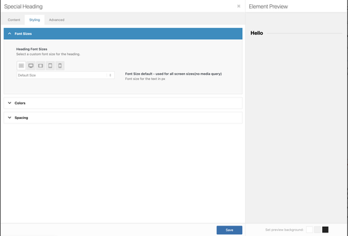
If you’re using the Advanced Layout Builder, each element, especially Text or Heading elements, has a Styling > Font Sizes option which can be adjusted for different screen sizes.
There is also an Element Visibility setting in the Advanced > Responsive panel which can be used to toggle the visibility of an element for different screen sizes. For cases where element options are not enough, you can always add css modifications.
Best regards,
Ismael
Hey Stretchspot,
Thank you for the inquiry.
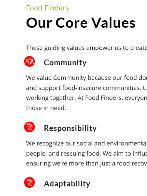
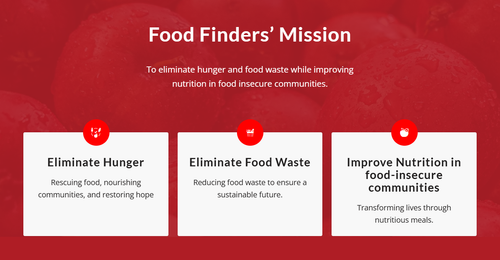
There is no option to use an Image in an Iconbox element, but you can replicate the box using combinations of elements. Add a Column element, insert an Image element inside, add a Text Block for the description, then a Button element if you need a call-to-action element. Let us know if this works for you.
Best regards,
Ismael
I was h oping I could display portfolio items in columns that display masonry style like the gallery. Is that possible, as the porfolio items have varied default image sizes.
Thank you,
CJ
Dear Team:
I’ve worked with Enfold for years, and haven’t really focused on mobile friendly versions. I need some help making this site mobile friendly, which I hope will help me with another one as well.
What do you recommend, beyond selecting mobile friendly options within the theme settings, to improve issues like image proportions and text that doesn’t adjust, causing it to be cut off the page?
Note the top of the page is not holding its proportion to the rest of the page, it looks weak and small, vs impactful. Also note, the title “heads” like “Be courageous” that gets cut off.
Your guidance here would be most appreciated!
Thank you!
Dan
Hey dreyerjm,
Try this css:
.main_color .avia-content-slider .slide-image {
	background: transparent;
}
Best regards,
Mike
Hi, is there a way to remove the white boxed behind the linked coalition pictures. When I add a link to these images it creates a background white box white i do not want but I still want the link to be there.
Hey dreyerjm,
Try adding this css to your quick css field in the theme options:
.av-single-event-content .tribe-events-event-image {
	display: none;
}
Then clear your cache and check.
Best regards,
Mike
Hi,
Is there anyone to remove the featured image on the single event page? I want to keep it on the overview page just not on the actual event page. On the actual event page I ended up embdeding the image seeing it only partially shows. Ideally i would like all event page like that.
I did and it looks a little better but the icons are still there overlapping the images. It also looks like there is a blue overlay color on the icons. Is there a way to make it so the images are grayed out and than on hover they become color?
Hi,
Thank you for the inquiry.
Please add this css code to adjust the width of the images on mobile view.
@media (max-width: 768px) {
  .avia-image-container.avia-align-center .avia-image-container-inner {
    width: 100%;
  }

  .avia-image-container .avia-image-overlay-wrap,
  .avia-image-container .avia_image {
    transition: all 0.7s;
    width: 100%;
  }
}
Let us know the result.
Best regards,
Ismael
Hi,
I’m using the directions from this thread but it didnt work. I attached the code I added. See pirvate
Please check below screen. Don’t know why the first and second image are not aligned correctly. The third to sixth images are correct.
https://prnt.sc/Riwyrl3nCO8b
The red lines shows the left/right of first & second image. However, they are not aligned with others (blue lines).
If you start a page with a full-width slideshow and an image, and then add a YouTube video to that page, the video will no longer display. You’ll only see a black screen.
This change was implemented with WordPress updates 6.9.2 through 6.9.4. You can now only integrate both a full-width slideshow and a video into a single page if you embed the video using the text embed function.
Hi, following up on this issue with an update and a request for a fix in a future version of Enfold. (BTW the forum sidebar still says the next update is coming out in January so you might want to change that.)
Using AI, I think I identified the root cause. The page uses an Isotope masonry gallery above an anchor link target. Isotope sets the gallery container height dynamically via JavaScript using absolute positioning on each item. On the first click of an anchor link, Isotope has not yet finished calculating the final grid height, so the container is shorter than its fully-loaded state. This causes the page to scroll to the wrong position. On the second click everything has loaded and the anchor lands correctly.
As a temporary workaround I have set a fixed minimum height on the color section containing the gallery, hardcoded to the fully-loaded pixel height of the grid. This works but is fragile — the value needs to be manually updated any time images are added or removed from the gallery, and it also varies by screen size.
A fix might be for Enfold to initialize Isotope and complete the layout calculation before any anchor scroll events fire. Specifically, the issue is that when a user clicks an anchor link, the browser calculates the target element’s position based on the current document height at that moment. If Isotope has not yet finished positioning all items and setting the final container height, the document is shorter than it will be once layout is complete, causing the scroll to undershoot the target. One approach would be to delay anchor scroll handling until after Isotope fires its layoutComplete event. Another approach would be to have Isotope run its initial layout synchronously on DOMContentLoaded rather than waiting for images to load, so the container height is stable before any user interaction is possible. A third approach would be a layout reservation strategy — for example, setting an explicit height on the container equal to the calculated grid height before images begin lazy loading, so the document height is consistent from the start regardless of image load state.”
Appreciate your feedback / advice on this as I use this element all the time and am concerned about my workaround.
Thanks!
Rob
Hi,
Thank you for the inquiry.
The height of the rows are the same because of this inline style in the html.
<div class="rss_image" style="height:150px;width:150px;">
You have to remove the height and width properties.
View post on imgur.com
Best regards,
Ismael
Hi,
We can’t find any layout issue on the page. Would you mind providing a screenshot of the issue? You can use platforms like FreeImage, ImgBB, PostImages or Dropbox to upload and share the screenshot. Here are the steps to follow:
1.) Visit the website of your chosen platform, such as Savvyify, ImgBB, PostImages or Dropbox.
2.) Locate the option to upload a file or an image.
3.) Select the screenshot file from your computer or device and upload it to the platform.
4.) After the upload is complete, you will be provided with a shareable link or an embed code.
5.) Copy the link or code and include it in your message or response to provide us with the screenshot.
Thank you for taking the time to share the screenshot. It will help us better understand the issue you’re facing and provide appropriate assistance.
Best regards,
Ismael
Hi there,
Would it be possible to create a slider element of 3 regular 1/3 columns on the mobile viewport instead of listing them simply vertically below each other. In the bottom of the 1st link of the private section I have placed 3 columns with each column containing an image.
In the 2nd link you wil find a similar section of 3 columns however there we have applied an ACF section to achieve the desired UX. Would it be possible by any chance to create a similar UX but then by using the core Enfold ALB elements instead of being dependant of the external ACF sections.
Thanks and regards
S
Hi,
Thank you for clarification.
This is how the image looks (see private field) when we magnify the page at the maximum level, and we don’t think there’s any way to enlarge it further. You can add a download button somewhere on the page so users can download the image and use default image editors in their operating systems, which should have their own zoom function if they really need to see the image more clearly.
Use the Button element to create a Download button — check the screenshot below.
View post on imgur.com
Let us know if you need more information.
Best regards,
Ismael
Hi Mike,
thanks for adjusting the functions file to show the images. That is fine.
About the excerpts: so you mean if I do not put any text in the summary box then an excerpt of the article text itself should be shown? (what you call auto excerpts). I have tried that, but if I leave the summary box empty, then no text at all is shown. Just want to make sure I understand how that works.
Best regards,
Elena
Hi,
I’m not sure that I understand, do you mean that the images are not lined up?
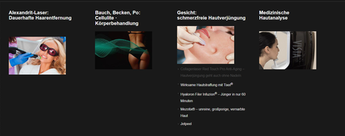
You write about the width, but all menu items & images are the same width
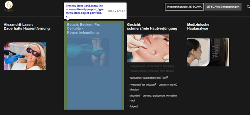
In the image above you have manual line breaks between the words, probably so the long word would not break and be hard to read
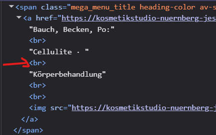
So this might make the space look larger, but it’s really not.
Best regards,
Mike
Hi,
To show the post featured image on the category pages, I added this to your child theme functions.php file:
add_filter('avf_blog_style','avia_change_category_blog_layout', 10, 2);
function avia_change_category_blog_layout($layout, $context){
if($context == 'archive') $layout = 'single-big';
return $layout;
}
As for your excerpts, right now you are using manual excerpts, what you call the summary box at the bottom of the article page, when these are used the auto excerpts are disabled, so you can’t have both. You could add more text to the manual excerpts if you wish.
Best regards,
Mike