-
Search Results
-
Hello –
Is there a way to move the thumbnail navigation on the layerslider fully below the main image (not overlapping it) so it doesn’t encroach on the main image?
This is the page I am working on: http://jboatsmexico.com/j70-one-design-sailboat/
Trying to get it something more like this: http://jboats.com/j70-one-design-sailboatMany thanks in advance!
I have a bug to report, that is impacting sales on my site. Please fix this quickly.
The single product page shop gallery simply doesn’t work on the iPhone. When the thumbnails are tapped the gallery doesn’t switch the image.
I removed all the plugins and tested with storefront theme and it works correctly.
With all plugins removed and only the enfold theme set to use the WooCommerce 3.0 gallery it doesn’t work correctly.
Also this is with Enfold, WooCommerce and WordPress versions up-to-date.
Best regards,
Chris SnowI’m using two easy sliders on a page whose element visibility is different for desktop, tablet landscape, tablet portrait (slider 1) and mobile portrait (slider 2). This works great, but whilst the hidden slider is not visible, it leaves unnecessary whitespace which really bugs me.
Since pictures say more than 1000 words
With hidden easy slider between menu and image: https://pasteboard.co/HI7xrFw.png
Hidden easy slider removed: https://pasteboard.co/HI7xVMj.png
if it helps, this is the div of the hidden easy slider.
<div data-size="masonry" data-lightbox_size="large" data-animation="fade" data-conditional_play="" data-ids="534,535,536" data-video_counter="0" data-autoplay="true" data-bg_slider="false" data-slide_height="" data-handle="av_slideshow" data-interval="5" data-class=" avia-builder-el-0 el_before_av_slideshow avia-builder-el-first av-desktop-hide av-medium-hide av-small-hide" data-css_id="" data-scroll_down="" data-control_layout="av-control-default" data-custom_markup="" data-perma_caption="" data-autoplay_stopper="" data-image_attachment="" data-min_height="0px" data-default-height="100" class="avia-slideshow avia-slideshow-1 av-control-default avia-slideshow-masonry av_slideshow avia-builder-el-0 el_before_av_slideshow avia-builder-el-first av-desktop-hide av-medium-hide av-small-hide avia-fade-slider" itemprop="ImageObject" itemscope="itemscope" itemtype="https://schema.org/ImageObject"><ul class="avia-slideshow-inner " style="padding: 0px;"><li class=" slide-1 " style="visibility: visible; opacity: 1; transition: all 0.4s cubic-bezier(0.55, 0.085, 0.68, 0.53) 0s; transform: translateZ(0px);"><div data-rel="slideshow-1" class="avia-slide-wrap "><img src="https://i1.wp.com/coaching-choices.ch/wp-content/uploads/2018/10/MK3C2960.jpg?fit=705%2C705&ssl=1" width="705" height="705" title="MK3C2960" alt="" itemprop="thumbnailUrl" data-lazy-src="https://i1.wp.com/coaching-choices.ch/wp-content/uploads/2018/10/MK3C2960.jpg?fit=705%2C705&ssl=1&is-pending-load=1" srcset="data:image/gif;base64,R0lGODlhAQABAIAAAAAAAP///yH5BAEAAAAALAAAAAABAAEAAAIBRAA7" class=" jetpack-lazy-image" style="left: 0px;"><noscript><img src='https://i1.wp.com/coaching-choices.ch/wp-content/uploads/2018/10/MK3C2960.jpg?fit=705%2C705&ssl=1' width='705' height='705' title='MK3C2960' alt='' itemprop="thumbnailUrl" /></noscript></div></li><li class=" slide-2 "><div data-rel="slideshow-1" class="avia-slide-wrap "><img src="https://i0.wp.com/coaching-choices.ch/wp-content/uploads/2018/10/MK3C2704.jpg?fit=705%2C705&ssl=1" width="705" height="705" title="MK3C2704" alt="" itemprop="thumbnailUrl" data-lazy-src="https://i0.wp.com/coaching-choices.ch/wp-content/uploads/2018/10/MK3C2704.jpg?fit=705%2C705&ssl=1&is-pending-load=1" srcset="data:image/gif;base64,R0lGODlhAQABAIAAAAAAAP///yH5BAEAAAAALAAAAAABAAEAAAIBRAA7" class=" jetpack-lazy-image"><noscript><img src='https://i0.wp.com/coaching-choices.ch/wp-content/uploads/2018/10/MK3C2704.jpg?fit=705%2C705&ssl=1' width='705' height='705' title='MK3C2704' alt='' itemprop="thumbnailUrl" /></noscript></div></li><li class=" slide-3 "><div data-rel="slideshow-1" class="avia-slide-wrap "><img src="https://i1.wp.com/coaching-choices.ch/wp-content/uploads/2018/10/MK3C2703.jpg?fit=705%2C705&ssl=1" width="705" height="705" title="MK3C2703" alt="" itemprop="thumbnailUrl" data-lazy-src="https://i1.wp.com/coaching-choices.ch/wp-content/uploads/2018/10/MK3C2703.jpg?fit=705%2C705&ssl=1&is-pending-load=1" srcset="data:image/gif;base64,R0lGODlhAQABAIAAAAAAAP///yH5BAEAAAAALAAAAAABAAEAAAIBRAA7" class=" jetpack-lazy-image"><noscript><img src='https://i1.wp.com/coaching-choices.ch/wp-content/uploads/2018/10/MK3C2703.jpg?fit=705%2C705&ssl=1' width='705' height='705' title='MK3C2703' alt='' itemprop="thumbnailUrl" /></noscript></div></li></ul><div class="avia-slideshow-arrows avia-slideshow-controls"><a href="#prev" class="prev-slide" aria-hidden="true" data-av_icon="" data-av_iconfont="entypo-fontello">Previous</a><a href="#next" class="next-slide" aria-hidden="true" data-av_icon="" data-av_iconfont="entypo-fontello">Next</a></div><div class="avia-slideshow-dots avia-slideshow-controls"><a href="#1" class="goto-slide active">1</a><a href="#2" class="goto-slide ">2</a><a href="#3" class="goto-slide ">3</a></div></div>Topic: Product Category Image
Hi,
The page below is a product category page:
http://netinfoweb.net/tsiropoulos/product-category/gold-jewelry/
I ve set as thumbnail page there an image with dimensions 1920px * 300px.
I also set the below option in the category’s settings: Enfold Child Category Styling = Display product image and description as full width page banner.
But the image is not shown properly. Only part of it is shown and it looks distorted. Can you help me with some css which will resolve my issue?
Thank you in advance
HI~
the problem is like the thumbnail
https://screencast.com/t/XxGUYSWvK7fcan you help me, thank you
Hi,
I noticed the website size of zoebooth.com.au is quite large and from my research it seems that it’s because of the 3 masonry galleries that all have large full size images in them. What I thought would be a superior approach would be for the image galleries to load only the thumbnails of the images on the front page and then have the main large images only load if they are clicked (thereby saving space so the site loads faster and is a better user experience and has better SEO). I was wondering if Enfold has an element that can be inserted to achieve this or if there is any input you would have on this.
Thanks!
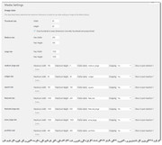
Topic: Search Result with thumbnail
I was able to set search results page with image but I’m not able to fit the image, I see big cropped filled image, I’d like to set little thumbnails with entire image fitted the image size.
Thank you for any advice.
Best,
Topic: Ajax preview window issues
Hi
this is following on from this support thread: https://kriesi.at/support/topic/ajax-window-stopped-working/
there is a lot of erroneous information contained in that thread so better to start again.
The original request was this:
I want the preview items to appear underneath the flags NOT on top.
I was provided with this code to do that (see end) BUT this code is what is breaking the site.
I tried the site this morning and it was no longer working again on mobile phones and I assume safari so I removed that code and it worked fine again, so it is that code, consistently.
I was suggested to try lots of things with caching etc but it’s just something in that code not anything else that is giving the problem.
I have had to switch back to the normal functionality – but if you look at that page you will see that when it opens an item you can no longer see the other items in the tab and whichever way you set the height of the tab you end up either not being able to click on items or a load of space underneath which is no good.
basically the tabs and also this ajax gallery do not work very well or not in the combination I am trying because the theme cannot seem to handle this and something so simple as having the item below the thumbnail – fairly standard for an ajax gallery I would have thought – becomes a major problem.
I had to pull that code today as my client was showing the site today in a big meeting and that code is making the site just not work. I am losing lots of time here…
anyway is it possible to take another look at that code and see where the issue is, or just say that this is not going to work and I will try some other route as at present Enfold is not helping me :)
many thanks!
<?php
/*
* Add your own functions here. You can also copy some of the theme functions into this file.
* WordPress will use those functions instead of the original functions then.
*/function ava_custom_script_portfolio_preview() {
?>
<script>
(function($) {
$(document).ready(function() {
$(‘.grid-sort-container’).each( function() {
var preview = $(this).prev(‘.portfolio_preview_container’);
var sort = $(this);
preview.insertAfter(sort);
});
});
})(jQuery);
</script>
<?php
}
add_action( ‘wp_footer’, ‘ava_custom_script_portfolio_preview’, 9999 );function av_larger_quick_css() {
echo ‘<style>#avia_quick_css .avia_control textarea {
min-height: 400px;
}
.avia_sidebar_active #avia_quick_css .avia_description {
width: 30%;
}
.avia_sidebar_active #avia_quick_css .avia_control {
width: 70%;
}
</style>’;
}
add_action(‘admin_head’, ‘av_larger_quick_css’);//set builder mode to debug
add_action(‘avia_builder_mode’, “builder_set_debug”);
function builder_set_debug()
{
return “debug”;
}add_action(‘wp_head’, ‘ava_auto_resize’);
function ava_auto_resize(){
?>
<script>
(function($){
var int = window.setInterval(function(){
$(window).trigger(‘resize’);
$(window).trigger(‘av-content-el-height-changed’);
}, 1000);
})(jQuery);
</script>
<?php
}In my test system I set up a number of pages each displaying one or more product categories using the Avia Layout Builder and the Plugin Addition – Product List. All the pages displayed a list of products with a small round thumbnail with the product details next to it. Looked good, nice and tight..
In my live system I set up , as far as I can tell, exactly the same pages, with all the settings in the Enfold Child and WooCommerce etc., but now the thumbnail is much larger and square with product details below. The list doesn’t look good and I am struggling to find a solution. Oddly, If I use the Preview Changes button, the display is as I want – small round thumbnail and the details next to it.
Regards
Mick
Greetings,
I come in peace. :)
Currently I have the Easy Slider that I’m using to display Videos from youtube from my channel. I placed the link with a fallback image.
I put the link in and it displays on my desktop perfectly. I set it up for automation, but it does not auto rotate on my desktop.
But most importantly, viewing from my phone (on both Safari & Chrome), instead of the thumbnail, I see a shortcake that says
“[object Object]“. When I click the short code it brings me to the youtube video.But I know this is most likely a kriesi issue.
Please help.
Hello, I’ve been using enfold for years now. I have a bug to report, that is impacting sales on my site.
The single product page shop gallery simply doesn’t work on the iPhone. When the thumbnails are tapped the gallery doesn’t switch the image.
I removed all the plugins and tested with storefront theme and it works correctly.
With all plugins removed and only the enfold theme set to use the WooCommerce 3.0 gallery it doesn’t work correctly.
Best regards,
Chris SnowI’m looking for a picture gallery (full screen) with thumbnails to click.
When clicking on the thumbnails, the full screen changes.
Example: http://wp.unitegallery.net/default-theme/
Is something like that in the theme included?Topic: Lightbox Image Sizing
Hello,
I have a larger image size 1200px by 1800px or so, and it is getting sized down when being opened via lightbox. It is a longer restaurant menu, and I really need it to show full-size. I tried one of Ygit’s methods (found on another thread) – which was going into media settings and increasing large thumbnail size to max, and then refreshing(rewriting?)thumbnails via a plugin. So far nothing has worked. Do this have to be accomplished via functions.php ? I’ve had my site crash when I’ve tried editing this before so not sure what I do wrong usually lol..
So, the issue is on the homepage, under dinner menu, both the links just under the fold, and the menu item called ‘dinner’ at the top is where I’d like to bring up the full-sized menu image if possible, on click. The lunch menu looks great, the dinner menu is coming in a little shrunk which makes the text hard to read. The mobile version you can just read, so the ability to just set the lightbox size on desktop would be beneficial too as well.
