@Ismael,
Thank you for your response. I have a couple naïve questions:
1. I have placed the Image Element within a Color Section
2. I added the “noLightbox” class name in the Advanced > Developer Settings > Custom CSS class field
3. Silly Naive Question: Where do I add this CSS code?
4. content: ‘Play Button Here’; – Is this the full URL for the button (e.g. https://kingdomlearners.com/wp-content/uploads/2021/12/Play-Button-Mouseover-for-Thumbnails.png)?
Thanks so much for your help.
In previous versions I modified includes/loop-search.php line 35
Commented this:
echo "<span class='search-result-counter {$counterclass}'>{$post_loop_count}</span>";
Added this:
$searchimage = get_the_post_thumbnail( $the_id, 'large' );
echo "<span class='search-result-image'>{$searchimage}</span>";
echo "<span class='search-result-counter {$counterclass}'>{$post_loop_count}</span>";
I see that 4.8.8 has some changes and I just want to be sure the modification should be the same.
Thank you.
I’m adding thumbnails that point to YouTube videos. YouTube forces extra stuff on top of the thumbnails which I’m trying to avoid.
Here’s what I’m thinking:
1. Add the raw thumbnail
2. On mouseover, the play button image would appear
3. When you click on the image, it takes you to another page
On the Enfold template I’m using, I remember on the homepage it had “Recent Top Sellers” with images of men and women and they would change on mouseover – https://kriesi.at/themes/enfold-shop/
I never looked behind the scenes to see how they were doing this. Examples are deleted now.
Any suggestions would be greatly appreciated. Thank you
Hi,
im using the grid layout with 3 columns on my blog page. In the side bar are the archive articles.
If i click on a sidebar article (for example October 2021) the blog articles have another layout. Not the grid.
Articles shown with a small thumbnail and a big header bar under the thumb. This doesn’t look not so nice.
Link for example: https://naturheilkunde-akademie.at/blog/
Can i change the results of the sidebar archives it in the same grid layout as my main blog page?
Thank you for helping!
Hey Manos,
Thank you for the inquiry.
1.) This is possible but you have to modify the avia_ajax_search function in the functions-enfold.php file and adjust the thumbnail manually. Look for this code around line 396.
$image = get_the_post_thumbnail( $post->ID, 'thumbnail' );
2.) You can use the avf_ajax_search_query filter to adjust the number of posts in the search results container.
add_filter("avf_ajax_search_query", function($query) {
	parse_str($query, $parameters);
	$parameters["numberposts"] = 2;

	return http_build_query( $parameters );
}, 10, 1);
Best regards,
Ismael
Hi there,
1) I am using Enfold Knowledgebase template and I would like to know if there is a way to change the thumbnail size of the AJAX results. Right now the thumbnail that is being generated is 80×80. I would like to get a 200×200.
2) I am using the Relevanssi plugin to improve the accuracy of the results. and I noticed that the maximum number of the results can be too long sometimes. Is there a way to limit the number of results that the AJAX search returns?
Hi Rikard,
I have a problem with all images on my website, also thumbnails in media library are not showing. Imported backups didn’t change anything. Can you help?
Thanks
Oliver
Hi Victoria,
I have a problem with all images on my website, also thumbnails in media library are not showing. Can you help?
Thanks
Oliver
Hey jb84,
Thank you for the inquiry.
This is the actual image (see private field) used in the slider. Is the original image much sharper than this thumbnail or image? Please provide the original image so that we can upload and check it on our installation.
Best regards,
Ismael
Hey xela,
Thank you for your patience and the link to your site, Try adding this code to the end of your child theme functions.php file in Appearance ▸ Editor:
add_filter( 'avf_modify_thumb_size', 'enfold_customization_modify_thumb_size', 10, 1 );
function enfold_customization_modify_thumb_size( $size ) {
  $size['entry_with_sidebar'] =array('width'=>1500, 'height'=>1500 , 'crop' => false);
  return $size;
}
this will only take effect on new uploaded featured images, or you can use the thumbnail regeneration plugin
Best regards,
Mike
Hey MikeTandySwag,
Thank you for the inquiry.
Looks like you adjusted the width of the portfolio preview container with the following css code, which also resizes the image.
.portfolio-preview-image {
    /* width: 30% !important; */
}
Default width value is 66.6%. To remove the thumbnail, make sure to set the Ajax Portfolio Preview Settings > Display Preview Images settings to slideshow or image list.
Best regards,
Ismael
@Yigit do you think this is a WordPress core issue? Should images added through ALB gallery, for example, be ‘attached’ to a post? I ask because I’m trying to use the Easy Add Thumbnail plugin so that I don’t need to explicitly add a featured image to my Porfolio Items and it’s not working and I think this might be the reason.
EDIT if I use the classic editor and add media to a post, the media is ‘attached’ to the post in the media library. If I use an ALB element that adds media to the post, this doesn’t work. I find this weird. Why would Enfold not try to replicate default WP behaviour in this way?
Thanks
-
This reply was modified 4 years, 3 months ago by
 ilowelife.
Hey melanie_erfrischt,
Thank you for the inquiry.
1.) You may need to adjust the height of the header on mobile view in order to increase the size of the logo. Please try to use this css code.
@media only screen and (max-width: 767px) {
.responsive #top #header_main > .container .main_menu .av-main-nav > li > a, .responsive #top #wrap_all .av-logo-container {
    height: 160px;
    line-height: 160px;
}

.responsive #top .logo, .responsive .logo img, .responsive .logo svg, .responsive #top #wrap_all .main_menu {
    height: 160px !important;
}
}
2.) The size of the thumbnails can be adjusted in the Appearance > Customize > Woocommerce > Product Images panel. You can also use a filter to adjust the default product image size. Please check the following documentation.
// https://woocommerce.com/document/image-sizes-theme-developers/?quid=8cf885fd38c8c30cc929ffa354f88a0f
If you have any additional questions at this time we kindly ask that you open them up in a separate thread. The longer threads get in the forum, they become more difficult to support as they tend to drift off topic and they also make it troublesome for users trying to search for solutions. Keeping threads relevant to their original inquiry ensures that we can keep better track of what has been resolved and that users can more effectively find answers to similar issues they might be experiencing.
Thanks!
Best regards,
Ismael
Hi enfold-team,
I´m using woocommerce for my clients new shop.
I have some things, needing your help:
1. The logo in mobile view is to small, how can I change the size (double or more)
2. I don´t know how to change the size of the thumbnail size for products on shop page – changing it in media settings, doesn´t help unfortunately
3. I´d like to show 2 products in one row in mobile view, how can I change this?
4. Loading time, since I startet working with woocommerce page loading is very bad (5 – 8 sec). I´m already using image optimizer plugin but it doesn´t became better
Thanks for your help so far,
melanie
ok – sorry, then I misunderstood him.
I thought he just didn’t want the lightbox to open when clicking the thumbnails.
So only the large image should be shown when clicking the thumbnails.
Hi,
Thank you for the info @Guenni007.
The user wanted the big thumbnail to change on click instead of hover or mouseover, so the changes in the gallery.js file may still be necessary
Best regards,
Ismael
Hey ilowelife,
Thank you for your patience the file that controls this is \wp-content\themes\enfold\config-templatebuilder\avia-shortcodes\gallery\gallery.js and I did some testing but while the thumbnail mouseover behavior can be changed to click this also affects the behavior of the rest of the element and breaks large image popup because of how the script is written, unfortunately it would require a rewrite that is more than we can offer here.
If you really want this customization, we can recommend Codeable for their experience and expertise with Enfold. Please follow the link to discuss your project and time frame with them.
Best regards,
Mike
Hello:
I am using the image gallery ALB element configured for Big image with thumbnails below and was wondering if there’s a way for the thumbnails to swap out the main image only onclick, as opposed to on mouseover.
I did some user testing and users were quite confused by the behaviour because the onclick just opens the lightbox rather than showing them the preview of that image in the big image space. Their expectation was that you click the thumbnail to see the big image as preview, and click the big image to open the image itself.
How might I go about adjusting this behaviour?
Thank you
Dear Kriesi-Team,
after updating one of my websites, all video thumbnails cutted off in height.
in private content i´ll send you examples.
thanks for your help!
but the Media Gallery has the possibility to accept up to 12 columns.
So put in your 64 Images with link and choose 8 columns with gallery style: small thumbnail
Edit: sorry i didn’t read on from Otherwise …
i’m looking now for a portfolio solution
Hi Enfold,
We ran the latest update to Enfold this morning (4.11.21) and have noticed that the Masonry gallery, no longer works properly.
All we see are popups of image at a larger size. We have used the gallery as menu and a way of linking through to other pages. We have links on the images and also within the gallery itself to ensure that when clicked on, they go to a page (rather than show a larger version of the thumbnail image).
We were about to go live with our site, and now are unable to with this feature not working. Could you please provide some advice? Links to our site have been provided in the private content section.
Cheers,
Salt Design
Hi Nikko,
thanks a lot for reply!
I changed media settings for thumbnail, medium and large (thumbnails were all regenerated) without any effect on height. Did I misunderstood something?
Best regards
Marc
Hey kowalski,
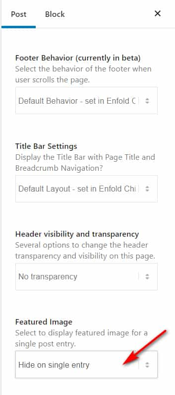
Thank you for the link to your site it looks like your featured images have a 16:9 aspect ratio (702×395) but the thumbnails need to be more square 206×166, thus the cropping.
One way around this would be to use featured images that are more square and would show on your blog page correctly and then hide the featured image on the post itself and use your full-sized image instead.
That is you would manually add your full-sized image at the top of your post and use the option to hide the featured image on the post:
Best regards,
Mike
Hello, I’ve nearly finished building out my site. The theme has been very easy to use so thank you.
What I can’t figure out is how to get all thumbnails on my blog page to display the whole image rather than cropping the image so it only displays part of it which looks messy to me. I’ve managed to work out how to display the image like this on the post page so that’s all good. Just the thumbnails I need assistance with please.
Or is there a way I could set the thumbnail as a separate image so they are custom. I could then create them in photoshop so they are uniform.
Many thanks
Damien
Merhabalar,
Her Enfold sitesinde 100 uzerinden 95-97 arasi sonuc alan @thomasjarvisdesign assagidaki eklentileri kullandigini bahsetti:
WP-Optimize – Caching and HTML minification
EWWW WebP Conversion
Short Pixel thumbnail regenerator
Enfold Performance settings on
Lutfen bu gonderiyede goz atin – https://kriesi.at/archives/scoring-100-100-in-google-pagespeed-insights-gtmetrix-pagespeed-and-yslow
Regards,
Yigit
Ismael, you are the man! Thanks a lot. That is exactly what I was searching for. I changed the opacity to 1, thanks for the line in the code. How could I set the size of the linked overlay picture to original or ‘large’? Right now only the thumbnail (80×80) is loaded. Can I add a line for the size like that:
$config["content"][$counter]['attr']['overlay_size'] = 'large';
Or do I have to add something to the last line where the attachment is loaded?
All the best, Daniel
Hi,
Thank you for the clarification.
Unfortunately, this is not possible because the default value of the overlay settings would be different for each element or for each page. It is only possible for settings in which the value would be the same for every element. For example, in the slider’s Styling > Slideshow Image Size settings, we could set the “Large” thumbnail as the default option.
You can try this filter in the functions.php file to automatically apply the same slider image as the custom pattern value.
add_filter("avf_slideshow_config", function($config) {
	$counter = 0;
	foreach ($config["content"] as $slider) {
		$config["content"][$counter]['attr']['overlay_enable'] = 'aviaTBaviaTBoverlay_enable';
		$config["content"][$counter]['attr']['overlay_opacity'] = '0.5';
		$config["content"][$counter]['attr']['overlay_pattern'] = 'custom';
		$config["content"][$counter]['attr']['overlay_custom_pattern'] = wp_get_attachment_image_url($slider['attr']["id"]);
		$counter++;
	}

	return $config;
}, 10, 1);
Best regards,
Ismael
I am having trouble with the Portfolio Grid element on two different pages on my website.
Suddenly this week I noticed that there is now an unwanted space gap between the rows of the grid. However, if the browser window is resized, the gap disappears for the viewing session. The resizing only applies to the visible part of the page. When closing the browser and returning to the same page, the extra space comes back.
I have tested this on Firefox, Safari and Chrome with the same results.
I have also tried using different thumbnail sizes but that does not solve the problem.
The theme is version 4.8.6.5.
Thank you.
-
This topic was modified 4 years, 4 months ago by
 stickinc.
Usually I set up the post module on a site to grid 3 collums. Which works fine on a laptop. On my phone, I get one collumn, which also makes sense. However om my tablet in portrait mode the layout is messed up. I get an alternating 1 post bigger thumbnail in a row and then two posts next to eachother > one post > two posts… etc…
—
When I use the masonry module, this doesnot happen and all rows are the same.
What can I do to achieve the same result on my tablet? In other words nicely algined rows of two posts each?
Hey Ivana,
Thank you for the inquiry.
The theme automatically adjusts the compression level of the uploaded images, which could lead to increase in file size. You can adjust the default quality by using this filter in the functions.php file.
add_filter("avf_jpeg_quality", "avf_set_quality_mod", 9999, 1);
add_filter("avf_wp_editor_set_quality", "avf_set_quality_mod", 9999, 1);
function avf_set_quality_mod($quality) {
	$quality = 65;   // compression level what you like in percent
	return $quality;
}
Quality is set to 100 by default. And if you want to prevent the generation of multiple images or thumbnails, please check the following thread.
// https://kriesi.at/support/topic/enfold-image-sizes-3/#post-1109028
// https://kriesi.at/support/topic/portfolio-grid-alignment-issues/#post-1306849
// https://kriesi.at/support/topic/how-can-i-delete-all-enfold-image-sizes/
Best regards,
Ismael