-
Search Results
-
Hello Kriesi Support Team,
We encountered a critical issue while working within the Enfold theme and are seeking guidance on recovery.
What happened:
- We were troubleshooting an issue where the Enfold theme was not updating properly.
- During this process, we clicked the “Reset” button, assuming it would clear cached/token-related data.
- Instead, this action reset/deleted all Enfold theme options globally.
Current situation:
- All Enfold theme settings (layout, styling, header, footer, etc.) have reverted to defaults.
- All media files disappeared immediately after the reset.
- We do not have a direct export/backup of the Enfold theme options.
- We do have a full website backup in .zip format.
What we have already checked:
- Searched the backup archive for Enfold-related configuration or option files.
- Reviewed wp-content (themes, uploads, etc.) but did not find identifiable option storage files.
- Looked for database-related content expecting to find theme settings (e.g., wp_options entries), but could not locate a usable database or clearly identifiable Enfold settings.
What we need help with:
- Are Enfold theme options stored in the WordPress database (wp_options) or in files?
- If stored in the database, what specific option names or prefixes should we look for (e.g.,avia_*)?
- Can theme options be restored from a backup without restoring the entire site?
- From a full .zip backup, which specific files or database tables are required to restore Enfold settings?
- Any guidance on recovering the missing media files would also be appreciated.
Important feedback:
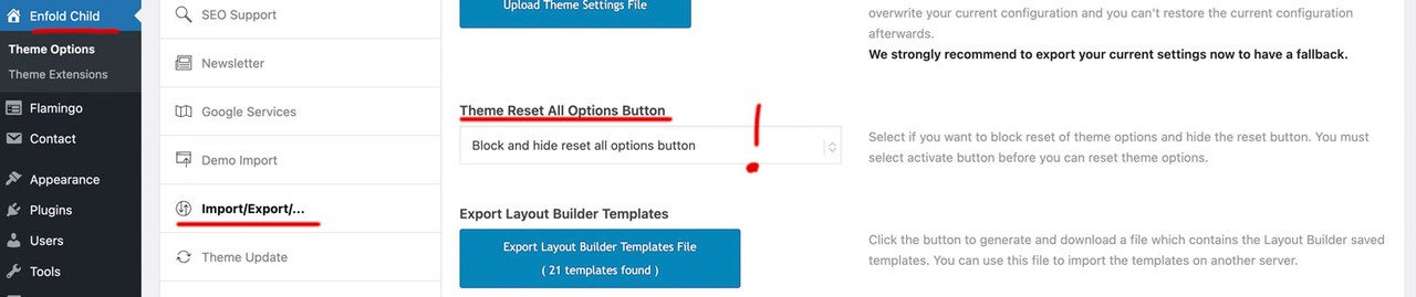
- The “Reset” button appears to reset all global theme options without a clear warning of the full impact.
- This behavior is extremely destructive in a production environment.
- We strongly recommend:
- Moving this function to a separate, clearly labeled section, and/or
- Adding a prominent confirmation warning explaining that ALL theme settings will be permanently reset.
This action resulted in a complete loss of configuration and media unexpectedly, so any assistance in recovery would be greatly appreciated.
Thank you;
ArmenHi
after creating a google ads account i need to put this code in the website. This google tag will follow on the form page the SEND FORM button click.
But how to upload it on enfold setings? And how to say on the script my contact form url is ?
Google says have to put this cscript in the <head></head> of the form pageHi,
my website was perfect but, the day after i lost menu size type, submenu size type, width of the main window content (normally full width), body size type…
All my enfold/advanced styles are her. So I tryed to reset some but no effect (tested a MENU type size to 40px but it display on front end a kind of small 10px for example).
The ENFOLD cookies tool seems to have an issue too… When trying to disable it i have this message: Saving didnt work! Please reload the page and try again.7.1.4 ENFOLD RUNNING and reinstalled for testing
PHP : 8.3.23For info: i installed/tested Forminator, CRM Peks Form, Eventon.
I try to deactivated all plugins. No resultsEDIT*** Now the ENFOLD Save all update button each time gives: “Saving didnt work! Please reload the page and try again.”
Subject: CRITICAL: Enfold 7.1.4 Redirect Failure & PHP Fatal Error (get_page_permastruct on null)
“Dear Enfold Support Team,
I am experiencing a critical issue with Enfold 7.1.4 on a site running the latest WordPress version and PHP 8.1 (also tested with 8.2 and 8.3).
The Problem:
A registration form (created with DigiMember) has stopped functioning correctly. While the user is successfully registered in the database, the AJAX redirect to the thank-you page fails completely. The button does not trigger the redirect, leaving the user stuck on the form page.Technical Analysis & Error Logs:
The error logs show that the process is interrupted by a Fatal Error within the WordPress core, triggered during an AJAX call. Even with PHP 8.1, I get the following stack trace:PHP Fatal error: Uncaught Error: Call to a member function get_page_permastruct() on null in …/wp-includes/link-template.php:435
Stack Trace highlights:
#0 …/wp-includes/link-template.php(397): _get_page_link()
#1 …/wp-includes/link-template.php(197): get_page_link()
#2 …/plugins/digimember/…/payment_handler.php(878): get_permalink()
Additionally, the log is flooded with hundreds of deprecated warnings regarding the Enfold core:
PHP Deprecated: Class avia_style_generator was called with an argument that has been deprecated since version 5.3! Trying to set protected/private property: avia_style_generator::print_extra_output.Environment:
Enfold Version: 7.1.4WordPress: Latest (6.9.1)
PHP: 8.1.34
Active Plugins: Cookiebot, DigiMember, GetResponse.
It seems that the way Enfold handles the style generator or AJAX environment is causing WordPress to lose its permastruct context, leading to the null error during the redirect.
Do you have a temporary fix, a filter for my child theme’s functions.php, or a patch to resolve this redirect failure? This is currently breaking my sales funnel.
Best regards,”
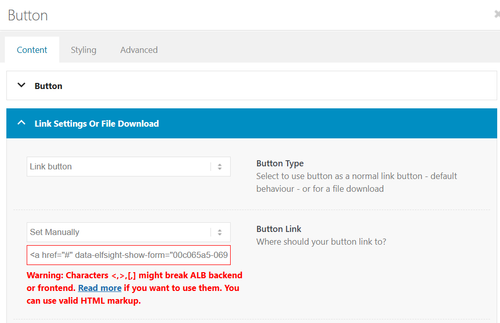
Feel free to tell me I’m crazy but, I’ve felt that buttons for links to specific content looked and felt more logical than hyperlinks. Text links to me feel more blog-like and less of an authority on a topic. It’s my understanding that an tag can enable a button to be interpreted byy crawlers as a link rather than an action. so my questions are:
Am I crazy?
Is this worth doing or should I go through and remove all of my link buttons and add text?
If I should keep my buttons, how do I add a tag to the in Enfold so that they are recognized as links?
I understand that some of this is outside an Enfold specific inquiry but, I’d welcome input from anyone on this UX question.
Thanks so much
Seattledecksupply.comHi there,
I’m facing problems with scrolling on enfold websites since a bit of time.
Not quite sure which version it started, but two of my customer websites are not possible to be scrolled for now with Enfold versions 7.1.4 and 7.0 on my other site.I wasn’t able to find any information towards that and was hoping that’s an interference of a plugin which is installed on both pages. But I couldn’t find any.
Could you please doublecheck and maybe fix that in a quick release or so? Of course when you find the problem…
Seems like, that it isn’t working on phones and also on my desktop computer. On Desktop, I only can scroll the page with the sidebar of the website and when hovering the mouse cursor to the header or within the “scroll to top”-Button. Every other area seems to be blocked to do that.
Please have a look on the both websites I will link in the private content area!
Thanks for your quick help!!
Best,
Martin
I have encountering an issue with Enfold 7.1.3 in various websites. The debug_log has the following errors, exactly as reported by another user here https://kriesi.at/support/topic/multiple-errors-on-pages-and-posts-analysis-included/
[20-Feb-2026 10:37:32 UTC] PHP Notice:  Function WP_Styles::add was called <strong>incorrectly</strong>. The style with the handle "avia-module-audioplayer" was enqueued with dependencies that are not registered: avia-layout. Please see <a href="https://developer.wordpress.org/advanced-administration/debug/debug-wordpress/">Debugging in WordPress</a> for more information. (This message was added in version 6.9.1.) in /home/www/public/isea-development/wp-includes/functions.php on line 6131
[20-Feb-2026 10:37:32 UTC] PHP Notice:  Function WP_Styles::add was called <strong>incorrectly</strong>. The style with the handle "avia-module-blog" was enqueued with dependencies that are not registered: avia-layout. Please see <a href="https://developer.wordpress.org/advanced-administration/debug/debug-wordpress/">Debugging in WordPress</a> for more information. (This message was added in version 6.9.1.) in /home/www/public/isea-development/wp-includes/functions.php on line 6131
[20-Feb-2026 10:37:32 UTC] PHP Notice:  Function WP_Styles::add was called <strong>incorrectly</strong>. The style with the handle "avia-module-postslider" was enqueued with dependencies that are not registered: avia-layout. Please see <a href="https://developer.wordpress.org/advanced-administration/debug/debug-wordpress/">Debugging in WordPress</a> for more information. (This message was added in version 6.9.1.) in /home/www/public/isea-development/wp-includes/functions.php on line 6131
[20-Feb-2026 10:37:32 UTC] PHP Notice:  Function WP_Styles::add was called <strong>incorrectly</strong>. The style with the handle "avia-module-button" was enqueued with dependencies that are not registered: avia-layout. Please see <a href="https://developer.wordpress.org/advanced-administration/debug/debug-wordpress/">Debugging in WordPress</a> for more information. (This message was added in version 6.9.1.) in /home/www/public/isea-development/wp-includes/functions.php on line 6131
[20-Feb-2026 10:37:32 UTC] PHP Notice:  Function WP_Styles::add was called <strong>incorrectly</strong>. The style with the handle "avia-module-buttonrow" was enqueued with dependencies that are not registered: avia-layout. Please see <a href="https://developer.wordpress.org/advanced-administration/debug/debug-wordpress/">Debugging in WordPress</a> for more information. (This message was added in version 6.9.1.) in /home/www/public/isea-development/wp-includes/functions.php on line 6131
[20-Feb-2026 10:37:32 UTC] PHP Notice:  Function WP_Styles::add was called <strong>incorrectly</strong>. The style with the handle "avia-module-button-fullwidth" was enqueued with dependencies that are not registered: avia-layout. Please see <a href="https://developer.wordpress.org/advanced-administration/debug/debug-wordpress/">Debugging in WordPress</a> for more information. (This message was added in version 6.9.1.) in /home/www/public/isea-development/wp-includes/functions.php on line 6131
[20-Feb-2026 10:37:32 UTC] PHP Notice:  Function WP_Styles::add was called <strong>incorrectly</strong>. The style with the handle "avia-module-catalogue" was enqueued with dependencies that are not registered: avia-layout. Please see <a href="https://developer.wordpress.org/advanced-administration/debug/debug-wordpress/">Debugging in WordPress</a> for more information. (This message was added in version 6.9.1.) in /home/www/public/isea-development/wp-includes/functions.php on line 6131
[20-Feb-2026 10:37:32 UTC] PHP Notice:  Function WP_Styles::add was called <strong>incorrectly</strong>. The style with the handle "avia-module-comments" was enqueued with dependencies that are not registered: avia-layout. Please see <a href="https://developer.wordpress.org/advanced-administration/debug/debug-wordpress/">Debugging in WordPress</a> for more information. (This message was added in version 6.9.1.) in /home/www/public/isea-development/wp-includes/functions.php on line 6131
[20-Feb-2026 10:37:32 UTC] PHP Notice:  Function WP_Styles::add was called <strong>incorrectly</strong>. The style with the handle "avia-module-contact" was enqueued with dependencies that are not registered: avia-layout. Please see <a href="https://developer.wordpress.org/advanced-administration/debug/debug-wordpress/">Debugging in WordPress</a> for more information. (This message was added in version 6.9.1.) in /home/www/public/isea-development/wp-includes/functions.php on line 6131
[20-Feb-2026 10:37:32 UTC] PHP Notice:  Function WP_Styles::add was called <strong>incorrectly</strong>. The style with the handle "avia-module-slideshow" was enqueued with dependencies that are not registered: avia-layout. Please see <a href="https://developer.wordpress.org/advanced-administration/debug/debug-wordpress/">Debugging in WordPress</a> for more information. (This message was added in version 6.9.1.) in /home/www/public/isea-development/wp-includes/functions.php on line 6131
[20-Feb-2026 10:37:32 UTC] PHP Notice:  Function WP_Styles::add was called <strong>incorrectly</strong>. The style with the handle "avia-module-countdown" was enqueued with dependencies that are not registered: avia-layout. Please see <a href="https://developer.wordpress.org/advanced-administration/debug/debug-wordpress/">Debugging in WordPress</a> for more information. (This message was added in version 6.9.1.) in /home/www/public/isea-development/wp-includes/functions.php on line 6131
[20-Feb-2026 10:37:32 UTC] PHP Notice:  Function WP_Styles::add was called <strong>incorrectly</strong>. The style with the handle "avia-module-dynamic-field" was enqueued with dependencies that are not registered: avia-layout. Please see <a href="https://developer.wordpress.org/advanced-administration/debug/debug-wordpress/">Debugging in WordPress</a> for more information. (This message was added in version 6.9.1.) in /home/www/public/isea-development/wp-includes/functions.php on line 6131
[20-Feb-2026 10:37:32 UTC] PHP Notice:  Function WP_Styles::add was called <strong>incorrectly</strong>. The style with the handle "avia-module-gallery" was enqueued with dependencies that are not registered: avia-layout. Please see <a href="https://developer.wordpress.org/advanced-administration/debug/debug-wordpress/">Debugging in WordPress</a> for more information. (This message was added in version 6.9.1.) in /home/www/public/isea-development/wp-includes/functions.php on line 6131
[20-Feb-2026 10:37:32 UTC] PHP Notice:  Function WP_Styles::add was called <strong>incorrectly</strong>. The style with the handle "avia-module-maps" was enqueued with dependencies that are not registered: avia-layout. Please see <a href="https://developer.wordpress.org/advanced-administration/debug/debug-wordpress/">Debugging in WordPress</a> for more information. (This message was added in version 6.9.1.) in /home/www/public/isea-development/wp-includes/functions.php on line 6131
[20-Feb-2026 10:37:32 UTC] PHP Notice:  Function WP_Styles::add was called <strong>incorrectly</strong>. The style with the handle "avia-module-gridrow" was enqueued with dependencies that are not registered: avia-layout. Please see <a href="https://developer.wordpress.org/advanced-administration/debug/debug-wordpress/">Debugging in WordPress</a> for more information. (This message was added in version 6.9.1.) in /home/www/public/isea-development/wp-includes/functions.php on line 6131
[20-Feb-2026 10:37:32 UTC] PHP Notice:  Function WP_Styles::add was called <strong>incorrectly</strong>. The style with the handle "avia-module-heading" was enqueued with dependencies that are not registered: avia-layout. Please see <a href="https://developer.wordpress.org/advanced-administration/debug/debug-wordpress/">Debugging in WordPress</a> for more information. (This message was added in version 6.9.1.) in /home/www/public/isea-development/wp-includes/functions.php on line 6131
[20-Feb-2026 10:37:32 UTC] PHP Notice:  Function WP_Styles::add was called <strong>incorrectly</strong>. The style with the handle "avia-module-rotator" was enqueued with dependencies that are not registered: avia-layout. Please see <a href="https://developer.wordpress.org/advanced-administration/debug/debug-wordpress/">Debugging in WordPress</a> for more information. (This message was added in version 6.9.1.) in /home/www/public/isea-development/wp-includes/functions.php on line 6131
[20-Feb-2026 10:37:32 UTC] PHP Notice:  Function WP_Styles::add was called <strong>incorrectly</strong>. The style with the handle "avia-module-hr" was enqueued with dependencies that are not registered: avia-layout. Please see <a href="https://developer.wordpress.org/advanced-administration/debug/debug-wordpress/">Debugging in WordPress</a> for more information. (This message was added in version 6.9.1.) in /home/www/public/isea-development/wp-includes/functions.php on line 6131
[20-Feb-2026 10:37:32 UTC] PHP Notice:  Function WP_Styles::add was called <strong>incorrectly</strong>. The style with the handle "avia-module-icon" was enqueued with dependencies that are not registered: avia-layout. Please see <a href="https://developer.wordpress.org/advanced-administration/debug/debug-wordpress/">Debugging in WordPress</a> for more information. (This message was added in version 6.9.1.) in /home/www/public/isea-development/wp-includes/functions.php on line 6131
[20-Feb-2026 10:37:32 UTC] PHP Notice:  Function WP_Styles::add was called <strong>incorrectly</strong>. The style with the handle "avia-module-icon-circles" was enqueued with dependencies that are not registered: avia-layout. Please see <a href="https://developer.wordpress.org/advanced-administration/debug/debug-wordpress/">Debugging in WordPress</a> for more information. (This message was added in version 6.9.1.) in /home/www/public/isea-development/wp-includes/functions.php on line 6131
[20-Feb-2026 10:37:32 UTC] PHP Notice:  Function WP_Styles::add was called <strong>incorrectly</strong>. The style with the handle "avia-module-iconbox" was enqueued with dependencies that are not registered: avia-layout. Please see <a href="https://developer.wordpress.org/advanced-administration/debug/debug-wordpress/">Debugging in WordPress</a> for more information. (This message was added in version 6.9.1.) in /home/www/public/isea-development/wp-includes/functions.php on line 6131
[20-Feb-2026 10:37:32 UTC] PHP Notice:  Function WP_Styles::add was called <strong>incorrectly</strong>. The style with the handle "avia-module-icongrid" was enqueued with dependencies that are not registered: avia-layout. Please see <a href="https://developer.wordpress.org/advanced-administration/debug/debug-wordpress/">Debugging in WordPress</a> for more information. (This message was added in version 6.9.1.) in /home/www/public/isea-development/wp-includes/functions.php on line 6131
[20-Feb-2026 10:37:32 UTC] PHP Notice:  Function WP_Styles::add was called <strong>incorrectly</strong>. The style with the handle "avia-module-iconlist" was enqueued with dependencies that are not registered: avia-layout. Please see <a href="https://developer.wordpress.org/advanced-administration/debug/debug-wordpress/">Debugging in WordPress</a> for more information. (This message was added in version 6.9.1.) in /home/www/public/isea-development/wp-includes/functions.php on line 6131
[20-Feb-2026 10:37:32 UTC] PHP Notice:  Function WP_Styles::add was called <strong>incorrectly</strong>. The style with the handle "avia-module-image" was enqueued with dependencies that are not registered: avia-layout. Please see <a href="https://developer.wordpress.org/advanced-administration/debug/debug-wordpress/">Debugging in WordPress</a> for more information. (This message was added in version 6.9.1.) in /home/www/public/isea-development/wp-includes/functions.php on line 6131
[20-Feb-2026 10:37:32 UTC] PHP Notice:  Function WP_Styles::add was called <strong>incorrectly</strong>. The style with the handle "avia-module-image-diff" was enqueued with dependencies that are not registered: avia-layout. Please see <a href="https://developer.wordpress.org/advanced-administration/debug/debug-wordpress/">Debugging in WordPress</a> for more information. (This message was added in version 6.9.1.) in /home/www/public/isea-development/wp-includes/functions.php on line 6131
[20-Feb-2026 10:37:32 UTC] PHP Notice:  Function WP_Styles::add was called <strong>incorrectly</strong>. The style with the handle "avia-module-hotspot" was enqueued with dependencies that are not registered: avia-layout. Please see <a href="https://developer.wordpress.org/advanced-administration/debug/debug-wordpress/">Debugging in WordPress</a> for more information. (This message was added in version 6.9.1.) in /home/www/public/isea-development/wp-includes/functions.php on line 6131
[20-Feb-2026 10:37:32 UTC] PHP Notice:  Function WP_Styles::add was called <strong>incorrectly</strong>. The style with the handle "avia-module-sc-lottie-animation" was enqueued with dependencies that are not registered: avia-layout. Please see <a href="https://developer.wordpress.org/advanced-administration/debug/debug-wordpress/">Debugging in WordPress</a> for more information. (This message was added in version 6.9.1.) in /home/www/public/isea-development/wp-includes/functions.php on line 6131
[20-Feb-2026 10:37:32 UTC] PHP Notice:  Function WP_Styles::add was called <strong>incorrectly</strong>. The style with the handle "avia-module-magazine" was enqueued with dependencies that are not registered: avia-layout. Please see <a href="https://developer.wordpress.org/advanced-administration/debug/debug-wordpress/">Debugging in WordPress</a> for more information. (This message was added in version 6.9.1.) in /home/www/public/isea-development/wp-includes/functions.php on line 6131
[20-Feb-2026 10:37:32 UTC] PHP Notice:  Function WP_Styles::add was called <strong>incorrectly</strong>. The style with the handle "avia-module-masonry" was enqueued with dependencies that are not registered: avia-layout. Please see <a href="https://developer.wordpress.org/advanced-administration/debug/debug-wordpress/">Debugging in WordPress</a> for more information. (This message was added in version 6.9.1.) in /home/www/public/isea-development/wp-includes/functions.php on line 6131
[20-Feb-2026 10:37:32 UTC] PHP Notice:  Function WP_Styles::add was called <strong>incorrectly</strong>. The style with the handle "avia-siteloader" was enqueued with dependencies that are not registered: avia-layout. Please see <a href="https://developer.wordpress.org/advanced-administration/debug/debug-wordpress/">Debugging in WordPress</a> for more information. (This message was added in version 6.9.1.) in /home/www/public/isea-development/wp-includes/functions.php on line 6131
[20-Feb-2026 10:37:32 UTC] PHP Notice:  Function WP_Styles::add was called <strong>incorrectly</strong>. The style with the handle "avia-module-menu" was enqueued with dependencies that are not registered: avia-layout. Please see <a href="https://developer.wordpress.org/advanced-administration/debug/debug-wordpress/">Debugging in WordPress</a> for more information. (This message was added in version 6.9.1.) in /home/www/public/isea-development/wp-includes/functions.php on line 6131
[20-Feb-2026 10:37:32 UTC] PHP Notice:  Function WP_Styles::add was called <strong>incorrectly</strong>. The style with the handle "avia-module-notification" was enqueued with dependencies that are not registered: avia-layout. Please see <a href="https://developer.wordpress.org/advanced-administration/debug/debug-wordpress/">Debugging in WordPress</a> for more information. (This message was added in version 6.9.1.) in /home/www/public/isea-development/wp-includes/functions.php on line 6131
[20-Feb-2026 10:37:32 UTC] PHP Notice:  Function WP_Styles::add was called <strong>incorrectly</strong>. The style with the handle "avia-module-numbers" was enqueued with dependencies that are not registered: avia-layout. Please see <a href="https://developer.wordpress.org/advanced-administration/debug/debug-wordpress/">Debugging in WordPress</a> for more information. (This message was added in version 6.9.1.) in /home/www/public/isea-development/wp-includes/functions.php on line 6131
[20-Feb-2026 10:37:32 UTC] PHP Notice:  Function WP_Styles::add was called <strong>incorrectly</strong>. The style with the handle "avia-module-portfolio" was enqueued with dependencies that are not registered: avia-layout. Please see <a href="https://developer.wordpress.org/advanced-administration/debug/debug-wordpress/">Debugging in WordPress</a> for more information. (This message was added in version 6.9.1.) in /home/www/public/isea-development/wp-includes/functions.php on line 6131
[20-Feb-2026 10:37:32 UTC] PHP Notice:  Function WP_Styles::add was called <strong>incorrectly</strong>. The style with the handle "avia-module-post-metadata" was enqueued with dependencies that are not registered: avia-layout. Please see <a href="https://developer.wordpress.org/advanced-administration/debug/debug-wordpress/">Debugging in WordPress</a> for more information. (This message was added in version 6.9.1.) in /home/www/public/isea-development/wp-includes/functions.php on line 6131
[20-Feb-2026 10:37:32 UTC] PHP Notice:  Function WP_Styles::add was called <strong>incorrectly</strong>. The style with the handle "avia-module-progress-bar" was enqueued with dependencies that are not registered: avia-layout. Please see <a href="https://developer.wordpress.org/advanced-administration/debug/debug-wordpress/">Debugging in WordPress</a> for more information. (This message was added in version 6.9.1.) in /home/www/public/isea-development/wp-includes/functions.php on line 6131
[20-Feb-2026 10:37:32 UTC] PHP Notice:  Function WP_Styles::add was called <strong>incorrectly</strong>. The style with the handle "avia-module-promobox" was enqueued with dependencies that are not registered: avia-layout. Please see <a href="https://developer.wordpress.org/advanced-administration/debug/debug-wordpress/">Debugging in WordPress</a> for more information. (This message was added in version 6.9.1.) in /home/www/public/isea-development/wp-includes/functions.php on line 6131
[20-Feb-2026 10:37:32 UTC] PHP Notice:  Function WP_Styles::add was called <strong>incorrectly</strong>. The style with the handle "avia-sc-search" was enqueued with dependencies that are not registered: avia-layout. Please see <a href="https://developer.wordpress.org/advanced-administration/debug/debug-wordpress/">Debugging in WordPress</a> for more information. (This message was added in version 6.9.1.) in /home/www/public/isea-development/wp-includes/functions.php on line 6131
[20-Feb-2026 10:37:32 UTC] PHP Notice:  Function WP_Styles::add was called <strong>incorrectly</strong>. The style with the handle "avia-module-slideshow-accordion" was enqueued with dependencies that are not registered: avia-layout. Please see <a href="https://developer.wordpress.org/advanced-administration/debug/debug-wordpress/">Debugging in WordPress</a> for more information. (This message was added in version 6.9.1.) in /home/www/public/isea-development/wp-includes/functions.php on line 6131
[20-Feb-2026 10:37:32 UTC] PHP Notice:  Function WP_Styles::add was called <strong>incorrectly</strong>. The style with the handle "avia-module-slideshow-ls" was enqueued with dependencies that are not registered: avia-layout. Please see <a href="https://developer.wordpress.org/advanced-administration/debug/debug-wordpress/">Debugging in WordPress</a> for more information. (This message was added in version 6.9.1.) in /home/www/public/isea-development/wp-includes/functions.php on line 6131
[20-Feb-2026 10:37:32 UTC] PHP Notice:  Function WP_Styles::add was called <strong>incorrectly</strong>. The style with the handle "avia-module-social" was enqueued with dependencies that are not registered: avia-layout. Please see <a href="https://developer.wordpress.org/advanced-administration/debug/debug-wordpress/">Debugging in WordPress</a> for more information. (This message was added in version 6.9.1.) in /home/www/public/isea-development/wp-includes/functions.php on line 6131
[20-Feb-2026 10:37:32 UTC] PHP Notice:  Function WP_Styles::add was called <strong>incorrectly</strong>. The style with the handle "avia-module-tabsection" was enqueued with dependencies that are not registered: avia-layout. Please see <a href="https://developer.wordpress.org/advanced-administration/debug/debug-wordpress/">Debugging in WordPress</a> for more information. (This message was added in version 6.9.1.) in /home/www/public/isea-development/wp-includes/functions.php on line 6131
[20-Feb-2026 10:37:32 UTC] PHP Notice:  Function WP_Styles::add was called <strong>incorrectly</strong>. The style with the handle "avia-module-table" was enqueued with dependencies that are not registered: avia-layout. Please see <a href="https://developer.wordpress.org/advanced-administration/debug/debug-wordpress/">Debugging in WordPress</a> for more information. (This message was added in version 6.9.1.) in /home/www/public/isea-development/wp-includes/functions.php on line 6131
[20-Feb-2026 10:37:32 UTC] PHP Notice:  Function WP_Styles::add was called <strong>incorrectly</strong>. The style with the handle "avia-module-tabs" was enqueued with dependencies that are not registered: avia-layout. Please see <a href="https://developer.wordpress.org/advanced-administration/debug/debug-wordpress/">Debugging in WordPress</a> for more information. (This message was added in version 6.9.1.) in /home/www/public/isea-development/wp-includes/functions.php on line 6131
[20-Feb-2026 10:37:32 UTC] PHP Notice:  Function WP_Styles::add was called <strong>incorrectly</strong>. The style with the handle "avia-module-team" was enqueued with dependencies that are not registered: avia-layout. Please see <a href="https://developer.wordpress.org/advanced-administration/debug/debug-wordpress/">Debugging in WordPress</a> for more information. (This message was added in version 6.9.1.) in /home/www/public/isea-development/wp-includes/functions.php on line 6131
[20-Feb-2026 10:37:32 UTC] PHP Notice:  Function WP_Styles::add was called <strong>incorrectly</strong>. The style with the handle "avia-module-testimonials" was enqueued with dependencies that are not registered: avia-layout. Please see <a href="https://developer.wordpress.org/advanced-administration/debug/debug-wordpress/">Debugging in WordPress</a> for more information. (This message was added in version 6.9.1.) in /home/www/public/isea-development/wp-includes/functions.php on line 6131
[20-Feb-2026 10:37:32 UTC] PHP Notice:  Function WP_Styles::add was called <strong>incorrectly</strong>. The style with the handle "avia-module-timeline" was enqueued with dependencies that are not registered: avia-layout. Please see <a href="https://developer.wordpress.org/advanced-administration/debug/debug-wordpress/">Debugging in WordPress</a> for more information. (This message was added in version 6.9.1.) in /home/www/public/isea-development/wp-includes/functions.php on line 6131
[20-Feb-2026 10:37:32 UTC] PHP Notice:  Function WP_Styles::add was called <strong>incorrectly</strong>. The style with the handle "avia-module-toggles" was enqueued with dependencies that are not registered: avia-layout. Please see <a href="https://developer.wordpress.org/advanced-administration/debug/debug-wordpress/">Debugging in WordPress</a> for more information. (This message was added in version 6.9.1.) in /home/www/public/isea-development/wp-includes/functions.php on line 6131
[20-Feb-2026 10:37:32 UTC] PHP Notice:  Function WP_Styles::add was called <strong>incorrectly</strong>. The style with the handle "avia-module-video" was enqueued with dependencies that are not registered: avia-layout. Please see <a href="https://developer.wordpress.org/advanced-administration/debug/debug-wordpress/">Debugging in WordPress</a> for more information. (This message was added in version 6.9.1.) in /home/www/public/isea-development/wp-includes/functions.php on line 6131
[20-Feb-2026 10:37:32 UTC] PHP Notice:  Function WP_Scripts::add was called <strong>incorrectly</strong>. The script with the handle "avia-module-audioplayer" was enqueued with dependencies that are not registered: avia-shortcodes. Please see <a href="https://developer.wordpress.org/advanced-administration/debug/debug-wordpress/">Debugging in WordPress</a> for more information. (This message was added in version 6.9.1.) in /home/www/public/isea-development/wp-includes/functions.php on line 6131
[20-Feb-2026 10:37:32 UTC] PHP Notice:  Function WP_Scripts::add was called <strong>incorrectly</strong>. The script with the handle "avia-module-chart-js" was enqueued with dependencies that are not registered: avia-shortcodes. Please see <a href="https://developer.wordpress.org/advanced-administration/debug/debug-wordpress/">Debugging in WordPress</a> for more information. (This message was added in version 6.9.1.) in /home/www/public/isea-development/wp-includes/functions.php on line 6131
[20-Feb-2026 10:37:32 UTC] PHP Notice:  Function WP_Scripts::add was called <strong>incorrectly</strong>. The script with the handle "avia-module-chart" was enqueued with dependencies that are not registered: avia-shortcodes. Please see <a href="https://developer.wordpress.org/advanced-administration/debug/debug-wordpress/">Debugging in WordPress</a> for more information. (This message was added in version 6.9.1.) in /home/www/public/isea-development/wp-includes/functions.php on line 6131
[20-Feb-2026 10:37:32 UTC] PHP Notice:  Function WP_Scripts::add was called <strong>incorrectly</strong>. The script with the handle "avia-module-contact" was enqueued with dependencies that are not registered: avia-shortcodes. Please see <a href="https://developer.wordpress.org/advanced-administration/debug/debug-wordpress/">Debugging in WordPress</a> for more information. (This message was added in version 6.9.1.) in /home/www/public/isea-development/wp-includes/functions.php on line 6131
[20-Feb-2026 10:37:32 UTC] PHP Notice:  Function WP_Scripts::add was called <strong>incorrectly</strong>. The script with the handle "avia-module-slideshow" was enqueued with dependencies that are not registered: avia-shortcodes. Please see <a href="https://developer.wordpress.org/advanced-administration/debug/debug-wordpress/">Debugging in WordPress</a> for more information. (This message was added in version 6.9.1.) in /home/www/public/isea-development/wp-includes/functions.php on line 6131
[20-Feb-2026 10:37:32 UTC] PHP Notice:  Function WP_Scripts::add was called <strong>incorrectly</strong>. The script with the handle "avia-module-countdown" was enqueued with dependencies that are not registered: avia-shortcodes. Please see <a href="https://developer.wordpress.org/advanced-administration/debug/debug-wordpress/">Debugging in WordPress</a> for more information. (This message was added in version 6.9.1.) in /home/www/public/isea-development/wp-includes/functions.php on line 6131
[20-Feb-2026 10:37:32 UTC] PHP Notice:  Function WP_Scripts::add was called <strong>incorrectly</strong>. The script with the handle "avia-module-gallery" was enqueued with dependencies that are not registered: avia-shortcodes. Please see <a href="https://developer.wordpress.org/advanced-administration/debug/debug-wordpress/">Debugging in WordPress</a> for more information. (This message was added in version 6.9.1.) in /home/www/public/isea-development/wp-includes/functions.php on line 6131
[20-Feb-2026 10:37:32 UTC] PHP Notice:  Function WP_Scripts::add was called <strong>incorrectly</strong>. The script with the handle "avia-module-gallery-hor" was enqueued with dependencies that are not registered: avia-shortcodes. Please see <a href="https://developer.wordpress.org/advanced-administration/debug/debug-wordpress/">Debugging in WordPress</a> for more information. (This message was added in version 6.9.1.) in /home/www/public/isea-development/wp-includes/functions.php on line 6131
[20-Feb-2026 10:37:32 UTC] PHP Notice:  Function WP_Scripts::add was called <strong>incorrectly</strong>. The script with the handle "avia-module-rotator" was enqueued with dependencies that are not registered: avia-shortcodes. Please see <a href="https://developer.wordpress.org/advanced-administration/debug/debug-wordpress/">Debugging in WordPress</a> for more information. (This message was added in version 6.9.1.) in /home/www/public/isea-development/wp-includes/functions.php on line 6131
[20-Feb-2026 10:37:32 UTC] PHP Notice:  Function WP_Scripts::add was called <strong>incorrectly</strong>. The script with the handle "avia-module-icon-circles" was enqueued with dependencies that are not registered: avia-shortcodes. Please see <a href="https://developer.wordpress.org/advanced-administration/debug/debug-wordpress/">Debugging in WordPress</a> for more information. (This message was added in version 6.9.1.) in /home/www/public/isea-development/wp-includes/functions.php on line 6131
[20-Feb-2026 10:37:32 UTC] PHP Notice:  Function WP_Scripts::add was called <strong>incorrectly</strong>. The script with the handle "avia-module-icongrid" was enqueued with dependencies that are not registered: avia-shortcodes. Please see <a href="https://developer.wordpress.org/advanced-administration/debug/debug-wordpress/">Debugging in WordPress</a> for more information. (This message was added in version 6.9.1.) in /home/www/public/isea-development/wp-includes/functions.php on line 6131
[20-Feb-2026 10:37:32 UTC] PHP Notice:  Function WP_Scripts::add was called <strong>incorrectly</strong>. The script with the handle "avia-module-iconlist" was enqueued with dependencies that are not registered: avia-shortcodes. Please see <a href="https://developer.wordpress.org/advanced-administration/debug/debug-wordpress/">Debugging in WordPress</a> for more information. (This message was added in version 6.9.1.) in /home/www/public/isea-development/wp-includes/functions.php on line 6131
[20-Feb-2026 10:37:32 UTC] PHP Notice:  Function WP_Scripts::add was called <strong>incorrectly</strong>. The script with the handle "avia-module-image-diff" was enqueued with dependencies that are not registered: avia-shortcodes. Please see <a href="https://developer.wordpress.org/advanced-administration/debug/debug-wordpress/">Debugging in WordPress</a> for more information. (This message was added in version 6.9.1.) in /home/www/public/isea-development/wp-includes/functions.php on line 6131
[20-Feb-2026 10:37:32 UTC] PHP Notice:  Function WP_Scripts::add was called <strong>incorrectly</strong>. The script with the handle "avia-module-hotspot" was enqueued with dependencies that are not registered: avia-shortcodes. Please see <a href="https://developer.wordpress.org/advanced-administration/debug/debug-wordpress/">Debugging in WordPress</a> for more information. (This message was added in version 6.9.1.) in /home/www/public/isea-development/wp-includes/functions.php on line 6131
[20-Feb-2026 10:37:32 UTC] PHP Notice:  Function WP_Scripts::add was called <strong>incorrectly</strong>. The script with the handle "avia-module-magazine" was enqueued with dependencies that are not registered: avia-shortcodes. Please see <a href="https://developer.wordpress.org/advanced-administration/debug/debug-wordpress/">Debugging in WordPress</a> for more information. (This message was added in version 6.9.1.) in /home/www/public/isea-development/wp-includes/functions.php on line 6131
[20-Feb-2026 10:37:32 UTC] PHP Notice:  Function WP_Scripts::add was called <strong>incorrectly</strong>. The script with the handle "avia-module-isotope" was enqueued with dependencies that are not registered: avia-shortcodes. Please see <a href="https://developer.wordpress.org/advanced-administration/debug/debug-wordpress/">Debugging in WordPress</a> for more information. (This message was added in version 6.9.1.) in /home/www/public/isea-development/wp-includes/functions.php on line 6131
[20-Feb-2026 10:37:32 UTC] PHP Notice:  Function WP_Scripts::add was called <strong>incorrectly</strong>. The script with the handle "avia-module-menu" was enqueued with dependencies that are not registered: avia-shortcodes. Please see <a href="https://developer.wordpress.org/advanced-administration/debug/debug-wordpress/">Debugging in WordPress</a> for more information. (This message was added in version 6.9.1.) in /home/www/public/isea-development/wp-includes/functions.php on line 6131
[20-Feb-2026 10:37:32 UTC] PHP Notice:  Function WP_Scripts::add was called <strong>incorrectly</strong>. The script with the handle "avia-module-notification" was enqueued with dependencies that are not registered: avia-shortcodes. Please see <a href="https://developer.wordpress.org/advanced-administration/debug/debug-wordpress/">Debugging in WordPress</a> for more information. (This message was added in version 6.9.1.) in /home/www/public/isea-development/wp-includes/functions.php on line 6131
[20-Feb-2026 10:37:32 UTC] PHP Notice:  Function WP_Scripts::add was called <strong>incorrectly</strong>. The script with the handle "avia-module-numbers" was enqueued with dependencies that are not registered: avia-shortcodes. Please see <a href="https://developer.wordpress.org/advanced-administration/debug/debug-wordpress/">Debugging in WordPress</a> for more information. (This message was added in version 6.9.1.) in /home/www/public/isea-development/wp-includes/functions.php on line 6131
[20-Feb-2026 10:37:32 UTC] PHP Notice:  Function WP_Scripts::add was called <strong>incorrectly</strong>. The script with the handle "avia-module-portfolio" was enqueued with dependencies that are not registered: avia-shortcodes. Please see <a href="https://developer.wordpress.org/advanced-administration/debug/debug-wordpress/">Debugging in WordPress</a> for more information. (This message was added in version 6.9.1.) in /home/www/public/isea-development/wp-includes/functions.php on line 6131
[20-Feb-2026 10:37:32 UTC] PHP Notice:  Function WP_Scripts::add was called <strong>incorrectly</strong>. The script with the handle "avia-module-progress-bar" was enqueued with dependencies that are not registered: avia-shortcodes. Please see <a href="https://developer.wordpress.org/advanced-administration/debug/debug-wordpress/">Debugging in WordPress</a> for more information. (This message was added in version 6.9.1.) in /home/www/public/isea-development/wp-includes/functions.php on line 6131
[20-Feb-2026 10:37:32 UTC] PHP Notice:  Function WP_Scripts::add was called <strong>incorrectly</strong>. The script with the handle "avia-module-slideshow-video" was enqueued with dependencies that are not registered: avia-shortcodes. Please see <a href="https://developer.wordpress.org/advanced-administration/debug/debug-wordpress/">Debugging in WordPress</a> for more information. (This message was added in version 6.9.1.) in /home/www/public/isea-development/wp-includes/functions.php on line 6131
[20-Feb-2026 10:37:32 UTC] PHP Notice:  Function WP_Scripts::add was called <strong>incorrectly</strong>. The script with the handle "avia-module-slideshow-accordion" was enqueued with dependencies that are not registered: avia-shortcodes. Please see <a href="https://developer.wordpress.org/advanced-administration/debug/debug-wordpress/">Debugging in WordPress</a> for more information. (This message was added in version 6.9.1.) in /home/www/public/isea-development/wp-includes/functions.php on line 6131
[20-Feb-2026 10:37:32 UTC] PHP Notice:  Function WP_Scripts::add was called <strong>incorrectly</strong>. The script with the handle "avia-module-slideshow-ls" was enqueued with dependencies that are not registered: avia-shortcodes. Please see <a href="https://developer.wordpress.org/advanced-administration/debug/debug-wordpress/">Debugging in WordPress</a> for more information. (This message was added in version 6.9.1.) in /home/www/public/isea-development/wp-includes/functions.php on line 6131
[20-Feb-2026 10:37:32 UTC] PHP Notice:  Function WP_Scripts::add was called <strong>incorrectly</strong>. The script with the handle "avia-module-tabsection" was enqueued with dependencies that are not registered: avia-shortcodes. Please see <a href="https://developer.wordpress.org/advanced-administration/debug/debug-wordpress/">Debugging in WordPress</a> for more information. (This message was added in version 6.9.1.) in /home/www/public/isea-development/wp-includes/functions.php on line 6131
[20-Feb-2026 10:37:32 UTC] PHP Notice:  Function WP_Scripts::add was called <strong>incorrectly</strong>. The script with the handle "avia-module-tabs" was enqueued with dependencies that are not registered: avia-shortcodes. Please see <a href="https://developer.wordpress.org/advanced-administration/debug/debug-wordpress/">Debugging in WordPress</a> for more information. (This message was added in version 6.9.1.) in /home/www/public/isea-development/wp-includes/functions.php on line 6131
[20-Feb-2026 10:37:32 UTC] PHP Notice:  Function WP_Scripts::add was called <strong>incorrectly</strong>. The script with the handle "avia-module-testimonials" was enqueued with dependencies that are not registered: avia-shortcodes. Please see <a href="https://developer.wordpress.org/advanced-administration/debug/debug-wordpress/">Debugging in WordPress</a> for more information. (This message was added in version 6.9.1.) in /home/www/public/isea-development/wp-includes/functions.php on line 6131
[20-Feb-2026 10:37:32 UTC] PHP Notice:  Function WP_Scripts::add was called <strong>incorrectly</strong>. The script with the handle "avia-module-timeline" was enqueued with dependencies that are not registered: avia-shortcodes. Please see <a href="https://developer.wordpress.org/advanced-administration/debug/debug-wordpress/">Debugging in WordPress</a> for more information. (This message was added in version 6.9.1.) in /home/www/public/isea-development/wp-includes/functions.php on line 6131
[20-Feb-2026 10:37:32 UTC] PHP Notice:  Function WP_Scripts::add was called <strong>incorrectly</strong>. The script with the handle "avia-module-toggles" was enqueued with dependencies that are not registered: avia-shortcodes. Please see <a href="https://developer.wordpress.org/advanced-administration/debug/debug-wordpress/">Debugging in WordPress</a> for more information. (This message was added in version 6.9.1.) in /home/www/public/isea-development/wp-includes/functions.php on line 6131
[20-Feb-2026 10:37:32 UTC] PHP Notice:  Function WP_Scripts::add was called <strong>incorrectly</strong>. The script with the handle "avia-module-video" was enqueued with dependencies that are not registered: avia-shortcodes. Please see <a href="https://developer.wordpress.org/advanced-administration/debug/debug-wordpress/">Debugging in WordPress</a> for more information. (This message was added in version 6.9.1.) in /home/www/public/isea-development/wp-includes/functions.php on line 6131
I tried the function suggested in the above mentioned post, but it messed up the custom css I created in my child theme.
In private content details
Are you guys seeing multiple error messages on the posts and pages WP pages?
Enfold: 7.1.3
WordPress 6.9.1
Chrome Browser 144.0.7559.133 (Official Build) (arm64)
Safari Version 26.2 (21623.1.14.11.9)
Vivaldi Version 7.8.3925.62 (Official Build) (arm64), Chromium Version 144.0.7559.167
Firefox 147.0.2 (aarch64)
Running on a Mac Mini M2 (Tahoe 26.2)Error Messages when opening Posts and Pages (but similar error seen on e.g. the Plugins page):
Notice: WP_Styles::add(): The style with the handle “avia-module-audioplayer” was enqueued with dependencies that are not registered: avia-layout. (This message was added in version 6.9.1.) Please see Debugging in WordPress for more information. in /homepages/1/d4297824949/htdocs/wordpress/wp-includes/functions.php on line 6163
Notice: WP_Styles::add(): The style with the handle “avia-module-blog” was enqueued with dependencies that are not registered: avia-layout. (This message was added in version 6.9.1.) Please see Debugging in WordPress for more information. in /homepages/1/d4297824949/htdocs/wordpress/wp-includes/functions.php on line 6163
Notice: WP_Styles::add(): The style with the handle “avia-module-postslider” was enqueued with dependencies that are not registered: avia-layout. (This message was added in version 6.9.1.) Please see Debugging in WordPress for more information. in /homepages/1/d4297824949/htdocs/wordpress/wp-includes/functions.php on line 6163
Notice: WP_Styles::add(): The style with the handle “avia-module-button” was enqueued with dependencies that are not registered: avia-layout. (This message was added in version 6.9.1.) Please see Debugging in WordPress for more information. in /homepages/1/d4297824949/htdocs/wordpress/wp-includes/functions.php on line 6163
Notice: WP_Styles::add(): The style with the handle “avia-module-buttonrow” was enqueued with dependencies that are not registered: avia-layout. (This message was added in version 6.9.1.) Please see Debugging in WordPress for more information. in /homepages/1/d4297824949/htdocs/wordpress/wp-includes/functions.php on line 6163
Notice: WP_Styles::add(): The style with the handle “avia-module-button-fullwidth” was enqueued with dependencies that are not registered: avia-layout. (This message was added in version 6.9.1.) Please see Debugging in WordPress for more information. in /homepages/1/d4297824949/htdocs/wordpress/wp-includes/functions.php on line 6163
Notice: WP_Styles::add(): The style with the handle “avia-module-catalogue” was enqueued with dependencies that are not registered: avia-layout. (This message was added in version 6.9.1.) Please see Debugging in WordPress for more information. in /homepages/1/d4297824949/htdocs/wordpress/wp-includes/functions.php on line 6163
Notice: WP_Styles::add(): The style with the handle “avia-module-comments” was enqueued with dependencies that are not registered: avia-layout. (This message was added in version 6.9.1.) Please see Debugging in WordPress for more information. in /homepages/1/d4297824949/htdocs/wordpress/wp-includes/functions.php on line 6163
Notice: WP_Styles::add(): The style with the handle “avia-module-contact” was enqueued with dependencies that are not registered: avia-layout. (This message was added in version 6.9.1.) Please see Debugging in WordPress for more information. in /homepages/1/d4297824949/htdocs/wordpress/wp-includes/functions.php on line 6163
Notice: WP_Styles::add(): The style with the handle “avia-module-slideshow” was enqueued with dependencies that are not registered: avia-layout. (This message was added in version 6.9.1.) Please see Debugging in WordPress for more information. in /homepages/1/d4297824949/htdocs/wordpress/wp-includes/functions.php on line 6163
Notice: WP_Styles::add(): The style with the handle “avia-module-countdown” was enqueued with dependencies that are not registered: avia-layout. (This message was added in version 6.9.1.) Please see Debugging in WordPress for more information. in /homepages/1/d4297824949/htdocs/wordpress/wp-includes/functions.php on line 6163
Notice: WP_Styles::add(): The style with the handle “avia-module-dynamic-field” was enqueued with dependencies that are not registered: avia-layout. (This message was added in version 6.9.1.) Please see Debugging in WordPress for more information. in /homepages/1/d4297824949/htdocs/wordpress/wp-includes/functions.php on line 6163
Notice: WP_Styles::add(): The style with the handle “avia-module-gallery” was enqueued with dependencies that are not registered: avia-layout. (This message was added in version 6.9.1.) Please see Debugging in WordPress for more information. in /homepages/1/d4297824949/htdocs/wordpress/wp-includes/functions.php on line 6163
Notice: WP_Styles::add(): The style with the handle “avia-module-maps” was enqueued with dependencies that are not registered: avia-layout. (This message was added in version 6.9.1.) Please see Debugging in WordPress for more information. in /homepages/1/d4297824949/htdocs/wordpress/wp-includes/functions.php on line 6163
Notice: WP_Styles::add(): The style with the handle “avia-module-gridrow” was enqueued with dependencies that are not registered: avia-layout. (This message was added in version 6.9.1.) Please see Debugging in WordPress for more information. in /homepages/1/d4297824949/htdocs/wordpress/wp-includes/functions.php on line 6163
Notice: WP_Styles::add(): The style with the handle “avia-module-heading” was enqueued with dependencies that are not registered: avia-layout. (This message was added in version 6.9.1.) Please see Debugging in WordPress for more information. in /homepages/1/d4297824949/htdocs/wordpress/wp-includes/functions.php on line 6163
Notice: WP_Styles::add(): The style with the handle “avia-module-rotator” was enqueued with dependencies that are not registered: avia-layout. (This message was added in version 6.9.1.) Please see Debugging in WordPress for more information. in /homepages/1/d4297824949/htdocs/wordpress/wp-includes/functions.php on line 6163
Notice: WP_Styles::add(): The style with the handle “avia-module-hr” was enqueued with dependencies that are not registered: avia-layout. (This message was added in version 6.9.1.) Please see Debugging in WordPress for more information. in /homepages/1/d4297824949/htdocs/wordpress/wp-includes/functions.php on line 6163
Notice: WP_Styles::add(): The style with the handle “avia-module-icon” was enqueued with dependencies that are not registered: avia-layout. (This message was added in version 6.9.1.) Please see Debugging in WordPress for more information. in /homepages/1/d4297824949/htdocs/wordpress/wp-includes/functions.php on line 6163
Notice: WP_Styles::add(): The style with the handle “avia-module-icon-circles” was enqueued with dependencies that are not registered: avia-layout. (This message was added in version 6.9.1.) Please see Debugging in WordPress for more information. in /homepages/1/d4297824949/htdocs/wordpress/wp-includes/functions.php on line 6163
Notice: WP_Styles::add(): The style with the handle “avia-module-iconbox” was enqueued with dependencies that are not registered: avia-layout. (This message was added in version 6.9.1.) Please see Debugging in WordPress for more information. in /homepages/1/d4297824949/htdocs/wordpress/wp-includes/functions.php on line 6163
Notice: WP_Styles::add(): The style with the handle “avia-module-icongrid” was enqueued with dependencies that are not registered: avia-layout. (This message was added in version 6.9.1.) Please see Debugging in WordPress for more information. in /homepages/1/d4297824949/htdocs/wordpress/wp-includes/functions.php on line 6163
Notice: WP_Styles::add(): The style with the handle “avia-module-iconlist” was enqueued with dependencies that are not registered: avia-layout. (This message was added in version 6.9.1.) Please see Debugging in WordPress for more information. in /homepages/1/d4297824949/htdocs/wordpress/wp-includes/functions.php on line 6163
Notice: WP_Styles::add(): The style with the handle “avia-module-image” was enqueued with dependencies that are not registered: avia-layout. (This message was added in version 6.9.1.) Please see Debugging in WordPress for more information. in /homepages/1/d4297824949/htdocs/wordpress/wp-includes/functions.php on line 6163
Notice: WP_Styles::add(): The style with the handle “avia-module-image-diff” was enqueued with dependencies that are not registered: avia-layout. (This message was added in version 6.9.1.) Please see Debugging in WordPress for more information. in /homepages/1/d4297824949/htdocs/wordpress/wp-includes/functions.php on line 6163
Notice: WP_Styles::add(): The style with the handle “avia-module-hotspot” was enqueued with dependencies that are not registered: avia-layout. (This message was added in version 6.9.1.) Please see Debugging in WordPress for more information. in /homepages/1/d4297824949/htdocs/wordpress/wp-includes/functions.php on line 6163
Notice: WP_Styles::add(): The style with the handle “avia-module-sc-lottie-animation” was enqueued with dependencies that are not registered: avia-layout. (This message was added in version 6.9.1.) Please see Debugging in WordPress for more information. in /homepages/1/d4297824949/htdocs/wordpress/wp-includes/functions.php on line 6163
Notice: WP_Styles::add(): The style with the handle “avia-module-magazine” was enqueued with dependencies that are not registered: avia-layout. (This message was added in version 6.9.1.) Please see Debugging in WordPress for more information. in /homepages/1/d4297824949/htdocs/wordpress/wp-includes/functions.php on line 6163
Notice: WP_Styles::add(): The style with the handle “avia-module-masonry” was enqueued with dependencies that are not registered: avia-layout. (This message was added in version 6.9.1.) Please see Debugging in WordPress for more information. in /homepages/1/d4297824949/htdocs/wordpress/wp-includes/functions.php on line 6163
Notice: WP_Styles::add(): The style with the handle “avia-siteloader” was enqueued with dependencies that are not registered: avia-layout. (This message was added in version 6.9.1.) Please see Debugging in WordPress for more information. in /homepages/1/d4297824949/htdocs/wordpress/wp-includes/functions.php on line 6163
Notice: WP_Styles::add(): The style with the handle “avia-module-menu” was enqueued with dependencies that are not registered: avia-layout. (This message was added in version 6.9.1.) Please see Debugging in WordPress for more information. in /homepages/1/d4297824949/htdocs/wordpress/wp-includes/functions.php on line 6163
Notice: WP_Styles::add(): The style with the handle “avia-module-notification” was enqueued with dependencies that are not registered: avia-layout. (This message was added in version 6.9.1.) Please see Debugging in WordPress for more information. in /homepages/1/d4297824949/htdocs/wordpress/wp-includes/functions.php on line 6163
Notice: WP_Styles::add(): The style with the handle “avia-module-numbers” was enqueued with dependencies that are not registered: avia-layout. (This message was added in version 6.9.1.) Please see Debugging in WordPress for more information. in /homepages/1/d4297824949/htdocs/wordpress/wp-includes/functions.php on line 6163
Notice: WP_Styles::add(): The style with the handle “avia-module-portfolio” was enqueued with dependencies that are not registered: avia-layout. (This message was added in version 6.9.1.) Please see Debugging in WordPress for more information. in /homepages/1/d4297824949/htdocs/wordpress/wp-includes/functions.php on line 6163
Notice: WP_Styles::add(): The style with the handle “avia-module-post-metadata” was enqueued with dependencies that are not registered: avia-layout. (This message was added in version 6.9.1.) Please see Debugging in WordPress for more information. in /homepages/1/d4297824949/htdocs/wordpress/wp-includes/functions.php on line 6163
Notice: WP_Styles::add(): The style with the handle “avia-module-progress-bar” was enqueued with dependencies that are not registered: avia-layout. (This message was added in version 6.9.1.) Please see Debugging in WordPress for more information. in /homepages/1/d4297824949/htdocs/wordpress/wp-includes/functions.php on line 6163
Notice: WP_Styles::add(): The style with the handle “avia-module-promobox” was enqueued with dependencies that are not registered: avia-layout. (This message was added in version 6.9.1.) Please see Debugging in WordPress for more information. in /homepages/1/d4297824949/htdocs/wordpress/wp-includes/functions.php on line 6163
Notice: WP_Styles::add(): The style with the handle “avia-sc-search” was enqueued with dependencies that are not registered: avia-layout. (This message was added in version 6.9.1.) Please see Debugging in WordPress for more information. in /homepages/1/d4297824949/htdocs/wordpress/wp-includes/functions.php on line 6163
Notice: WP_Styles::add(): The style with the handle “avia-module-slideshow-accordion” was enqueued with dependencies that are not registered: avia-layout. (This message was added in version 6.9.1.) Please see Debugging in WordPress for more information. in /homepages/1/d4297824949/htdocs/wordpress/wp-includes/functions.php on line 6163
Notice: WP_Styles::add(): The style with the handle “avia-module-slideshow-ls” was enqueued with dependencies that are not registered: avia-layout. (This message was added in version 6.9.1.) Please see Debugging in WordPress for more information. in /homepages/1/d4297824949/htdocs/wordpress/wp-includes/functions.php on line 6163
Notice: WP_Styles::add(): The style with the handle “avia-module-social” was enqueued with dependencies that are not registered: avia-layout. (This message was added in version 6.9.1.) Please see Debugging in WordPress for more information. in /homepages/1/d4297824949/htdocs/wordpress/wp-includes/functions.php on line 6163
Notice: WP_Styles::add(): The style with the handle “avia-module-tabsection” was enqueued with dependencies that are not registered: avia-layout. (This message was added in version 6.9.1.) Please see Debugging in WordPress for more information. in /homepages/1/d4297824949/htdocs/wordpress/wp-includes/functions.php on line 6163
Notice: WP_Styles::add(): The style with the handle “avia-module-table” was enqueued with dependencies that are not registered: avia-layout. (This message was added in version 6.9.1.) Please see Debugging in WordPress for more information. in /homepages/1/d4297824949/htdocs/wordpress/wp-includes/functions.php on line 6163
Notice: WP_Styles::add(): The style with the handle “avia-module-tabs” was enqueued with dependencies that are not registered: avia-layout. (This message was added in version 6.9.1.) Please see Debugging in WordPress for more information. in /homepages/1/d4297824949/htdocs/wordpress/wp-includes/functions.php on line 6163
Notice: WP_Styles::add(): The style with the handle “avia-module-team” was enqueued with dependencies that are not registered: avia-layout. (This message was added in version 6.9.1.) Please see Debugging in WordPress for more information. in /homepages/1/d4297824949/htdocs/wordpress/wp-includes/functions.php on line 6163
Notice: WP_Styles::add(): The style with the handle “avia-module-testimonials” was enqueued with dependencies that are not registered: avia-layout. (This message was added in version 6.9.1.) Please see Debugging in WordPress for more information. in /homepages/1/d4297824949/htdocs/wordpress/wp-includes/functions.php on line 6163
Notice: WP_Styles::add(): The style with the handle “avia-module-timeline” was enqueued with dependencies that are not registered: avia-layout. (This message was added in version 6.9.1.) Please see Debugging in WordPress for more information. in /homepages/1/d4297824949/htdocs/wordpress/wp-includes/functions.php on line 6163
Notice: WP_Styles::add(): The style with the handle “avia-module-toggles” was enqueued with dependencies that are not registered: avia-layout. (This message was added in version 6.9.1.) Please see Debugging in WordPress for more information. in /homepages/1/d4297824949/htdocs/wordpress/wp-includes/functions.php on line 6163
Notice: WP_Styles::add(): The style with the handle “avia-module-video” was enqueued with dependencies that are not registered: avia-layout. (This message was added in version 6.9.1.) Please see Debugging in WordPress for more information. in /homepages/1/d4297824949/htdocs/wordpress/wp-includes/functions.php on line 6163
Notice: WP_Scripts::add(): The script with the handle “avia-module-audioplayer” was enqueued with dependencies that are not registered: avia-shortcodes. (This message was added in version 6.9.1.) Please see Debugging in WordPress for more information. in /homepages/1/d4297824949/htdocs/wordpress/wp-includes/functions.php on line 6163
Notice: WP_Scripts::add(): The script with the handle “avia-module-chart-js” was enqueued with dependencies that are not registered: avia-shortcodes. (This message was added in version 6.9.1.) Please see Debugging in WordPress for more information. in /homepages/1/d4297824949/htdocs/wordpress/wp-includes/functions.php on line 6163
Notice: WP_Scripts::add(): The script with the handle “avia-module-chart” was enqueued with dependencies that are not registered: avia-shortcodes. (This message was added in version 6.9.1.) Please see Debugging in WordPress for more information. in /homepages/1/d4297824949/htdocs/wordpress/wp-includes/functions.php on line 6163
Notice: WP_Scripts::add(): The script with the handle “avia-module-contact” was enqueued with dependencies that are not registered: avia-shortcodes. (This message was added in version 6.9.1.) Please see Debugging in WordPress for more information. in /homepages/1/d4297824949/htdocs/wordpress/wp-includes/functions.php on line 6163
Notice: WP_Scripts::add(): The script with the handle “avia-module-slideshow” was enqueued with dependencies that are not registered: avia-shortcodes. (This message was added in version 6.9.1.) Please see Debugging in WordPress for more information. in /homepages/1/d4297824949/htdocs/wordpress/wp-includes/functions.php on line 6163
Notice: WP_Scripts::add(): The script with the handle “avia-module-countdown” was enqueued with dependencies that are not registered: avia-shortcodes. (This message was added in version 6.9.1.) Please see Debugging in WordPress for more information. in /homepages/1/d4297824949/htdocs/wordpress/wp-includes/functions.php on line 6163
Notice: WP_Scripts::add(): The script with the handle “avia-module-gallery” was enqueued with dependencies that are not registered: avia-shortcodes. (This message was added in version 6.9.1.) Please see Debugging in WordPress for more information. in /homepages/1/d4297824949/htdocs/wordpress/wp-includes/functions.php on line 6163
Notice: WP_Scripts::add(): The script with the handle “avia-module-gallery-hor” was enqueued with dependencies that are not registered: avia-shortcodes. (This message was added in version 6.9.1.) Please see Debugging in WordPress for more information. in /homepages/1/d4297824949/htdocs/wordpress/wp-includes/functions.php on line 6163
Notice: WP_Scripts::add(): The script with the handle “avia-module-rotator” was enqueued with dependencies that are not registered: avia-shortcodes. (This message was added in version 6.9.1.) Please see Debugging in WordPress for more information. in /homepages/1/d4297824949/htdocs/wordpress/wp-includes/functions.php on line 6163
Notice: WP_Scripts::add(): The script with the handle “avia-module-icon-circles” was enqueued with dependencies that are not registered: avia-shortcodes. (This message was added in version 6.9.1.) Please see Debugging in WordPress for more information. in /homepages/1/d4297824949/htdocs/wordpress/wp-includes/functions.php on line 6163
Notice: WP_Scripts::add(): The script with the handle “avia-module-icongrid” was enqueued with dependencies that are not registered: avia-shortcodes. (This message was added in version 6.9.1.) Please see Debugging in WordPress for more information. in /homepages/1/d4297824949/htdocs/wordpress/wp-includes/functions.php on line 6163
Notice: WP_Scripts::add(): The script with the handle “avia-module-iconlist” was enqueued with dependencies that are not registered: avia-shortcodes. (This message was added in version 6.9.1.) Please see Debugging in WordPress for more information. in /homepages/1/d4297824949/htdocs/wordpress/wp-includes/functions.php on line 6163
Notice: WP_Scripts::add(): The script with the handle “avia-module-image-diff” was enqueued with dependencies that are not registered: avia-shortcodes. (This message was added in version 6.9.1.) Please see Debugging in WordPress for more information. in /homepages/1/d4297824949/htdocs/wordpress/wp-includes/functions.php on line 6163
Notice: WP_Scripts::add(): The script with the handle “avia-module-hotspot” was enqueued with dependencies that are not registered: avia-shortcodes. (This message was added in version 6.9.1.) Please see Debugging in WordPress for more information. in /homepages/1/d4297824949/htdocs/wordpress/wp-includes/functions.php on line 6163
Notice: WP_Scripts::add(): The script with the handle “avia-module-magazine” was enqueued with dependencies that are not registered: avia-shortcodes. (This message was added in version 6.9.1.) Please see Debugging in WordPress for more information. in /homepages/1/d4297824949/htdocs/wordpress/wp-includes/functions.php on line 6163
Notice: WP_Scripts::add(): The script with the handle “avia-module-isotope” was enqueued with dependencies that are not registered: avia-shortcodes. (This message was added in version 6.9.1.) Please see Debugging in WordPress for more information. in /homepages/1/d4297824949/htdocs/wordpress/wp-includes/functions.php on line 6163
Notice: WP_Scripts::add(): The script with the handle “avia-module-menu” was enqueued with dependencies that are not registered: avia-shortcodes. (This message was added in version 6.9.1.) Please see Debugging in WordPress for more information. in /homepages/1/d4297824949/htdocs/wordpress/wp-includes/functions.php on line 6163
Notice: WP_Scripts::add(): The script with the handle “avia-module-notification” was enqueued with dependencies that are not registered: avia-shortcodes. (This message was added in version 6.9.1.) Please see Debugging in WordPress for more information. in /homepages/1/d4297824949/htdocs/wordpress/wp-includes/functions.php on line 6163
Notice: WP_Scripts::add(): The script with the handle “avia-module-numbers” was enqueued with dependencies that are not registered: avia-shortcodes. (This message was added in version 6.9.1.) Please see Debugging in WordPress for more information. in /homepages/1/d4297824949/htdocs/wordpress/wp-includes/functions.php on line 6163
Notice: WP_Scripts::add(): The script with the handle “avia-module-portfolio” was enqueued with dependencies that are not registered: avia-shortcodes. (This message was added in version 6.9.1.) Please see Debugging in WordPress for more information. in /homepages/1/d4297824949/htdocs/wordpress/wp-includes/functions.php on line 6163
Notice: WP_Scripts::add(): The script with the handle “avia-module-progress-bar” was enqueued with dependencies that are not registered: avia-shortcodes. (This message was added in version 6.9.1.) Please see Debugging in WordPress for more information. in /homepages/1/d4297824949/htdocs/wordpress/wp-includes/functions.php on line 6163
Notice: WP_Scripts::add(): The script with the handle “avia-module-slideshow-video” was enqueued with dependencies that are not registered: avia-shortcodes. (This message was added in version 6.9.1.) Please see Debugging in WordPress for more information. in /homepages/1/d4297824949/htdocs/wordpress/wp-includes/functions.php on line 6163
Notice: WP_Scripts::add(): The script with the handle “avia-module-slideshow-accordion” was enqueued with dependencies that are not registered: avia-shortcodes. (This message was added in version 6.9.1.) Please see Debugging in WordPress for more information. in /homepages/1/d4297824949/htdocs/wordpress/wp-includes/functions.php on line 6163
Notice: WP_Scripts::add(): The script with the handle “avia-module-slideshow-ls” was enqueued with dependencies that are not registered: avia-shortcodes. (This message was added in version 6.9.1.) Please see Debugging in WordPress for more information. in /homepages/1/d4297824949/htdocs/wordpress/wp-includes/functions.php on line 6163
Notice: WP_Scripts::add(): The script with the handle “avia-module-tabsection” was enqueued with dependencies that are not registered: avia-shortcodes. (This message was added in version 6.9.1.) Please see Debugging in WordPress for more information. in /homepages/1/d4297824949/htdocs/wordpress/wp-includes/functions.php on line 6163
Notice: WP_Scripts::add(): The script with the handle “avia-module-tabs” was enqueued with dependencies that are not registered: avia-shortcodes. (This message was added in version 6.9.1.) Please see Debugging in WordPress for more information. in /homepages/1/d4297824949/htdocs/wordpress/wp-includes/functions.php on line 6163
Notice: WP_Scripts::add(): The script with the handle “avia-module-testimonials” was enqueued with dependencies that are not registered: avia-shortcodes. (This message was added in version 6.9.1.) Please see Debugging in WordPress for more information. in /homepages/1/d4297824949/htdocs/wordpress/wp-includes/functions.php on line 6163
Notice: WP_Scripts::add(): The script with the handle “avia-module-timeline” was enqueued with dependencies that are not registered: avia-shortcodes. (This message was added in version 6.9.1.) Please see Debugging in WordPress for more information. in /homepages/1/d4297824949/htdocs/wordpress/wp-includes/functions.php on line 6163
Notice: WP_Scripts::add(): The script with the handle “avia-module-toggles” was enqueued with dependencies that are not registered: avia-shortcodes. (This message was added in version 6.9.1.) Please see Debugging in WordPress for more information. in /homepages/1/d4297824949/htdocs/wordpress/wp-includes/functions.php on line 6163
Notice: WP_Scripts::add(): The script with the handle “avia-module-video” was enqueued with dependencies that are not registered: avia-shortcodes. (This message was added in version 6.9.1.) Please see Debugging in WordPress for more information. in /homepages/1/d4297824949/htdocs/wordpress/wp-includes/functions.php on line 6163
Notice: WP_Scripts::add(): The script with the handle “avia_analytics_js” was enqueued with dependencies that are not registered: avia_builder_js. (This message was added in version 6.9.1.) Please see Debugging in WordPress for more information. in /homepages/1/d4297824949/htdocs/wordpress/wp-includes/functions.php on line 6163
+++
Here’s Gemini’s Research result of looking at the functions.php code:
The error in this code is a logic and implementation mismatch related to how the WordPress function wp_trigger_error() handles message formatting.
Specifically, there are two issues in the final line:
wp_trigger_error( ”, $message );
1. Redundant Formatting (The Main Issue)
In WordPress 6.4+, wp_trigger_error() was introduced to standardize how “Doing it wrong” and “Deprecated” notices are handled.
Inside wp_trigger_error(), WordPress automatically prepends the text:
“Function %s was called incorrectly…”
However, your code manually builds that exact same string in the lines above:
$message = sprintf(
__( ‘Function %1$s was called incorrectly. %2$s %3$s’ ),
$function_name,
$message,
$version
);
The Result: If this code runs, the error output will look like a stuttering mess:“Function was called incorrectly. Function my_function_name was called incorrectly. [Actual Message] [Version]”
2. Empty First Parameter
The first parameter of wp_trigger_error( $function_name, $message ) is intended to be the name of the function that was called incorrectly. By passing an empty string (”), you are preventing wp_trigger_error from correctly identifying the culprit in its own automated prefix.+++
What I tried:
Enfold > Performance > Disabled all file merging and compression (Enfold > Performance), cleared all caches (very few plugins and no cacheing on the website).
Enfold > Performance > Unused features > changed to ‘Always load all elements’
Checked for /wp-content/uploads/dynamic_avia and its permissions.
Temp. emptying of dynamic_avia reset the website visually.These are warnings, so the website seems to work OK, but it looks like it needs to be fixed elsewhere (loading of avia-layout).
