Hi Stefan,
Please try the following in Quick CSS under Enfold->General Styling:
@media only screen and (max-width: 767px) {
div.avia-cookie-consent p {
    font-size: 12px;
    line-height: 18px;
}
}
Best regards,
Rikard
Hi goodpixel,
Please use this code instead (with !important it will be hard to override CSS):
top label.input_checkbox_label {
    font-size: 18px;
}

@media only screen and (max-width:767px) {
  #top label.input_checkbox_label {
    font-size: 14px;
    padding-left: 25px;
  }
}
The first block with 18px (font-size) is for desktop and tablet versions.
The second block in the media query is set to 14px (font-size) for mobile and I added a left padding so the label does not show under the text box when it’s more than one row of text.
Just adjust the values as you see fit.
Best regards,
Nikko
label.input_checkbox_label { font-size: 18px!important}
I would like to have the same font size for the checkboxes text at the bottom of the page
Hey bemodesign,
Thank you for the inquiry.
There is a missing closing curly brace in the third css media query, which is probably why it affects the desktop view or why it is not working correctly. You can also combine the css rules inside a single css media query and remove the duplicates.
Please replace the above css with the following code.
@media only screen and (max-width: 768px) {
  .responsive #top .avia-slideshow-inner, .responsive #top .avia-slideshow-inner img {
    height: 420px !important;
  }

  .responsive #top .slideshow_caption {
    padding: 20px;
  }
}

@media only screen and (max-width: 767px) {
  .responsive #top .av_slideshow_full li img {
    width: 180% !important;
    max-width: 180% !important;
    margin-left: -45%;
  }
}

@media only screen and (max-width: 480px) {
  .responsive #top .slideshow_caption h2 {
    font-size: 14px !important;
  }
}
Best regards,
Ismael
Please help me with the CSS code for adjusting Fullwidth Easy Slider image and text ON MOBILE.
I have added this 3 part code. But the #3 code for “ADJUSTING THE IMAGE ZOOM PERCENTAGE:” messes up my view on desktop.
How can I fix the #3 part so that it doesn’t affect my desktop view? Or any updates to any of this code would be appreciated. Thanks
1. ADJUSTING THE FONT SIZE:
@media only screen and (max-width: 768px) {
.slideshow_caption { padding: 20px; }}
@media only screen and (max-width: 480px) {
.responsive #top .slideshow_caption h2 {
font-size: 14px !important;
}}
2. ADJUSTING THE IMAGE HEIGHT:
@media only screen and (max-width: 768px) {
.avia-slideshow-inner, .avia-slideshow-inner img {
height: 420px !important;
}
}
3. ADJUSTING THE IMAGE ZOOM PERCENTAGE:
@media only screen and (max-width: 768px) {
.av_slideshow_full li img {
width: 180% !important;
max-width: 180% !important;
margin-left: -45%;
}
Hello
I need to increase the font size in the charts that I designed. How do I do that without changing the font size in the entire website?
 Dietmar Gapp
Guest
I would like to design a webapp for a museum that offers the option global e.g. to switch from black to white to white to black, and 3 zoom levels for text fields should also be offered.
is this possible with your theme?
Hi aruizhuidobro,
Does this code work properly on your site?
#top .round-submit_m_p .avia-form-success {
text-align: center;
border-style: solid;
border-width: 1px;
padding: 20px 15px;
font-size: 10px;
line-height: 1.4em;
border-radius: 2px;
clear: both;
}
If not, try to replace #top .round-submit_m_p .avia-form-success with #top .avia-form-success
If that does not work as well, then please give us a link to your site.
You can post it privately.
Best regards,
Nikko
Thank you Ismael, It is not taking it…
is this correct ? (I know is applying the button property)
//————————————–*/
#top .round-submit_m_p .button {
background: transparent;
border: 2px solid whitesmoke;
border-radius: 20px!important;
font-size:16px;
padding: 10px 10px;
position: relative;
}
#top .round-submit_m_p .text_area
{
border-radius:20px!important;
background: #83b6fe;
border: none;
overflow:auto;
resize:none;
position: relative;
}
#top .round-submit_m_p .avia-form-success {
text-align: center;
border-style: solid;
border-width: 1px;
padding: 20px 15px;
font-size: 10px;
line-height: 1.4em;
border-radius: 2px;
clear: both;
}
Hey Eric,
Merci pour le lien vers votre site, les grandes couleurs violettes du titre du méga menu sont définies dans vos options de thème, si vous regardez dans votre Enfold Theme Options ▸ General Styling vous trouvez-en un qui soit violet. Les titres du méga menu sont traités comme des en-têtes plutôt que comme des liens simples, mais si vous voulez qu’ils ressemblent à des liens simples, essayez ce code dans le champ Style général ▸ CSS rapide ou dans le champ WordPress ▸ Personnaliser ▸ CSS supplémentaire :
#top #header #header_main .mega_menu_title a {
    color: #c6d6be;
    font-size: 12px;
    font-weight: 400;
}
#top #header #header_main .mega_menu_title a:hover {
	color: #1078ff;
}
Après avoir appliqué le CSS, veuillez vider le cache de votre navigateur et vérifier.
— Translated with Google —
Thanks for the link to your site, the large purple mega menu title colors are set in your theme options, if you look in your Enfold Theme Options ▸ General Styling you will find one that purple. The mega menu titles are treated like headings rather than simple links, but if you want them to look like simple links please try this code in the General Styling ▸ Quick CSS field or in the WordPress ▸ Customize ▸ Additional CSS field:
#top #header #header_main .mega_menu_title a {
    color: #c6d6be;
    font-size: 12px;
    font-weight: 400;
}
#top #header #header_main .mega_menu_title a:hover {
	color: #1078ff;
}
After applying the css, please clear your browser cache and check.
Best regards,
Mike
Hello,
I have this problem quite often and today I want to ask for a solution. It’s about the slide show in the header of the page http://designplanung.de/projekt-012/. This is how everything looks normal. I have also set the fonts so that they get smaller on iPads and smart phones. However, with iPhone size in portrait format, the text is not arranged in the middle, but is almost no longer visible. The text simply does not adapt, even with landscape the button is cut off. Is there a solution to this problem? I’ll probably have to make the slideshow taller, but I really don’t want to.
Best regards,
Martin
Hey aruizhuidobro,
Thank you for the inquiry.
You can use this css code to adjust the style of the success message including the font size.
.avia-form-success {
	text-align: center;
	border-style: solid;
	border-width: 1px;
	padding: 20px 15px;
        font-size: 18px;
	line-height: 1.4em;
	border-radius: 2px;
	clear: both;
}
Best regards,
Ismael
Hi Veronika,
The code is working properly on mobile.
Try adding this CSS code as well to adjust on tablet/ipad:
@media only screen and (min-width:768px) and (max-width:980px) {
  .html_modern-blog #top #wrap_all .post-entry .post-title,
  .html_modern-blog #top #wrap_all .avia-content-slider .slide-entry-title {
    font-size: 16px;
  }
}
Hope it helps.
Best regards,
Nikko
Hi,
Please try this CSS as well:
.widget li a:before {
    font-size: 20px;
}
Best regards,
Rikard
Hi,
Thank you for the update.
You can also adjust the font size on smaller screens. Please try this css code.
@media only screen and (max-width: 767px) {

  /* Add your Mobile Styles here */
  .html_modern-blog #top .post-entry .post-title, .html_modern-blog .avia-content-slider .slide-entry-title {
    font-size: 1em;
    letter-spacing: 1px;
    word-break: break-word;
  }
}
Default font-size value is 2em.
Best regards,
Ismael
Hey woogie07,
Thank you for the inquiry.
You can use this css code to adjust the size of the social icons. Please add it in the Quick CSS field or in the child theme’s style.css file.
#top #socket .social_bookmarks {
    margin: 0 0 0 30px;
    height: 50px;
}

#top .social_bookmarks li {
    width: 50px;
}

#top .social_bookmarks li a {
    width: 100px;
    line-height: 50px;
    min-height: 50px;
    font-size: 30px;
}
You may need to toggle or temporarily disable the Enfold > Performance > File Compression settings after adding the css.
Best regards,
Ismael
Our enfold installation has a folder that has a huge file size.
The issue is with the avia_fonts folder in wp-content/uploads. We can’t even browse to it.
This has eaten up our server space.
can you temporarily remove the child-theme tag.php – and put this to your child-theme functions.php:
add_filter('avf_blog_style','avia_change_tag_blog_layout', 10, 2);
function avia_change_tag_blog_layout($layout, $context){
if($context == 'tag') $layout = 'blog-grid';
return $layout;
}

add_filter('avf_post_slider_args', function($atts, $context){
  if($context == 'tag') {
    $atts['type']  = 'grid';
    $atts['columns']  = 1;
  }
  return $atts;
}, 10, 2);
and this to quick css
#top.tag .entry-content-wrapper .post-title{
  margin-bottom: 40px
}

#top.tag .slide-entry-wrap {
  margin-bottom: 10px;
}

#top.tag .slide-image {
  display: none !important;
}

#top.tag .slide-content > :not(.entry-content-header) {
  display: none;
}

#top.tag .slide-entry-wrap .entry-content-header .slide-entry-title:before {
  content: "Article:";
  font-size: inherit;
  font-weight: inherit;
  color: #666;
  padding-right: 15px;
}
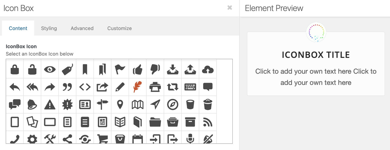
you can address these icons via attribute selector.
f.e. here on a testpage – see the first iconbox on the left: https://webers-testseite.de/
Open the alb ( in this case the iconbox – and hover the wanted icon to inspect the code behind that font-icon – here it is: ue837
get rid of the u ( i guess it stands for unicode ) and note your code for the icon as : \e837 ( the backslash is used here )
click to enlarge the image:
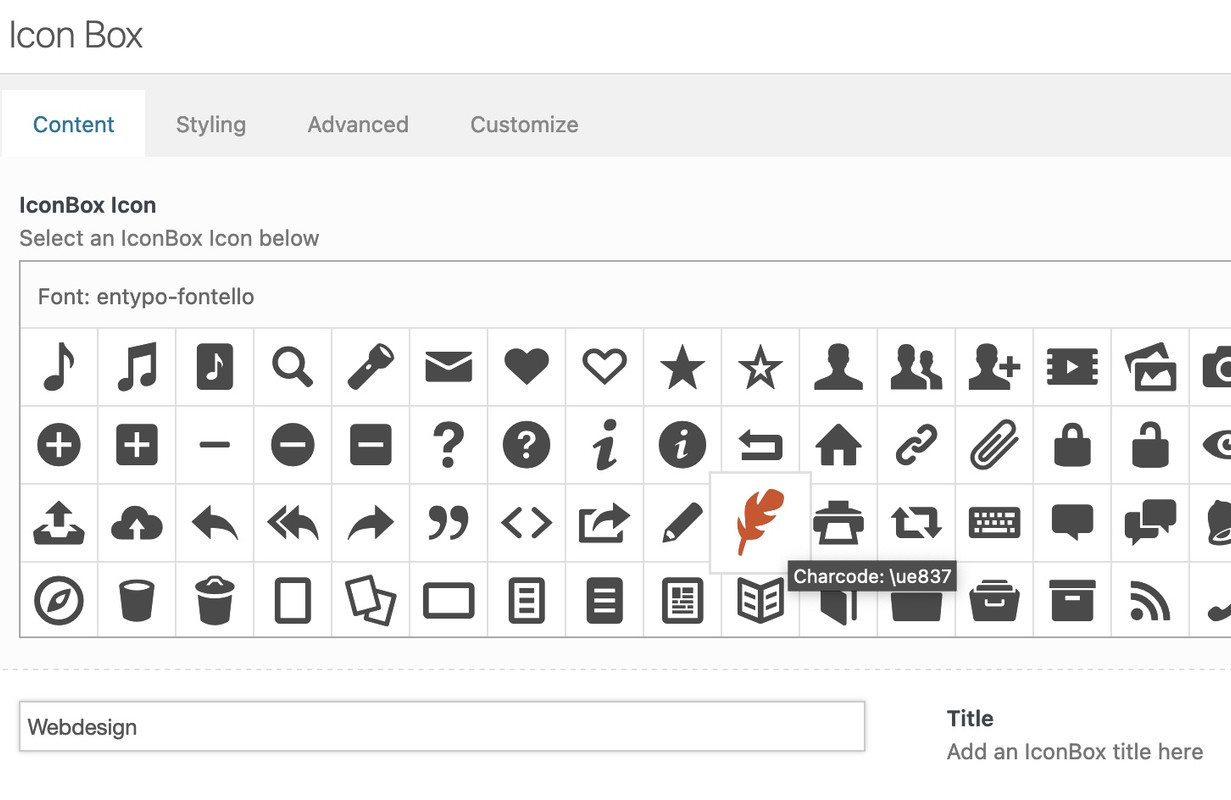
now my replacement code on quick css is:
div[data-av_icon="\e837"] {
	content: " ";
	background-image: url(/wp-content/uploads/ezgif-4-64b6614e32.gif);
	background-size: contain;
	background-repeat: no-repeat;
       font-size: 0 !important
}
this gif will now replace all occurrences of this font icon. And if the replacement image is transparent the alb settings for border-color and background-color will be adjustable too. ( Font-color : NOT ; self-evident )
:LOL and even in the preview it will be replace:
BUT: i see that some of those icons are placed in a different way ( f.e. as span – so be carefull to adjust the code then !
Hi,
Thank you for your patience, in your opening post you said that the EN iconbox title doesn’t show in white only for logged-in uses, but I see this error on Windows with Chrome not logged-in.
Anyways, on your EN page all of the sections starting with #references and below are outside the #main container:

compare to the DE site:

typically this occurs when an element has an unclosed manually added tag or div, and typically it’s the last element befor the error, but it could be anywhere on the page.
So considering this, when I compare your DE & EN tab section, I see the DE has two columns and EN only has one, please see the screenshot in the Private Content area.
Please check your tab sections.
Another possible cause is if you are programmatically adding sections with broken shortcodes or injecting shortcode somehow after the DOM, so if you are try disabling this function.
If you just want to fix the iconbox title color for this one page, try this css:
#top.page-id-4519 .iconbox .iconbox_content_title {
    font-size: 50px;
    color: #fff;
}
Best regards,
Mike
Hi,
If you want to set general font sizes for headings, then you can do so under Enfold->General Styling->Typography. If you are referring to the captions in the Full Width Easy slider on your front page, then you can set font sizes for each screen size if you click in to each slide, then change the font sizes in the Styling->Font Sizes tab.
Best regards,
Rikard
Hi Ismael,
It looks like you didn’t received my answer.
As I am new to responsive editing, could you please explain where exactly are the locations you are talking about ?
– Where are special headings ? I am using the legend within the slide-shows.
– Where is Style/Font/size ?
– Where should I put the css ? I tried in the box of the slide-show (in advanced, css class) but it didn’t change anything when looking from the mobile.
Thank you
Regards,
HulaSlim
Hi,
Yes, this is the default implementation.
You can check in the post css files.
Create a page with e.g. textblock and set the font sizes. You will see “default” font is without media query and then come the responsive media queries for the font sizes.
Best regards,
Günter
Hi,
Thanks for the update. We didn’t change anything on your site, so it’s likely that you have active caching on your site, which has now expired.
1. I’m not sure exactly on which screen size you are looking to change which headings, but the ones you indicated in the screencast can be controlled with this CSS:
.av-image-caption-overlay-center {
  font-size: 26px;
}
2. There is CSS changing that section to orange coming from the file in private. It’s impossible for us to know where that is added though, since the URL doesn’t give any clues.
Best regards,
Rikard
Hey Guenter,
A first response:
The basic implementation for responsive in enfold is that you have a setting with no media query (description is desktop – no media query) either in css files or set in options and then media queries that override the desktop setting.
I think this is also a historical reason because responsive was added later.
Changing this will certainly break many sites.
But I agree – there is missing an option with a media query for large screens only (wider than 990px).
This would allow:
- set a custom default value for all sizes (and override theme setting)
- set a custom value for each of the 4 devices independently, if not set the custom default value for all sizes or theme default is used
I will think about it a little more.
This can also be used for font sizes and other responsive settings
Best regards,
Günter
put it in General Styling – Quick CSS
maybe an important is necessary :
#top .image-overlay .image-overlay-inside::before {
  content: "\e80f" !important;
  font-size: 50px;
  color: #fff !important;
}

#top div .avia-gallery .avia-gallery-big {
  padding: 0px !important;
  border-style: none !important;
}

#top div .avia-gallery img {
  border-style: none !important;
  padding: 0px !important;
}
the : content: "\e80f" is a little camera – if you like to show a real image – code has to be adjusted.
if you like to have it specific only for one gallery – give a custom-class to that gallery – and this has to be part of the css code.
PS: i do not see your private content area – i’m participant as you- so i only could investigate own or the enfold demo pages to give advice.
use on that the quick css input field.
if you mean this “Gallery with Preview” on https://kriesi.at/themes/enfold/shortcodes/gallery/
try:
#top .image-overlay .image-overlay-inside::before {
  content: "\e80f" !important;
  font-size: 50px;
  color: #fff !important;
}

#top div .avia-gallery .avia-gallery-big {
  padding: 0px;
  border-style: none;
}

#top div .avia-gallery img {
  border-style: none;
  /*** padding: 0px; *** - if you like ***/
}
Hi schweg33,
You can use the same plugin, it can be fixed by adding this CSS code in Enfold > General Styling > Quick CSS:
#footer {
    padding: 0;
}

#footer .widget {
    margin: 0;
}

#top .footer_color .widgettitle, #top .socket_color .widgettitle {
    color: #000000;
    text-transform: none;
    font-size: 13px;
    letter-spacing: 0.09em;
}
Best regards,
Nikko
seems like when i use below css i can see the green button but not the other button.
@media only screen and (max-width: 767px) {
.html_header_transparency #top .avia-builder-el-0 .slideshow_caption {
padding-top: 10px;
}
#top #wrap_all .avia-slideshow .av-slideshow-caption {
font-size: 30px;
}
#top .avia-slideshow .av-slideshow-caption p {
font-size: 14px;
}
#top .flex_column_table.av-equal-height-column-flextable.av-9y4su-ed9cb8f9ef6e3819ca120920f518c18b {
margin-top: -115px;
}
}
@media only screen and (max-width: 767px) {
.av-slideshow-caption .container {
width: 95%;
max-width: 95%;
}
}