Hi,
in a page, created with ALB, I have added a textblock with this content:
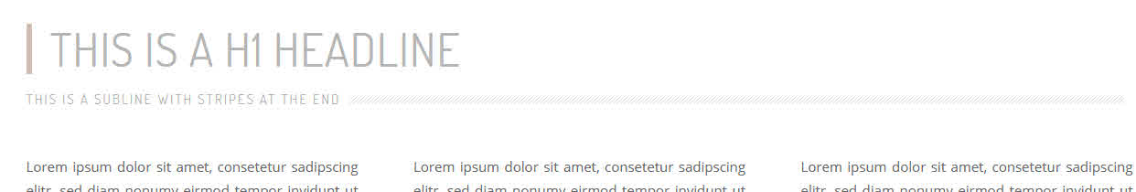
<h1>This is a h1 Headline</h1>
<h3 class="stripes"><span>This is a subline with stripes at the end</span></h3>
After saving the textblock and saving the page, it looks correctly like this:
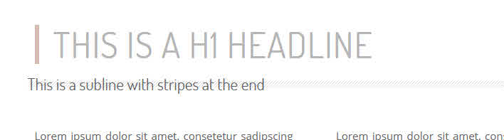
But when I reopen this textblock, then the <span> </span> has been stripped out – and therefor the output in frontend is wrong:
Used CSS:
.entry-content-wrapper h1 {
  border-left: 6px solid #d3b9b1;
  color: #b5b5b5;
  font-size: 50px;
  font-weight: 400;
  padding-left: 20px;
text-transform: uppercase;
letter-spacing: 1px;
}
h3.stripes {
  background: url("../images/eigene/stripes.gif") repeat-x scroll center 10px !important;
  padding: 1px 0 0 0px;
  width: 100%;
  text-align: left;
  margin-left: -10px;
}
h3.stripes span {
  background-color: #FFFFFF;
  color: #b5b5b5;
  font-size: 15px !important;
  letter-spacing: 2px !important;
  padding: 2px 10px;
  text-transform: uppercase;
  font-weight: normal;
  vertical-align: top;
}
Why is the <span> tag always stripped out when I save the textblock after editing it?
I use the newest ENFOLD, WP 6.2.2, classic editor and I have this on my sandbox site as well as my local site.
The fact, that span tags have been stripped out, is an old issue, that others had, too:
here –>
and here –>
Hey Anna_Tewes,
Thank you for the inquiry.
Adding this css code should adjust the size of the post titles in the AJAX search container.
.av_ajax_search_title {
    font-weight: bold;
    text-transform: uppercase;
    font-size: 14px;
    line-height: 1.2em;
}
Please make sure to toggle or temporarily disable the Enfold > Performance > File Compression settings after adding the css code.
Best regards,
Ismael
Thank you for your answer,
I believe those ones are not the one implemented in my footer, since I have put the following in the footer:
[av_font_icon icon='ue8f4' font='entypo-fontello' style='' caption='' size='40px' position='left' color='' link='manually,https://www.facebook.com/'username'/' linktarget='_blank' animation='' id='' custom_class='' av_uid='av-dce4o' admin_preview_bg=''][/av_font_icon][av_font_icon icon='ue909' font='entypo-fontello' style='' caption='' size='40px' position='left' color='' link='manually,https://www.instagram.com/'username'/' linktarget='_blank' animation='' id='' custom_class='' av_uid='av-8vgx4' admin_preview_bg=''][/av_font_icon]
Well of course I am not an expert at any of this but I have a feeling it is connected to something else about which I am sending a screenshot.
https://yourimageshare.com/ib/V0CGL0nt3d
Of course I am not sure the only thing I am guessing that is they are below the scroll-down-link
This reply has been marked as private.
Hi Martin,
I tried to install and activate Duplicate Page by mndpsingh287 https://wordpress.org/plugins/duplicate-page/ and it seems to work properly.
I tried to create an accordion with custom background color, font color, font sizes, also added 1/3 column with custom padding and background image as you have mentioned.
If that does not help, can you create a staging site? so we can try to inspect further.
Best regards,
Nikko
Hi M-Graphics24,
Thanks for giving us admin access.
It seems you don’t have a child theme, so I removed the code from functions.php (since it will be overwritten when the theme is updated).
I have installed a plugin called WPCode where I inserted the code instead, I also replaced the code with:
function custom_script() { ?>
  <script>
window.addEventListener('DOMContentLoaded', function() {
  (function($){
  var button = $('<div id="sticky-button-wrap"><a href="#" class="sticky-button">Get a<strong> Quote</strong></a></div>');
  $(button).prependTo('#main');
  })(jQuery);
});
</script>
  <?php
}
add_action('wp_footer', 'custom_script');
If you want to change anything or add a link to the button, you can go to the link in private content (you can also deactivate the code, if ever you decide to remove it).
Then in Quick CSS, I have removed the code since it’s inside a media query for mobile, and added this CSS code on top:
#sticky-button-wrap {
    position: fixed;
    right: 0;
    top: 40%;
    z-index: 503;
}

#sticky-button-wrap .sticky-button {
    background: rgba(45,186,127,.95);
    display: block;
    width: 90px;
    height: auto;
    padding: 12px 6px;
    text-align: center;
    text-transform: uppercase;
    line-height: 1 !important;
    color: white;
    font-size: 15px;
    line-height: 1.4;
    border-radius: 4px 0 0 4px;
    letter-spacing: .05rem;
    transition: all .3s ease-in-out;
}

#sticky-button-wrap .sticky-button:hover {
    background: #2DBA7F;
}

#sticky-button-wrap .sticky-button strong {
    display: block;
    font-weight: 700 !important;
}
Please review your site.
Best regards,
Nikko
Hi Manfred,
You can change the caption size by adding this CSS code in Enfold Theme Options > General Styling > Quick CSS:
#top .avia-image-container .avia-copyright {
    font-size: 15px;
}
Best regards,
Nikko
Dear Kriesi-Team,
I don’t like the image caption overlay, i prefer the caption below the image. That works pretty well misusing the copyright info. But may be that causes some SEO struggle or other problems. Therefore my question:
1. if there are no problems, how can i change the caption (copyright) fontsize to 15 or 16 px?
2. if you don’t recommend this workaround, is there a easy way to solve the problem or is it more practicable to add a additional text field?
best regards
Manfred
Hi,
Thanks for the feedback, I was not able to login, but your font-color: #65877f; is not correct you should use color: #65877f; and your min-hight: 180px; is misspelled try: min-height: 180px;
If you want the text in the button centered try using this css instead of yours:
#top #wrap_all .main_color .avia-color-theme-color.avia-slideshow-button {
    background: rgba(255,210,62,.75);
    color: #65877f;
    padding: 20px;
    min-width: 300px;
    min-height: 180px;
    border-radius: 15px;
    font-size: 20px;
    line-height: 20px;
    align-content: center;
    display: flex;
    flex-wrap: wrap;
    justify-content: center;
}
After applying the css, please clear your browser cache and check.
Best regards,
Mike
Hello
On my one site, I have font and size dropdowns in the text block editor but not on another site. How do I activate it so I can select the fonts easily?
Thanks
Hi,
Thank you for your patience, I saw your widget area with your name and address and the text below it with the three links, and as I understood you wanted this to show in your mobile menu below the other menu items. I thought the best way would be to add these as menu items, so I added your name, email, address to one custom menu item and made the link your mailto email link and added line breaks between the items. I thought you would like this text to be a little smaller to distinguish it from the other menu items. I also added the other three links below it and three separate menu items. Then I added this css to your Enfold Theme Options ▸ General Styling ▸ Quick CSS field
@media only screen and (max-width: 767px) {
	#av-burger-menu-ul .menu-item-22286 .avia-menu-text,
	#av-burger-menu-ul .menu-item-22287 .avia-menu-text,
	#av-burger-menu-ul .menu-item-22288 .avia-menu-text,
	#av-burger-menu-ul .menu-item-22289 .avia-menu-text {
		font-size: 18px;
        line-height: 18px;
        display: inline-block;
	}
    .html_av-overlay-full #top #wrap_all #av-burger-menu-ul .menu-item-22287,
	.html_av-overlay-full #top #wrap_all #av-burger-menu-ul .menu-item-22288,
	.html_av-overlay-full #top #wrap_all #av-burger-menu-ul .menu-item-22289 {
        line-height: 18px;
        padding: 0;
	}
}
@media only screen and (min-width: 768px) {
	#top #wrap_all #avia-menu #menu-item-22286,
	#top #wrap_all #avia-menu #menu-item-22287,
	#top #wrap_all #avia-menu #menu-item-22288,
	#top #wrap_all #avia-menu #menu-item-22289 {
        display: none;
	}
}
this will hide this on desktop and show on mobile, please clear your browser cache and check and let us know if this is what you had in mind.
Please see the screenshot in the Private Content area.
Best regards,
Mike
Hi Ismael,
I figured it out. The language code set by translate press is fr-FR for french and en-EN for English. This is what worked for me. You can close this ticket!
Thanks a lot,
Guy
/** New Search **/

#menu-item-search [data-av_icon]:before {
  float: left;
  margin-right: 2px;
  font-size: 16px !important;
}

html[lang=en-US] #menu-item-search a:after {
  content: ' Search';
}

html[lang=fr-FR] #menu-item-search a:after {
  content: ' Recherche';
}

/** end new search **/
Hi Ismael,
I’ve added the code to my child themes style.css, but it doesn’t have any effect. Below is the code that I have in that file. I did clear cache and have compression turned off.
Do you have any idea why this isn’t working.
I’ve included a link to the site.
Thanks,
Guy
#menu-item-search [data-av_icon]:before {
  float: left;
  margin-right: 2px;
  font-size: 16px !important;
}

html[lang=fr_FR] #menu-item-search a:after {
    content: ‘ Recherche’;
}

#menu-item-search a:after {
  content: ' Search';
}
Hi,
You could try this instead:
#footer p {
font-size: inherit !important;
}
Best regards,
Rikard
Hi,
This CSS in Quick CSS is overriding the settings:
/*Footer Font for Small Text about company*/
#top .all_colors p {
font-size: inherit !important;
}
Try removing or modifying it.
Best regards,
Rikard
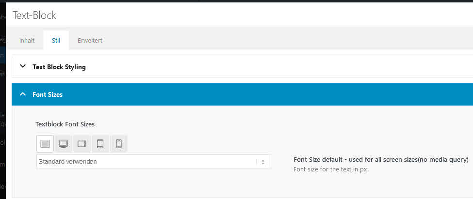
Hi Ismael,
It maybe easier if you log in to the home page and look at the Text Block for the headers and look at the Font Size Changes on the screen adjustments and check that the size does not adjust when you make the browser screen smaller.
Please let me know.
Hi Nikko,
thank you for your Input concerning the button.
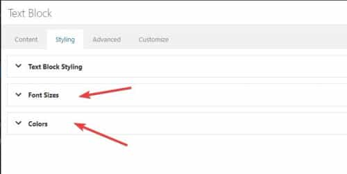
Talking about the text element I’m a but surprised you wrote “go to Styling (tab) > Spacing”…
Within the styling-tab I can see “blog-style”, “font-size” and “Colors” only.
If possible to manipulate text elements by CSS – would you pls send an example with all accepted arguments from where I can go further?
Thx
Hi,
When using the Content Element Text Block the Font Size responsivity is not working, it does not adjust on different screens.
Login in Private
Thanks
Hi,
will this come with a future update of the theme or is there a special reason why the ALB element “special heading” has no option for different font sizes for different devices?
Only the margins can set differently for different devices, not the font size resp. the H-size.
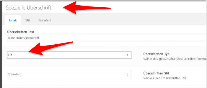
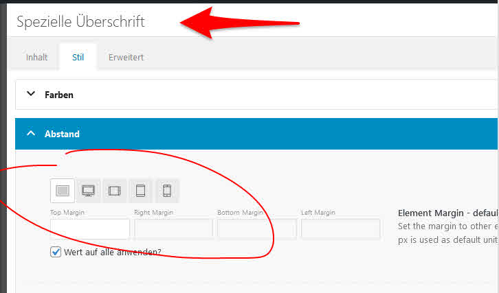
When I add a textblock, for example, and type there a H1 headline, I can vary the font size for different devices, but not for the ALB element “special headline”.
I updated the enfold child with what is available in documentaiton (2018 version). The one I had up was previously dated 2013 I think. That fixed the /* impact verification below*/ issue, which I had been getting when I was logged in. Thank you for that, as it was annoying.
I cleared cache in cloudflare and am still getting the two formatting issues.
I do have the following in the Quick CSS
.footer_font_icon a {
  margin-right: 10px;/*space to the right of the blue*/ outline
  padding-right: 10px;/*between the red and blue outlines*/
}

.minor-meta {display:none !important;}

.entry-footer {display:none !important;}

.tweet-left {
float: left;
margin: 0 20px 5px 0;
width:324px
}

.attachment main a img {
    min-height: 350px;
    min-width: 500px;
    height: 100%;
    width: 100%;
}

.nf-field-container, #ninja_forms_required_items, .nf-input-limit {
    margin-bottom: 0px !important;
    margin-top: 0 !important;
}
#nf-field-4{
    padding-left: 15px;
    padding-right: 15px;
    font-family: "Georgia";
    font-size: 34px;
}
Can you check now and see if you’re seeing the errors, as I am? Agree that it might be something on my site but I can’t find it.
Hey Nomad,
Thanks for the link to your example, but you can achieve this with a text element below a button element without any extra css:

You can change the font size and color of the text block in the style tab:
or change it with inline css in the text block.
Best regards,
Mike
Hi Nikko,
OK, I sent u IOS & Mac-Screenshots attached, pls chk:
Safari and Chrome on Mac and IOS is OK, Firefox and Chrome on Mac not.
Is there anything I can do via Quick CSS to ensure browsers using grotesk fonts and no serifs?
Or via Custom CSS on the child side to manipulate Font size, weight, family …
-
This reply was modified 2 years, 10 months ago by
 Nomad.
-
This reply was modified 2 years, 10 months ago by Nomad.
-
This reply was modified 2 years, 10 months ago by Nomad.
Hi Marc,
Please try to add this CSS code in Enfold > General Styling > Quick CSS:
@media only screen and (max-width:767px) {
  .avia_textblock p {
    font-size: 16px;
  }
}
Hope it helps.
Best regards,
Nikko
Hey ballindigital,
Thanks for your patience and the link to your site, to make the Add to Basket button lager and change it’s style you can try some css like this:
#top.woocommerce-page .main_color .button[name=add-to-cart] {
	 background-color: #ffd1ed;
	 width: 200px;
	 font-size: 16px;
}

I’m not sure how you want to style the button, please explain further if you need more help with it.
#2 where on the page do you want the second Add to Basket button, in the Description?
#3 I don’t see a link to your example site, but even with only 4 images on mobile I don’t believe the info would be “above the fold” perhaps moving the images after the info on mobile would achieve what you would like? If so try this css:
@media only screen and (max-width: 767px) {
  #top.single-product .product {
  display: flex !important;
  flex-wrap: wrap !important;
  }
  #top.single-product .single-product-main-image {
      order: 2 !important;
  }
  #top.single-product .single-product-summary {
      order: 1 !important;
  }
}
After applying the css, please clear your browser cache and check.
Best regards,
Mike
Hi Nomad,
Yes, but you’ll need to add a Custom CSS Class name for it, you can replace .class-name:
#top .class-name .avia-button {
  font-size: 30px;
  font-weight: bold;
}
Best regards,
Nikko
Hi,
is there some quick CSS magic available that let me control font size, weight on some of my buttons?
-
This topic was modified 2 years, 10 months ago by Nomad.
Hi,
I recognised enfold having a font problem with a numbered icon list.
In quick CSS, I used …
.VV-IconList-numbers li:nth-child(1) .iconlist-char:before {content: '1';
}
.VV-IconList-numbers li:nth-child(2) .iconlist-char:before  {content: '2';
}
how can I change font/family, weight, size as well?
-
This topic was modified 2 years, 10 months ago by Nomad.
Hi,
I’d like to have a button with a subline below. Like to change font, size, weight, more lines …
is this a new feature request or possible with a little quick-CSS magic?
-
This topic was modified 2 years, 10 months ago by Nomad.
This reply has been marked as private.
Hello,
I have two questions to solve:
1. I would like to have th position of titel and Caption in the Fullwidht easy slider more on the top of the page than on the bottom. Didn’t find a way to do this.
2. I changed the color from the button. Is it possible to customize the hover style from the button too?
This is the CSS I used for the Button:
/* Slideshow button */
#top .avia-slideshow-button {
background: rgba(255,210,62, .75) !important;
font-color: #65877f; -> Font color doesn’t work, the Font is still white!
padding: 20px;
min-width: 300px;
min-hight: 180px;
border-radius: 15px;
font-size: 20px;
line-height: 20px;
}
Thank’s for your help.
Claudia