Hey Malene,
Here is the code you can put in Enfold > General Styling > Quick Css, if it does not work, put into themes/enfold/css/custom.css
#top .content .flex_column .widget_nav_menu li a {
    font-size: 16px;
}
If you need further assistance please let us know.
Best regards,
Victoria
Hi prana_aok,
Here is the code you can put in Enfold > General Styling > Quick Css, if it does not work, put into themes/enfold/css/custom.css
.home .iconbox_top .iconbox_content {
    min-height: 225px;
}
.av_phone_active_right .phone-info {
    font-size: 14px;
}
How do you want to adjust the social icons and the logo?
If you need further assistance please let us know.
Best regards,
Victoria
How to make the font size changed and the color changed to the below screen shot’s three elements.
http://prntscr.com/l0izpc
Please note that there is three elements i have selected please mention for all three.
Hi,
Add this to quick css:
.avia-slideshow-button.avia-button.avia-color-orange{
width: 200px!important;
    height: 53px!important;
    cursor: pointer!important;
    background-color: #6ae2a6!important;
    border: 0!important;
    -webkit-border-radius: 4px 4px 4px 4px!important;
    border-radius: 4px 4px 4px 4px!important;
    font-size: 15px!important;
    color: #fff!important;
}
Best regards,
Jordan Shannon
Hi Rikard,
Thanks for your coding. Regretfully, they don’t work.
I tried the coding on this thread yesterday. But it did not work. https://kriesi.at/support/topic/how-to-change-title-font-sized-of-featured-image-slider/
Link to the page (home page) on what I would like to achieve is in private content. Any other suggestions is appreciated.
Nik
Hi,
Please try adding this code to the Quick CSS section under Enfold > General Styling or to your child theme’s style.css file:
CSS Snippet:
@media only screen and (max-width: 767px) {
.av-catalogue-title {
    font-size: 15px;
}
.av-catalogue-price {
    font-size: 14px;
}}
If that does not help, please post a link of your page :)
Best regards,
Yigit
Hello!
I am trying to figure out a solution for opening a modal on button click.
I found a few helpful forums, like this one: https://kriesi.at/support/topic/open-iframe-in-lightbox-modal-window/
That have allowed me to open the modal on other buttons on my site. However, I am struggling to get this to work with the buttons in my header widget, which I added using this documentation: https://kriesi.at/documentation/enfold/header/#adding-a-header-widget-area
I’ve used the same href as the properly working buttons: [av_buttonrow_item label='REQUEST FREE CONSULT' link='manually,https://app.acuityscheduling.com/schedule.php?owner=16684187?iframe=true' size='medium' label_display='' icon_select='no' icon='5' font='entypo-fontello' color='theme-color' custom_bg='#444444' custom_font='#ffffff' av_uid='av-3y48lo']
[/av_buttonrow]
But this is opening the page as a new site, not in a modal.
Thank you!
Hi there,
I’m trying to achieve two things on my blog page/category page and single post:
1) Because our logo is rather big, I’d like to place a transparent divider on top of the page content, so it doesn’t collide with the logo
and 2) I’d like to make the font size in the menu in the sidebar bigger
How do I do that? Nothing I’ve tried so far has worked for me.
Also, I’d like to use the same background image on blog category and single post as on the rest of the site. Is that possible?
Thank you in advance for your always awesome support!
/M.
Hey Nik,
How do you want to adjust the text? Try this CSS for the other changes:
.home .avia-caption-title::after {
  display:none;
}

.home .avia-caption-title {
  font-size:10px !important;
}
Best regards,
Rikard
Hello,
I want to change the font size of the blog post title, remove the line and also adjust the title text position in the featured image slider.
I used the coding provided in thread #686685 and #686784, but they didn’t work.
Any suggestion to resolve the issue is appreciated. The website is in private content.
Thanks,
Nik
Hi Enfold team,
The code above didn’t work for me, instead I used this :
` .responsive #top .av_mobile_menu_tablet .av-main-nav .menu-item-avia-special a:after {
content: ‘MENU’;
color: #000000;
display: block;
line-height: 10px;
margin-top: 16px;
font-size: 25px;
border: solid 2px black;
padding: 15px;
}
span.av-hamburger.av-hamburger–spin.av-js-hamburger {
display:none!important;
}’
But the problem is how can I can I change the margin-top when the geader is scrolled (I already tried with .header_scrolled of course :)
Can you help me ?
Thanks,
Clément
Hi,
You have this code on the Quick CSS field.
blockquote p {
    font-size: 14px !important;
}
Please adjust it.
Best regards,
Ismael
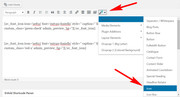
Hi,
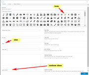
To add green checks & red X’s to your table, open a new post or page using the default editor and use the “shortcode wand” to create a icon shortcode with the size, color, and icon options you wish to use. Also ensure to add a custom class for the css later.
Here are the examples I used here:
[av_font_icon icon='ue812' font='entypo-fontello' style='' caption='' link='' linktarget='' size='20px' position='' color='green' av_uid='av-ulmt36' custom_class='green-check' admin_preview_bg=''][/av_font_icon]

[av_font_icon icon='ue813' font='entypo-fontello' style='' caption='' link='' linktarget='' size='20px' position='' color='red' av_uid='' custom_class='red-x' admin_preview_bg=''][/av_font_icon]
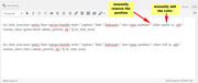
Then add the shortcodes to your tables:
Then if your custom classes are “green-check” & “red-x” you can use this css in your Quick CSS:
.red-x,.green-check {
 display: inline-block !important;
}
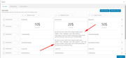
and your final results should be:
Best regards,
Mike
Hey Stegemueller,
I checked your code on stegemueller.dk and the font size of the blockquotes is set to 10pt. You can use this css code on letsupport.dk to change the font size to 10pt (i.e. add it to the quick css field):
#top #wrap_all blockquote, #top #wrap_all blockquote p {
    font-size: 10pt;
}
Best regards,
Peter
Hi,
Sure, try this code:
#top #wrap_all p.price .woocommerce-Price-amount.amount{
font-size 15px;
}
and adjust the px value.
Best regards,
Peter
How to make the font size changed and the color changed to the below screen shot’s three elements.
http://prntscr.com/l0izpc
Please note that there is three elements i have selected please mention for all three.
Hi,
Please us this code to change the font-size of the links:
#top #wrap_all #header_meta a, #top #header_meta li, #top  #wrap_all #header_meta .phone-info {
    font-size: 12px;
}
Best regards,
Peter
Hello there
I’m struggling a bit with block quote font size. I attach two images:
Number 1: from my own site stegemueller.dk.
Here I have done nothing but selecting the font size to 11 and the Line Height to default.
Number 2: from another site: letsupport.dk:
Font Size is 8 and Line Height is default.
I found some code on this site, which I put under quick CSS:
blockquote, blockquote p {
font-size: 8px;
}
That does not work.
My goal is to have letsupport.dk have the same font size as stegemueller.dk
Do you have any suggestions?
Best regards,
Hanne
I realize I can’t attach images, therefore you get two links
Hi,
I have a particular request :-), I have created on my website single page with one element “full slider screen”.
impresaedileghisini
I have insert a caption at bottom position with this custom code:
+39 030 3384972 [av_font_icon color='#ffffff' position='right-custom' font='entypo-fontello' icon='ue854' size='40px' av_uid='av-ubtu']</br> (Email address hidden if logged out) [av_font_icon color='#ffffff' position='right-custom' font='entypo-fontello' icon='ue805' size='40px' av_uid='av-ubtu']</br>
Is all ok, but i I would like to insert some images ( 3-4 partners’ logo) at bottom of page, the final result should be like this:

I know that is very difficult, but I will be very grateful to those who want to help me :-)
thanks for you support
Hey perihelionweb,
Please try this code in the General Styling > Quick CSS field: or in the WordPress > Customize > Additional CSS:
#top #wrap_all .social_bookmarks li a {
width: 30px!important;
line-height: 30px!important;
min-height: 30px!important;
font-size: 20px!important;
}

#top #wrap_all .social_bookmarks li {
height: 20px!important;
width: 30px!important;
}

#top #wrap_all .social_bookmarks {
    height: 60px!important;
}
Best regards,
Mike
Hey meanster99,
Please try this code in the General Styling > Quick CSS field: or in the WordPress > Customize > Additional CSS:
@media only screen and (min-width: 768px) and (max-width:989px) {
 .responsive #top .av_header_transparency.av_alternate_logo_active .logo a > img {
        opacity: 1 !important;
    }
#header {
background-color: #fff !important;
}
.header_color .av-hamburger-inner, .header_color .av-hamburger-inner::before, .header_color .av-hamburger-inner::after {
    background-color: #999999 !important;
}
.responsive #top #wrap_all .av_header_transparency .sub_menu > ul > li > a {
color: #999999 !important;
}
.responsive #top .slideshow_caption {
    left: 0;
    width: 100% !important;
    padding: 0;
}
.responsive #top #wrap_all .av-small-font-size-40 {
    font-size: 40px !important;
}

    .responsive #top .av_header_transparency .logo img.alternate {
        display: none !important;
    }
.av-burger-overlay-active #top #wrap_all .av-hamburger-inner,.av-burger-overlay-active #top #wrap_all span.av-hamburger-inner::after,.av-burger-overlay-active #top #wrap_all span.av-hamburger-inner::before {
    background-color: #ffffff !important;
}

    .responsive #top #wrap_all #header {
        position: relative !important;
        width: 100%!important;
        float: none!important;
        height: auto!important;
        margin: 0 !important;
        opacity: 1!important;
        min-height: 0!important;     }
.responsive.html_header_top.html_logo_center .logo {
        left: 0%!important;
        -webkit-transform: translate(0%,0)!important;
        -ms-transform: translate(0%,0)!important;
        transform: translate(0%,0)!important;
        margin: 0!important;     }
    .responsive.html_header_top #header_main .social_bookmarks ,.responsive.html_top_nav_header #top .social_bookmarks {
        width: auto!important;
        margin-top: -16px!important;     }
    .responsive #header_main .container {
        height: auto !important
    }

    .responsive #top .header_bg {
        opacity: 1!important;
        filter: alpha(opacity=1)
    }

    .responsive.social_header .phone-info {
        text-align: center!important;
        float: none!important;
        clear: both!important;
        margin: 0!important;
        padding: 0!important;     }

    .responsive.social_header .phone-info span {
        border: none!important;
        width: 100%!important;
        text-align: center!important;
        float: none!important;
        clear: both!important;
        margin: 0!important;
        padding: 0!important;     }

    .responsive #header_meta .social_bookmarks li {
        border-style: solid!important;
        border-width: 1px!important;
        margin-bottom: -1px!important;
        margin-left: -1px!important;     }

    .responsive #top #header_meta .social_bookmarks li:last-child {
        border-right-style: solid!important;
        border-right-width: 1px!important;     }

    .responsive #header .sub_menu,.responsive #header_meta .sub_menu>ul {
        float: none!important;
        width: 100%!important;
        text-align: center!important;
        margin: 0 auto!important;
        position: static
    }

.avia_transform .av_fullscreen .active-slide .avia-caption-content {
font-size: 13px !important;
}

    .responsive #header_meta .sub_menu>ul>li {
        float: none!important;
        display: inline-block!important;
        padding: 0 10px!important;     }

    .responsive #header .social_bookmarks li {
        float: none!important;
        display: inline-block!important;     }

    .responsive.bottom_nav_header #header_main .social_bookmarks {
        position: relative!important;
        top: 0!important;
        right: 0!important;
        margin: 10px auto!important;
        clear: both!important;     }

    .responsive.bottom_nav_header.social_header .main_menu>div {
        height: auto!important;     }

    .responsive .logo img {
        margin: 0!important;     }

    .responsive.html_header_sidebar #top #header .social_bookmarks {
        display: none!important;     }

    .responsive body.boxed#top,.responsive.html_boxed.html_header_sticky #top #header {
        max-width: 100%!important;     }

    .responsive.html_header_transparency #top .avia-builder-el-0 .container,.responsive.html_header_transparency #top .avia-builder-el-0 .slideshow_inner_caption {
        padding-top: 0!important;     }

    .responsive #top .av_phone_active_right .phone-info.with_nav span {
        border: none!important;     }

.responsive #top #wrap_all .container {
    width: 85%;
    max-width: 85%;
    margin: 0 auto;
    padding-left: 0;
    padding-right: 0;
    float: none;
}
.responsive #top .av_header_transparency #header_meta {
border-bottom-color: rgb(225, 225, 225) !important;
}
    .responsive.html_top_nav_header .av-logo-container {
        height: auto!important;     }

    .responsive.html_top_nav_header .av-section-bottom-logo {
        border-bottom-style: solid!important;
        border-bottom-width: 1px!important;     }
   .responsive #header_main_alternate {
        display: none!important;     }

    .responsive #top #header .social_bookmarks {
        display: none!important;     }

    .responsive #top #header .main_menu .social_bookmarks {
        display: block!important;
        position: relative!important;
        margin-top: -15px!important;     }
    .responsive #top #header_main > .container .main_menu .av-main-nav > li > a,.responsive #top #wrap_all .av-logo-container {
        height: 80px!important;
        line-height: 80px!important;     }

    .responsive #top #wrap_all .av-logo-container {
        padding: 0!important;     }

    .responsive #top #header_main > .container .main_menu .av-main-nav > li > a {
        min-width: 0!important;
        padding: 0 0 0 20px!important;
        margin: 0!important;
        border-style: none!important;
        border-width: 0!important;     }
   .responsive #top #header .av-main-nav > li > a,.responsive #top #header .av-main-nav > li > a:hover {
        background: transparent!important;
        color: inherit
    }

    .responsive.html_top_nav_header .av-logo-container .inner-container {
        overflow: visible!important;     }
   .responsive.html_header_transparency #top .avia-builder-el-0 .container {
        padding-top: 0px!important;     }

    .responsive.html_header_sidebar #header .avia-custom-sidebar-widget-area {
        display: none!important;     }

    .responsive.html_header_sidebar #main {
        border: none!important;     }
    .responsive #top .logo {
        position: static!important;
        display: table!important;
        height: 80px !important;
        float: none!important;
        padding: 0!important;
        border: none!important;
        width: 80%!important;     }

    .responsive .logo a {
        display: table-cell!important;
        vertical-align: middle!important;     }

    .responsive .logo img {
        height: auto !important;
        width: auto!important;
        max-width: 100%!important;
        display: block!important;
        max-height: 80px!important;     }
    .responsive #top .av-logo-container .avia-menu {
        height: 100%!important;     }

    .responsive #top .av-logo-container .avia-menu > li > a {
        line-height: 80px!important;     }

    .responsive #top #main .av-logo-container .main_menu {
        display: block!important;     }

    .responsive #top #main .av-logo-container .social_bookmarks {
        display: none!important;     }

    .responsive #top #main .av-logo-container .main_menu .social_bookmarks {
        display: block!important;
        position: relative!important;     }

    .responsive #top #main .av-logo-container .main_menu {
        display: block!important;     }

}
Best regards,
Mike
Thanks so much you made my day! is there a way to adjust font size?
you can do this to your child-theme functions.php:
function replace_tags_with_tags(){
?>
<script>
  (function($) {
      function replaceElementTag(targetSelector, newTagString) {
        $(targetSelector).each(function(){
          var newElem = $(newTagString, {html: $(this).html()});
          $.each(this.attributes, function() {
            newElem.attr(this.name, this.value);
          });
          $(this).replaceWith(newElem);
        });
      }

      replaceElementTag('h3.widgettitle', '<div></div>');

  }(jQuery));
</script>
<?php
}
add_action('wp_footer', 'replace_tags_with_tags');
if you like to have p tags then replace div with p
PS : the color set by enfold via the h-tag is lost : but you can give to the div.widgettitle a color and font-size settings etc.
Hi I don’t want to have htags in the widget area title.. I will still need to have some sort of font size control. Any advice would be very helpful. Thanks John
Hi Rikard,
thanks for your help!
I would like to change the size of it too. Could not find a way to do this with css.
How can i change the font-size?
Thanks!
can you try to make it dependent on screen width:
.avia-slideshow,
.avia-slideshow-inner ,
.avia-slideshow li {
    overflow: visible;
}

.avia-slideshow {
    margin-bottom: 80px !important;
}

.avia-slideshow-inner .avia-caption {
    position: absolute;
    top: 100%;
    left: 50%;
    transform: translateX(-50%);
    width: 100%;
}

.avia-slideshow-inner .avia-caption-title {
    color: #000 !important;
    text-align: center;
    font-size: 2.5vw
}
see here on bottom: https://webers-testseite.de/horizontal-gallery/
the avia-slideshow margin-bottom: 80px. has to be big enough to show even the caption content – if there was something
-
This reply was modified 7 years, 6 months ago by
 Guenni007.
Hi,
Add this to quick css:
.header-scrolled .textwidget.custom-html-widget span{
font-size:10px!important;
}
Best regards,
Jordan Shannon
Hi K&H ,
Here is the code you can put in Enfold > General Styling > Quick Css, if it does not work, put into themes/enfold/css/custom.css
#top #av-layout-grid-1 .iconbox.av-no-box .iconbox_icon {
        font-size: 50px;
}
If you need further assistance please let us know.
Best regards,
Victoria
Hi, i managed to place some new icons in my website layout with fontello, but they show up very small inside the circle.
I want the circle to stay the same size but i want to enlarge the icons inside.
I read some topics i could find but none of them had the exact same problem or solution.
here’s an example of my icon:
https://www.mupload.nl/img/ffinryreyrra.08.35.png
Who knows the solution?
Hi,
I added this code to the quick css field to fix the style
#top .woocommerce-pagination .page-numbers li, #top  .woocommerce-pagination .page-numbers li a, #top  .woocommerce-pagination .page-numbers li span{
display: inline;
width: auto;
margin-right: 10px;
font-size: 18px;
}
Best regards,
Peter