Viewing 30 results - 31 through 60 (of 18,724 total)
  • Author
    Search Results
  • #1493820

    In reply to: Text Align Justified

    because your css is merged – i can not say where you set this rule – but this might be the reason for it:
    it is in this css block – with comment:

    /**handles:avia-module-blog**/
    /* ======================================================================================================================================================
    #Blog Styles
    ====================================================================================================================================================== */
    #top .fullsize .template-blog .post .entry-content-wrapper {
      text-align: justify;
      font-size: 1.15em;
      line-height: 1.7em;
      max-width: 800px;
      margin: 0 auto;
      overflow: visible;
    }

    if you do not find it – you can overwrite that rule by higher selectivity:

    #top #wrap_all .fullsize .template-blog .post .entry-content-wrapper {
      text-align:  left;
    }

    #1493779
    finchkelsey
    Participant

    HELP!
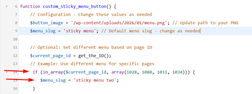
    I don’t want t0 rebuild what is missing..

    [av_section min_height='custom' min_height_pc='25' min_height_px='300px' padding='default' custom_margin='0px' custom_margin_sync='true' color='main_color' background='bg_color' custom_bg='#f2f2f2' src='https://cdnbeefperforms.ca/wp-content/uploads/2024/03/frying-pans-bg-scaled-1030x687.jpg' attachment='25287' attachment_size='large' attach='scroll' position='center right' repeat='stretch' overlay_enable='aviaTBoverlay_enable' overlay_opacity='0.5' overlay_color='#000000' shadow='no-border-styling' bottom_border='no-border-styling']
    [av_heading heading='Foodservice Resources' tag='h2' style='blockquote modern-quote' subheading_active='subheading_below' color='custom-color-heading' custom_font='#ffffff' padding='10' custom_class='white']
    New resources provided by Canada Beef and the Canadian Beef Centre of Excellence.
    [/av_heading]
    [/av_section]

    [av_section min_height_pc='25' min_height_px='500px' padding='default' custom_margin='0px' custom_margin_sync='true' color='main_color' background='bg_color' shadow='no-border-styling' bottom_border='no-border-styling']

    [av_one_fourth first min_height='av-equal-height-column' vertical_alignment='av-align-top' margin='40px' margin_sync='true' padding='40px' padding_sync='true' background='bg_color' background_color='#f2f2f2']
    [av_textblock]
    <h4 style=”text-align: center;”>Appetizers and Soups</h4>
    [/av_textblock]
    [av_image src='https://cdnbeefperforms.ca/wp-content/uploads/2024/05/CDNB_Culinary_Planner_Appetizers_and_Soups_Interactive_F-pdf-796x1030.jpg' attachment='25496' attachment_size='large' align='center' overlay_opacity='0.4' overlay_color='#000000' overlay_text_color='#ffffff' animation='fade-in']
    [/av_image]
    [av_button label='View Now' link='manually,https://cdnbeefperforms.ca/wp-content/uploads/2024/03/RS12961_Menu_Planner_Appetizers_and_Soups_Interactive_F_LowRes.pdf' link_target='_blank' size='large' position='center' color='black' custom_bg='#444444' custom_font='#ffffff']
    [av_textblock]
    Beef cuts, known for their rich and savory flavours, are the perfect addition to any soup or appetizer spread. From tenderloin to brisket, there are endless possibilities to create delicious bites that will leave your guests craving for more.
    [/av_textblock]
    [/av_one_fourth]

    [av_one_fourth min_height='av-equal-height-column' vertical_alignment='av-align-top' margin='40px' margin_sync='true' padding='40px' padding_sync='true' background='bg_color' background_color='#f2f2f2']
    [av_textblock]
    <h4 style=”text-align: center;”>Beef Bowls</h4>
    [/av_textblock]
    [av_image src='https://cdnbeefperforms.ca/wp-content/uploads/2024/05/CDNB_Culinary_Planner_Beef_Bowls_Interactive_F-pdf-796x1030.jpg' attachment='25498' attachment_size='large' align='center' overlay_opacity='0.4' overlay_color='#000000' overlay_text_color='#ffffff' animation='fade-in']
    [/av_image]
    [av_button label='View Now' link='manually,https://cdnbeefperforms.ca/wp-content/uploads/2024/05/10053_CB_Beef_Bowl_Menu_Planner_Ph5F_Digital.pdf' link_target='_blank' size='large' position='center' color='black' custom_bg='#444444' custom_font='#ffffff']
    [av_textblock]
    Beef bowl entrées are a popular choice among meat lovers and food enthusiasts. These hearty and satisfying dishes showcase the versatility and succulence of various beef cuts. Each cut adds its unique flavour and texture to the dish
    [/av_textblock]
    [/av_one_fourth]

    [av_one_fourth min_height='av-equal-height-column' vertical_alignment='av-align-top' margin='40px' margin_sync='true' padding='40px' padding_sync='true' background='bg_color' background_color='#f2f2f2']
    [av_textblock]
    <h4 style=”text-align: center;”>Burgers</h4>
    [/av_textblock]
    [av_image src='https://cdnbeefperforms.ca/wp-content/uploads/2024/05/CDNB_Culinary_Planner_Burgers_Interactive_F-pdf-796x1030.jpg' attachment='25500' attachment_size='large' align='center' overlay_opacity='0.4' overlay_color='#000000' overlay_text_color='#ffffff' animation='fade-in']
    [/av_image]
    [av_button label='View Now' link='manually,https://cdnbeefperforms.ca/wp-content/uploads/2024/05/RS12961_Menu_Planner_Burgers_Interactive_F_LowRes.pdf' link_target='_blank' size='large' position='center' color='black' custom_bg='#444444' custom_font='#ffffff']
    [av_textblock]
    Beef burgers are highly popular and versatile, ideal for quick service and diverse culinary styles. Easy to customize and profitable, they appeal to a broad customer base, fitting various dining settings from fast food to gourmet restaurants, ensuring consistent demand and customer satisfaction.
    [/av_textblock]
    [/av_one_fourth]

    [av_one_fourth min_height='av-equal-height-column' vertical_alignment='av-align-top' margin='40px' margin_sync='true' padding='40px' padding_sync='true' background='bg_color' background_color='#f2f2f2']
    [av_textblock]
    <h4 style=”text-align: center;”>Sandwiches, Flatbreads and Wraps</h4>
    [/av_textblock]
    [av_image src='https://cdnbeefperforms.ca/wp-content/uploads/2024/05/CDNB_Culinary_Planner_Sandwiches_Flatbreads_and_Wraps_Interactive_F-pdf-796x1030.jpg' attachment='25502' attachment_size='large' align='center' overlay_opacity='0.4' overlay_color='#000000' overlay_text_color='#ffffff' animation='fade-in']
    [/av_image]
    [av_button label='View Now' link='manually,https://cdnbeefperforms.ca/wp-content/uploads/2024/05/RS12961_Menu_Planner_Sandwiches_Flatbreads_and_Wraps_Interactive_F_LowRes.pdf' link_target='_blank' size='large' position='center' color='black' custom_bg='#444444' custom_font='#ffffff']
    [av_textblock]
    Sandwiches, flatbreads, and wraps are versatile dishes that can be made using various ingredients, and beef cuts are an excellent choice to add a hearty and satisfying flavour to these dishes.
    [/av_textblock]
    [/av_one_fourth]

    [av_one_fourth first min_height='av-equal-height-column' vertical_alignment='av-align-top' margin='40px' margin_sync='true' padding='40px' padding_sync='true' background='bg_color' background_color='#f2f2f2']
    [av_textblock]
    <h4 style=”text-align: center;”>Entrées Salads</h4>
    [/av_textblock]
    [av_image src='https://cdnbeefperforms.ca/wp-content/uploads/2024/05/CDNB_Culinary_Planner_Entree_Salads_Interactive_F-pdf-796x1030.jpg' attachment='25505' attachment_size='large' align='center' overlay_opacity='0.4' overlay_color='#000000' overlay_text_color='#ffffff' animation='fade-in']
    [/av_image]
    [av_button label='View Now' link='manually,https://cdnbeefperforms.ca/wp-content/uploads/2024/05/RS12961_Menu_Planner_Entree_Salads_Interactive_F_LowRes.pdf' link_target='_blank' size='large' position='center' color='black' custom_bg='#444444' custom_font='#ffffff']
    [av_textblock]
    Beef cuts in salads offer a hearty twist, bringing savoury slices of sirloin or flavourful strips of flank steak to vibrant greens and vegetables. Grilled to perfection, these cuts elevate salads, adding richness and a protein-packed punch to every bite.
    [/av_textblock]
    [/av_one_fourth]

    [av_one_fourth min_height='av-equal-height-column' vertical_alignment='av-align-top' margin='40px' margin_sync='true' padding='40px' padding_sync='true' background='bg_color' background_color='#f2f2f2']
    [av_textblock]
    <h4 style=”text-align: center;”>Kids Menu</h4>
    [/av_textblock]
    [av_image src='https://cdnbeefperforms.ca/wp-content/uploads/2024/05/CDNB_Culinary_Planner_Kids_Menu_Interactive_F-pdf-796x1030.jpg' attachment='25507' attachment_size='large' align='center' overlay_opacity='0.4' overlay_color='#000000' overlay_text_color='#ffffff' animation='fade-in']
    [/av_image]
    [av_button label='View Now' link='manually,https://cdnbeefperforms.ca/wp-content/uploads/2024/05/RS12961_Menu_Planner_Kids_Menu_Interactive_F_LowRes.pdf' link_target='_blank' size='large' position='center' color='black' custom_bg='#444444' custom_font='#ffffff']
    [av_textblock]
    A kids menu featuring beef cuts offers tasty and nutritious options that cater to young tastes. These meals aim to please young palates while delivering essential protein and nutrients for their growth.
    [/av_textblock]
    [/av_one_fourth]

    [av_one_fourth min_height='av-equal-height-column' vertical_alignment='av-align-top' margin='40px' margin_sync='true' padding='40px' padding_sync='true' background='bg_color' background_color='#f2f2f2']
    [av_textblock]
    <h4 style=”text-align: center;”>Entrées</h4>
    [/av_textblock]
    [av_image src='https://cdnbeefperforms.ca/wp-content/uploads/2024/05/CDNB_Culinary_Planner_Entree_Classics_Interactive_F-pdf-796x1030.jpg' attachment='25509' attachment_size='large' align='center' overlay_opacity='0.4' overlay_color='#000000' overlay_text_color='#ffffff' animation='fade-in']
    [/av_image]
    [av_button label='View Now' link='manually,https://cdnbeefperforms.ca/wp-content/uploads/2024/05/RS12961_Menu_Planner_Entree_Classics_Interactive_F_LowRes.pdf' link_target='_blank' size='large' position='center' color='black' custom_bg='#444444' custom_font='#ffffff']
    [av_textblock]
    Beef cuts can be utilized to create a variety of delicious entrée classics that are sure to satisfy any meat lover’s palate. The possibilities for creating delicious entrée classics are endless.
    [/av_textblock]
    [/av_one_fourth]

    [av_one_fourth min_height='av-equal-height-column' vertical_alignment='av-align-top' margin='40px' margin_sync='true' padding='40px' padding_sync='true' background='bg_color' background_color='#f2f2f2']
    [av_textblock]
    <h4 style=”text-align: center;”>Senior Living</h4>
    [/av_textblock]
    [av_image src='https://cdnbeefperforms.ca/wp-content/uploads/2024/05/CDNB_Culinary_Planner_Senior_Living_Interactive_F-pdf-796x1030.jpg' attachment='25511' attachment_size='large' align='center' overlay_opacity='0.4' overlay_color='#000000' overlay_text_color='#ffffff' animation='fade-in']
    [/av_image]
    [av_button label='View Now' link='manually,https://cdnbeefperforms.ca/wp-content/uploads/2024/05/RS12961_Menu_Planner_Senior_Living_Interactive_F_LowRes.pdf' link_target='_blank' size='large' position='center' color='black' custom_bg='#444444' custom_font='#ffffff']
    [av_textblock]
    Entrées for seniors using beef cuts offer a wide range of options that are both nutritious and appetizing. These entrees can provide the necessary nutrients for seniors while catering to their specific dietary needs and preferences.
    [/av_textblock]
    [/av_one_fourth]

    [/av_section]

    [av_section min_height='custom' min_height_pc='25' min_height_px='300px' padding='default' custom_margin='0px' custom_margin_sync='true' color='main_color' background='bg_color' custom_bg='#f2f2f2' src='https://cdnbeefperforms.ca/wp-content/uploads/2023/12/RS12752_RS11619_Tuscan-inspired-Grilled-Steak-1500x430.jpg' attachment='25111' attachment_size='featured' attach='scroll' position='center right' repeat='stretch' overlay_enable='aviaTBoverlay_enable' overlay_opacity='0.5' overlay_color='#000000' shadow='no-border-styling' bottom_border='no-border-styling']

    [av_one_half first vertical_alignment='av-align-middle' space='3']
    [av_heading heading='VIDEO' tag='h1' style='blockquote modern-quote modern-centered' subheading_active='subheading_below' color='custom-color-heading' custom_font='#ffffff' padding='10']
    <div style=”font-size:24px;”>CANADA PRIME GRADE BEEF</div><div style=”font-size:24px;padding-top:10px;”>MASTER CHEF</div>
    [/av_heading]
    [/av_one_half]

    [av_one_half]
    [av_textblock]
    <div style=”border:solid 5px #f5f7f7; padding: 56.25% 0 0 0; position: relative;”>
    <iframe style=”position: absolute; top: 0; left: 0; width: 100%; height: 100%;” title=”Canada Prime Grade Beef – Master Chef” src=”https://player.vimeo.com/video/1074398616?badge=0&autopause=0&player_id=0&app_id=58479&#8243; frameborder=”0″></iframe>
    </div>
    [/av_textblock]
    [/av_one_half]

    [/av_section]

    [av_section padding='default' custom_margin='0px' custom_margin_sync='true' color='main_color' background='bg_color' custom_bg='#f2f2f2' shadow='no-border-styling' bottom_border='no-border-styling']

    [av_two_fifth first margin='0px' margin_sync='true' padding='40px' padding_sync='true' background='bg_color' background_color='#f2f2f2']
    [av_image src='https://cdnbeefperforms.ca/wp-content/uploads/2024/03/RS12896_9582_2024_CB_Foodservice_Merch_Poster_F-1-pdf-scaled.jpg' attachment='25327' attachment_size='full' align='center' overlay_opacity='0.4' overlay_color='#000000' overlay_text_color='#ffffff' animation='fade-in']
    [/av_image]
    [av_button label='View PDF' link='manually,https://cdnbeefperforms.ca/wp-content/uploads/2024/03/RS12896_9582_2024_CB_Foodservice_Merch_Poster_F-1.pdf' link_target='_blank' size='large' position='center' color='black' custom_bg='#444444' custom_font='#ffffff']
    [/av_two_fifth]

    [av_three_fifth margin='0px' margin_sync='true' padding='40px' padding_sync='true' background='bg_color' background_color='#f2f2f2']
    [av_textblock]
    <h4 style=”text-align: center;”>Foodservice Beef Merchandising Guide Poster</h4>
    [/av_textblock]
    [av_textblock]
    <p style=”text-align: center;”>Educate your front and back of house staff about the versatility of Canadian Beef with the new Foodservice Merchandising Poster, powered by the Canadian Beef Information Gateway. Users can scan QR codes to learn how to merchandise each foodservice-specific beef subprimal through videos, photographs, and more. Each subprimal also has product specifications to ensure informed purchasing, and commercial recipes to inspire your team to do more with Canadian Beef. Users can also access information about the Canadian Beef Advantage, including our gate-to-plate virtual tours, enabling further discussions about the unique qualities of Canadian Beef to customers.</p>
    [/av_textblock]
    [av_textblock]
    [gravityform id=”39″ title=”true” description=”false” ajax=”true”]
    [/av_textblock]
    [/av_three_fifth]

    [/av_section]

    #1493569

    Hey a10plus,

    It’s likely due to the CSS you have added in Quick CSS:

    .faq-title h4 {
      margin: 0px !important;
      font-size: 16px !important;
      line-height: 22px !important;
      padding: 0 !important;
      color: #000000;
      font-weight: normal;
    
    h1{
    text-transform: none !important;
    }

    You need a closing curly bracket after the first block.

    Best regards,
    Rikard

    #1492704

    well – for the size i see in your merged styles :

    #top #wrap_all .av-inherit-size .av-special-heading-tag {
      font-size: 1em;
    }

    because it is the merged version i do not see – if it is a quick css made rule.

    f.e. for the heading “NOTRE ENGAGEMENT” inside color-section : #engagement
    these rulesets are made inline ( inside the element options ) ( they are listed in a post-….css file )

    .avia-section.av-2ah6ew-59724389008986c8623645d2779db077 {
      background-color: #0984a9;
      background-image: unset;
    }
    
    #top #wrap_all .av-special-heading.av-ma6kesg8-158f508a9a89994cebab9c80a4c731f0 .av-special-heading-tag {
      font-size: 40px;
    }

    for the heading “ACTUALITÉ” inside color-section : #actualite this is not done.
    so the standard property is used:

    .main_color {
      background-color: var(--enfold-main-color-bg);
    }

    and this is for your page #fff

    #1492555

    Hey Angelo,

    Thank you for the inquiry.

    Try to add this code to the functions.php file to insert a go back button inside the header container.

    
    add_action( 'ava_main_header', 'ava_main_header_mod' );
    function ava_main_header_mod() {
        ?>
        <div class="ava-go-back-wrapper">
            <a href="javascript:history.back();" class="ava-go-back-button">Go Back</a>
        </div>
    
        <style>
            .ava-go-back-wrapper {
                display: none;
                justify-content: center;
                align-items: center;
                padding: 10px 0;
            }
            .ava-go-back-button {
                display: inline-block;
                padding: 8px 16px;
                background-color: #333;
                color: #fff;
                text-decoration: none;
                border-radius: 4px;
                font-size: 14px;
            }
            @media (max-width: 768px) {
                .ava-go-back-wrapper {
                    display: flex;
                }
            }
        </style>
    
        <script>
            function closeBurgerMenu() {
                const burgerBtn = document.querySelector('.av-burger-menu-main .av-hamburger.av-js-hamburger');
                const overlay = document.querySelector('.av-burger-overlay');
                if (burgerBtn && burgerBtn.classList.contains('is-active')) {
                    burgerBtn.classList.remove('is-active');
                }
                if (overlay) {
                    overlay.style.display = 'none';
                    overlay.style.opacity = '0';
                }
            }
    
            document.addEventListener('DOMContentLoaded', function() {
                closeBurgerMenu();
    
                const goBackBtn = document.querySelector('.ava-go-back-button');
                if (goBackBtn) {
                    goBackBtn.addEventListener('click', function(e) {
                        e.stopPropagation();
                        closeBurgerMenu();
                        setTimeout(function() {
                            history.back();
                        }, 50);
                    });
                }
            });
    
            window.addEventListener('pageshow', function(event) {
                if (event.persisted) {
                    closeBurgerMenu();
                }
            });
        </script>
        <?php
    }
    

    Best regards,
    Ismael

    #1492509

    Hi,

    Sorry for the delay. Since removing the br tags also removes the list items, we used this css in the style.css file to hide the line breaks and display the list as a standard bullet list.

    .av-masonry-entry-content ul br {
        display: none;
    }
    
    .av-masonry-entry-content ul li {
        padding-left: 10px;
    	position: relative;
    }
    
    .av-masonry-entry-content ul li:before {
        content: "•";
        position: absolute;
        left: 0;
        top: 5px;
        font-size: 1em;
        line-height: 1;
    }

    Please check the private field for the screenshot.

    faIfPXs.md.png

    Best regards,
    Ismael

    #1492439

    Hi,

    Thank you for the link.

    Did you add this css code?

    #top .fullsize .template-blog .post-title {
        text-align: left;
        font-size: 48px;
    }

    Try to override the font size with this code:

    @media only screen and (max-width: 767px) {
    
      /* Add your Mobile Styles here */
      #top .fullsize .template-blog .post-title {
        font-size: 16px;
      }
    }

    Best regards,
    Ismael

    #1492300

    File 2025-12-09 09.24.33 mobile post huge.png shows H1 in a post on mobile. Too huge!

    The General Styling > Typography tab has settings for font styling. H1 is set the same font sizes as H2, yet it’s huge on mobile posts.

    #1492266
    Sandy
    Participant

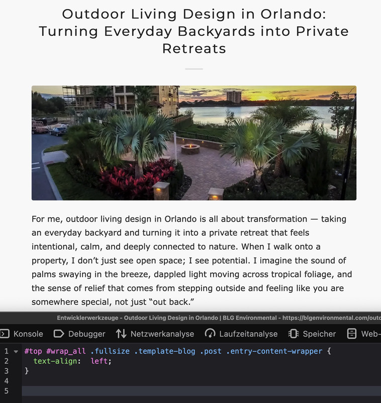
    Fonts on mobile are larger than fonts on other devices. Also, post fonts are larger than page fonts on mobile. Is this normal?

    The General Styling > Typography tab has settings for font styling. Not sure why these only seem to work on desktop.

    The biggest problem is post fonts H1, H2, and H3 on mobile. They are far too large and get cut off. Please advise on how to set those font sizes specifically.

    #1492236

    Hey condonp,

    Thank you for the inquiry.

    This is possible but it will require some custom html and some css modifications. You can start with the following code:

    <div class="av-custom-testimonial">
      <div class="av-testimonial-card">
        
        <div class="av-testimonial-left">
          <h3 class="av-testimonial-heading">What our clients say</h3>
          <div class="av-testimonial-stars"></div>
          <p class="av-testimonial-text">“Your testimonial text goes here.”</p>
          <div class="av-testimonial-client">Client Name</div>
          <div class="av-testimonial-client-meta">Client Title</div>
        </div>
    
        <div class="av-testimonial-right">
          <div class="av-image-wrap">
            <img src="image.jpg" alt="">
          </div>
        </div>
      </div>
    </div>


    Then add this code in the Quick CSS field:

    .av-custom-testimonial .av-testimonial-card {
      display: grid;
      grid-template-columns: 1fr 220px;
      gap: 24px;
      background: #fff;
      padding: 20px;
      border-radius: 16px;
      box-shadow: 0 6px 20px rgba(16, 24, 40, 0.08);
      max-width: 880px;
      align-items: stretch;
    }
    
    .av-custom-testimonial .av-testimonial-left {
      display: flex;
      flex-direction: column;
      justify-content: center;
      padding: 6px 0;
    }
    
    .av-custom-testimonial .av-testimonial-heading {
      font-size: 1.25rem;
      line-height: 1.1;
      font-weight: 700;
      color: #0f172a;
      margin: 0 0 10px 0;
      display: inline-block;
      width: 50%;
    }
    
    .av-custom-testimonial .av-testimonial-stars {
      display: inline-flex;
      gap: 6px;
      align-items: center;
      margin-bottom: 12px;
    }
    
    .av-custom-testimonial .av-testimonial-text {
      font-size: 0.98rem;
      color: #6b7280;
      margin-bottom: 14px;
    }
    
    .av-custom-testimonial .av-testimonial-client {
      font-weight: 600;
      font-size: 0.95rem;
      color: #08121a;
    }
    
    .av-custom-testimonial .av-testimonial-client-meta {
      font-size: 0.85rem;
      color: #6b7280;
      margin-top: 4px;
    }
    
    .av-custom-testimonial .av-testimonial-right {
      position: relative;
      min-height: 220px;
      overflow: visible;
    }
    
    .av-custom-testimonial .av-image-wrap {
      position: absolute;
      bottom: 0;
      right: 0;
      width: 160px;
      height: 280px;
      overflow: hidden;
      border-top-left-radius: 140px 72px;
      border-bottom-left-radius: 24px;
      border-bottom-right-radius: 12px;
      border-top-right-radius: 12px;
      background: #f3f4f6;
    }
    
    .av-custom-testimonial .av-image-wrap img {
      width: 100%;
      height: 100%;
      object-fit: cover;
      display: block;
    }
    
    @media (max-width: 760px) {
      .av-custom-testimonial .av-testimonial-card {
        grid-template-columns: 1fr;
      }
    
      .av-custom-testimonial .av-image-wrap {
        position: relative;
        width: 100%;
        height: 220px;
        border-top-left-radius: 48px 26px;
      }
    
      .av-custom-testimonial .av-testimonial-right {
        min-height: auto;
      }
    
      .av-custom-testimonial .av-testimonial-heading {
        width: 70%;
      }
    }
    

    Best regards,
    Ismael

    #1492231
    lara666
    Participant

    Hi Kresi team,

    On my portfolio page, I’m using a portfolio grid and the breadcrumbs are currently aligned to the left.

    Is there a way to center them and match the font size of the paragraph above?

    Please see the page link in the private content section.

    Thank you!

    Hey ti2media,
    Try adding this snippet to your child theme functions.php:

    function add_sticky_info_box() {
        ?>
        <style>
            .sticky-info-box {
                position: fixed;
                bottom: 120px;
                right: 20px;
                width: 300px;
                height: 300px;
                background: #ffffff;
                border: 1px solid #ddd;
                border-radius: 8px;
                box-shadow: 0 4px 12px rgba(0,0,0,0.15);
                z-index: 9999;
                display: flex;
                flex-direction: column;
                padding: 20px;
                box-sizing: border-box;
                transition: opacity 0.3s ease;
            }
            
            .sticky-info-box.hidden {
                display: none;
            }
            
            .sticky-info-box-header {
                display: flex;
                justify-content: space-between;
                align-items: flex-start;
                margin-bottom: 15px;
            }
            
            .sticky-info-box-title {
                font-size: 20px;
                font-weight: bold;
                color: #333;
                margin: 0;
                flex: 1;
            }
            
            .sticky-info-box-close {
                background: none;
                border: none;
                font-size: 24px;
                color: #999;
                cursor: pointer;
                padding: 0;
                width: 30px;
                height: 30px;
                display: flex;
                align-items: center;
                justify-content: center;
                transition: color 0.2s ease;
            }
            
            .sticky-info-box-close:hover {
                color: #333;
            }
            
            .sticky-info-box-message {
                flex: 1;
                color: #666;
                font-size: 14px;
                line-height: 1.6;
                margin-bottom: 20px;
                overflow-y: auto;
            }
            
            .sticky-info-box-button {
                background: #0073aa;
                color: white;
                border: none;
                padding: 12px 24px;
                border-radius: 4px;
                font-size: 16px;
                cursor: pointer;
                text-decoration: none;
                display: inline-block;
                text-align: center;
                transition: background 0.2s ease;
            }
            
            .sticky-info-box-button:hover {
                background: #005a87;
            }
            
            .sticky-info-toggle {
                position: fixed;
                bottom: 120px;
                right: 50px;
                width: 50px;
                height: 50px;
                background: #0073aa;
                color: white;
                border: none;
                border-radius: 50%;
                font-size: 24px;
                cursor: pointer;
                box-shadow: 0 4px 12px rgba(0,0,0,0.15);
                z-index: 9998;
                display: none;
                align-items: center;
                justify-content: center;
                transition: background 0.2s ease;
            }
            
            .sticky-info-toggle:hover {
                background: #005a87;
            }
            
            .sticky-info-toggle.visible {
                display: flex;
            }
        </style>
        
        <div class="sticky-info-box" id="stickyInfoBox">
            <div class="sticky-info-box-header">
                <h3 class="sticky-info-box-title">Important Information</h3>
                <button class="sticky-info-box-close" id="closeInfoBox" aria-label="Close">×</button>
            </div>
            <div class="sticky-info-box-message">
                <p>This is your information box! You can customize this message to display any content you'd like to share with your visitors.</p>
            </div>
            <a href="/your-page-url" class="sticky-info-box-button">Learn More</a>
        </div>
        
        <button class="sticky-info-toggle" id="infoToggle" aria-label="Show information">ℹ</button>
        
        <script>
            (function() {
                var infoBox = document.getElementById('stickyInfoBox');
                var closeBtn = document.getElementById('closeInfoBox');
                var toggleBtn = document.getElementById('infoToggle');
                
                // Close the info box
                closeBtn.addEventListener('click', function() {
                    infoBox.classList.add('hidden');
                    toggleBtn.classList.add('visible');
                });
                
                // Show the info box again
                toggleBtn.addEventListener('click', function() {
                    infoBox.classList.remove('hidden');
                    toggleBtn.classList.remove('visible');
                });
            })();
        </script>
        <?php
    }
    add_action('wp_footer', 'add_sticky_info_box');
    

    Then adjust the title, message, buttone text & link to suit. You can also adjust the CSS to change colors, etc.
    It places the box & info button 120px from the bottom so they are above the scroll-top button, ratio than have them move if the scroll-top shows, which would not be so good.
    fIPHs99.md.png
    fIPJ6iv.md.png

    Best regards,
    Mike

    #1492026

    Hi,

    Thank you for the update.

    If you want to create it manually using html, try to add this code in a text or code block element:

    
    <div class="av-logo-row">
    <div class="av-logo-item">
        <img src="logo1.png" alt="Logo 1">
        <span>Text 1</span></div>
    <div class="av-logo-item">
        <img src="logo2.png" alt="Logo 2">
        <span>Text 2</span></div>
    <div class="av-logo-item">
        <img src="logo3.png" alt="Logo 3">
        <span>Text 3</span></div>
    <div class="av-logo-item">
        <img src="logo4.png" alt="Logo 4">
        <span>Text 4</span></div>
    <div class="av-logo-item">
        <img src="logo5.png" alt="Logo 5">
        <span>Text 5</span></div>
    <div class="av-logo-item">
        <img src="logo6.png" alt="Logo 6">
        <span>Text 6</span></div>
    <div class="av-logo-item">
        <img src="logo7.png" alt="Logo 7">
        <span>Text 7</span></div>
    <div class="av-logo-item">
        <img src="logo8.png" alt="Logo 8">
        <span>Text 8</span></div>
    <div class="av-logo-item">
        <img src="logo9.png" alt="Logo 9">
        <span>Text 9</span></div>
    </div>
    

    Then use this css:

    .av-logo-row {
      display: flex;
      flex-wrap: wrap;
      justify-content: space-between;
      gap: 20px;
    }
    
    .av-logo-item {
      flex: 1 1 calc(100% / 9 - 20px);
      display: flex;
      flex-direction: column;
      align-items: center;
      text-align: center;
      margin-bottom: 20px;
    }
    
    .av-logo-item img {
      width: 40px;
      height: 40px;
      margin-bottom: 8px;
    }
    
    .av-logo-item span {
      font-size: 14px;
      color: #333;
    }
    
    @media (max-width: 1024px) {
      .av-logo-item {
        flex: 1 1 calc(33.333% - 20px);
      }
    }
    
    @media (max-width: 600px) {
      .av-logo-item {
        flex: 1 1 100%;
      }
    }

    Best regards,
    Ismael

    #1491941

    In reply to: Arrow above sub menu

    if you would like to have it always visible just remove the hover pseudo-class:

    here is the solution for sub-menu

    #top .menu-item-has-children:hover:before {
      position: absolute;
      top: auto;
      bottom: -4px;
      left: 20px;
      display:   block;
      content: "\e886";
      font-size: 36px;
      line-height: 24px;
      font-family: 'entypo-fontello';
      color: inherit;
    }
    #1491937

    In reply to: Arrow above sub menu

    there is no extra class on top-level menu-item if a sub-menu is open. So this is probably only usable for modern browsers.
    Maybe a solution to bring an extra class to top-level menu-item via script seems to be better.

    try:

    #top .menu-item-has-children > a {
      display: flex;
      justify-content: center;
    }
    
    #top .menu-item-has-children > a:hover:after,
    #top .current_page_item.menu-item-has-children > a:after,
    #top .menu-item-has-children:has(ul.sub-menu[style*="visible"]) > a:after {
      position: absolute;
      top: auto;
      bottom: -4px;
      display:   block;
      content: "\e886";
      font-size: 36px;
      line-height: 24px;
      font-family: 'entypo-fontello';
      color: var(--enfold-main-color-primary);
    }
    

    see here on “our clinic” menu-item: https://basis.webers-testseite.de/

    #1491888

    if you like to have the pipes between the links:
    adjust the new switch point when the links goto a twoliner:

    @media only screen and (max-width: 467px) {
      #header {
        height: 160px !important;
        max-height: 160px !important;
      }
      .responsive.html_header_top.html_mobile_menu_tablet  #top #main {
        padding-top: 160px !important;
      }
    } 

    and for phone-info:

    /******  styling the phone-info links with pipe separator  *************/
    #top #header_meta .phone-info {
      display: flex;
      flex-flow: row wrap;
      gap: 0 40px; 
    }
    
    #top #header_meta .phone-info a {
      flex:  1 1 auto;
      position: relative;
    }
    
    #top #header_meta .phone-info a:not(:last-child)::after {
      content: '|';
      font-size: 18px;
      position: absolute;
      right: -24px; 
      color: #FFF;
    }
    
    #1491821

    Hi,


    @Eleina_Shinn
    : Try to use this html in the phone number field:

    
    <div style="display:flex;align-items:center;gap:20px;">
    <div style="display:flex;align-items:center;gap:6px;">[av_font_icon icon='phone' font='svg_entypo-fontello' size='13px' position='left' av_uid='av-mifjh9cz' sc_version='1.0'][/av_font_icon] 941-462-9082</div>
    <div style="display:flex;align-items:center;gap:6px;">[av_font_icon icon='ue805' font='entypo-fontello' size='13px' position='left' av_uid='av-emailicon' sc_version='1.0'][/av_font_icon]  (Email address hidden if logged out) </div>
    </div>
    

    Please don’t hesitate to open another thread if you need additional assistance.

    Best regards,
    Ismael

    #1491685

    Hi.

    I appreciate your contributions to this thread.

    At this point the titles on my posts are laughably small. https://tinyurl.com/2coyjhvr

    I changed the h3 tag setting you had from 9px to default and then to 20px and it will not adjust.

    I’m wondering where else you are modifying the font size besides here: https://tinyurl.com/287ze3kt

    https://tinyurl.com/2yrayqjf

    Please reply and advise,

    #1491585

    HI

    Thank you for the reply.

    An example page is my latest post here: https://blgenvironmental.com/sustainable-landscape-design-orlando/.

    Note: Changing the H3 Tag does not affect the page here. I set it for 9px as a visual test for each screen setting. I am developing in Firefox on a desktop. https://tinyurl.com/29nlpg6v

    The default says that it is 20px. I can visually tell by eyeballing the h2 tag and te h3 tag right underneath that these are both the same font size and not 28 px h2 and 20 px h3 respectively. https://tinyurl.com/24jgxgok

    I’m resetting the h3 back to default after the test. Can you please enter the dashboard with the info that I provided at the outset of this ticket?

    This setting also does not have an affect: https://tinyurl.com/2ycxfogv

    Side note: I do not see the panel for font position: left, right, center, justify. Everything appears to be set to justify somewhere.

    • This reply was modified 3 months, 3 weeks ago by kurson.
    #1491551

    Hi,

    Thank you for the info.

    The site is broken because there is an invalid css rule in the Quick CSS field — a closing curly brace is missing.

    /* -- Change font size in Main Menu Bar -- */
    #header_main .avia-menu-text {
        font-size: 17px;
    

    We corrected the css code and set the Maximum Container Width to 1310px. The site should be displaying correctly now.

    Screenshot-2025-11-20-at-1-57-03-PM

    Best regards,
    Ismael

    #1491531
    Kelly Erickson
    Participant

    Hi there! It’s been a while but I’m back with some more issues regarding the centering of shortcode icons in an Avia text box, along with another issue with adding a custom fontello icon.

    I will note: with all of these issues, I’ve cleared cache on the website, on my browser, used incognito windows and other browsers to cross check and troubleshoot.

    Overview: I’ve uploaded an IMDB Fontello Icon as outlined in the Enfold documentation. I want to be able to use this icon in both the header & socket as well as within the Shortcode Icons options to use on pages within the site using the text block editor.

    I have inserted the following CSS in the Quick CSS theme options section:

    #top .av_textblock_section .av_font_icon {
        display: inline-block;
        float: none;
    }

    Issue #1 with a custom fontello icon:
    When using in a standard text box and inserting the icons using shortcode, the icons do center align but they are staggered (the custom icon is lower than the Instagram icon that is already in there). See the link in the Private Content and scroll down to the bottom to see the result of that.

    Issue #2:
    Header & footer icons are also misaligned, see screenshot link below.
    As a result of changing the size of the icons in the header and footer as well, the mouseovers are off (on the Instagram specifically, the circle mouseover is not centering around the icon). Best way to see this is in the live link I’ve provided as well as the screenshots in the Private Content!

    Thank so much in advance!

    #1491491

    Hi,

    The font size of the heading elements for different screen sizes can also be adjusted in Enfold > General Styling > Typography as shown in the screenshot below.

    Screenshot-2025-11-19-at-12-41-59-PM

    Best regards,
    Ismael

    #1491488
    kurson
    Participant

    My Enfold post font size and position look terrible to the client. The H2 and H3 tags look the same size, everything is justified. They would like to know where to edit this to be font position left. Or at least have the controls. The GUI controls under Advanced Styling do not seem to work. Adding custom css does not override,’

    Please instruct me on how to edit each H tag from1 to 6 in font size and the option to change from justify to position left for each element including main text font.

    #1491486
    placeit53591
    Participant

    The font sizes for the <H1> and <H2> tags are much too large for my taste on a smartphone. How can I make them smaller without changing the font sizes for the computer screen?

    #1491389

    Hi,

    Thank you for the update.

    If you want to revert to using the default icon, please remove the previous modifications, then add this css code to enlarge the instagram icon and adjust the color:

    #top #wrap_all .social_bookmarks .social_bookmarks_instagram a {
        background: linear-gradient(44deg, #ef1a88, #e6683c, #fa991f, #ee166c, #bc1888);
        -webkit-text-fill-color: transparent;
        background-clip: text;
        font-size: 50px !important;
        width: 100%;
        height: 100%;
        line-height: 80px;
    }
    
    .responsive #top #header .main_menu .social_bookmarks {
        margin-top: -40px !important;
        overflow: visible;
    }

    Screenshot-2025-11-17-at-12-56-53-PM

    Best regards,
    Ismael

    #1491369

    to have the title you only have to make it visible by:

    #top .av-burger-menu-main .avia_hidden_link_text {
      display: inline;
      font-size: 20px;
      line-height: 0;
      color: var(--enfold-header-color-meta);
      margin-left: 5px !important;
      position: relative;
      top: 2px; /*=== just to center horizontally - adjust to your needs ===*/
    }

    but for your header layout “Hamburger menu icon left, logo centered, search icon right” i would start from a different header layout – not the header centered – menü below .

    btw. some topics under yours there is the same title of the topic “Hamburger menu icon left, logo centered, search icon right”

    #1491360

    In reply to: TABS

    I moved the tab section out of the color box, so I dont need to edit tab colors anymore, but I do need to edit font size and colors for :

    Lonestar Roofing and Restoration LLC
    Hours of Operation
    Follow us on Facebook
    Service Areas:

    Which are added via widget in the new footer page I am creating.

    #1491357

    In reply to: TABS

    I need to be able to edit all the css on the footer page, change font colors/sizes, background colors of the tabs etc.

    #1491356

    so because – the original insta logo is to complex to insert it as svg file to the social media icons.
    I would place the normal instagram icon via font-icon !
    and replace that by css .

    maybe you upload two versions of that logo:

    and for hover style:

    then to quick css:

    #top #wrap_all .av-social-link-instagram a:focus, 
    #top #wrap_all .av-social-link-instagram:hover a {
      color: unset;
      background-color: unset;
    }
    
    .social_bookmarks_instagram a {
      font-size:0 !important
    }
    
    .social_bookmarks_instagram a:before {
      content:"";
      background-image:url(/wp-content/uploads/Instagram_Glyph_Gradient.png);
      background-size:contain;
      display:inline-block;
      width:inherit;
      height:inherit;
      border-radius: 10px;
      background-position:center center;
    }
    
    .social_bookmarks_instagram:hover a:before {
      background-image:url(/wp-content/uploads/Instagram_Glyph_Gradient_invers.png);
      border-radius: 10px
    }

    see (the first in the row) https://basis.webers-testseite.de/
    the second icon on the right is the svg icon (with its trouble to use the mask (or clipPath)

    #1491353

    Hey Tanja,

    You can change the font size directly in the editor. The toolbar is located just above the content.

    Best regards,
    Rikard

Viewing 30 results - 31 through 60 (of 18,724 total)