Hi,
For H2 headings in text elements, the default font size is 28px, this is a different element that the “Special Heading”.
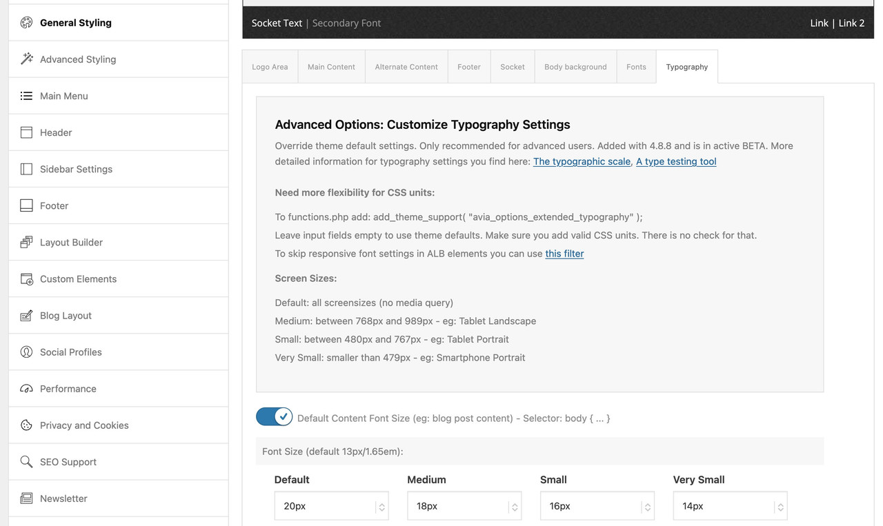
I made the change for you in the Enfold Theme Options ▸ General Styling ▸ Typography ▸ Advanced Options: Customize Typography Settings

adjust to suit, these are now 40px

On your /hot-spring-spas-vigor-cold-plunge/ page that are all “Special Heading” elements or H3 and are correct from Ismael above.
Please clear your browser cache and check.
Best regards,
Mike
Hi,
You can use this css code to adjust the product price:
#top .price, #top .price span, #top del, #top ins {
	display: inline;
	text-decoration: none;
	font-size: 30px;
	line-height: 24px;
	font-weight: 600;
}
If you have any further questions, we kindly ask that you open a new thread. As threads become longer in the forum, they can become harder to manage, tend to drift off-topic, and make it more difficult for users to search for solutions. Keeping threads focused on the original topic helps us track resolutions more effectively and allows users to more easily find answers to similar issues.
Thank you!
Best regards,
Ismael
You are awesome!
Can you please please tell me how to adjust the Price font size? or get a CSS code for that?
Hi,
We added this script to move the sales count under the ratings
function ava_custom_script_move_product_sales_count()
{
    ?>
    <script type="text/javascript">
        (function ($)
        {
            $(document).ready(function () {
                var salesCount = $('.product-sales-count');
                var productRating = $('.woocommerce-product-rating');

                salesCount.insertAfter(productRating);
            });
        })(jQuery);
    </script>
    <?php
}

add_action('wp_footer', 'ava_custom_script_move_product_sales_count', 9999);
And added this code in the Quick CSS field to adjust the style a bit.
.product-sales-count {
	font-size: 0.8em;
	margin-top: 0;
	top: -10px;
	position: relative;
}
Best regards,
Ismael
Great, but can you remove the 0+ at the beginning? I don’t want it to actually track sales, I will fill in the text myself. See screenshot.
And lastly, could you make the font a couple sizes smaller please?
Let me know.
Thanks!
-
This reply was modified 1 year, 2 months ago by
 bemodesign.
-
This reply was modified 1 year, 2 months ago by bemodesign.
Hi,
Thanks for that. I’m seeing this in a text block, what happens if you remove it?
<h3><!--[av_button label='WhatsApp' link='manually,https://api.whatsapp.com/send?phone=4917642403291' link_target='' size='medium' position='left' icon_select='yes' icon='ue83b' font='entypo-fontello' color='theme-color' custom_bg='#444444' custom_font='#ffffff' admin_preview_bg='' av_uid='av-3l5p7lx']--></h3>
Best regards,
Rikard
Hi,
You need to edit all the Special Heading elements on the page and adjust the Styling > Font Sizes settings. Please refer to the screenshot in the private field.
To learn more about the theme, please check the documentation: https://kriesi.at/documentation/enfold/intro-to-layout-builder/
Best regards,
Ismael
Hi,
Thank you. Where do I find the Special Heading elements in the page and Styling > Font Sizes because it’s off on a few pages.
Thanks!
Hi,
UPDATE: We set the font size of the “Ready to take the Plunge?” heading to 40px.
Best regards,
Ismael
Hi,
Thank you for the update.
Did you check the value of the Styling > Font Sizes settings? Please edit the Special Heading elements in the page, then adjust the value of the Styling > Font Sizes settings.
Best regards,
Ismael
Hey jnightingale,
Thank you for the inquiry.
The font sizes of the Special Heading elements were configured manually. You have to adjust them by editing the elements and adjusting the values in the Styling > Font Sizes panel. Let us know the result.
Best regards,
Ismael
Hey, I’m trying to get this logo to switch to a different version below 1024px browser width. I’ve been using the filters from https://kriesi.at/support/topic/different-logo-in-the-header-for-mobile-version/ including the addition from @ismael for the screen width support https://kriesi.at/support/topic/different-logo-in-the-header-for-mobile-version/#post-965244 — The logo is switching for mobile but only for iPad mini and below (< 768px).
My situation may be further complicated because this is a Left Sidebar layout and I’m using some css to switch to the Top Header layout below 1024px.
So, here’s the code I’m using and the css below that — can you help me get the logo switching at 1024 so the big vertical logo doesn’t show on iPad Air and Pro? Thanks and lmk if you have any questions.
/* USE ALTERNATE LOGO FOR MOBILE HEADERS */
add_filter('avf_logo','av_change_logo');
function av_change_logo($logo) {
	if(wp_is_mobile()) {
	    $logo = "https://deserttortoise.org/wp-content/uploads/desert-tortoise-council-50th-ann-logo-hor.png";
	}
	return $logo;
}
add_action('wp_footer', 'ava_custom_script');
function ava_custom_script(){
	?>
	<script type="text/javascript">
		(function($)) {
			$(document).ready( function() {
				if($(window).innerWidth() <= 1024){
					$('.logo img').attr('src', 'https://deserttortoise.org/wp-content/uploads/desert-tortoise-council-50th-ann-logo-hor.png');
				}
			});
		})(jQuery);
	</script>
	<?php
}
/* SWITCH LEFT COLUMN TO TOP HEADER AT 1024 */
@media only screen and (min-width: 768px) and (max-width: 1024px) {
	.html_header_sidebar .av-sidebar-social-container {
		display: none;
	}
	.responsive #top .av_header_transparency.av_alternate_logo_active .logo a > img {
		opacity:1
	}
	.responsive #top .av_header_transparency .logo img.alternate {
		display:none;
	}
	.responsive #top #wrap_all #header {
		position: relative;
		width:100%;
		float:none;
		height:auto;
		margin:0 !important;
		opacity: 1;
		min-height:0;
	}
	.responsive #top #main {
		padding-top:0 !important;
		margin:0;
	}
	#header .avia-custom-sidebar-widget-area {
		display:none;
	}
	.responsive.html_header_sidebar .logo {
		padding: inherit;
	}
	.html_header_sidebar .logo img {
		padding: 10px 10px 10px 30px;
	}
	#top #header .av-main-nav > li {
		display: none;
	}
	#top #header .av-main-nav > li#menu-item-search {
		display: block;
	}
	#top #header .av-main-nav > li.av-burger-menu-main.menu-item-avia-special {
		display: block;
	}
	.html_header_sidebar .main_menu {
		position: absolute;
		margin: 6%;
	}
	.html_header_sidebar #header .av-main-nav {
		padding: 0;
	}
	.html_header_sidebar .logo {
		width: 40%;
	}
}
@media only screen and (max-width: 1024px) {
	#search-3.widget, #custom_post_widget-2.widget {
		padding: 0 40px 40px 40px;
		display: none;
	}
}
@media only screen and (max-width: 1140px) {
	.avia-button.avia-size-small {
		padding: 10px 10px 8px;
		font-size: 13px;
		min-width: 65px;
	}
}
@media print {
    .html_header_left #top #header {
		display: none;
	}
    .html_header_left #main {
		margin-left: 0;
	}
}
@media only screen and (min-device-width: 1024px) and (max-device-width: 1366px) and (-webkit-min-device-pixel-ratio: 2) and (orientation: landscape)  {
	#search-4, #custom_post_widget-7 {
		display:none;
	}
}
Hey Martin,
Please try the following in Quick CSS under Enfold->General Styling:
.av-masonry-entry .av-masonry-entry-title {
  font-size: 24px;
}
Best regards,
Rikard
Hello,
I’m currently setting up the site http://designplanung.de/projekt-012/whirlpools/chrom-serie/ and would like the headlines in the Masonry gallery to be larger (OMAHA, SEATTLE…). I thought I could set this by defining the H3 headings, but somehow nothing is happening. Where do I set this?
best regards,
Martin
Hey Andreotti,
Thank you for the inquiry.
You can adjust the font size in Enfold > General Styling > Typography, and for additional configurations, you can edit the Main Menu elements in Enfold > Advanced Styling. Let us know if you need further assistance.
Best regards,
Ismael
Hello I wish you the best wishes for the new year..
Can you please help me:
how can I change the font size in the main menu
thanks
Andrea K.
give this a try:
@media only screen and (min-width: 990px) {
  .html_header_top.html_logo_center #top #header_main_alternate .main_menu {
    width: 100%
  }

  .html_header_top.html_logo_center #header_main_alternate .main_menu #avia-menu {
    display: flex !important;
    flex-flow: row nowrap;
    justify-content: space-evenly;
  }

  .html_header_top.html_logo_center #header_main_alternate .main_menu  .av-main-nav > li > a {
    padding: 0 !important;
    font-size: 19px !important;
  }
}
i guess you will set the header widget to display none on small screens
@media only screen and (max-width: 989px) {
  #header .widget {
    display: none;
  }
}
by the way: is it intentional that the container width is set to 1130px ?
You have to find these rules:
@media only screen and (min-width:768px) and (max-width:989px) {
  body,
  body .avia-tooltip {
    font-size:80px
  }
  h1 {
    font-size:60px
  }
  h2 {
    font-size:50px
  }
  h3 {
    font-size:42px
  }
}
@media only screen and (min-width:480px) and (max-width:767px) {
  body,
  body .avia-tooltip {
    font-size:66px
  }
  h1 {
    font-size:46px
  }
  h2 {
    font-size:37px
  }
  h3 {
    font-size:29px
  }
}
@media only screen and (max-width:479px) {
  body,
  body .avia-tooltip {
    font-size:53px
  }
  h1 {
    font-size:38px
  }
  h2 {
    font-size:28px
  }
  h3 {
    font-size:20px
  }
}
This is a very unusual scaling.
First of all, the value for the base (body) is set very high.
Even if you take the aspect of wai aria into account, a body font-size of 53 ( below 479px) is gigantic. For desktop screen widths, this is 13px.
Here I would rather go higher, e.g. to 16px.
Because you have set a merging of the styles – i can not say where the rules comes from ( maybe it is a merging of W3total Cache ).
have a look if you have set on General Styling – Typography these values or in your quick css.
Hi,
I added to the quick css
body {
font-size: 16px;
letter-spacing: .04rem;
font-family: univers, ‘univers’, ‘Univers LT Std’;
font-weight: 400;
font-style: normal;
}
And added a link in the header
<link rel=”preload” href=”UniversLTStd-LightCn.woff2″ as=”font” type=”font/woff2″ crossorigin>
This works
Thank you for thinking with me
Best regards, Wouter
Hi,
Thank you for the update.
Yes, you can adjust the style as you wish and include the font-family property if you want to change the font:
.grid-entry-title {
    font-size: 13px;
    margin: 0;
    padding: 0;
    font-weight: 500;
    font-family: 'Roboto';
}
If you want to adjust the font globally, go to Enfold > General Styling > Fonts tab. For more info, please refer to this documentation: https://kriesi.at/documentation/enfold/typography/#overview
Best regards,
Ismael
Hi,
For the /artikler/ page titles to look like the /blog/ page titles,
Try this CSS in your Enfold Theme Options ▸ General Styling ▸ Quick CSS field:
.grid-sort-container .grid-entry-title {
	font-weight: 600;
	font-size: 15px;
}
or for the other way:
.av-masonry-entry-title.entry-title {
	font-weight: 500;
	font-size: 13px;
}
After applying the css, please clear your browser cache and check.
Best regards,
Mike
Hi,
Thank you for the update.
If you need to specifically target the elements in the mega menu, you can start with this css code — take note of the comments:
/* description */
#top #header .avia_mega_div > .sub-menu > li > ul li {
    font-size: 100px;
}

/* menu items */
#top #header .avia_mega_div .sub-menu li a .avia-menu-text {
    font-size: 50px;
    padding: 50px 0;
}

/* mega menu title */
#top #header .mega_menu_title {
    margin-bottom: 8px;
    font-size: 90px;
    line-height: 1.1em;
    font-weight: 600;
    display: block;
}
You may need to remove this css code:
.sub-menu li a .avia-menu-text {
    font-size: 20px !important;
    padding: 20px 0 !important;
}
And make sure to toggle or temporarily disable the Enfold > Performance > File Compression settings and purge the cache after the modification.
Best regards,
Ismael
Hi, I checked the resource you recommend but there is no way to change the just the font family or the link size for the links specifically in my mega menu. I do see a way to change all the element size using the advanced settings but I need the link element specifically in the mega menu. I wanted to have different fonts and sizes for the links and headers in the mega menu. The advanced styling setting make everything the same font. Please let me know if this is doable.
This thread highlights what I’m trying to do but the code did not work. https://kriesi.at/support/topic/enfold-mega-menu-font-sizes-and-spaces/
Basically I want the links a different font family than the header and smaller. I thought this code would work but it doesn’t
#top #header .avia_mega_div > .sub-menu > li > ul > li a { font-size: 16px; }
How do I change the size and the font family for the link in my mega menu?
How do I change the font size and font family for the description text box in my mega menu?
Hey John,
Thank you for the inquiry.
You may need to adjust the font sizes in the Enfold > General Styling > Typography tab. Let us know if you need further assistance.
Best regards,
Ismael
Hey Dzimnikov,
Thank you for the inquiry.
Try to add this script in the functions.php file to create another container below the product description or shop banner :
function ava_custom_add_shipping_text_script() {
    if (is_shop()) {
    ?>
        <script>
            (function ($) {
                $(document).ready(function () {
                    var newContainer = $('<div class="av-custom-shipping-container"><p>Free Shipping on All Orders!</p></div>');
                    $('#av_product_description .container').after(newContainer);
                });
            }(jQuery));
        </script>
    <?php
    }
}
add_action('wp_footer', 'ava_custom_add_shipping_text_script', 99);
Then add this css code to adjust the style of the new container:
#top .av-custom-shipping-container {
    background: red;
    padding: 20px;
}

#top .av-custom-shipping-container p {
    color: #ffffff;
    font-size: 40px;
}
Best regards,
Ismael
Hello,
Not sure if I’m losing my mind here but to change the font sizing of headings and body text – wasn’t this in General Styling/Fonts where you can choose the font type and then the font size from within the same tab section? I only have the font type – where did the sizing go?
Thanks
John