-
AuthorSearch Results
-
April 7, 2025 at 7:07 am #1480907
In reply to: Enfold theme options non responsive
Hi,
Thank you for the update.
We temporarily disabled the Enfold > Performance > File Compression settings and adjusted the font size of the paragraph (p) tag to 16px. It updated correctly as shown in the screenshot below.
Best regards,
IsmaelApril 5, 2025 at 7:32 pm #1480836In reply to: Enfold theme options non responsive
Hey Rikard,
We wanted to explore different font options for headers and adjust font sizes and weight for body and header text.
Thank you
April 3, 2025 at 11:46 pm #1480743In reply to: Advanced Styling Not Working
Thank you! #2 is resolved.
For #1, I did change the color in the Enfold > Theme Options > Transparency Options > Transparency Menu Color area and that did change the color for transparency. I have also changed the color in Advanced Styling for the default menu, but no changes are showing up. That was my main issue. You can see I have a Main Menu element in Advanced Styling with both the color (#314050) and size indicated, but no changes on the front end. Remember too my note: “Also under Advanced Styling, just like the menu font issue, changes to H2 don’t apply on the frontend.”
Thanks!
April 3, 2025 at 1:22 am #1480677Topic: Advanced Styling Not Working
in forum Enfoldimagestudios
ParticipantHi, this is probably my 30th license, so I’ve been around the block with this theme and very much love it! I installed the parallax demo and for some reason am having issues/bugs in two areas:
1) Advanced Styling:
The Advanced Styling doesn’t appear to work. I can’t change the menu font color or size. I’ve set it as #314050 and 16pts, but it still shows white and 12 pts.
Also under Advanced Styling, just like the menu font issue, changes to H2 don’t apply on the frontend.
2) Another issue I have is the Headline Rotator that comes with the demo is spaced out different than the demo you guys show where each phrase reveals on a separate line and the final line is way below the first line, so there’s a gap of white space. The demo on your site doesn’t show that.Thanks!
April 2, 2025 at 1:55 pm #1480651In reply to: font size – depending from posttype
you have on those post-types different classes on body tag ( or #top).
so you can differ by :
#top.page
#top.single-portfolio
#top.single-postso try:
.responsive #top.page  {
  font-size: 13px !important;
}
.responsive #top.single-post {
  font-size: 16px !important;
}
.responsive #top.single-portfolio  {
  font-size: 19px !important;
}
March 30, 2025 at 6:49 pm #1480484In reply to: Scaling and aligning videos
have a look to this solution for another participant:
https://webers-testseite.de/html5-video-fanlokbun-2/in your case you do not need to place the column on the right side with an empty column before. That position is ruled by css only.
see: https://webers-testseite.de/html5-video-bhe/
your heading and text is inside that overlay column.PS: if you do not like that i use your video here – tell me after you have seen the demo page and i will replace it by a different video.
PPS: the font-size-adjust property seems not to be supported by all browsers – so for very small screens you had to adjust the font-size by conventional methods
March 30, 2025 at 12:44 pm #1480473In reply to: font size – depending from posttype
Hi
the font sizes for normal bodytext SHOULD BE:
on pages : 13px
on posts: 16px
on portfolio-elements: 19pxHow DO I DO THIS?
Better?
-
This reply was modified 1 year ago by
MarcusJeroch.
March 26, 2025 at 7:19 am #1480183In reply to: cookie banner needs some work
Hi,
Sorry for the delay. Please add this css code to adjust the layout of the cookie consent on mobile view:
@media only screen and (max-width: 498px) { /* Add your Mobile Styles here */ .avia-cookie-consent .container { display: flex; flex-direction: column; justify-content: center; gap: 20px; } .avia-cookie-consent .container .avia_cookie_text { align-self: center; font-size: 14px; line-height: 1.2em; } }Best regards,
IsmaelMarch 25, 2025 at 8:03 pm #1480159In reply to: Custom fonts for certain instances of headings
Hi Mike, I need a class because almost all headings will use the default Open Sans. I’m now only using Sacramento in a few H2 instances.
I tested by adding your code to my code:
/*To override font styles for extra large display font*/
@media (min-width: 768px) {
.extralargedisplayfont h2 {
font-size: 500%!important;
line-height: 75px;
font-family: “sacramento”, cursive;
font-weight: 700;
}
}The Sacramento font isn’t showing, but rather a substitute script font shows. Are you able to send me your zip file so I can see what’s different from my zip file?
March 25, 2025 at 9:50 am #1480116Topic: Changing the fonts in main menu
in forum EnfoldMarcusJeroch
ParticipantHi
what IDs / classes need do be adressed to change size, text-transform, color, text-weight and font-family of the main menu for both (first level and second level) link levels?mfg
m.March 25, 2025 at 8:12 am #1480107In reply to: Trying to load website name and page-title in h1 tag
but you do not want to combine those things mentioned on the other post?
see f.e.: https://enfold.webers-webdesign.de/impressum/
see text logo above , when you switch to other posts/pagesfunction use_text_logo_only($logo){ $link = apply_filters( 'avf_logo_link', home_url( '/' ) ); $logo_tag = "h1"; $logo_heading = "Webers Webdesign"; $alt = get_bloginfo( 'name' ); $title = get_bloginfo( 'name' ); $page_title = get_the_title(); if(is_search()){ $logo = '<a class="logo text-logo" href="'.$link.'" alt="'.$alt.'" title="'.$title.'"><'.$logo_tag.'>' .$logo_heading.' - Suchergebnisse</'.$logo_tag.'></a>'; } elseif(is_front_page()){ $logo = '<a class="logo text-logo" href="'.$link.'" alt="'.$alt.'" title="'.$title.'"><'.$logo_tag.'>' .$logo_heading.'</'.$logo_tag.'></a>'; } else{ $logo = '<a class="logo text-logo" href="'.$link.'" alt="'.$alt.'" title="'.$title.'"><'.$logo_tag.'>' .$logo_heading.' - '.$page_title.'</'.$logo_tag.'></a>'; } return $logo; } add_filter('avf_logo_final_output','use_text_logo_only');#top .logo.text-logo { display: flex; justify-content: left; align-items: center; width: auto; } #top .logo.text-logo h1 { margin: 0 !important; font-size: 30px; }March 25, 2025 at 6:26 am #1480098In reply to: Sticky element
Hi,
You can try this css code to adjust the display of the header on mobile view:
@media only screen and (max-width: 767px) { /* Add your Mobile Styles here */ .responsive #header_main .container { height: 130px !important; } #top .avia_search_element.av-m8j6ucsp-f1ed25db4fcf2e1d4ba1dd7653626aed #s.av-input-field { line-height: 33px; height: 33px; color: #bed028; font-size: 14px; } #top #searchform_element { margin-bottom: 0; } #top .avia-section.av-m8h8o2m6-a6ff6f0926c56ce5cb244fa93948b320 { background-color: transparent; background-image: unset; margin-top: 5px; margin-bottom: 0px; position: absolute !important; margin-top: 0; z-index: 5000; margin-top: -40px; } #top .av-main-nav-wrap ul { margin: 0; padding: 0; } }Best regards,
IsmaelMarch 25, 2025 at 3:15 am #1480078or use those icons inside a text-block element: see example page at the bottom.
[av_textblock fold_type='' fold_height='' fold_more='Read more' fold_less='Read less' fold_text_style='' fold_btn_align='' textblock_styling_align='' textblock_styling='' textblock_styling_gap='' textblock_styling_mobile='' size='' av-desktop-font-size='' av-medium-font-size='' av-small-font-size='' av-mini-font-size='' font_color='' color='' fold_overlay_color='' fold_text_color='' fold_btn_color='theme-color' fold_btn_bg_color='' fold_btn_font_color='' size-btn-text='' av-desktop-font-size-btn-text='' av-medium-font-size-btn-text='' av-small-font-size-btn-text='' av-mini-font-size-btn-text='' fold_timer='' z_index_fold='' id='' custom_class='center-stars' template_class='' element_template='' one_element_template='' av_uid='av-psa03l' sc_version='1.0' admin_preview_bg=''] [av_font_icon icon='ue808' font='entypo-fontello' style='' caption='' size='40px' position='left' color='#eacf00' link='' link_dynamic='' linktarget='' title_attr='' sonar_effect_effect='' sonar_effect_color='' sonar_effect_duration='1' sonar_effect_scale='' sonar_effect_opac='0.5' animation='' id='' custom_class='' template_class='' element_template='' one_element_template='' av_uid='av-8z2voh' sc_version='1.0' admin_preview_bg=''][/av_font_icon][av_font_icon icon='ue808' font='entypo-fontello' style='' caption='' size='40px' position='left' color='#eacf00' link='' link_dynamic='' linktarget='' title_attr='' sonar_effect_effect='' sonar_effect_color='' sonar_effect_duration='1' sonar_effect_scale='' sonar_effect_opac='0.5' animation='' id='' custom_class='' template_class='' element_template='' one_element_template='' av_uid='av-27dcl9d' sc_version='1.0' admin_preview_bg=''][/av_font_icon][av_font_icon icon='ue808' font='entypo-fontello' style='' caption='' size='40px' position='left' color='#eacf00' link='' link_dynamic='' linktarget='' title_attr='' sonar_effect_effect='' sonar_effect_color='' sonar_effect_duration='1' sonar_effect_scale='' sonar_effect_opac='0.5' animation='' id='' custom_class='' template_class='' element_template='' one_element_template='' av_uid='av-1kvehwh' sc_version='1.0' admin_preview_bg=''][/av_font_icon][av_font_icon icon='ue808' font='entypo-fontello' style='' caption='' size='40px' position='left' color='#eacf00' link='' link_dynamic='' linktarget='' title_attr='' sonar_effect_effect='' sonar_effect_color='' sonar_effect_duration='1' sonar_effect_scale='' sonar_effect_opac='0.5' animation='' id='' custom_class='' template_class='' element_template='' one_element_template='' av_uid='av-4al7hd' sc_version='1.0' admin_preview_bg=''][/av_font_icon][av_font_icon icon='ue808' font='entypo-fontello' style='' caption='' size='40px' position='left' color='#eacf00' link='' link_dynamic='' linktarget='' title_attr='' sonar_effect_effect='' sonar_effect_color='' sonar_effect_duration='1' sonar_effect_scale='' sonar_effect_opac='0.5' animation='' id='' custom_class='' template_class='' element_template='' one_element_template='' av_uid='av-n9hech' sc_version='1.0' admin_preview_bg=''][/av_font_icon] [/av_textblock]March 24, 2025 at 6:40 pm #1480061Topic: font size – depending from posttype
in forum EnfoldParticipantHi
the font sizes for normal bodytext:
on pages : 13px
on posts: 16px
on portfolio-elements: 19pxHow?
mfg
m.March 24, 2025 at 3:46 pm #1480052AnnemarieDoolin
ParticipantHej Brilliant Team, I have a set of 5 star icons and I want to centre them together. If I set each icon to center align then they all stack vertically. If I set them to left align they group but of course they aren’t centred. For the moment, I’ve had to create them as an image for the client to see a demo but ideally I want to be able to do this without him having to rely on me creating images if he changes the content.
………………………………………………………………………………
Here is the text for the five icons:[av_font_icon icon='ue808' font='entypo-fontello' style='' caption='' size='30px' position='center' color='#ffffff' link='' link_dynamic='' linktarget='' title_attr='' sonar_effect_effect='' sonar_effect_color='' sonar_effect_duration='1' sonar_effect_scale='' sonar_effect_opac='0.5' animation='' id='' custom_class='' template_class='' av_uid='' sc_version='1.0' admin_preview_bg=''][/av_font_icon][av_font_icon icon='ue808' font='entypo-fontello' style='' caption='' size='30px' position='center' color='#ffffff' link='' link_dynamic='' linktarget='' title_attr='' sonar_effect_effect='' sonar_effect_color='' sonar_effect_duration='1' sonar_effect_scale='' sonar_effect_opac='0.5' animation='' id='' custom_class='' template_class='' av_uid='' sc_version='1.0' admin_preview_bg=''][/av_font_icon][av_font_icon icon='ue808' font='entypo-fontello' style='' caption='' size='30px' position='center' color='#ffffff' link='' link_dynamic='' linktarget='' title_attr='' sonar_effect_effect='' sonar_effect_color='' sonar_effect_duration='1' sonar_effect_scale='' sonar_effect_opac='0.5' animation='' id='' custom_class='' template_class='' av_uid='' sc_version='1.0' admin_preview_bg=''][/av_font_icon][av_font_icon icon='ue808' font='entypo-fontello' style='' caption='' size='30px' position='center' color='#ffffff' link='' link_dynamic='' linktarget='' title_attr='' sonar_effect_effect='' sonar_effect_color='' sonar_effect_duration='1' sonar_effect_scale='' sonar_effect_opac='0.5' animation='' id='' custom_class='' template_class='' av_uid='' sc_version='1.0' admin_preview_bg=''][/av_font_icon][av_font_icon icon='ue808' font='entypo-fontello' style='' caption='' size='30px' position='center' color='#ffffff' link='' link_dynamic='' linktarget='' title_attr='' sonar_effect_effect='' sonar_effect_color='' sonar_effect_duration='1' sonar_effect_scale='' sonar_effect_opac='0.5' animation='' id='' custom_class='' template_class='' av_uid='' sc_version='1.0' admin_preview_bg=''][/av_font_icon]
………………………………………………………………………………….Would appreciate your help guys.
Regards,
AnnemarieMarch 21, 2025 at 4:52 am #1479829In reply to: slideshow not displayed from an Android browser
Hey Philipp,
Thank you for the inquiry.
Are you referring to the slideshows below the first section? They seem to be displaying on our end, but the caption font size may need to be adjusted for smaller screens.
Best regards,
IsmaelMarch 20, 2025 at 8:02 pm #1479817In reply to: Enfold Top Socket Phone Info Not Centering
That’s not working here are the 2 sections of code I have for the header meta phone area
#top #header_meta .container {
display: flex!Important;
justify-content: center!Important;
min-height: 30px;
height: 50px;
font-size:18px!Important;
}#header_meta .phone-info {
color: #ffffff;
padding-top: 15px;
text-align:center!Important;
font-size:18px!Important;
}March 19, 2025 at 9:57 pm #1479754Topic: Heading font weight
in forum Enfoldwlashack
ParticipantHello,
I am trying to use “Enfold — Advanced styling” to set H4 custom settings. I changed font, size etc. It works except Font Weight. I set 900, which means “very heavy”, but on my webpage it is definitely not that weight. Can you help, please?March 19, 2025 at 1:05 pm #1479722Topic: Tag Cloud Widget
in forum EnfoldBikul
ParticipantHello,
I wonder why the Tag Cloud Widget is not showing the different tags in different font sizes according to how often they have been used.
Is there away to get that functionality back again (I think in normal wordpress it is like that)?
Thank you for feedback
BerndMarch 19, 2025 at 7:53 am #1479692In reply to: How to make the text-logo H1?
by the way: on former times it is better to place the anchor-tag inside the heading-tag (as enfold do with f.e. entry-title etc.)
since html5 / xhtml this is not mandatory. You can have it vice-versa:function use_text_logo_only($logo){ $link = apply_filters( 'avf_logo_link', home_url( '/' ) ); $logo_tag = "h1"; $logo_heading = "My Website Textlogo"; $alt = get_bloginfo( 'name' ); $title = get_bloginfo( 'name' ); $logo = '<a class="logo text-logo" href="'.$link.'" alt="'.$alt.'" title="'.$title.'"><'.$logo_tag.'>' .$logo_heading. '</'.$logo_tag.'></a>'; return $logo; } add_filter('avf_logo_final_output','use_text_logo_only');to aline that heading with f.e. navigation to the right some css is needed:
#top .logo.text-logo { display: flex; justify-content: left; align-items: center; width: auto; } #top .logo.text-logo h1 { margin: 0 !important; font-size: 30px; }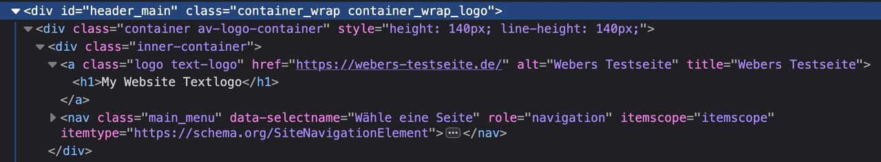 March 13, 2025 at 11:23 am #1479227
Topic: Footer and Menu area issues
in forum EnfoldM-Graphics24
ParticipantHi, please can you assist with the following:-
1. My footer and menu text have suddenly become bold – I don’t want any of the menu or footer text bold.
2. Also how do I get the footer columns to be an equal distance from each other or more balanced.
3. I have added custom CSS in general styling to increase the small menu bar at the top and to increase the WhatsApp contact number
, and it worked beautifully on both laptop and mobile but then reverted to small on laptop and larger screens only. The mobile still looks perfect. Please check why this has happened.I added this CSS:
#header_meta {
min-height: 60px;
}#header_meta .phone-info {
line-height: 60px;
font-size: 18px;
}4. Please assist with the font colors on contact form 7 – it is driving me crazy, nothing suggested online works
PS: I have another thread asking for assistance with the buttons over images that I have set to be centred. They are showing centred on the larger screens but not on mobile.
Please can you assist urgently with this.
Thank you
March 12, 2025 at 2:48 pm #1479161In reply to: Google font error
What is the benefit of a variable font ( besides very special settings ) : https://fonts.google.com/knowledge/introducing_type/introducing_variable_fonts
but you see on the file-size column that if you really need all font-weights the varible font is less file-size than all the static font-files together.
March 12, 2025 at 6:34 am #1479127In reply to: Help with some shop elements
Hi,
Try to add this code in the functions.php file to add a custom sales badge above the product image.
add_filter('woocommerce_sale_flash', 'avf_woocommerce_sale_badge', 10, 3);
function avf_woocommerce_sale_badge($badge, $post, $product) {
    if ($product->is_on_sale()) {
        return '<span class="av-custom-sale-badge">Sale!</span>';
    }
    return $badge;
}
Then apply this css code:
.av-custom-sale-badge {
    position: absolute;
    top: 10px;
    left: 10px;
    background: #7E9A47;
    color: white;
    padding: 5px 10px;
    font-size: 14px;
    font-weight: bold;
    border-radius: 5px;
    z-index: 10;
}
Best regards,
IsmaelMarch 11, 2025 at 4:26 am #1479054In reply to: Header structure
Hi,
Thank you for the info.
In the style.css file, you have the following css rules that target specific widgets using #custom_html-2 or #custom_html-3. These rules don’t apply to the EN version because the widget there has a different ID, #custom_html-4.
body #header_main #custom_html-2 .col.btn a, body #header_main #custom_html-3 .col.btn a {
    display: block;
    background-image: linear-gradient(#d9c596, #b39b60);
    padding: 0 25px 0 25px;
    color: #050607;
    font-size: 14px;
    font-weight: 700;
    border-radius: 25px;
    max-height: 40px;
    line-height: 40px;
    text-transform: uppercase;
    margin-top: 5px;
}
Please update the css to include the widgets in the EN version.
Best regards,
IsmaelMarch 10, 2025 at 6:12 pm #1479040In reply to: Pill Tab Section not working as expected
Hi,
1. Try this CSS and change the values to your liking:
.avia_transform .av-active-tab-title .av-tab-arrow-container span {
  top: -5px;
}

.av-tab-arrow-container {
  height: 21px;
}
2. Try this CSS:
.CF-av-pill-tabs .av-active-tab-title {
  background: red;
}
3. Try setting the width to 100%:
.CF-av-pill-tabs .av-inner-tab-title {
  color: #FFFFFF;
  font-family: 'roboto';
  font-weight: 500;
  font-size: 36px !important;
  width: 80%;
  text-align: left;
  margin-left: 5% !important;
  margin-bottom: 0px !important;
  padding: 10px 0px 0px 0px !important;
}
Best regards,
RikardMarch 5, 2025 at 5:48 pm #1478689In reply to: Enfold 7.0
<?php /*.. Plugin Name: Abstrakt Enfold Extensions Plugin URI: https://abstraktmg.com Description: Plugin for Abstrakt Marketing Group Designers Only Author: Nathaniel Riggins Author URI: https://abstraktmg.com Version: 2.0.5 License: Private */ if ( !defined('ABSPATH') ) { die('-1'); } if (!class_exists('AbstraktEnfoldExtensions')) { class AbstraktEnfoldExtensions { public string $plugin; private array $elements = array( 'accordion', 'aces', 'badges', 'billboard', 'bulletin', 'button', 'cards', 'carousel', 'crawl', 'cube', 'deck', 'fashion', 'glow', 'hero', 'marquee', 'material', 'panorama', 'paper', 'pricing', 'rotators', 'tabs', 'testimonials', 'triple', 'versa', 'wall', 'waves', ); private array $deletes = array( 'animate', 'blocks', 'intros', 'navi', 'neon', 'podcasts', 'posters', 'sticky', 'text', 'traveler', ); // Class construct function __construct() { $this->plugin = plugin_basename(__FILE__); add_action('wp_enqueue_scripts', array($this, 'load_scripts')); add_action('admin_enqueue_scripts', array($this, 'load_admin_scripts')); add_action('init', array($this, 'includeClasses')); add_action('avia_builder_mode', array($this, 'builder_set_debug')); add_action('admin_menu', array($this, 'amg_enfold_admin_menu')); add_action('admin_init', array($this, 'amg_enfold_admin_settings_init')); add_action('wp_footer', array($this, 'amg_enfold_popup')); add_action( 'init', array($this, 'add_all_image_sizes')); } function add_all_image_sizes() :void { ///// AUTO SIZES /// add_image_size( 'amg-auto-300', 300); add_image_size( 'amg-auto-500', 500); add_image_size( 'amg-auto-750', 750); add_image_size( 'amg-auto-1000', 1000); add_image_size( 'amg-auto-1250', 1250); add_image_size( 'amg-auto-1500', 1500); add_image_size( 'amg-auto-2000', 2000); add_image_size( 'amg-portrait-300', 300, 400, true ); add_image_size( 'amg-portrait-450', 450, 600, true ); add_image_size( 'amg-portrait-600', 600, 800, true ); add_image_size( 'amg-portrait-750', 750, 1000, true ); add_image_size( 'amg-landscape-320', 320, 180, true ); add_image_size( 'amg-landscape-480', 480, 270, true ); add_image_size( 'amg-landscape-720', 720, 405, true ); add_image_size( 'amg-landscape-960', 960, 540, true ); add_image_size( 'amg-landscape-1440', 1440, 810, true ); add_image_size( 'amg-landscape-1920', 1920, 1080, true ); } function builder_set_debug() { return "debug"; } public static function get_image_sizes() : array { return array( __( 'None', 'avia_framework' ) => '', __( 'Auto 300w', 'avia_framework' ) => 'amg-auto-300', __( 'Auto 500w', 'avia_framework' ) => 'amg-auto-500', __( 'Auto 750w', 'avia_framework' ) => 'amg-auto-750', __( 'Auto 1000w', 'avia_framework' ) => 'amg-auto-1000', __( 'Auto 1250w', 'avia_framework' ) => 'amg-auto-1250', __( 'Auto 1500w', 'avia_framework' ) => 'amg-auto-1500', __( 'Auto 2000w', 'avia_framework' ) => 'amg-auto-2000', __( 'Portrait 300w', 'avia_framework' ) => 'amg-portrait-300', __( 'Portrait 450w', 'avia_framework' ) => 'amg-portrait-450', __( 'Portrait 600w', 'avia_framework' ) => 'amg-portrait-600', __( 'Portrait 750w', 'avia_framework' ) => 'amg-portrait-750', __( 'Landscape 320w', 'avia_framework' ) => 'amg-landscape-320', __( 'Landscape 480w', 'avia_framework' ) => 'amg-landscape-480', __( 'Landscape 720w', 'avia_framework' ) => 'amg-landscape-720', __( 'Landscape 960w', 'avia_framework' ) => 'amg-landscape-960', __( 'Landscape 1440w', 'avia_framework' ) => 'amg-landscape-1440', __( 'Landscape 1920w', 'avia_framework' ) => 'amg-landscape-1920', ); } public static function get_plugin_version():string { $data = get_plugin_data(__FILE__); return $data['Version']; } public static function developMode():bool { return get_option('amg_enfold_developer_mode') == 'yes'; } public function includeClasses():void { $count = count($this->elements); for ($i = 0; $i < $count; $i++) { if (get_option("amg_enfold_extensions_{$this->elements[$i]}_active") == 'yes') { include plugin_dir_path( __FILE__ ) . "/enfold/{$this->elements[$i]}/{$this->elements[$i]}.php"; } } } public function load_admin_scripts():void { $ver = AbstraktEnfoldExtensions::get_plugin_version(); $developMode = AbstraktEnfoldExtensions::developMode(); $lastmodtime = $developMode ? rand(1, 999999999) : $ver; wp_enqueue_style('amg-admin-enfold', plugin_dir_url(__FILE__) . 'css/style.min.css', false, $lastmodtime); wp_enqueue_script('amg-admin-enfold-fontawesome', 'https://kit.fontawesome.com/ececabbde4.js', false, $lastmodtime); } public function load_scripts():void { $ver = AbstraktEnfoldExtensions::get_plugin_version(); $developMode = AbstraktEnfoldExtensions::developMode(); $lastmodtime = $developMode ? rand(1, 999999999) : $ver; wp_enqueue_style('amg-enfold-icons', plugin_dir_url(__FILE__) . 'css/uicons.min.css', array('avia-layout'), $lastmodtime); wp_enqueue_style( 'amg-css-animate', plugin_dir_url(__FILE__) . "css/animateCSS.min.css", array( 'avia-layout' ) ); wp_enqueue_style('amg-enfold', plugin_dir_url(__FILE__) . 'css/style.min.css', array('avia-layout'), $lastmodtime); wp_enqueue_style('amg-swiper', plugin_dir_url(__FILE__) . 'css/swiper.css', array('avia-layout'), $lastmodtime); wp_enqueue_script( 'amg-gsap', plugin_dir_url(__FILE__) . "js/gsap.min.js", array( 'amg-swiper' ), $lastmodtime, true ); wp_enqueue_script( 'amg-enfold', plugin_dir_url(__FILE__) . "js/script.min.js", array(), $lastmodtime ); wp_enqueue_script( 'amg-swiper', plugin_dir_url(__FILE__) . "js/swiper.js", array(), $lastmodtime ); } public static function get_duration_times():array { return array( __( 'None', 'avia_framework' ) => '', __( '0.1s', 'avia_framework' ) => 's100', __( '0.2s', 'avia_framework' ) => 's200', __( '0.3s', 'avia_framework' ) => 's300', __( '0.4s', 'avia_framework' ) => 's400', __( '0.5s', 'avia_framework' ) => 's500', __( '0.6s', 'avia_framework' ) => 's600', __( '0.7s', 'avia_framework' ) => 's700', __( '0.8s', 'avia_framework' ) => 's800', __( '0.9s', 'avia_framework' ) => 's900', __( '1s', 'avia_framework' ) => 's1000', __( '1.1s', 'avia_framework' ) => 's1100', __( '1.2s', 'avia_framework' ) => 's1200', __( '1.3s', 'avia_framework' ) => 's1300', __( '1.4s', 'avia_framework' ) => 's1400', __( '1.5s', 'avia_framework' ) => 's1500', __( '1.6s', 'avia_framework' ) => 's1600', __( '1.7s', 'avia_framework' ) => 's1700', __( '1.8s', 'avia_framework' ) => 's1800', __( '1.9s', 'avia_framework' ) => 's1900', __( '2s', 'avia_framework' ) => 's2000', __( '2.1s', 'avia_framework' ) => 's2100', __( '2.2s', 'avia_framework' ) => 's2200', __( '2.3s', 'avia_framework' ) => 's2300', __( '2.4s', 'avia_framework' ) => 's2400', __( '2.5s', 'avia_framework' ) => 's2500', __( '2.6s', 'avia_framework' ) => 's2600', __( '2.7s', 'avia_framework' ) => 's2700', __( '2.8s', 'avia_framework' ) => 's2800', __( '2.9s', 'avia_framework' ) => 's2900', __( '3s', 'avia_framework' ) => 's3000', ); } public static function get_delay_times():array { return array( __( 'None', 'avia_framework' ) => '', __( '0.1s', 'avia_framework' ) => 'd100', __( '0.2s', 'avia_framework' ) => 'd200', __( '0.3s', 'avia_framework' ) => 'd300', __( '0.4s', 'avia_framework' ) => 'd400', __( '0.5s', 'avia_framework' ) => 'd500', __( '0.6s', 'avia_framework' ) => 'd600', __( '0.7s', 'avia_framework' ) => 'd700', __( '0.8s', 'avia_framework' ) => 'd800', __( '0.9s', 'avia_framework' ) => 'd900', __( '1s', 'avia_framework' ) => 'd1000', __( '1.1s', 'avia_framework' ) => 'd1100', __( '1.2s', 'avia_framework' ) => 'd1200', __( '1.3s', 'avia_framework' ) => 'd1300', __( '1.4s', 'avia_framework' ) => 'd1400', __( '1.5s', 'avia_framework' ) => 'd1500', __( '1.6s', 'avia_framework' ) => 'd1600', __( '1.7s', 'avia_framework' ) => 'd1700', __( '1.8s', 'avia_framework' ) => 'd1800', __( '1.9s', 'avia_framework' ) => 'd1900', __( '2s', 'avia_framework' ) => 'd2000', __( '2.1s', 'avia_framework' ) => 'd2100', __( '2.2s', 'avia_framework' ) => 'd2200', __( '2.3s', 'avia_framework' ) => 'd2300', __( '2.4s', 'avia_framework' ) => 'd2400', __( '2.5s', 'avia_framework' ) => 'd2500', __( '2.6s', 'avia_framework' ) => 'd2600', __( '2.7s', 'avia_framework' ) => 'd2700', __( '2.8s', 'avia_framework' ) => 'd2800', __( '2.9s', 'avia_framework' ) => 'd2900', __( '3s', 'avia_framework' ) => 'd3000', ); } public static function get_slider_speeds():array { return array( __( '3s', 'avia_framework' ) => '3000', __( '4s', 'avia_framework' ) => '4000', __( '5s', 'avia_framework' ) => '5000', __( '6s', 'avia_framework' ) => '6000', __( '7s', 'avia_framework' ) => '7000', __( '8s', 'avia_framework' ) => '8000', __( '9s', 'avia_framework' ) => '9000', __( '10s', 'avia_framework' ) => '10000', __( '11s', 'avia_framework' ) => '11000', __( '12s', 'avia_framework' ) => '12000', __( '13s', 'avia_framework' ) => '13000', __( '14s', 'avia_framework' ) => '14000', __( '15s', 'avia_framework' ) => '15000', ); } public static function get_intro_animations():array { return array( array( __( 'None', 'avia_framework' ) => '', __( 'animate__bounce', 'avia_framework' ) => 'animate__animated animate__bounce', __( 'animate__flash', 'avia_framework' ) => 'animate__animated animate__flash', __( 'Back in down', 'avia_framework' ) => 'animate__animated animate__backInDown', __( 'Back in left', 'avia_framework' ) => 'animate__animated animate__backInLeft', __( 'Back in right', 'avia_framework' ) => 'animate__animated animate__backInRight', __( 'Back in up', 'avia_framework' ) => 'animate__animated animate__backInUp', __( 'Bounce in', 'avia_framework' ) => 'animate__animated animate__bounceIn', __( 'Bounce in down', 'avia_framework' ) => 'animate__animated animate__bounceInDown', __( 'Bounce in left', 'avia_framework' ) => 'animate__animated animate__bounceInLeft', __( 'Bounce in right', 'avia_framework' ) => 'animate__animated animate__bounceInRight', __( 'Bounce in up', 'avia_framework' ) => 'animate__animated animate__bounceInUp', __( 'Fade in', 'avia_framework' ) => 'animate__animated animate__fadeIn', __( 'Fade in bottom left', 'avia_framework' ) => 'animate__animated animate__fadeInBottomLeft', __( 'Fade in bottom right', 'avia_framework' ) => 'animate__animated animate__fadeInBottomRight', __( 'Fade in down', 'avia_framework' ) => 'animate__animated animate__fadeInDown', __( 'Fade down big', 'avia_framework' ) => 'animate__animated animate__fadeInDownBig', __( 'Fade in left', 'avia_framework' ) => 'animate__animated animate__fadeInLeft', __( 'Fade in left big', 'avia_framework' ) => 'animate__animated animate__fadeInLeftBig', __( 'Fade in right', 'avia_framework' ) => 'animate__animated animate__fadeInRight', __( 'Fade in right big', 'avia_framework' ) => 'animate__animated animate__fadeInRightBig', __( 'Fade in up', 'avia_framework' ) => 'animate__animated animate__fadeInUp', __( 'Fade in up big', 'avia_framework' ) => 'animate__animated animate__fadeInUpBig', __( 'Fade in top left', 'avia_framework' ) => 'animate__animated animate__fadeInTopLeft', __( 'Fade in top right', 'avia_framework' ) => 'animate__animated animate__fadeInTopRight', __( 'Flip', 'avia_framework' ) => 'animate__animated animate__flip', __( 'Flip X', 'avia_framework' ) => 'animate__animated animate__flipInX', __( 'Flip Y', 'avia_framework' ) => 'animate__animated animate__flipInY', __( 'Head Shake', 'avia_framework' ) => 'animate__animated animate__headShake', __( 'Heartbeat', 'avia_framework' ) => 'animate__animated animate__heartBeat', __( 'Hinge', 'avia_framework' ) => 'animate__animated animate__hinge', __( 'Jack In The Box', 'avia_framework' ) => 'animate__animated animate__jackInTheBox', __( 'Jello', 'avia_framework' ) => 'animate__animated animate__jello', __( 'Lightspeed in left', 'avia_framework' ) => 'animate__animated animate__lightSpeedInLeft', __( 'Lightspeed in right', 'avia_framework' ) => 'animate__animated animate__lightSpeedInRight', __( 'Mask', 'avia_framework' ) => 'animate__animated animate__pulse', __( 'Roll in', 'avia_framework' ) => 'animate__animated animate__rollIn', __( 'Rotate in', 'avia_framework' ) => 'animate__animated animate__rotateIn', __( 'Rotate down left', 'avia_framework' ) => 'animate__animated animate__rotateInDownLeft', __( 'Rotate in down right', 'avia_framework' ) => 'animate__animated animate__rotateInDownRight', __( 'Rotate in up left', 'avia_framework' ) => 'animate__animated animate__rotateInUpLeft', __( 'Rotate in up right', 'avia_framework' ) => 'animate__animated animate__rotateInUpRight', __( 'Rubber Band', 'avia_framework' ) => 'animate__animated animate__rubberBand', __( 'Shake X', 'avia_framework' ) => 'animate__animated animate__shakeX', __( 'Shake Y', 'avia_framework' ) => 'animate__animated animate__shakeY', __( 'Slide in', 'avia_framework' ) => 'animate__animated animate__slideInDown', __( 'Slide in left', 'avia_framework' ) => 'animate__animated animate__slideInLeft', __( 'Slide in right', 'avia_framework' ) => 'animate__animated animate__slideInRight', __( 'Slide in up', 'avia_framework' ) => 'animate__animated animate__slideInUp', __( 'Swing', 'avia_framework' ) => 'animate__animated animate__swing', __( 'Tada', 'avia_framework' ) => 'animate__animated animate__tada', __( 'Wobble', 'avia_framework' ) => 'animate__animated animate__wobble', __( 'Zoom in', 'avia_framework' ) => 'animate__animated animate__zoomIn', __( 'Zoom in down', 'avia_framework' ) => 'animate__animated animate__zoomInDown', __( 'Zoom in left', 'avia_framework' ) => 'animate__animated animate__zoomInLeft', __( 'Zoom in right', 'avia_framework' ) => 'animate__animated animate__zoomInRight', __( 'Zoom in up', 'avia_framework' ) => 'animate__animated animate__zoomInUp', ) ); } public static function get_button_links($type):array { $data = match ($type) { 'page' => get_pages(), default => get_posts(), }; $links = array(); foreach ($data as $link) { $links[__( $link->post_title, 'avia_framework' )] = $link->post_name; } return $links; } public static function get_full_percentage():array { $i = 1; $nums = array(); while ($i < 101) { $k = $i . '%'; $nums[$k] = $i . '%'; $i++; } return $nums; } public static function get_full_360():array { $i = 1; $nums = array(); while ($i < 361) { $k = $i; $nums[$k] = $i; $i++; } return $nums; } public static function create_button_link($atts, $b = 'button'):string { $link = ''; if (isset($atts[$b]) && $atts[$b] == 'yes') { switch ($atts[$b . '_link_type']) { case 'page': $link = home_url() . '/' . $atts[$b . '_page_link']; break; case 'post': $link .= home_url() . '/' . $atts[$b . '_post_link']; break; case 'custom': $link .= $atts[$b . '_custom_link']; break; default: } } return $link; } public static function get_seconds():array { return array( '1s' => '1s', '2s' => '2s', '3s' => '3s', '4s' => '4s', '5s' => '5s', '6s' => '6s', '7s' => '7s', '8s' => '8s', '9s' => '9s', '10s' => '10s', '11s' => '11s', '12s' => '12s', '13s' => '13s', '14s' => '14s', '15s' => '15s', '16s' => '16s', '17s' => '17s', '18s' => '18s', '19s' => '19s', '20s' => '20s', ); } public static function select_button_style():array { $arr = array ( __( 'Animated Gradient', 'avia_framework' ) => 'amg_1', __( 'Candied Colored 1', 'avia_framework' ) => 'amg_2', __( 'Candied Colored 2', 'avia_framework' ) => 'amg_3', __( 'Candied Colored 3', 'avia_framework' ) => 'amg_4', __( 'Candied Colored 4', 'avia_framework' ) => 'amg_5', __( 'Candied Colored 5', 'avia_framework' ) => 'amg_6', __( 'Candied Colored 6', 'avia_framework' ) => 'amg_7', __( 'Candied Colored 7', 'avia_framework' ) => 'amg_8', __( 'Candied Colored 8', 'avia_framework' ) => 'amg_9', __( 'Candied Colored 9', 'avia_framework' ) => 'amg_10', __( 'Candied Colored 10', 'avia_framework' ) => 'amg_11', __( 'Candied Colored 11', 'avia_framework' ) => 'amg_12', __( 'Candied Colored 12', 'avia_framework' ) => 'amg_13', __( 'Candied Colored 13', 'avia_framework' ) => 'amg_14', __( 'Candied Colored 14', 'avia_framework' ) => 'amg_15', __( 'Candied Colored 15', 'avia_framework' ) => 'amg_16', __( 'Candied Colored 16', 'avia_framework' ) => 'amg_17', __( 'Coin', 'avia_framework' ) => 'amg_18', __( 'Cold Light', 'avia_framework' ) => 'amg_19', __( 'Flip Box', 'avia_framework' ) => 'amg_20', __( 'Gradient', 'avia_framework' ) => 'amg_21', __( 'Gradient Glow', 'avia_framework' ) => 'amg_22', __( 'Gradient Hole', 'avia_framework' ) => 'amg_61', __( 'Hover 1', 'avia_framework' ) => 'amg_23', __( 'Hover 2', 'avia_framework' ) => 'amg_24', __( 'Hover 3', 'avia_framework' ) => 'amg_25', __( 'Hover 4', 'avia_framework' ) => 'amg_26', __( 'Label Slice', 'avia_framework' ) => 'amg_27', __( 'Liquid', 'avia_framework' ) => 'amg_28', __( 'Menu', 'avia_framework' ) => 'amg_29', __( 'Modern 1', 'avia_framework' ) => 'amg_30', __( 'Modern 2', 'avia_framework' ) => 'amg_31', __( 'Modern 3', 'avia_framework' ) => 'amg_32', __( 'Modern 4', 'avia_framework' ) => 'amg_33', __( 'Modern 5', 'avia_framework' ) => 'amg_34', __( 'Modern 6', 'avia_framework' ) => 'amg_35', __( 'Modern 7', 'avia_framework' ) => 'amg_36', __( 'Modern 8', 'avia_framework' ) => 'amg_37', __( 'Modern 9', 'avia_framework' ) => 'amg_38', __( 'Modern 10', 'avia_framework' ) => 'amg_39', __( 'Modern 11', 'avia_framework' ) => 'amg_40', __( 'Modern 12', 'avia_framework' ) => 'amg_41', __( 'Modern 13', 'avia_framework' ) => 'amg_42', __( 'Modern 14', 'avia_framework' ) => 'amg_43', __( 'Modern 15', 'avia_framework' ) => 'amg_44', __( 'Modern 16', 'avia_framework' ) => 'amg_45', __( 'Modern 17', 'avia_framework' ) => 'amg_46', __( 'Modern 18', 'avia_framework' ) => 'amg_47', __( 'Modern 19', 'avia_framework' ) => 'amg_48', __( 'Modern 20', 'avia_framework' ) => 'amg_49', __( 'Modern 21', 'avia_framework' ) => 'amg_50', __( 'Modern 22', 'avia_framework' ) => 'amg_51', __( 'Modern 23', 'avia_framework' ) => 'amg_52', __( 'Modern 24', 'avia_framework' ) => 'amg_53', __( 'Modern 25', 'avia_framework' ) => 'amg_54', __( 'Modern 26', 'avia_framework' ) => 'amg_55', __( 'Modern 27', 'avia_framework' ) => 'amg_56', __( 'Modern 28', 'avia_framework' ) => 'amg_57', __( 'Plastic', 'avia_framework' ) => 'amg_58', __( 'Neon Lines', 'avia_framework' ) => 'amg_59', __( 'Pulsating', 'avia_framework' ) => 'amg_60', __( 'Hover 4', 'avia_framework' ) => 'amg_62', __( 'Snake Border 2', 'avia_framework' ) => 'amg_63', __( 'Hover 5', 'avia_framework' ) => 'amg_64', __( 'Hover 6', 'avia_framework' ) => 'amg_65', __( 'Ripple', 'avia_framework' ) => 'amg_66', __( 'Snake Border 1', 'avia_framework' ) => 'amg_67', __( 'Gradient Hover Border', 'avia_framework' ) => 'amg_68', __( 'Pulsar', 'avia_framework' ) => 'amg_69', __( 'Neon Lights', 'avia_framework' ) => 'amg_70', __( 'Blend Mode', 'avia_framework' ) => 'amg_71', __( 'Bubble Bursts', 'avia_framework' ) => 'amg_72', ); ksort($arr, SORT_NATURAL); return $arr; } function amg_enfold_admin_menu() : void { add_options_page( 'AMG Enfold Extensions', 'AMG Enfold', 'manage_options', 'amg-enfold-options', array( $this, 'amg_enfold_admin_settings' ), '1' ); } function amg_enfold_admin_settings_init() : void { /// sticky banner text add_settings_section ( 'enfold_extensions_developer_section' , 'Developer' , '', 'amg-enfold-options' ); add_settings_section ( 'enfold_extensions_elements_section' , 'Active Elements' , '', 'amg-enfold-options' ); register_setting( 'amg-enfold-options', 'amg_enfold_developer_mode', array( 'type' => 'string', 'sanitize_callback' => 'sanitize_text_field', 'default' => 'no' ) ); add_settings_field( 'amg_enfold_developer_mode', 'Developer Mode On', array($this, 'amg_enfold_developer_mode_callback'), 'amg-enfold-options', 'enfold_extensions_developer_section' ); $count = count($this->elements); for ($i = 0; $i < $count; $i++) { register_setting( 'amg-enfold-options', "amg_enfold_extensions_{$this->elements[$i]}_active", array( 'type' => 'string', 'default' => '' ) ); add_settings_field( "amg_enfold_extensions_{$this->elements[$i]}_active", ucfirst($this->elements[$i]), array($this, 'amg_enfold_modules_callback'), 'amg-enfold-options', 'enfold_extensions_elements_section', $this->elements[$i] ); } $count = count($this->deletes); for ($k = 0; $i < $count; $k++) { $option = get_option("amg_enfold_extensions_{$this->deletes[$k]}_active"); if (!empty($option)) { delete_option("amg_enfold_extensions_{$this->deletes[$k]}_active"); } } } function amg_enfold_admin_settings(): void { require_once plugin_dir_path(__FILE__) . 'templates/admin_settings.php'; } public function amg_enfold_developer_mode_callback(): void { $checked = checked( 'yes', get_option( 'amg_enfold_developer_mode' ), false ); ?> <input type="checkbox" name="amg_enfold_developer_mode" value="yes" <?php echo $checked ?>/> <?php } public function amg_enfold_modules_callback($name): void { $field = "amg_enfold_extensions_{$name}_active"; $checked = checked( 'yes', get_option( $field ), false ); ?> <input type="checkbox" name="<?php echo $field ?>" value="yes" <?php echo $checked ?>/> <a title="view demo" href="<?php echo 'https://natesstg.wpenginepowered.com/' . $name . '/' ?>" target="_blank"><i class="fa-solid fa-arrow-up-right-from-square"></i></a> <?php } public static function amg_enfold_popup() : void { $html = "<div id='amg-enfold-popup' class=''>"; $html .= "<div id='amg-enfold-popup-bg'></div>"; $html .= "<div id='amg-enfold-popup-box'>"; $html .= "<div id='amg-enfold-popup-close'><i class='fi fi-br-circle-xmark'></i></div>"; $html .= "<div id='content'></div>"; $html .= "</div></div>"; echo $html; } public static function prepare_navigation(array $atts): array { $prev_button = ''; $next_button = ''; if (isset($atts['navigation']) && $atts['navigation'] == 'yes') { $prev_button = "<div class='swiper-button-prev'></div>"; $next_button = '<div class="swiper-button-next"></div>'; } if (isset($atts['pagination']) && $atts['pagination'] == 'yes') { $pagination = "<div class='swiper-pagination'></div>"; } $above = ''; $below = ''; $side = ''; if (isset($atts['navigation_position']) && $atts['navigation_position'] == 'above' && $atts['nav_layout'] == 'custom') { $above = "<div class='swiper-nav-wrapper above'>"; $above .= $prev_button; $above .= $pagination; $above .= $next_button; $above .= '</div>'; } else if (isset($atts['navigation_position']) && $atts['navigation_position'] == 'below' && $atts['nav_layout'] == 'custom') { $below = "<div class='swiper-nav-wrapper below'>"; $below .= $prev_button; $below .= $pagination; $below .= $next_button; $below .= '</div>'; } else { $below = $pagination; $side = $prev_button; $side .= $next_button; } return array($atts, $above, $below, $side); } public static function amg_enfold_section($title) : array { $c = null; $template = null; switch ($title) { case 'Button': $c = array( array( 'name' => __( 'Enable?', 'avia_framework' ), 'desc' => __( 'Choosing yes enables the button for this single element.', 'avia_framework' ), 'id' => 'button', 'type' => 'select', 'std' => 'no', 'lockable' => true, 'subtype' => array( __( 'No', 'avia_framework' ) => 'no', __( 'Yes', 'avia_framework' ) => 'yes' , ) ), array( 'name' => __( 'Button Label', 'avia_framework' ), 'desc' => __( 'This is the text that appears on your button.', 'avia_framework' ), 'id' => 'label', 'type' => 'input', 'std' => __( 'Contact Us', 'avia_framework' ), 'required' => array( 'button', 'equals', 'yes' ), 'lockable' => true ), /* array( 'name' => __( 'Show Button Icon', 'avia_framework' ), 'desc' => __( 'Should an icon be displayed at the left or right side of the button', 'avia_framework' ), 'id' => 'button_icon_select', 'type' => 'select', 'std' => 'yes', 'lockable' => true, 'required' => array( 'button', 'equals', 'yes' ), 'subtype' => array( __( 'No Icon', 'avia_framework' ) => 'no', __( 'Display icon to the left', 'avia_framework' ) => 'yes' , __( 'Display icon to the right', 'avia_framework' ) => 'yes-right-icon', ) ), array( 'name' => __( 'Button Icon', 'avia_framework' ), 'desc' => __( 'Select an icon for your Button below', 'avia_framework' ), 'id' => 'button_icon', 'type' => 'iconfont', 'std' => '', 'lockable' => true, 'locked' => array( 'button_icon', 'font' ), 'required' => array( 'button_icon_select', 'not_empty_and', 'no' ) ), array( 'name' => __( 'Icon Visibility', 'avia_framework' ), 'desc' => __( 'Check to only display icon on hover', 'avia_framework' ), 'id' => 'button_icon_hover', 'type' => 'checkbox', 'std' => '', 'lockable' => true, 'required' => array( 'button_icon_select', 'not_empty_and', 'no' ) )*/ ); break; case 'Link Settings': $template = array( array( 'type' => 'template', 'template_id' => 'linkpicker_toggle', 'name' => __( 'Button Link', 'avia_framework' ), 'desc' => __( 'Where should your button link to?', 'avia_framework' ), 'subtypes' => array( 'manually', 'single', 'taxonomy' ), 'target_id' => 'link_target', 'lockable' => true ), ); break; case 'Appearance': $c = array( array( 'name' => __( 'Button Size', 'avia_framework' ), 'desc' => __( 'Choose the size of your button here.', 'avia_framework' ), 'id' => 'size', 'type' => 'select', 'std' => 'small', 'lockable' => true, 'subtype' => array( __( 'Small', 'avia_framework' ) => 'small', __( 'Medium', 'avia_framework' ) => 'medium', __( 'Large', 'avia_framework' ) => 'large', __( 'X Large', 'avia_framework' ) => 'x-large' ) ), array( 'name' => __( 'Button Position', 'avia_framework' ), 'desc' => __( 'Choose the alignment of your button here', 'avia_framework' ), 'id' => 'position', 'type' => 'select', 'std' => 'center', 'lockable' => true, 'subtype' => array( __( 'Align Left', 'avia_framework' ) => 'left', __( 'Align Center', 'avia_framework' ) => 'center', __( 'Align Right', 'avia_framework' ) => 'right', ), 'required' => array( 'size', 'not', 'fullwidth' ) ), array( 'name' => __( 'Button Label Display', 'avia_framework' ), 'desc' => __( 'Select how to display the label', 'avia_framework' ), 'id' => 'label_display', 'type' => 'select', 'std' => '', 'lockable' => true, 'subtype' => array( __( 'Always display', 'avia_framework' ) => '', __( 'Display on hover', 'avia_framework' ) => 'av-button-label-on-hover', ) ), array( 'name' => __( 'Button Title Attribute', 'avia_framework' ), 'desc' => __( 'Add a title attribute for this button.', 'avia_framework' ), 'id' => 'title_attr', 'type' => 'input', 'std' => '', 'required' => array( 'label_display', 'equals', '' ) ), ); break; case 'Font Sizes': $c = array( array( 'name' => __( 'Button Text Font Sizes', 'avia_framework' ), 'desc' => __( 'Select a custom font size for the button text.', 'avia_framework' ), 'type' => 'template', 'template_id' => 'font_sizes_icon_switcher', 'textfield' => true, 'lockable' => true, 'subtype' => array( 'default' => AviaHtmlHelper::number_array( 10, 90, 1, array( __( 'Use Default', 'avia_framework' ) => '' ), 'px' ), 'desktop' => AviaHtmlHelper::number_array( 10, 90, 1, array( __( 'Use Default', 'avia_framework' ) => '' ), 'px' ), 'medium' => AviaHtmlHelper::number_array( 10, 90, 1, array( __( 'Use Default', 'avia_framework' ) => '', __( 'Hidden', 'avia_framework' ) => 'hidden' ), 'px' ), 'small' => AviaHtmlHelper::number_array( 10, 90, 1, array( __( 'Use Default', 'avia_framework' ) => '', __( 'Hidden', 'avia_framework' ) => 'hidden' ), 'px' ), 'mini' => AviaHtmlHelper::number_array( 10, 90, 1, array( __( 'Use Default', 'avia_framework' ) => '', __( 'Hidden', 'avia_framework' ) => 'hidden' ), 'px' ) ), 'id_sizes' => array( 'default' => 'size-text', 'desktop' => 'av-desktop-font-size-text', 'medium' => 'av-medium-font-size-text', 'small' => 'av-small-font-size-text', 'mini' => 'av-mini-font-size-text' ) ), array( 'name' => __( 'Button Icon Font Sizes', 'avia_framework' ), 'desc' => __( 'Select a custom font size for the button text.', 'avia_framework' ), 'type' => 'template', 'template_id' => 'font_sizes_icon_switcher', 'textfield' => true, 'lockable' => true, 'subtype' => array( 'default' => AviaHtmlHelper::number_array( 10, 90, 1, array( __( 'Use Default', 'avia_framework' ) => '' ), 'px' ), 'desktop' => AviaHtmlHelper::number_array( 10, 90, 1, array( __( 'Use Default', 'avia_framework' ) => '' ), 'px' ), 'medium' => AviaHtmlHelper::number_array( 10, 90, 1, array( __( 'Use Default', 'avia_framework' ) => '', __( 'Hidden', 'avia_framework' ) => 'hidden' ), 'px' ), 'small' => AviaHtmlHelper::number_array( 10, 90, 1, array( __( 'Use Default', 'avia_framework' ) => '', __( 'Hidden', 'avia_framework' ) => 'hidden' ), 'px' ), 'mini' => AviaHtmlHelper::number_array( 10, 90, 1, array( __( 'Use Default', 'avia_framework' ) => '', __( 'Hidden', 'avia_framework' ) => 'hidden' ), 'px' ) ), 'id_sizes' => array( 'default' => 'size-button-icon', 'desktop' => 'av-desktop-font-size-button-icon', 'medium' => 'av-medium-font-size-button-icon', 'small' => 'av-small-font-size-button-icon', 'mini' => 'av-mini-font-size-button-icon' ) ) ); break; case 'Button Margin And Padding': $template = array( array( 'type' => 'template', 'template_id' => 'margin_padding', 'toggle' => true, 'name' => __( 'Margin And Padding', 'avia_framework' ), 'desc' => __( 'Set a responsive margin and a padding to text for the button.', 'avia_framework' ), 'lockable' => true, ) ); break; case 'Colors': $c = array( array( 'name' => __( 'Button Colors Selection', 'avia_framework' ), 'desc' => __( "Choose the available options for button colors. Switching to advanced options for already existing buttons you need to set all options (color settings from basic options are ignored)", 'avia_framework' ), 'id' => 'color_options', 'type' => 'select', 'std' => '', 'lockable' => true, 'subtype' => array( __( 'Basic options only', 'avia_framework' ) => '', __( 'Advanced options', 'avia_framework' ) => 'color_options_advanced', ) ), array( 'type' => 'template', 'template_id' => 'named_colors', 'custom' => true, 'lockable' => true, 'required' => array( 'color_options', 'equals', '' ) ), array( 'name' => __( 'Custom Background Color', 'avia_framework' ), 'desc' => __( 'Select a custom background color for your button here', 'avia_framework' ), 'id' => 'custom_bg', 'type' => 'colorpicker', 'std' => '#444444', 'lockable' => true, 'required' => array( 'color', 'equals', 'custom' ) ), array( 'name' => __( 'Custom Font Color', 'avia_framework' ), 'desc' => __( 'Select a custom font color for your button here', 'avia_framework' ), 'id' => 'custom_font', 'type' => 'colorpicker', 'std' => '#ffffff', 'lockable' => true, 'required' => array( 'color', 'equals', 'custom') ), array( 'type' => 'template', 'template_id' => 'button_colors', 'color_id' => 'btn_color', 'custom_id' => 'btn_custom', 'lockable' => true, 'required' => array( 'color_options', 'not', '' ) ) ); break; case 'Animation': $c = array( array( 'type' => 'template', 'template_id' => 'animation', 'lockable' => true, 'std_none' => '', 'name' => __( 'Button Animation', 'avia_framework' ), 'desc' => __( 'Add a small animation to the button when the user first scrolls to the button position. This is only to add some "spice" to the site and only works in modern browsers and only on desktop computers to keep page rendering as fast as possible.', 'avia_framework' ), 'groups' => array( 'fade', 'slide', 'rotate', 'fade-adv', 'special' ) ) ); break; case 'Content': $c = array( array( 'name' => __( 'Content Display', 'avia_framework' ), 'desc' => __( 'Choose to display the content in a popup or below the slides.', 'avia_framework' ), 'id' => 'content_layout', 'type' => 'select', 'std' => '', 'lockable' => true, 'subtype' => array( __( 'No Display', 'avia_framework' ) => '', __( 'Display content in popup', 'avia_framework' ) => 'popup', __( 'Display content below slides', 'avia_framework' ) => 'inline' ), ), array( 'name' => __( 'Max Width', 'avia_framework' ), 'desc' => __( 'This is the width of your content box.', 'avia_framework' ), 'id' => 'popup_max_width', 'type' => 'input', 'std' => '750px', 'lockable' => true, 'required' => array( 'content_layout', 'not', '' ), 'container_class' => 'av_third av_third_first' ), array( 'name' => __( 'Min Height', 'avia_framework' ), 'desc' => __( 'This is the min-height of your content box.', 'avia_framework' ), 'id' => 'popup_min_height', 'type' => 'input', 'std' => '320px', 'lockable' => true, 'required' => array( 'content_layout', 'not', '' ), 'container_class' => 'av_third' ), array( 'name' => __( 'Text Align', 'avia_framework' ), 'desc' => __( 'Figure it out.', 'avia_framework' ), 'id' => 'popup_text_align', 'type' => 'select', 'std' => 'center', 'lockable' => true, 'required' => array( 'content_layout', 'not', '' ), 'container_class' => 'av_third', 'subtype' => array( __( 'Left', 'avia_framework' ) => 'left', __( 'Center', 'avia_framework' ) => 'center', __( 'Right', 'avia_framework' ) => 'right' ), ), array( 'name' => __( 'Container BG Color', 'avia_framework' ), 'desc' => __( 'This is the background of the content box', 'avia_framework' ), 'id' => 'popup_background_color', 'type' => 'colorpicker', 'std' => '', 'rgba' => true, 'lockable' => true, 'required' => array( 'content_layout', 'equals', 'popup' ), 'container_class' => 'av_half av_half_first' ), array( 'name' => __( 'Background BG Color', 'avia_framework' ), 'desc' => __( 'This is the full page background when the popup is visible.', 'avia_framework' ), 'id' => 'popup_bg_color', 'type' => 'colorpicker', 'std' => '', 'rgba' => true, 'lockable' => true, 'required' => array( 'content_layout', 'equals', 'popup' ), 'container_class' => 'av_half' ), array( 'name' => __( 'Border Radius', 'avia_framework' ), 'desc' => __( 'Set the border radius of the content box.', 'avia_framework' ), 'id' => 'popup_border_radius', 'type' => 'multi_input', 'sync' => true, 'std' => '24px', 'lockable' => true, 'required' => array( 'content_layout', 'not', '' ), 'multi' => array( 'top' => __( 'Top-Left-Radius', 'avia_framework' ), 'right' => __( 'Top-Right-Radius', 'avia_framework' ), 'bottom' => __( 'Bottom-Right-Radius', 'avia_framework' ), 'left' => __( 'Bottom-Left-Radius', 'avia_framework' ) ), ), array( 'type' => 'template', 'template_id' => 'box_shadow', 'id' => 'popup_box_shadow', 'names' => array( __( 'Box Shadow', 'avia_framework' ), __( 'Box Shadow Styling ', 'avia_framework' ), __( 'Box Shadow Color', 'avia_framework' ) ), 'default_check' => true, 'lockable' => true, 'required' => array( 'content_layout', 'not', '' ) ) ); break; case 'Navigation': $c = array( array( 'name' => __( 'Navigation Layout', 'avia_framework' ), 'desc' => __( 'Either use the widget default colors or apply some custom ones', 'avia_framework' ), 'id' => 'nav_layout', 'type' => 'select', 'std' => '', 'lockable' => true, 'subtype' => array( __( 'Default', 'avia_framework' ) => '', __( 'Define Custom layout', 'avia_framework' ) => 'custom' ), ), array( 'name' => __( 'Vertical Position', 'avia_framework' ), 'desc' => __( 'Define the vertical position of the navigation controls', 'avia_framework' ), 'id' => 'navigation_position', 'type' => 'select', 'std' => '', 'lockable' => true, 'required' => array( 'nav_layout', 'equals', 'custom' ), 'subtype' => array( __( 'Default', 'avia_framework' ) => '', __( 'Above', 'avia_framework' ) => 'above', __( 'Below', 'avia_framework' ) => 'below', ) ), array( 'name' => __( 'Controls Max Width', 'avia_framework' ), 'desc' => __( 'Enter the max width of the navigation controls', 'avia_framework' ), 'id' => 'nav_max_width', 'type' => 'input', 'std' => '100%', 'lockable' => true, 'required' => array( 'navigation_position', 'not', ''), ), array( 'name' => __( 'Horizontal Alignment', 'avia_framework' ), 'desc' => __( 'This only works if navigation controls are not 100% max width', 'avia_framework' ), 'id' => 'navigation_alignment', 'type' => 'select', 'std' => 'center', 'lockable' => true, 'required' => array( 'navigation_position', 'not', ''), 'subtype' => array( __( 'Left', 'avia_framework' ) => 'left', __( 'Center', 'avia_framework' ) => 'center', __( 'Right', 'avia_framework' ) => 'right', ) ), array( 'name' => __( 'Horizontal Offset', 'avia_framework' ), 'desc' => __( 'Enter a CSS value (50px) to push the controls towards center', 'avia_framework' ), 'id' => 'nav_offset', 'type' => 'input', 'std' => '0', 'lockable' => true, 'required' => array( 'navigation_alignment', 'not', 'center'), ), array( 'name' => __( 'Button Width', 'avia_framework' ), 'desc' => __( 'Button width in a CSS value', 'avia_framework' ), 'id' => 'nav_width', 'type' => 'input', 'std' => '50px', 'lockable' => true, 'required' => array( 'nav_layout', 'equals', 'custom' ), 'container_class' => 'av_half av_half_first' ), array( 'name' => __( 'Button Height', 'avia_framework' ), 'desc' => __( 'Button height in a CSS value', 'avia_framework' ), 'id' => 'nav_height', 'type' => 'input', 'std' => '50px', 'lockable' => true, 'required' => array( 'nav_layout', 'equals', 'custom' ), 'container_class' => 'av_half' ), array( 'name' => __( 'Button Border Radius', 'avia_framework' ), 'desc' => __( 'Set the border radius of the button', 'avia_framework' ), 'id' => 'nav_radius', 'type' => 'multi_input', 'sync' => true, 'std' => '50%', 'lockable' => true, 'required' => array( 'nav_layout', 'equals', 'custom' ), 'multi' => array( 'top' => __( 'Top-Left-Radius', 'avia_framework' ), 'right' => __( 'Top-Right-Radius', 'avia_framework' ), 'bottom' => __( 'Bottom-Right-Radius', 'avia_framework' ), 'left' => __( 'Bottom-Left-Radius', 'avia_framework' ) ), ), ); break; case 'Image': $c = array( array( 'name' => __( 'Image Size and Orientation', 'avia_framework' ), 'desc' => __( 'Either use the widget default colors or apply some custom ones', 'avia_framework' ), 'id' => 'orientation_and_size', 'type' => 'select', 'std' => '', 'lockable' => true, 'subtype' => AbstraktEnfoldExtensions::get_image_sizes(), ), array( 'name' => __( 'Image Aspect Ratio', 'avia_framework' ), 'desc' => __( 'Enter the CSS value as a fraction, ie 16/9', 'avia_framework' ), 'id' => 'aspect_ratio', 'type' => 'input', 'std' => '', 'lockable' => true, 'required' => array( 'orientation_and_size', 'not', '' ), 'container_class' => 'av_third av_third_first' ), array( 'name' => __( 'Image Object Fit', 'avia_framework' ), 'desc' => __( 'Select one of the CSS values or choose none.', 'avia_framework' ), 'id' => 'object_fit', 'type' => 'select', 'std' => 'cover', 'lockable' => true, 'required' => array( 'orientation_and_size', 'not', '' ), 'container_class' => 'av_third', 'subtype' => array( __( 'None', 'avia_framework' ) => 'none', __( 'Fill', 'avia_framework' ) => 'fill', __( 'Contain', 'avia_framework' ) => 'contain', __( 'Cover', 'avia_framework' ) => 'cover', __( 'Scale Down', 'avia_framework' ) => 'scale-down' ), ), array( 'name' => __( 'Image Object Position', 'avia_framework' ), 'desc' => __( 'Enter a css value ie 50% 50% or left top', 'avia_framework' ), 'id' => 'object_position', 'type' => 'input', 'std' => 'center center', 'lockable' => true, 'required' => array( 'orientation_and_size', 'not', '' ), 'container_class' => 'av_third', ), ); break; case 'Container': $c = array( array( 'name' => __( 'Slides Layout', 'avia_framework' ), 'desc' => __( 'Either use the widget default colors or apply some custom ones', 'avia_framework' ), 'id' => 'slides_layout', 'type' => 'select', 'std' => '', 'lockable' => true, 'subtype' => array( __( 'Default', 'avia_framework' ) => '', __( 'Define Custom layout', 'avia_framework' ) => 'custom' ), ), array( 'name' => __( 'Badge Max Width', 'avia_framework' ), 'desc' => __( 'Enter the badges title here (Better keep it short)', 'avia_framework' ), 'id' => 'max_width', 'type' => 'input', 'std' => '250px', 'lockable' => true, 'required' => array( 'slides_layout', 'equals', 'custom' ), 'container_class' => 'av_half av_half_first' ), array( 'name' => __( 'Badge Min Height', 'avia_framework' ), 'desc' => __( 'Enter the badges title here (Better keep it short)', 'avia_framework' ), 'id' => 'min_height', 'type' => 'input', 'std' => '400px', 'lockable' => true, 'required' => array( 'slides_layout', 'equals', 'custom' ), 'container_class' => 'av_half' ), array( 'name' => __( 'Badge Border Radius', 'avia_framework' ), 'desc' => __( 'Set the border radius of the column', 'avia_framework' ), 'id' => 'border_radius', 'type' => 'multi_input', 'sync' => true, 'std' => '', 'lockable' => true, 'required' => array( 'slides_layout', 'equals', 'custom' ), 'multi' => array( 'top' => __( 'Top-Left-Radius', 'avia_framework' ), 'right' => __( 'Top-Right-Radius', 'avia_framework' ), 'bottom' => __( 'Bottom-Right-Radius', 'avia_framework' ), 'left' => __( 'Bottom-Left-Radius', 'avia_framework' ) ), ), ); break; } if (!is_array($template)) { $template = array( array( 'type' => 'template', 'template_id' => 'toggle', 'title' => __( $title, 'avia_framework' ), 'content' => $c ), ); } return $template; } public static function amg_enfold_inline($atts) : string { $output = ''; if ($atts['content_layout'] == 'inline') { $output .= "<div id='amg-enfold-inline'>"; $output .= "<div id='amg-enfold-inline-box'>"; $output .= "<div id='content'></div>"; $output .= "</div>"; $output .= "</div>"; } return $output; } public static function amg_button_append_selectors($selectors, $element_id) : array { $selectors['wrap'] = "#top #wrap_all .accordionContainer.{$element_id} .c-accordion .c-accordion__item .avia-button-wrap.button-wrap"; $selectors['wrap-animation'] = "#top #wrap_all .accordionContainer.{$element_id} .c-accordion .c-accordion__item .avia_transform .avia-button-wrap.button-wrap"; $selectors['button_container'] = "#top #wrap_all .accordionContainer.{$element_id} .c-accordion .c-accordion__item .avia-button"; $selectors['container-hover'] = "#top #wrap_all .accordionContainer.{$element_id} .c-accordion .c-accordion__item .avia-button:hover"; $selectors['container-hover-overlay'] = "#top #wrap_all .accordionContainer.{$element_id} .c-accordion .c-accordion__item .avia-button:hover .avia_button_background"; $selectors['container-after'] = "#top #wrap_all .accordionContainer.{$element_id} .c-accordion .c-accordion__item .avia-button.avia-sonar-shadow:after"; $selectors['container-after-hover'] = "#top #wrap_all .accordionContainer.{$element_id} .c-accordion .c-accordion__item .avia-button.avia-sonar-shadow:hover:after"; $selectors['curtain'] = "#top #wrap_all .accordionContainer.{$element_id} .c-accordion .c-accordion__item .avia-button-wrap.button-wrap .avia-curtain-reveal-overlay"; $selectors['button_icon'] = "#top #wrap_all .accordionContainer.{$element_id} .c-accordion .c-accordion__item .amg-button-wrap .amg-tab-icon"; return $selectors; } public static function amg_create_button(array $atts, array $meta, $container_class, $style_tag, $wrap_class, $background_hover ):string { $data = ''; /* if( $atts['button_icon_select'] == 'yes' ) { $atts['button_icon_select'] = 'yes-left-icon'; } $fonts = explode(',', $atts['font']); $font = $fonts[1] ?? $fonts[0]; $display_char = av_icon( $atts['button_icon'], $font );*/ if( ! empty( $atts['label_display'] ) && $atts['label_display'] == 'av-button-label-on-hover' ) { $data .= 'data-avia-tooltip="' . htmlspecialchars( $atts['label'] ) . '"'; $atts['label'] = ''; } $blank = AviaHelper::get_link_target( $atts['link_target'] ); $link = AviaHelper::get_url( $atts['link'] ); $link = ( ( $link == 'http://' ) || ( $link == 'manually' ) ) ? '' : $link; $title_attr = ! empty( $atts['title_attr'] ) && empty( $atts['label_display'] ) ? 'title="' . esc_attr( $atts['title_attr'] ) . '"' : ''; $content_html = ''; /*if( 'yes-left-icon' == $atts['button_icon_select'] ) { $content_html .= "<span class='avia_button_icon avia_button_icon_left'></span>"; }*/ $content_html .= "<span class='avia_iconbox_title' >{$atts['label']}</span>"; /*if( 'yes-right-icon' == $atts['button_icon_select'] ) { $content_html .= "<span class='avia_button_icon avia_button_icon_right' {$display_char}></span>"; }*/ $curtain_reveal_overlay = ''; $html = ''; $html .= $style_tag; $html .= "<a href='{$link}' {$data} class='{$container_class}' {$blank} {$title_attr}>"; $html .= $curtain_reveal_overlay; $html .= $content_html; $html .= $background_hover; $html .= '</a>'; $output = "<div {$meta['custom_el_id']} class='avia-button-wrap {$wrap_class} avia-button-{$atts['position']} {$meta['el_class']}'>"; //$output .= $curtain_reveal_overlay; $output .= $html; $output .= '</div>'; return $output; } } } new AbstraktEnfoldExtensions(); require 'plugin-update-checker-master/plugin-update-checker.php'; use YahnisElsts\PluginUpdateChecker\v5\PucFactory; $myUpdateChecker = PucFactory::buildUpdateChecker( 'https://nates1dev.wpengine.com/wp-content/uploads/enfold-extensions/info.json', __FILE__, //Full path to the main plugin file or functions.php. 'abstrakt-enfold-extensions' );March 5, 2025 at 5:45 pm #1478688In reply to: Enfold 7.0
Here is the main file. the structure is included int the image. You might need to look at the include classes function and limit it to just cards.php for demo also you won’t have any of the CSS but we don’t need that to work for testing.
 (hosted on WPengine) alt="Screenshot" />
functions.php of the plugin
<?php
/*..
Plugin Name: Abstrakt Enfold Extensions
Plugin URI: https://abstraktmg.com
Description: Plugin for Abstrakt Marketing Group Designers Only
Author: Nathaniel Riggins
Author URI: https://abstraktmg.com
Version: 2.0.5
License: Private
*/if ( !defined(‘ABSPATH’) ) { die(‘-1’); }
if (!class_exists(‘AbstraktEnfoldExtensions’)) {
class AbstraktEnfoldExtensions {public string $plugin;
private array $elements = array(
‘accordion’,
‘aces’,
‘badges’,
‘billboard’,
‘bulletin’,
‘button’,
‘cards’,
‘carousel’,
‘crawl’,
‘cube’,
‘deck’,
‘fashion’,
‘glow’,
‘hero’,
‘marquee’,
‘material’,
‘panorama’,
‘paper’,
‘pricing’,
‘rotators’,
‘tabs’,
‘testimonials’,
‘triple’,
‘versa’,
‘wall’,
‘waves’,
);
private array $deletes = array(
‘animate’,
‘blocks’,
‘intros’,
‘navi’,
‘neon’,
‘podcasts’,
‘posters’,
‘sticky’,
‘text’,
‘traveler’,
);
// Class construct
function __construct() {
$this->plugin = plugin_basename(__FILE__);
add_action(‘wp_enqueue_scripts’, array($this, ‘load_scripts’));
add_action(‘admin_enqueue_scripts’, array($this, ‘load_admin_scripts’));
add_action(‘init’, array($this, ‘includeClasses’));
add_action(‘avia_builder_mode’, array($this, ‘builder_set_debug’));
add_action(‘admin_menu’, array($this, ‘amg_enfold_admin_menu’));
add_action(‘admin_init’, array($this, ‘amg_enfold_admin_settings_init’));
add_action(‘wp_footer’, array($this, ‘amg_enfold_popup’));
add_action( ‘init’, array($this, ‘add_all_image_sizes’));
}
function add_all_image_sizes() :void
{
///// AUTO SIZES ///
add_image_size( ‘amg-auto-300’, 300);
add_image_size( ‘amg-auto-500’, 500);
add_image_size( ‘amg-auto-750’, 750);
add_image_size( ‘amg-auto-1000’, 1000);
add_image_size( ‘amg-auto-1250’, 1250);
add_image_size( ‘amg-auto-1500’, 1500);
add_image_size( ‘amg-auto-2000’, 2000);
add_image_size( ‘amg-portrait-300’, 300, 400, true );
add_image_size( ‘amg-portrait-450’, 450, 600, true );
add_image_size( ‘amg-portrait-600’, 600, 800, true );
add_image_size( ‘amg-portrait-750’, 750, 1000, true );
add_image_size( ‘amg-landscape-320’, 320, 180, true );
add_image_size( ‘amg-landscape-480’, 480, 270, true );
add_image_size( ‘amg-landscape-720’, 720, 405, true );
add_image_size( ‘amg-landscape-960’, 960, 540, true );
add_image_size( ‘amg-landscape-1440’, 1440, 810, true );
add_image_size( ‘amg-landscape-1920’, 1920, 1080, true );
}
function builder_set_debug()
{
return “debug”;
}
public static function get_image_sizes() : array
{
return array(
__( ‘None’, ‘avia_framework’ ) => ”,
__( ‘Auto 300w’, ‘avia_framework’ ) => ‘amg-auto-300’,
__( ‘Auto 500w’, ‘avia_framework’ ) => ‘amg-auto-500’,
__( ‘Auto 750w’, ‘avia_framework’ ) => ‘amg-auto-750’,
__( ‘Auto 1000w’, ‘avia_framework’ ) => ‘amg-auto-1000’,
__( ‘Auto 1250w’, ‘avia_framework’ ) => ‘amg-auto-1250’,
__( ‘Auto 1500w’, ‘avia_framework’ ) => ‘amg-auto-1500’,
__( ‘Auto 2000w’, ‘avia_framework’ ) => ‘amg-auto-2000’,__( ‘Portrait 300w’, ‘avia_framework’ ) => ‘amg-portrait-300’,
__( ‘Portrait 450w’, ‘avia_framework’ ) => ‘amg-portrait-450’,
__( ‘Portrait 600w’, ‘avia_framework’ ) => ‘amg-portrait-600’,
__( ‘Portrait 750w’, ‘avia_framework’ ) => ‘amg-portrait-750’,__( ‘Landscape 320w’, ‘avia_framework’ ) => ‘amg-landscape-320’,
__( ‘Landscape 480w’, ‘avia_framework’ ) => ‘amg-landscape-480’,
__( ‘Landscape 720w’, ‘avia_framework’ ) => ‘amg-landscape-720’,
__( ‘Landscape 960w’, ‘avia_framework’ ) => ‘amg-landscape-960’,
__( ‘Landscape 1440w’, ‘avia_framework’ ) => ‘amg-landscape-1440’,
__( ‘Landscape 1920w’, ‘avia_framework’ ) => ‘amg-landscape-1920’,
);
}public static function get_plugin_version():string
{
$data = get_plugin_data(__FILE__);
return $data[‘Version’];
}public static function developMode():bool {
return get_option(‘amg_enfold_developer_mode’) == ‘yes’;
}
public function includeClasses():void {$count = count($this->elements);
for ($i = 0; $i < $count; $i++) {
if (get_option(“amg_enfold_extensions_{$this->elements[$i]}_active”) == ‘yes’) {
include plugin_dir_path( __FILE__ ) . “/enfold/{$this->elements[$i]}/{$this->elements[$i]}.php”;
}
}
}
public function load_admin_scripts():void
{
$ver = AbstraktEnfoldExtensions::get_plugin_version();
$developMode = AbstraktEnfoldExtensions::developMode();
$lastmodtime = $developMode ? rand(1, 999999999) : $ver;
wp_enqueue_style(‘amg-admin-enfold’, plugin_dir_url(__FILE__) . ‘css/style.min.css’, false, $lastmodtime);
wp_enqueue_script(‘amg-admin-enfold-fontawesome’, ‘https://kit.fontawesome.com/ececabbde4.js’, false, $lastmodtime);
}public function load_scripts():void {
$ver = AbstraktEnfoldExtensions::get_plugin_version();
$developMode = AbstraktEnfoldExtensions::developMode();
$lastmodtime = $developMode ? rand(1, 999999999) : $ver;
wp_enqueue_style(‘amg-enfold-icons’, plugin_dir_url(__FILE__) . ‘css/uicons.min.css’, array(‘avia-layout’), $lastmodtime);
wp_enqueue_style( ‘amg-css-animate’, plugin_dir_url(__FILE__) . “css/animateCSS.min.css”, array( ‘avia-layout’ ) );
wp_enqueue_style(‘amg-enfold’, plugin_dir_url(__FILE__) . ‘css/style.min.css’, array(‘avia-layout’), $lastmodtime);
wp_enqueue_style(‘amg-swiper’, plugin_dir_url(__FILE__) . ‘css/swiper.css’, array(‘avia-layout’), $lastmodtime);
wp_enqueue_script( ‘amg-gsap’, plugin_dir_url(__FILE__) . “js/gsap.min.js”, array( ‘amg-swiper’ ), $lastmodtime, true );
wp_enqueue_script( ‘amg-enfold’, plugin_dir_url(__FILE__) . “js/script.min.js”, array(), $lastmodtime );
wp_enqueue_script( ‘amg-swiper’, plugin_dir_url(__FILE__) . “js/swiper.js”, array(), $lastmodtime );
}
public static function get_duration_times():array {
return array(
__( ‘None’, ‘avia_framework’ ) => ”,
__( ‘0.1s’, ‘avia_framework’ ) => ‘s100’,
__( ‘0.2s’, ‘avia_framework’ ) => ‘s200’,
__( ‘0.3s’, ‘avia_framework’ ) => ‘s300’,
__( ‘0.4s’, ‘avia_framework’ ) => ‘s400’,
__( ‘0.5s’, ‘avia_framework’ ) => ‘s500’,
__( ‘0.6s’, ‘avia_framework’ ) => ‘s600’,
__( ‘0.7s’, ‘avia_framework’ ) => ‘s700’,
__( ‘0.8s’, ‘avia_framework’ ) => ‘s800’,
__( ‘0.9s’, ‘avia_framework’ ) => ‘s900’,
__( ‘1s’, ‘avia_framework’ ) => ‘s1000’,
__( ‘1.1s’, ‘avia_framework’ ) => ‘s1100’,
__( ‘1.2s’, ‘avia_framework’ ) => ‘s1200’,
__( ‘1.3s’, ‘avia_framework’ ) => ‘s1300’,
__( ‘1.4s’, ‘avia_framework’ ) => ‘s1400’,
__( ‘1.5s’, ‘avia_framework’ ) => ‘s1500’,
__( ‘1.6s’, ‘avia_framework’ ) => ‘s1600’,
__( ‘1.7s’, ‘avia_framework’ ) => ‘s1700’,
__( ‘1.8s’, ‘avia_framework’ ) => ‘s1800’,
__( ‘1.9s’, ‘avia_framework’ ) => ‘s1900’,
__( ‘2s’, ‘avia_framework’ ) => ‘s2000’,
__( ‘2.1s’, ‘avia_framework’ ) => ‘s2100’,
__( ‘2.2s’, ‘avia_framework’ ) => ‘s2200’,
__( ‘2.3s’, ‘avia_framework’ ) => ‘s2300’,
__( ‘2.4s’, ‘avia_framework’ ) => ‘s2400’,
__( ‘2.5s’, ‘avia_framework’ ) => ‘s2500’,
__( ‘2.6s’, ‘avia_framework’ ) => ‘s2600’,
__( ‘2.7s’, ‘avia_framework’ ) => ‘s2700’,
__( ‘2.8s’, ‘avia_framework’ ) => ‘s2800’,
__( ‘2.9s’, ‘avia_framework’ ) => ‘s2900’,
__( ‘3s’, ‘avia_framework’ ) => ‘s3000’,
);
}
public static function get_delay_times():array {
return array(
__( ‘None’, ‘avia_framework’ ) => ”,
__( ‘0.1s’, ‘avia_framework’ ) => ‘d100’,
__( ‘0.2s’, ‘avia_framework’ ) => ‘d200’,
__( ‘0.3s’, ‘avia_framework’ ) => ‘d300’,
__( ‘0.4s’, ‘avia_framework’ ) => ‘d400’,
__( ‘0.5s’, ‘avia_framework’ ) => ‘d500’,
__( ‘0.6s’, ‘avia_framework’ ) => ‘d600’,
__( ‘0.7s’, ‘avia_framework’ ) => ‘d700’,
__( ‘0.8s’, ‘avia_framework’ ) => ‘d800’,
__( ‘0.9s’, ‘avia_framework’ ) => ‘d900’,
__( ‘1s’, ‘avia_framework’ ) => ‘d1000’,
__( ‘1.1s’, ‘avia_framework’ ) => ‘d1100’,
__( ‘1.2s’, ‘avia_framework’ ) => ‘d1200’,
__( ‘1.3s’, ‘avia_framework’ ) => ‘d1300’,
__( ‘1.4s’, ‘avia_framework’ ) => ‘d1400’,
__( ‘1.5s’, ‘avia_framework’ ) => ‘d1500’,
__( ‘1.6s’, ‘avia_framework’ ) => ‘d1600’,
__( ‘1.7s’, ‘avia_framework’ ) => ‘d1700’,
__( ‘1.8s’, ‘avia_framework’ ) => ‘d1800’,
__( ‘1.9s’, ‘avia_framework’ ) => ‘d1900’,
__( ‘2s’, ‘avia_framework’ ) => ‘d2000’,
__( ‘2.1s’, ‘avia_framework’ ) => ‘d2100’,
__( ‘2.2s’, ‘avia_framework’ ) => ‘d2200’,
__( ‘2.3s’, ‘avia_framework’ ) => ‘d2300’,
__( ‘2.4s’, ‘avia_framework’ ) => ‘d2400’,
__( ‘2.5s’, ‘avia_framework’ ) => ‘d2500’,
__( ‘2.6s’, ‘avia_framework’ ) => ‘d2600’,
__( ‘2.7s’, ‘avia_framework’ ) => ‘d2700’,
__( ‘2.8s’, ‘avia_framework’ ) => ‘d2800’,
__( ‘2.9s’, ‘avia_framework’ ) => ‘d2900’,
__( ‘3s’, ‘avia_framework’ ) => ‘d3000’,
);
}public static function get_slider_speeds():array {
return array(
__( ‘3s’, ‘avia_framework’ ) => ‘3000’,
__( ‘4s’, ‘avia_framework’ ) => ‘4000’,
__( ‘5s’, ‘avia_framework’ ) => ‘5000’,
__( ‘6s’, ‘avia_framework’ ) => ‘6000’,
__( ‘7s’, ‘avia_framework’ ) => ‘7000’,
__( ‘8s’, ‘avia_framework’ ) => ‘8000’,
__( ‘9s’, ‘avia_framework’ ) => ‘9000’,
__( ’10s’, ‘avia_framework’ ) => ‘10000’,
__( ’11s’, ‘avia_framework’ ) => ‘11000’,
__( ’12s’, ‘avia_framework’ ) => ‘12000’,
__( ’13s’, ‘avia_framework’ ) => ‘13000’,
__( ’14s’, ‘avia_framework’ ) => ‘14000’,
__( ’15s’, ‘avia_framework’ ) => ‘15000’,
);
}
public static function get_intro_animations():array {
return array(
array(
__( ‘None’, ‘avia_framework’ ) => ”,
__( ‘animate__bounce’, ‘avia_framework’ ) => ‘animate__animated animate__bounce’,
__( ‘animate__flash’, ‘avia_framework’ ) => ‘animate__animated animate__flash’,
__( ‘Back in down’, ‘avia_framework’ ) => ‘animate__animated animate__backInDown’,
__( ‘Back in left’, ‘avia_framework’ ) => ‘animate__animated animate__backInLeft’,
__( ‘Back in right’, ‘avia_framework’ ) => ‘animate__animated animate__backInRight’,
__( ‘Back in up’, ‘avia_framework’ ) => ‘animate__animated animate__backInUp’,
__( ‘Bounce in’, ‘avia_framework’ ) => ‘animate__animated animate__bounceIn’,
__( ‘Bounce in down’, ‘avia_framework’ ) => ‘animate__animated animate__bounceInDown’,
__( ‘Bounce in left’, ‘avia_framework’ ) => ‘animate__animated animate__bounceInLeft’,
__( ‘Bounce in right’, ‘avia_framework’ ) => ‘animate__animated animate__bounceInRight’,
__( ‘Bounce in up’, ‘avia_framework’ ) => ‘animate__animated animate__bounceInUp’,
__( ‘Fade in’, ‘avia_framework’ ) => ‘animate__animated animate__fadeIn’,
__( ‘Fade in bottom left’, ‘avia_framework’ ) => ‘animate__animated animate__fadeInBottomLeft’,
__( ‘Fade in bottom right’, ‘avia_framework’ ) => ‘animate__animated animate__fadeInBottomRight’,
__( ‘Fade in down’, ‘avia_framework’ ) => ‘animate__animated animate__fadeInDown’,
__( ‘Fade down big’, ‘avia_framework’ ) => ‘animate__animated animate__fadeInDownBig’,
__( ‘Fade in left’, ‘avia_framework’ ) => ‘animate__animated animate__fadeInLeft’,
__( ‘Fade in left big’, ‘avia_framework’ ) => ‘animate__animated animate__fadeInLeftBig’,
__( ‘Fade in right’, ‘avia_framework’ ) => ‘animate__animated animate__fadeInRight’,
__( ‘Fade in right big’, ‘avia_framework’ ) => ‘animate__animated animate__fadeInRightBig’,
__( ‘Fade in up’, ‘avia_framework’ ) => ‘animate__animated animate__fadeInUp’,
__( ‘Fade in up big’, ‘avia_framework’ ) => ‘animate__animated animate__fadeInUpBig’,
__( ‘Fade in top left’, ‘avia_framework’ ) => ‘animate__animated animate__fadeInTopLeft’,
__( ‘Fade in top right’, ‘avia_framework’ ) => ‘animate__animated animate__fadeInTopRight’,
__( ‘Flip’, ‘avia_framework’ ) => ‘animate__animated animate__flip’,
__( ‘Flip X’, ‘avia_framework’ ) => ‘animate__animated animate__flipInX’,
__( ‘Flip Y’, ‘avia_framework’ ) => ‘animate__animated animate__flipInY’,
__( ‘Head Shake’, ‘avia_framework’ ) => ‘animate__animated animate__headShake’,
__( ‘Heartbeat’, ‘avia_framework’ ) => ‘animate__animated animate__heartBeat’,
__( ‘Hinge’, ‘avia_framework’ ) => ‘animate__animated animate__hinge’,
__( ‘Jack In The Box’, ‘avia_framework’ ) => ‘animate__animated animate__jackInTheBox’,
__( ‘Jello’, ‘avia_framework’ ) => ‘animate__animated animate__jello’,
__( ‘Lightspeed in left’, ‘avia_framework’ ) => ‘animate__animated animate__lightSpeedInLeft’,
__( ‘Lightspeed in right’, ‘avia_framework’ ) => ‘animate__animated animate__lightSpeedInRight’,
__( ‘Mask’, ‘avia_framework’ ) => ‘animate__animated animate__pulse’,
__( ‘Roll in’, ‘avia_framework’ ) => ‘animate__animated animate__rollIn’,
__( ‘Rotate in’, ‘avia_framework’ ) => ‘animate__animated animate__rotateIn’,
__( ‘Rotate down left’, ‘avia_framework’ ) => ‘animate__animated animate__rotateInDownLeft’,
__( ‘Rotate in down right’, ‘avia_framework’ ) => ‘animate__animated animate__rotateInDownRight’,
__( ‘Rotate in up left’, ‘avia_framework’ ) => ‘animate__animated animate__rotateInUpLeft’,
__( ‘Rotate in up right’, ‘avia_framework’ ) => ‘animate__animated animate__rotateInUpRight’,
__( ‘Rubber Band’, ‘avia_framework’ ) => ‘animate__animated animate__rubberBand’,
__( ‘Shake X’, ‘avia_framework’ ) => ‘animate__animated animate__shakeX’,
__( ‘Shake Y’, ‘avia_framework’ ) => ‘animate__animated animate__shakeY’,
__( ‘Slide in’, ‘avia_framework’ ) => ‘animate__animated animate__slideInDown’,
__( ‘Slide in left’, ‘avia_framework’ ) => ‘animate__animated animate__slideInLeft’,
__( ‘Slide in right’, ‘avia_framework’ ) => ‘animate__animated animate__slideInRight’,
__( ‘Slide in up’, ‘avia_framework’ ) => ‘animate__animated animate__slideInUp’,
__( ‘Swing’, ‘avia_framework’ ) => ‘animate__animated animate__swing’,
__( ‘Tada’, ‘avia_framework’ ) => ‘animate__animated animate__tada’,
__( ‘Wobble’, ‘avia_framework’ ) => ‘animate__animated animate__wobble’,
__( ‘Zoom in’, ‘avia_framework’ ) => ‘animate__animated animate__zoomIn’,
__( ‘Zoom in down’, ‘avia_framework’ ) => ‘animate__animated animate__zoomInDown’,
__( ‘Zoom in left’, ‘avia_framework’ ) => ‘animate__animated animate__zoomInLeft’,
__( ‘Zoom in right’, ‘avia_framework’ ) => ‘animate__animated animate__zoomInRight’,
__( ‘Zoom in up’, ‘avia_framework’ ) => ‘animate__animated animate__zoomInUp’,
)
);
}
public static function get_button_links($type):array {
$data = match ($type) {
‘page’ => get_pages(),
default => get_posts(),
};
$links = array();
foreach ($data as $link) {
$links[__( $link->post_title, ‘avia_framework’ )] = $link->post_name;
}return $links;
}
public static function get_full_percentage():array {
$i = 1;
$nums = array();
while ($i < 101) {
$k = $i . ‘%’;
$nums[$k] = $i . ‘%’;
$i++;
}
return $nums;
}
public static function get_full_360():array {
$i = 1;
$nums = array();
while ($i < 361) {
$k = $i;
$nums[$k] = $i;
$i++;
}
return $nums;
}
public static function create_button_link($atts, $b = ‘button’):string {
$link = ”;
if (isset($atts[$b]) && $atts[$b] == ‘yes’) {
switch ($atts[$b . ‘_link_type’]) {
case ‘page’:
$link = home_url() . ‘/’ . $atts[$b . ‘_page_link’];
break;
case ‘post’:
$link .= home_url() . ‘/’ . $atts[$b . ‘_post_link’];
break;
case ‘custom’:
$link .= $atts[$b . ‘_custom_link’];
break;
default:}
}
return $link;
}
public static function get_seconds():array {
return array(
‘1s’ => ‘1s’,
‘2s’ => ‘2s’,
‘3s’ => ‘3s’,
‘4s’ => ‘4s’,
‘5s’ => ‘5s’,
‘6s’ => ‘6s’,
‘7s’ => ‘7s’,
‘8s’ => ‘8s’,
‘9s’ => ‘9s’,
’10s’ => ’10s’,
’11s’ => ’11s’,
’12s’ => ’12s’,
’13s’ => ’13s’,
’14s’ => ’14s’,
’15s’ => ’15s’,
’16s’ => ’16s’,
’17s’ => ’17s’,
’18s’ => ’18s’,
’19s’ => ’19s’,
’20s’ => ’20s’,
);
}
public static function select_button_style():array {
$arr = array (
__( ‘Animated Gradient’, ‘avia_framework’ ) => ‘amg_1’,
__( ‘Candied Colored 1’, ‘avia_framework’ ) => ‘amg_2’,
__( ‘Candied Colored 2’, ‘avia_framework’ ) => ‘amg_3’,
__( ‘Candied Colored 3’, ‘avia_framework’ ) => ‘amg_4’,
__( ‘Candied Colored 4’, ‘avia_framework’ ) => ‘amg_5’,
__( ‘Candied Colored 5’, ‘avia_framework’ ) => ‘amg_6’,
__( ‘Candied Colored 6’, ‘avia_framework’ ) => ‘amg_7’,
__( ‘Candied Colored 7’, ‘avia_framework’ ) => ‘amg_8’,
__( ‘Candied Colored 8’, ‘avia_framework’ ) => ‘amg_9’,
__( ‘Candied Colored 9’, ‘avia_framework’ ) => ‘amg_10’,
__( ‘Candied Colored 10’, ‘avia_framework’ ) => ‘amg_11’,
__( ‘Candied Colored 11’, ‘avia_framework’ ) => ‘amg_12’,
__( ‘Candied Colored 12’, ‘avia_framework’ ) => ‘amg_13’,
__( ‘Candied Colored 13’, ‘avia_framework’ ) => ‘amg_14’,
__( ‘Candied Colored 14’, ‘avia_framework’ ) => ‘amg_15’,
__( ‘Candied Colored 15’, ‘avia_framework’ ) => ‘amg_16’,
__( ‘Candied Colored 16’, ‘avia_framework’ ) => ‘amg_17’,
__( ‘Coin’, ‘avia_framework’ ) => ‘amg_18’,
__( ‘Cold Light’, ‘avia_framework’ ) => ‘amg_19’,
__( ‘Flip Box’, ‘avia_framework’ ) => ‘amg_20’,
__( ‘Gradient’, ‘avia_framework’ ) => ‘amg_21’,
__( ‘Gradient Glow’, ‘avia_framework’ ) => ‘amg_22’,
__( ‘Gradient Hole’, ‘avia_framework’ ) => ‘amg_61’,
__( ‘Hover 1’, ‘avia_framework’ ) => ‘amg_23’,
__( ‘Hover 2’, ‘avia_framework’ ) => ‘amg_24’,
__( ‘Hover 3’, ‘avia_framework’ ) => ‘amg_25’,
__( ‘Hover 4’, ‘avia_framework’ ) => ‘amg_26’,
__( ‘Label Slice’, ‘avia_framework’ ) => ‘amg_27’,
__( ‘Liquid’, ‘avia_framework’ ) => ‘amg_28’,
__( ‘Menu’, ‘avia_framework’ ) => ‘amg_29’,
__( ‘Modern 1’, ‘avia_framework’ ) => ‘amg_30’,
__( ‘Modern 2’, ‘avia_framework’ ) => ‘amg_31’,
__( ‘Modern 3’, ‘avia_framework’ ) => ‘amg_32’,
__( ‘Modern 4’, ‘avia_framework’ ) => ‘amg_33’,
__( ‘Modern 5’, ‘avia_framework’ ) => ‘amg_34’,
__( ‘Modern 6’, ‘avia_framework’ ) => ‘amg_35’,
__( ‘Modern 7’, ‘avia_framework’ ) => ‘amg_36’,
__( ‘Modern 8’, ‘avia_framework’ ) => ‘amg_37’,
__( ‘Modern 9’, ‘avia_framework’ ) => ‘amg_38’,
__( ‘Modern 10’, ‘avia_framework’ ) => ‘amg_39’,
__( ‘Modern 11’, ‘avia_framework’ ) => ‘amg_40’,
__( ‘Modern 12’, ‘avia_framework’ ) => ‘amg_41’,
__( ‘Modern 13’, ‘avia_framework’ ) => ‘amg_42’,
__( ‘Modern 14’, ‘avia_framework’ ) => ‘amg_43’,
__( ‘Modern 15’, ‘avia_framework’ ) => ‘amg_44’,
__( ‘Modern 16’, ‘avia_framework’ ) => ‘amg_45’,
__( ‘Modern 17’, ‘avia_framework’ ) => ‘amg_46’,
__( ‘Modern 18’, ‘avia_framework’ ) => ‘amg_47’,
__( ‘Modern 19’, ‘avia_framework’ ) => ‘amg_48’,
__( ‘Modern 20’, ‘avia_framework’ ) => ‘amg_49’,
__( ‘Modern 21’, ‘avia_framework’ ) => ‘amg_50’,
__( ‘Modern 22’, ‘avia_framework’ ) => ‘amg_51’,
__( ‘Modern 23’, ‘avia_framework’ ) => ‘amg_52’,
__( ‘Modern 24’, ‘avia_framework’ ) => ‘amg_53’,
__( ‘Modern 25’, ‘avia_framework’ ) => ‘amg_54’,
__( ‘Modern 26’, ‘avia_framework’ ) => ‘amg_55’,
__( ‘Modern 27’, ‘avia_framework’ ) => ‘amg_56’,
__( ‘Modern 28’, ‘avia_framework’ ) => ‘amg_57’,
__( ‘Plastic’, ‘avia_framework’ ) => ‘amg_58’,
__( ‘Neon Lines’, ‘avia_framework’ ) => ‘amg_59’,
__( ‘Pulsating’, ‘avia_framework’ ) => ‘amg_60’,
__( ‘Hover 4’, ‘avia_framework’ ) => ‘amg_62’,
__( ‘Snake Border 2’, ‘avia_framework’ ) => ‘amg_63’,
__( ‘Hover 5’, ‘avia_framework’ ) => ‘amg_64’,
__( ‘Hover 6’, ‘avia_framework’ ) => ‘amg_65’,
__( ‘Ripple’, ‘avia_framework’ ) => ‘amg_66’,
__( ‘Snake Border 1’, ‘avia_framework’ ) => ‘amg_67’,
__( ‘Gradient Hover Border’, ‘avia_framework’ ) => ‘amg_68’,
__( ‘Pulsar’, ‘avia_framework’ ) => ‘amg_69’,
__( ‘Neon Lights’, ‘avia_framework’ ) => ‘amg_70’,
__( ‘Blend Mode’, ‘avia_framework’ ) => ‘amg_71’,
__( ‘Bubble Bursts’, ‘avia_framework’ ) => ‘amg_72’,);
ksort($arr, SORT_NATURAL);
return $arr;
}
function amg_enfold_admin_menu() : void
{
add_options_page(
‘AMG Enfold Extensions’,
‘AMG Enfold’,
‘manage_options’,
‘amg-enfold-options’,
array(
$this,
‘amg_enfold_admin_settings’
),
‘1’
);
}
function amg_enfold_admin_settings_init() : void
{
/// sticky banner text
add_settings_section (
‘enfold_extensions_developer_section’ ,
‘Developer’ ,
”,
‘amg-enfold-options’
);add_settings_section (
‘enfold_extensions_elements_section’ ,
‘Active Elements’ ,
”,
‘amg-enfold-options’
);register_setting(
‘amg-enfold-options’,
‘amg_enfold_developer_mode’,
array(
‘type’ => ‘string’,
‘sanitize_callback’ => ‘sanitize_text_field’,
‘default’ => ‘no’
)
);
add_settings_field(
‘amg_enfold_developer_mode’,
‘Developer Mode On’,
array($this, ‘amg_enfold_developer_mode_callback’),
‘amg-enfold-options’,
‘enfold_extensions_developer_section’
);$count = count($this->elements);
for ($i = 0; $i < $count; $i++) {
register_setting(
‘amg-enfold-options’,
“amg_enfold_extensions_{$this->elements[$i]}_active”,
array(
‘type’ => ‘string’,
‘default’ => ”
)
);
add_settings_field(
“amg_enfold_extensions_{$this->elements[$i]}_active”,
ucfirst($this->elements[$i]),
array($this, ‘amg_enfold_modules_callback’),
‘amg-enfold-options’,
‘enfold_extensions_elements_section’,
$this->elements[$i]);
}$count = count($this->deletes);
for ($k = 0; $i < $count; $k++) {
$option = get_option(“amg_enfold_extensions_{$this->deletes[$k]}_active”);
if (!empty($option)) {
delete_option(“amg_enfold_extensions_{$this->deletes[$k]}_active”);
}
}
}
function amg_enfold_admin_settings(): void
{
require_once plugin_dir_path(__FILE__) . ‘templates/admin_settings.php’;
}
public function amg_enfold_developer_mode_callback(): void
{
$checked = checked( ‘yes’, get_option( ‘amg_enfold_developer_mode’ ), false );
?>
<input type=”checkbox” name=”amg_enfold_developer_mode” value=”yes” <?php echo $checked ?>/>
<?php
}
public function amg_enfold_modules_callback($name): void
{
$field = “amg_enfold_extensions_{$name}_active”;
$checked = checked( ‘yes’, get_option( $field ), false );
?>
<input type=”checkbox” name=”<?php echo $field ?>” value=”yes” <?php echo $checked ?>/>
” target=”_blank”><i class=”fa-solid fa-arrow-up-right-from-square”></i><?php
}
public static function amg_enfold_popup() : void
{
$html = “<div id=’amg-enfold-popup’ class=”>”;
$html .= “<div id=’amg-enfold-popup-bg’></div>”;
$html .= “<div id=’amg-enfold-popup-box’>”;
$html .= “<div id=’amg-enfold-popup-close’><i class=’fi fi-br-circle-xmark’></i></div>”;
$html .= “<div id=’content’></div>”;
$html .= “</div></div>”;
echo $html;
}public static function prepare_navigation(array $atts): array
{
$prev_button = ”;
$next_button = ”;
if (isset($atts[‘navigation’]) && $atts[‘navigation’] == ‘yes’) {
$prev_button = “<div class=’swiper-button-prev’></div>”;
$next_button = ‘<div class=”swiper-button-next”></div>’;
}
if (isset($atts[‘pagination’]) && $atts[‘pagination’] == ‘yes’) {
$pagination = “<div class=’swiper-pagination’></div>”;
}$above = ”;
$below = ”;
$side = ”;
if (isset($atts[‘navigation_position’]) && $atts[‘navigation_position’] == ‘above’ && $atts[‘nav_layout’] == ‘custom’) {
$above = “<div class=’swiper-nav-wrapper above’>”;
$above .= $prev_button;
$above .= $pagination;
$above .= $next_button;
$above .= ‘</div>’;
} else if (isset($atts[‘navigation_position’]) && $atts[‘navigation_position’] == ‘below’ && $atts[‘nav_layout’] == ‘custom’) {
$below = “<div class=’swiper-nav-wrapper below’>”;
$below .= $prev_button;
$below .= $pagination;
$below .= $next_button;
$below .= ‘</div>’;
} else {
$below = $pagination;
$side = $prev_button;
$side .= $next_button;
}
return array($atts, $above, $below, $side);
}public static function amg_enfold_section($title) : array
{
$c = null;
$template = null;
switch ($title) {
case ‘Button’:
$c = array(
array(
‘name’ => __( ‘Enable?’, ‘avia_framework’ ),
‘desc’ => __( ‘Choosing yes enables the button for this single element.’, ‘avia_framework’ ),
‘id’ => ‘button’,
‘type’ => ‘select’,
‘std’ => ‘no’,
‘lockable’ => true,
‘subtype’ => array(
__( ‘No’, ‘avia_framework’ ) => ‘no’,
__( ‘Yes’, ‘avia_framework’ ) => ‘yes’ ,
)
),
array(
‘name’ => __( ‘Button Label’, ‘avia_framework’ ),
‘desc’ => __( ‘This is the text that appears on your button.’, ‘avia_framework’ ),
‘id’ => ‘label’,
‘type’ => ‘input’,
‘std’ => __( ‘Contact Us’, ‘avia_framework’ ),
‘required’ => array( ‘button’, ‘equals’, ‘yes’ ),
‘lockable’ => true
),
/* array(
‘name’ => __( ‘Show Button Icon’, ‘avia_framework’ ),
‘desc’ => __( ‘Should an icon be displayed at the left or right side of the button’, ‘avia_framework’ ),
‘id’ => ‘button_icon_select’,
‘type’ => ‘select’,
‘std’ => ‘yes’,
‘lockable’ => true,
‘required’ => array( ‘button’, ‘equals’, ‘yes’ ),
‘subtype’ => array(
__( ‘No Icon’, ‘avia_framework’ ) => ‘no’,
__( ‘Display icon to the left’, ‘avia_framework’ ) => ‘yes’ ,
__( ‘Display icon to the right’, ‘avia_framework’ ) => ‘yes-right-icon’,
)
),
array(
‘name’ => __( ‘Button Icon’, ‘avia_framework’ ),
‘desc’ => __( ‘Select an icon for your Button below’, ‘avia_framework’ ),
‘id’ => ‘button_icon’,
‘type’ => ‘iconfont’,
‘std’ => ”,
‘lockable’ => true,
‘locked’ => array( ‘button_icon’, ‘font’ ),
‘required’ => array( ‘button_icon_select’, ‘not_empty_and’, ‘no’ )
),
array(
‘name’ => __( ‘Icon Visibility’, ‘avia_framework’ ),
‘desc’ => __( ‘Check to only display icon on hover’, ‘avia_framework’ ),
‘id’ => ‘button_icon_hover’,
‘type’ => ‘checkbox’,
‘std’ => ”,
‘lockable’ => true,
‘required’ => array( ‘button_icon_select’, ‘not_empty_and’, ‘no’ )
)*/);
break;
case ‘Link Settings’:
$template = array(
array(
‘type’ => ‘template’,
‘template_id’ => ‘linkpicker_toggle’,
‘name’ => __( ‘Button Link’, ‘avia_framework’ ),
‘desc’ => __( ‘Where should your button link to?’, ‘avia_framework’ ),
‘subtypes’ => array( ‘manually’, ‘single’, ‘taxonomy’ ),
‘target_id’ => ‘link_target’,
‘lockable’ => true
),
);
break;
case ‘Appearance’:
$c = array(
array(
‘name’ => __( ‘Button Size’, ‘avia_framework’ ),
‘desc’ => __( ‘Choose the size of your button here.’, ‘avia_framework’ ),
‘id’ => ‘size’,
‘type’ => ‘select’,
‘std’ => ‘small’,
‘lockable’ => true,
‘subtype’ => array(
__( ‘Small’, ‘avia_framework’ ) => ‘small’,
__( ‘Medium’, ‘avia_framework’ ) => ‘medium’,
__( ‘Large’, ‘avia_framework’ ) => ‘large’,
__( ‘X Large’, ‘avia_framework’ ) => ‘x-large’
)
),array(
‘name’ => __( ‘Button Position’, ‘avia_framework’ ),
‘desc’ => __( ‘Choose the alignment of your button here’, ‘avia_framework’ ),
‘id’ => ‘position’,
‘type’ => ‘select’,
‘std’ => ‘center’,
‘lockable’ => true,
‘subtype’ => array(
__( ‘Align Left’, ‘avia_framework’ ) => ‘left’,
__( ‘Align Center’, ‘avia_framework’ ) => ‘center’,
__( ‘Align Right’, ‘avia_framework’ ) => ‘right’,
),
‘required’ => array( ‘size’, ‘not’, ‘fullwidth’ )
),array(
‘name’ => __( ‘Button Label Display’, ‘avia_framework’ ),
‘desc’ => __( ‘Select how to display the label’, ‘avia_framework’ ),
‘id’ => ‘label_display’,
‘type’ => ‘select’,
‘std’ => ”,
‘lockable’ => true,
‘subtype’ => array(
__( ‘Always display’, ‘avia_framework’ ) => ”,
__( ‘Display on hover’, ‘avia_framework’ ) => ‘av-button-label-on-hover’,
)
),array(
‘name’ => __( ‘Button Title Attribute’, ‘avia_framework’ ),
‘desc’ => __( ‘Add a title attribute for this button.’, ‘avia_framework’ ),
‘id’ => ‘title_attr’,
‘type’ => ‘input’,
‘std’ => ”,
‘required’ => array( ‘label_display’, ‘equals’, ” )
),);
break;
case ‘Font Sizes’:
$c = array(
array(
‘name’ => __( ‘Button Text Font Sizes’, ‘avia_framework’ ),
‘desc’ => __( ‘Select a custom font size for the button text.’, ‘avia_framework’ ),
‘type’ => ‘template’,
‘template_id’ => ‘font_sizes_icon_switcher’,
‘textfield’ => true,
‘lockable’ => true,
‘subtype’ => array(
‘default’ => AviaHtmlHelper::number_array( 10, 90, 1, array( __( ‘Use Default’, ‘avia_framework’ ) => ” ), ‘px’ ),
‘desktop’ => AviaHtmlHelper::number_array( 10, 90, 1, array( __( ‘Use Default’, ‘avia_framework’ ) => ” ), ‘px’ ),
‘medium’ => AviaHtmlHelper::number_array( 10, 90, 1, array( __( ‘Use Default’, ‘avia_framework’ ) => ”, __( ‘Hidden’, ‘avia_framework’ ) => ‘hidden’ ), ‘px’ ),
‘small’ => AviaHtmlHelper::number_array( 10, 90, 1, array( __( ‘Use Default’, ‘avia_framework’ ) => ”, __( ‘Hidden’, ‘avia_framework’ ) => ‘hidden’ ), ‘px’ ),
‘mini’ => AviaHtmlHelper::number_array( 10, 90, 1, array( __( ‘Use Default’, ‘avia_framework’ ) => ”, __( ‘Hidden’, ‘avia_framework’ ) => ‘hidden’ ), ‘px’ )
),
‘id_sizes’ => array(
‘default’ => ‘size-text’,
‘desktop’ => ‘av-desktop-font-size-text’,
‘medium’ => ‘av-medium-font-size-text’,
‘small’ => ‘av-small-font-size-text’,
‘mini’ => ‘av-mini-font-size-text’
)
),
array(
‘name’ => __( ‘Button Icon Font Sizes’, ‘avia_framework’ ),
‘desc’ => __( ‘Select a custom font size for the button text.’, ‘avia_framework’ ),
‘type’ => ‘template’,
‘template_id’ => ‘font_sizes_icon_switcher’,
‘textfield’ => true,
‘lockable’ => true,
‘subtype’ => array(
‘default’ => AviaHtmlHelper::number_array( 10, 90, 1, array( __( ‘Use Default’, ‘avia_framework’ ) => ” ), ‘px’ ),
‘desktop’ => AviaHtmlHelper::number_array( 10, 90, 1, array( __( ‘Use Default’, ‘avia_framework’ ) => ” ), ‘px’ ),
‘medium’ => AviaHtmlHelper::number_array( 10, 90, 1, array( __( ‘Use Default’, ‘avia_framework’ ) => ”, __( ‘Hidden’, ‘avia_framework’ ) => ‘hidden’ ), ‘px’ ),
‘small’ => AviaHtmlHelper::number_array( 10, 90, 1, array( __( ‘Use Default’, ‘avia_framework’ ) => ”, __( ‘Hidden’, ‘avia_framework’ ) => ‘hidden’ ), ‘px’ ),
‘mini’ => AviaHtmlHelper::number_array( 10, 90, 1, array( __( ‘Use Default’, ‘avia_framework’ ) => ”, __( ‘Hidden’, ‘avia_framework’ ) => ‘hidden’ ), ‘px’ )
),
‘id_sizes’ => array(
‘default’ => ‘size-button-icon’,
‘desktop’ => ‘av-desktop-font-size-button-icon’,
‘medium’ => ‘av-medium-font-size-button-icon’,
‘small’ => ‘av-small-font-size-button-icon’,
‘mini’ => ‘av-mini-font-size-button-icon’
)
)
);
break;
case ‘Button Margin And Padding’:
$template = array(
array(
‘type’ => ‘template’,
‘template_id’ => ‘margin_padding’,
‘toggle’ => true,
‘name’ => __( ‘Margin And Padding’, ‘avia_framework’ ),
‘desc’ => __( ‘Set a responsive margin and a padding to text for the button.’, ‘avia_framework’ ),
‘lockable’ => true,
)
);
break;
case ‘Colors’:
$c = array(
array(
‘name’ => __( ‘Button Colors Selection’, ‘avia_framework’ ),
‘desc’ => __( “Choose the available options for button colors. Switching to advanced options for already existing buttons you need to set all options (color settings from basic options are ignored)”, ‘avia_framework’ ),
‘id’ => ‘color_options’,
‘type’ => ‘select’,
‘std’ => ”,
‘lockable’ => true,
‘subtype’ => array(
__( ‘Basic options only’, ‘avia_framework’ ) => ”,
__( ‘Advanced options’, ‘avia_framework’ ) => ‘color_options_advanced’,
)
),
array(
‘type’ => ‘template’,
‘template_id’ => ‘named_colors’,
‘custom’ => true,
‘lockable’ => true,
‘required’ => array( ‘color_options’, ‘equals’, ” )
),
array(
‘name’ => __( ‘Custom Background Color’, ‘avia_framework’ ),
‘desc’ => __( ‘Select a custom background color for your button here’, ‘avia_framework’ ),
‘id’ => ‘custom_bg’,
‘type’ => ‘colorpicker’,
‘std’ => ‘#444444’,
‘lockable’ => true,
‘required’ => array( ‘color’, ‘equals’, ‘custom’ )
),
array(
‘name’ => __( ‘Custom Font Color’, ‘avia_framework’ ),
‘desc’ => __( ‘Select a custom font color for your button here’, ‘avia_framework’ ),
‘id’ => ‘custom_font’,
‘type’ => ‘colorpicker’,
‘std’ => ‘#ffffff’,
‘lockable’ => true,
‘required’ => array( ‘color’, ‘equals’, ‘custom’)
),
array(
‘type’ => ‘template’,
‘template_id’ => ‘button_colors’,
‘color_id’ => ‘btn_color’,
‘custom_id’ => ‘btn_custom’,
‘lockable’ => true,
‘required’ => array( ‘color_options’, ‘not’, ” )
)
);
break;
case ‘Animation’:
$c = array(
array(
‘type’ => ‘template’,
‘template_id’ => ‘animation’,
‘lockable’ => true,
‘std_none’ => ”,
‘name’ => __( ‘Button Animation’, ‘avia_framework’ ),
‘desc’ => __( ‘Add a small animation to the button when the user first scrolls to the button position. This is only to add some "spice" to the site and only works in modern browsers and only on desktop computers to keep page rendering as fast as possible.’, ‘avia_framework’ ),
‘groups’ => array( ‘fade’, ‘slide’, ‘rotate’, ‘fade-adv’, ‘special’ )
)
);
break;
case ‘Content’:
$c = array(
array(
‘name’ => __( ‘Content Display’, ‘avia_framework’ ),
‘desc’ => __( ‘Choose to display the content in a popup or below the slides.’, ‘avia_framework’ ),
‘id’ => ‘content_layout’,
‘type’ => ‘select’,
‘std’ => ”,
‘lockable’ => true,
‘subtype’ => array(
__( ‘No Display’, ‘avia_framework’ ) => ”,
__( ‘Display content in popup’, ‘avia_framework’ ) => ‘popup’,
__( ‘Display content below slides’, ‘avia_framework’ ) => ‘inline’
),
),
array(
‘name’ => __( ‘Max Width’, ‘avia_framework’ ),
‘desc’ => __( ‘This is the width of your content box.’, ‘avia_framework’ ),
‘id’ => ‘popup_max_width’,
‘type’ => ‘input’,
‘std’ => ‘750px’,
‘lockable’ => true,
‘required’ => array( ‘content_layout’, ‘not’, ” ),
‘container_class’ => ‘av_third av_third_first’
),
array(
‘name’ => __( ‘Min Height’, ‘avia_framework’ ),
‘desc’ => __( ‘This is the min-height of your content box.’, ‘avia_framework’ ),
‘id’ => ‘popup_min_height’,
‘type’ => ‘input’,
‘std’ => ‘320px’,
‘lockable’ => true,
‘required’ => array( ‘content_layout’, ‘not’, ” ),
‘container_class’ => ‘av_third’
),
array(
‘name’ => __( ‘Text Align’, ‘avia_framework’ ),
‘desc’ => __( ‘Figure it out.’, ‘avia_framework’ ),
‘id’ => ‘popup_text_align’,
‘type’ => ‘select’,
‘std’ => ‘center’,
‘lockable’ => true,
‘required’ => array( ‘content_layout’, ‘not’, ” ),
‘container_class’ => ‘av_third’,
‘subtype’ => array(
__( ‘Left’, ‘avia_framework’ ) => ‘left’,
__( ‘Center’, ‘avia_framework’ ) => ‘center’,
__( ‘Right’, ‘avia_framework’ ) => ‘right’
),
),
array(
‘name’ => __( ‘Container BG Color’, ‘avia_framework’ ),
‘desc’ => __( ‘This is the background of the content box’, ‘avia_framework’ ),
‘id’ => ‘popup_background_color’,
‘type’ => ‘colorpicker’,
‘std’ => ”,
‘rgba’ => true,
‘lockable’ => true,
‘required’ => array( ‘content_layout’, ‘equals’, ‘popup’ ),
‘container_class’ => ‘av_half av_half_first’
),
array(
‘name’ => __( ‘Background BG Color’, ‘avia_framework’ ),
‘desc’ => __( ‘This is the full page background when the popup is visible.’, ‘avia_framework’ ),
‘id’ => ‘popup_bg_color’,
‘type’ => ‘colorpicker’,
‘std’ => ”,
‘rgba’ => true,
‘lockable’ => true,
‘required’ => array( ‘content_layout’, ‘equals’, ‘popup’ ),
‘container_class’ => ‘av_half’
),
array(
‘name’ => __( ‘Border Radius’, ‘avia_framework’ ),
‘desc’ => __( ‘Set the border radius of the content box.’, ‘avia_framework’ ),
‘id’ => ‘popup_border_radius’,
‘type’ => ‘multi_input’,
‘sync’ => true,
‘std’ => ’24px’,
‘lockable’ => true,
‘required’ => array( ‘content_layout’, ‘not’, ” ),
‘multi’ => array(
‘top’ => __( ‘Top-Left-Radius’, ‘avia_framework’ ),
‘right’ => __( ‘Top-Right-Radius’, ‘avia_framework’ ),
‘bottom’ => __( ‘Bottom-Right-Radius’, ‘avia_framework’ ),
‘left’ => __( ‘Bottom-Left-Radius’, ‘avia_framework’ )
),
),
array(
‘type’ => ‘template’,
‘template_id’ => ‘box_shadow’,
‘id’ => ‘popup_box_shadow’,
‘names’ => array(
__( ‘Box Shadow’, ‘avia_framework’ ),
__( ‘Box Shadow Styling ‘, ‘avia_framework’ ),
__( ‘Box Shadow Color’, ‘avia_framework’ )
),
‘default_check’ => true,
‘lockable’ => true,
‘required’ => array( ‘content_layout’, ‘not’, ” )
)
);
break;
case ‘Navigation’:
$c = array(
array(
‘name’ => __( ‘Navigation Layout’, ‘avia_framework’ ),
‘desc’ => __( ‘Either use the widget default colors or apply some custom ones’, ‘avia_framework’ ),
‘id’ => ‘nav_layout’,
‘type’ => ‘select’,
‘std’ => ”,
‘lockable’ => true,
‘subtype’ => array(
__( ‘Default’, ‘avia_framework’ ) => ”,
__( ‘Define Custom layout’, ‘avia_framework’ ) => ‘custom’
),),
array(
‘name’ => __( ‘Vertical Position’, ‘avia_framework’ ),
‘desc’ => __( ‘Define the vertical position of the navigation controls’, ‘avia_framework’ ),
‘id’ => ‘navigation_position’,
‘type’ => ‘select’,
‘std’ => ”,
‘lockable’ => true,
‘required’ => array( ‘nav_layout’, ‘equals’, ‘custom’ ),
‘subtype’ => array(
__( ‘Default’, ‘avia_framework’ ) => ”,
__( ‘Above’, ‘avia_framework’ ) => ‘above’,
__( ‘Below’, ‘avia_framework’ ) => ‘below’,
)
),
array(
‘name’ => __( ‘Controls Max Width’, ‘avia_framework’ ),
‘desc’ => __( ‘Enter the max width of the navigation controls’, ‘avia_framework’ ),
‘id’ => ‘nav_max_width’,
‘type’ => ‘input’,
‘std’ => ‘100%’,
‘lockable’ => true,
‘required’ => array( ‘navigation_position’, ‘not’, ”),),
array(
‘name’ => __( ‘Horizontal Alignment’, ‘avia_framework’ ),
‘desc’ => __( ‘This only works if navigation controls are not 100% max width’, ‘avia_framework’ ),
‘id’ => ‘navigation_alignment’,
‘type’ => ‘select’,
‘std’ => ‘center’,
‘lockable’ => true,
‘required’ => array( ‘navigation_position’, ‘not’, ”),
‘subtype’ => array(
__( ‘Left’, ‘avia_framework’ ) => ‘left’,
__( ‘Center’, ‘avia_framework’ ) => ‘center’,
__( ‘Right’, ‘avia_framework’ ) => ‘right’,
)
),
array(
‘name’ => __( ‘Horizontal Offset’, ‘avia_framework’ ),
‘desc’ => __( ‘Enter a CSS value (50px) to push the controls towards center’, ‘avia_framework’ ),
‘id’ => ‘nav_offset’,
‘type’ => ‘input’,
‘std’ => ‘0’,
‘lockable’ => true,
‘required’ => array( ‘navigation_alignment’, ‘not’, ‘center’),
),
array(
‘name’ => __( ‘Button Width’, ‘avia_framework’ ),
‘desc’ => __( ‘Button width in a CSS value’, ‘avia_framework’ ),
‘id’ => ‘nav_width’,
‘type’ => ‘input’,
‘std’ => ’50px’,
‘lockable’ => true,
‘required’ => array( ‘nav_layout’, ‘equals’, ‘custom’ ),
‘container_class’ => ‘av_half av_half_first’
),
array(
‘name’ => __( ‘Button Height’, ‘avia_framework’ ),
‘desc’ => __( ‘Button height in a CSS value’, ‘avia_framework’ ),
‘id’ => ‘nav_height’,
‘type’ => ‘input’,
‘std’ => ’50px’,
‘lockable’ => true,
‘required’ => array( ‘nav_layout’, ‘equals’, ‘custom’ ),
‘container_class’ => ‘av_half’
),
array(
‘name’ => __( ‘Button Border Radius’, ‘avia_framework’ ),
‘desc’ => __( ‘Set the border radius of the button’, ‘avia_framework’ ),
‘id’ => ‘nav_radius’,
‘type’ => ‘multi_input’,
‘sync’ => true,
‘std’ => ‘50%’,
‘lockable’ => true,
‘required’ => array( ‘nav_layout’, ‘equals’, ‘custom’ ),
‘multi’ => array(
‘top’ => __( ‘Top-Left-Radius’, ‘avia_framework’ ),
‘right’ => __( ‘Top-Right-Radius’, ‘avia_framework’ ),
‘bottom’ => __( ‘Bottom-Right-Radius’, ‘avia_framework’ ),
‘left’ => __( ‘Bottom-Left-Radius’, ‘avia_framework’ )
),
),
);
break;
case ‘Image’:
$c = array(
array(
‘name’ => __( ‘Image Size and Orientation’, ‘avia_framework’ ),
‘desc’ => __( ‘Either use the widget default colors or apply some custom ones’, ‘avia_framework’ ),
‘id’ => ‘orientation_and_size’,
‘type’ => ‘select’,
‘std’ => ”,
‘lockable’ => true,
‘subtype’ => AbstraktEnfoldExtensions::get_image_sizes(),
),
array(
‘name’ => __( ‘Image Aspect Ratio’, ‘avia_framework’ ),
‘desc’ => __( ‘Enter the CSS value as a fraction, ie 16/9’, ‘avia_framework’ ),
‘id’ => ‘aspect_ratio’,
‘type’ => ‘input’,
‘std’ => ”,
‘lockable’ => true,
‘required’ => array( ‘orientation_and_size’, ‘not’, ” ),
‘container_class’ => ‘av_third av_third_first’
),
array(
‘name’ => __( ‘Image Object Fit’, ‘avia_framework’ ),
‘desc’ => __( ‘Select one of the CSS values or choose none.’, ‘avia_framework’ ),
‘id’ => ‘object_fit’,
‘type’ => ‘select’,
‘std’ => ‘cover’,
‘lockable’ => true,
‘required’ => array( ‘orientation_and_size’, ‘not’, ” ),
‘container_class’ => ‘av_third’,
‘subtype’ => array(
__( ‘None’, ‘avia_framework’ ) => ‘none’,
__( ‘Fill’, ‘avia_framework’ ) => ‘fill’,
__( ‘Contain’, ‘avia_framework’ ) => ‘contain’,
__( ‘Cover’, ‘avia_framework’ ) => ‘cover’,
__( ‘Scale Down’, ‘avia_framework’ ) => ‘scale-down’
),
),
array(
‘name’ => __( ‘Image Object Position’, ‘avia_framework’ ),
‘desc’ => __( ‘Enter a css value ie 50% 50% or left top’, ‘avia_framework’ ),
‘id’ => ‘object_position’,
‘type’ => ‘input’,
‘std’ => ‘center center’,
‘lockable’ => true,
‘required’ => array( ‘orientation_and_size’, ‘not’, ” ),
‘container_class’ => ‘av_third’,
),
);
break;
case ‘Container’:
$c = array(
array(
‘name’ => __( ‘Slides Layout’, ‘avia_framework’ ),
‘desc’ => __( ‘Either use the widget default colors or apply some custom ones’, ‘avia_framework’ ),
‘id’ => ‘slides_layout’,
‘type’ => ‘select’,
‘std’ => ”,
‘lockable’ => true,
‘subtype’ => array(
__( ‘Default’, ‘avia_framework’ ) => ”,
__( ‘Define Custom layout’, ‘avia_framework’ ) => ‘custom’
),),
array(
‘name’ => __( ‘Badge Max Width’, ‘avia_framework’ ),
‘desc’ => __( ‘Enter the badges title here (Better keep it short)’, ‘avia_framework’ ),
‘id’ => ‘max_width’,
‘type’ => ‘input’,
‘std’ => ‘250px’,
‘lockable’ => true,
‘required’ => array( ‘slides_layout’, ‘equals’, ‘custom’ ),
‘container_class’ => ‘av_half av_half_first’
),
array(
‘name’ => __( ‘Badge Min Height’, ‘avia_framework’ ),
‘desc’ => __( ‘Enter the badges title here (Better keep it short)’, ‘avia_framework’ ),
‘id’ => ‘min_height’,
‘type’ => ‘input’,
‘std’ => ‘400px’,
‘lockable’ => true,
‘required’ => array( ‘slides_layout’, ‘equals’, ‘custom’ ),
‘container_class’ => ‘av_half’
),
array(
‘name’ => __( ‘Badge Border Radius’, ‘avia_framework’ ),
‘desc’ => __( ‘Set the border radius of the column’, ‘avia_framework’ ),
‘id’ => ‘border_radius’,
‘type’ => ‘multi_input’,
‘sync’ => true,
‘std’ => ”,
‘lockable’ => true,
‘required’ => array( ‘slides_layout’, ‘equals’, ‘custom’ ),
‘multi’ => array(
‘top’ => __( ‘Top-Left-Radius’, ‘avia_framework’ ),
‘right’ => __( ‘Top-Right-Radius’, ‘avia_framework’ ),
‘bottom’ => __( ‘Bottom-Right-Radius’, ‘avia_framework’ ),
‘left’ => __( ‘Bottom-Left-Radius’, ‘avia_framework’ )
),
),
);
break;
}
if (!is_array($template)) {
$template = array(
array(
‘type’ => ‘template’,
‘template_id’ => ‘toggle’,
‘title’ => __( $title, ‘avia_framework’ ),
‘content’ => $c
),
);
}return $template;
}
public static function amg_enfold_inline($atts) : string
{
$output = ”;
if ($atts[‘content_layout’] == ‘inline’) {
$output .= “<div id=’amg-enfold-inline’>”;
$output .= “<div id=’amg-enfold-inline-box’>”;
$output .= “<div id=’content’></div>”;
$output .= “</div>”;
$output .= “</div>”;
}
return $output;
}public static function amg_button_append_selectors($selectors, $element_id) : array
{
$selectors[‘wrap’] = “#top #wrap_all .accordionContainer.{$element_id} .c-accordion .c-accordion__item .avia-button-wrap.button-wrap”;
$selectors[‘wrap-animation’] = “#top #wrap_all .accordionContainer.{$element_id} .c-accordion .c-accordion__item .avia_transform .avia-button-wrap.button-wrap”;
$selectors[‘button_container’] = “#top #wrap_all .accordionContainer.{$element_id} .c-accordion .c-accordion__item .avia-button”;
$selectors[‘container-hover’] = “#top #wrap_all .accordionContainer.{$element_id} .c-accordion .c-accordion__item .avia-button:hover”;
$selectors[‘container-hover-overlay’] = “#top #wrap_all .accordionContainer.{$element_id} .c-accordion .c-accordion__item .avia-button:hover .avia_button_background”;
$selectors[‘container-after’] = “#top #wrap_all .accordionContainer.{$element_id} .c-accordion .c-accordion__item .avia-button.avia-sonar-shadow:after”;
$selectors[‘container-after-hover’] = “#top #wrap_all .accordionContainer.{$element_id} .c-accordion .c-accordion__item .avia-button.avia-sonar-shadow:hover:after”;
$selectors[‘curtain’] = “#top #wrap_all .accordionContainer.{$element_id} .c-accordion .c-accordion__item .avia-button-wrap.button-wrap .avia-curtain-reveal-overlay”;
$selectors[‘button_icon’] = “#top #wrap_all .accordionContainer.{$element_id} .c-accordion .c-accordion__item .amg-button-wrap .amg-tab-icon”;return $selectors;
}public static function amg_create_button(array $atts, array $meta, $container_class, $style_tag, $wrap_class, $background_hover ):string {
$data = ”;/* if( $atts[‘button_icon_select’] == ‘yes’ )
{
$atts[‘button_icon_select’] = ‘yes-left-icon’;
}$fonts = explode(‘,’, $atts[‘font’]);
$font = $fonts[1] ?? $fonts[0];
$display_char = av_icon( $atts[‘button_icon’], $font );*/if( ! empty( $atts[‘label_display’] ) && $atts[‘label_display’] == ‘av-button-label-on-hover’ )
{
$data .= ‘data-avia-tooltip=”‘ . htmlspecialchars( $atts[‘label’] ) . ‘”‘;
$atts[‘label’] = ”;
}$blank = AviaHelper::get_link_target( $atts[‘link_target’] );
$link = AviaHelper::get_url( $atts[‘link’] );
$link = ( ( $link == ‘http://’ ) || ( $link == ‘manually’ ) ) ? ” : $link;$title_attr = ! empty( $atts[‘title_attr’] ) && empty( $atts[‘label_display’] ) ? ‘title=”‘ . esc_attr( $atts[‘title_attr’] ) . ‘”‘ : ”;
$content_html = ”;
/*if( ‘yes-left-icon’ == $atts[‘button_icon_select’] )
{
$content_html .= “<span class=’avia_button_icon avia_button_icon_left’></span>”;
}*/$content_html .= “<span class=’avia_iconbox_title’ >{$atts[‘label’]}</span>”;
/*if( ‘yes-right-icon’ == $atts[‘button_icon_select’] )
{
$content_html .= “<span class=’avia_button_icon avia_button_icon_right’ {$display_char}></span>”;
}*/$curtain_reveal_overlay = ”;
$html = ”;
$html .= $style_tag;$html .= ““;
$html .= $curtain_reveal_overlay;
$html .= $content_html;
$html .= $background_hover;
$html .= ‘‘;$output = “<div {$meta[‘custom_el_id’]} class=’avia-button-wrap {$wrap_class} avia-button-{$atts[‘position’]} {$meta[‘el_class’]}’>”;
//$output .= $curtain_reveal_overlay;
$output .= $html;
$output .= ‘</div>’;return $output;
}
}
}new AbstraktEnfoldExtensions();
require ‘plugin-update-checker-master/plugin-update-checker.php’;
use YahnisElsts\PluginUpdateChecker\v5\PucFactory;
$myUpdateChecker = PucFactory::buildUpdateChecker(
‘https://nates1dev.wpengine.com/wp-content/uploads/enfold-extensions/info.json’,
__FILE__, //Full path to the main plugin file or functions.php.
‘abstrakt-enfold-extensions’
);March 3, 2025 at 7:55 am #1478440Topic: Pill Tab Section not working as expected
in forum EnfoldWorldinColor
ParticipantI set up a Pill tab section and have 3 issues that I could not resolved from reading through the forums:
1) Bigger arrows. I was able to make them slightly bigger with the following CSS but would like to have better control of size:
.ACME-av-pill-tabs .av-tab-arrow-container
{
top: 1px; /*reducing px increased arrow size slightly 8?
width: 500px;
}
2) active tab a different color
I tried the css below from this thread but it’s not working. When I inspect my tab section on the web page, the html does not reference: a tab.active_tab class or tabcontainer.– https://kriesi.at/support/topic/font-color-tabs-active-and-hover/
#top ..ACME-av-pill-tabs .tabcontainer .tab.active_tab {
background-color: #D65799;
}3) Remove extra space to the right of tab titles
There’s padding or margin space to the right of the tab titles This is making the tabs wider than necessary. I want the space to the right of the titles to be similar to the space to the left of the titles.Thx!
March 1, 2025 at 2:38 pm #1478325In reply to: Background color on hover of second submenu
Hey rvga,
Try this CSS in your Enfold Theme Options ▸ General Styling ▸ Quick CSS field:#header.header_color #header_meta .sub_menu li ul a:hover { background-color: red; } #top #header.header_color #header_meta .sub_menu li ul { left: 8%; } #header.header_color #header_meta .sub_menu li ul a, #header.header_color #header_meta .sub_menu li a { font-size: 14px; }Please ensure to copy the code from the forum and not an email notification so the symbols are not converted.
adjust the color, font-size and placement (left) to suit.
After applying the css, please clear your browser cache and check.Best regards,
MikeFebruary 28, 2025 at 9:13 am #1478216In reply to: Similar themes to Enfold or design options
Hi,
If you are having trouble importing the creative studio demo, then you can paste these shortcodes to a new page:
[av_section min_height='' min_height_px='500px' padding='large' shadow='no-border-styling' bottom_border='border-extra-diagonal' bottom_border_diagonal_color='#f8f8f8' bottom_border_diagonal_direction='' bottom_border_style='diagonal-box-shadow' scroll_down='aviaTBscroll_down' id='' color='main_color' custom_bg='#ffffff' src='https://kriesi.at/themes/enfold-creative-studio/files/2015/07/laptop-white.jpg' attachment='437' attachment_size='full' attach='fixed' position='top left' repeat='stretch' video='' video_ratio='16:9' overlay_opacity='0.2' overlay_color='#ffffff' overlay_pattern='' overlay_custom_pattern='' av_uid='av-dbfgfq']
[av_one_fifth first min_height='' vertical_alignment='av-align-top' space='' margin='0px' margin_sync='true' padding='20px' padding_sync='true' border='' border_color='' radius='0px' radius_sync='true' background_color='' src='' attachment='' attachment_size='' background_position='top left' background_repeat='no-repeat' animation='right-to-left' mobile_display='' av_uid='av-d3kd2u']

[/av_one_fifth][av_three_fifth min_height='' vertical_alignment='av-align-top' space='' margin='0px' margin_sync='true' padding='20px' padding_sync='true' border='' border_color='' radius='0px' radius_sync='true' background_color='' src='' attachment='' attachment_size='' background_position='top left' background_repeat='no-repeat' animation='top-to-bottom' mobile_display='' av_uid='av-cxkf5q']

[av_heading tag='h3' padding='0' heading='<strong>Enfold</strong><br/>Creative Studio' color='' style='blockquote modern-quote modern-centered' custom_font='' size='65' subheading_active='' subheading_size='15' custom_class='' av_uid='av-csfzhy'][/av_heading]

[av_hr class='custom' height='50' shadow='no-shadow' position='center' custom_border='av-border-thin' custom_width='50px' custom_border_color='#000000' custom_margin_top='30px' custom_margin_bottom='30px' icon_select='no' custom_icon_color='' icon='ue808' font='entypo-fontello' av_uid='av-cof1wm']

[av_textblock size='22' font_color='' color='' av_uid='av-cgf792']
<p style="text-align: center;">We create beautiful animations and mock ups. Make sure to check out our portfolio and get in touch if you want to work together.</p>
[/av_textblock]

[av_hr class='invisible' height='120px' shadow='no-shadow' position='center' custom_border='av-border-thin' custom_width='50px' custom_border_color='' custom_margin_top='30px' custom_margin_bottom='30px' icon_select='yes' custom_icon_color='' icon='ue808' font='entypo-fontello' av_uid='av-ccyha6']

[/av_three_fifth][av_one_fifth min_height='' vertical_alignment='av-align-top' space='' margin='0px' margin_sync='true' padding='20px' padding_sync='true' border='' border_color='' radius='0px' radius_sync='true' background_color='' src='' attachment='' attachment_size='' background_position='top left' background_repeat='no-repeat' animation='right-to-left' mobile_display='' av_uid='av-c6xq1i']

[/av_one_fifth]
[/av_section]

[av_section min_height='' min_height_px='500px' padding='huge' shadow='no-border-styling' bottom_border='border-extra-diagonal' bottom_border_diagonal_color='#ffffff' bottom_border_diagonal_direction='border-extra-diagonal-inverse' bottom_border_style='' id='service' color='main_color' custom_bg='#f8f8f8' src='https://test.kriesi.at/enfold-bold-portfolio/wp-content/uploads/sites/23/2015/07/services-3.png' attachment='391' attachment_size='full' attach='scroll' position='center right' repeat='contain' video='' video_ratio='16:9' overlay_opacity='0.2' overlay_color='#ffffff' overlay_pattern='' overlay_custom_pattern='' av_uid='av-c27v2m']

[av_one_third first min_height='' vertical_alignment='av-align-top' space='' margin='0px' margin_sync='true' padding='0px' padding_sync='true' border='' border_color='' radius='0px' radius_sync='true' background_color='' src='' attachment='' attachment_size='' background_position='top left' background_repeat='no-repeat' animation='right-to-left' mobile_display='' av_uid='av-16u2ti']

[av_font_icon icon='uf17a' font='flaticon' style='' caption='' size='40px' position='left' color='' link='' linktarget='' sonar_effect_effect='' sonar_effect_color='' sonar_effect_duration='1' sonar_effect_scale='' sonar_effect_opac='0.5' animation='' id='' custom_class='' template_class='' av_uid='av-bmsbue' sc_version='1.0' admin_preview_bg=''][/av_font_icon]

[av_hr class='invisible' height='20' shadow='no-shadow' position='center' custom_border='av-border-thin' custom_width='50px' custom_border_color='' custom_margin_top='30px' custom_margin_bottom='30px' icon_select='yes' custom_icon_color='' icon='ue808' font='entypo-fontello' av_uid='av-bhyhcu']

[av_textblock size='' font_color='' color='' av_uid='av-bdkmhi']
<h2>Logo Design</h2>
Cras dapibus. Vivamus elementum semper nisi. Aenean vulputate eleifend tellus. Aenean leo.
[/av_textblock]

[/av_one_third][av_one_third min_height='' vertical_alignment='av-align-top' space='' margin='0px' margin_sync='true' padding='0px' padding_sync='true' border='' border_color='' radius='0px' radius_sync='true' background_color='' src='' attachment='' attachment_size='' background_position='top left' background_repeat='no-repeat' animation='right-to-left' mobile_display='' av_uid='av-b6qbz2']

[av_font_icon icon='uf215' font='flaticon' style='' caption='' size='40px' position='left' color='' link='' linktarget='' sonar_effect_effect='' sonar_effect_color='' sonar_effect_duration='1' sonar_effect_scale='' sonar_effect_opac='0.5' animation='' id='' custom_class='' template_class='' av_uid='av-b0hos6' sc_version='1.0' admin_preview_bg=''][/av_font_icon]

[av_hr class='invisible' height='20' shadow='no-shadow' position='center' custom_border='av-border-thin' custom_width='50px' custom_border_color='' custom_margin_top='30px' custom_margin_bottom='30px' icon_select='yes' custom_icon_color='' icon='ue808' font='entypo-fontello' av_uid='av-awjowe']

[av_textblock size='' font_color='' color='' av_uid='av-anooby']
<h2>Print Design</h2>
Aenean massa. Cum sociis natoque penatibus et magnis dis montes,  ridiculus mus sociis inter.
[/av_textblock]

[/av_one_third][av_one_third min_height='' vertical_alignment='av-align-top' space='' margin='0px' margin_sync='true' padding='0px' padding_sync='true' border='' border_color='' radius='0px' radius_sync='true' background_color='' src='' attachment='' attachment_size='' background_position='top left' background_repeat='no-repeat' animation='right-to-left' mobile_display='' av_uid='av-11ycfi']

[/av_one_third][av_one_third first min_height='' vertical_alignment='av-align-top' space='' margin='0px' margin_sync='true' padding='0px' padding_sync='true' border='' border_color='' radius='0px' radius_sync='true' background_color='' src='' attachment='' attachment_size='' background_position='top left' background_repeat='no-repeat' animation='right-to-left' mobile_display='' av_uid='av-acjxmu']

[av_font_icon icon='uf243' font='flaticon' style='' caption='' size='40px' position='left' color='' link='' linktarget='' sonar_effect_effect='' sonar_effect_color='' sonar_effect_duration='1' sonar_effect_scale='' sonar_effect_opac='0.5' animation='' id='' custom_class='' template_class='' av_uid='av-a6ktt2' sc_version='1.0' admin_preview_bg=''][/av_font_icon]

[av_hr class='invisible' height='20' shadow='no-shadow' position='center' custom_border='av-border-thin' custom_width='50px' custom_border_color='' custom_margin_top='30px' custom_margin_bottom='30px' icon_select='yes' custom_icon_color='' icon='ue808' font='entypo-fontello' av_uid='av-9yt54u']

[av_textblock size='' font_color='' color='' av_uid='av-z97im']
<h2>Web Creation</h2>
Lorem ipsum dolor sit amet, consectetuer adipiscing elit. Aenean commodo ligula eget dolor.
[/av_textblock]

[/av_one_third][av_one_third min_height='' vertical_alignment='av-align-top' space='' margin='0px' margin_sync='true' padding='0px' padding_sync='true' border='' border_color='' radius='0px' radius_sync='true' background_color='' src='' attachment='' attachment_size='' background_position='top left' background_repeat='no-repeat' animation='right-to-left' mobile_display='' av_uid='av-9osae6']

[av_font_icon icon='uf224' font='flaticon' style='' caption='' size='40px' position='left' color='' link='' linktarget='' sonar_effect_effect='' sonar_effect_color='' sonar_effect_duration='1' sonar_effect_scale='' sonar_effect_opac='0.5' animation='' id='' custom_class='' template_class='' av_uid='av-9kmli6' sc_version='1.0' admin_preview_bg=''][/av_font_icon]

[av_hr class='invisible' height='20' shadow='no-shadow' position='center' custom_border='av-border-thin' custom_width='50px' custom_border_color='' custom_margin_top='30px' custom_margin_bottom='30px' icon_select='yes' custom_icon_color='' icon='ue808' font='entypo-fontello' av_uid='av-9ez5fi']

[av_textblock size='' font_color='' color='' av_uid='av-94y27a']
<h2>Swift Support</h2>
Aenean leo ligula, porttitor eu, consequat vitae, eleifend ac, enim. Aliquam lorem ante dapibus.
[/av_textblock]

[/av_one_third][av_one_third min_height='' vertical_alignment='av-align-top' space='' margin='0px' margin_sync='true' padding='20px' padding_sync='true' border='' border_color='' radius='0px' radius_sync='true' background_color='' src='' attachment='' attachment_size='' background_position='top left' background_repeat='no-repeat' animation='right-to-left' mobile_display='' av_uid='av-8yg09y']

[/av_one_third][/av_section][av_section min_height='' min_height_px='500px' padding='huge' shadow='no-border-styling' bottom_border='border-extra-diagonal' bottom_border_diagonal_color='#f8f8f8' bottom_border_diagonal_direction='' bottom_border_style='' id='' color='main_color' custom_bg='' src='' attachment='' attachment_size='' attach='scroll' position='top right' repeat='stretch' video='' video_ratio='16:9' overlay_opacity='0.2' overlay_color='#ffffff' overlay_pattern='' overlay_custom_pattern='' av_uid='av-8tq8e6']

[av_one_third first min_height='' vertical_alignment='av-align-top' space='' margin='0px' margin_sync='true' padding='0px' padding_sync='true' border='' border_color='' radius='0px' radius_sync='true' background_color='' src='' attachment='' attachment_size='' background_position='top left' background_repeat='no-repeat' animation='right-to-left' mobile_display='' av_uid='av-8o7o8u']

[av_font_icon icon='uf123' font='flaticon' style='' caption='' size='40px' position='left' color='' link='' linktarget='' sonar_effect_effect='' sonar_effect_color='' sonar_effect_duration='1' sonar_effect_scale='' sonar_effect_opac='0.5' animation='' id='' custom_class='' template_class='' av_uid='av-8ineda' sc_version='1.0' admin_preview_bg=''][/av_font_icon]

[av_hr class='invisible' height='20' shadow='no-shadow' position='center' custom_border='av-border-thin' custom_width='50px' custom_border_color='' custom_margin_top='30px' custom_margin_bottom='30px' icon_select='yes' custom_icon_color='' icon='ue808' font='entypo-fontello' av_uid='av-8e3eti']

[av_textblock size='' font_color='' color='' av_uid='av-88i3wm']
<h2>Stock Photos</h2>
Lorem ipsum dolor sit amet, consectetuer adipiscing elit. Aenean commodo ligula eget dolor.
[/av_textblock]

[/av_one_third][av_one_third min_height='' vertical_alignment='av-align-top' space='' margin='0px' margin_sync='true' padding='0px' padding_sync='true' border='' border_color='' radius='0px' radius_sync='true' background_color='' src='' attachment='' attachment_size='' background_position='top left' background_repeat='no-repeat' animation='right-to-left' mobile_display='' av_uid='av-8350im']

[av_font_icon icon='uf161' font='flaticon' style='' caption='' size='40px' position='left' color='' link='' linktarget='' sonar_effect_effect='' sonar_effect_color='' sonar_effect_duration='1' sonar_effect_scale='' sonar_effect_opac='0.5' animation='' id='' custom_class='' template_class='' av_uid='av-2tgxq' sc_version='1.0' admin_preview_bg=''][/av_font_icon]

[av_hr class='invisible' height='20' shadow='no-shadow' position='center' custom_border='av-border-thin' custom_width='50px' custom_border_color='' custom_margin_top='30px' custom_margin_bottom='30px' icon_select='yes' custom_icon_color='' icon='ue808' font='entypo-fontello' av_uid='av-7reso6']

[av_textblock size='' font_color='' color='' av_uid='av-7kc4gm']
<h2>E-Commerce Solutions</h2>
Aenean massa. Cum sociis natoque penatibus et magnis dis montes,  ridiculus mus sociis inter.
[/av_textblock]

[/av_one_third][av_one_third min_height='' vertical_alignment='av-align-top' space='' margin='0px' margin_sync='true' padding='0px' padding_sync='true' border='' border_color='' radius='0px' radius_sync='true' background_color='' src='' attachment='' attachment_size='' background_position='top left' background_repeat='no-repeat' animation='right-to-left' mobile_display='' av_uid='av-7c3izq']

[av_font_icon icon='uf200' font='flaticon' style='' caption='' size='40px' position='left' color='' link='' linktarget='' sonar_effect_effect='' sonar_effect_color='' sonar_effect_duration='1' sonar_effect_scale='' sonar_effect_opac='0.5' animation='' id='' custom_class='' template_class='' av_uid='av-76vx4u' sc_version='1.0' admin_preview_bg=''][/av_font_icon]

[av_hr class='invisible' height='20' shadow='no-shadow' position='center' custom_border='av-border-thin' custom_width='50px' custom_border_color='' custom_margin_top='30px' custom_margin_bottom='30px' icon_select='yes' custom_icon_color='' icon='ue808' font='entypo-fontello' av_uid='av-72vrbi']

[av_textblock size='' font_color='' color='' av_uid='av-6ty8h2']
<h2>Secure Coding</h2>
Donec quam felis, ultricies nec, pellentesque eu, pretium quis, sem. Nulla consequat massa enim.
[/av_textblock]

[/av_one_third][av_hr class='invisible' height='115' shadow='no-shadow' position='center' custom_border='av-border-thin' custom_width='50px' custom_border_color='' custom_margin_top='30px' custom_margin_bottom='30px' icon_select='yes' custom_icon_color='' icon='ue808' font='entypo-fontello' av_uid='av-6pks9i']

[/av_section][av_section min_height='' min_height_px='500px' padding='huge' shadow='no-border-styling' bottom_border='no-border-styling' bottom_border_diagonal_color='#ffffff' bottom_border_diagonal_direction='border-extra-diagonal-inverse' bottom_border_style='' id='work' color='main_color' custom_bg='#f8f8f8' src='' attachment='' attachment_size='' attach='scroll' position='top left' repeat='stretch' video='' video_ratio='16:9' overlay_opacity='0.2' overlay_color='#ffffff' overlay_pattern='' overlay_custom_pattern='' av_uid='av-6lu8we']
[av_heading tag='h3' padding='40' heading='Recent Work' color='' style='blockquote modern-quote' custom_font='' size='65' subheading_active='' subheading_size='15' custom_class='' av_uid='av-6b51m6'][/av_heading]

[av_masonry_gallery ids='403,404,405,408,409,410' items='9' columns='3' paginate='load_more' size='fixed' gap='large' overlay_fx='active' container_links='active' id='' caption_elements='title' caption_styling='overlay' caption_display='on-hover' color='' custom_bg='' av_uid='av-69hvzi']
[/av_section]

[av_section min_height='' min_height_px='500px' padding='small' shadow='no-border-styling' bottom_border='border-extra-diagonal' bottom_border_diagonal_color='#ffffff' bottom_border_diagonal_direction='border-extra-diagonal-inverse' bottom_border_style='' id='team' color='main_color' custom_bg='#f8f8f8' src='' attachment='' attachment_size='' attach='scroll' position='top right' repeat='stretch' video='' video_ratio='16:9' overlay_opacity='0.2' overlay_color='#ffffff' overlay_pattern='' overlay_custom_pattern='' av_uid='av-60xre6']
[av_heading heading='Our Team' tag='h3' style='blockquote modern-quote' size='65' subheading_active='' subheading_size='15' padding='40' color='' custom_font='' av_uid='av-5w6fye'][/av_heading]
[/av_section]

[av_layout_row border='' min_height='500px' color='main_color' mobile='av-flex-cells' id='' av_uid='av-5q6dem']
[av_cell_one_third vertical_align='middle' padding='50px' padding_sync='true' background_color='' src='' attachment='' attachment_size='' background_attachment='scroll' background_position='top center' background_repeat='no-repeat' mobile_display='' av_uid='av-5h9k0u']

[av_heading tag='h3' padding='0' heading='Jana Weaving' color='' style='blockquote modern-quote modern-centered' custom_font='' size='30' subheading_active='subheading_below' subheading_size='15' custom_class='' av_uid='av-1xkse']
Design & Graphics
[/av_heading]

[av_hr class='custom' height='50' shadow='no-shadow' position='center' custom_border='av-border-thin' custom_width='30px' custom_border_color='#000000' custom_margin_top='15px' custom_margin_bottom='15px' icon_select='no' custom_icon_color='' icon='ue808' font='entypo-fontello' av_uid='av-ik4mm']

[av_textblock size='' font_color='' color='' av_uid='av-4zcoqu']
<p style="text-align: center;">Nullam dictum felis eu pede mollis pretium. Integer tincidunt. Cras imperdiet dapibus.</p>
[/av_textblock]

[av_font_icon icon='ue877' font='entypo-fontello' style='' caption='' link='' linktarget='' size='40px' position='center' color='#cecece' av_uid='av-4ykmpq'][/av_font_icon]

[/av_cell_one_third][av_cell_one_third vertical_align='middle' padding='50px' padding_sync='true' background_color='' src='https://test.kriesi.at/enfold-bold-portfolio/wp-content/uploads/sites/23/2015/07/team3-700x1030.jpg' attachment='426' attachment_size='large' background_attachment='scroll' background_position='top center' background_repeat='stretch' mobile_display='av-hide-on-mobile' av_uid='av-4rthmm']

[/av_cell_one_third][av_cell_one_third vertical_align='middle' padding='50px' padding_sync='true' background_color='' src='' attachment='' attachment_size='' background_attachment='scroll' background_position='top center' background_repeat='no-repeat' mobile_display='' av_uid='av-4mg82e']

[av_heading tag='h3' padding='0' heading='Juliet McMahon' color='' style='blockquote modern-quote modern-centered' custom_font='' size='30' subheading_active='subheading_below' subheading_size='15' custom_class='' av_uid='av-1l1ee']
Customer Support
[/av_heading]

[av_hr class='custom' height='50' shadow='no-shadow' position='center' custom_border='av-border-thin' custom_width='30px' custom_border_color='#000000' custom_margin_top='15px' custom_margin_bottom='15px' icon_select='no' custom_icon_color='' icon='ue808' font='entypo-fontello' av_uid='av-47uxkm']

[av_textblock size='' font_color='' color='' av_uid='av-42hr3i']
<p style="text-align: center;">Donec pede justo, fringilla vel,nascetur ridiculus aliquet nec, vulputate eget, arcu.</p>
[/av_textblock]

[av_font_icon icon='ue877' font='entypo-fontello' style='' caption='' link='' linktarget='' size='40px' position='center' color='#cecece' av_uid='av-3w4jjy'][/av_font_icon]

[/av_cell_one_third]
[/av_layout_row]

[av_layout_row border='' min_height='500px' color='main_color' mobile='av-flex-cells' id='' av_uid='av-3q2sti']
[av_cell_one_third vertical_align='middle' padding='50px' padding_sync='true' background_color='' src='https://test.kriesi.at/enfold-bold-portfolio/wp-content/uploads/sites/23/2015/07/team2-700x1030.jpg' attachment='425' attachment_size='large' background_attachment='scroll' background_position='top center' background_repeat='stretch' mobile_display='av-hide-on-mobile' av_uid='av-3i0yem']

[/av_cell_one_third][av_cell_one_third vertical_align='middle' padding='50px' padding_sync='true' background_color='' src='' attachment='' attachment_size='' background_attachment='scroll' background_position='top left' background_repeat='no-repeat' mobile_display='' av_uid='av-3fz2om']

[av_font_icon icon='ue87a' font='entypo-fontello' style='' caption='' link='' linktarget='' size='40px' position='center' color='#cecece' av_uid='av-36j8vy'][/av_font_icon]

[av_heading tag='h3' padding='0' heading='Tim Bronson' color='' style='blockquote modern-quote modern-centered' custom_font='' size='30' subheading_active='subheading_below' subheading_size='15' custom_class='' av_uid='av-b271a']
Development
[/av_heading]

[av_hr class='custom' height='50' shadow='no-shadow' position='center' custom_border='av-border-thin' custom_width='30px' custom_border_color='#000000' custom_margin_top='15px' custom_margin_bottom='15px' icon_select='no' custom_icon_color='' icon='ue808' font='entypo-fontello' av_uid='av-a7adq']

[av_textblock size='' font_color='' color='' av_uid='av-a11ue']
<p style="text-align: center;">Aenean massa. Cum sociis natoque penatibus et magnis dis montes,  ridiculus mus sociis inter.</p>
[/av_textblock]

[/av_cell_one_third][av_cell_one_third vertical_align='middle' padding='50px' padding_sync='true' background_color='' src='https://test.kriesi.at/enfold-bold-portfolio/wp-content/uploads/sites/23/2015/07/team1-700x1030.jpg' attachment='424' attachment_size='large' background_attachment='scroll' background_position='top center' background_repeat='stretch' mobile_display='av-hide-on-mobile' av_uid='av-2idipa']

[/av_cell_one_third]
[/av_layout_row]

[av_section min_height='' min_height_px='500px' padding='large' shadow='no-border-styling' bottom_border='border-extra-diagonal' bottom_border_diagonal_color='#f8f8f8' bottom_border_diagonal_direction='' bottom_border_style='' id='team' color='main_color' custom_bg='#ffffff' src='' attachment='' attachment_size='' attach='scroll' position='top right' repeat='stretch' video='' video_ratio='16:9' overlay_opacity='0.2' overlay_color='#ffffff' overlay_pattern='' overlay_custom_pattern='' av_uid='av-2eopu6'][/av_section]

[av_section min_height='' min_height_px='500px' padding='large' shadow='no-border-styling' bottom_border='border-extra-diagonal' bottom_border_diagonal_color='#ffffff' bottom_border_diagonal_direction='border-extra-diagonal-inverse' bottom_border_style='' id='contact' color='main_color' custom_bg='#f8f8f8' src='' attachment='' attachment_size='' attach='scroll' position='top right' repeat='stretch' video='' video_ratio='16:9' overlay_opacity='0.2' overlay_color='#ffffff' overlay_pattern='' overlay_custom_pattern='' av_uid='av-2aqedq']
[av_heading tag='h3' padding='40' heading='Contact' color='' style='blockquote modern-quote' custom_font='' size='65' subheading_active='' subheading_size='15' custom_class='' av_uid='av-7k586'][/av_heading]

[av_one_half first min_height='' vertical_alignment='av-align-top' space='' margin='0px' margin_sync='true' padding='0px' padding_sync='true' border='' border_color='' radius='0px' radius_sync='true' background_color='' src='' attachment='' attachment_size='' background_position='top left' background_repeat='no-repeat' animation='right-to-left' mobile_display='' av_uid='av-1uh12u']

[av_contact email='' title='' button='Submit' on_send='' sent='Your message has been sent!' link='manually,http://' subject='' autorespond='' captcha='' hide_labels='aviaTBhide_labels' form_align='' color='av-custom-form-color av-dark-form' av_uid='av-1rb732']
[av_contact_field label='Name' type='text' options='' check='is_empty' width='' multi_select='' av_uid='av-1ibmxq'][/av_contact_field]
[av_contact_field label='E-Mail' type='text' check='is_email' options='' multi_select='' width='' av_uid='av-1cy3ce'][/av_contact_field]
[av_contact_field label='Message' type='textarea' check='is_empty' options='' multi_select='' width='' av_uid='av-1aljd2'][/av_contact_field]
[/av_contact]

[/av_one_half][av_one_fourth min_height='' vertical_alignment='av-align-top' space='' margin='0px' margin_sync='true' padding='0px' padding_sync='true' border='' border_color='' radius='0px' radius_sync='true' background_color='' src='' attachment='' attachment_size='' background_position='top left' background_repeat='no-repeat' animation='right-to-left' mobile_display='' av_uid='av-128rfi']

[av_textblock size='' font_color='' color='' av_uid='av-utcvy']
<h2>Address</h2>
10800 West Pico Boulevard Infinity Loop
Cupertino, Los Angeles, USA
<h2>Contact</h2>
 (Email address hidden if logged out)
555-3587 347
<h2></h2>
[/av_textblock]

[/av_one_fourth][av_one_fourth min_height='' vertical_alignment='av-align-top' space='' margin='0px' margin_sync='true' padding='0px' padding_sync='true' border='' border_color='' radius='0px' radius_sync='true' background_color='' src='' attachment='' attachment_size='' background_position='top left' background_repeat='no-repeat' animation='right-to-left' mobile_display='' av_uid='av-pbp5a']

[av_textblock size='' font_color='' color='' av_uid='av-n4l5i']
<h2>Opening Hours:</h2>
Mo-Fr: 8:00-19:00
Sa: 8:00-14:00
So: closed
[/av_textblock]

[/av_one_fourth]
[/av_section]

[av_google_map height='400px' zoom='16' saturation='fill' hue='#ffffff' zoom_control='aviaTBzoom_control' av_uid='av-ghjfy']
[av_gmap_location address='Infinite Loop' city='Cupertino' country='' long='-122.03077589999998' lat='37.332112' marker='197' imagesize='40' av_uid='av-9s9hi'][/av_gmap_location]
[/av_google_map]
Best regards,
Rikard -
This reply was modified 1 year ago by
-
AuthorSearch Results
-
Search Results
-
Topic: Advanced Styling Not Working
Hi, this is probably my 30th license, so I’ve been around the block with this theme and very much love it! I installed the parallax demo and for some reason am having issues/bugs in two areas:
1) Advanced Styling:
The Advanced Styling doesn’t appear to work. I can’t change the menu font color or size. I’ve set it as #314050 and 16pts, but it still shows white and 12 pts.
Also under Advanced Styling, just like the menu font issue, changes to H2 don’t apply on the frontend.
2) Another issue I have is the Headline Rotator that comes with the demo is spaced out different than the demo you guys show where each phrase reveals on a separate line and the final line is way below the first line, so there’s a gap of white space. The demo on your site doesn’t show that.Thanks!
Hi
what IDs / classes need do be adressed to change size, text-transform, color, text-weight and font-family of the main menu for both (first level and second level) link levels?mfg
m.Hi
the font sizes for normal bodytext:
on pages : 13px
on posts: 16px
on portfolio-elements: 19pxHow?
mfg
m.Hej Brilliant Team, I have a set of 5 star icons and I want to centre them together. If I set each icon to center align then they all stack vertically. If I set them to left align they group but of course they aren’t centred. For the moment, I’ve had to create them as an image for the client to see a demo but ideally I want to be able to do this without him having to rely on me creating images if he changes the content.
………………………………………………………………………………
Here is the text for the five icons:[av_font_icon icon='ue808' font='entypo-fontello' style='' caption='' size='30px' position='center' color='#ffffff' link='' link_dynamic='' linktarget='' title_attr='' sonar_effect_effect='' sonar_effect_color='' sonar_effect_duration='1' sonar_effect_scale='' sonar_effect_opac='0.5' animation='' id='' custom_class='' template_class='' av_uid='' sc_version='1.0' admin_preview_bg=''][/av_font_icon][av_font_icon icon='ue808' font='entypo-fontello' style='' caption='' size='30px' position='center' color='#ffffff' link='' link_dynamic='' linktarget='' title_attr='' sonar_effect_effect='' sonar_effect_color='' sonar_effect_duration='1' sonar_effect_scale='' sonar_effect_opac='0.5' animation='' id='' custom_class='' template_class='' av_uid='' sc_version='1.0' admin_preview_bg=''][/av_font_icon][av_font_icon icon='ue808' font='entypo-fontello' style='' caption='' size='30px' position='center' color='#ffffff' link='' link_dynamic='' linktarget='' title_attr='' sonar_effect_effect='' sonar_effect_color='' sonar_effect_duration='1' sonar_effect_scale='' sonar_effect_opac='0.5' animation='' id='' custom_class='' template_class='' av_uid='' sc_version='1.0' admin_preview_bg=''][/av_font_icon][av_font_icon icon='ue808' font='entypo-fontello' style='' caption='' size='30px' position='center' color='#ffffff' link='' link_dynamic='' linktarget='' title_attr='' sonar_effect_effect='' sonar_effect_color='' sonar_effect_duration='1' sonar_effect_scale='' sonar_effect_opac='0.5' animation='' id='' custom_class='' template_class='' av_uid='' sc_version='1.0' admin_preview_bg=''][/av_font_icon][av_font_icon icon='ue808' font='entypo-fontello' style='' caption='' size='30px' position='center' color='#ffffff' link='' link_dynamic='' linktarget='' title_attr='' sonar_effect_effect='' sonar_effect_color='' sonar_effect_duration='1' sonar_effect_scale='' sonar_effect_opac='0.5' animation='' id='' custom_class='' template_class='' av_uid='' sc_version='1.0' admin_preview_bg=''][/av_font_icon]
………………………………………………………………………………….Would appreciate your help guys.
Regards,
AnnemarieTopic: Heading font weight
Hello,
I am trying to use “Enfold — Advanced styling” to set H4 custom settings. I changed font, size etc. It works except Font Weight. I set 900, which means “very heavy”, but on my webpage it is definitely not that weight. Can you help, please?Topic: Tag Cloud Widget
Hello,
I wonder why the Tag Cloud Widget is not showing the different tags in different font sizes according to how often they have been used.
Is there away to get that functionality back again (I think in normal wordpress it is like that)?
Thank you for feedback
BerndTopic: Footer and Menu area issues
Hi, please can you assist with the following:-
1. My footer and menu text have suddenly become bold – I don’t want any of the menu or footer text bold.
2. Also how do I get the footer columns to be an equal distance from each other or more balanced.
3. I have added custom CSS in general styling to increase the small menu bar at the top and to increase the WhatsApp contact number
, and it worked beautifully on both laptop and mobile but then reverted to small on laptop and larger screens only. The mobile still looks perfect. Please check why this has happened.I added this CSS:
#header_meta {
min-height: 60px;
}#header_meta .phone-info {
line-height: 60px;
font-size: 18px;
}4. Please assist with the font colors on contact form 7 – it is driving me crazy, nothing suggested online works
PS: I have another thread asking for assistance with the buttons over images that I have set to be centred. They are showing centred on the larger screens but not on mobile.
Please can you assist urgently with this.
Thank you
I set up a Pill tab section and have 3 issues that I could not resolved from reading through the forums:
1) Bigger arrows. I was able to make them slightly bigger with the following CSS but would like to have better control of size:
.ACME-av-pill-tabs .av-tab-arrow-container
{
top: 1px; /*reducing px increased arrow size slightly 8?
width: 500px;
}
2) active tab a different color
I tried the css below from this thread but it’s not working. When I inspect my tab section on the web page, the html does not reference: a tab.active_tab class or tabcontainer.– https://kriesi.at/support/topic/font-color-tabs-active-and-hover/
#top ..ACME-av-pill-tabs .tabcontainer .tab.active_tab {
background-color: #D65799;
}3) Remove extra space to the right of tab titles
There’s padding or margin space to the right of the tab titles This is making the tabs wider than necessary. I want the space to the right of the titles to be similar to the space to the left of the titles.Thx!