-
Search Results
-
Hello,
I tried to change the font size of the submenu to 16px with the following CSS code:
#top .av-main-nav ul a{width:100%;height:auto;float:left;text-align:left;line-height:23px;padding:8px 15px;/* font-size: 16px !important; */min-height: 23px;max-width: none;text-decoration: none;font-family: inherit;}
But it does not work. Please advise. Thanks.
Topic: Smaller font size on Footer?
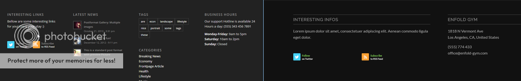
THe demo i loaded has a bulky footer (right on the pic below) how can i achieve the slimmer lighter look of the footer on the left?
Topic: Change Tabs Title font size
Hi,
how can I change the font size of the tabs title?
I tried the following code but nothing happened:
.js_active .tab_titles .tab:first-child { font-size: 16px; !important}Hi there
I’m trying to edit the theme options but it’s not changing, here’s what I’ve tried to do:-
Mojito Child Theme Options > Advanced Styling > Main Menu Links > Amending font, colour and size
Also as above but..
General Layout > Dimensions
Please help :(
How do I get to a setting to change the size of the font and image on mobile?
I have a color area with a background image. Inside the color area is a heading and text underneath. Its pretty nice looking and large on a desktop but on the phone the text is still really huge and goes off the screen.
Topic: Promobox font size
How do i increase excert font size in grid layout in enfold theme?
reference site is http://armstrongbooks.com/
thanks for your support
Hi guys,
My website is ruined after I posted the following CSS codes found on the forum:
@media only screen and (max-width: 767px) {
.responsive .logo a {
display: inline-block;
vertical-align: middle;
}.responsive.html_header_top.html_logo_center .logo {
text-align: center;
}
}Below are the list of issues affected by the CSS codes above:
1) Some website contents’ sizes shrink
2) Header becomes transparent (despite selecting no transparency)
3) Menu, menu fonts shrink
4) Large part of avia builder functions not workingPlease refer to the original site screenshots before I implement the CSS codes.
I need help to revert the changes, guys!Thanks & Regards,
SteveTopic: acces box
Hey guys!
I got a problem with the acces box of my website.
When I write the first box and I press tab key all the formulary box gets bigger. It also happens with the second box of the formulary.How can I fixed it?
This is the code I used to create it:
<form action=”http://vet24.pedidosweb.com/logon.asp” method=”POST” name=”login”>
<table style=”height: 109px;” border=”0″ width=”323″ cellspacing=”0″ cellpadding=”0″ align=”center”>
<tbody>
<tr>
<td bgcolor=”#0033cc” width=”70″ height=”center”><span style=”color: #ffffff;”>USUARIO:</span></td>
<td align=”center” bgcolor=”#0033cc” width=”130″><input name=”login” type=”TEXT” autofocus=”” /></td>
</tr>
<tr>
<td bgcolor=”#0033cc” width=”70″ height=”center”><span style=”color: #ffffff;”>CONTRASENYA:</span></td>
<td align=”left” bgcolor=”#0033cc” width=”130″><input name=”pwd” size=”20″ type=”password” />
<p style=”text-align: right;”></p>
</td>
</tr>
</tbody>
</table>
<p style=”text-align: right;”><input src=”http://web.soladomingo.com/wp-content/uploads/2016/03/Entrar-acceso-clientes.jpg” type=”image” value=”submit” /></p></form>
And this CSS that I used too (you gave it to me to fix some issues):
table strong {
position: relative;
top: -22px;
right: -15px;
}
table input {
position: relative;
top: 10px;
}For font size use this:
table strong span {
font-size: 14px;
}Thanks a lot!
7. Re-order masonry categories items, not the image grid, but the names of the categories.
I’d like to customize the order of the category items, not the grid images. Please see attached.
category_items_orderIf this could not be achieved. Can I hide the categories on Mobile which takes a lot of space, or can I decrease the font size of the category items on mobile.
category_item_on_mobileTopic: Custumize Masonry overlay
Hello,
I would like to customize the masonry grid’s overlay frame, such as size, position, colour, opacity, font size, font colour, font opacity…
Also I wonder if I could replace with my own overlay design instead of a simple rectangular frame.
And, how to set different parameters for mobile for all those settings.Thanks.
Hello,
For lightbox window size and background mask opacity. I used following css to increase window size to 1280px and bg opacity to 0.9 showing less original content.
.mfp-iframe-holder .mfp-content {
max-width: 1280px;
position:center;
top:30px;
}.mfp-zoom-in.mfp-ready.mfp-bg, .mfp-zoom-in.mfp-ready .mfp-preloader {
opacity: 0.9 !important;
background: black !important;
}This works on links that has a custom url (either an image or video). However, when I choose “Lightbox linking active” in a masonry gallery element. it ignors my css settings, using the default layout which is less then 1280px and more bg content opacity. Although my targeted image size is >= 1280px. That is not I want. So how to change its default lightbox window size and the bg opacity.
You can see in the link I provided, when you click the video link on an image, it pops up a correct 1280px lightbox with 0.9 bg mask opacity. But when you click on a masonry gallery below, the popup window is less then 1280px.
And if possible, could you list the reference for all the essential lightbox CSS formats, including its icons (arrows), subtitle font size, position and how it shows differently on mobile.
Hey,
after I updated to Version 3.6 all CSS defined in the section “extended Styling” (Erweitertes Styling) is ignored.Settings and results can be seen here: https://www.nachbarrecht.com/wrong-css.html
H1,H2 and H3 are defined to have a 10px font-size
Even the update to 3.6.1 didn’t fix it.