.av-masonry-sort * {
    font-size: 20px;
}
portfolio – no cat.
if you only want the “terms” bigger:
.av-sort-by-term * {
    font-size: 20px;
}
PS: your link above is gone – so i can not test it at your environment !
Ismael,
I´ve used your above code to get the full width sub-menu to stick to the top of the screen for the ipad in landscape mode but it´s having no effect. The menu shows up in the correct place on the page but just scrolls up past the top of the page like the rest of the page contents and doesn´t stick.
I got round this problem for smaller screens with the burger menu by making the menu stick to the top from page load (which isn´t ideal but I can´t find a way to get it to respond the same on mobile screens as it does on larger screens) with the following css:
@media only screen and (max-width: 479px) {
.responsive #top .av-submenu-container {
position: fixed !important;
top: 120px !important;}
#top .av-subnav-menu > li > a {
font-size: 11px;
color: #56882d!important;
font-weight:700 !important;}
#top #av-custom-submenu-1 .av-menu-button > a .avia-menu-text {padding: 4px;}
#top .av-subnav-menu > li {margin: 0px 0px 0px 0px;}
}
@media only screen and (min-width: 480px) and (max-width: 990px) {
.responsive #top .av-submenu-container {
position: fixed !important;
top: 120px !important;}
#top #av-custom-submenu-1 .av-menu-button > a .avia-menu-text {padding: 4px;}
#top .av-subnav-menu > li {margin: 0px 10px 0px 10px;}
}
I added your above code for ipad landscape mode with the adjustment as follows:
@media only screen and (min-width: 991px) and (max-width: 1024px) {
.responsive #top .av-submenu-container {
top: auto !important;
position: relative !important;
height: auto;
min-height: 0;
margin-bottom: -1px;}
}
but it´s had no effect. Any ideas? The page that the problem is occuring on is below!
Thanks for your help!!
So the final code should be:
[av_one_third first min_height='av-equal-height-column' vertical_alignment='av-align-top' space='' margin='0px' margin_sync='true' link='' linktarget='' link_hover='' padding='0px' padding_sync='true' border='' border_color='' radius='0px' radius_sync='true' background='bg_color' background_color='' background_gradient_color1='' background_gradient_color2='' background_gradient_direction='vertical' src='' attachment='' attachment_size='' background_position='top left' background_repeat='no-repeat' animation='' mobile_breaking='' mobile_display='' av_uid='av-nas6lr' custom_class='']
[av_image src='https://img.youtube.com/vi/W9On5fAdu8I/0.jpg' attachment='' attachment_size='full' align='center' styling='' hover='' link='manually,https://www.youtube.com/watch?v=W9On5fAdu8I?autoplay=1&cc_load_policy=1&enablejsapi=1&ecver=2&playsinline=1&rel=0&showinfo=0&color=white&iv_load_policy=3' target='' caption='' font_size='' appearance='' overlay_opacity='0.4' overlay_color='#000000' overlay_text_color='#ffffff' copyright='' animation='no-animation' av_uid='av-jldgiixt' custom_class='' admin_preview_bg=''][/av_image]
[/av_one_third]
[av_one_third min_height='av-equal-height-column' vertical_alignment='av-align-top' space='' margin='0px' margin_sync='true' link='' linktarget='' link_hover='' padding='0px' padding_sync='true' border='' border_color='' radius='0px' radius_sync='true' background='bg_color' background_color='' background_gradient_color1='' background_gradient_color2='' background_gradient_direction='vertical' src='' attachment='' attachment_size='' background_position='top left' background_repeat='no-repeat' animation='' mobile_breaking='' mobile_display='' av_uid='av-nas6lr' custom_class='']
[av_image src='https://img.youtube.com/vi/W9On5fAdu8I/0.jpg' attachment='' attachment_size='full' align='center' styling='' hover='' link='manually,https://www.youtube.com/watch?v=W9On5fAdu8I?autoplay=1&cc_load_policy=1&enablejsapi=1&ecver=2&playsinline=1&rel=0&showinfo=0&color=white&iv_load_policy=3' target='' caption='' font_size='' appearance='' overlay_opacity='0.4' overlay_color='#000000' overlay_text_color='#ffffff' copyright='' animation='no-animation' av_uid='av-jldgiixt' custom_class='' admin_preview_bg=''][/av_image]
[/av_one_third]
Correct?
Is there a cleaner way to have this short code? Like the one I am starting with? Removing all the conditions?
Pasting all that in 500 posts and edit it to have the videos is not that easy. If something changes in the theme later I will end with a bunch of unusable code.
The idea is to have the less code possible and the cleaner one as well.
Thank you.
well if you got that image ( and you can not insert the image directly to enfold as link) take always the 0 one of preview images – it is the biggest one – and always the https variant.
https://img.youtube.com/vi/W9On5fAdu8I/0.jpg
so to see above the shortcodes – i suppose that you know how to insert the link to this preview image.
First enter one of your media images – then replace the link in debug mode.
as manual link of the image i would insert a better input here ( this only works here because with manual link. a pitty that we can not insert it in video alb or color-section background-video)
always add to your watch youtube video link following:
?autoplay=1&cc_load_policy=1&enablejsapi=1&ecver=2&playsinline=1&rel=0&showinfo=0&color=white&iv_load_policy=3
the ecver=2 is for not showing on pausing the video – other video suggestions
playsinline is for showing on modern mobiles the video as if it was a desktop embed. Iframes etc
rel=0 ist for not showing at the end some other video suggestions etc. pp
my code would be than (only 1/3):
[av_one_third first min_height='av-equal-height-column' vertical_alignment='av-align-top' space='' margin='0px' margin_sync='true' link='' linktarget='' link_hover='' padding='0px' padding_sync='true' border='' border_color='' radius='0px' radius_sync='true' background='bg_color' background_color='' background_gradient_color1='' background_gradient_color2='' background_gradient_direction='vertical' src='' attachment='' attachment_size='' background_position='top left' background_repeat='no-repeat' animation='' mobile_breaking='' mobile_display='' av_uid='av-nas6lr' custom_class='']
[av_image src='https://img.youtube.com/vi/W9On5fAdu8I/0.jpg' attachment='' attachment_size='full' align='center' styling='' hover='' link='manually,https://www.youtube.com/watch?v=W9On5fAdu8I?autoplay=1&cc_load_policy=1&enablejsapi=1&ecver=2&playsinline=1&rel=0&showinfo=0&color=white&iv_load_policy=3' target='' caption='' font_size='' appearance='' overlay_opacity='0.4' overlay_color='#000000' overlay_text_color='#ffffff' copyright='' animation='no-animation' av_uid='av-jldgiixt' custom_class='' admin_preview_bg=''][/av_image]
[/av_one_third]
look here: https://webers-testseite.de/testvideopage/
Hi,
Um das Hauptmenü mit 18px Größe darzustellen habe ich diesen Code in das Quick CSS Feld eingefügt:
#top .av_seperator_big_border#header .av-main-nav > li > a {
    font-size: 18px;
}
Die Untermenüs wurden mit diesem Code größer gemacht:
#top .av_seperator_big_border#header .av-main-nav ul li a {
    font-size: 16px;
}
LG,
Dude
Hi,
Thanks for that, the first one worked. Please try the following in Quick CSS under Enfold->General Styling:
.home .av-alb-blogposts .entry-content p {
  font-size:14px !important;
}
Best regards,
Rikard
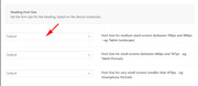
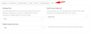
Hello,
I’m trying to increase the font size for the “Portfolio grid sorting” text. I have tried adding the following css (as per the forums) to the Quick CSS, and a couple of other variations to no avail in increasing the font-size of the text for the sort options.
Please advise
.sort_by_cat {
font-size: 20px;
}
#js_sort_items a, #js_sort_items {
text-decoration: none;
outline: none;
font-size: 18px; /*was 12 before*/
}
Hi,
Thanks for the update.
1.) You can try these css codes to change the header background on scroll.
.header-scrolled .header_bg {
    background-color: #666666;
    color: #ffffff;
}

.header-scrolled.header_color .av-subnav-menu a:hover, .header-scrolled.header_color .main_menu ul:first-child > li a:hover, .header-scrolled.header_color .main_menu ul:first-child > li.current-menu-item > a, .header-scrolled.header_color .main_menu ul:first-child > li.current_page_item > a, .header-scrolled.header_color .main_menu ul:first-child > li.active-parent-item > a {
    color: #ffffff;
}

.header-scrolled.header_color .sub_menu>ul>li>a, .header-scrolled.header_color .sub_menu>div>ul>li>a, .header-scrolled.header_color .main_menu ul:first-child > li > a, #top .header-scrolled.header_color .main_menu .menu ul .current_page_item > a, #top .header-scrolled.header_color .main_menu .menu ul .current-menu-item > a, #top .header-scrolled.header_color .sub_menu li ul a {
    color: #a40633;
}
2.) And then use this css code to adjust the h1 font size on mobile view.
@media only screen and (max-width: 767px) {
    .template-page .entry-content-wrapper h1, .template-page .entry-content-wrapper h2 {
        text-transform: uppercase;
        letter-spacing: 1px;
        font-size: 1.3em;
    }
}
Best regards,
Ismael
Hi,
When viewed on mobile, the text of the timeline is cut off by a few words. This happens even when rotating my screen or changing the font size. How can this be fixed? Here is an image to show you what I’m talking about:
https://ibb.co/mb9hCp
Thanks!
Hi,
This is the default style of the h3 tag in your installation.
h3 {
    font-size: 20px;
    font-weight: 300;
    line-height: 1.1em;
    margin-bottom: 8px;
    color: #222222;
    font-family: 'Lato','HelveticaNeue','Helvetica Neue',Helvetica,Arial,sans-serif;
}
Best regards,
Ismael
Under a text box I have to add two icon (web and email), but I like they are side by side.
I add the icon with shortcode
`[av_font_icon icon='ue8b1' font='entypo-fontello' style='' caption='' link='manually' linktarget='_blank' size='25px' position='center' color='#0095d5' av_uid='av-1c8ta' admin_preview_bg=''][/av_font_icon]
[av_font_icon icon='ue805' font='entypo-fontello' style='' caption='' link='manually' linktarget='' size='25px' position='center' color='#0095d5' av_uid='av-qiem' admin_preview_bg=''][/av_font_icon]
but they are one above the other
thanks
Hi Ismael,
Thx, works fine! 2 last minor things and I am done.
1. I would like to have the main menu points on the transparent background WHITE and then change it to black when the menu gets smaller on a white background when you scroll down (pls. see my website: https://interim-manager.biz/). Currently the settings are the same on transparent and white background. Is this possible? I fiddle around in the menu appearance settings, but it seems that I am to stupid to get it.
2. The Headline “DATENSCHUTZERKLÄRUNG” is to long for mobile. I changed the font size in the paragraph settings to a smaller font size for mobile, but the effect is none. What do I do wrong?
Thx for your resonse,
Holger
Hi Mike!
This is so helpful! Thank you for your patience. As a complete coding novice, CSS scares me, so I prefer to leave this to the experts! But your clear explanations have explained where I was going wrong, and how to avoid making the same mistakes in the future.
Point 1. This is a little clearer now. But I’m not sure what you mean by “Typically the rule is Line Height = Text Height x 1.62”. I actually changed by line height setting back to ‘Default’, but I still think the spaces between the lines is rather large. If, for example, I’m using a font size of 16px, what line height value would I need to have to make the spacing the equivalent of 1.5 in a Word Doc?
Point 2. Thanks for the CSS code. I’ve actually ammended the Post Title code to 25, and I’m much happier.
Point 3. A very clear explanation! Could you please
(i) tell me what the ’em’ value of the line height of the ‘Default’ setting is?
(ii) write a CSS rule to make the ’em’ line height value for the List Items the same as for the default setting.
Point 4. I’ve decided to change the font height of my paragraph in ‘Advanced Styling to 16px. The size of the font in the List Item box still appeared to be 25px, so this morning I got rid of the bullet points and added hyphens instead so that it has the layout of a Paragraph instead of a List Item. Please could you add a CSS code rule so that the size of the font for my List Items are also 16px?
You’ve been very helpful indeed, Mike! I’m sure more things will crop up (like how to change the colour of the content of the reply boxes on my contact form, for example) and will need some more bits of code, but I guess I’ll have to write separate posts for that, right? For now, I’m really happy with the result and speed of your response.
Many, many thanks.
Frances
Hi,
1: I looked at your “H” tags to find inconsistencies but most of the “H” tags are “special heading” elements that had a overriding font size in the element, so your “advanced styling” is your base size, but a element can overwrite it if you use it’s font size option. Sorry, I couldn’t find the H4 in your screenshot.
Please note that there is a big difference in font sizes between “px” & “em” and mixing the two can give odd results.
px: Pixels are fixed-size unit.
em: is a scalable unit that changes with screen size.
So for your “p” tag you have 25px, with a line height of .7em which works out to 17px, so your text looks very tight, even a line height of 25px will look tight. Typically the rule is Line Height = Text Height x 1.62
Try thinking of MS Word and the line height of 1.5 is easier to read than 1.
2: The blog title is a H2 and the sidebar title is a H3, which match your “advanced styling” selections. But we can write rules for those elements if you let us know what you would like. I added this to your Enfold Theme Options > General Styling > Quick CSS field as an example:
h2.post-title a {
font-size: 30px !important;
}
h3.widgettitle {
font-size: 20px !important;
}
3: Most of the spaces between lines of text within a paragraph are very small, as discussed above, which I will let you change to your liking, the few pages that were too big was because in your “advanced styling” you didn’t check the box “Alternate Content” I did this for you so they will all follow the same rules.
Except list items, which don’t have a “advanced styling” setting, but we can write a css rule for you once you decide on a line height.
4: The text in both boxes are the same font size, except the line height, which is because the bottom box is a list item, as talked about above.
I’m certain that we can add a couple of css rules for you to address these few points and then going forward you can add to your site without needing to address them again. As the top of the “advanced styling” page says it is a “beta” feature so it doesn’t have a option for every element yet. But we are always happy to assist any way we can.
Best regards,
Mike
Hey Colindie,
Please refer to the following:
Best regards,
Jordan Shannon
Hey DROR,
To move the logo left for mobile, Please try this code in the General Styling > Quick CSS field:
@media only screen and (max-width: 767px) {
.responsive #top .logo {
    width: 100% !important;
}
.responsive #top .logo img {
    float: left !important;
}
}
To change the font size of the caption title and subtitle bigger, Please try this code in the General Styling > Quick CSS field:
@media only screen and (max-width: 767px) {
.responsive #top.home .slideshow_caption h2 {
    font-size: 60px !important;
}
.responsive #top.home .slideshow_caption .avia-caption-content {
    font-size: 40px !important;
}
}
Best regards,
Mike
Hi, how do I move the logo on mobile to the left so it won’t go over the menu?
And how do I make the caption title and subtitle bigger? It seems that no matte what size I select in the element settings, the font remains small.
Thanks.
Hi,
I’d like to change my font stylings for headers on all pages, because I don’t like the size/capital letters of the current H1.
H1 should look like H3 looks now,
H2 should look like H4 looks now
etc
1) How can I do this without using CSS? I thought the Advanced Styling in the Enfold menu would be the right place, but changing settings there doesn’t have any effect.
2) How can I find out the current settings for H1, H2, H3…
Thanks
as i see now, also changing the font sizes of the icon boxes does´nt work for me:/ is there maybe any general setting i dismissed or something like that?
Hi,
To call the font, please follow this example:
.image-overlay-inside:before {
    content: "\E869";
    font-family: 'entypo-fontello';
    font-size: 18px;
    font-weight: normal
}
the font codes begin with a “U” which is replaced in the css with a “\”
One observation though, if you are going to replace all of the shortcodes with HTML, then won’t you have to recreate each page and element as you add new content in the going forward?
Another option could be to use the theme with the shortcode now, and in the future if you want to remove them, use the plugin Shortcode Cleaner Lite
Best regards,
Mike
Hi Demaup,
Here is the code you can put in Enfold > General Styling > Quick Css, if it does not work, put into themes/enfold/css/custom.css
#top #searchsubmit {
    min-width: 110px;
}
#top #s {
    border-radius: 20px;
    border: 2px #32a05c solid;
    font-size: 15px;
    padding: 11px 47px 11px 20px;

}
If you need further assistance please let us know.
Best regards,
Victoria
Hi akapoun,
Here is the code you can put in Enfold > General Styling > Quick Css, if it does not work, put into themes/enfold/css/custom.css
@media only screen and (max-width:767px){
    #top #wrap_all .av-inherit-size .av-special-heading-tag {
        font-size: 34px;
    }
}
If you need further assistance please let us know.
Best regards,
Victoria
Hey better_in_violet,
Sure thing:
[av_layout_row border='' min_height='430px' color='main_color' mobile='av-flex-cells' id='' av_uid='av-2ous1e']

[av_cell_one_half vertical_align='top' padding='30px' padding_sync='true' background_color='' src='https://test.kriesi.at/minimal-portfolio/wp-content/uploads/sites/6/2015/07/me-bw.jpg' attachment='164' attachment_size='full' background_attachment='scroll' background_position='center left' background_repeat='stretch' av_uid='av-2izam2']

[/av_cell_one_half][av_cell_one_half vertical_align='middle' padding='30px,100px,30px,100px' background_color='#f7f7f7' src='' attachment='' attachment_size='' background_attachment='scroll' background_position='top left' background_repeat='no-repeat' av_uid='av-2eyxuq']

[av_one_full first min_height='' vertical_alignment='av-align-top' space='' margin='0px' margin_sync='true' padding='0px' padding_sync='true' border='' border_color='' radius='0px' radius_sync='true' background_color='' src='' attachment='' attachment_size='' background_position='top left' background_repeat='no-repeat' animation='bottom-to-top' av_uid='av-298wey']

[av_heading tag='h3' padding='10' heading='About me' color='' style='blockquote modern-quote' custom_font='' size='' subheading_active='' subheading_size='15' custom_class='' av_uid='av-255i36'][/av_heading]

[av_textblock size='' font_color='' color='' av_uid='av-1x8p02']
Lorem ipsum dolor sit amet, consectetuer adipiscing elit. Aenean commodo ligula eget dolor. Aenean massa. Cum sociis natoque penatibus et magnis dis <strong>parturient</strong> montes, nascetur ridiculus mus.

Donec quam felis, ultricies nec, pellentesque eu, pretium quis, sem. Nulla consequat massa quis enim.
[/av_textblock]

[/av_one_full][/av_cell_one_half][/av_layout_row][av_section min_height='' min_height_px='500px' padding='large' shadow='no-border-styling' bottom_border='no-border-styling' id='' color='main_color' custom_bg='' src='' attachment='' attachment_size='' attach='scroll' position='top left' repeat='no-repeat' video='' video_ratio='16:9' overlay_opacity='0.5' overlay_color='' overlay_pattern='' overlay_custom_pattern='' av_uid='av-1qovsy']
[av_one_half first min_height='' vertical_alignment='av-align-top' space='' margin='0px' margin_sync='true' padding='0px' padding_sync='true' border='' border_color='' radius='0px' radius_sync='true' background_color='' src='' attachment='' attachment_size='' background_position='top left' background_repeat='no-repeat' animation='bottom-to-top' av_uid='av-1lnfea']

[av_heading tag='h3' padding='10' heading='What I can do for you' color='' style='blockquote modern-quote' custom_font='' size='' subheading_active='' subheading_size='15' custom_class='' av_uid='av-1h8b02'][/av_heading]

[av_textblock size='' font_color='' color='' av_uid='av-1b3ryi']
Lorem ipsum dolor sit amet, consectetuer <strong>adipiscing</strong> elit. Aenean commodo ligula eget dolor. Aenean massa. Cum sociis natoque penatibus et magnis dis parturient montes, nascetur ridiculus mus.

Donec quam felis, ultricies nec, pellentesque eu, pretium quis, sem. Nulla consequat massa quis enim.
[/av_textblock]

[/av_one_half][av_one_half min_height='' vertical_alignment='av-align-top' space='' margin='0px' margin_sync='true' padding='0px' padding_sync='true' border='' border_color='' radius='0px' radius_sync='true' background_color='' src='' attachment='' attachment_size='' background_position='top left' background_repeat='no-repeat' animation='bottom-to-top' av_uid='av-14eqhm']

[av_heading tag='h3' padding='10' heading='Skills' color='' style='blockquote modern-quote' custom_font='' size='' subheading_active='' subheading_size='15' custom_class='' av_uid='av-w7276'][/av_heading]

[av_textblock size='' font_color='' color='' av_uid='av-qcy5m']
Aenean vulputate eleifend tellus. <strong>Aenean</strong> leo ligula, porttitor eu, <strong>consequat</strong> vitae, eleifend ac, enim. Aliquam lorem ante, dapibus in, viverra quis, feugiat a, tellus.
<ul>
	<li>Nullam felis eu pede mollis pretium.</li>
	<li>Integer tincidunt. Cras dapibus.</li>
	<li>Vivamus elementum semper nisi.</li>
</ul>
[/av_textblock]

[/av_one_half][av_one_full first min_height='' vertical_alignment='av-align-top' space='' margin='0px' margin_sync='true' padding='30px' padding_sync='true' border='' border_color='' radius='0px' radius_sync='true' background_color='#f7f7f7' src='' attachment='' attachment_size='' background_position='top left' background_repeat='no-repeat' animation='bottom-to-top' av_uid='av-m1wd6']

[av_heading tag='h3' padding='20' heading='I am currently:' color='' style='blockquote modern-quote modern-centered' custom_font='' size='' subheading_active='' subheading_size='15' custom_class='' av_uid='av-fnyl6'][/av_heading]

[av_button label='Available for work' link='page,156' link_target='' size='x-large' position='center' icon_select='no' icon='ue800' font='entypo-fontello' color='dark' custom_bg='#444444' custom_font='#ffffff' av_uid='av-bifve']

[/av_one_full]
[/av_section]
Best regards,
Mike
Hey Luc_44,
For the Icon Box element, you can change the font size based on screen size.
Please open your Icon Box element and go to the third tab “Screen Options” there you will see “Heading Font Size” & “Content Font Size” for each font size option, you can choose the sizes.
For your second question, you can change the font for your general site at Enfold Theme Options > General Styling > Font
Best regards,
Mike
– yes pleas follow Rikards link – i guess this is the way to do.
To have a different heading and a background you can do this to quick css:
Just test it and look:
#customer_login {
    background-color: #ddd;
}

.woocommerce-form-register.register {
    min-height: 265px;
    border: 1px solid #023744;
}

.u-column1.col-1,
.u-column2.col-2 {
    padding: 20px;
    text-align: center
}
.u-column1.col-1 { background-color: #023744}

.u-column2.col-2 { background-color: #ddd }

.u-column1.col-1 h2,
.u-column2.col-2 h2 {
    display:none
}

.u-column1.col-1::before,
.u-column2.col-2::before {
    word-wrap: break-word;
    font-weight: bold;
    font-size: 34px !important;
    line-height: 46px;
}

.u-column1.col-1::before {
	color: #fff;
	content: "Sign up to receive your \A free CORTIME trial"
}

.u-column1.col-1::after {
    color: #fff;
    font-weight: normal;
    word-wrap: break-word;
    white-space: pre-wrap;
    content: "By signing up you will automatically receive our newsletter. Don't worry - we hate spam just as much as you. \A\A We will send you no more than 6 newsletters a year and you can always unsubscribe";
    position: relative;
    top: 10px;
}

.u-column2.col-2::before {
	color: #333;
	content: "Already a CORTIME user? \A Log into your account here"
}

.col2-set .col-1 { width: 47% }
.col2-set .col-2 { width: 53% }

@media only screen and (max-width: 768px){
.responsive #top .col2-set .col-1,
.responsive #top .col2-set .col-2,
.responsive .cart-collaterals .shipping_calculator {
    width: 100%;
}
#customer_login { background-color: inherit }
}
maybe you get rid of those social media logins:
.wc-social-login.form-row-wide {
    display: none;
}
-
This reply was modified 7 years, 7 months ago by
 Guenni007.
Thank you Victoria! Just one more question: I need to make the font size smaller. Is this something that I can do through Advanced Styling? It’s words are far too big.
Thanks!
Erin
Hello there!
i can´t find any option in the icon box function, which allows me to change the Font Size of the icon box title + the icon box body font.
Could you please tell me, how i am able to do this? i don´t have knowledge in CSS or HTML that much, so i´d appreciate if you could tell me in steps, how to go on :)
Another question i have, which also has to do with font, is how i can change the font (montserrat etc.) in general or respectively belated ?
Best regards
When I add the following code – nothing changes:
@media only screen and (max-width: 767) {
h4 {font-size: 0.3em;}
}
Please can you have a look on it.
Hello,
I use enfold 4.2 and on the shop page I use the sidebar to show the product categories (works really great for me!)
But is it possible to highlight the first category layer (with larger font or bold) because this would make it easier for my customers to find the right category and the associated subcategories and products.
But I want to highlight only the first layer – so only categories which do not have parent categories.
Many thanks!
regards stefan